
Search results for "Quitting process" in Home Design Ideas
 Tile Doctor Ltd
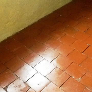
Here’s an interesting work I recently completed on a red Quarry tiled floor at a house in the town of Abington, Northampton. In post-war Britain (more specifically in the 1940s and 1950s), many new homes were built with Quarry tiled hallways and kitchens, so quite a popular feature back then. These floors are typically quite hard wearing and therefore ideal for such high traffic areas; additionally they don’t need a great deal of maintenance but their appearance will degrade over time.
In this particular house, the Quarry tiled floor had been covered with linoleum for many years, causing significant patches of visible black mould. The floor also had a loose tile (which I promptly reset to mitigate the potential tripping hazard) and splashes of paint due to a lack of precaution while the house was being renovated. Needless to say, the floor needed a lot of work.
Before beginning the cleaning I made sure to vacuum up all of the loose debris from the floor. I then applied Tile Doctor Remove & Go to the tiles, left it to dwell for a short period, and then agitated the area with a black stripping pad, adding water to aid the process. This helped to break down any old and ineffectual sealer, along with the paint splashes marking the tiles, leaving a much cleaner and more refined appearance.
I followed this up with Tile Doctor Grout Clean-Up to eliminate the odd speck of cement and grout haze dating back to when the floor was first installed; Gout Clean-up has an acid base so it’s not advised to leave it on the tiles for too long, consequently as soon as I was happy it had done the job I rinsed it off with water and give the floor a thorough wash down.
I used a wet-vacuum machine to extract as much water as possible and gave the floor a once over with steam cleaner which improves the evaporation of any remaining moisture by heating up the tiles.
After completing the cleaning process, I left the house to allow time for the floor to dry completely. Upon my return, I conducted a damp test which showed the floor needed to dry further before sealing so I left an industrial fan in place for a couple of hours to help speed things up.
Once I was satisfied that the floor was dry enough to take the sealant, I sealed the floor using Tile Doctor Colour Grow which is an interesting product that will not only provide durable stain protection but also improves the natural colours of the tile.
While the floor required a lot of time and work to restore, I think you will agree the results were certainly worth waiting for.
Phil Vissian
Northamptonshire Tile Doctor

 Cassoni Furniture & Accessories
- 14 SUSPENSION LAMP. The 14 is an articulated, seamed cast glass sphere with a frosted cylindrical void that houses either a low voltage (12V, 10W xenon) or LED (12V, 1.5W) lamp. Individual pendants are visually quite subtle, but gain tremendous strength when multiplied and clustered in large groups. Light interacts with the bubbles and imperfections of the cast glass to produce a glow reminiscent of small candles oating within spheres of water. Cast glass is an organic process, imperfect by nature and each 14 is hand made; thus, every piece produced is unique.
Ø4'' x 120''H.
Adjustable height.
http://ow.ly/3zh1gV
 birdRock Project Studio Inc.
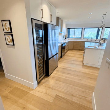
This home originally felt quite dark and moody, so we set out to reimagine the entire aesthetic. We brightened everything—from the walls and flooring to the cabinetry and finishing accents—bringing a renewed sense of openness and light to each room. The homeowners were thrilled to experience the fresh, light, and airy energy that now defines their space.
Working with them was truly a pleasure, and I’m grateful for the trust they placed in us throughout the process. Their willingness to explore new ideas allowed us to create a design that not only transformed their home, but also aligned beautifully with how they wanted to live in it. Hearing how they love every inch and detail of their renewed space was one of the most rewarding parts of the project.
Find the right local pro for your project
 birdRock Project Studio Inc.
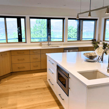
This home originally felt quite dark and moody, so we set out to reimagine the entire aesthetic. We brightened everything—from the walls and flooring to the cabinetry and finishing accents—bringing a renewed sense of openness and light to each room. The homeowners were thrilled to experience the fresh, light, and airy energy that now defines their space.
Working with them was truly a pleasure, and I’m grateful for the trust they placed in us throughout the process. Their willingness to explore new ideas allowed us to create a design that not only transformed their home, but also aligned beautifully with how they wanted to live in it. Hearing how they love every inch and detail of their renewed space was one of the most rewarding parts of the project.
 Furniture Fashion
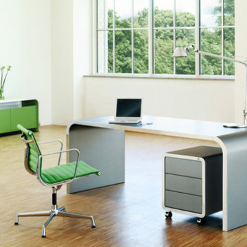
From the house of Müller Möbelfabrikation, comes forth the L14-2 Sideboard is part of the Highline Collection, an impeccable coalesce of multi-functionality and crispness as it explores incipient heights in terms of versatility, adaptability and flexibility in ensemble design. The German modeling is bold and confident without being overwhelming and this quite forms the highlight of this creative sideboard.
The L14-2 Sideboard, a hand-welded collection from the house of Müller Möbelfabrikation, is engineered out of 1mm thick steel and finished in a glossy lacquer, giving it that clean, uncomplicated and streamlined look. The neat geometry embodying gentle curves around the corners, speaks of the introspective design process and results in making the L14-2 Sideboard very safe to use, sans any poky prodding edges. The Sideboard comes with lacquered doors and matt lacquered filing surfaces that beautifully complement the gentle organic top. All put together, this simple yet functional, Highline Sideboard meets the demands of purpose and aesthetics, efficiently with its elegant and communicative design.
The L14-2 Sideboard, is an ensemble that gives a warm, velvety feeling, making the user feel relaxed and reposed. And the best part is that it brings the comfort of your home into your office and the other way round, with great ease! What will you store and display in this dynamic sideboard?
 birdRock Project Studio Inc.
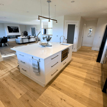
This home originally felt quite dark and moody, so we set out to reimagine the entire aesthetic. We brightened everything—from the walls and flooring to the cabinetry and finishing accents—bringing a renewed sense of openness and light to each room. The homeowners were thrilled to experience the fresh, light, and airy energy that now defines their space.
Working with them was truly a pleasure, and I’m grateful for the trust they placed in us throughout the process. Their willingness to explore new ideas allowed us to create a design that not only transformed their home, but also aligned beautifully with how they wanted to live in it. Hearing how they love every inch and detail of their renewed space was one of the most rewarding parts of the project.
 birdRock Project Studio Inc.
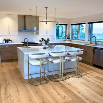
This home originally felt quite dark and moody, so we set out to reimagine the entire aesthetic. We brightened everything—from the walls and flooring to the cabinetry and finishing accents—bringing a renewed sense of openness and light to each room. The homeowners were thrilled to experience the fresh, light, and airy energy that now defines their space.
Working with them was truly a pleasure, and I’m grateful for the trust they placed in us throughout the process. Their willingness to explore new ideas allowed us to create a design that not only transformed their home, but also aligned beautifully with how they wanted to live in it. Hearing how they love every inch and detail of their renewed space was one of the most rewarding parts of the project.
 birdRock Project Studio Inc.
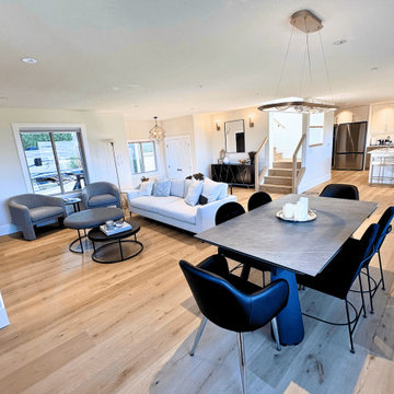
This home originally felt quite dark and moody, so we set out to reimagine the entire aesthetic. We brightened everything—from the walls and flooring to the cabinetry and finishing accents—bringing a renewed sense of openness and light to each room. The homeowners were thrilled to experience the fresh, light, and airy energy that now defines their space.
Working with them was truly a pleasure, and I’m grateful for the trust they placed in us throughout the process. Their willingness to explore new ideas allowed us to create a design that not only transformed their home, but also aligned beautifully with how they wanted to live in it. Hearing how they love every inch and detail of their renewed space was one of the most rewarding parts of the project.
 birdRock Project Studio Inc.
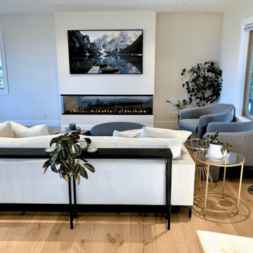
This home originally felt quite dark and moody, so we set out to reimagine the entire aesthetic. We brightened everything—from the walls and flooring to the cabinetry and finishing accents—bringing a renewed sense of openness and light to each room. The homeowners were thrilled to experience the fresh, light, and airy energy that now defines their space.
Working with them was truly a pleasure, and I’m grateful for the trust they placed in us throughout the process. Their willingness to explore new ideas allowed us to create a design that not only transformed their home, but also aligned beautifully with how they wanted to live in it. Hearing how they love every inch and detail of their renewed space was one of the most rewarding parts of the project.

 Native Edge Landscape
Another fun Crestview project! This young couple wanted a back yard that reflected their bohemian-eclectic style and could add additional privacy from the ever climbing construction around them. A place for “hanging out and drinking coffee or beer in the backyard.” But what was most exciting, was the air stream they had just purchased and were in the process of restoring. With the end goal of using it as a guest home for family and friends, we were challenged with creating a space that was cohesive and connected this new living space with the rest of the yard.
In the front we had another quark to fix. The sidewalk from their front door to the street suddenly stopped 5 feet from the curb, making a less than inviting entry for guests. So, creating a new usable entryway with additional curb appeal was a top priority.
We managed the entertainment space by using modern poured concrete pad’s as a focal. A poured concrete wall serves as a bench as well as creates a visual anchor for the patio area. To soften the hard materials, small plantings of succulents and ground cover were planted in the spaces between the pads. For a backdrop, a custom Cedar Plank wall and trellis combined to soften the vertical space and add plenty of privacy. The trellis is anchored by a Coral Vine to add interest. Cafe style lighting was strung across the area create a sense of intimacy.
We also completed the fence transition, and eliminated the grass areas that were not being utilized to reduce the amount of water waste in the landscape, and replaced these areas with beneficial plantings for the wildlife.
Overall, this landscape was completed with a cohesive Austin-friendly design in mind for these busy young professionals!
Caleb Kerr - http://www.calebkerr.com

 Vetter Architects
The client’s request was quite common - a typical 2800 sf builder home with 3 bedrooms, 2 baths, living space, and den. However, their desire was for this to be “anything but common.” The result is an innovative update on the production home for the modern era, and serves as a direct counterpoint to the neighborhood and its more conventional suburban housing stock, which focus views to the backyard and seeks to nullify the unique qualities and challenges of topography and the natural environment.
The Terraced House cautiously steps down the site’s steep topography, resulting in a more nuanced approach to site development than cutting and filling that is so common in the builder homes of the area. The compact house opens up in very focused views that capture the natural wooded setting, while masking the sounds and views of the directly adjacent roadway. The main living spaces face this major roadway, effectively flipping the typical orientation of a suburban home, and the main entrance pulls visitors up to the second floor and halfway through the site, providing a sense of procession and privacy absent in the typical suburban home.
Clad in a custom rain screen that reflects the wood of the surrounding landscape - while providing a glimpse into the interior tones that are used. The stepping “wood boxes” rest on a series of concrete walls that organize the site, retain the earth, and - in conjunction with the wood veneer panels - provide a subtle organic texture to the composition.
The interior spaces wrap around an interior knuckle that houses public zones and vertical circulation - allowing more private spaces to exist at the edges of the building. The windows get larger and more frequent as they ascend the building, culminating in the upstairs bedrooms that occupy the site like a tree house - giving views in all directions.
The Terraced House imports urban qualities to the suburban neighborhood and seeks to elevate the typical approach to production home construction, while being more in tune with modern family living patterns.
Overview
Elm Grove
Size
2,800 sf
3 bedrooms, 2 bathrooms
Completion Date
September 2014
Services
Architecture, Landscape Architecture
Interior Consultants: Amy Carman Design
Steve Gotter

 Susan Yeley Homes
Like most of our projects, we can't gush about this reno—a new kitchen and mudroom, ensuite closet and pantry—without gushing about the people who live there. The best projects, we always say, are the ones in which client, contractor and design team are all present throughout, conception to completion, each bringing their particular expertise to the table and forming a cohesive, trustworthy team that is mutually invested in a smooth and successful process. They listen to each other, give the benefit of the doubt to each other, do what they say they'll do. This project exemplified that kind of team, and it shows in the results.
Most obvious is the opening up of the kitchen to the dining room, decompartmentalizing somewhat a century-old bungalow that was originally quite purposefully compartmentalized. As a result, the kitchen had to become a place one wanted to see clear through from the front door. Inset cabinets and carefully selected details make the functional heart of the house equal in elegance to the more "public" gathering spaces, with their craftsman depth and detail. An old back porch was converted to interior space, creating a mudroom and a much-needed ensuite walk-in closet. A new, larger deck went on: Phase One of an extensive design for outdoor living, that we all hope will be realized over the next few years. Finally, a duplicative back stairwell was repurposed into a walk-in pantry.
Modernizing often means opening spaces up for more casual living and entertaining, and/or making better use of dead space. In this re-conceptualized old house, we did all of that, creating a back-of-the-house that is now bright and cheerful and new, while carefully incorporating meaningful vintage and personal elements.
The best result of all: the clients are thrilled. And everyone who went in to the project came out of it friends.
Contractor: Stumpner Building Services
Cabinetry: Stoll’s Woodworking
Photographer: Gina Rogers

 Janvrin & Co.
Photos: Ashley Ross
I knew it was time to makeover my son's nursery after removing the changing pad and baby toiletries from the changing area. My son has also developed quite the interest in cars, it's beyond toy cars. He loves flipping through car mags with dad and can name almost any model that drives by us on the road or he's sees parked on the street. I really wanted to bring in "some" of his love of four wheel vehicles into his personal space. Especially since we don't do toys in the bedroom.
We took our time and didn't race through the process and both mom and kiddo are champions of this new space. For five simple makeover tips for a smooth transition from the nursery into that more mature space check out our blog post '5 Tips Transition From Nursery to Big Kid Bedroom'.
 Reico Kitchen & Bath
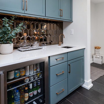
Designed by Lauren Hunt of Reico Kitchen & Bath in Charlotte, NC, in collaboration with The Atta Group, this mid-century/transitional kitchen & bar features Merillat Masterpiece cabinets in the Levan shaker door style with a Rainfall finish. Kitchen countertops are Hanstone Strato, complemented by a Bally Butcherblock bar countertop in teak.
“The clients were a dream to work with! We have similar design taste, so it made for a really effortless and smooth design process!” said Hunt.
“Their original kitchen was much smaller, so much of our discussion was centered on making the new space they had functional and efficient. We used quite a few pullouts and drawer accessories to help keep their storage space organized.”
“I was thrilled that they’ve broke away from the whites and gray painted cabinets we’ve been seeing by selecting Masterpiece’s Rainfall paint and incorporating some warmer finishes. I’m really happy with the finished product – we were able to create a design that is sleek and streamlined while still being warm and inviting!”
Photos courtesy of Six Cents Media.

 Cure Design Group
The furniture was recently purchased so we really needed to get the job done in bedding, color, patterns, and infusing some key pieces/accessories to work in conjunction with the youthful furniture selection.
The inspiration to her design came from a Designers Guild wallpaper that resembled the color of the sky…from there we changed the wall color to a soft gray, added new bedding and pillows, gave the window treatments a neutral texture, changed out overhead lighting and lamps and infused some current accessories.
The change was exactly what was needed! But….we weren’t quite finished. We decided at that point that some extra storage was needed as well as an opportunity to bring that outdoor woodsy feeling into her room. We then changed her nightstand to more of a dresser wrapped in the gloss white and drawers in reclaimed wood.
What a difference!!! But, collectively we still I felt we needed one more change to give her room that “wow” factor. I then decided to change the drama of her existing headboard to one that was spectacular!! And it worked!!!
We are still in the process of changing out her desk, but for the most part we are there!!!
 Janvrin & Co.
Photos: Ashley Ross
I knew it was time to makeover my son's nursery after removing the changing pad and baby toiletries from the changing area. My son has also developed quite the interest in cars, it's beyond toy cars. He loves flipping through car mags with dad and can name almost any model that drives by us on the road or he's sees parked on the street. I really wanted to bring in "some" of his love of four wheel vehicles into his personal space. Especially since we don't do toys in the bedroom.
We took our time and didn't race through the process and both mom and kiddo are champions of this new space. For five simple makeover tips for a smooth transition from the nursery into that more mature space check out our blog post '5 Tips Transition From Nursery to Big Kid Bedroom'.


 Reico Kitchen & Bath
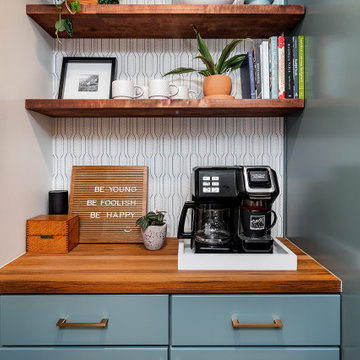
Designed by Lauren Hunt of Reico Kitchen & Bath in Charlotte, NC, in collaboration with The Atta Group, this mid-century/transitional kitchen & bar features Merillat Masterpiece cabinets in the Levan shaker door style with a Rainfall finish. Kitchen countertops are Hanstone Strato, complemented by a Bally Butcherblock bar countertop in teak.
“The clients were a dream to work with! We have similar design taste, so it made for a really effortless and smooth design process!” said Hunt.
“Their original kitchen was much smaller, so much of our discussion was centered on making the new space they had functional and efficient. We used quite a few pullouts and drawer accessories to help keep their storage space organized.”
“I was thrilled that they’ve broke away from the whites and gray painted cabinets we’ve been seeing by selecting Masterpiece’s Rainfall paint and incorporating some warmer finishes. I’m really happy with the finished product – we were able to create a design that is sleek and streamlined while still being warm and inviting!”
Photos courtesy of Six Cents Media.
 Reico Kitchen & Bath
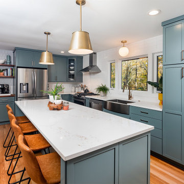
Designed by Lauren Hunt of Reico Kitchen & Bath in Charlotte, NC, in collaboration with The Atta Group, this mid-century/transitional kitchen & bar features Merillat Masterpiece cabinets in the Levan shaker door style with a Rainfall finish. Kitchen countertops are Hanstone Strato, complemented by a Bally Butcherblock bar countertop in teak.
“The clients were a dream to work with! We have similar design taste, so it made for a really effortless and smooth design process!” said Hunt.
“Their original kitchen was much smaller, so much of our discussion was centered on making the new space they had functional and efficient. We used quite a few pullouts and drawer accessories to help keep their storage space organized.”
“I was thrilled that they’ve broke away from the whites and gray painted cabinets we’ve been seeing by selecting Masterpiece’s Rainfall paint and incorporating some warmer finishes. I’m really happy with the finished product – we were able to create a design that is sleek and streamlined while still being warm and inviting!”
Photos courtesy of Six Cents Media.
 Cure Design Group
The furniture was recently purchased so we really needed to get the job done in bedding, color, patterns, and infusing some key pieces/accessories to work in conjunction with the youthful furniture selection.
The inspiration to her design came from a Designers Guild wallpaper that resembled the color of the sky…from there we changed the wall color to a soft gray, added new bedding and pillows, gave the window treatments a neutral texture, changed out overhead lighting and lamps and infused some current accessories.
The change was exactly what was needed! But….we weren’t quite finished. We decided at that point that some extra storage was needed as well as an opportunity to bring that outdoor woodsy feeling into her room. We then changed her nightstand to more of a dresser wrapped in the gloss white and drawers in reclaimed wood.
What a difference!!! But, collectively we still I felt we needed one more change to give her room that “wow” factor. I then decided to change the drama of her existing headboard to one that was spectacular!! And it worked!!!
We are still in the process of changing out her desk, but for the most part we are there!!!
10