
Search results for "Range supports" in Home Design Ideas

 Bilotta Kitchen & Home
This kitchen was designed by two Bilotta designers, Randy O’Kane and Danielle Florie in concert with Murphy Brothers Contracting and Tim Button of Stedila Design Inc. It is in an existing home which was renovated with an eye to the original structure and neighborhood in Rye. The kitchen itself was an addition, as well as the family room adjacent to the kitchen. The interior wall of the kitchen was the exterior brick of the existing structure. The Waterworks Grove Brickworks tile gives the appearance of the “old” existing brick but painted. The concept was to create a new kitchen with all the up-to-date technology and accessories, but with the feel of an old scullery. We used 1” thick shaker-style Bilotta Collection cabinetry in a custom paint on the perimeter and a custom stain and texture on rift cut white oak for the island. The tall pantry larders cap off the runs of countertop allowing for work tops at each vignette. By using a column refrigerator and freezer in different sizes, we could address refrigeration needs while also addressing symmetry. The Wolf range and the fireplace in the family room are centered on each other which you can see by peeking through to each room. Reclaimed floor and beams help to give this new room that “lived-in” look. Although this kitchen is big enough for catering a large party, it still has a warm family feel with a layout that will serve both functions.
Designer: Randy O’Kane & Danielle Florie, Bilotta Kitchens Photo Credit: Peter Krupenye
 TKS Design Group
Download our free ebook, Creating the Ideal Kitchen. DOWNLOAD NOW
This family from Wheaton was ready to remodel their kitchen, dining room and powder room. The project didn’t call for any structural or space planning changes but the makeover still had a massive impact on their home. The homeowners wanted to change their dated 1990’s brown speckled granite and light maple kitchen. They liked the welcoming feeling they got from the wood and warm tones in their current kitchen, but this style clashed with their vision of a deVOL type kitchen, a London-based furniture company. Their inspiration came from the country homes of the UK that mix the warmth of traditional detail with clean lines and modern updates.
To create their vision, we started with all new framed cabinets with a modified overlay painted in beautiful, understated colors. Our clients were adamant about “no white cabinets.” Instead we used an oyster color for the perimeter and a custom color match to a specific shade of green chosen by the homeowner. The use of a simple color pallet reduces the visual noise and allows the space to feel open and welcoming. We also painted the trim above the cabinets the same color to make the cabinets look taller. The room trim was painted a bright clean white to match the ceiling.
In true English fashion our clients are not coffee drinkers, but they LOVE tea. We created a tea station for them where they can prepare and serve tea. We added plenty of glass to showcase their tea mugs and adapted the cabinetry below to accommodate storage for their tea items. Function is also key for the English kitchen and the homeowners. They requested a deep farmhouse sink and a cabinet devoted to their heavy mixer because they bake a lot. We then got rid of the stovetop on the island and wall oven and replaced both of them with a range located against the far wall. This gives them plenty of space on the island to roll out dough and prepare any number of baked goods. We then removed the bifold pantry doors and created custom built-ins with plenty of usable storage for all their cooking and baking needs.
The client wanted a big change to the dining room but still wanted to use their own furniture and rug. We installed a toile-like wallpaper on the top half of the room and supported it with white wainscot paneling. We also changed out the light fixture, showing us once again that small changes can have a big impact.
As the final touch, we also re-did the powder room to be in line with the rest of the first floor. We had the new vanity painted in the same oyster color as the kitchen cabinets and then covered the walls in a whimsical patterned wallpaper. Although the homeowners like subtle neutral colors they were willing to go a bit bold in the powder room for something unexpected. For more design inspiration go to: www.kitchenstudio-ge.com

 gardenaar
Does your orange tree drop its fruit before it reaches full size, or worse, does it drop flowers before the fruit starts to form?
Trees photosynthesize to produce carbohydrates like sugar which they store as a source of energy. They can maintain a limited amount, which is used to drive the growth of new leaves, branches, roots and stem. Fruitfulness requires the tree to divert its limited energy sources away from these vital functions to the production of flowers, blossoms and fruits.
Fruit development involves maturity followed by fertilization, growth, maturity and maturity. This process takes between 6-7 months in warmer climates, which requires a large number of tree energy sources as a result.
Trees are able to manage their resources, and will also divert them to emergencies ...
Fruit Drop and Crop Depression
In regions where oranges produce one crop per year, they go through a series of growth stages as follows:
Sprout formation and flower launching (mid-winter)
Flowers and fruit set (early spring)
Fruit growth - cell division (late spring to early summer)
Fruit growth - cell proliferation (mid-summer to early autumn)
Fruit ripening (autumn to late winter)
The difference is in the regions where most citrus crops are produced year-round. In these cases, the different stages of development will take place simultaneously.
The orange tree can handle its plant load well, and it will bear as much fruit as we can support. It is natural for all citrus trees to produce too little fruit and too little flowers in early spring to prevent overproduction. There is no need to worry too much about flowering, as an orange tree needs only 1% to 2% of flowers to produce a good crop, and sometimes even less than 1% is enough.
If a tree is depressed because it does not get enough water in hot, dry weather, and if it dies of nitrogen starvation because it is not given enough fertilizer, fruit set will be very difficult in the spring. There may also be a small number of fruit losses in the summer under stressful conditions.
Solution: Provide enough water, and water often in hot weather and strong winds. Orange feed with moderate fertilizer in early spring (September in Southern hemisphere, March in the Northern Hemisphere)
Fruit Drop and Lack of Potassium Nutrient
When orange trees are heavy, the decline in fruit can be exacerbated by low potassium levels.
Potassium, also known as potash (represented by the chemical mark K on fertilizer labels meaning N-P-K or nitrogen-phosphorus-potassium ratio) is a major macronutrient needed for flowering and fruit formation. Next to nitrogen, plants absorb more potassium than any other nutrient. Without potassium, the trees stop flowering and fruiting, which is what happens if they are not fed regularly.
Before any smug horticulturist declares to you that potassium has no direct effect on flowering and fruit set, let me say that as a horticulturist and biochemist, plant chemistry, like the chemistry of all living things is complex, but some input it is necessary to produce certain results. , and the references I have made to the end of this article support what I am saying!
Entering science, Potassium (K) is essential for water, nutrients and the movement of carbohydrates in plant tissues. It also activates enzymes that facilitate the synthesis of complex chemicals within the plant - such as starch, protein and adenosine triphosphate (ATP) production. The role of ATP is to transport the energy needed for all cellular metabolic activities to all living things, and in plants ATP production can regulate the level of photosynthesis.
Potassium also helps regulate the opening and closing of stomata, holes or cavities under which oxygen and carbon dioxide are exchanged with the atmosphere, and respiratory losses are controlled. It increases root growth which increases the absorption of nutrients and improves drought resistance, and increases resistance to frost, pests and diseases. High potassium levels produce similar maturity and fruit growth rate, as well as better nutritional quality, taste and range.
Agricultural extension agencies suggest that large amounts of potash are needed in many crops, and that potassium deficiency or macronutrient deficiency leads to reduced crop growth and reduced yields, and that potassium levels not only affect yield, but fruit size, juice. quality and shelf life.
Since potassium plays an important role in water regulation, deficiency can clearly increase the pressures associated with the declining fruit mentioned in the previous section.
Solution: Make sure that the orange trees are fertilized with the right fertilizer as previously discussed. Extra potassium can be brought in using seaweed extract (which is not a fertilizer but contains a good amount of potassium), wood ash (used in small quantities only as it is very alkaline), or potash sulphate (potassium sulphate) - all this is guaranteed. as acceptable in a natural garden.
Never use potassium chloride as it can be harmful to plants, it is a very inexpensive alternative to fertilizer manufacturers to save money!
Even if there are sufficient levels of potassium in the soil, it may not be accessible to plants, unless we make some improvements.
Find the right local pro for your project

 Lori Jolin Design, LLC.
Sutter Photographers
The Hardware Studio - hardware
Martinwood Cabinetry - millwork
Studio GlassWorks - glass countertop
Window Design Center - awning window
Nonn's Showplace - quartz, granite countertops
• The most difficult part of the project was figuring out all the technical details to install the glass counter-top, which would weigh about 300 pounds!
• One goal was to avoid seeing the cabinet supports through the glass. The glass itself proposed problems because it had a wavy texture and separate confetti glass that could be added to the bottom. Therefore, we needed to add something below it.
• A custom steel base was designed to carry the weight yet float the glass so you are able to see the beauty of the glass itself. A small 1/2 inch trim piece on the steel was added to accomplish this task.
• Once the steel was made, we took it to the glass distributor. We turned the very heavy base upside down, traced the 1/2 inch trim piece on a full size piece of paper, and sent it to the glass manufacturer.
• After this, the base was sent to a powder coater and the raw steel was transformed into a beautiful champagne color.
• In the meantime, the glass manufacturer molded a channel for the glass to rest that would suspend the glass 1/2 inch higher than the powder coated steel base.
• The glass manufacturer was instructed to make the top of the glass smooth, so it would hold a plate without rocking; they added an extra layer of 1/4 inch glass after it was fired the first time to accomplish this.
• When the base was brought to the job site, the carpenter installed a thick 6 inch block of wood through the tile and into the floor joists. The hollow 6 inch square base of the steel table was glued and screwed into the wood. The base was leveled and ready for the top to arrive several days later.
• The glass installers put it over the base, and it fit PERFECTLY! (whew)
• The steel base is 3 inches smaller than the glass, creating a see-through effect around the entire perimeter of the kidney bean shape.
• The granite was then templated by using a specialized camera that measured the curve of the glass. However, upon arrival, the fit was less than perfect. Thanks to a patient and skilled granite installer from Nonn's Showplace spent several hours hand grinding and polishing the curve on site until it fit perfectly.
• A small bead of silicone between the granite and the glass was all that was needed to complete the perfect installation.
• With a few shims under the end of the granite, the top is perfectly level!
• Our client was extremely excited and very patient with the process because they trusted our abilities so that the end result would be spectacular.

 Lang's Home Remodeling
This transitional style kitchen remodel is the heart and soul of this Yardley, PA home, with the perfect marriage of form and function. The combination of white and gray finish DuraSupreme kitchen cabinets, accented by Top Knobs hardware and granite countertops, create a stunning visual effect. Each cabinet houses well-planned specialized storage, including glass front cabinetry and a beverage bar with pull outs. A walk-in pantry provides ample room to store all your cooking essentials. Custom features like the Jay Rambo hood, stainless insert under the range, and Walker Zanger decorative tile feature set this kitchen design apart. The main sink by Julien includes a drain board, colander, and drying rack with a Grohe pull-down faucet, and the secondary sink from Elkay is a hammered stainless sculpted metal sink. The kitchen features top of the line appliances including Subzero refrigerators, a Sharp microwave drawer, Wolf cooking appliances, a Bosch dishwasher, and Kitchenaid ice maker. Task Lighting angled power strips offer space to plug in appliances and charge devices. The Eco Timber engineered wood floor gives the entire space a warm, inviting appearance.
 M-Squared Contracting Inc.
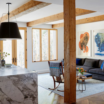
Perched high above the Islington Golf course, on a quiet cul-de-sac, this contemporary residential home is all about bringing the outdoor surroundings in. In keeping with the French style, a metal and slate mansard roofline dominates the façade, while inside, an open concept main floor split across three elevations, is punctuated by reclaimed rough hewn fir beams and a herringbone dark walnut floor. The elegant kitchen includes Calacatta marble countertops, Wolf range, SubZero glass paned refrigerator, open walnut shelving, blue/black cabinetry with hand forged bronze hardware and a larder with a SubZero freezer, wine fridge and even a dog bed. The emphasis on wood detailing continues with Pella fir windows framing a full view of the canopy of trees that hang over the golf course and back of the house. This project included a full reimagining of the backyard landscaping and features the use of Thermory decking and a refurbished in-ground pool surrounded by dark Eramosa limestone. Design elements include the use of three species of wood, warm metals, various marbles, bespoke lighting fixtures and Canadian art as a focal point within each space. The main walnut waterfall staircase features a custom hand forged metal railing with tuning fork spindles. The end result is a nod to the elegance of French Country, mixed with the modern day requirements of a family of four and two dogs!

 CairnsCraft Design & Remodel
This adorable kitchen in Point Loma, CA is now open to the family room, small in spaces but united with a nature-inspired color palette. The kitchen went through an extensive remodel removing walls, raised ceiling, exposing the beam and a new glass door for the back entry and now this small kitchen feel open and spacious. The cabinetry features shaker elements―clean lines, plain trim, and little ornamentation― great for transitional decor.
Functional fixtures and modern appliances peacefully coexist with the mosaic marble backsplash. Hidden behind the door panels is a 30” Subzero refrigerator/freezer integrated nicely to keep the kitchen plan, clean and understated. The corner sink is recessed back adding a nice detail but even more importantly a more accessible corner access to the kitchen windows.
Accessories and details added to the kitchen cabinets give this chef everything she was looking for with a spice pullout, knife block pullout and rollouts to top off the new cabinets.
When space is tight it is a great option for a small family to open up the walls and add a counter where the family can dine. On the walls, neutral gray painted create a soothing atmosphere.
Adjacent to the kitchen was a cramped room that functioned as a workout room and laundry room. By changing some wall space, closing in a door and removing a closet the new space has great storage and is more open and functional for a quick workout.
In the family room the fireplace was re-tiled with a concrete looking porcelain tile topped off with a rustic beam mantle. Combined with new home furnishings to make the most of a small space this new family room is both functional and a great place for the couple to spend time with each other on a daily basis and to entertain guest and a new space has been created with the feel of a comfortable cozy space for all to enjoy.
General Contractor: CairnsCraft Design & Remodel
Designer: Bonnie Bagley Catlin
Photogtapher: Jon Upson

Sponsored
Plain City, OH

The Creative Kitchen Company
Columbus Area Kitchen Remodeling and Refacing Professional

 Simply Perfect
Advice on interior design is available everywhere—from TV shows and websites to books, magazines and apps.
We love seeing people become engaged in design and educated on the wide range of possibilities. But we hope you’ll proceed with caution.
It’s not that style errors are a matter of life and death. It’s just that it’s easy to choose designs that aren’t necessarily reflective of your own personality and character. And since you’re typically stuck with your interior design decisions for years, styles that don’t quite fit can tend to grate on you.
Interiors that give one person comfort may unleash chaos in someone else. This goes beyond favorite colors or hot trends, right to the heart of interior design, where you find questions of composition, balance, repetition, space and more.
The goal is to find that unique combination of design elements that gives you comfort, support and balance.
In one home, that perfect balance was struck through the use of symmetry. A pair of comfortable swivel chairs sit beneath matching indigo patterned paintings. Matching bookcases below the paintings contain similar, but not identical, arrangements of books, vases and bowls. Woods and bronzes help warm up the simple white bookcase shelving.
Two matching poufs in front of the fireplace provide additional seating. The sofa is accented with a pair of pillows with a blue pattern that echoes the artwork.
The effect of the symmetry is to achieve order and simplicity, which I promote at every opportunity. After all, your home interiors should be the setting or the backdrop of your life—not center stage.
Antique bronze and blue are complementary colors. Together, they offer a rich palette of richness and depth, which brings out the beauty of wood and stone.
In the home office, a unique, whitewash-stained wooden desk rests on metal, Sawhorse-inspired legs for a warm, rustic look. The black leather chair features a contemporary silhouette with an antique brass frame. An adjustable desk lamp has bronze accents.
The bookcase combines a sleek, black metal frame with concrete shelves, for another unusual pairing. It’s kept uncluttered for an orderly, peaceful look. Items on the shelves include a bronze-accented lamp and a pair
of high gloss-finished wooden bookends.
The elegant artwork behind the desk is a simple midnight-blue and bronze with mottled white. Deep blues are again picked up in the rug, which adds a stately vibe with a modern pattern and satisfying texture.
Within the framework of symmetry, the living room repeats the blue-and-bronze color scheme.
A large midcentury brass clock above the fireplace keeps the natural stone visible, rather than hidden behind a painting or television, while its straight lines and color create a beautiful contrast.
The sofa is a soft, neutral blue. The pattern on the round brass side table features echoes the darker blue-patterned rug, as well as the rug in the office, tying the rooms together.
Indigo blue books adjacent to bronze vases on the shelves repeat the color scheme. The soapstone-topped coffee table echoes the shape of the fireplace. A pair of tall, matching floor lamps with long wooden bases, brass pulls and simple linen shades combine both the colors and symmetry found throughout the home.

 Skill Construction & Design, LLC
There are so many design elements to this kitchen, I almost don’t know where to start. Bright and airy with crisp clean white cabinets, the kitchen is open and welcoming. Still crisp but gently contrasting, the stainless steel appliance add depth amid the white. To keep this kitchen warm, natural oak covers the floors and a toasted wheat color washes the walls. And then there is the architectural elements. You know. That post and beam in the middle of the room. It’s the center of attention.
When you walk into a room your eyes roam around, establishing the size and shape of the room as your feet take you forward. From the front door of this home straight ahead you encountered this wall. The dining area to the right gives you a glimpse of things to come. Where there is a dining room you will usually find a kitchen.
The architecture of years gone by consistently hides the kitchen, the heart of the home, behind walls. I sympathize with my Mom, and all the other Moms, who have had to spend so much time tucked into a tight kitchen, away from the family. This wall had to go, but it was structural. We needed its support but not its bulk.
So we got rid of the bulk and only the bulk. Instead of a wall we have a post and beam, offering all of the structure we need. We could have installed a huge steel beam and reconfigure the joists to upset the beam, but why? The small beam and post add an incredible architectural element. It’s turning lemons into lemon, we simply made the most of what we had. It may be functional but it’s so fantastic. It looks like we created the effect just for the drama.
The original kitchen may have had a working triangle and some counter space, but it was fairly small, with each area only a step or two away. The dark cabinets made the space feel even smaller and the butcher block patterned laminate counter tops were very dated. The appliances were feeling their age as well, from a coil burner electric stove to a top freezer refrigerator. To keep this kitchen within its space, a half wall separated it from the dining area.
With the wall gone we borrowed some space from the living room and extended what was a U shaped kitchen into an L. At the living room window we start our new kitchen. We kept a small part of the wall to support the other end of our decorative beam. Sandwiched between a large pantry and our new French door refrigerator, the wall disappears. With our new open floor plan a sizable island was in order.
We split our cooking areas and installed a continuous grill gas cooktop into the island. A sleek island hood takes care of exhaust and adds an extra element to our architectural feature. Under the cooktop we added over-sized drawers for pots and pan storage. The frameless cabinets from New River Cabinetry are maple, painted white, with the Herndon door style. With the cooktop safely nestled into our island, we still had to add an oven.
We used the space where the old range sat for a large single oven of stainless steel and glass. If it worked for one, why not two? We created a home for a microwave in the wall cabinets. It’s perfect for heating leftovers so close to the refrigerator.
An important consideration for hot spots in your kitchen is landing zones. Each of our cooking areas have generous landing zones, one on each side of the cooktop and an entire counter area above or below the ovens, depending on which one you’re using.
We wanted to give the sink area more room so the half wall had to come out. We moved the trash and recycle cans into a cabinet, removed the heavy soffits and kept the sink under the window.
With that little bit of extra space we were able to add a larger cabinet above the dishwasher and slide it all down. This used to be where the carpeting met the vinyl floor, but all of it is gone. Long oak planks eliminate that final divide between the kitchen and the dining area, while adding visual length to the area. White wall cabinets on each side of the window reflect the sunlight for a brighter view.
With all of the darker cabinetry the backsplash walls had been painted white. Even still, there was a darkness in the corners and it wasn’t very exciting. We wanted to add visual interest and reflect the new under-cabinet lighting, eliminating the shadows in this corner.
With 1″x 2″ Arabescato Honed marble mosaics and those under-cabinet lights, we achieved the perfect balance. The marble has subtle swirls in gray and beige on a clean white background, but with the honed finish the light is softly reflected instead of glaring. For granite, we chose the soft gray tones of Luna Pearl. The speckles of gray and beige are a gentle contrast to the white cabinets and emulate the color of the stainless steel.
Between the carpet, red half wall, dark railing and dated light fixture, the dining area felt tired. Since the kitchen lacked sufficient storage, a large utility cabinet crowded the table space without adding any decorate elements.
Although it didn’t get any bigger, our dining area feels fresher and more open too. With the oak flooring joining the area to the rest of our space and the toasted wheat on the walls, the white table and chairs compliment the cabinetry while contrasting the warmer colors. We replaced the chandelier with recessed lighting and changed that railing too.
With our new open floor plan, we ended up with a fairly open area in between our foyer closet and the living room window. Not one to miss an opportunity, we filled the space with a multi-functional work space.
With the sunlight streaming in this bright corner works for anything this family needs.
There’s plenty of space for a chair under this large desk drawer. A closed cabinet below, glass doors above and lots of open shelving let you store and or showcase your belongings. We added a lite area at the top to keep away the darker corners.
The transformation is complete. This kitchen and all of its features are truly the center of attention in this home.
http://www.designsbyskill.com/
http://www.rjkconstructioninc.com/
 Simply Perfect
Advice on interior design is available everywhere—from TV shows and websites to books, magazines and apps.
We love seeing people become engaged in design and educated on the wide range of possibilities. But we hope you’ll proceed with caution.
It’s not that style errors are a matter of life and death. It’s just that it’s easy to choose designs that aren’t necessarily reflective of your own personality and character. And since you’re typically stuck with your interior design decisions for years, styles that don’t quite fit can tend to grate on you.
Interiors that give one person comfort may unleash chaos in someone else. This goes beyond favorite colors or hot trends, right to the heart of interior design, where you find questions of composition, balance, repetition, space and more.
The goal is to find that unique combination of design elements that gives you comfort, support and balance.
In one home, that perfect balance was struck through the use of symmetry. A pair of comfortable swivel chairs sit beneath matching indigo patterned paintings. Matching bookcases below the paintings contain similar, but not identical, arrangements of books, vases and bowls. Woods and bronzes help warm up the simple white bookcase shelving.
Two matching poufs in front of the fireplace provide additional seating. The sofa is accented with a pair of pillows with a blue pattern that echoes the artwork.
The effect of the symmetry is to achieve order and simplicity, which I promote at every opportunity. After all, your home interiors should be the setting or the backdrop of your life—not center stage.
Antique bronze and blue are complementary colors. Together, they offer a rich palette of richness and depth, which brings out the beauty of wood and stone.
In the home office, a unique, whitewash-stained wooden desk rests on metal, Sawhorse-inspired legs for a warm, rustic look. The black leather chair features a contemporary silhouette with an antique brass frame. An adjustable desk lamp has bronze accents.
The bookcase combines a sleek, black metal frame with concrete shelves, for another unusual pairing. It’s kept uncluttered for an orderly, peaceful look. Items on the shelves include a bronze-accented lamp and a pair
of high gloss-finished wooden bookends.
The elegant artwork behind the desk is a simple midnight-blue and bronze with mottled white. Deep blues are again picked up in the rug, which adds a stately vibe with a modern pattern and satisfying texture.
Within the framework of symmetry, the living room repeats the blue-and-bronze color scheme.
A large midcentury brass clock above the fireplace keeps the natural stone visible, rather than hidden behind a painting or television, while its straight lines and color create a beautiful contrast.
The sofa is a soft, neutral blue. The pattern on the round brass side table features echoes the darker blue-patterned rug, as well as the rug in the office, tying the rooms together.
Indigo blue books adjacent to bronze vases on the shelves repeat the color scheme. The soapstone-topped coffee table echoes the shape of the fireplace. A pair of tall, matching floor lamps with long wooden bases, brass pulls and simple linen shades combine both the colors and symmetry found throughout the home.

 Get My Rugs LLC
Elevate your space with the understated sophistication of our Multicolor Area Rug, where quality meets aesthetics in perfect harmony. Whether you're seeking warmth, style, or eco-consciousness, this hand-tufted masterpiece promises to exceed your expectations and transform your home into a sanctuary of comfort and elegance. Step into luxury with our exquisite Hand-Tufted Wool Area Rug, a masterpiece of craftsmanship and style. Skillfully handmade using the traditional hand-tufting technique, this stunning rug showcases the timeless elegance of wool in a captivating shade of Multicolor, seamlessly blending with any decor. Crafted with eco-friendly materials and a commitment to sustainability, each tuft is carefully placed to create a sumptuously soft and high-pile surface, offering both comfort and durability. The anti-slip backing ensures stability, making it ideal for any area, from the bustling living room to the serene bedroom.
[FEATURES]
*PATTERN - Abstract
*COLOR - Multicolor
*MATERIAL - Wool
*MATERIAL COMPOSITION - 70% Wool; 30% Cotton
*CONSTRUCTION - Handmade
*WEAVE - Hand Tufted
*COUNTRY OF ORIGIN - India
*BRAND - RUGSOTIC CARPETS
*MANUFACTURER - GET MY RUGS LLC
*SHIPPING - Free Shipping
*OCCASION - All
*ROOM TYPE - Living Room, Bed Room, Study Room, Guest Room, Kids Room, Office
*CARE INSTRUCTION - Vacuum Cleaning
*ECO-FRIENDLY - Yes
*NATURAL FIBRE - Yes
*PILE - High Pile
*PILE HEIGHT - 0.75 Inches
*BACK MATERIAL - Cotton
*USAGE - Indoor
*DURABLE - Yes
*ANTI-SKID - Yes
*Order Handling Time - 2 Business days
*Washable - No
*RUG PAD NEEEDED - No
*ITEM CONDITION - New
*REVERSIBLE - No
*[WEAVE / CONSTRUCTION] Handmade by skilled artisans proficient in rug weaving, devoting countless hours to craft this artistic area rug to perfection. The rug is weaved using the hand-tufted technique, employing hand-tufted guns along with the material on the layer of the design. Through this weaving method, a wide variety of designs can be achieved while simultaneously enhancing the rug's durability and ensuring affordability.
*[MATERIAL] The area rug is weaved using wool, renowned for its exceptional quality due to its luxurious texture, feel, and practical advantages. Wool stands out in The area rug-making industry for its numerous qualities such as high durability, warmth, and rich appearance and feel.
*[PATTERN] This modern area rugs with Abstract modern design elevates the elegance of your living space and complement various home décor styles including transitional, modern, Abstract, and bohemian.
*[ECO-FRIENDLY] By selecting this handmade area rug, woven with eco-friendly natural fibers and crafted without the use of harmful chemicals, you demonstrate your commitment to a healthier environment and your support for traditional craftsmanship.
*[DURABLE & EASY CARE] Crafted with meticulous precision and using top-quality materials, these area rugs boast unparalleled durability, making them suitable for high-traffic areas while providing exceptional underfoot comfort. Moreover, they require minimal maintenance, needing only occasional vacuuming to keep them looking their best.
*[USAGE AREA] Area rugs are versatile decor elements that can elevate the ambiance and functionality of any room in your home. From the living room to the bedroom, and even outdoor spaces, study rooms, runway, dining room and office room here's how you can make the most of area rugs throughout your home.
*[SHAPE & SIZE] This Round area rug is of 8'x8' size. Ensure that the rug is the appropriate size and shape for the space, considering the furniture arrangement and the room's dimensions.
*[SERVICES] Free Shipping | Quick Order Dispatch | Easy Return | Accessible Customer Support - With quality product we deliver exceptional services to customers.
*[BRAND] RUGSOTIC CARPETS is a name synonymous with quality area rugs, rooted in decades of manufacturing expertise. Our commitment to excellence extends beyond product quality to supporting thousands of skilled weavers and artisans. We prioritize environmental friendliness and climate sustainability in our weaving processes, while also fostering the continuous skill development of our weavers through training initiatives. From spinning and dyeing yarn with natural ingredients in our in-house units to the meticulous weaving of our area rugs, quality checks at every stage ensure the delivery of products that uphold high moral values and exceed customer expectations.I
*[SHIPPING]Free shipping across USA (except Puerto Rico, Alaska & Hawaii). Easy 30 days free returns. In case of damaged or wrong product delivered, the return shipment cost will be borne by us, in any other case, it will be paid by the customer.
*[WEAVE DESCRIPTION]The weaving of hand tufted rug is entirely different than that of hand knotted or hand woven rugs. To create a hand tufted rug, skilled weavers use a hand-tufting gun to create a weave on the top sheet, with a sturdy looped pile which can be left as is or cut. The height of the pile is determined by initial setting of the loop-length, or, on how much yarn is cut off. Hand tufted rugs have grown popularity owing to quicker preparation, affordable price ranges and for great durability amidst heavy footfall.
*[MATERIAL DESCRIPTION]In the universe of rug-fabrics, wool is considered one of the finest, owing to the touch, feel & practical benefits of this natural wonder-fiber. Wool has many qualities that place it far ahead in the rug-making business – e.g. high durability, warmth, rich look & feel etc. Wool is a pre-eminent choice for a classy rug that can last you for decades.
*[PILE DESCRIPTION]The pile of this rug is ideal for any kind of room where traffic is high. This rug will be long lasting if regular cleaning is done. The weaving of this rug is done in such a fashion that doesn’t allow the dust to reach inner surface and offers amazing durability.
*[PROPER SET UP & CARE]Hand Tufted rugs are heavy rugs and fits well with any kind of flooring. Unlike rugs of other weave the hand tufted rugs have a cotton backing which makes it anti-skid. With regular use and proper care, including avoiding damp conditions, ensure that hand-tufted rugs maintain their durability and longevity.
*[FLOOR PROTECTION]Though hand tufted rugs have cotton backing which makes it anti-skid and harmless to the floor but you can always use a high quality rug pad to provide an extra level for floor protection.
*[CLEANING METHOD]It is advised to choose the vacuum cleaning option as the material is wool and the weaving is hand tufted. For any stain, the users can opt for professional dry cleaning method.
 Simply Perfect
Advice on interior design is available everywhere—from TV shows and websites to books, magazines and apps.
We love seeing people become engaged in design and educated on the wide range of possibilities. But we hope you’ll proceed with caution.
It’s not that style errors are a matter of life and death. It’s just that it’s easy to choose designs that aren’t necessarily reflective of your own personality and character. And since you’re typically stuck with your interior design decisions for years, styles that don’t quite fit can tend to grate on you.
Interiors that give one person comfort may unleash chaos in someone else. This goes beyond favorite colors or hot trends, right to the heart of interior design, where you find questions of composition, balance, repetition, space and more.
The goal is to find that unique combination of design elements that gives you comfort, support and balance.
In one home, that perfect balance was struck through the use of symmetry. A pair of comfortable swivel chairs sit beneath matching indigo patterned paintings. Matching bookcases below the paintings contain similar, but not identical, arrangements of books, vases and bowls. Woods and bronzes help warm up the simple white bookcase shelving.
Two matching poufs in front of the fireplace provide additional seating. The sofa is accented with a pair of pillows with a blue pattern that echoes the artwork.
The effect of the symmetry is to achieve order and simplicity, which I promote at every opportunity. After all, your home interiors should be the setting or the backdrop of your life—not center stage.
Antique bronze and blue are complementary colors. Together, they offer a rich palette of richness and depth, which brings out the beauty of wood and stone.
In the home office, a unique, whitewash-stained wooden desk rests on metal, Sawhorse-inspired legs for a warm, rustic look. The black leather chair features a contemporary silhouette with an antique brass frame. An adjustable desk lamp has bronze accents.
The bookcase combines a sleek, black metal frame with concrete shelves, for another unusual pairing. It’s kept uncluttered for an orderly, peaceful look. Items on the shelves include a bronze-accented lamp and a pair
of high gloss-finished wooden bookends.
The elegant artwork behind the desk is a simple midnight-blue and bronze with mottled white. Deep blues are again picked up in the rug, which adds a stately vibe with a modern pattern and satisfying texture.
Within the framework of symmetry, the living room repeats the blue-and-bronze color scheme.
A large midcentury brass clock above the fireplace keeps the natural stone visible, rather than hidden behind a painting or television, while its straight lines and color create a beautiful contrast.
The sofa is a soft, neutral blue. The pattern on the round brass side table features echoes the darker blue-patterned rug, as well as the rug in the office, tying the rooms together.
Indigo blue books adjacent to bronze vases on the shelves repeat the color scheme. The soapstone-topped coffee table echoes the shape of the fireplace. A pair of tall, matching floor lamps with long wooden bases, brass pulls and simple linen shades combine both the colors and symmetry found throughout the home.

 Kaplan Thompson Architects
A young family with a wooded, triangular lot in Ipswich, Massachusetts wanted to take on a highly creative, organic, and unrushed process in designing their new home. The parents of three boys had contemporary ideas for living, including phasing the construction of different structures over time as the kids grew so they could maximize the options for use on their land.
They hoped to build a net zero energy home that would be cozy on the very coldest days of winter, using cost-efficient methods of home building. The house needed to be sited to minimize impact on the land and trees, and it was critical to respect a conservation easement on the south border of the lot.
Finally, the design would be contemporary in form and feel, but it would also need to fit into a classic New England context, both in terms of materials used and durability. We were asked to honor the notions of “surprise and delight,” and that inspired everything we designed for the family.
The highly unique home consists of a three-story form, composed mostly of bedrooms and baths on the top two floors and a cross axis of shared living spaces on the first level. This axis extends out to an oversized covered porch, open to the south and west. The porch connects to a two-story garage with flex space above, used as a guest house, play room, and yoga studio depending on the day.
A floor-to-ceiling ribbon of glass wraps the south and west walls of the lower level, bringing in an abundance of natural light and linking the entire open plan to the yard beyond. The master suite takes up the entire top floor, and includes an outdoor deck with a shower. The middle floor has extra height to accommodate a variety of multi-level play scenarios in the kids’ rooms.
Many of the materials used in this house are made from recycled or environmentally friendly content, or they come from local sources. The high performance home has triple glazed windows and all materials, adhesives, and sealants are low toxicity and safe for growing kids.
Photographer credit: Irvin Serrano


 Advance Design Studio, Ltd.
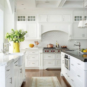
Curtis and Peggy had been thinking of a kitchen remodel for quite some time, but they knew their house would have a unique set of challenges. Their older Victorian house was built in 1891. The kitchen cabinetry was original, and they wanted to keep the authenticity of their period home while adding modern comforts that would improve their quality of life.
A friend recommended Advance Design Studio for their exceptional experience and quality of work. After meeting with designer Michelle Lecinski at Advance Design, they were confident they could partner with Advance to accomplish the unique kitchen renovation they’d been talking about for years. “We wanted to do the kitchen for a long, long time,” Curtis said. “(We asked ourselves) what are we actually going to do? How are we going to do this? And who are we going to find to do exactly what we want?”
The goal for the project was to keep the home renovation and new kitchen feeling authentic to the time in which it was built. They desperately wanted the modern comforts that come with a larger refrigerator and the dishwasher that they never had! The old home was also a bit drafty so adding a fireplace, wall insulation and new windows became a priority. They very much wanted to create a comfortable hearth room adjacent to the kitchen, complete with old world brick.
The original cabinetry had to go to make way for beautiful new kitchen cabinetry that appears as if it was a hundred years old, but with all the benefits of cutting-edge storage, self-closing drawers, and a brand-new look. “We just wanted to keep it old looking, but with some modern updates,” Peggy said.
Dura Supreme Highland Cabinets with a Heritage Old World Painted Finish replaced the original 1891 cabinets. The hand-applied careful rubbed-off detailing makes these exquisite cabinets look as if they came from a far-gone era. Despite the small size of the kitchen, Peggy, Curtis and Michelle utilized every inch with custom cabinet sizes to increase storage capacity. The custom cabinets allowed for the addition of a 24” Fisher Paykel dishwasher with a concealing Dura Supreme door panel. Michelle was also able to work into the new design a larger 30” Fisher Paykel French refrigerator. “We made every ¼ inch count in this small space,” designer Michelle said. “Having the ability to custom size the cabinetry was the only way to achieve this.”
“The kitchen essentially was designed around the Heartland Vintage range and oven,” says Michelle. A classic appliance that combines nostalgic beauty and craftsmanship for modern cooking, with nickel plated trim and elegantly shaped handles and legs; the not to miss range is a striking focal point of the entire room and an engaging conversation piece.
Granite countertops in Kodiak Satin with subtle veining kept with the old-world style. The delicate porcelain La Vie Crackle Sonoma tile kitchen backsplash compliments the home’s style perfectly. A handcrafted passthrough designed to show off Peggy’s fine china was custom built by project carpenters Justin Davis and Jeff Dallain to physically and visually open the space. Additional storage was created in the custom panty room with Latte Edinburg cabinets, hand-made weathered wood shelving with authentic black iron brackets, and an intricate tin copper ceiling.
Peggy and Curtis loved the idea of adding a Vermont stove to make the hearth-room not only functional, but a truly beckoning place to be. A stunning Bordeaux red Vermont Castings Stove with crisp black ventilation was chosen and combined with the authentic reclaimed Chicago brick wall. Advance’s talented carpenters custom-built elegant weathered shelves to house family memorabilia, installed carefully chosen barn sconces, and made the hearth room an inviting place to relax with a cup of coffee and a good book.
“Peggy and Curtis’ project was so much fun to work on. Creating a space that looks and feels like it always belonged in this beautiful old Victorian home is a designer’s dream. To see the delight in their faces when they saw the design details coming together truly made it worth the time and effort that went into making the very compact kitchen space work”, said Michelle. “The result is an amazing custom kitchen, packed with functionality in every inch, nook and cranny!” exclaims Michelle.
The renovation didn’t end with the kitchen. New Pella windows were added to help lessen the drafts. The removal of the original windows and trim necessitated the re-creation of hand-made corbels and trim details no longer available today. The talented carpenter team came to the rescue, crafting new pieces and masterfully finishing them as if they were always there. New custom gutters were formed and installed with a front entry rework necessary to accommodate the changes.
The whole house functions better, but it still feels like the original 1891 home. “From start to finish it’s just a much better space than we used to have,” Peggy said. “Jeff and Justin were amazing.” Curtis added; “We were lucky to find Advance Design, because they really came through for us. I loved that they had everything in house, anything you needed to have done, they could do it”.
 Simply Perfect
Advice on interior design is available everywhere—from TV shows and websites to books, magazines and apps.
We love seeing people become engaged in design and educated on the wide range of possibilities. But we hope you’ll proceed with caution.
It’s not that style errors are a matter of life and death. It’s just that it’s easy to choose designs that aren’t necessarily reflective of your own personality and character. And since you’re typically stuck with your interior design decisions for years, styles that don’t quite fit can tend to grate on you.
Interiors that give one person comfort may unleash chaos in someone else. This goes beyond favorite colors or hot trends, right to the heart of interior design, where you find questions of composition, balance, repetition, space and more.
The goal is to find that unique combination of design elements that gives you comfort, support and balance.
In one home, that perfect balance was struck through the use of symmetry. A pair of comfortable swivel chairs sit beneath matching indigo patterned paintings. Matching bookcases below the paintings contain similar, but not identical, arrangements of books, vases and bowls. Woods and bronzes help warm up the simple white bookcase shelving.
Two matching poufs in front of the fireplace provide additional seating. The sofa is accented with a pair of pillows with a blue pattern that echoes the artwork.
The effect of the symmetry is to achieve order and simplicity, which I promote at every opportunity. After all, your home interiors should be the setting or the backdrop of your life—not center stage.
Antique bronze and blue are complementary colors. Together, they offer a rich palette of richness and depth, which brings out the beauty of wood and stone.
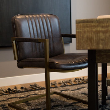
In the home office, a unique, whitewash-stained wooden desk rests on metal, Sawhorse-inspired legs for a warm, rustic look. The black leather chair features a contemporary silhouette with an antique brass frame. An adjustable desk lamp has bronze accents.
The bookcase combines a sleek, black metal frame with concrete shelves, for another unusual pairing. It’s kept uncluttered for an orderly, peaceful look. Items on the shelves include a bronze-accented lamp and a pair
of high gloss-finished wooden bookends.
The elegant artwork behind the desk is a simple midnight-blue and bronze with mottled white. Deep blues are again picked up in the rug, which adds a stately vibe with a modern pattern and satisfying texture.
Within the framework of symmetry, the living room repeats the blue-and-bronze color scheme.
A large midcentury brass clock above the fireplace keeps the natural stone visible, rather than hidden behind a painting or television, while its straight lines and color create a beautiful contrast.
The sofa is a soft, neutral blue. The pattern on the round brass side table features echoes the darker blue-patterned rug, as well as the rug in the office, tying the rooms together.
Indigo blue books adjacent to bronze vases on the shelves repeat the color scheme. The soapstone-topped coffee table echoes the shape of the fireplace. A pair of tall, matching floor lamps with long wooden bases, brass pulls and simple linen shades combine both the colors and symmetry found throughout the home.
 Simply Perfect
Advice on interior design is available everywhere—from TV shows and websites to books, magazines and apps.
We love seeing people become engaged in design and educated on the wide range of possibilities. But we hope you’ll proceed with caution.
It’s not that style errors are a matter of life and death. It’s just that it’s easy to choose designs that aren’t necessarily reflective of your own personality and character. And since you’re typically stuck with your interior design decisions for years, styles that don’t quite fit can tend to grate on you.
Interiors that give one person comfort may unleash chaos in someone else. This goes beyond favorite colors or hot trends, right to the heart of interior design, where you find questions of composition, balance, repetition, space and more.
The goal is to find that unique combination of design elements that gives you comfort, support and balance.
In one home, that perfect balance was struck through the use of symmetry. A pair of comfortable swivel chairs sit beneath matching indigo patterned paintings. Matching bookcases below the paintings contain similar, but not identical, arrangements of books, vases and bowls. Woods and bronzes help warm up the simple white bookcase shelving.
Two matching poufs in front of the fireplace provide additional seating. The sofa is accented with a pair of pillows with a blue pattern that echoes the artwork.
The effect of the symmetry is to achieve order and simplicity, which I promote at every opportunity. After all, your home interiors should be the setting or the backdrop of your life—not center stage.
Antique bronze and blue are complementary colors. Together, they offer a rich palette of richness and depth, which brings out the beauty of wood and stone.
In the home office, a unique, whitewash-stained wooden desk rests on metal, Sawhorse-inspired legs for a warm, rustic look. The black leather chair features a contemporary silhouette with an antique brass frame. An adjustable desk lamp has bronze accents.
The bookcase combines a sleek, black metal frame with concrete shelves, for another unusual pairing. It’s kept uncluttered for an orderly, peaceful look. Items on the shelves include a bronze-accented lamp and a pair
of high gloss-finished wooden bookends.
The elegant artwork behind the desk is a simple midnight-blue and bronze with mottled white. Deep blues are again picked up in the rug, which adds a stately vibe with a modern pattern and satisfying texture.
Within the framework of symmetry, the living room repeats the blue-and-bronze color scheme.
A large midcentury brass clock above the fireplace keeps the natural stone visible, rather than hidden behind a painting or television, while its straight lines and color create a beautiful contrast.
The sofa is a soft, neutral blue. The pattern on the round brass side table features echoes the darker blue-patterned rug, as well as the rug in the office, tying the rooms together.
Indigo blue books adjacent to bronze vases on the shelves repeat the color scheme. The soapstone-topped coffee table echoes the shape of the fireplace. A pair of tall, matching floor lamps with long wooden bases, brass pulls and simple linen shades combine both the colors and symmetry found throughout the home.
 Simply Perfect
Advice on interior design is available everywhere—from TV shows and websites to books, magazines and apps.
We love seeing people become engaged in design and educated on the wide range of possibilities. But we hope you’ll proceed with caution.
It’s not that style errors are a matter of life and death. It’s just that it’s easy to choose designs that aren’t necessarily reflective of your own personality and character. And since you’re typically stuck with your interior design decisions for years, styles that don’t quite fit can tend to grate on you.
Interiors that give one person comfort may unleash chaos in someone else. This goes beyond favorite colors or hot trends, right to the heart of interior design, where you find questions of composition, balance, repetition, space and more.
The goal is to find that unique combination of design elements that gives you comfort, support and balance.
In one home, that perfect balance was struck through the use of symmetry. A pair of comfortable swivel chairs sit beneath matching indigo patterned paintings. Matching bookcases below the paintings contain similar, but not identical, arrangements of books, vases and bowls. Woods and bronzes help warm up the simple white bookcase shelving.
Two matching poufs in front of the fireplace provide additional seating. The sofa is accented with a pair of pillows with a blue pattern that echoes the artwork.
The effect of the symmetry is to achieve order and simplicity, which I promote at every opportunity. After all, your home interiors should be the setting or the backdrop of your life—not center stage.
Antique bronze and blue are complementary colors. Together, they offer a rich palette of richness and depth, which brings out the beauty of wood and stone.
In the home office, a unique, whitewash-stained wooden desk rests on metal, Sawhorse-inspired legs for a warm, rustic look. The black leather chair features a contemporary silhouette with an antique brass frame. An adjustable desk lamp has bronze accents.
The bookcase combines a sleek, black metal frame with concrete shelves, for another unusual pairing. It’s kept uncluttered for an orderly, peaceful look. Items on the shelves include a bronze-accented lamp and a pair
of high gloss-finished wooden bookends.
The elegant artwork behind the desk is a simple midnight-blue and bronze with mottled white. Deep blues are again picked up in the rug, which adds a stately vibe with a modern pattern and satisfying texture.
Within the framework of symmetry, the living room repeats the blue-and-bronze color scheme.
A large midcentury brass clock above the fireplace keeps the natural stone visible, rather than hidden behind a painting or television, while its straight lines and color create a beautiful contrast.
The sofa is a soft, neutral blue. The pattern on the round brass side table features echoes the darker blue-patterned rug, as well as the rug in the office, tying the rooms together.
Indigo blue books adjacent to bronze vases on the shelves repeat the color scheme. The soapstone-topped coffee table echoes the shape of the fireplace. A pair of tall, matching floor lamps with long wooden bases, brass pulls and simple linen shades combine both the colors and symmetry found throughout the home.
Sponsored
Fredericksburg, OH

High Point Cabinets
Columbus' Experienced Custom Cabinet Builder | 4x Best of Houzz Winner
 Simply Perfect
Advice on interior design is available everywhere—from TV shows and websites to books, magazines and apps.
We love seeing people become engaged in design and educated on the wide range of possibilities. But we hope you’ll proceed with caution.
It’s not that style errors are a matter of life and death. It’s just that it’s easy to choose designs that aren’t necessarily reflective of your own personality and character. And since you’re typically stuck with your interior design decisions for years, styles that don’t quite fit can tend to grate on you.
Interiors that give one person comfort may unleash chaos in someone else. This goes beyond favorite colors or hot trends, right to the heart of interior design, where you find questions of composition, balance, repetition, space and more.
The goal is to find that unique combination of design elements that gives you comfort, support and balance.
In one home, that perfect balance was struck through the use of symmetry. A pair of comfortable swivel chairs sit beneath matching indigo patterned paintings. Matching bookcases below the paintings contain similar, but not identical, arrangements of books, vases and bowls. Woods and bronzes help warm up the simple white bookcase shelving.
Two matching poufs in front of the fireplace provide additional seating. The sofa is accented with a pair of pillows with a blue pattern that echoes the artwork.
The effect of the symmetry is to achieve order and simplicity, which I promote at every opportunity. After all, your home interiors should be the setting or the backdrop of your life—not center stage.
Antique bronze and blue are complementary colors. Together, they offer a rich palette of richness and depth, which brings out the beauty of wood and stone.
In the home office, a unique, whitewash-stained wooden desk rests on metal, Sawhorse-inspired legs for a warm, rustic look. The black leather chair features a contemporary silhouette with an antique brass frame. An adjustable desk lamp has bronze accents.
The bookcase combines a sleek, black metal frame with concrete shelves, for another unusual pairing. It’s kept uncluttered for an orderly, peaceful look. Items on the shelves include a bronze-accented lamp and a pair
of high gloss-finished wooden bookends.
The elegant artwork behind the desk is a simple midnight-blue and bronze with mottled white. Deep blues are again picked up in the rug, which adds a stately vibe with a modern pattern and satisfying texture.
Within the framework of symmetry, the living room repeats the blue-and-bronze color scheme.
A large midcentury brass clock above the fireplace keeps the natural stone visible, rather than hidden behind a painting or television, while its straight lines and color create a beautiful contrast.
The sofa is a soft, neutral blue. The pattern on the round brass side table features echoes the darker blue-patterned rug, as well as the rug in the office, tying the rooms together.
Indigo blue books adjacent to bronze vases on the shelves repeat the color scheme. The soapstone-topped coffee table echoes the shape of the fireplace. A pair of tall, matching floor lamps with long wooden bases, brass pulls and simple linen shades combine both the colors and symmetry found throughout the home.
 Simply Perfect
Advice on interior design is available everywhere—from TV shows and websites to books, magazines and apps.
We love seeing people become engaged in design and educated on the wide range of possibilities. But we hope you’ll proceed with caution.
It’s not that style errors are a matter of life and death. It’s just that it’s easy to choose designs that aren’t necessarily reflective of your own personality and character. And since you’re typically stuck with your interior design decisions for years, styles that don’t quite fit can tend to grate on you.
Interiors that give one person comfort may unleash chaos in someone else. This goes beyond favorite colors or hot trends, right to the heart of interior design, where you find questions of composition, balance, repetition, space and more.
The goal is to find that unique combination of design elements that gives you comfort, support and balance.
In one home, that perfect balance was struck through the use of symmetry. A pair of comfortable swivel chairs sit beneath matching indigo patterned paintings. Matching bookcases below the paintings contain similar, but not identical, arrangements of books, vases and bowls. Woods and bronzes help warm up the simple white bookcase shelving.
Two matching poufs in front of the fireplace provide additional seating. The sofa is accented with a pair of pillows with a blue pattern that echoes the artwork.
The effect of the symmetry is to achieve order and simplicity, which I promote at every opportunity. After all, your home interiors should be the setting or the backdrop of your life—not center stage.
Antique bronze and blue are complementary colors. Together, they offer a rich palette of richness and depth, which brings out the beauty of wood and stone.
In the home office, a unique, whitewash-stained wooden desk rests on metal, Sawhorse-inspired legs for a warm, rustic look. The black leather chair features a contemporary silhouette with an antique brass frame. An adjustable desk lamp has bronze accents.
The bookcase combines a sleek, black metal frame with concrete shelves, for another unusual pairing. It’s kept uncluttered for an orderly, peaceful look. Items on the shelves include a bronze-accented lamp and a pair
of high gloss-finished wooden bookends.
The elegant artwork behind the desk is a simple midnight-blue and bronze with mottled white. Deep blues are again picked up in the rug, which adds a stately vibe with a modern pattern and satisfying texture.
Within the framework of symmetry, the living room repeats the blue-and-bronze color scheme.
A large midcentury brass clock above the fireplace keeps the natural stone visible, rather than hidden behind a painting or television, while its straight lines and color create a beautiful contrast.
The sofa is a soft, neutral blue. The pattern on the round brass side table features echoes the darker blue-patterned rug, as well as the rug in the office, tying the rooms together.
Indigo blue books adjacent to bronze vases on the shelves repeat the color scheme. The soapstone-topped coffee table echoes the shape of the fireplace. A pair of tall, matching floor lamps with long wooden bases, brass pulls and simple linen shades combine both the colors and symmetry found throughout the home.
 Skill Construction & Design, LLC
There are so many design elements to this kitchen, I almost don’t know where to start. Bright and airy with crisp clean white cabinets, the kitchen is open and welcoming. Still crisp but gently contrasting, the stainless steel appliance add depth amid the white. To keep this kitchen warm, natural oak covers the floors and a toasted wheat color washes the walls. And then there is the architectural elements. You know. That post and beam in the middle of the room. It’s the center of attention.
When you walk into a room your eyes roam around, establishing the size and shape of the room as your feet take you forward. From the front door of this home straight ahead you encountered this wall. The dining area to the right gives you a glimpse of things to come. Where there is a dining room you will usually find a kitchen.
The architecture of years gone by consistently hides the kitchen, the heart of the home, behind walls. I sympathize with my Mom, and all the other Moms, who have had to spend so much time tucked into a tight kitchen, away from the family. This wall had to go, but it was structural. We needed its support but not its bulk.
So we got rid of the bulk and only the bulk. Instead of a wall we have a post and beam, offering all of the structure we need. We could have installed a huge steel beam and reconfigure the joists to upset the beam, but why? The small beam and post add an incredible architectural element. It’s turning lemons into lemon, we simply made the most of what we had. It may be functional but it’s so fantastic. It looks like we created the effect just for the drama.
The original kitchen may have had a working triangle and some counter space, but it was fairly small, with each area only a step or two away. The dark cabinets made the space feel even smaller and the butcher block patterned laminate counter tops were very dated. The appliances were feeling their age as well, from a coil burner electric stove to a top freezer refrigerator. To keep this kitchen within its space, a half wall separated it from the dining area.
With the wall gone we borrowed some space from the living room and extended what was a U shaped kitchen into an L. At the living room window we start our new kitchen. We kept a small part of the wall to support the other end of our decorative beam. Sandwiched between a large pantry and our new French door refrigerator, the wall disappears. With our new open floor plan a sizable island was in order.
We split our cooking areas and installed a continuous grill gas cooktop into the island. A sleek island hood takes care of exhaust and adds an extra element to our architectural feature. Under the cooktop we added over-sized drawers for pots and pan storage. The frameless cabinets from New River Cabinetry are maple, painted white, with the Herndon door style. With the cooktop safely nestled into our island, we still had to add an oven.
We used the space where the old range sat for a large single oven of stainless steel and glass. If it worked for one, why not two? We created a home for a microwave in the wall cabinets. It’s perfect for heating leftovers so close to the refrigerator.
An important consideration for hot spots in your kitchen is landing zones. Each of our cooking areas have generous landing zones, one on each side of the cooktop and an entire counter area above or below the ovens, depending on which one you’re using.
We wanted to give the sink area more room so the half wall had to come out. We moved the trash and recycle cans into a cabinet, removed the heavy soffits and kept the sink under the window.
With that little bit of extra space we were able to add a larger cabinet above the dishwasher and slide it all down. This used to be where the carpeting met the vinyl floor, but all of it is gone. Long oak planks eliminate that final divide between the kitchen and the dining area, while adding visual length to the area. White wall cabinets on each side of the window reflect the sunlight for a brighter view.
With all of the darker cabinetry the backsplash walls had been painted white. Even still, there was a darkness in the corners and it wasn’t very exciting. We wanted to add visual interest and reflect the new under-cabinet lighting, eliminating the shadows in this corner.
With 1″x 2″ Arabescato Honed marble mosaics and those under-cabinet lights, we achieved the perfect balance. The marble has subtle swirls in gray and beige on a clean white background, but with the honed finish the light is softly reflected instead of glaring. For granite, we chose the soft gray tones of Luna Pearl. The speckles of gray and beige are a gentle contrast to the white cabinets and emulate the color of the stainless steel.
Between the carpet, red half wall, dark railing and dated light fixture, the dining area felt tired. Since the kitchen lacked sufficient storage, a large utility cabinet crowded the table space without adding any decorate elements.
Although it didn’t get any bigger, our dining area feels fresher and more open too. With the oak flooring joining the area to the rest of our space and the toasted wheat on the walls, the white table and chairs compliment the cabinetry while contrasting the warmer colors. We replaced the chandelier with recessed lighting and changed that railing too.
With our new open floor plan, we ended up with a fairly open area in between our foyer closet and the living room window. Not one to miss an opportunity, we filled the space with a multi-functional work space.
With the sunlight streaming in this bright corner works for anything this family needs.
There’s plenty of space for a chair under this large desk drawer. A closed cabinet below, glass doors above and lots of open shelving let you store and or showcase your belongings. We added a lite area at the top to keep away the darker corners.
The transformation is complete. This kitchen and all of its features are truly the center of attention in this home.
http://www.designsbyskill.com/
http://www.rjkconstructioninc.com/
239