
Search results for "Range supports" in Home Design Ideas
 TKS Design Group
Download our free ebook, Creating the Ideal Kitchen. DOWNLOAD NOW
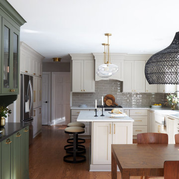
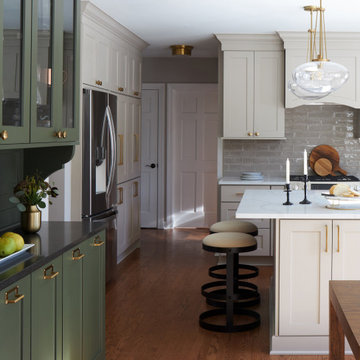
This family from Wheaton was ready to remodel their kitchen, dining room and powder room. The project didn’t call for any structural or space planning changes but the makeover still had a massive impact on their home. The homeowners wanted to change their dated 1990’s brown speckled granite and light maple kitchen. They liked the welcoming feeling they got from the wood and warm tones in their current kitchen, but this style clashed with their vision of a deVOL type kitchen, a London-based furniture company. Their inspiration came from the country homes of the UK that mix the warmth of traditional detail with clean lines and modern updates.
To create their vision, we started with all new framed cabinets with a modified overlay painted in beautiful, understated colors. Our clients were adamant about “no white cabinets.” Instead we used an oyster color for the perimeter and a custom color match to a specific shade of green chosen by the homeowner. The use of a simple color pallet reduces the visual noise and allows the space to feel open and welcoming. We also painted the trim above the cabinets the same color to make the cabinets look taller. The room trim was painted a bright clean white to match the ceiling.
In true English fashion our clients are not coffee drinkers, but they LOVE tea. We created a tea station for them where they can prepare and serve tea. We added plenty of glass to showcase their tea mugs and adapted the cabinetry below to accommodate storage for their tea items. Function is also key for the English kitchen and the homeowners. They requested a deep farmhouse sink and a cabinet devoted to their heavy mixer because they bake a lot. We then got rid of the stovetop on the island and wall oven and replaced both of them with a range located against the far wall. This gives them plenty of space on the island to roll out dough and prepare any number of baked goods. We then removed the bifold pantry doors and created custom built-ins with plenty of usable storage for all their cooking and baking needs.
The client wanted a big change to the dining room but still wanted to use their own furniture and rug. We installed a toile-like wallpaper on the top half of the room and supported it with white wainscot paneling. We also changed out the light fixture, showing us once again that small changes can have a big impact.
As the final touch, we also re-did the powder room to be in line with the rest of the first floor. We had the new vanity painted in the same oyster color as the kitchen cabinets and then covered the walls in a whimsical patterned wallpaper. Although the homeowners like subtle neutral colors they were willing to go a bit bold in the powder room for something unexpected. For more design inspiration go to: www.kitchenstudio-ge.com

 TVL Creative Ltd.
Cramped kitchen be gone! That was the project motto and top priority. The goal was to transform the current layout from multiple smaller spaces into a connected whole that would activate the main level for our clients, a young family of four.
The biggest obstacle was the wall dividing the kitchen and the dining room. Removing this wall was central to opening up and integrating the main living spaces, but the existing ductwork that ran right through the center of the wall posed a design challenge, er design opportunity. The resulting design solution features a central pantry that captures the ductwork and provides valuable storage- especially when compared to the original kitchen's 18" wide pantry cabinet. The pantry also anchors the kitchen island and serves as a visual separation of space between the kitchen and homework area.
Through our design development process, we learned the formal living room was of no service to their lifestyle and therefore space they rarely spent time in. With that in mind, we proposed to eliminate the unused living room and make it the new dining room. Relocating the dining room to this space inherently felt right given the soaring ceiling and ample room for holiday dinners and celebrations. The new dining room was spacious enough for us to incorporate a conversational seating area in the warm, south-facing window alcove.
Now what to do with the old dining room?! To answer that question we took inspiration from our clients' shared profession in education and developed a craft area/homework station for both of their boys. The semi-custom cabinetry of the desk area carries over to the adjacent wall and forms window bench base with storage that we topped with butcher block for a touch of warmth. While the boys are young, the bench drawers are the perfect place for a stash of toys close to the kitchen.
The kitchen begins just beyond the window seat with their refrigerator enclosure. Opposite the refrigerator is the new pantry with twenty linear feet of shelving and space for brooms and a stick vacuum. Extending from the backside of the pantry the kitchen island design incorporates counter seating on the family room side and a cabinetry configuration on the kitchen side with drawer storage, a trashcan center, farmhouse sink, and dishwasher.
We took careful time in design and execution to align the range and sink because while it might seem like a small detail, it plays an important role in supporting the symmetrical configuration of the back wall of the kitchen. The rear wall design utilizes an appliance garage mirrors the visual impact of the refrigerator enclosure and helps keep the now open kitchen tidy. Between the appliance garage and refrigerator enclosure is the cooking zone with 30" of cabinetry and work surface on either side of the range, a chimney style vent hood, and a bold graphic tile backsplash.
The backsplash is just one of many personal touches we added to the space to reflect our client's modern eclectic style and love of color. Swooping lines of the mid-mod style barstools compliment the pendants and backsplash pattern. A pop of vibrant green on the frame of the pantry door adds a fresh wash of color to an otherwise neutral space. The big show stopper is the custom charcoal gray and copper chevron wall installation in the dining room. This was an idea our clients softly suggested, and we excitedly embraced the opportunity. It is also a kickass solution to the head-scratching design dilemma of how to fill a large and lofty wall.
We are so grateful to bring this design to life for our clients and now dear friends.
 TVL Creative Ltd.
Cramped kitchen be gone! That was the project motto and top priority. The goal was to transform the current layout from multiple smaller spaces into a connected whole that would activate the main level for our clients, a young family of four.
The biggest obstacle was the wall dividing the kitchen and the dining room. Removing this wall was central to opening up and integrating the main living spaces, but the existing ductwork that ran right through the center of the wall posed a design challenge, er design opportunity. The resulting design solution features a central pantry that captures the ductwork and provides valuable storage- especially when compared to the original kitchen's 18" wide pantry cabinet. The pantry also anchors the kitchen island and serves as a visual separation of space between the kitchen and homework area.
Through our design development process, we learned the formal living room was of no service to their lifestyle and therefore space they rarely spent time in. With that in mind, we proposed to eliminate the unused living room and make it the new dining room. Relocating the dining room to this space inherently felt right given the soaring ceiling and ample room for holiday dinners and celebrations. The new dining room was spacious enough for us to incorporate a conversational seating area in the warm, south-facing window alcove.
Now what to do with the old dining room?! To answer that question we took inspiration from our clients' shared profession in education and developed a craft area/homework station for both of their boys. The semi-custom cabinetry of the desk area carries over to the adjacent wall and forms window bench base with storage that we topped with butcher block for a touch of warmth. While the boys are young, the bench drawers are the perfect place for a stash of toys close to the kitchen.
The kitchen begins just beyond the window seat with their refrigerator enclosure. Opposite the refrigerator is the new pantry with twenty linear feet of shelving and space for brooms and a stick vacuum. Extending from the backside of the pantry the kitchen island design incorporates counter seating on the family room side and a cabinetry configuration on the kitchen side with drawer storage, a trashcan center, farmhouse sink, and dishwasher.
We took careful time in design and execution to align the range and sink because while it might seem like a small detail, it plays an important role in supporting the symmetrical configuration of the back wall of the kitchen. The rear wall design utilizes an appliance garage mirrors the visual impact of the refrigerator enclosure and helps keep the now open kitchen tidy. Between the appliance garage and refrigerator enclosure is the cooking zone with 30" of cabinetry and work surface on either side of the range, a chimney style vent hood, and a bold graphic tile backsplash.
The backsplash is just one of many personal touches we added to the space to reflect our client's modern eclectic style and love of color. Swooping lines of the mid-mod style barstools compliment the pendants and backsplash pattern. A pop of vibrant green on the frame of the pantry door adds a fresh wash of color to an otherwise neutral space. The big show stopper is the custom charcoal gray and copper chevron wall installation in the dining room. This was an idea our clients softly suggested, and we excitedly embraced the opportunity. It is also a kickass solution to the head-scratching design dilemma of how to fill a large and lofty wall.
We are so grateful to bring this design to life for our clients and now dear friends.
Find the right local pro for your project

 Red House Design Build
Newer Homes Need Makeovers Too
Yes, it’s true. The new home that you purchased not that long ago needs a makeover. It feels like just yesterday that you just moved in and are still settling into your new space. But the fact is, it’s already time to remodel. Homes that were built in the early 2000’s and even later are depreciating in value, aesthetically speaking. Kitchens and Baths are the top two culprits.
When our clients decided to move back to the New England area in 2012, they chose East Greenwich, RI as their destination. A quaint, centered town with an excellent school system that’s just 45 minutes to Boston and 3 hours to Manhattan (or a quick 40min direct flight). The 5-bedroom colonial they purchased was originally built in 1997, which at the time was only 15 years old. But they knew going into it that, eventually, they would have to make necessary updates for a higher return on investment.
In 2017, our clients came to Red House to help them reach their remodeling goals. The two focus areas were the outdated kitchen and a double entry full bathroom located on the second floor. The Red House design team got to work and presented a few design concepts that met our clients’ needs. After a bit of tweaking and refining of details, a fabulous yet functional space was created.
In the kitchen, traditional maple cabinets were replaced with linen white shaker style cabinets, making the space feel open and airy. An extra-large island was designed with added seating at one end, ideal for entertaining while the cooktop was replaced with a range and was relocated to a perimeter wall for ease of use. Complimenting the linen white cabinetry, cherry cabinets were used in bar area creating a nice contrast. Taking advantage of the soaring cathedral ceilings, outdated light fixtures were swapped out with 3 large hanging glass pendants by Kichler giving off more light. Granite countertops in River White were installed throughout and venetian bronze hardware by Baldwin was added to support uniformity and consistency. The wall color used was Sherman Williams Agreeable Gray.
Upstairs, the full bathroom is accessed from two separate entries, similar to that of a Jack and Jill layout. New custom white vanities with Quartz countertops in Calcutta Classique were installed at each of the two entrances. A glass shower was installed with white Carrara marble tile and natural slate floors. Polished nickel fixtures and hardware were used creating a classic look. The wall color used was Benjamin Moore Oyster Shell. Visit our website for more information!
Photo Credit: Aaron Usher Photography
Instagram: @redhousedesignbuild


 TVL Creative Ltd.
Cramped kitchen be gone! That was the project motto and top priority. The goal was to transform the current layout from multiple smaller spaces into a connected whole that would activate the main level for our clients, a young family of four.
The biggest obstacle was the wall dividing the kitchen and the dining room. Removing this wall was central to opening up and integrating the main living spaces, but the existing ductwork that ran right through the center of the wall posed a design challenge, er design opportunity. The resulting design solution features a central pantry that captures the ductwork and provides valuable storage- especially when compared to the original kitchen's 18" wide pantry cabinet. The pantry also anchors the kitchen island and serves as a visual separation of space between the kitchen and homework area.
Through our design development process, we learned the formal living room was of no service to their lifestyle and therefore space they rarely spent time in. With that in mind, we proposed to eliminate the unused living room and make it the new dining room. Relocating the dining room to this space inherently felt right given the soaring ceiling and ample room for holiday dinners and celebrations. The new dining room was spacious enough for us to incorporate a conversational seating area in the warm, south-facing window alcove.
Now what to do with the old dining room?! To answer that question we took inspiration from our clients' shared profession in education and developed a craft area/homework station for both of their boys. The semi-custom cabinetry of the desk area carries over to the adjacent wall and forms window bench base with storage that we topped with butcher block for a touch of warmth. While the boys are young, the bench drawers are the perfect place for a stash of toys close to the kitchen.
The kitchen begins just beyond the window seat with their refrigerator enclosure. Opposite the refrigerator is the new pantry with twenty linear feet of shelving and space for brooms and a stick vacuum. Extending from the backside of the pantry the kitchen island design incorporates counter seating on the family room side and a cabinetry configuration on the kitchen side with drawer storage, a trashcan center, farmhouse sink, and dishwasher.
We took careful time in design and execution to align the range and sink because while it might seem like a small detail, it plays an important role in supporting the symmetrical configuration of the back wall of the kitchen. The rear wall design utilizes an appliance garage mirrors the visual impact of the refrigerator enclosure and helps keep the now open kitchen tidy. Between the appliance garage and refrigerator enclosure is the cooking zone with 30" of cabinetry and work surface on either side of the range, a chimney style vent hood, and a bold graphic tile backsplash.
The backsplash is just one of many personal touches we added to the space to reflect our client's modern eclectic style and love of color. Swooping lines of the mid-mod style barstools compliment the pendants and backsplash pattern. A pop of vibrant green on the frame of the pantry door adds a fresh wash of color to an otherwise neutral space. The big show stopper is the custom charcoal gray and copper chevron wall installation in the dining room. This was an idea our clients softly suggested, and we excitedly embraced the opportunity. It is also a kickass solution to the head-scratching design dilemma of how to fill a large and lofty wall.
We are so grateful to bring this design to life for our clients and now dear friends.
 TVL Creative Ltd.
Cramped kitchen be gone! That was the project motto and top priority. The goal was to transform the current layout from multiple smaller spaces into a connected whole that would activate the main level for our clients, a young family of four.
The biggest obstacle was the wall dividing the kitchen and the dining room. Removing this wall was central to opening up and integrating the main living spaces, but the existing ductwork that ran right through the center of the wall posed a design challenge, er design opportunity. The resulting design solution features a central pantry that captures the ductwork and provides valuable storage- especially when compared to the original kitchen's 18" wide pantry cabinet. The pantry also anchors the kitchen island and serves as a visual separation of space between the kitchen and homework area.
Through our design development process, we learned the formal living room was of no service to their lifestyle and therefore space they rarely spent time in. With that in mind, we proposed to eliminate the unused living room and make it the new dining room. Relocating the dining room to this space inherently felt right given the soaring ceiling and ample room for holiday dinners and celebrations. The new dining room was spacious enough for us to incorporate a conversational seating area in the warm, south-facing window alcove.
Now what to do with the old dining room?! To answer that question we took inspiration from our clients' shared profession in education and developed a craft area/homework station for both of their boys. The semi-custom cabinetry of the desk area carries over to the adjacent wall and forms window bench base with storage that we topped with butcher block for a touch of warmth. While the boys are young, the bench drawers are the perfect place for a stash of toys close to the kitchen.
The kitchen begins just beyond the window seat with their refrigerator enclosure. Opposite the refrigerator is the new pantry with twenty linear feet of shelving and space for brooms and a stick vacuum. Extending from the backside of the pantry the kitchen island design incorporates counter seating on the family room side and a cabinetry configuration on the kitchen side with drawer storage, a trashcan center, farmhouse sink, and dishwasher.
We took careful time in design and execution to align the range and sink because while it might seem like a small detail, it plays an important role in supporting the symmetrical configuration of the back wall of the kitchen. The rear wall design utilizes an appliance garage mirrors the visual impact of the refrigerator enclosure and helps keep the now open kitchen tidy. Between the appliance garage and refrigerator enclosure is the cooking zone with 30" of cabinetry and work surface on either side of the range, a chimney style vent hood, and a bold graphic tile backsplash.
The backsplash is just one of many personal touches we added to the space to reflect our client's modern eclectic style and love of color. Swooping lines of the mid-mod style barstools compliment the pendants and backsplash pattern. A pop of vibrant green on the frame of the pantry door adds a fresh wash of color to an otherwise neutral space. The big show stopper is the custom charcoal gray and copper chevron wall installation in the dining room. This was an idea our clients softly suggested, and we excitedly embraced the opportunity. It is also a kickass solution to the head-scratching design dilemma of how to fill a large and lofty wall.
We are so grateful to bring this design to life for our clients and now dear friends.
Sponsored
Fredericksburg, OH

High Point Cabinets
Columbus' Experienced Custom Cabinet Builder | 4x Best of Houzz Winner
 TKS Design Group
Download our free ebook, Creating the Ideal Kitchen. DOWNLOAD NOW
This family from Wheaton was ready to remodel their kitchen, dining room and powder room. The project didn’t call for any structural or space planning changes but the makeover still had a massive impact on their home. The homeowners wanted to change their dated 1990’s brown speckled granite and light maple kitchen. They liked the welcoming feeling they got from the wood and warm tones in their current kitchen, but this style clashed with their vision of a deVOL type kitchen, a London-based furniture company. Their inspiration came from the country homes of the UK that mix the warmth of traditional detail with clean lines and modern updates.
To create their vision, we started with all new framed cabinets with a modified overlay painted in beautiful, understated colors. Our clients were adamant about “no white cabinets.” Instead we used an oyster color for the perimeter and a custom color match to a specific shade of green chosen by the homeowner. The use of a simple color pallet reduces the visual noise and allows the space to feel open and welcoming. We also painted the trim above the cabinets the same color to make the cabinets look taller. The room trim was painted a bright clean white to match the ceiling.
In true English fashion our clients are not coffee drinkers, but they LOVE tea. We created a tea station for them where they can prepare and serve tea. We added plenty of glass to showcase their tea mugs and adapted the cabinetry below to accommodate storage for their tea items. Function is also key for the English kitchen and the homeowners. They requested a deep farmhouse sink and a cabinet devoted to their heavy mixer because they bake a lot. We then got rid of the stovetop on the island and wall oven and replaced both of them with a range located against the far wall. This gives them plenty of space on the island to roll out dough and prepare any number of baked goods. We then removed the bifold pantry doors and created custom built-ins with plenty of usable storage for all their cooking and baking needs.
The client wanted a big change to the dining room but still wanted to use their own furniture and rug. We installed a toile-like wallpaper on the top half of the room and supported it with white wainscot paneling. We also changed out the light fixture, showing us once again that small changes can have a big impact.
As the final touch, we also re-did the powder room to be in line with the rest of the first floor. We had the new vanity painted in the same oyster color as the kitchen cabinets and then covered the walls in a whimsical patterned wallpaper. Although the homeowners like subtle neutral colors they were willing to go a bit bold in the powder room for something unexpected. For more design inspiration go to: www.kitchenstudio-ge.com
 Amy Pearson Design
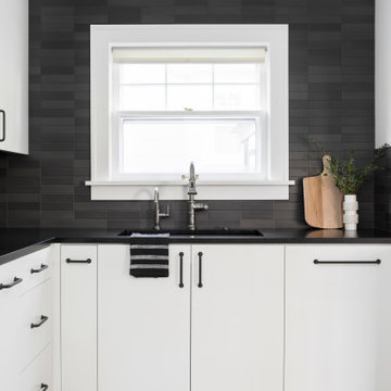
This classic Portland bungalow in the highly desirable Irvington neighborhood was in desperate need of a kitchen update. Aside from tired finishes and cabinets that have seen a full life, the original layout left the family living in a small portion of the kitchen and not taking advantage of the full square footage.
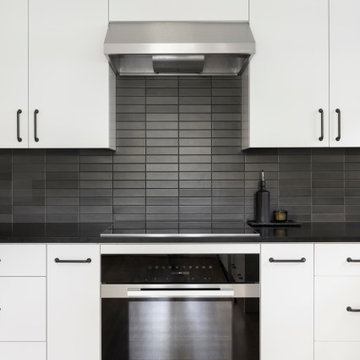
The family desired a design that married both the original architectural details of their bungalow with their preference for clean and modern European design. To accomplish this request, APD brought in sleek flat panel custom frameless cabinets filled with smart and strategic accessories to make the most out of every cabinet box, including full height pantry pull-out, spice and utensil pull-outs flanking the cooking zone, a blind corner pull-0ut to avoid loosing items in the hard-to-reach space, trash & recycling pull-0ut disguised to blend with the adjacent three drawers, and a wall cabinet pull-out sized to fit under the support beam spanning the width of the room. For the traditional - we kept the classic moldings around the windows and doors, continued the homes hardwood floors into the new space, incorporated classic school house light fixtures, and swapped out the slider to the back patio in favor for one with divided lights adding to the architectural detail. Matte black granite countertops with handmade black ceramic tile backsplash bridge the gap between the modern and the traditional thanks to their clean lines, high contrast color palette, and textural and artistic details.
Opting for a few adjustments to the layout created a space plan that took advantage of the full square footage of the room! In the original layout, the refrigerator was squeezed onto the same wall as the cooking, leaving very little counterspace around the hard working cooking zone along with a significant portion of the room (a previous addition) under-utilized. Relocating the refrigerator increased counterspace and storage while creating a “flow” through the entire room.
Luxury Miele and Subzero appliances make this kitchen a chef’s dream! To add to the clean modern look, we opted for an induction cooktop with wall oven directly below … a great alternative to the often used range! Paneling the built-in refrigerator and dishwasher help to calm the overall visual noise of the space, hiding the two hardworking appliances away!
This new family kitchen is at once hardworking, sleek, and timeless!
 TVL Creative Ltd.
Cramped kitchen be gone! That was the project motto and top priority. The goal was to transform the current layout from multiple smaller spaces into a connected whole that would activate the main level for our clients, a young family of four.
The biggest obstacle was the wall dividing the kitchen and the dining room. Removing this wall was central to opening up and integrating the main living spaces, but the existing ductwork that ran right through the center of the wall posed a design challenge, er design opportunity. The resulting design solution features a central pantry that captures the ductwork and provides valuable storage- especially when compared to the original kitchen's 18" wide pantry cabinet. The pantry also anchors the kitchen island and serves as a visual separation of space between the kitchen and homework area.
Through our design development process, we learned the formal living room was of no service to their lifestyle and therefore space they rarely spent time in. With that in mind, we proposed to eliminate the unused living room and make it the new dining room. Relocating the dining room to this space inherently felt right given the soaring ceiling and ample room for holiday dinners and celebrations. The new dining room was spacious enough for us to incorporate a conversational seating area in the warm, south-facing window alcove.
Now what to do with the old dining room?! To answer that question we took inspiration from our clients' shared profession in education and developed a craft area/homework station for both of their boys. The semi-custom cabinetry of the desk area carries over to the adjacent wall and forms window bench base with storage that we topped with butcher block for a touch of warmth. While the boys are young, the bench drawers are the perfect place for a stash of toys close to the kitchen.
The kitchen begins just beyond the window seat with their refrigerator enclosure. Opposite the refrigerator is the new pantry with twenty linear feet of shelving and space for brooms and a stick vacuum. Extending from the backside of the pantry the kitchen island design incorporates counter seating on the family room side and a cabinetry configuration on the kitchen side with drawer storage, a trashcan center, farmhouse sink, and dishwasher.
We took careful time in design and execution to align the range and sink because while it might seem like a small detail, it plays an important role in supporting the symmetrical configuration of the back wall of the kitchen. The rear wall design utilizes an appliance garage mirrors the visual impact of the refrigerator enclosure and helps keep the now open kitchen tidy. Between the appliance garage and refrigerator enclosure is the cooking zone with 30" of cabinetry and work surface on either side of the range, a chimney style vent hood, and a bold graphic tile backsplash.
The backsplash is just one of many personal touches we added to the space to reflect our client's modern eclectic style and love of color. Swooping lines of the mid-mod style barstools compliment the pendants and backsplash pattern. A pop of vibrant green on the frame of the pantry door adds a fresh wash of color to an otherwise neutral space. The big show stopper is the custom charcoal gray and copper chevron wall installation in the dining room. This was an idea our clients softly suggested, and we excitedly embraced the opportunity. It is also a kickass solution to the head-scratching design dilemma of how to fill a large and lofty wall.
We are so grateful to bring this design to life for our clients and now dear friends.

 PB Kitchen Design
An open concept custom kitchen lives large but the strategic placement of appliances creates a convenient and compact work zone. This distinctly divided yet beautifully merged Glen Ellyn, IL kitchen takes the classic white to another level. The clean lines of the flat panel white cabinetry and polished design are easy on the eyes, complemented by the earth tones found in the subway tile, pendant lighting over the island, and soft seating. This large family can enjoy multiple seating areas, around the island, and at a dedicated space showcasing their impressive farm table. More then ample accessible storage provides enough places to hide any pots, pans and small appliances, while not sacrificing the views and natural light. The midpoint integrated built in Thermador Refrigerator serves as the anchor of the kitchen. Prep areas include miles of quartz counters along with a small but practically placed island sink. The warmth and comfort in this dream kitchen highlights design trends while also fulfilling the client’s request for a kitchen with a family focus.
 Amy Pearson Design
This classic Portland bungalow in the highly desirable Irvington neighborhood was in desperate need of a kitchen update. Aside from tired finishes and cabinets that have seen a full life, the original layout left the family living in a small portion of the kitchen and not taking advantage of the full square footage.
The family desired a design that married both the original architectural details of their bungalow with their preference for clean and modern European design. To accomplish this request, APD brought in sleek flat panel custom frameless cabinets filled with smart and strategic accessories to make the most out of every cabinet box, including full height pantry pull-out, spice and utensil pull-outs flanking the cooking zone, a blind corner pull-0ut to avoid loosing items in the hard-to-reach space, trash & recycling pull-0ut disguised to blend with the adjacent three drawers, and a wall cabinet pull-out sized to fit under the support beam spanning the width of the room. For the traditional - we kept the classic moldings around the windows and doors, continued the homes hardwood floors into the new space, incorporated classic school house light fixtures, and swapped out the slider to the back patio in favor for one with divided lights adding to the architectural detail. Matte black granite countertops with handmade black ceramic tile backsplash bridge the gap between the modern and the traditional thanks to their clean lines, high contrast color palette, and textural and artistic details.
Opting for a few adjustments to the layout created a space plan that took advantage of the full square footage of the room! In the original layout, the refrigerator was squeezed onto the same wall as the cooking, leaving very little counterspace around the hard working cooking zone along with a significant portion of the room (a previous addition) under-utilized. Relocating the refrigerator increased counterspace and storage while creating a “flow” through the entire room.
Luxury Miele and Subzero appliances make this kitchen a chef’s dream! To add to the clean modern look, we opted for an induction cooktop with wall oven directly below … a great alternative to the often used range! Paneling the built-in refrigerator and dishwasher help to calm the overall visual noise of the space, hiding the two hardworking appliances away!
This new family kitchen is at once hardworking, sleek, and timeless!
 Stark Carpet
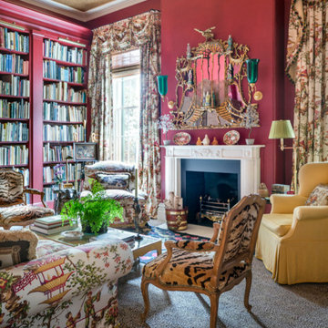
An even-tempered carpet in the Ocelot pattern is the perfect support for exuberant and exotic furnishings in a rose-colored library by Mario Buatta.
Sponsored
Fredericksburg, OH
High Point Cabinets
Columbus' Experienced Custom Cabinet Builder | 4x Best of Houzz Winner
 TKS Design Group
Download our free ebook, Creating the Ideal Kitchen. DOWNLOAD NOW
This family from Wheaton was ready to remodel their kitchen, dining room and powder room. The project didn’t call for any structural or space planning changes but the makeover still had a massive impact on their home. The homeowners wanted to change their dated 1990’s brown speckled granite and light maple kitchen. They liked the welcoming feeling they got from the wood and warm tones in their current kitchen, but this style clashed with their vision of a deVOL type kitchen, a London-based furniture company. Their inspiration came from the country homes of the UK that mix the warmth of traditional detail with clean lines and modern updates.
To create their vision, we started with all new framed cabinets with a modified overlay painted in beautiful, understated colors. Our clients were adamant about “no white cabinets.” Instead we used an oyster color for the perimeter and a custom color match to a specific shade of green chosen by the homeowner. The use of a simple color pallet reduces the visual noise and allows the space to feel open and welcoming. We also painted the trim above the cabinets the same color to make the cabinets look taller. The room trim was painted a bright clean white to match the ceiling.
In true English fashion our clients are not coffee drinkers, but they LOVE tea. We created a tea station for them where they can prepare and serve tea. We added plenty of glass to showcase their tea mugs and adapted the cabinetry below to accommodate storage for their tea items. Function is also key for the English kitchen and the homeowners. They requested a deep farmhouse sink and a cabinet devoted to their heavy mixer because they bake a lot. We then got rid of the stovetop on the island and wall oven and replaced both of them with a range located against the far wall. This gives them plenty of space on the island to roll out dough and prepare any number of baked goods. We then removed the bifold pantry doors and created custom built-ins with plenty of usable storage for all their cooking and baking needs.
The client wanted a big change to the dining room but still wanted to use their own furniture and rug. We installed a toile-like wallpaper on the top half of the room and supported it with white wainscot paneling. We also changed out the light fixture, showing us once again that small changes can have a big impact.
As the final touch, we also re-did the powder room to be in line with the rest of the first floor. We had the new vanity painted in the same oyster color as the kitchen cabinets and then covered the walls in a whimsical patterned wallpaper. Although the homeowners like subtle neutral colors they were willing to go a bit bold in the powder room for something unexpected. For more design inspiration go to: www.kitchenstudio-ge.com
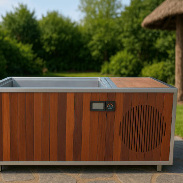
 Eco Hearth
Size: 7′1″ × 3′0″ × 2′4” | Comfortably fits 2–3 people
Price: $7,360 | Includes: Chiller, UV Filtration & Wi-Fi Control
Interior: Stainless Steel | Exterior: Red Cedar | FREE SHIPPING
Restore your energy, sharpen your focus, and embrace a daily wellness ritual with the IceBath Luxury Plunge — a premium cold plunge bath designed for full-body immersion and shared recovery. Its generous rectangular shape makes it ideal for families, couples, or athletes looking to recover together.
The interior is made from high-grade stainless steel — corrosion-resistant, hygienic, and easy to clean. The exterior is finished with natural red cedar, a weather-resistant wood celebrated for its warmth, beauty, and year-round durability outdoors.
As manufacturers with over 11 years of experience, we build every unit turnkey and fully assembled, delivering it directly to your location. Production and shipping take 2–3 months, and installation is plug-and-play — no extra tools or plumbing needed.
Why cold therapy?
• Reduces muscle soreness and post-workout fatigue
• Supports inflammation recovery and circulation
• Boosts sleep quality, immunity, and stress resilience
• Enhances skin tone and collagen production
• Sharpens mental focus and promotes calm
Included High-Performance Chiller:
• 0.8 HP cooling power
• 2500W output
• Temperature range: 37°F – 108°F
• Flow rate: 8–10.5 gal/min
• Integrated UV filtration for water clarity
• Quiet, energy-efficient operation
• Timer mode for scheduled plunges
• Quick-connect system — no special setup required
Bath Features:
• Elongated rectangular shape — perfect for 2–3 users
• Fully insulated for cold retention and energy savings
• Built-in drainage + overflow outlet
• Stainless interior cools fast and stays cold
• UV filtration keeps water clean between uses
• Optional LED lighting available (+$170)
We also offer Round, Oval, and Rectangular models — all designed for personal or commercial wellness spaces. Custom finishes available.
➤ Use it as a standalone ritual or combine it with one of our outdoor saunas for the full wellness experience.
➤ Discover more: www.eco-hearth.com/us
Call Us: +1 951 633 7691
WhatsApp: +1 929 420 8945
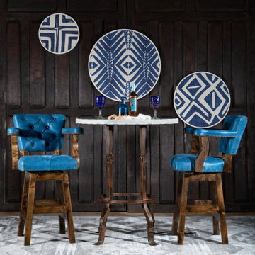
 Adobe Interiors
Looking for a stunning and unique leather barstool for your home? Look no further than our Chisum Levi Barstool. With a solid hardwood frame and subtle denim blue leather, this barstool is the perfect accent piece for any home, dining room, or living area. The brass-studded accents and worn, comforting feel of the leather give this barstool a perfect motif, while the armrests' gentle curve and sturdy squared base provide comfort and support. Handcrafted from Knotty Alder, the Chisum Levi Barstool is a truly authentic and elegant addition to any space.
But that's not all - the Chisum Levi Barstool also features a full 360 degree swivel mechanism, allowing for easy movement and comfortable seating. Plus, with the option to choose either bar or counter height, this barstool is customizable to fit your needs. Experience the beauty, charm, and stand-alone character of our Chisum Levi Barstool and bring color and life to your home today. These handcrafted, 100% American made barstools are a must-have for any dynamic set.
Overall Barstool Dimensions: 43" H x 26" W x 22" D
Seat Height: 30"
Top of Arm Height: 40"
Overall Counter Stool Dimension: 38" H x 26" W x 22" D
Seat Height: 25"
Top of Arm Height: 35"
Leather Description: Every hide will have personality of its own. Drum dyed, these hides are then hand sanded, giving each one an individual look, accented by the natural markings that Mother Nature has already provided. A coat of silicon completes the process leaving a finished article that will be uniquely rustic without a raspy feel. The leather enthusiast will recognize it as a natural product with the healed scars, fat wrinkles, and range marks. Due to the character of this leather, significant color variations are to be expected and accepted..
100% top grain cowhide leather is characterized by variations in shade, texture, color and grain. Healed marks and scars are to be expected and enhance the natural beauty of the hides. These variations should not be considered defects as they are normal and unique features of genuine 100% top grain cowhide leather.
Frame Construction: Made with American Alder Wood, our frames are glued, screwed and dowelled at the joints. Two coats of high quality stain is hand rubbed on the wood finish and then sealed with industrial grade clear coat.
 TVL Creative Ltd.
Cramped kitchen be gone! That was the project motto and top priority. The goal was to transform the current layout from multiple smaller spaces into a connected whole that would activate the main level for our clients, a young family of four.
The biggest obstacle was the wall dividing the kitchen and the dining room. Removing this wall was central to opening up and integrating the main living spaces, but the existing ductwork that ran right through the center of the wall posed a design challenge, er design opportunity. The resulting design solution features a central pantry that captures the ductwork and provides valuable storage- especially when compared to the original kitchen's 18" wide pantry cabinet. The pantry also anchors the kitchen island and serves as a visual separation of space between the kitchen and homework area.
Through our design development process, we learned the formal living room was of no service to their lifestyle and therefore space they rarely spent time in. With that in mind, we proposed to eliminate the unused living room and make it the new dining room. Relocating the dining room to this space inherently felt right given the soaring ceiling and ample room for holiday dinners and celebrations. The new dining room was spacious enough for us to incorporate a conversational seating area in the warm, south-facing window alcove.
Now what to do with the old dining room?! To answer that question we took inspiration from our clients' shared profession in education and developed a craft area/homework station for both of their boys. The semi-custom cabinetry of the desk area carries over to the adjacent wall and forms window bench base with storage that we topped with butcher block for a touch of warmth. While the boys are young, the bench drawers are the perfect place for a stash of toys close to the kitchen.
The kitchen begins just beyond the window seat with their refrigerator enclosure. Opposite the refrigerator is the new pantry with twenty linear feet of shelving and space for brooms and a stick vacuum. Extending from the backside of the pantry the kitchen island design incorporates counter seating on the family room side and a cabinetry configuration on the kitchen side with drawer storage, a trashcan center, farmhouse sink, and dishwasher.
We took careful time in design and execution to align the range and sink because while it might seem like a small detail, it plays an important role in supporting the symmetrical configuration of the back wall of the kitchen. The rear wall design utilizes an appliance garage mirrors the visual impact of the refrigerator enclosure and helps keep the now open kitchen tidy. Between the appliance garage and refrigerator enclosure is the cooking zone with 30" of cabinetry and work surface on either side of the range, a chimney style vent hood, and a bold graphic tile backsplash.
The backsplash is just one of many personal touches we added to the space to reflect our client's modern eclectic style and love of color. Swooping lines of the mid-mod style barstools compliment the pendants and backsplash pattern. A pop of vibrant green on the frame of the pantry door adds a fresh wash of color to an otherwise neutral space. The big show stopper is the custom charcoal gray and copper chevron wall installation in the dining room. This was an idea our clients softly suggested, and we excitedly embraced the opportunity. It is also a kickass solution to the head-scratching design dilemma of how to fill a large and lofty wall.
We are so grateful to bring this design to life for our clients and now dear friends.
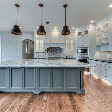
Sponsored
Fredericksburg, OH
High Point Cabinets
Columbus' Experienced Custom Cabinet Builder | 4x Best of Houzz Winner
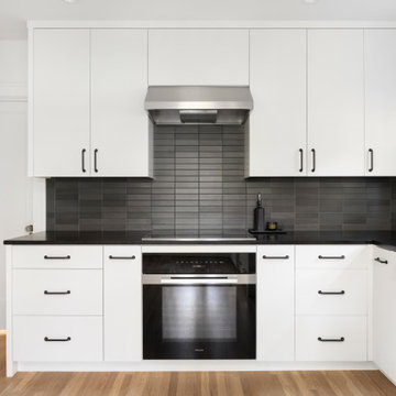 Amy Pearson Design
This classic Portland bungalow in the highly desirable Irvington neighborhood was in desperate need of a kitchen update. Aside from tired finishes and cabinets that have seen a full life, the original layout left the family living in a small portion of the kitchen and not taking advantage of the full square footage.
The family desired a design that married both the original architectural details of their bungalow with their preference for clean and modern European design. To accomplish this request, APD brought in sleek flat panel custom frameless cabinets filled with smart and strategic accessories to make the most out of every cabinet box, including full height pantry pull-out, spice and utensil pull-outs flanking the cooking zone, a blind corner pull-0ut to avoid loosing items in the hard-to-reach space, trash & recycling pull-0ut disguised to blend with the adjacent three drawers, and a wall cabinet pull-out sized to fit under the support beam spanning the width of the room. For the traditional - we kept the classic moldings around the windows and doors, continued the homes hardwood floors into the new space, incorporated classic school house light fixtures, and swapped out the slider to the back patio in favor for one with divided lights adding to the architectural detail. Matte black granite countertops with handmade black ceramic tile backsplash bridge the gap between the modern and the traditional thanks to their clean lines, high contrast color palette, and textural and artistic details.
Opting for a few adjustments to the layout created a space plan that took advantage of the full square footage of the room! In the original layout, the refrigerator was squeezed onto the same wall as the cooking, leaving very little counterspace around the hard working cooking zone along with a significant portion of the room (a previous addition) under-utilized. Relocating the refrigerator increased counterspace and storage while creating a “flow” through the entire room.
Luxury Miele and Subzero appliances make this kitchen a chef’s dream! To add to the clean modern look, we opted for an induction cooktop with wall oven directly below … a great alternative to the often used range! Paneling the built-in refrigerator and dishwasher help to calm the overall visual noise of the space, hiding the two hardworking appliances away!
This new family kitchen is at once hardworking, sleek, and timeless!
 TVL Creative Ltd.
Cramped kitchen be gone! That was the project motto and top priority. The goal was to transform the current layout from multiple smaller spaces into a connected whole that would activate the main level for our clients, a young family of four.
The biggest obstacle was the wall dividing the kitchen and the dining room. Removing this wall was central to opening up and integrating the main living spaces, but the existing ductwork that ran right through the center of the wall posed a design challenge, er design opportunity. The resulting design solution features a central pantry that captures the ductwork and provides valuable storage- especially when compared to the original kitchen's 18" wide pantry cabinet. The pantry also anchors the kitchen island and serves as a visual separation of space between the kitchen and homework area.
Through our design development process, we learned the formal living room was of no service to their lifestyle and therefore space they rarely spent time in. With that in mind, we proposed to eliminate the unused living room and make it the new dining room. Relocating the dining room to this space inherently felt right given the soaring ceiling and ample room for holiday dinners and celebrations. The new dining room was spacious enough for us to incorporate a conversational seating area in the warm, south-facing window alcove.
Now what to do with the old dining room?! To answer that question we took inspiration from our clients' shared profession in education and developed a craft area/homework station for both of their boys. The semi-custom cabinetry of the desk area carries over to the adjacent wall and forms window bench base with storage that we topped with butcher block for a touch of warmth. While the boys are young, the bench drawers are the perfect place for a stash of toys close to the kitchen.
The kitchen begins just beyond the window seat with their refrigerator enclosure. Opposite the refrigerator is the new pantry with twenty linear feet of shelving and space for brooms and a stick vacuum. Extending from the backside of the pantry the kitchen island design incorporates counter seating on the family room side and a cabinetry configuration on the kitchen side with drawer storage, a trashcan center, farmhouse sink, and dishwasher.
We took careful time in design and execution to align the range and sink because while it might seem like a small detail, it plays an important role in supporting the symmetrical configuration of the back wall of the kitchen. The rear wall design utilizes an appliance garage mirrors the visual impact of the refrigerator enclosure and helps keep the now open kitchen tidy. Between the appliance garage and refrigerator enclosure is the cooking zone with 30" of cabinetry and work surface on either side of the range, a chimney style vent hood, and a bold graphic tile backsplash.
The backsplash is just one of many personal touches we added to the space to reflect our client's modern eclectic style and love of color. Swooping lines of the mid-mod style barstools compliment the pendants and backsplash pattern. A pop of vibrant green on the frame of the pantry door adds a fresh wash of color to an otherwise neutral space. The big show stopper is the custom charcoal gray and copper chevron wall installation in the dining room. This was an idea our clients softly suggested, and we excitedly embraced the opportunity. It is also a kickass solution to the head-scratching design dilemma of how to fill a large and lofty wall.
We are so grateful to bring this design to life for our clients and now dear friends.
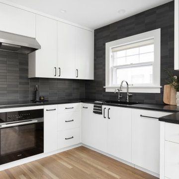 Amy Pearson Design
This classic Portland bungalow in the highly desirable Irvington neighborhood was in desperate need of a kitchen update. Aside from tired finishes and cabinets that have seen a full life, the original layout left the family living in a small portion of the kitchen and not taking advantage of the full square footage.
The family desired a design that married both the original architectural details of their bungalow with their preference for clean and modern European design. To accomplish this request, APD brought in sleek flat panel custom frameless cabinets filled with smart and strategic accessories to make the most out of every cabinet box, including full height pantry pull-out, spice and utensil pull-outs flanking the cooking zone, a blind corner pull-0ut to avoid loosing items in the hard-to-reach space, trash & recycling pull-0ut disguised to blend with the adjacent three drawers, and a wall cabinet pull-out sized to fit under the support beam spanning the width of the room. For the traditional - we kept the classic moldings around the windows and doors, continued the homes hardwood floors into the new space, incorporated classic school house light fixtures, and swapped out the slider to the back patio in favor for one with divided lights adding to the architectural detail. Matte black granite countertops with handmade black ceramic tile backsplash bridge the gap between the modern and the traditional thanks to their clean lines, high contrast color palette, and textural and artistic details.
Opting for a few adjustments to the layout created a space plan that took advantage of the full square footage of the room! In the original layout, the refrigerator was squeezed onto the same wall as the cooking, leaving very little counterspace around the hard working cooking zone along with a significant portion of the room (a previous addition) under-utilized. Relocating the refrigerator increased counterspace and storage while creating a “flow” through the entire room.
Luxury Miele and Subzero appliances make this kitchen a chef’s dream! To add to the clean modern look, we opted for an induction cooktop with wall oven directly below … a great alternative to the often used range! Paneling the built-in refrigerator and dishwasher help to calm the overall visual noise of the space, hiding the two hardworking appliances away!
This new family kitchen is at once hardworking, sleek, and timeless!
237