
Search results for "Real time access" in Home Design Ideas
 TKS Design Group
Download our free ebook, Creating the Ideal Kitchen. DOWNLOAD NOW
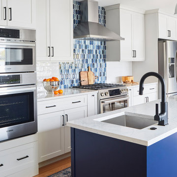
Lakefront property in the northwest suburbs of Chicago is hard to come by, so when we were hired by this young family with exactly that, we were immediately inspired by not just the unusually large footprint of this 1950’s colonial revival but also the lovely views of the manmade lake it was sited on. The large 5-bedroom home was solidly stuck in the 1980’s, but we saw tons of potential. We started out by updating the existing staircase with a fresh coat of paint and adding new herringbone slate to the entry hall.
The powder room off the entryway also got a refresh - new flooring, new cabinets and fixtures. We ran the new slate right through into this space for some consistency. A fun wallpaper and shiplap trim add a welcoming feel and set the tone for the home.
Next, we tackled the kitchen. Located away from the rest of the first floor, the kitchen felt a little isolated, so we immediately began planning for how to better connect it to the rest of the first floor. We landed on removing the wall between the kitchen and dining room and designed a modified galley style space with separate cooking and clean up zones. The cooking zone consists of the refrigerator, prep sink and cooktop, along with a nice long run of prep space at the island. The cleanup side of the kitchen consists of the main sink and dishwasher. Both areas are situated so that the user can view the lake during prep work and cleanup!
One of the home’s main puzzles was how to incorporate the mudroom and area in front of the patio doors at the back of the house. We already had a breakfast table area, so the space by the patio doors was a bit of a no man’s land. We decided to separate the kitchen proper from what became the new mudroom with a large set of barn doors. That way you can quickly hide any mudroom messes but have easy access to the light coming in through the patio doors as well as the outdoor grilling station. We also love the impact the barn doors add to the overall space.
The homeowners’ first words to us were “it’s time to ditch the brown,” so we did! We chose a lovely blue pallet that reflects the home’s location on the lake which is also vibrant yet easy on the eye. Countertops are white quartz, and the natural oak floor works well with the other honey accents. The breakfast table was given a refresh with new chairs, chandelier and window treatments that frame the gorgeous views of the lake out the back.
We coordinated the slate mudroom flooring with that used in the home’s main entrance for a consistent feel. The storage area consists of open and closed storage to allow for some clutter control as needed.
Next on our “to do” list was revamping the dated brown bar area in the neighboring dining room. We eliminated the clutter by adding some closed cabinets and did some easy updates to help the space feel more current. One snag we ran into here was the discovery of a beam above the existing open shelving that had to be modified with a smaller structural beam to allow for our new design to work. This was an unexpected surprise, but in the end we think it was well worth it!
We kept the colors here a bit more muted to blend with the homeowner’s existing furnishings. Open shelving and polished nickel hardware add some simple detail to the new entertainment zone which also looks out onto the lake!
Next we tackled the upstairs starting with the homeowner’s son’s bath. The bath originally had both a tub shower and a separate shower, so we decided to swap out the shower for a new laundry area. This freed up some space downstairs in what used to be the mudroom/laundry room and is much more convenient for daily laundry needs.
We continued the blue palette here with navy cabinetry and the navy tile in the shower. Porcelain floor tile and chrome fixtures keep maintenance to a minimum while matte black mirrors and lighting add some depth the design. A low maintenance runner adds some warmth underfoot and ties the whole space together.
We added a pocket door to the bathroom to minimize interference with the door swings. The left door of the laundry closet is on a 180 degree hinge to allow for easy full access to the machines. Next we tackled the master bath which is an en suite arrangement. The original was typical of the 1980’s with the vanity outside of the bathroom, situated near the master closet. And the brown theme continued here with multiple shades of brown.
Our first move was to segment off the bath and the closet from the master bedroom. We created a short hall from the bedroom to the bathroom with his and hers walk-in closets on the left and right as well as a separate toilet closet outside of the main bathroom for privacy and flexibility.
The original bathroom had a giant soaking tub with steps (dangerous!) as well as a small shower that did not work well for our homeowner who is 6’3”. With other bathtubs in the home, they decided to eliminate the tub and create an oversized shower which takes up the space where the old tub was located. The double vanity is on the opposite wall and a bench is located under the window for morning conversations and a place to set a couple of towels.
The pallet in here is light and airy with a mix of blond wood, creamy porcelain and marble tile, and brass accents. A simple roman shade adds some texture and it’s top-down mechanism allows for light and privacy.
This large whole house remodel gave our homeowners not only the ability to maximize the potential of their home but also created a lovely new frame from which to view their fabulous lake views.
Designed by: Susan Klimala, CKD, CBD
Photography by: Michael Kaskel
For more information on kitchen and bath design ideas go to: www.kitchenstudio-ge.com
 Flooret
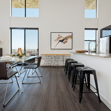
Part of the Modin Vinyl Plank Collection, Available Exclusively From www.Flooret.com
$3.49 / sq ft, 22.08 sq ft per box
50% WIDER. 25% LONGER. TWICE AS DURABLE
Luxury Vinyl Plank, 5 mm x 9" x 60" (1.0 mm / 40 mil wear-layer)
Lifetime Residential Warranty, 20 year Commercial Warranty
Sleek and chic. In terms of high-impact, going with a dark wire-brush pattern is a sure way to quickly define a space. Never boring, this modern pattern will set the mood immediately.
The most important specification for determining the durability of vinyl flooring is the thickness of the wear-layer. The best wear-layers are made of thick, clear virgin PVC, which covers the paper print-film that gives the floor its unique appearance. Once the wear-layer wears through, the paper is damaged and the floor will need replacement.
Most vinyl floors come with a 8-12 mil wear-layer (0.2-3 mm). The top commercial specs in the industry are higher, at 20-22 mil (0.5 mm). A select few manufacturers offer a “super” commercial spec of 28 mil (0.7 mm).
For Modin, we decided to set a new standard: 40 mil (1.0 mm) of premium virgin PVC. This allows us to offer an industry-leading 20 year Commercial Warranty (Lifetime Residential), compared to nearly all other commercial vinyl floors’ 10 year Commercial Warranty.
Beyond our superior wear-layer, we also use a patented click mechanism for superior hold, and a ceramic-bead coating.
SIZE MATTERS
Wider and longer planks create a sense of space and luxury. Most vinyl floors come in 6” or 7” widths, and 36” or 48” lengths.
For Modin, we designed our planks to be 9” wide, and 60” long. This extra large size allows our gorgeous designs to be fully expressed.
DETAILS THAT COUNT
We made sure to get all the details right. Real texture, to create the feel of wire-brushed wood. Low sheen level, to ensure a natural look that wears well over time. 4-sided bevels, to more accurately emulate the look of real planks. When added together they help create the unique look that is Modin.
DESIGNS THAT INSPIRE
We spent nearly a year just focusing on our designs, to ensure they provide the right mix of color and depth. Focusing on timeless wire-brush and European Oak styles, as well as more contemporary modern washes, our collection offers truly beautiful design that is both functional and inspiring.
 Stalburg Design
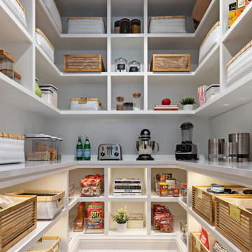
Today's pantries are functional and gorgeous! Our custom pantry creates ample space for every day appliances to be kept out of sight, with easy access to bins and storage containers. Undercounter LED lighting allows for easy night-time use as well.
Find the right local pro for your project

 Homefront Farmers
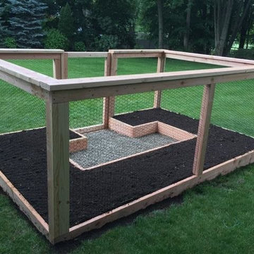
We refer to this style of garden as "basic," but it has all the features of a great growing space. You'll find raised beds filled with quality organic soil, rugged construction using natural (untreated) lumber, animal resistant fencing w/ground barrier, simple good looks, hinged gate with latch for easy access, and isles lined with weed block/crushed stone. At the same time, because we forgo some of the premium features of our "classic" gardens, our "basic" gardens and available at excellent prices.
 Tomco Company Inc.
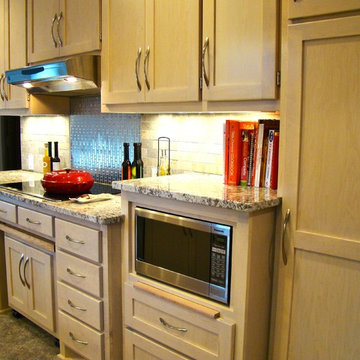
This 1950's kitchen need upgrading, but when (2) sisters Elaine and Janet moved in, it required accessible renovation to meet their needs. Photo by Content Craftsmen
 transFORM Home
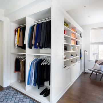
transFORM had the honor of designing, manufacturing and installing a crisp new walk-in closet at The Chatsworth - a historic Beaux Art building located in the heart of Manhattan's charming Upper West Side. Built in 1904, The Chatsworth was reintroduced in 2015 with expanded floor plans, incredible amenities and a private club-like atmosphere.
transFORM’s Senior Design Manager Rozalia Kiss, worked with the HFZ Capital Group to create a striking bedroom sized walk-in closet, which was recently featured in the New York Times article : Closets as Big as Some Apartments. The article identifies spacious closets as the latest must-have in some of the city’s most expensive condominiums.
Quickly becoming an essential part of the modern home, a walk-in closet adds style and convenience to your daily routine. Designed in a clean white finish and tastefully accented with complementing polished chrome hardware, this custom walk-in closet delivers tons of functional and accessible space.
All-white cabinetry offers a crisp look that allows your clothing to steal the spotlight. The high-contrast shaker style doors, create an elegant backdrop for your clothing. Light also pours through the big windows, drawing your eye to the iconic views of the Hudson River. It creates a feeling of brightness and positivity that energizes and enlivens. It’s a walk-in closet where you can look and feel your best as you begin your day.
For added visual appeal, the unit was accented with crown and base molding. The elegant detailing was inspired by the pre-war era building’s architectural features. The moldings add a retro geometric touch that matches the apartments beamed ceilings and traditional herringbone floors that were all the rage during the period and make a striking comeback in this beautiful renovation.
This unit was specifically designed with a variety of open shelves, hanging sections, and shoe storage. Hanging sections provide enough elevation to conveniently organize items based on size. From blazers and blouses to maxi skirts and evening gowns, all of your clothing is easily accessible. By using the same color hangers, your space will appear even more collected and composed. You can also arrange your clothing so that the colors compliment each other and appear as the favorable options they really are.
For the shoe enthusiast, we included numerous sets of shoe shelves and cubbies that attractively organize and showcase your finest footwear. This type of system allows you to identify and grab your favorite pair as you mix and match the perfect ensemble.
Shelving provides many of the same storage functions as drawers or baskets, but at a more economical price point. Items on open shelves are easier to recognize as a match for an outfit than items inside drawers. Top shelves are best for large, lightweight and seldomly-used items like your favorite floppy beach hat. Middle shelves, which tend to be the units focal point can be personalized with photos and home decor. Bottom shelves provide easy access to your most frequently used items like cozy sweaters and beloved slacks.
This custom closet also includes three tilt-out laundry hampers. No more dragging big clunky laundry baskets around the house. Tilt-out hampers are removable, lightweight nylon bags and easy to grab and go. They are stored behind cabinet faces that blend in with your space, removing unsightly and unpleasant-to-be-around dirty laundry from accumulating in piles on the floor. Installing 2 - 3 tilt-outs will make sorting laundry lightning fast. These hampers help keep your closet clean and tidy and increase space without losing functionality.
Let's face it, an organized custom closet just looks great. The side benefit is increased awareness and more pride in your clothing and your day-to-day appearance. With an organized system everything has its place and you can find the garments you need in the moment you need them, sans the ‘what to wear’ frustration.
 Rooted By Design
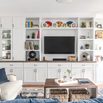
Philadelphia Row Home Renovation focusing on maximizing storage for a young family of 5. We created a "mudroom" in the front of the row home with a large living room space for family time + hosting. We used kid-friendly furnishings with performance fabrics that are durable and easy to clean. Prioritized eco-friendly selections, utilizing locally sourced + American made pieces.

Sponsored
Sunbury, OH

J.Holderby - Renovations
Franklin County's Leading General Contractors - 2X Best of Houzz!
 Schloegel Design Remodel
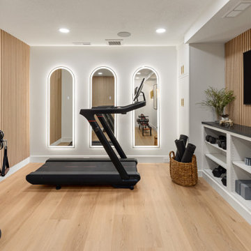
This view highlights the more refined training side of the basement gym, where performance and polish come together in a boutique fitness studio feel. Three full-length arched mirrors with integrated dimmable lighting visually expand the space while providing ideal lighting for workouts at any time of day.
Along the wall, a custom wall of creamy full-height cabinetry paired with open shelving offers a clean balance of concealed and accessible storage—keeping the space organized without sacrificing style. Black granite countertops add contrast and durability, grounding the lighter finishes with a sleek, elevated touch.
A treadmill and strength-training machine are thoughtfully placed to maintain an open flow, while generous floor space remains intentionally clear for stretching, yoga, and mat-based workouts. The result is a highly functional yet visually calm environment designed to support both everyday movement and focused training.
 Lenton Company, Inc.
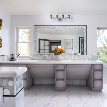
A luxurious and accessible bathroom that will enable our clients to Live-in-Place for many years. The design and layout allows for ease of use and room to maneuver for someone physically challenged and a caretaker.
 AV Architects + Builders
AV Architects + Builders
Location: Falls Church, VA, USA
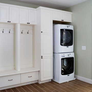
Our clients were a newly-wed couple looking to start a new life together. With a love for the outdoors and theirs dogs and cats, we wanted to create a design that wouldn’t make them sacrifice any of their hobbies or interests. We designed a floor plan to allow for comfortability relaxation, any day of the year. We added a mudroom complete with a dog bath at the entrance of the home to help take care of their pets and track all the mess from outside. We added multiple access points to outdoor covered porches and decks so they can always enjoy the outdoors, not matter the time of year. The second floor comes complete with the master suite, two bedrooms for the kids with a shared bath, and a guest room for when they have family over. The lower level offers all the entertainment whether it’s a large family room for movie nights or an exercise room. Additionally, the home has 4 garages for cars – 3 are attached to the home and one is detached and serves as a workshop for him.
The look and feel of the home is informal, casual and earthy as the clients wanted to feel relaxed at home. The materials used are stone, wood, iron and glass and the home has ample natural light. Clean lines, natural materials and simple details for relaxed casual living.
Stacy Zarin Photography
 Simply Home Decorating
This beautiful North Vancouver home belongs to a nature-loving and health-conscious couple, Emma and Vince (names changed), their two young children, and their dog, Jasper. When they contacted us about renovating and furnishing their kitchen and family room, we walked in and saw a world of potential waiting to be uncovered.
Before: Larkhall Crescent Home:
Like many original North Vancouver homes, the interior was definitely dated. We encountered late ‘80s finishes in powder pink and teal green, old carpet, and a kitchen that wasn’t maximized to suit this family’s modern-day lifestyle. However, the size of the rooms offered us a ton of space with which to get creative.
Knowing our clients’ love of cooking, need for work spaces (Emma and Vince both work remotely), and growing family, we developed a design concept that would increase usable space, optimize storage, and create intimacy in this large area. As for the style, we were inspired by their European roots, inventing a new and modern take on “Belgian Farmhouse” style. Now, the home is truly one-of-a-kind.
After: Warm & Cozy Family Room:
Fresh, bright, and comfortable, this living area has been transformed! We started with the fireplace as a focal point, selecting aged brick tiles for added texture and a crisp wood mantle. The taupe-coloured sectional infuses the room with visual warmth and serves the added purpose of separating the family room from the kitchen.
Emma and Vince were also keen on using non-toxic materials in their home, and we were happy to oblige. To meet their needs, we sourced natural wood elements and sought out Canadian-made products - that adhere to high health standards - whenever possible.
Look closer at the elements of this space, and you will find this stunning, honeycomb-patterned rug in earthy gold, beige, and charcoal tones. It’s plush to the touch and full of visual texture that brings this room’s colour palette together. We sourced these two-tone chairs with caning, petrified wood side table, black sconces, and botanical prints in greyscale from local artist, Heather Johnston.
We topped off the space with this dark wood and rattan console that offers storage facing the kitchen and presents an opportunity to display cherished items. The result is a cozy lounging space brimming with comfort and functionality. It’s perfect for enjoying quality family time, or Emma can simply slide the coffee table away to make room for her morning yoga practice.
Now, let’s turn around and give some attention to the kitchen. Do you remember what the original kitchen looked like? If not, scroll back up, because the transformation is shocking…
Moody & Welcoming Kitchen for Healthy Living:
This kitchen looks very different from how it started, right? Though we didn’t touch any walls, the kitchen has almost doubled in usable space! We created a long, extended island with storage, an outlet for small appliances, and seating for comfortable prep, after-school snacking, or mingling among friends.
On the other side of the island, the family has even more storage and an integrated dishwasher within easy reach of the sink, perfect for quick clean-up. From this angle, you can also see the expansive custom Shaker cabinetry in white and the integrated double ovens. These facilitate their cooking experience and gave us the opportunity to add an additional surprise…
A coffee garage station and more hidden storage! Keeping these items located along the perimeter allows them to be accessed by the family or their guests without someone getting under the cook’s feet. These are the little details that make everyday life easier and more enjoyable.
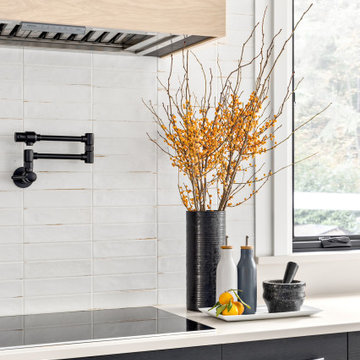
Moving deeper into the kitchen, the seamless induction cooktop topped with a freestanding concealed hood fan commands attention in a soft yet prominent way. The natural wood accent mirrors the fireplace mantle, and the choice of off-black wood-grain cabinets not only continues our black-and-white colour palette but adds a sense of depth and contrast. The corner sink is located to the right and perfectly positioned with a view of their thriving backyard.
To invite more of this family’s character into the space, we mixed metals for interest — matte black, dark pewter, and warm brass — and created open shelves in white oak for their plants and decor. You can also glimpse the tumbled edge of the backsplash tile, which echoes the rustic brick of the fireplace. It adds that farmhouse charm while still feeling timeless and sophisticated.
Last but not least, we designed this dining banquette in the bay window (with integrated bench storage, of course), where the family can share a meal together, the kids can do homework, or Emma and Vince can work and enjoy a change of scenery from their offices. Like the other spaces in the home, it was designed to be beautiful, multi-functional, and long-lasting.
Praise from Our Clients:
It is clear that we love this home, but what did our clients have to say?
“Lori is a visionary and masters execution to the finest detail all at the same time. When she first met us to know more about who we are and how we live, she could right away envision how we could use the space in our kitchen and living room…The results exceeded our expectations.
Lori and her team were also a delight to work with — coordination with all the trades, fast problem-solving, regular updates, professional and friendly attitude of her entire team — made it the dream team. Thank you SHD for making our space so beautiful!”
In turn, we are so grateful for this family’s trust, their open communication, and for being wonderful people with whom to work. (So, thank you!)

 Mary Cook
Bill Taylor
Example of a classic formal and open concept dark wood floor and coffered ceiling living room design in Boston with white walls, a standard fireplace and a stone fireplace
Example of a classic formal and open concept dark wood floor and coffered ceiling living room design in Boston with white walls, a standard fireplace and a stone fireplace
 ZeroEnergy Design
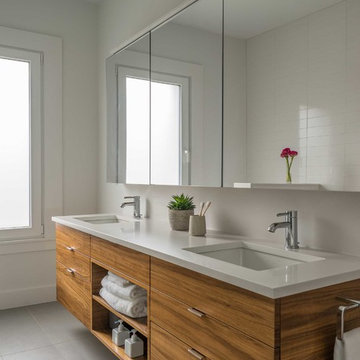
This renovated brick rowhome in Boston’s South End offers a modern aesthetic within a historic structure, creative use of space, exceptional thermal comfort, a reduced carbon footprint, and a passive stream of income.
DESIGN PRIORITIES. The goals for the project were clear - design the primary unit to accommodate the family’s modern lifestyle, rework the layout to create a desirable rental unit, improve thermal comfort and introduce a modern aesthetic. We designed the street-level entry as a shared entrance for both the primary and rental unit. The family uses it as their everyday entrance - we planned for bike storage and an open mudroom with bench and shoe storage to facilitate the change from shoes to slippers or bare feet as they enter their home. On the main level, we expanded the kitchen into the dining room to create an eat-in space with generous counter space and storage, as well as a comfortable connection to the living space. The second floor serves as master suite for the couple - a bedroom with a walk-in-closet and ensuite bathroom, and an adjacent study, with refinished original pumpkin pine floors. The upper floor, aside from a guest bedroom, is the child's domain with interconnected spaces for sleeping, work and play. In the play space, which can be separated from the work space with new translucent sliding doors, we incorporated recreational features inspired by adventurous and competitive television shows, at their son’s request.
MODERN MEETS TRADITIONAL. We left the historic front facade of the building largely unchanged - the security bars were removed from the windows and the single pane windows were replaced with higher performing historic replicas. We designed the interior and rear facade with a vision of warm modernism, weaving in the notable period features. Each element was either restored or reinterpreted to blend with the modern aesthetic. The detailed ceiling in the living space, for example, has a new matte monochromatic finish, and the wood stairs are covered in a dark grey floor paint, whereas the mahogany doors were simply refinished. New wide plank wood flooring with a neutral finish, floor-to-ceiling casework, and bold splashes of color in wall paint and tile, and oversized high-performance windows (on the rear facade) round out the modern aesthetic.
RENTAL INCOME. The existing rowhome was zoned for a 2-family dwelling but included an undesirable, single-floor studio apartment at the garden level with low ceiling heights and questionable emergency egress. In order to increase the quality and quantity of space in the rental unit, we reimagined it as a two-floor, 1 or 2 bedroom, 2 bathroom apartment with a modern aesthetic, increased ceiling height on the lowest level and provided an in-unit washer/dryer. The apartment was listed with Jackie O'Connor Real Estate and rented immediately, providing the owners with a source of passive income.
ENCLOSURE WITH BENEFITS. The homeowners sought a minimal carbon footprint, enabled by their urban location and lifestyle decisions, paired with the benefits of a high-performance home. The extent of the renovation allowed us to implement a deep energy retrofit (DER) to address air tightness, insulation, and high-performance windows. The historic front facade is insulated from the interior, while the rear facade is insulated on the exterior. Together with these building enclosure improvements, we designed an HVAC system comprised of continuous fresh air ventilation, and an efficient, all-electric heating and cooling system to decouple the house from natural gas. This strategy provides optimal thermal comfort and indoor air quality, improved acoustic isolation from street noise and neighbors, as well as a further reduced carbon footprint. We also took measures to prepare the roof for future solar panels, for when the South End neighborhood’s aging electrical infrastructure is upgraded to allow them.
URBAN LIVING. The desirable neighborhood location allows the both the homeowners and tenant to walk, bike, and use public transportation to access the city, while each charging their respective plug-in electric cars behind the building to travel greater distances.
OVERALL. The understated rowhouse is now ready for another century of urban living, offering the owners comfort and convenience as they live life as an expression of their values.
Photography Eric Roth Photo

Sponsored
Columbus, OH
Free consultation for landscape design!

Peabody Landscape Group
Columbus' Reliable Landscape Design & Contracting
 Artistic Design And Remodeling
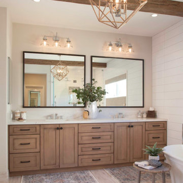
Light and Airy shiplap bathroom was the dream for this hard working couple. The goal was to totally re-create a space that was both beautiful, that made sense functionally and a place to remind the clients of their vacation time. A peaceful oasis. We knew we wanted to use tile that looks like shiplap. A cost effective way to create a timeless look. By cladding the entire tub shower wall it really looks more like real shiplap planked walls.
The center point of the room is the new window and two new rustic beams. Centered in the beams is the rustic chandelier.
Design by Signature Designs Kitchen Bath
Contractor ADR Design & Remodel
Photos by Gail Owens
 Homefront Farmers
Homefront Farmers "basic" gardens have great features such as raised beds filled with quality organic soil, rugged construction, animal resistant fencing/ground barrier, simple good looks, hinged gate with latch for easy access, and isles lined with weed block/crushed stone. At the same time, because we forgo some of the premium features of our "classic" gardens, the "basic" gardens and available at excellent prices.
 Innovative Design Build
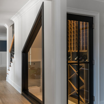
This full basement renovation included adding a mudroom area, media room, a bedroom, a full bathroom, a game room, a kitchen, a gym and a beautiful custom wine cellar. Our clients are a family that is growing, and with a new baby, they wanted a comfortable place for family to stay when they visited, as well as space to spend time themselves. They also wanted an area that was easy to access from the pool for entertaining, grabbing snacks and using a new full pool bath.We never treat a basement as a second-class area of the house. Wood beams, customized details, moldings, built-ins, beadboard and wainscoting give the lower level main-floor style. There’s just as much custom millwork as you’d see in the formal spaces upstairs. We’re especially proud of the wine cellar, the media built-ins, the customized details on the island, the custom cubbies in the mudroom and the relaxing flow throughout the entire space.
 Accessibility by Design, Inc.
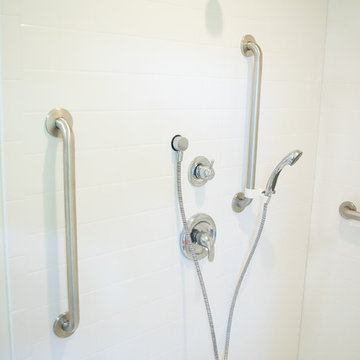
This bathroom was remodeled for wheelchair accessibility in mind. We made a roll under vanity with a tilting mirror and granite counter tops with a towel ring on the side. A barrier free shower and bidet were installed with accompanying grab bars for safety and mobility of the client.
Sponsored
Sunbury, OH
J.Holderby - Renovations
Franklin County's Leading General Contractors - 2X Best of Houzz!
 Advance Design Studio, Ltd.
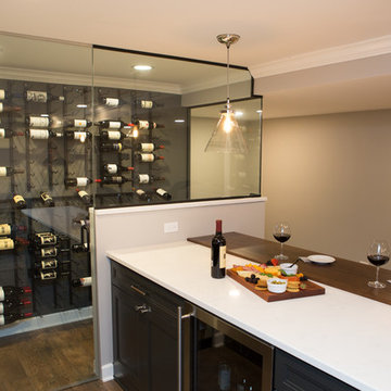
Karen and Chad of Tower Lakes, IL were tired of their unfinished basement functioning as nothing more than a storage area and depressing gym. They wanted to increase the livable square footage of their home with a cohesive finished basement design, while incorporating space for the kids and adults to hang out.
“We wanted to make sure that upon renovating the basement, that we can have a place where we can spend time and watch movies, but also entertain and showcase the wine collection that we have,” Karen said.
After a long search comparing many different remodeling companies, Karen and Chad found Advance Design Studio. They were drawn towards the unique “Common Sense Remodeling” process that simplifies the renovation experience into predictable steps focused on customer satisfaction.
“There are so many other design/build companies, who may not have transparency, or a focused process in mind and I think that is what separated Advance Design Studio from the rest,” Karen said.
Karen loved how designer Claudia Pop was able to take very high-level concepts, “non-negotiable items” and implement them in the initial 3D drawings. Claudia and Project Manager DJ Yurik kept the couple in constant communication through the project. “Claudia was very receptive to the ideas we had, but she was also very good at infusing her own points and thoughts, she was very responsive, and we had an open line of communication,” Karen said.
A very important part of the basement renovation for the couple was the home gym and sauna. The “high-end hotel” look and feel of the openly blended work out area is both highly functional and beautiful to look at. The home sauna gives them a place to relax after a long day of work or a tough workout. “The gym was a very important feature for us,” Karen said. “And I think (Advance Design) did a very great job in not only making the gym a functional area, but also an aesthetic point in our basement”.
An extremely unique wow-factor in this basement is the walk in glass wine cellar that elegantly displays Karen and Chad’s extensive wine collection. Immediate access to the stunning wet bar accompanies the wine cellar to make this basement a popular spot for friends and family.
The custom-built wine bar brings together two natural elements; Calacatta Vicenza Quartz and thick distressed Black Walnut. Sophisticated yet warm Graphite Dura Supreme cabinetry provides contrast to the soft beige walls and the Calacatta Gold backsplash. An undermount sink across from the bar in a matching Calacatta Vicenza Quartz countertop adds functionality and convenience to the bar, while identical distressed walnut floating shelves add an interesting design element and increased storage. Rich true brown Rustic Oak hardwood floors soften and warm the space drawing all the areas together.
Across from the bar is a comfortable living area perfect for the family to sit down at a watch a movie. A full bath completes this finished basement with a spacious walk-in shower, Cocoa Brown Dura Supreme vanity with Calacatta Vicenza Quartz countertop, a crisp white sink and a stainless-steel Voss faucet.
Advance Design’s Common Sense process gives clients the opportunity to walk through the basement renovation process one step at a time, in a completely predictable and controlled environment. “Everything was designed and built exactly how we envisioned it, and we are really enjoying it to it’s full potential,” Karen said.
Constantly striving for customer satisfaction, Advance Design’s success is heavily reliant upon happy clients referring their friends and family. “We definitely will and have recommended Advance Design Studio to friends who are looking to embark on a remodeling project small or large,” Karen exclaimed at the completion of her project.
 Irene Designs
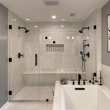
This Master Suite while being spacious, was poorly planned in the beginning. Master Bathroom and Walk-in Closet were small relative to the Bedroom size. Bathroom, being a maze of turns, offered a poor traffic flow. It only had basic fixtures and was never decorated to look like a living space. Geometry of the Bedroom (long and stretched) allowed to use some of its' space to build two Walk-in Closets while the original walk-in closet space was added to adjacent Bathroom. New Master Bathroom layout has changed dramatically (walls, door, and fixtures moved). The new space was carefully planned for two people using it at once with no sacrifice to the comfort. New shower is huge. It stretches wall-to-wall and has a full length bench with granite top. Frame-less glass enclosure partially sits on the tub platform (it is a drop-in tub). Tiles on the walls and on the floor are of the same collection. Elegant, time-less, neutral - something you would enjoy for years. This selection leaves no boundaries on the decor. Beautiful open shelf vanity cabinet was actually made by the Home Owners! They both were actively involved into the process of creating their new oasis. New Master Suite has two separate Walk-in Closets. Linen closet which used to be a part of the Bathroom, is now accessible from the hallway. Master Bedroom, still big, looks stunning. It reflects taste and life style of the Home Owners and blends in with the overall style of the House. Some of the furniture in the Bedroom was also made by the Home Owners.
 Monarch Builders & Remodelers
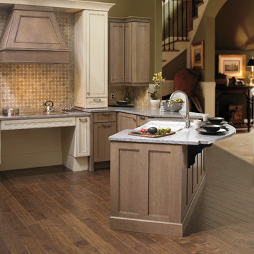
This aging-in-place kitchen and both beautiful and functional with wheelchair accessible cook top and sink apron. The lower-cabinet lazy susan and trash bin are within easy reach. The tri-level counter top is at once serviceable and accessible for the entire family.
Monarch Builders and Remodelers, Inc. is SW Florida’s specialist in providing state-of-the-art "Aging in Place" building design services and techniques, including a full range of home-remodeling services. With a prime goal of interpreting the needs and desires in an aesthetically pleasing way, Monarch Builders creates an environment in which homeowners can live and work positively and independently. Monarch knows there’s no place like home and people 50 and older want to remain living in their own home - comfortably, safely, and independently; it all comes down to design that keep one’s house a home. Monarch brings care, respect, and empathy into the designer-client relationship. By providing innovation and excellence, Monarch works to make your home function beautifully.
53