
Search results for "Real time feedback" in Home Design Ideas
 Utopia 360 Studio
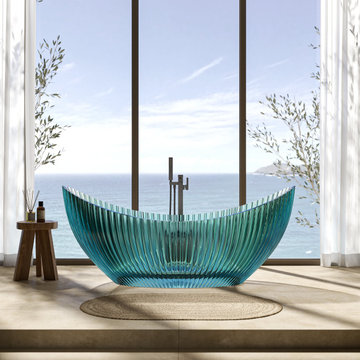
Leader Online, a UK-based company, approached us to support the launch of Nosa, a new sanitary ware brand targeting the British market.
With competition in the sector increasing, they required a cohesive set of visuals for their numerous products to establish a consistent visual language across e-commerce platforms, catalogs, and promotional materials.
It was a complete brand creation from scratch, and we pulled it off.
Key tasks:
- Develop a cohesive visual brand identity for Nosa
- Produce over 2,000 high-quality 3D visualizations
within five months
- Optimize workflows for high efficiency and a unified
visual standard
Our approach:
To efficiently manage high production volumes and accelerate feedback, we implemented an optimized workflow system. This transformed our render production into an assembly line, drastically cutting individual product processing time while upholding top image quality.
Nosa's unique marble, with its distinct veins and inclusions, was central to their brand. Since no existing textures matched, we requested physical samples.
Upon receiving the stone, we set up an improvised photo studio, capturing every detail. Our goal was
not just to replicate the marble in 3D, but to preserve
its raw, organic beauty.
We applied the same meticulous process to metal materials for accurate shade representation. Nosa prioritized authenticity, ensuring buyers saw the true material, not an over-polished version.
Result:
Nosa's market entry surpassed all expectations.
Fueled by its compelling visual identity, the brand achieved strong initial sales and is now rapidly expanding its product range, cementing its presence.
We are proud to continue our partnership with Nosa
to this day.
 Rocky Tops Granite & Marble LLC
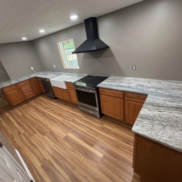
Fantasy Brown dolomite went into this kitchen in Gaston, and it's the kind of stone that changes how a room feels the minute the sun hits it. Dolomite has real depth to it, that soft natural movement running through the slab, along with a toughness that matters in a room where people actually cook. The background on this stone runs warm, brown and gold tones woven through with darker veining that breaks up the surface without turning busy. No two pieces off the same block look identical, so we spent real time on the layout, working out where the veining would land across the counters before anything got cut.
Templating a stone like this takes patience. We measure the kitchen precise, then we go back to the slab and figure out how to lay the template so the movement in the stone flows the right direction across the counter and doesn't fight itself at the seams. On a job like this one, getting the veining to carry across the seam near the sink or across an inside corner is the difference between a counter that reads as one piece and one that looks like two slabs pushed together. We took our time with it here.
The edge is eased, clean and simple, and it lets the stone do the talking instead of pulling attention to the edge itself. That's the right call on a material with this much natural character in the face of the slab.
Day to day, dolomite holds up well. It's a hard, dense stone, and it resists scratching better than a lot of people expect, though we still recommend a sealer to keep the surface protected from oil and acidic spills, same as we'd tell anyone with a natural stone counter. Wipe up wine or citrus before it sits too long, use a cutting board, and it'll look right for years. Heat isn't a worry either, you can set a hot pan down without thinking twice.
Gaston sits right in that stretch of the Midlands where we do a lot of our work, and it's always good seeing a kitchen come together with a stone this striking. Fantasy Brown dolomite gives the room warmth and texture that's hard to match, and installed with a tight, clean fit, it's going to be the centerpiece of that kitchen for a long time.
 Utopia 360 Studio
Leader Online, a UK-based company, approached us to support the launch of Nosa, a new sanitary ware brand targeting the British market.
With competition in the sector increasing, they required a cohesive set of visuals for their numerous products to establish a consistent visual language across e-commerce platforms, catalogs, and promotional materials.
It was a complete brand creation from scratch, and we pulled it off.
Key tasks:
- Develop a cohesive visual brand identity for Nosa
- Produce over 2,000 high-quality 3D visualizations
within five months
- Optimize workflows for high efficiency and a unified
visual standard
Our approach:
To efficiently manage high production volumes and accelerate feedback, we implemented an optimized workflow system. This transformed our render production into an assembly line, drastically cutting individual product processing time while upholding top image quality.
Nosa's unique marble, with its distinct veins and inclusions, was central to their brand. Since no existing textures matched, we requested physical samples.
Upon receiving the stone, we set up an improvised photo studio, capturing every detail. Our goal was
not just to replicate the marble in 3D, but to preserve
its raw, organic beauty.
We applied the same meticulous process to metal materials for accurate shade representation. Nosa prioritized authenticity, ensuring buyers saw the true material, not an over-polished version.
Result:
Nosa's market entry surpassed all expectations.
Fueled by its compelling visual identity, the brand achieved strong initial sales and is now rapidly expanding its product range, cementing its presence.
We are proud to continue our partnership with Nosa
to this day.
Find the right local pro for your project
 Rocky Tops Granite & Marble LLC
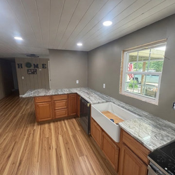
Fantasy Brown dolomite went into this kitchen in Gaston, and it's the kind of stone that changes how a room feels the minute the sun hits it. Dolomite has real depth to it, that soft natural movement running through the slab, along with a toughness that matters in a room where people actually cook. The background on this stone runs warm, brown and gold tones woven through with darker veining that breaks up the surface without turning busy. No two pieces off the same block look identical, so we spent real time on the layout, working out where the veining would land across the counters before anything got cut.
Templating a stone like this takes patience. We measure the kitchen precise, then we go back to the slab and figure out how to lay the template so the movement in the stone flows the right direction across the counter and doesn't fight itself at the seams. On a job like this one, getting the veining to carry across the seam near the sink or across an inside corner is the difference between a counter that reads as one piece and one that looks like two slabs pushed together. We took our time with it here.
The edge is eased, clean and simple, and it lets the stone do the talking instead of pulling attention to the edge itself. That's the right call on a material with this much natural character in the face of the slab.
Day to day, dolomite holds up well. It's a hard, dense stone, and it resists scratching better than a lot of people expect, though we still recommend a sealer to keep the surface protected from oil and acidic spills, same as we'd tell anyone with a natural stone counter. Wipe up wine or citrus before it sits too long, use a cutting board, and it'll look right for years. Heat isn't a worry either, you can set a hot pan down without thinking twice.
Gaston sits right in that stretch of the Midlands where we do a lot of our work, and it's always good seeing a kitchen come together with a stone this striking. Fantasy Brown dolomite gives the room warmth and texture that's hard to match, and installed with a tight, clean fit, it's going to be the centerpiece of that kitchen for a long time.

 Advance Design Studio, Ltd.
Jackie and Sean loved the Algonquin neighborhood they lived in with the peaceful neighborhood and the close proximity to work and school. What they didn’t love was how outdated their home had become. With a cramped kitchen and an unused dining room, they decided a remodel was the perfect solution to their problem. They would be able to continue to live in the area they loved, while at the same time they could have the dream home they envisioned.
After a thorough search, Jackie came across Advance Design Studio. She was impressed by all of the positive reviews she saw on the internet and saw herself identifying with all of the project stories she saw on the website. Once they met with designer Scott Christensen and owner Todd Jurs, they knew Advance Design was the right company to make their dreams a reality.
The project consisted of four main areas: the kitchen/dining/powder room, the laundry room, the master bathroom, and the kid’s bathroom. They wanted to expand the kitchen into the seldom used dining room and add a large island for hosting parties and family gatherings. They also wanted new hardwood flooring throughout the first level. The laundry room needed to be more functional, and all three bathrooms were in dire need of updating.
The closed off kitchen was opened up to create a sweeping space between the new eating area and the much larger kitchen. A handsome dry bar complete with a beverage refrigerator and lighted glass door cabinetry makes an elegant transition across from a peninsula area filled with storage. An additional decorative cabinet lighting up elegant dishware through the mullioned glass sits directly across from the drybar.
An expansive island was critical to the kitchen plans. Jackie, Sean and Scott worked closely together to create just the right details for their design. They wanted the island to be functional in addition to being the centerpiece of the room. Added storage for the kid’s school supplies was hidden behind cabinet doors so the children could do their schoolwork right at the island, and a microwave drawer glides open with the touch of a finger hidden inconspicuously within the island space. The easy to care for Cambria Britannica Quartz island top with its sweeping grey and white marble look perched atop hand-carved Craftsman corbels was absolutely what they were hoping for, blending both beauty and function perfectly.
Adding a nice contrast to the brightness of the quartz and the white cabinetry, Kodiak - Leather granite countertops were used to balance the light and dark tones of the space. Dura Supreme Classic White painted cabinets grace the perimeter, while Maple Poppy Seed stained cabinets with a beautiful soft grey woodgrain were used in the beverage center and island. The two tones compliment the large space balancing it out nicely creating interest and elegance with the simple Craftsman style full overlay doors.
A deep warm Barnwood White Oak flooring was added throughout the lower level. The new floor brings additional contrast to the bright kitchen and provides unity with the now open floorplan as it rolls in to the foyer and family room. Final details like the show-stopping lunar like duo light fixtures complete the space and intermix expertly with crisscross details of the glass door mullions, the island bar seating and even accessories in the space.
The small cluttered laundry room needed more space and more storage. With a busy family it seemed to overflow daily and did not have anywhere to hide the families “in and out stuff.” Scott designed the new space with a stackable washer and dryer and much more efficiently organized cabinetry. Doing laundry is now (almost!) a pleasure and keeping everyone’s “stuff” hidden, but readily accessible is now a snap.
The master bath was not a place where the couple enjoyed spending time getting ready for their day. The tub almost never was used, so removing it made it possible to build an extra-large shower, replacing the small cramped cube of the previous shower they hated. Clean, horizontal lines softly draw your eye around the space with porcelain tile called Driftwood Sea spray. Full overlay cabinetry in a soft white vanity with double sinks makes getting ready for the day much more convenient for the busy couple.
Long floor planks made of porcelain tile mimic real hardwood floors in a soft grey to compliment the shower, but with the ease and care of a tile surface. Cambrian Black Granite counters with a matte finish and under mount porcelain sinks with handsome brushed chrome hardware complete the handsome space. A real bonus in any master bath; a custom built in storage nook was tucked in the corner of the space for linens and heavenly storage.
The kid’s bath was in sad shape because it was original to the house. To keep the budget in control, the tub which was in great condition was retained, but focus was on the new large brick style porcelain charcoal tile on the floor, crisp white new Craftsman style cabinetry with pretty furniture details on the corner base, a striking granite top with white under mount porcelain sinks and fresh hardware and faucets. Some beautiful soft grey wood mirrors to match mom and dads were custom sized and placed under new lighting, and 4 hooks were smartly arranged down the wall for kids’ towels.
This couple was determined not to move, and made their house their dream home. Not only does their home function greatly now, but Jackie says, “When the neighbors come to visit, they’re asking if they can “steal” the design”! The added functionality, elegance, and open floor plan were exactly what this family needed in order to stay.
Advance Design Studio, Joe Nowak

 Unique Home Solutions Inc.
We really enjoyed staging this beautiful $2.25 million dollar home in Ottawa. What made the job challenging was a very large open concept. All the furniture and accessories would be seen at the same time when you walk through the front door so the style and colour schemes within each area had to work.
 Rocky Tops Granite & Marble LLC
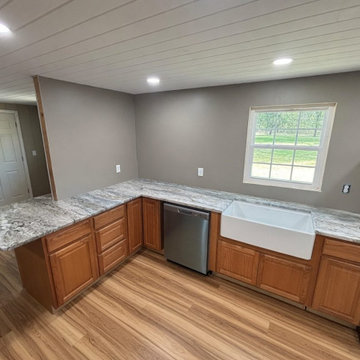
Fantasy Brown dolomite went into this kitchen in Gaston, and it's the kind of stone that changes how a room feels the minute the sun hits it. Dolomite has real depth to it, that soft natural movement running through the slab, along with a toughness that matters in a room where people actually cook. The background on this stone runs warm, brown and gold tones woven through with darker veining that breaks up the surface without turning busy. No two pieces off the same block look identical, so we spent real time on the layout, working out where the veining would land across the counters before anything got cut.
Templating a stone like this takes patience. We measure the kitchen precise, then we go back to the slab and figure out how to lay the template so the movement in the stone flows the right direction across the counter and doesn't fight itself at the seams. On a job like this one, getting the veining to carry across the seam near the sink or across an inside corner is the difference between a counter that reads as one piece and one that looks like two slabs pushed together. We took our time with it here.
The edge is eased, clean and simple, and it lets the stone do the talking instead of pulling attention to the edge itself. That's the right call on a material with this much natural character in the face of the slab.
Day to day, dolomite holds up well. It's a hard, dense stone, and it resists scratching better than a lot of people expect, though we still recommend a sealer to keep the surface protected from oil and acidic spills, same as we'd tell anyone with a natural stone counter. Wipe up wine or citrus before it sits too long, use a cutting board, and it'll look right for years. Heat isn't a worry either, you can set a hot pan down without thinking twice.
Gaston sits right in that stretch of the Midlands where we do a lot of our work, and it's always good seeing a kitchen come together with a stone this striking. Fantasy Brown dolomite gives the room warmth and texture that's hard to match, and installed with a tight, clean fit, it's going to be the centerpiece of that kitchen for a long time.

Sponsored
Sunbury, OH

J.Holderby - Renovations
Franklin County's Leading General Contractors - 2X Best of Houzz!

 SYNLawn | Southern Alberta
This is an example of a large traditional backyard landscaping in Calgary.

 Bellingham Bay Builders
We feel fortunate to have had the opportunity to work on this clean NW Contemporary home. Due to its remote location, our goal was to pre-fabricate as much as possible and shorten the installation time on site. We were able to cut and pre-fit all the glue-laminated timber frame structural elements, the Douglas Fir tongue and groove ceilings, and even the open riser Maple stair.
The pictures mostly speak for themselves; but it is worth noting, we were very pleased with the final result. Despite its simple modern aesthetic with exposed concrete walls and miles of glass on the view side, the wood ceilings and the warm lighting give a cozy, comfy feel to the spaces.
The owners were very involved with the design and build, including swinging hammers with us, so it was a real labor of love. The owners, and ourselves, walked away from the project with a great pride and deep feeling of satisfied accomplishment.
Design by Level Design
Photography by C9 Photography
 Ollin Stone
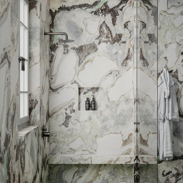
Oyster White Marble is a popular choice for floors, walls, and even counters. Known as metamorphic rock because it tends to change over time from exposure to heat and pressure, marble is a good option for kitchens and bathrooms because of its low abrasion resistance and overall ability to withstand heat. Marble tile enhances the interior/exterior walls and floors.
 Flooret
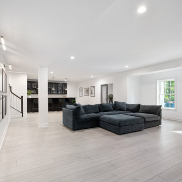
Influenced by classic Nordic design. Surprisingly flexible with furnishings. Amplify by continuing the clean modern aesthetic, or punctuate with statement pieces.
The Modin Rigid luxury vinyl plank flooring collection is the new standard in resilient flooring. Modin Rigid offers true embossed-in-register texture, creating a surface that is convincing to the eye and to the touch; a low sheen level to ensure a natural look that wears well over time; four-sided enhanced bevels to more accurately emulate the look of real wood floors; wider and longer waterproof planks; an industry-leading wear layer; and a pre-attached underlayment.

 Kase Custom
Our Reclaimed Wood Square Table is crafted entirely by hand with time, skill, and great attention to detail that make for a fine piece of furniture. The result is a strong table full of rustic character you'll be raising a glass over for many years. Wood legs with foot bar for added stability make this design a sustainable style statement. Shop the dining collection at kasecustom.com.
 Cutting Edge Innovative
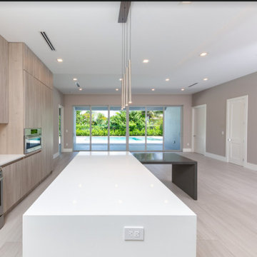
Home in Coral Gables completely built from ground up. Creating a new modern, contemporary look to a home that was originally built in the 1970's. Homeowner bought the outdated home and decided to tear it down and start fresh. We help build the homeowner a contemporary, modern and efficient home for the times. One he and his family and friends enjoy!
Sponsored
Sunbury, OH
J.Holderby - Renovations
Franklin County's Leading General Contractors - 2X Best of Houzz!

 G&K FLOOR COVERING
Wood flooring is timeless. It enhances the warmth of any home and complements the decor of any room.
Like a fine piece of furniture, wood flooring increases in value and becomes more beautiful with time. In a national survey, 90 percent of real estate agents said that houses with wood flooring sell faster and for more money.
Wood is a natural resource, renewable and recyclable. Buildings, barns, ships and other structures made of wood often find a second life in wood flooring, cabinets, walls and ceilings. And leading allergists agree that wood floors are the perfect choice for a healthy home.
The state-of-the-art technology and almost limitless choices of today's stains, finishes, styles and designs make wood flooring one of the most practical, easy-care and versatile floor coverings today. Maintained properly, wood flooring should never have to be replaced.
 SYDfemMellE Design, Remodeling and Construction
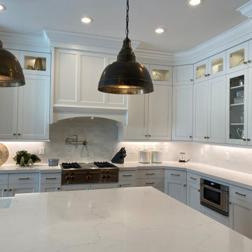
Kitchens have a beautiful simplicity when designed white on white. However, when designing white on white, finding a white with a little cream (not yellow cream) rather a silver undertone with a little beige cream, will sooth the white to become a warm flavor. White is NEVER white. Every white is a different color. Making sure that the "whites" that you choose, to marry together, must all have the same undertones or have a dab of silver which allows warms and cools to work together.
This kitchen, in real time, has a very warm feel to the room. The whites DO NOT have a blue undertone, which will push the space to feel extremely cool.
 Prima Kitchen New York
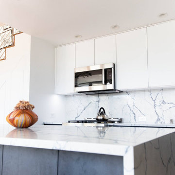
A unique and bold kitchen design for a contemporary penthouse in the heart of Harlem.
This design was curated using a two-tone split between upper and base cabinets and merged together via a stunningly striking blended countertop. This color split allows the kitchen space to take advantage of the ambient lighting during the day while maintaining a slick look through fine details at all times.
 Bellingham Bay Builders
We feel fortunate to have had the opportunity to work on this clean NW Contemporary home. Due to its remote location, our goal was to pre-fabricate as much as possible and shorten the installation time on site. We were able to cut and pre-fit all the glue-laminated timber frame structural elements, the Douglas Fir tongue and groove ceilings, and even the open riser Maple stair.
The pictures mostly speak for themselves; but it is worth noting, we were very pleased with the final result. Despite its simple modern aesthetic with exposed concrete walls and miles of glass on the view side, the wood ceilings and the warm lighting give a cozy, comfy feel to the spaces.
The owners were very involved with the design and build, including swinging hammers with us, so it was a real labor of love. The owners, and ourselves, walked away from the project with a great pride and deep feeling of satisfied accomplishment.
Design by Level Design
Photography by C9 Photography
 Flooret
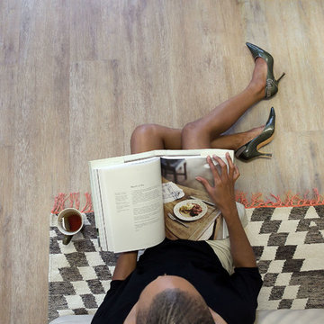
Discerning, intelligent, European. A staff favorite, Noret captures the depth of color and texture that is expected with premium European Oak. A slight tan with a whitewash brush, Noret provides a luxurious template for any refined space.
The most important specification for determining the durability of vinyl flooring is the thickness of the wear-layer. The best wear-layers are made of thick, clear virgin PVC, which covers the paper print-film that gives the floor its unique appearance. Once the wear-layer wears through, the paper is damaged and the floor will need replacement.
Most vinyl floors come with a 8-12 mil wear-layer (0.2-3 mm). The top commercial specs in the industry are higher, at 20-22 mil (0.5 mm). A select few manufacturers offer a “super” commercial spec of 28 mil (0.7 mm).
For Modin, we decided to set a new standard: 40 mil (1.0 mm) of premium virgin PVC. This allows us to offer an industry-leading 20 year Commercial Warranty (Lifetime Residential), compared to nearly all other commercial vinyl floors’ 10 year Commercial Warranty.
Beyond our superior wear-layer, we also use a patented click mechanism for superior hold, and a ceramic-bead coating.
SIZE MATTERS
Wider and longer planks create a sense of space and luxury. Most vinyl floors come in 6” or 7” widths, and 36” or 48” lengths.
For Modin, we designed our planks to be 9” wide, and 60” long. This extra large size allows our gorgeous designs to be fully expressed.
DETAILS THAT COUNT
We made sure to get all the details right. Real texture, to create the feel of wire-brushed wood. Low sheen level, to ensure a natural look that wears well over time. 4-sided bevels, to more accurately emulate the look of real planks. When added together they help create the unique look that is Modin.
DESIGNS THAT INSPIRE
We spent nearly a year just focusing on our designs, to ensure they provide the right mix of color and depth. Focusing on timeless wire-brush and European Oak styles, as well as more contemporary modern washes, our collection offers truly beautiful design that is both functional and inspiring.
 Flooret
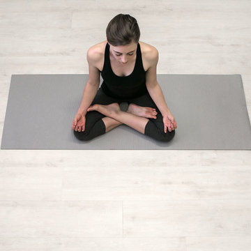
Nordic simplicity. White floors can be challenging to use, but when pulled off correctly are extremely rewarding. An instant statement-maker, they often present the challenge of maintenance. For Nordland, we specifically created a slightly weathered pattern with darker knots, so that they do not reveal dirt as quickly.
The most important specification for determining the durability of vinyl flooring is the thickness of the wear-layer. The best wear-layers are made of thick, clear virgin PVC, which covers the paper print-film that gives the floor its unique appearance. Once the wear-layer wears through, the paper is damaged and the floor will need replacement.
Most vinyl floors come with a 8-12 mil wear-layer (0.2-3 mm). The top commercial specs in the industry are higher, at 20-22 mil (0.5 mm). A select few manufacturers offer a “super” commercial spec of 28 mil (0.7 mm).
For Modin, we decided to set a new standard: 40 mil (1.0 mm) of premium virgin PVC. This allows us to offer an industry-leading 20 year Commercial Warranty (Lifetime Residential), compared to nearly all other commercial vinyl floors’ 10 year Commercial Warranty.
Beyond our superior wear-layer, we also use a patented click mechanism for superior hold, and a ceramic-bead coating.
SIZE MATTERS
Wider and longer planks create a sense of space and luxury. Most vinyl floors come in 6” or 7” widths, and 36” or 48” lengths.
For Modin, we designed our planks to be 9” wide, and 60” long. This extra large size allows our gorgeous designs to be fully expressed.
DETAILS THAT COUNT
We made sure to get all the details right. Real texture, to create the feel of wire-brushed wood. Low sheen level, to ensure a natural look that wears well over time. 4-sided bevels, to more accurately emulate the look of real planks. When added together they help create the unique look that is Modin.
DESIGNS THAT INSPIRE
We spent nearly a year just focusing on our designs, to ensure they provide the right mix of color and depth. Focusing on timeless wire-brush and European Oak styles, as well as more contemporary modern washes, our collection offers truly beautiful design that is both functional and inspiring.


129