
Search results for "Reduce accessible" in Home Design Ideas
 United Porte Inc
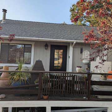
Your front door is your best defender. It protects you, your family, and your most valuable belongings from theft and damage.
Our new collection of wrought iron doors provides superior sound and heat insulation. The solid metal construction prevents rust, while the wrought iron insert inside the glass unit eliminates the need for maintenance and keeps the door looking new for years.
Special feature is the use of durable aluminum profiles that improve both strength and appearance.
Furthermore, VDom Doors protect your home from extreme weather conditions, insects, and dust infiltration.
Our doors offer several key advantages:
- The structure is made from a single, non-welded metal sheet, which prevents internal condensation and extends the lifespan of the door mechanisms.
- Reinforced stiffening ribs inside the frame increase resistance to impact and mechanical stress.
- High-quality insulation materials help reduce external noise and protect against heat loss and cold penetration.
Each door is designed and assembled with precision. The solid iron frame and aluminum threshold provide durability and stability, while the clean, balanced design ensures the door fits a wide range of architectural styles.
Model - 0101 Iron
Color - Black
Glass - Safety Triplex, with mirrored-clear effect; Insulated glass with internal metal dividers, forming an 8-lite layout integrated within the iron door structure.
Door thickness - 3 1/4"
Frame thickness - 4"
Exterior design - Coating of the door - Black Enamel metal.
Interior design - Coating of the door - Black Enamel metal.
Hardware included:
- Aluminum frame 4" thick - dimensions of the door 36" x 80" with the frame is 38" x 82".
- Aluminum threshold.
- Plate-type, primary lock for armoured type of steel doors, locked by 3 key turns, doors are captured in 3 places. The lock has replaceable core and 5 keys.
- Cylinder.
- 3D Hinges.
- Turnknob for lock.
- Armor plate for the lock.
- 2 Long Black Pull Handles
VDom smart lock option provides keyless fingerprint access and is available as an add-on.
Each door comes prehung in a sturdy aluminum frame for easy installation. Sidelites (if included) can be installed on either the right or left side of the door - the design is universal. Please note: sidelites ship separately and require simple assembly on site.
A canopy over the door is recommended to maintain the warranty.

 San Luis Kitchen Co.
Doors and drawer-heads stained Dark Lager contrast with black face-frames for a dramatic look. The gray quartz counter is extended full height at the back splash.
A bank of floor to ceiling cabinets separates the dining area from the kitchen, confining the space in both rooms. Note the massive blank end of the cabinets – in desperation to reduce the scale of this monolith, the homeowners decorated it with a clock and small nick-knacks, but it didn’t help. This is not a welcoming entrance to the kitchen. On the dining side, there is a hutch (with mirrored back), which ostensibly could serve as a buffet, however it is inconvenient to the prep area of the kitchen as it is tucked behind the tall pantry cabinets. And on the opposite wall is a separate wet bar which could serve more conveniently with a more unified kitchen and dining space.
You would think that the large pantry cabinets would be a plus in a kitchen, however their placement and the deep fixed shelves belie any positive contribution.
The looming wall of cabinetry confines the space and is a claustrophobe’s nightmare. Then note the clutter and chaos of storing small food items (normally most of your daily supplies don’t come in giant bulk quantities and sizes) on deep fixed shelves. Nothing really fits and canned goods become lost behind cereal boxes while baking supplies are piled on top of the snacks!
The decision to remodel – the lady of the house wanted her kitchen to reflect the couples’ modern lifestyle. They are passionate people who love to entertain their friends and family – they need an open and accessible space that is both dramatic in bearing and easy to use on a daily basis.
San Luis Kitchen began design by helping the homeowners choose a style and color scheme for their kitchen. The decision was made – a slab style cabinet door in a “Dark Lager” stain on maple wood. Because the homeowners did not want handles on their cabinets, we used a face frame cabinet construction to allow for “finger-pull” opening of the doors and drawers. The face frame is colored black as a contrast to the doors for a bold finish. Dark gray engineered-quartz counters and full height backsplash complete the picture.
Kitchen layout and design is next. The sink remains at the corner window with the dishwasher moved to the left wall – giving space for a 36” range-top and dramatic 42” rectilinear hood. The refrigerator remains in place but is replaced with a black model. The cabinet above it is now 24” deep for a custom look and a built-in microwave/oven combo are placed to the right. Simple-line contemporary trim and uniform black and stainless modern appliances reinforce the linear aesthetic created by the doorstyle and face frame detailing.
In place of the pantry, San Luis Kitchen designed a true buffet – accessible from both kitchen and dining sides. The storage needs are met by upper cabinets, base corner swing-out shelves and drawers, and a tall (adjustable) roll-out shelf unit on the dining side. We added an end wall (with niches) and extended the cabinetry and counter beyond as a welcome to the kitchen. In the dining room glass doors for display items grace the buffet. The wet bar is now visually and functionally joined to the kitchen – matching cabinetry and the more open overall plan tie everything together as a whole.
Now in their new kitchen, the homeowners can prepare, serve, and enjoy a meal with their guests. The mosaic glass backsplash used at the bar adds pizzazz for fun gatherings and an evening’s entertainment.

 TVL Creative Ltd.
Our clients’ recently purchase home is set in a picturesque location in Golden, Colorado. With idyllic square footage for raising a family, it was almost just what they wanted. However, the 90’s interior furnishings and dated layout didn’t feel like home. So, they reached out to TVL Creative to help them get the place move-in ready and feeling more 'them.' The scope of work included an overhaul of the master bathroom, full-home paint scheme, lighting updates, and new staircase railings. The most profound transformation within our scope was the master bathroom renovation. This luxurious space, built by TVL’s own Team Angel, is a calming retreat with gorgeous detailing throughout. Every part of this bathroom was gutted and we worked to establish a new concept and functional layout that would better serve our clients. As part of the transformative design, a calming symmetry was created by marrying the new vanity design with the existing architecture of the room. A feature tile accentuates the symmetrical composition of vanity and vaulted ceiling: large beveled mirrors and linear sconces bring the eye upward. Custom built-ins flanking the master bathroom sinks were designed to provide ample organized storage for linens and toiletries. A make-up vanity accented by a full height mirror and coordinating pendant rounds out the custom built-ins. Opposite the vanity wall is the commode room, bathtub, and a large shower. In the bathtub nook, the sculptural form of the Elise tub by MTI Baths compliments the arc of the picture window above. The Kohler Archer tub filler adds transitional and classy styling to the area. A quartz-topped bench running the length of the back wall provides a perfect spot for a glass of wine near the bath, while doubling as a gorgeous and functional seat in the shower. The bench was also utilized to move the bathtub off of the exterior wall and reduce the amount of awkward-to-clean floor space. In the shower, the upgrades feel limitless. We relocated the valve controls to the entry half wall for easy on/off access. We also created functionals shower niches that are tucked out of view for handy storage without aesthetic compromise. The shower features a lovely three-dimensional diamond accent tile and is wrapped in frameless glass for added light entry. In general, the space is outfitted with other stunning features including Kohler Archer fixtures throughout, Feiss decorative lighting, Amerock hardware on all built-ins, and cabinetry from Waypoint Living Spaces. From bachelor pad to first family home, it's been a pleasure to work with our client over the years! We will especially cherish our time working with them this time around to make their new house feel more like home.
Find the right local pro for your project

 Katie Hutchison Studio
The new owners of this house in Harvard, Massachusetts loved its location and authentic Shaker characteristics, but weren’t fans of its curious layout. A dated first-floor full bathroom could only be accessed by going up a few steps to a landing, opening the bathroom door and then going down the same number of steps to enter the room. The dark kitchen faced the driveway to the north, rather than the bucolic backyard fields to the south. The dining space felt more like an enlarged hall and could only comfortably seat four. Upstairs, a den/office had a woefully low ceiling; the master bedroom had limited storage, and a sad full bathroom featured a cramped shower.
KHS proposed a number of changes to create an updated home where the owners could enjoy cooking, entertaining, and being connected to the outdoors from the first-floor living spaces, while also experiencing more inviting and more functional private spaces upstairs.
On the first floor, the primary change was to capture space that had been part of an upper-level screen porch and convert it to interior space. To make the interior expansion seamless, we raised the floor of the area that had been the upper-level porch, so it aligns with the main living level, and made sure there would be no soffits in the planes of the walls we removed. We also raised the floor of the remaining lower-level porch to reduce the number of steps required to circulate from it to the newly expanded interior. New patio door systems now fill the arched openings that used to be infilled with screen. The exterior interventions (which also included some new casement windows in the dining area) were designed to be subtle, while affording significant improvements on the interior. Additionally, the first-floor bathroom was reconfigured, shifting one of its walls to widen the dining space, and moving the entrance to the bathroom from the stair landing to the kitchen instead.
These changes (which involved significant structural interventions) resulted in a much more open space to accommodate a new kitchen with a view of the lush backyard and a new dining space defined by a new built-in banquette that comfortably seats six, and -- with the addition of a table extension -- up to eight people.
Upstairs in the den/office, replacing the low, board ceiling with a raised, plaster, tray ceiling that springs from above the original board-finish walls – newly painted a light color -- created a much more inviting, bright, and expansive space. Re-configuring the master bath to accommodate a larger shower and adding built-in storage cabinets in the master bedroom improved comfort and function. A new whole-house color palette rounds out the improvements.
Photos by Katie Hutchison
 THE Remodel Group
When these longtime clients traded the bustle of Portland for a quieter neighborhood in Lake Oswego, they found a home they loved almost immediately. But while the rest of the house reflected the warm, welcoming environment they envisioned for this next chapter, one space remained firmly rooted in another era: the primary bathroom.
Dark tile, a cramped shower, and a dated tub deck left the room feeling heavy and disconnected from the calming retreat the homeowners hoped to create. Their vision was simple but meaningful: a bright, spa-inspired bathroom designed for comfort, relaxation, and sharing the space together.
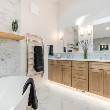
At the heart of the transformation is a thoughtfully designed wet room that combines the shower and soaking tub into one seamless experience. By removing the enclosed shower and replacing it with clear sightlines and an open, curbless design, the room immediately feels larger, brighter, and more connected to the natural light streaming through the window. The result is a space that balances luxury and accessibility while creating the serene atmosphere the homeowners were seeking.
The project's greatest design challenge arrived before construction even began. The homeowners dreamed of a soaking tub large enough for two, but a winding staircase with tight corners made transporting a traditional oversized tub nearly impossible. Through careful planning and product selection, the team identified an elegant oval soaking tub that delivered the depth and comfort they wanted while successfully navigating the home's challenging access conditions.
What makes this wet room particularly special is the attention given to how the homeowners actually use the space. The freestanding tub is positioned beneath a custom ledge featuring a wall-mounted tub filler, creating a convenient surface for candles, beverages, books, or a laptop for movie nights. The faucet placement was carefully considered to keep the interior of the tub open and comfortable, allowing the homeowners to sit face-to-face and enjoy the experience together.
Throughout the space, material selections were chosen to amplify light and create a timeless sense of calm. Large-format porcelain tile with soft gray marble veining wraps the floors and shower walls, while a custom blue herringbone feature wall introduces subtle color and texture without overwhelming the room's airy aesthetic. Chrome plumbing fixtures reflect natural light throughout the space, enhancing the clean, spa-like atmosphere.
Custom cabinetry allowed every inch of the vanity to work harder. In addition to generous storage and double sinks, a specialized vanity organizer was incorporated to store a hair dryer and styling tools out of sight while keeping them plugged in and ready to use. It's a small detail that streamlines everyday routines while reducing countertop clutter. Quartz countertops provide a durable, low-maintenance surface, while integrated toe-kick lighting creates a soft nighttime glow that serves as both an accent feature and practical nightlight.
Comfort was a major priority throughout the design process. Heated tile floors and heated towel bars transform everyday routines into small moments of luxury, while a bidet toilet seat adds a layer of convenience and comfort the homeowners now consider indispensable.
Beyond aesthetics, the bathroom was designed with long-term usability in mind. The curbless shower improves accessibility while preserving the sophisticated visual flow of the wet room. A hand shower mounted on a slide bar doubles as a grab bar, providing future aging-in-place benefits without compromising the room's refined appearance. It has also become one of the homeowners' favorite features for an entirely different reason: a remarkably convenient dog-washing station.
Preserving natural light was equally important. The original wood window was replaced with a moisture-resistant vinyl casement window, ensuring long-term durability while maintaining the bright connection to the outdoors that helps define the room's character. Combined with the open shower design, the window allows daylight to travel throughout the entire space, making the bathroom feel both expansive and inviting.
Perhaps the greatest testament to the success of the project came from the homeowners themselves:
"I didn't have the skills to dream up this design. You did. Thank you."
 Katie Hutchison Studio
The new owners of this house in Harvard, Massachusetts loved its location and authentic Shaker characteristics, but weren’t fans of its curious layout. A dated first-floor full bathroom could only be accessed by going up a few steps to a landing, opening the bathroom door and then going down the same number of steps to enter the room. The dark kitchen faced the driveway to the north, rather than the bucolic backyard fields to the south. The dining space felt more like an enlarged hall and could only comfortably seat four. Upstairs, a den/office had a woefully low ceiling; the master bedroom had limited storage, and a sad full bathroom featured a cramped shower.
KHS proposed a number of changes to create an updated home where the owners could enjoy cooking, entertaining, and being connected to the outdoors from the first-floor living spaces, while also experiencing more inviting and more functional private spaces upstairs.
On the first floor, the primary change was to capture space that had been part of an upper-level screen porch and convert it to interior space. To make the interior expansion seamless, we raised the floor of the area that had been the upper-level porch, so it aligns with the main living level, and made sure there would be no soffits in the planes of the walls we removed. We also raised the floor of the remaining lower-level porch to reduce the number of steps required to circulate from it to the newly expanded interior. New patio door systems now fill the arched openings that used to be infilled with screen. The exterior interventions (which also included some new casement windows in the dining area) were designed to be subtle, while affording significant improvements on the interior. Additionally, the first-floor bathroom was reconfigured, shifting one of its walls to widen the dining space, and moving the entrance to the bathroom from the stair landing to the kitchen instead.
These changes (which involved significant structural interventions) resulted in a much more open space to accommodate a new kitchen with a view of the lush backyard and a new dining space defined by a new built-in banquette that comfortably seats six, and -- with the addition of a table extension -- up to eight people.
Upstairs in the den/office, replacing the low, board ceiling with a raised, plaster, tray ceiling that springs from above the original board-finish walls – newly painted a light color -- created a much more inviting, bright, and expansive space. Re-configuring the master bath to accommodate a larger shower and adding built-in storage cabinets in the master bedroom improved comfort and function. A new whole-house color palette rounds out the improvements.
Photos by Katie Hutchison
 Alleylane Homes
Functionality of layout
Unique design elements
Choice of materials
Environmental considerations (energy, comfort, health)
Construction details/techniques to achieve industry best practices
Open-concept and filled with sunshine, a culinary hub that’s designed to be the social heart of this home and a subtle reference to the engaged, family-first lifestyle that would have been found in the original, heritage farmhouse located on this property.
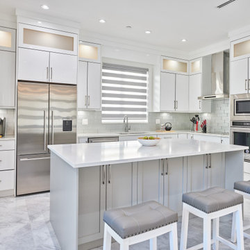
8x5-foot* island (with seating for 4-5 people) includes storage on each side plus convenient USB outlets to keep everyone’s electronics powered up and ready to go. Easy flow when entertaining is appreciated by family/guests alike who want to engage with chefs-at-work without intruding into their workspace.
Pendant lighting above island is purposefully absent. View-lines to adjacent great-room remains unobstructed, thus fulfilling clients desire to provide the entire family (from teen to grandparents) with welcoming space to simply hang out together.
Gas cooktop (with elegantly-curved, chimney hood-fan) and two, full-sized wall-ovens (regular and microwave/convection) conveniently located adjacent to each other on the back wall where it’s easy to transfer steaming dishes directly onto the island ready for your guests/family to help themselves.
Subway-tile (3x6-inch) quartz backsplash creates visual continuity with the solid-slab island surface and perimeter countertops.
Custom millwork (in contemporary white with brushed chrome handles) designed with full-height cabinets with upper shelves back-lit for warm night-time visual. Extra bonus storage and reduced dusting: always a winning combo.
Easy-access spice kitchen includes all the features today’s savvy buyers expect from their cooking space: full-sized range with induction* cooktop, fridge, dishwasher, and 36-inch* sink that’s deep enough to effortlessly handle the biggest spaghetti/corn pots. A caterer’s dream too.
Large format (3x3-foot) marble-inspired porcelain floor-tiling is extension of material used throughout main floor. Elegant, contemporary, dramatic. Warm on the feet, thanks to energy-efficient, in-floor radiant heating.
Sponsored
Sunbury, OH

J.Holderby - Renovations
Franklin County's Leading General Contractors - 2X Best of Houzz!
 Katie Hutchison Studio
The new owners of this house in Harvard, Massachusetts loved its location and authentic Shaker characteristics, but weren’t fans of its curious layout. A dated first-floor full bathroom could only be accessed by going up a few steps to a landing, opening the bathroom door and then going down the same number of steps to enter the room. The dark kitchen faced the driveway to the north, rather than the bucolic backyard fields to the south. The dining space felt more like an enlarged hall and could only comfortably seat four. Upstairs, a den/office had a woefully low ceiling; the master bedroom had limited storage, and a sad full bathroom featured a cramped shower.
KHS proposed a number of changes to create an updated home where the owners could enjoy cooking, entertaining, and being connected to the outdoors from the first-floor living spaces, while also experiencing more inviting and more functional private spaces upstairs.
On the first floor, the primary change was to capture space that had been part of an upper-level screen porch and convert it to interior space. To make the interior expansion seamless, we raised the floor of the area that had been the upper-level porch, so it aligns with the main living level, and made sure there would be no soffits in the planes of the walls we removed. We also raised the floor of the remaining lower-level porch to reduce the number of steps required to circulate from it to the newly expanded interior. New patio door systems now fill the arched openings that used to be infilled with screen. The exterior interventions (which also included some new casement windows in the dining area) were designed to be subtle, while affording significant improvements on the interior. Additionally, the first-floor bathroom was reconfigured, shifting one of its walls to widen the dining space, and moving the entrance to the bathroom from the stair landing to the kitchen instead.
These changes (which involved significant structural interventions) resulted in a much more open space to accommodate a new kitchen with a view of the lush backyard and a new dining space defined by a new built-in banquette that comfortably seats six, and -- with the addition of a table extension -- up to eight people.
Upstairs in the den/office, replacing the low, board ceiling with a raised, plaster, tray ceiling that springs from above the original board-finish walls – newly painted a light color -- created a much more inviting, bright, and expansive space. Re-configuring the master bath to accommodate a larger shower and adding built-in storage cabinets in the master bedroom improved comfort and function. A new whole-house color palette rounds out the improvements.
Photos by Katie Hutchison
 TVL Creative Ltd.
Our clients’ recently purchase home is set in a picturesque location in Golden, Colorado. With idyllic square footage for raising a family, it was almost just what they wanted. However, the 90’s interior furnishings and dated layout didn’t feel like home. So, they reached out to TVL Creative to help them get the place move-in ready and feeling more 'them.' The scope of work included an overhaul of the master bathroom, full-home paint scheme, lighting updates, and new staircase railings. The most profound transformation within our scope was the master bathroom renovation. This luxurious space, built by TVL’s own Team Angel, is a calming retreat with gorgeous detailing throughout. Every part of this bathroom was gutted and we worked to establish a new concept and functional layout that would better serve our clients. As part of the transformative design, a calming symmetry was created by marrying the new vanity design with the existing architecture of the room. A feature tile accentuates the symmetrical composition of vanity and vaulted ceiling: large beveled mirrors and linear sconces bring the eye upward. Custom built-ins flanking the master bathroom sinks were designed to provide ample organized storage for linens and toiletries. A make-up vanity accented by a full height mirror and coordinating pendant rounds out the custom built-ins. Opposite the vanity wall is the commode room, bathtub, and a large shower. In the bathtub nook, the sculptural form of the Elise tub by MTI Baths compliments the arc of the picture window above. The Kohler Archer tub filler adds transitional and classy styling to the area. A quartz-topped bench running the length of the back wall provides a perfect spot for a glass of wine near the bath, while doubling as a gorgeous and functional seat in the shower. The bench was also utilized to move the bathtub off of the exterior wall and reduce the amount of awkward-to-clean floor space. In the shower, the upgrades feel limitless. We relocated the valve controls to the entry half wall for easy on/off access. We also created functionals shower niches that are tucked out of view for handy storage without aesthetic compromise. The shower features a lovely three-dimensional diamond accent tile and is wrapped in frameless glass for added light entry. In general, the space is outfitted with other stunning features including Kohler Archer fixtures throughout, Feiss decorative lighting, Amerock hardware on all built-ins, and cabinetry from Waypoint Living Spaces. From bachelor pad to first family home, it's been a pleasure to work with our client over the years! We will especially cherish our time working with them this time around to make their new house feel more like home.
 Katie Hutchison Studio
The new owners of this house in Harvard, Massachusetts loved its location and authentic Shaker characteristics, but weren’t fans of its curious layout. A dated first-floor full bathroom could only be accessed by going up a few steps to a landing, opening the bathroom door and then going down the same number of steps to enter the room. The dark kitchen faced the driveway to the north, rather than the bucolic backyard fields to the south. The dining space felt more like an enlarged hall and could only comfortably seat four. Upstairs, a den/office had a woefully low ceiling; the master bedroom had limited storage, and a sad full bathroom featured a cramped shower.
KHS proposed a number of changes to create an updated home where the owners could enjoy cooking, entertaining, and being connected to the outdoors from the first-floor living spaces, while also experiencing more inviting and more functional private spaces upstairs.
On the first floor, the primary change was to capture space that had been part of an upper-level screen porch and convert it to interior space. To make the interior expansion seamless, we raised the floor of the area that had been the upper-level porch, so it aligns with the main living level, and made sure there would be no soffits in the planes of the walls we removed. We also raised the floor of the remaining lower-level porch to reduce the number of steps required to circulate from it to the newly expanded interior. New patio door systems now fill the arched openings that used to be infilled with screen. The exterior interventions (which also included some new casement windows in the dining area) were designed to be subtle, while affording significant improvements on the interior. Additionally, the first-floor bathroom was reconfigured, shifting one of its walls to widen the dining space, and moving the entrance to the bathroom from the stair landing to the kitchen instead.
These changes (which involved significant structural interventions) resulted in a much more open space to accommodate a new kitchen with a view of the lush backyard and a new dining space defined by a new built-in banquette that comfortably seats six, and -- with the addition of a table extension -- up to eight people.
Upstairs in the den/office, replacing the low, board ceiling with a raised, plaster, tray ceiling that springs from above the original board-finish walls – newly painted a light color -- created a much more inviting, bright, and expansive space. Re-configuring the master bath to accommodate a larger shower and adding built-in storage cabinets in the master bedroom improved comfort and function. A new whole-house color palette rounds out the improvements.
Photos by Katie Hutchison
 Katie Hutchison Studio
The new owners of this house in Harvard, Massachusetts loved its location and authentic Shaker characteristics, but weren’t fans of its curious layout. A dated first-floor full bathroom could only be accessed by going up a few steps to a landing, opening the bathroom door and then going down the same number of steps to enter the room. The dark kitchen faced the driveway to the north, rather than the bucolic backyard fields to the south. The dining space felt more like an enlarged hall and could only comfortably seat four. Upstairs, a den/office had a woefully low ceiling; the master bedroom had limited storage, and a sad full bathroom featured a cramped shower.
KHS proposed a number of changes to create an updated home where the owners could enjoy cooking, entertaining, and being connected to the outdoors from the first-floor living spaces, while also experiencing more inviting and more functional private spaces upstairs.
On the first floor, the primary change was to capture space that had been part of an upper-level screen porch and convert it to interior space. To make the interior expansion seamless, we raised the floor of the area that had been the upper-level porch, so it aligns with the main living level, and made sure there would be no soffits in the planes of the walls we removed. We also raised the floor of the remaining lower-level porch to reduce the number of steps required to circulate from it to the newly expanded interior. New patio door systems now fill the arched openings that used to be infilled with screen. The exterior interventions (which also included some new casement windows in the dining area) were designed to be subtle, while affording significant improvements on the interior. Additionally, the first-floor bathroom was reconfigured, shifting one of its walls to widen the dining space, and moving the entrance to the bathroom from the stair landing to the kitchen instead.
These changes (which involved significant structural interventions) resulted in a much more open space to accommodate a new kitchen with a view of the lush backyard and a new dining space defined by a new built-in banquette that comfortably seats six, and -- with the addition of a table extension -- up to eight people.
Upstairs in the den/office, replacing the low, board ceiling with a raised, plaster, tray ceiling that springs from above the original board-finish walls – newly painted a light color -- created a much more inviting, bright, and expansive space. Re-configuring the master bath to accommodate a larger shower and adding built-in storage cabinets in the master bedroom improved comfort and function. A new whole-house color palette rounds out the improvements.
Photos by Katie Hutchison

 Envision Landscape Studio
Photography By Joe Dodd
Design ideas for a large contemporary backyard gravel landscaping in San Francisco with a fire pit.
Design ideas for a large contemporary backyard gravel landscaping in San Francisco with a fire pit.
 U.S. Green Building Council (USGBC)
LEED Certification Level: V4
Builder: BPC Green Builders, LLC
Architect: Trillium Architects
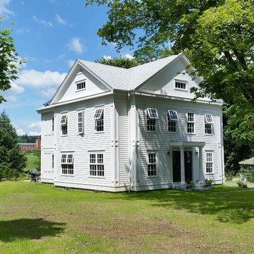
The Taft School faculty home serves as a high performance residence and learning lab for students. The project also earned certification through ENERGY STAR, Indoor airPLUS, Water Sense, PHIUS, and Department of Energy Zero Energy Ready Homes with Living Building Challenge Petal recognition pending. The project team was honored with third place in the 2014 Connecticut Zero Energy Home Challenge. Excluding the photovoltaic installation the HERS index was 33, and with the 13.1 kW the HERS index is -14. A year of utility bills show the home is producing more electricity than it uses.
Located on a quiet street adjacent to campus the existing, historic home was deconstructed and materials donated or reused where possible. Challenged to find high efficiency windows that were historic commission acceptable, the team installed Klearwall awnings or casements over fixed glass (to mimic double hungs) with simulated divided lites (u-values as low as 0.13). A high solar heat gain coefficient (0.58) facilitates the passive solar gain for winter months, while well designed overhangs and a pergola shade summer sun. Double stud walls have 2¼” closed cell foam plus 8½” dense pack cellulose for a R-49 cavity. The exterior sheathing is R-6.6 Zip Wall System with taped seams to create the continuous air barrier. Inside the solid concrete foundation is 3” closed cell foam behind 2x4 stud walls and R-32 cellulose in the cavity. Prefabricated TJI joists frame the attic floor, an insulated “room” houses the heat recovery ventilator and ductwork, and blown in cellulose blankets it all in R-86. The house tested 0.6ACH50 proving the effectiveness of its air-tight envelope and attention to air sealing.
Heating and cooling is provided by efficient air source heat pumps (9.2 HSPF, 16.5 SEER) and delivered by short duct runs which tested extremely tight. A heat pump water heater provides domestic hot water and an on-demand switch, with an occupancy sensor at each bath, ensures hot water is delivered fast and efficiently. Low flow fixtures are WaterSense certified, appliances are Energy Star labeled, and all LED lighting. A Zehnder Novus 300 (93.3% efficient) HRV supplies 112 cfm of continuous fresh air while using only 32 watts of power and running quietly. The homeowners control the mechanical ventilation through the intuitive wall-mounted control pad to shut off or increase the ventilation. Chemicals and contaminants were reduced by using low VOC and GreenGuard certified sealants, adhesives, primers, and paints. A walk-off matt at the side entry and hardwood floors help control dirt and dust. The granite front steps were salvaged and local stone used for the patio and stone walls. Storm water runoff from the roof, patio, and driveway is managed by the rain garden. The native landscaping is low maintenance, a community garden produces vegetables, and the chicken coop is powered by its own roof mounted PV panels.
Taft School Director of Environmental Stewardship, Carly Borken has used the design and construction process as a teaching tool for her science classes. With access to the home monitoring system they can virtually access the residents’ consumption.
Sponsored
Columbus, OH
Free consultation for landscape design!

Peabody Landscape Group
Columbus' Reliable Landscape Design & Contracting
 Katie Hutchison Studio
The new owners of this house in Harvard, Massachusetts loved its location and authentic Shaker characteristics, but weren’t fans of its curious layout. A dated first-floor full bathroom could only be accessed by going up a few steps to a landing, opening the bathroom door and then going down the same number of steps to enter the room. The dark kitchen faced the driveway to the north, rather than the bucolic backyard fields to the south. The dining space felt more like an enlarged hall and could only comfortably seat four. Upstairs, a den/office had a woefully low ceiling; the master bedroom had limited storage, and a sad full bathroom featured a cramped shower.
KHS proposed a number of changes to create an updated home where the owners could enjoy cooking, entertaining, and being connected to the outdoors from the first-floor living spaces, while also experiencing more inviting and more functional private spaces upstairs.
On the first floor, the primary change was to capture space that had been part of an upper-level screen porch and convert it to interior space. To make the interior expansion seamless, we raised the floor of the area that had been the upper-level porch, so it aligns with the main living level, and made sure there would be no soffits in the planes of the walls we removed. We also raised the floor of the remaining lower-level porch to reduce the number of steps required to circulate from it to the newly expanded interior. New patio door systems now fill the arched openings that used to be infilled with screen. The exterior interventions (which also included some new casement windows in the dining area) were designed to be subtle, while affording significant improvements on the interior. Additionally, the first-floor bathroom was reconfigured, shifting one of its walls to widen the dining space, and moving the entrance to the bathroom from the stair landing to the kitchen instead.
These changes (which involved significant structural interventions) resulted in a much more open space to accommodate a new kitchen with a view of the lush backyard and a new dining space defined by a new built-in banquette that comfortably seats six, and -- with the addition of a table extension -- up to eight people.
Upstairs in the den/office, replacing the low, board ceiling with a raised, plaster, tray ceiling that springs from above the original board-finish walls – newly painted a light color -- created a much more inviting, bright, and expansive space. Re-configuring the master bath to accommodate a larger shower and adding built-in storage cabinets in the master bedroom improved comfort and function. A new whole-house color palette rounds out the improvements.
Photos by Katie Hutchison
 TVL Creative Ltd.
Our clients’ recently purchase home is set in a picturesque location in Golden, Colorado. With idyllic square footage for raising a family, it was almost just what they wanted. However, the 90’s interior furnishings and dated layout didn’t feel like home. So, they reached out to TVL Creative to help them get the place move-in ready and feeling more 'them.' The scope of work included an overhaul of the master bathroom, full-home paint scheme, lighting updates, and new staircase railings. The most profound transformation within our scope was the master bathroom renovation. This luxurious space, built by TVL’s own Team Angel, is a calming retreat with gorgeous detailing throughout. Every part of this bathroom was gutted and we worked to establish a new concept and functional layout that would better serve our clients. As part of the transformative design, a calming symmetry was created by marrying the new vanity design with the existing architecture of the room. A feature tile accentuates the symmetrical composition of vanity and vaulted ceiling: large beveled mirrors and linear sconces bring the eye upward. Custom built-ins flanking the master bathroom sinks were designed to provide ample organized storage for linens and toiletries. A make-up vanity accented by a full height mirror and coordinating pendant rounds out the custom built-ins. Opposite the vanity wall is the commode room, bathtub, and a large shower. In the bathtub nook, the sculptural form of the Elise tub by MTI Baths compliments the arc of the picture window above. The Kohler Archer tub filler adds transitional and classy styling to the area. A quartz-topped bench running the length of the back wall provides a perfect spot for a glass of wine near the bath, while doubling as a gorgeous and functional seat in the shower. The bench was also utilized to move the bathtub off of the exterior wall and reduce the amount of awkward-to-clean floor space. In the shower, the upgrades feel limitless. We relocated the valve controls to the entry half wall for easy on/off access. We also created functionals shower niches that are tucked out of view for handy storage without aesthetic compromise. The shower features a lovely three-dimensional diamond accent tile and is wrapped in frameless glass for added light entry. In general, the space is outfitted with other stunning features including Kohler Archer fixtures throughout, Feiss decorative lighting, Amerock hardware on all built-ins, and cabinetry from Waypoint Living Spaces. From bachelor pad to first family home, it's been a pleasure to work with our client over the years! We will especially cherish our time working with them this time around to make their new house feel more like home.

 ZeroEnergy Design
This LEED Platinum certified house reflects the homeowner's desire for an exceptionally healthy and comfortable living environment, within a traditional neighborhood.
INFILL SITE. The family, who moved from another area of Wellesley, sought out this property to be within walking distance of the high school and downtown area. An existing structure on the tight lot was removed to make way for the new home. 84% of the construction waste, from both the previous structure and the new home, was diverted from a landfill. ZED designed to preserve the existing mature trees on the perimeter of the property to minimize site impacts, and to maintain the character of the neighborhood as well as privacy on the site.
EXTERIOR EXPRESSION. The street facade of the home relates to the local New England vernacular. The rear uses contemporary language, a nod to the family’s Californian roots, to incorporate a roof deck, solar panels, outdoor living space, and the backyard swimming pool. ZED’s careful planning avoided to the need to face the garage doors towards the street, a common syndrome of a narrow lot.
THOUGHTFUL SPACE. Homes with dual entries can often result in duplicate and unused spaces. In this home, the everyday and formal entry areas are one and the same; the front and garage doors share the entry program of coat closets, mudroom storage with bench for removing your shoes, and a laundry room with generous closets for the children's sporting equipment. The entry area leads directly to the living space, encompassing the kitchen, dining and sitting area areas in an L-shaped open plan arrangement. The kitchen is placed at the south-west corner of the space to allow for a strong connection to the dining, sitting and outdoor living spaces. A fire pit on the deck satisfies the family’s desire for an open flame while a sealed gas fireplace is used indoors - ZED’s preference after omitting gas burning appliances completely from an airtight home. A small study, with a window seat, is conveniently located just off of the living space. A first floor guest bedroom includes an accessible bathroom for aging visitors and can be used as a master suite to accommodate aging in place.
HEALTHY LIVING. The client requested a home that was easy to clean and would provide a respite from seasonal allergies and common contaminants that are found in many indoor spaces. ZED selected easy to clean solid surface flooring throughout, provided ample space for cleaning supplies on each floor, and designed a mechanical system with ventilation that provides a constant supply of fresh outdoor air. ZED selected durable materials, finishes, cabinetry, and casework with low or no volatile organic compounds (VOCs) and no added urea formaldehyde.
YEAR-ROUND COMFORT. The home is super insulated and air-tight, paired with high performance triple-paned windows, to ensure it is draft-free throughout the winter (even when in front of the large windows and doors). ZED designed a right-sized heating and cooling system to pair with the thermally improved building enclosure to ensure year-round comfort. The glazing on the home maximizes passive solar gains, and facilitates cross ventilation and daylighting.
ENERGY EFFICIENT. As one of the most energy efficient houses built to date in Wellesley, the home highlights a practical solution for Massachusetts. First, the building enclosure reduces the largest energy requirement for typical houses (heating). Super-insulation, exceptional air sealing, a thermally broken wall assembly, triple pane windows, and passive solar gain combine for a sizable heating load reduction. Second, within the house only efficient systems consume energy. These include an air source heat pump for heating & cooling, a heat pump hot water heater, LED lighting, energy recovery ventilation, and high efficiency appliances. Lastly, photovoltaics provide renewable energy help offset energy consumption. The result is an 89% reduction in energy use compared to a similar brand new home built to code requirements.
RESILIENT. The home will fare well in extreme weather events. During a winter power outage, heat loss will be very slow due to the super-insulated and airtight envelope– taking multiple days to drop to 60 degrees even with no heat source. An engineered drainage system, paired with careful the detailing of the foundation, will help to keep the finished basement dry. A generator will provide full operation of the all-electric house during a power outage.
OVERALL. The home is a reflection of the family goals and an expression of their values, beautifully enabling health, comfort, safety, resilience, and utility, all while respecting the planet.
ZED - Architect & Mechanical Designer
Bevilacqua Builders Inc - Contractor
Creative Land & Water Engineering - Civil Engineering
Barbara Peterson Landscape - Landscape Design
Nest & Company - Interior Furnishings
Eric Roth Photography - Photography
 THE Remodel Group
When these longtime clients traded the bustle of Portland for a quieter neighborhood in Lake Oswego, they found a home they loved almost immediately. But while the rest of the house reflected the warm, welcoming environment they envisioned for this next chapter, one space remained firmly rooted in another era: the primary bathroom.
Dark tile, a cramped shower, and a dated tub deck left the room feeling heavy and disconnected from the calming retreat the homeowners hoped to create. Their vision was simple but meaningful: a bright, spa-inspired bathroom designed for comfort, relaxation, and sharing the space together.
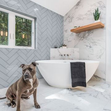
At the heart of the transformation is a thoughtfully designed wet room that combines the shower and soaking tub into one seamless experience. By removing the enclosed shower and replacing it with clear sightlines and an open, curbless design, the room immediately feels larger, brighter, and more connected to the natural light streaming through the window. The result is a space that balances luxury and accessibility while creating the serene atmosphere the homeowners were seeking.
The project's greatest design challenge arrived before construction even began. The homeowners dreamed of a soaking tub large enough for two, but a winding staircase with tight corners made transporting a traditional oversized tub nearly impossible. Through careful planning and product selection, the team identified an elegant oval soaking tub that delivered the depth and comfort they wanted while successfully navigating the home's challenging access conditions.
What makes this wet room particularly special is the attention given to how the homeowners actually use the space. The freestanding tub is positioned beneath a custom ledge featuring a wall-mounted tub filler, creating a convenient surface for candles, beverages, books, or a laptop for movie nights. The faucet placement was carefully considered to keep the interior of the tub open and comfortable, allowing the homeowners to sit face-to-face and enjoy the experience together.
Throughout the space, material selections were chosen to amplify light and create a timeless sense of calm. Large-format porcelain tile with soft gray marble veining wraps the floors and shower walls, while a custom blue herringbone feature wall introduces subtle color and texture without overwhelming the room's airy aesthetic. Chrome plumbing fixtures reflect natural light throughout the space, enhancing the clean, spa-like atmosphere.
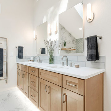
Custom cabinetry allowed every inch of the vanity to work harder. In addition to generous storage and double sinks, a specialized vanity organizer was incorporated to store a hair dryer and styling tools out of sight while keeping them plugged in and ready to use. It's a small detail that streamlines everyday routines while reducing countertop clutter. Quartz countertops provide a durable, low-maintenance surface, while integrated toe-kick lighting creates a soft nighttime glow that serves as both an accent feature and practical nightlight.
Comfort was a major priority throughout the design process. Heated tile floors and heated towel bars transform everyday routines into small moments of luxury, while a bidet toilet seat adds a layer of convenience and comfort the homeowners now consider indispensable.
Beyond aesthetics, the bathroom was designed with long-term usability in mind. The curbless shower improves accessibility while preserving the sophisticated visual flow of the wet room. A hand shower mounted on a slide bar doubles as a grab bar, providing future aging-in-place benefits without compromising the room's refined appearance. It has also become one of the homeowners' favorite features for an entirely different reason: a remarkably convenient dog-washing station.
Preserving natural light was equally important. The original wood window was replaced with a moisture-resistant vinyl casement window, ensuring long-term durability while maintaining the bright connection to the outdoors that helps define the room's character. Combined with the open shower design, the window allows daylight to travel throughout the entire space, making the bathroom feel both expansive and inviting.
Perhaps the greatest testament to the success of the project came from the homeowners themselves:
"I didn't have the skills to dream up this design. You did. Thank you."
Sponsored
Columbus, OH
Free consultation for landscape design!
Peabody Landscape Group
Columbus' Reliable Landscape Design & Contracting
 Katie Hutchison Studio
The new owners of this house in Harvard, Massachusetts loved its location and authentic Shaker characteristics, but weren’t fans of its curious layout. A dated first-floor full bathroom could only be accessed by going up a few steps to a landing, opening the bathroom door and then going down the same number of steps to enter the room. The dark kitchen faced the driveway to the north, rather than the bucolic backyard fields to the south. The dining space felt more like an enlarged hall and could only comfortably seat four. Upstairs, a den/office had a woefully low ceiling; the master bedroom had limited storage, and a sad full bathroom featured a cramped shower.
KHS proposed a number of changes to create an updated home where the owners could enjoy cooking, entertaining, and being connected to the outdoors from the first-floor living spaces, while also experiencing more inviting and more functional private spaces upstairs.
On the first floor, the primary change was to capture space that had been part of an upper-level screen porch and convert it to interior space. To make the interior expansion seamless, we raised the floor of the area that had been the upper-level porch, so it aligns with the main living level, and made sure there would be no soffits in the planes of the walls we removed. We also raised the floor of the remaining lower-level porch to reduce the number of steps required to circulate from it to the newly expanded interior. New patio door systems now fill the arched openings that used to be infilled with screen. The exterior interventions (which also included some new casement windows in the dining area) were designed to be subtle, while affording significant improvements on the interior. Additionally, the first-floor bathroom was reconfigured, shifting one of its walls to widen the dining space, and moving the entrance to the bathroom from the stair landing to the kitchen instead.
These changes (which involved significant structural interventions) resulted in a much more open space to accommodate a new kitchen with a view of the lush backyard and a new dining space defined by a new built-in banquette that comfortably seats six, and -- with the addition of a table extension -- up to eight people.
Upstairs in the den/office, replacing the low, board ceiling with a raised, plaster, tray ceiling that springs from above the original board-finish walls – newly painted a light color -- created a much more inviting, bright, and expansive space. Re-configuring the master bath to accommodate a larger shower and adding built-in storage cabinets in the master bedroom improved comfort and function. A new whole-house color palette rounds out the improvements.
Photos by Katie Hutchison
 THE Remodel Group
When these longtime clients traded the bustle of Portland for a quieter neighborhood in Lake Oswego, they found a home they loved almost immediately. But while the rest of the house reflected the warm, welcoming environment they envisioned for this next chapter, one space remained firmly rooted in another era: the primary bathroom.
Dark tile, a cramped shower, and a dated tub deck left the room feeling heavy and disconnected from the calming retreat the homeowners hoped to create. Their vision was simple but meaningful: a bright, spa-inspired bathroom designed for comfort, relaxation, and sharing the space together.
At the heart of the transformation is a thoughtfully designed wet room that combines the shower and soaking tub into one seamless experience. By removing the enclosed shower and replacing it with clear sightlines and an open, curbless design, the room immediately feels larger, brighter, and more connected to the natural light streaming through the window. The result is a space that balances luxury and accessibility while creating the serene atmosphere the homeowners were seeking.
The project's greatest design challenge arrived before construction even began. The homeowners dreamed of a soaking tub large enough for two, but a winding staircase with tight corners made transporting a traditional oversized tub nearly impossible. Through careful planning and product selection, the team identified an elegant oval soaking tub that delivered the depth and comfort they wanted while successfully navigating the home's challenging access conditions.
What makes this wet room particularly special is the attention given to how the homeowners actually use the space. The freestanding tub is positioned beneath a custom ledge featuring a wall-mounted tub filler, creating a convenient surface for candles, beverages, books, or a laptop for movie nights. The faucet placement was carefully considered to keep the interior of the tub open and comfortable, allowing the homeowners to sit face-to-face and enjoy the experience together.
Throughout the space, material selections were chosen to amplify light and create a timeless sense of calm. Large-format porcelain tile with soft gray marble veining wraps the floors and shower walls, while a custom blue herringbone feature wall introduces subtle color and texture without overwhelming the room's airy aesthetic. Chrome plumbing fixtures reflect natural light throughout the space, enhancing the clean, spa-like atmosphere.
Custom cabinetry allowed every inch of the vanity to work harder. In addition to generous storage and double sinks, a specialized vanity organizer was incorporated to store a hair dryer and styling tools out of sight while keeping them plugged in and ready to use. It's a small detail that streamlines everyday routines while reducing countertop clutter. Quartz countertops provide a durable, low-maintenance surface, while integrated toe-kick lighting creates a soft nighttime glow that serves as both an accent feature and practical nightlight.
Comfort was a major priority throughout the design process. Heated tile floors and heated towel bars transform everyday routines into small moments of luxury, while a bidet toilet seat adds a layer of convenience and comfort the homeowners now consider indispensable.
Beyond aesthetics, the bathroom was designed with long-term usability in mind. The curbless shower improves accessibility while preserving the sophisticated visual flow of the wet room. A hand shower mounted on a slide bar doubles as a grab bar, providing future aging-in-place benefits without compromising the room's refined appearance. It has also become one of the homeowners' favorite features for an entirely different reason: a remarkably convenient dog-washing station.
Preserving natural light was equally important. The original wood window was replaced with a moisture-resistant vinyl casement window, ensuring long-term durability while maintaining the bright connection to the outdoors that helps define the room's character. Combined with the open shower design, the window allows daylight to travel throughout the entire space, making the bathroom feel both expansive and inviting.
Perhaps the greatest testament to the success of the project came from the homeowners themselves:
"I didn't have the skills to dream up this design. You did. Thank you."
 TVL Creative Ltd.
Our clients’ recently purchase home is set in a picturesque location in Golden, Colorado. With idyllic square footage for raising a family, it was almost just what they wanted. However, the 90’s interior furnishings and dated layout didn’t feel like home. So, they reached out to TVL Creative to help them get the place move-in ready and feeling more 'them.' The scope of work included an overhaul of the master bathroom, full-home paint scheme, lighting updates, and new staircase railings. The most profound transformation within our scope was the master bathroom renovation. This luxurious space, built by TVL’s own Team Angel, is a calming retreat with gorgeous detailing throughout. Every part of this bathroom was gutted and we worked to establish a new concept and functional layout that would better serve our clients. As part of the transformative design, a calming symmetry was created by marrying the new vanity design with the existing architecture of the room. A feature tile accentuates the symmetrical composition of vanity and vaulted ceiling: large beveled mirrors and linear sconces bring the eye upward. Custom built-ins flanking the master bathroom sinks were designed to provide ample organized storage for linens and toiletries. A make-up vanity accented by a full height mirror and coordinating pendant rounds out the custom built-ins. Opposite the vanity wall is the commode room, bathtub, and a large shower. In the bathtub nook, the sculptural form of the Elise tub by MTI Baths compliments the arc of the picture window above. The Kohler Archer tub filler adds transitional and classy styling to the area. A quartz-topped bench running the length of the back wall provides a perfect spot for a glass of wine near the bath, while doubling as a gorgeous and functional seat in the shower. The bench was also utilized to move the bathtub off of the exterior wall and reduce the amount of awkward-to-clean floor space. In the shower, the upgrades feel limitless. We relocated the valve controls to the entry half wall for easy on/off access. We also created functionals shower niches that are tucked out of view for handy storage without aesthetic compromise. The shower features a lovely three-dimensional diamond accent tile and is wrapped in frameless glass for added light entry. In general, the space is outfitted with other stunning features including Kohler Archer fixtures throughout, Feiss decorative lighting, Amerock hardware on all built-ins, and cabinetry from Waypoint Living Spaces. From bachelor pad to first family home, it's been a pleasure to work with our client over the years! We will especially cherish our time working with them this time around to make their new house feel more like home.
52