
Search results for "Reduce accessing" in Home Design Ideas

 Katie Hutchison Studio
The new owners of this house in Harvard, Massachusetts loved its location and authentic Shaker characteristics, but weren’t fans of its curious layout. A dated first-floor full bathroom could only be accessed by going up a few steps to a landing, opening the bathroom door and then going down the same number of steps to enter the room. The dark kitchen faced the driveway to the north, rather than the bucolic backyard fields to the south. The dining space felt more like an enlarged hall and could only comfortably seat four. Upstairs, a den/office had a woefully low ceiling; the master bedroom had limited storage, and a sad full bathroom featured a cramped shower.
KHS proposed a number of changes to create an updated home where the owners could enjoy cooking, entertaining, and being connected to the outdoors from the first-floor living spaces, while also experiencing more inviting and more functional private spaces upstairs.
On the first floor, the primary change was to capture space that had been part of an upper-level screen porch and convert it to interior space. To make the interior expansion seamless, we raised the floor of the area that had been the upper-level porch, so it aligns with the main living level, and made sure there would be no soffits in the planes of the walls we removed. We also raised the floor of the remaining lower-level porch to reduce the number of steps required to circulate from it to the newly expanded interior. New patio door systems now fill the arched openings that used to be infilled with screen. The exterior interventions (which also included some new casement windows in the dining area) were designed to be subtle, while affording significant improvements on the interior. Additionally, the first-floor bathroom was reconfigured, shifting one of its walls to widen the dining space, and moving the entrance to the bathroom from the stair landing to the kitchen instead.
These changes (which involved significant structural interventions) resulted in a much more open space to accommodate a new kitchen with a view of the lush backyard and a new dining space defined by a new built-in banquette that comfortably seats six, and -- with the addition of a table extension -- up to eight people.
Upstairs in the den/office, replacing the low, board ceiling with a raised, plaster, tray ceiling that springs from above the original board-finish walls – newly painted a light color -- created a much more inviting, bright, and expansive space. Re-configuring the master bath to accommodate a larger shower and adding built-in storage cabinets in the master bedroom improved comfort and function. A new whole-house color palette rounds out the improvements.
Photos by Katie Hutchison
 Katie Hutchison Studio
The new owners of this house in Harvard, Massachusetts loved its location and authentic Shaker characteristics, but weren’t fans of its curious layout. A dated first-floor full bathroom could only be accessed by going up a few steps to a landing, opening the bathroom door and then going down the same number of steps to enter the room. The dark kitchen faced the driveway to the north, rather than the bucolic backyard fields to the south. The dining space felt more like an enlarged hall and could only comfortably seat four. Upstairs, a den/office had a woefully low ceiling; the master bedroom had limited storage, and a sad full bathroom featured a cramped shower.
KHS proposed a number of changes to create an updated home where the owners could enjoy cooking, entertaining, and being connected to the outdoors from the first-floor living spaces, while also experiencing more inviting and more functional private spaces upstairs.
On the first floor, the primary change was to capture space that had been part of an upper-level screen porch and convert it to interior space. To make the interior expansion seamless, we raised the floor of the area that had been the upper-level porch, so it aligns with the main living level, and made sure there would be no soffits in the planes of the walls we removed. We also raised the floor of the remaining lower-level porch to reduce the number of steps required to circulate from it to the newly expanded interior. New patio door systems now fill the arched openings that used to be infilled with screen. The exterior interventions (which also included some new casement windows in the dining area) were designed to be subtle, while affording significant improvements on the interior. Additionally, the first-floor bathroom was reconfigured, shifting one of its walls to widen the dining space, and moving the entrance to the bathroom from the stair landing to the kitchen instead.
These changes (which involved significant structural interventions) resulted in a much more open space to accommodate a new kitchen with a view of the lush backyard and a new dining space defined by a new built-in banquette that comfortably seats six, and -- with the addition of a table extension -- up to eight people.
Upstairs in the den/office, replacing the low, board ceiling with a raised, plaster, tray ceiling that springs from above the original board-finish walls – newly painted a light color -- created a much more inviting, bright, and expansive space. Re-configuring the master bath to accommodate a larger shower and adding built-in storage cabinets in the master bedroom improved comfort and function. A new whole-house color palette rounds out the improvements.
Photos by Katie Hutchison

 Visbeen Architects
Inspired by the surrounding landscape, the Craftsman/Prairie style is one of the few truly American architectural styles. It was developed around the turn of the century by a group of Midwestern architects and continues to be among the most comfortable of all American-designed architecture more than a century later, one of the main reasons it continues to attract architects and homeowners today. Oxbridge builds on that solid reputation, drawing from Craftsman/Prairie and classic Farmhouse styles. Its handsome Shingle-clad exterior includes interesting pitched rooflines, alternating rows of cedar shake siding, stone accents in the foundation and chimney and distinctive decorative brackets. Repeating triple windows add interest to the exterior while keeping interior spaces open and bright. Inside, the floor plan is equally impressive. Columns on the porch and a custom entry door with sidelights and decorative glass leads into a spacious 2,900-square-foot main floor, including a 19 by 24-foot living room with a period-inspired built-ins and a natural fireplace. While inspired by the past, the home lives for the present, with open rooms and plenty of storage throughout. Also included is a 27-foot-wide family-style kitchen with a large island and eat-in dining and a nearby dining room with a beadboard ceiling that leads out onto a relaxing 240-square-foot screen porch that takes full advantage of the nearby outdoors and a private 16 by 20-foot master suite with a sloped ceiling and relaxing personal sitting area. The first floor also includes a large walk-in closet, a home management area and pantry to help you stay organized and a first-floor laundry area. Upstairs, another 1,500 square feet awaits, with a built-ins and a window seat at the top of the stairs that nod to the home’s historic inspiration. Opt for three family bedrooms or use one of the three as a yoga room; the upper level also includes attic access, which offers another 500 square feet, perfect for crafts or a playroom. More space awaits in the lower level, where another 1,500 square feet (and an additional 1,000) include a recreation/family room with nine-foot ceilings, a wine cellar and home office.
Photographer: Jeff Garland
Find the right local pro for your project
 Katie Hutchison Studio
The new owners of this house in Harvard, Massachusetts loved its location and authentic Shaker characteristics, but weren’t fans of its curious layout. A dated first-floor full bathroom could only be accessed by going up a few steps to a landing, opening the bathroom door and then going down the same number of steps to enter the room. The dark kitchen faced the driveway to the north, rather than the bucolic backyard fields to the south. The dining space felt more like an enlarged hall and could only comfortably seat four. Upstairs, a den/office had a woefully low ceiling; the master bedroom had limited storage, and a sad full bathroom featured a cramped shower.
KHS proposed a number of changes to create an updated home where the owners could enjoy cooking, entertaining, and being connected to the outdoors from the first-floor living spaces, while also experiencing more inviting and more functional private spaces upstairs.
On the first floor, the primary change was to capture space that had been part of an upper-level screen porch and convert it to interior space. To make the interior expansion seamless, we raised the floor of the area that had been the upper-level porch, so it aligns with the main living level, and made sure there would be no soffits in the planes of the walls we removed. We also raised the floor of the remaining lower-level porch to reduce the number of steps required to circulate from it to the newly expanded interior. New patio door systems now fill the arched openings that used to be infilled with screen. The exterior interventions (which also included some new casement windows in the dining area) were designed to be subtle, while affording significant improvements on the interior. Additionally, the first-floor bathroom was reconfigured, shifting one of its walls to widen the dining space, and moving the entrance to the bathroom from the stair landing to the kitchen instead.
These changes (which involved significant structural interventions) resulted in a much more open space to accommodate a new kitchen with a view of the lush backyard and a new dining space defined by a new built-in banquette that comfortably seats six, and -- with the addition of a table extension -- up to eight people.
Upstairs in the den/office, replacing the low, board ceiling with a raised, plaster, tray ceiling that springs from above the original board-finish walls – newly painted a light color -- created a much more inviting, bright, and expansive space. Re-configuring the master bath to accommodate a larger shower and adding built-in storage cabinets in the master bedroom improved comfort and function. A new whole-house color palette rounds out the improvements.
Photso by Katie Hutchison
 Katie Hutchison Studio
The new owners of this house in Harvard, Massachusetts loved its location and authentic Shaker characteristics, but weren’t fans of its curious layout. A dated first-floor full bathroom could only be accessed by going up a few steps to a landing, opening the bathroom door and then going down the same number of steps to enter the room. The dark kitchen faced the driveway to the north, rather than the bucolic backyard fields to the south. The dining space felt more like an enlarged hall and could only comfortably seat four. Upstairs, a den/office had a woefully low ceiling; the master bedroom had limited storage, and a sad full bathroom featured a cramped shower.
KHS proposed a number of changes to create an updated home where the owners could enjoy cooking, entertaining, and being connected to the outdoors from the first-floor living spaces, while also experiencing more inviting and more functional private spaces upstairs.
On the first floor, the primary change was to capture space that had been part of an upper-level screen porch and convert it to interior space. To make the interior expansion seamless, we raised the floor of the area that had been the upper-level porch, so it aligns with the main living level, and made sure there would be no soffits in the planes of the walls we removed. We also raised the floor of the remaining lower-level porch to reduce the number of steps required to circulate from it to the newly expanded interior. New patio door systems now fill the arched openings that used to be infilled with screen. The exterior interventions (which also included some new casement windows in the dining area) were designed to be subtle, while affording significant improvements on the interior. Additionally, the first-floor bathroom was reconfigured, shifting one of its walls to widen the dining space, and moving the entrance to the bathroom from the stair landing to the kitchen instead.
These changes (which involved significant structural interventions) resulted in a much more open space to accommodate a new kitchen with a view of the lush backyard and a new dining space defined by a new built-in banquette that comfortably seats six, and -- with the addition of a table extension -- up to eight people.
Upstairs in the den/office, replacing the low, board ceiling with a raised, plaster, tray ceiling that springs from above the original board-finish walls – newly painted a light color -- created a much more inviting, bright, and expansive space. Re-configuring the master bath to accommodate a larger shower and adding built-in storage cabinets in the master bedroom improved comfort and function. A new whole-house color palette rounds out the improvements.
Photos by Katie Hutchison
 Katie Hutchison Studio
The new owners of this house in Harvard, Massachusetts loved its location and authentic Shaker characteristics, but weren’t fans of its curious layout. A dated first-floor full bathroom could only be accessed by going up a few steps to a landing, opening the bathroom door and then going down the same number of steps to enter the room. The dark kitchen faced the driveway to the north, rather than the bucolic backyard fields to the south. The dining space felt more like an enlarged hall and could only comfortably seat four. Upstairs, a den/office had a woefully low ceiling; the master bedroom had limited storage, and a sad full bathroom featured a cramped shower.
KHS proposed a number of changes to create an updated home where the owners could enjoy cooking, entertaining, and being connected to the outdoors from the first-floor living spaces, while also experiencing more inviting and more functional private spaces upstairs.
On the first floor, the primary change was to capture space that had been part of an upper-level screen porch and convert it to interior space. To make the interior expansion seamless, we raised the floor of the area that had been the upper-level porch, so it aligns with the main living level, and made sure there would be no soffits in the planes of the walls we removed. We also raised the floor of the remaining lower-level porch to reduce the number of steps required to circulate from it to the newly expanded interior. New patio door systems now fill the arched openings that used to be infilled with screen. The exterior interventions (which also included some new casement windows in the dining area) were designed to be subtle, while affording significant improvements on the interior. Additionally, the first-floor bathroom was reconfigured, shifting one of its walls to widen the dining space, and moving the entrance to the bathroom from the stair landing to the kitchen instead.
These changes (which involved significant structural interventions) resulted in a much more open space to accommodate a new kitchen with a view of the lush backyard and a new dining space defined by a new built-in banquette that comfortably seats six, and -- with the addition of a table extension -- up to eight people.
Upstairs in the den/office, replacing the low, board ceiling with a raised, plaster, tray ceiling that springs from above the original board-finish walls – newly painted a light color -- created a much more inviting, bright, and expansive space. Re-configuring the master bath to accommodate a larger shower and adding built-in storage cabinets in the master bedroom improved comfort and function. A new whole-house color palette rounds out the improvements.
Photos by Katie Hutchison
 Alleylane Homes
Functionality of layout
Unique design elements
Choice of materials
Environmental considerations (energy, comfort, health)
Construction details/techniques to achieve industry best practices
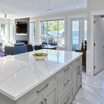
Open-concept and filled with sunshine, a culinary hub that’s designed to be the social heart of this home and a subtle reference to the engaged, family-first lifestyle that would have been found in the original, heritage farmhouse located on this property.
8x5-foot* island (with seating for 4-5 people) includes storage on each side plus convenient USB outlets to keep everyone’s electronics powered up and ready to go. Easy flow when entertaining is appreciated by family/guests alike who want to engage with chefs-at-work without intruding into their workspace.
Pendant lighting above island is purposefully absent. View-lines to adjacent great-room remains unobstructed, thus fulfilling clients desire to provide the entire family (from teen to grandparents) with welcoming space to simply hang out together.
Gas cooktop (with elegantly-curved, chimney hood-fan) and two, full-sized wall-ovens (regular and microwave/convection) conveniently located adjacent to each other on the back wall where it’s easy to transfer steaming dishes directly onto the island ready for your guests/family to help themselves.
Subway-tile (3x6-inch) quartz backsplash creates visual continuity with the solid-slab island surface and perimeter countertops.
Custom millwork (in contemporary white with brushed chrome handles) designed with full-height cabinets with upper shelves back-lit for warm night-time visual. Extra bonus storage and reduced dusting: always a winning combo.
Easy-access spice kitchen includes all the features today’s savvy buyers expect from their cooking space: full-sized range with induction* cooktop, fridge, dishwasher, and 36-inch* sink that’s deep enough to effortlessly handle the biggest spaghetti/corn pots. A caterer’s dream too.
Large format (3x3-foot) marble-inspired porcelain floor-tiling is extension of material used throughout main floor. Elegant, contemporary, dramatic. Warm on the feet, thanks to energy-efficient, in-floor radiant heating.

Sponsored
Columbus, OH
Free consultation for landscape design!

Peabody Landscape Group
Columbus' Reliable Landscape Design & Contracting
 Katie Hutchison Studio
The new owners of this house in Harvard, Massachusetts loved its location and authentic Shaker characteristics, but weren’t fans of its curious layout. A dated first-floor full bathroom could only be accessed by going up a few steps to a landing, opening the bathroom door and then going down the same number of steps to enter the room. The dark kitchen faced the driveway to the north, rather than the bucolic backyard fields to the south. The dining space felt more like an enlarged hall and could only comfortably seat four. Upstairs, a den/office had a woefully low ceiling; the master bedroom had limited storage, and a sad full bathroom featured a cramped shower.
KHS proposed a number of changes to create an updated home where the owners could enjoy cooking, entertaining, and being connected to the outdoors from the first-floor living spaces, while also experiencing more inviting and more functional private spaces upstairs.
On the first floor, the primary change was to capture space that had been part of an upper-level screen porch and convert it to interior space. To make the interior expansion seamless, we raised the floor of the area that had been the upper-level porch, so it aligns with the main living level, and made sure there would be no soffits in the planes of the walls we removed. We also raised the floor of the remaining lower-level porch to reduce the number of steps required to circulate from it to the newly expanded interior. New patio door systems now fill the arched openings that used to be infilled with screen. The exterior interventions (which also included some new casement windows in the dining area) were designed to be subtle, while affording significant improvements on the interior. Additionally, the first-floor bathroom was reconfigured, shifting one of its walls to widen the dining space, and moving the entrance to the bathroom from the stair landing to the kitchen instead.
These changes (which involved significant structural interventions) resulted in a much more open space to accommodate a new kitchen with a view of the lush backyard and a new dining space defined by a new built-in banquette that comfortably seats six, and -- with the addition of a table extension -- up to eight people.
Upstairs in the den/office, replacing the low, board ceiling with a raised, plaster, tray ceiling that springs from above the original board-finish walls – newly painted a light color -- created a much more inviting, bright, and expansive space. Re-configuring the master bath to accommodate a larger shower and adding built-in storage cabinets in the master bedroom improved comfort and function. A new whole-house color palette rounds out the improvements.
Photos by Katie Hutchison
 Katie Hutchison Studio
The new owners of this house in Harvard, Massachusetts loved its location and authentic Shaker characteristics, but weren’t fans of its curious layout. A dated first-floor full bathroom could only be accessed by going up a few steps to a landing, opening the bathroom door and then going down the same number of steps to enter the room. The dark kitchen faced the driveway to the north, rather than the bucolic backyard fields to the south. The dining space felt more like an enlarged hall and could only comfortably seat four. Upstairs, a den/office had a woefully low ceiling; the master bedroom had limited storage, and a sad full bathroom featured a cramped shower.
KHS proposed a number of changes to create an updated home where the owners could enjoy cooking, entertaining, and being connected to the outdoors from the first-floor living spaces, while also experiencing more inviting and more functional private spaces upstairs.
On the first floor, the primary change was to capture space that had been part of an upper-level screen porch and convert it to interior space. To make the interior expansion seamless, we raised the floor of the area that had been the upper-level porch, so it aligns with the main living level, and made sure there would be no soffits in the planes of the walls we removed. We also raised the floor of the remaining lower-level porch to reduce the number of steps required to circulate from it to the newly expanded interior. New patio door systems now fill the arched openings that used to be infilled with screen. The exterior interventions (which also included some new casement windows in the dining area) were designed to be subtle, while affording significant improvements on the interior. Additionally, the first-floor bathroom was reconfigured, shifting one of its walls to widen the dining space, and moving the entrance to the bathroom from the stair landing to the kitchen instead.
These changes (which involved significant structural interventions) resulted in a much more open space to accommodate a new kitchen with a view of the lush backyard and a new dining space defined by a new built-in banquette that comfortably seats six, and -- with the addition of a table extension -- up to eight people.
Upstairs in the den/office, replacing the low, board ceiling with a raised, plaster, tray ceiling that springs from above the original board-finish walls – newly painted a light color -- created a much more inviting, bright, and expansive space. Re-configuring the master bath to accommodate a larger shower and adding built-in storage cabinets in the master bedroom improved comfort and function. A new whole-house color palette rounds out the improvements.
Photos by Katie Hutchison

 TVL Creative Ltd.
Our clients’ recently purchase home is set in a picturesque location in Golden, Colorado. With idyllic square footage for raising a family, it was almost just what they wanted. However, the 90’s interior furnishings and dated layout didn’t feel like home. So, they reached out to TVL Creative to help them get the place move-in ready and feeling more 'them.' The scope of work included an overhaul of the master bathroom, full-home paint scheme, lighting updates, and new staircase railings. The most profound transformation within our scope was the master bathroom renovation. This luxurious space, built by TVL’s own Team Angel, is a calming retreat with gorgeous detailing throughout. Every part of this bathroom was gutted and we worked to establish a new concept and functional layout that would better serve our clients. As part of the transformative design, a calming symmetry was created by marrying the new vanity design with the existing architecture of the room. A feature tile accentuates the symmetrical composition of vanity and vaulted ceiling: large beveled mirrors and linear sconces bring the eye upward. Custom built-ins flanking the master bathroom sinks were designed to provide ample organized storage for linens and toiletries. A make-up vanity accented by a full height mirror and coordinating pendant rounds out the custom built-ins. Opposite the vanity wall is the commode room, bathtub, and a large shower. In the bathtub nook, the sculptural form of the Elise tub by MTI Baths compliments the arc of the picture window above. The Kohler Archer tub filler adds transitional and classy styling to the area. A quartz-topped bench running the length of the back wall provides a perfect spot for a glass of wine near the bath, while doubling as a gorgeous and functional seat in the shower. The bench was also utilized to move the bathtub off of the exterior wall and reduce the amount of awkward-to-clean floor space. In the shower, the upgrades feel limitless. We relocated the valve controls to the entry half wall for easy on/off access. We also created functionals shower niches that are tucked out of view for handy storage without aesthetic compromise. The shower features a lovely three-dimensional diamond accent tile and is wrapped in frameless glass for added light entry. In general, the space is outfitted with other stunning features including Kohler Archer fixtures throughout, Feiss decorative lighting, Amerock hardware on all built-ins, and cabinetry from Waypoint Living Spaces. From bachelor pad to first family home, it's been a pleasure to work with our client over the years! We will especially cherish our time working with them this time around to make their new house feel more like home.
 Katie Hutchison Studio
The new owners of this house in Harvard, Massachusetts loved its location and authentic Shaker characteristics, but weren’t fans of its curious layout. A dated first-floor full bathroom could only be accessed by going up a few steps to a landing, opening the bathroom door and then going down the same number of steps to enter the room. The dark kitchen faced the driveway to the north, rather than the bucolic backyard fields to the south. The dining space felt more like an enlarged hall and could only comfortably seat four. Upstairs, a den/office had a woefully low ceiling; the master bedroom had limited storage, and a sad full bathroom featured a cramped shower.
KHS proposed a number of changes to create an updated home where the owners could enjoy cooking, entertaining, and being connected to the outdoors from the first-floor living spaces, while also experiencing more inviting and more functional private spaces upstairs.
On the first floor, the primary change was to capture space that had been part of an upper-level screen porch and convert it to interior space. To make the interior expansion seamless, we raised the floor of the area that had been the upper-level porch, so it aligns with the main living level, and made sure there would be no soffits in the planes of the walls we removed. We also raised the floor of the remaining lower-level porch to reduce the number of steps required to circulate from it to the newly expanded interior. New patio door systems now fill the arched openings that used to be infilled with screen. The exterior interventions (which also included some new casement windows in the dining area) were designed to be subtle, while affording significant improvements on the interior. Additionally, the first-floor bathroom was reconfigured, shifting one of its walls to widen the dining space, and moving the entrance to the bathroom from the stair landing to the kitchen instead.
These changes (which involved significant structural interventions) resulted in a much more open space to accommodate a new kitchen with a view of the lush backyard and a new dining space defined by a new built-in banquette that comfortably seats six, and -- with the addition of a table extension -- up to eight people.
Upstairs in the den/office, replacing the low, board ceiling with a raised, plaster, tray ceiling that springs from above the original board-finish walls – newly painted a light color -- created a much more inviting, bright, and expansive space. Re-configuring the master bath to accommodate a larger shower and adding built-in storage cabinets in the master bedroom improved comfort and function. A new whole-house color palette rounds out the improvements.
Photos by Katie Hutchison

 AirField Systems, LLC
AirField installed an AirPave grass fire lane for their porous flexible paving at Baptist Trinity Residential Hospice, creating a beautiful, functional, ecological friendly solution to facility access.
An installation of an AirField Systems grass fire lane at Baptist Trinity Residential Hospice brings green building benefits and incredible strength to a beautiful new facility. A time lapse photo series highlight the installation process of the 6,747 PSI sand filled 100% recycled geocell technology, providing the strength of asphalt and concrete while relieving some of the burden of costly storm sewers and drainage.
This new installation highlights the benefits of paving with grass, as well as the comparative ease of installation. Concrete and asphalt surfaces occupy twice the area of buildings and are the most detrimental to clean water. Concrete and asphalt surfaces dominate the landscape of our urban environments and prevent rainwater from being filtered naturally. They send harmful polluted water straight into our streams, rivers and lakes. In urban America, concrete and asphalt pavements produce two thirds of our excess water runoff. They are responsible for significant hydrocarbon pollutants on our ground and in our water, causing ground water decline, and resulting in local water shortages. These concrete and asphalt surfaces also create huge increases in temperature known as the urban “heat island effect”.
The pollution caused by impervious surfaces deteriorate the quality of our storm water runoff and create large overflows that our storm sewer systems cannot handle. It is also important to realize that the urban forest force is drastically diminishing, causing CO2 levels to rise, which in turn causes global warming. With all the negative influences of impervious pavements now is the time to turn our attention to alternatives for the benefit of the environment.
From fire lanes, overflow, and event parking, to temporary and stadium parking, reinforced grass parking systems deliver the same strength and durability of asphalt and concrete without the negative affects mentioned above. These incredibly strong geocells reinforce grass parking, prevent rutting from traffic, protect turf roots, and promote beautiful grass. Reinforced grass parking structures, also know as grass pavements, enhance the environment by naturally filtering auto and truck liquids such as oil drippings, antifreeze overflows and many other leaks and spills. They also help with air pollutants after they have been knocked to the ground by rainwater and greatly reduce hot surface temperatures thus fighting global warming and the “heat island effect”. Grass pavements allow our groundwater to be naturally replenished, the roots of trees to breathe, and they help our streams and rivers flow cleanly in dry hot summers. A large part of the solution to urban environmental problems is under our feet. By paying appropriate attention to the everyday materials on which we walk and drive, we can replenish renewable resources, restore the natural regenerative processes, and produce a cleaner, healthier, safer, more sustainable world in which we must live. Porous pavements are potentially the most important development in urban watersheds since the invention of storm sewers. By routing rainwater directly into the earth as nature intended, the need for costly storm water structures can be drastically reduced.
Reinforced grass parking has built in permeable spaces through which water and air can pass. Although some porous paving materials are nearly indistinguishable from nonporous materials in construction and superficial appearance, their environmental effects are qualitatively exponential. They allow air, water and heat to dissipate into the environment naturally helping to save the planet.
AirField reinforced grass parking provides beauty and comfort, and with the unbeatable price and performance of AirDrain you can’t go wrong. AirDrain is the reinforced grass pave system the industry has trusted for years !!!
Airfield Systems, LLC 8028 North May Avenue Oklahoma City, OK 73120 405-359-3775
Installer – GREENPRO Landscapes Kevin James 9847 Stewart Rd Arlington, TN 38002
 safe ZOnea
Staging a home for sale or for a major transition is a strange in-between state. You are still living in the space, but you are also preparing it to impress strangers, support showings, and remain functional until the final move-out day. That tension between “home” and “product” is where storage quietly becomes one of your smartest tools. Used well, storage lets you reduce clutter, protect important items, and create the kind of rooms that photograph beautifully and feel calm when buyers walk through the door.
A staged move is rarely just about shifting boxes from one address to another. It is about managing timing, presentation, and stress at the same time. When storage is built into the plan from day one, the entire process feels less rushed and more strategic. Rooms open up gradually, essentials stay accessible, and you never feel like you are drowning in half-packed chaos. Understanding how to use storage as a staging partner, not just a place to dump excess stuff, is what turns a messy transition into a controlled, professional-looking move.
Why Storage Is the Backbone of Every Staged Move
Visual space is emotional space. When every surface is covered, and every corner is full, buyers feel crowded before they have even evaluated the layout. Storage gives you a way to pull back without making drastic decisions about what to keep or donate. Seasonal décor, bulky furniture, duplicate items, archives, and personal collections can be moved out early, so the home reads cleaner and more open while still feeling lived-in. That balance between warmth and simplicity is exactly what good staging tries to achieve.
In more complex situations, such as live-work properties or home offices, storage becomes even more important. You may need to keep a business running while also presenting a polished environment to viewers. Partnering with local movers in Boston makes it easier to shift equipment, files, and nonessential pieces into storage in phases, so work can continue while the visible areas of the property stay controlled and presentable.
How Staging and Storage Work Together to Control Visual Impact
Staging works best when every object in a room has a clear purpose. A sofa frames a conversation. A table suggests gathering. A lamp softens the mood. Everything else that is not essential to that story competes for attention. Storage supports staging by giving you a clean staging bench off-site, where nonessential items can wait without being constantly shuffled between rooms or piled into overstuffed closets.
The art lies in deciding what stays and what goes. Family photos, extensive collections, excess seating, and rarely used appliances often move into storage first. What remains should be enough to show scale, comfort, and function without revealing the full weight of daily life. Commercial properties go through a similar filtering process. Extra desks, surplus equipment, outdated signage, and inactive files often move out early so the active workspace feels lean, efficient, and future-ready before a relocation supported by commercial movers takes place.
Strategic Timing of Storage before the Actual Move
The worst time to think about storage is when boxes are already stacked in the hallway. In a staged move, storage decisions ideally begin as soon as you know the property will be listed or the space will be transitioned. That might be a month or more before the main moving date. Starting early gives you time to sort, label, and prioritize instead of throwing things together in a panic.
An early storage phase also helps you test how the home feels with less in it. You may discover that removing a few large pieces transforms a cramped room into an open, inviting space. For commercial spaces, early storage lets operations continue with fewer interruptions. Departments can send nonessential items out in waves. When the main relocation comes, much of the excess is already safely stored, and what remains is easier for a commercial movers Boston team to handle with speed and care.
The Emotional Psychology behind Letting Storage Hold Your Belongings
Letting belongings leave the house ahead of you can feel unsettling. There is always a quiet fear that once something is out of sight, it will be forgotten, damaged, or harder to reclaim. That is why some people resist using storage even when they know it would make the staging process easier. Acknowledging that emotion instead of dismissing it helps you plan more honestly and avoids last-minute regret.
The reality is that good storage is not a black hole; it is a temporary pause. When items are packed thoughtfully, labeled clearly, and placed in an environment you trust, they become easier to manage than when they are tucked into random cupboards or stacked in spare rooms. For many people, living with fewer visible possessions during staging actually reduces tension. The home feels lighter and easier to maintain. Businesses notice the same effect when storage removes outdated equipment and clutter from the floor. The workspace looks more focused, and staff can concentrate on current tasks instead of navigating around accumulated history.
Protecting Assets While They Live in Storage
Sending belongings into storage is only a good idea if they come back in the same or better condition. That is where quality control matters. Furniture, textiles, electronics, files, and artwork each have different vulnerabilities. Moisture, temperature swings, dust, and rough handling can all damage them in ways that only become obvious later. Choosing the right type of storage and packing accordingly is central to the genius of using storage as part of a staged move rather than as a desperate overflow container.
Climate-controlled units, padded wrapping, elevated pallets, careful stacking, and clearly marked boxes all reduce risk. The goal is to handle items fewer times, not more. When storage is integrated into the move plan, belongings can travel directly from the home to storage and later from storage to the new address with minimal extra movement. Many owners coordinate those transfers through a well trusted movers in Boston, so the same team that moves items out early also manages their final delivery, preserving continuity and accountability.
How Storage Reduces Risk during Multi-Phase Moves
Few staged moves happen in a single clean step. There are often gaps between listing and selling, between selling and closing, between closing and final move-out. If renovations, inspections, or office reconfigurations are involved, the timeline becomes even more layered. Storage absorbs those gaps, so you are not forced to live among towers of boxes or stack equipment in hallways waiting for the next phase.
By treating storage as a flexible middle ground, you can move things out gradually while still having access when needed. For example, archived files can go first, followed by seasonal décor, then surplus furniture. As each stage ends, fewer items remain to be shifted on the final date. This phased approach reduces the risk of rushed, late-night packing sessions, careless stacking, and damaged items. It also makes it easier for commercial moving crews to work efficiently because they are handling a manageable volume of goods at each phase rather than everything at once.
Using Storage to Maintain Clean Show-Ready Conditions
One of the hardest parts of staging is keeping the property consistently show-ready. Every viewing becomes its own small event. Floors need to be cleared, surfaces wiped, and personal items tucked away. When too many belongings remain in the home, each showing takes a heavy amount of effort. Storage cuts that workload dramatically by taking nonessentials completely off the stage.
With fewer items to move and hide, maintaining a neutral, inviting look becomes much more realistic. You are not scrambling to stuff things into closets or push items under the bed. Instead, the home sits closer to show condition all the time, and the final touches before a viewing are minimal. In commercial environments, using storage helps maintain a professional appearance for clients and staff, even while the space is being prepared for a larger transition. Active tools and furniture stay in play, while inactive pieces quietly support the future from storage.
Storage as a Strategic Tool in Business Relocation Planning
For businesses, storage is more than a convenience; it is part of risk management. Office relocations and staged commercial moves have to juggle lease deadlines, equipment deliveries, IT cutovers, and staffing realities. Trying to shift everything in one move often results in downtime, lost files, and strained teams. Storage turns the move into a series of controlled steps instead of a single disruptive jump.
Unused furniture, archived documents, and non-critical inventory can be moved into storage weeks ahead of the main relocation. As the new space becomes ready, items can move out of storage and directly into position. This reduces double-handling and keeps the old and new locations from filling with half-unpacked material. A business that coordinates these flows with professional commercial movers in Boston usually experiences smoother transitions, because storage is treated as a working part of the operational plan rather than a leftover problem.
The Hidden Cost Benefits of Proper Storage Planning
On paper, storage looks like an extra expense. In reality, poorly managed moves cost far more. When everything is rushed into boxes at the last minute, items are damaged, misplaced, or transported multiple times. Extra labor hours, emergency packing supplies, replacement furniture, and extended timelines quickly outweigh the cost of well-used storage. Staging without storage also tends to keep homes and offices crowded longer, which can hurt impressions and, in the case of a sale, influence offers.
When storage is integrated from the beginning, you minimize waste. You handle items fewer times, you know where things are, and you avoid paying people to shift the same objects repeatedly. Staged homes that look better often sell faster or draw stronger interest, which helps recover investment on the back end. Businesses benefit from less downtime, safer handling of equipment, and predictable work schedules. Those gains are why many clients prefer partnering with a commercial moving company in Boston that understands storage as a cost-control tool, not just a place to park overflow.
Conclusion
The true genius of using storage during a staged home move is that it quietly rewrites the rules of transition. Instead of treating space as something that must absorb every box and belonging until the last possible moment, you treat storage as a flexible extension of the home or office. This shift in thinking opens rooms, clears sightlines, and makes every phase of the move more intentional. Staging becomes easier, maintenance becomes lighter, and the stress of living in a half-moved environment drops noticeably. When storage is chosen carefully, used early, and coordinated with the overall moving plan, it protects both physical assets and emotional energy. Buyers and visitors see a calm, collected space. You experience a less chaotic path from “here” to “there.” Whether you are selling a home, repositioning a business, or managing a complex phased relocation, storage can turn a disruptive event into a managed, almost elegant process.
For people who want that level of control and care during a staged move, Stairhopper movers have built a strong reputation by treating storage, timing, and transport as parts of one connected strategy. Their team is known for listening closely, planning around real-life constraints, and moving both residential and commercial clients through transitions with calm, steady execution. They approach every project as a partnership, aligning storage use, staging needs, and final delivery so that what matters most arrives safely, on schedule, and with as little disruption as possible.
Frequently Asked Questions
Q1. When should I arrange storage for a staged home move?
Ideally, four to six weeks before listing or transition, so clearing, packing, and staging can happen gradually without rushed decisions or last-minute stress.
Q2. Is climate-controlled storage necessary for staged moves?
It is highly recommended for wood furniture, electronics, artwork, and documents, since temperature and humidity swings can quietly damage materials over time.
Q3. How does storage help keep a home show-ready?
By moving nonessential items off-site, daily tidying becomes simpler, and each room can stay closer to a staged condition between viewings or inspections.
Q4. Can storage reduce the length of the final moving day?
Yes. When many items are moved into storage in advance, the final moving day focuses on essentials, which shortens timelines and reduces physical and mental strain.
Q5. Is storage useful for short-term business relocations?
Even in short relocations, storage helps prevent overcrowded offices and allows departments to move in phases without interrupting everyday operations.
Q6. How do I decide what should go into storage first?
Start with rarely used items, seasonal décor, surplus furniture, and archived materials, then work toward pieces that are visually distracting or make rooms feel cramped.
Q7. Will using storage make it harder to find things later?
Not if packing and labeling are done carefully. Clear categories, room-based labels, and simple inventories make stored items easier to locate than when scattered at home.
Q8. Does storage still make sense if my move happens in one day?
Yes, because staging and preparation begin well before that day. Storage keeps the home functional and attractive during the weeks leading up to the final move.
Sponsored
Columbus, OH
Free consultation for landscape design!
Peabody Landscape Group
Columbus' Reliable Landscape Design & Contracting
 Katie Hutchison Studio
The new owners of this house in Harvard, Massachusetts loved its location and authentic Shaker characteristics, but weren’t fans of its curious layout. A dated first-floor full bathroom could only be accessed by going up a few steps to a landing, opening the bathroom door and then going down the same number of steps to enter the room. The dark kitchen faced the driveway to the north, rather than the bucolic backyard fields to the south. The dining space felt more like an enlarged hall and could only comfortably seat four. Upstairs, a den/office had a woefully low ceiling; the master bedroom had limited storage, and a sad full bathroom featured a cramped shower.
KHS proposed a number of changes to create an updated home where the owners could enjoy cooking, entertaining, and being connected to the outdoors from the first-floor living spaces, while also experiencing more inviting and more functional private spaces upstairs.
On the first floor, the primary change was to capture space that had been part of an upper-level screen porch and convert it to interior space. To make the interior expansion seamless, we raised the floor of the area that had been the upper-level porch, so it aligns with the main living level, and made sure there would be no soffits in the planes of the walls we removed. We also raised the floor of the remaining lower-level porch to reduce the number of steps required to circulate from it to the newly expanded interior. New patio door systems now fill the arched openings that used to be infilled with screen. The exterior interventions (which also included some new casement windows in the dining area) were designed to be subtle, while affording significant improvements on the interior. Additionally, the first-floor bathroom was reconfigured, shifting one of its walls to widen the dining space, and moving the entrance to the bathroom from the stair landing to the kitchen instead.
These changes (which involved significant structural interventions) resulted in a much more open space to accommodate a new kitchen with a view of the lush backyard and a new dining space defined by a new built-in banquette that comfortably seats six, and -- with the addition of a table extension -- up to eight people.
Upstairs in the den/office, replacing the low, board ceiling with a raised, plaster, tray ceiling that springs from above the original board-finish walls – newly painted a light color -- created a much more inviting, bright, and expansive space. Re-configuring the master bath to accommodate a larger shower and adding built-in storage cabinets in the master bedroom improved comfort and function. A new whole-house color palette rounds out the improvements.
Photos by Katie Hutchison
 Katie Hutchison Studio
The new owners of this house in Harvard, Massachusetts loved its location and authentic Shaker characteristics, but weren’t fans of its curious layout. A dated first-floor full bathroom could only be accessed by going up a few steps to a landing, opening the bathroom door and then going down the same number of steps to enter the room. The dark kitchen faced the driveway to the north, rather than the bucolic backyard fields to the south. The dining space felt more like an enlarged hall and could only comfortably seat four. Upstairs, a den/office had a woefully low ceiling; the master bedroom had limited storage, and a sad full bathroom featured a cramped shower.
KHS proposed a number of changes to create an updated home where the owners could enjoy cooking, entertaining, and being connected to the outdoors from the first-floor living spaces, while also experiencing more inviting and more functional private spaces upstairs.
On the first floor, the primary change was to capture space that had been part of an upper-level screen porch and convert it to interior space. To make the interior expansion seamless, we raised the floor of the area that had been the upper-level porch, so it aligns with the main living level, and made sure there would be no soffits in the planes of the walls we removed. We also raised the floor of the remaining lower-level porch to reduce the number of steps required to circulate from it to the newly expanded interior. New patio door systems now fill the arched openings that used to be infilled with screen. The exterior interventions (which also included some new casement windows in the dining area) were designed to be subtle, while affording significant improvements on the interior. Additionally, the first-floor bathroom was reconfigured, shifting one of its walls to widen the dining space, and moving the entrance to the bathroom from the stair landing to the kitchen instead.
These changes (which involved significant structural interventions) resulted in a much more open space to accommodate a new kitchen with a view of the lush backyard and a new dining space defined by a new built-in banquette that comfortably seats six, and -- with the addition of a table extension -- up to eight people.
Upstairs in the den/office, replacing the low, board ceiling with a raised, plaster, tray ceiling that springs from above the original board-finish walls – newly painted a light color -- created a much more inviting, bright, and expansive space. Re-configuring the master bath to accommodate a larger shower and adding built-in storage cabinets in the master bedroom improved comfort and function. A new whole-house color palette rounds out the improvements.
Photos by Katie Hutchison
 Katie Hutchison Studio
The new owners of this house in Harvard, Massachusetts loved its location and authentic Shaker characteristics, but weren’t fans of its curious layout. A dated first-floor full bathroom could only be accessed by going up a few steps to a landing, opening the bathroom door and then going down the same number of steps to enter the room. The dark kitchen faced the driveway to the north, rather than the bucolic backyard fields to the south. The dining space felt more like an enlarged hall and could only comfortably seat four. Upstairs, a den/office had a woefully low ceiling; the master bedroom had limited storage, and a sad full bathroom featured a cramped shower.
KHS proposed a number of changes to create an updated home where the owners could enjoy cooking, entertaining, and being connected to the outdoors from the first-floor living spaces, while also experiencing more inviting and more functional private spaces upstairs.
On the first floor, the primary change was to capture space that had been part of an upper-level screen porch and convert it to interior space. To make the interior expansion seamless, we raised the floor of the area that had been the upper-level porch, so it aligns with the main living level, and made sure there would be no soffits in the planes of the walls we removed. We also raised the floor of the remaining lower-level porch to reduce the number of steps required to circulate from it to the newly expanded interior. New patio door systems now fill the arched openings that used to be infilled with screen. The exterior interventions (which also included some new casement windows in the dining area) were designed to be subtle, while affording significant improvements on the interior. Additionally, the first-floor bathroom was reconfigured, shifting one of its walls to widen the dining space, and moving the entrance to the bathroom from the stair landing to the kitchen instead.
These changes (which involved significant structural interventions) resulted in a much more open space to accommodate a new kitchen with a view of the lush backyard and a new dining space defined by a new built-in banquette that comfortably seats six, and -- with the addition of a table extension -- up to eight people.
Upstairs in the den/office, replacing the low, board ceiling with a raised, plaster, tray ceiling that springs from above the original board-finish walls – newly painted a light color -- created a much more inviting, bright, and expansive space. Re-configuring the master bath to accommodate a larger shower and adding built-in storage cabinets in the master bedroom improved comfort and function. A new whole-house color palette rounds out the improvements.
Photos by Katie Hutchison
 Nico van der Meulen Architects
East of Tshwane in Gauteng, South Africa is the spectacular Mooikloof Heights home which is situated on a north sloping 15000sq.m. site.
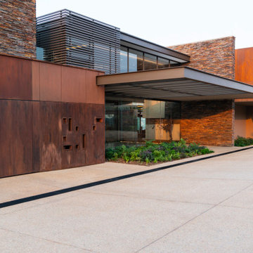
This home is approached from the north where it is completely transparent, but as the driveway curves around the west side it becomes a collection of stacked rusted boxes without any openings.
Due to the size of the site, the house could be stretched to extend to nearly 85m from east to west: The north elevation is totally glazed across the three storeys with deeply recessed glazing to create sun control.
The house is clad with natural stone and rusted steel panels framing openings in the façade. These materials speak to the taste of the client, as well as the environment.
The soil is composed of deep slate rock which had to be excavated and used for the gabion walls or crushed and covered with topsoil to create the garden. The sloping landscape was reduced to different terraces, creating a stepped landscape with a large retaining pond on the lowest level.
As the driveway curves around the house to the entrance on the south side, a transparent “canyon” opens, with views through the house to the hills, miles away. The rust colour is picked up by the gabion retaining walls that create a carport to the south of the home, while “Weathered”, a steel sculpture by Regardt van der Meulen, welcomes you at the front door.
On entering the double volume entrance hall, the view is across two water features, the first one part of the atrium at the core of the house, the other a large reflecting pond in the garden that doubles as a rainwater collection tank. Internally ribbed brass cladding is introduced to walls and ceilings, while several paintings by Santa van der Meulen complements the interiors.
Mooikloof Heights was designed in such a way that the feeling of indoor-outdoor living was prominent from almost every space in the house, lending itself to spectacular views. The style of open plan living Is evident throughout the house. The flow of the ground living and entertainment areas blend and combine into each other and create a connectedness throughout house.
The exposed steel beams, glass and stone cladding creates a symphony of textures combined with rusting steel walls and screed floors. The staircase cantilevers out of a massive stone wall with double storey glass to the west protected from the sun by steel louvres and an indigenous tree.
A few steps down you are presented with a choice of either the formal lounge or the informal family and dining room flowing out onto the lanai, while the open plan kitchen and breakfast room are just past the jacuzzi. Another sculpture by Regardt van der Meulen sits on a perch above the family room, staring across the double volume space.
The lanai is a vast space suited to the Highveld lifestyle, incorporating a bar/ barbeque, dining area and lounge, adjacent to the jacuzzi and pool.
The view from the whole house to the north is breath taking, covering the valley down to foot of the hill where Mooikloof Equestrian estate is situated and the whole hill across the extensive garden and the large reflecting pond.
On the opposite side of the hall is access to the garages (the other 4 garages have direct access to the kitchen area), a lift that connects the basement floor and first floor, and an executive study leading onto a massive roof garden over the guest wing. A large home theatre is situated to the south of the family room.
The guest wing can be reached via the lift or another cantilevered staircase and comprises three suites with a lounge area, all leading onto the lower garden.
Going up the main staircase you arrive at the pyjama lounge, with one bridge across the double volume family room leading to the main suite. The other runs across the double volume hall leading to two kid’s suites, while a third suite and the gym are situated to the south of the bridge leading to the main suite. The kid’s suite has an internal balcony with the wall facing the suite painted with a whimsical map of the world.
The main suite is a private sanctuary, flooded with north and east sun, and a fabulous dressing room and bathroom leading onto large balconies.
The home was designed by Nico and Werner van der Meulen of Nico van der Meulen Architects with interiors by their interior design company, M Square Lifestyle Design. Furniture and accessories were supplied by M Square Lifestyle Necessities.
View the VTour for Mooikloof Heights now: https://my.matterport.com/show/?m=ChPHjLYWUuf
View some of our other Contemporary Projects here >>> https://nicovdmeulen.com/contemporary/
Sponsored
Sunbury, OH

J.Holderby - Renovations
Franklin County's Leading General Contractors - 2X Best of Houzz!
 Katie Hutchison Studio
The new owners of this house in Harvard, Massachusetts loved its location and authentic Shaker characteristics, but weren’t fans of its curious layout. A dated first-floor full bathroom could only be accessed by going up a few steps to a landing, opening the bathroom door and then going down the same number of steps to enter the room. The dark kitchen faced the driveway to the north, rather than the bucolic backyard fields to the south. The dining space felt more like an enlarged hall and could only comfortably seat four. Upstairs, a den/office had a woefully low ceiling; the master bedroom had limited storage, and a sad full bathroom featured a cramped shower.
KHS proposed a number of changes to create an updated home where the owners could enjoy cooking, entertaining, and being connected to the outdoors from the first-floor living spaces, while also experiencing more inviting and more functional private spaces upstairs.
On the first floor, the primary change was to capture space that had been part of an upper-level screen porch and convert it to interior space. To make the interior expansion seamless, we raised the floor of the area that had been the upper-level porch, so it aligns with the main living level, and made sure there would be no soffits in the planes of the walls we removed. We also raised the floor of the remaining lower-level porch to reduce the number of steps required to circulate from it to the newly expanded interior. New patio door systems now fill the arched openings that used to be infilled with screen. The exterior interventions (which also included some new casement windows in the dining area) were designed to be subtle, while affording significant improvements on the interior. Additionally, the first-floor bathroom was reconfigured, shifting one of its walls to widen the dining space, and moving the entrance to the bathroom from the stair landing to the kitchen instead.
These changes (which involved significant structural interventions) resulted in a much more open space to accommodate a new kitchen with a view of the lush backyard and a new dining space defined by a new built-in banquette that comfortably seats six, and -- with the addition of a table extension -- up to eight people.
Upstairs in the den/office, replacing the low, board ceiling with a raised, plaster, tray ceiling that springs from above the original board-finish walls – newly painted a light color -- created a much more inviting, bright, and expansive space. Re-configuring the master bath to accommodate a larger shower and adding built-in storage cabinets in the master bedroom improved comfort and function. A new whole-house color palette rounds out the improvements.
Photos by Katie Hutchison
 Katie Hutchison Studio
The new owners of this house in Harvard, Massachusetts loved its location and authentic Shaker characteristics, but weren’t fans of its curious layout. A dated first-floor full bathroom could only be accessed by going up a few steps to a landing, opening the bathroom door and then going down the same number of steps to enter the room. The dark kitchen faced the driveway to the north, rather than the bucolic backyard fields to the south. The dining space felt more like an enlarged hall and could only comfortably seat four. Upstairs, a den/office had a woefully low ceiling; the master bedroom had limited storage, and a sad full bathroom featured a cramped shower.
KHS proposed a number of changes to create an updated home where the owners could enjoy cooking, entertaining, and being connected to the outdoors from the first-floor living spaces, while also experiencing more inviting and more functional private spaces upstairs.
On the first floor, the primary change was to capture space that had been part of an upper-level screen porch and convert it to interior space. To make the interior expansion seamless, we raised the floor of the area that had been the upper-level porch, so it aligns with the main living level, and made sure there would be no soffits in the planes of the walls we removed. We also raised the floor of the remaining lower-level porch to reduce the number of steps required to circulate from it to the newly expanded interior. New patio door systems now fill the arched openings that used to be infilled with screen. The exterior interventions (which also included some new casement windows in the dining area) were designed to be subtle, while affording significant improvements on the interior. Additionally, the first-floor bathroom was reconfigured, shifting one of its walls to widen the dining space, and moving the entrance to the bathroom from the stair landing to the kitchen instead.
These changes (which involved significant structural interventions) resulted in a much more open space to accommodate a new kitchen with a view of the lush backyard and a new dining space defined by a new built-in banquette that comfortably seats six, and -- with the addition of a table extension -- up to eight people.
Upstairs in the den/office, replacing the low, board ceiling with a raised, plaster, tray ceiling that springs from above the original board-finish walls – newly painted a light color -- created a much more inviting, bright, and expansive space. Re-configuring the master bath to accommodate a larger shower and adding built-in storage cabinets in the master bedroom improved comfort and function. A new whole-house color palette rounds out the improvements.
Photos by Katie Hutchison
 Katie Hutchison Studio
The new owners of this house in Harvard, Massachusetts loved its location and authentic Shaker characteristics, but weren’t fans of its curious layout. A dated first-floor full bathroom could only be accessed by going up a few steps to a landing, opening the bathroom door and then going down the same number of steps to enter the room. The dark kitchen faced the driveway to the north, rather than the bucolic backyard fields to the south. The dining space felt more like an enlarged hall and could only comfortably seat four. Upstairs, a den/office had a woefully low ceiling; the master bedroom had limited storage, and a sad full bathroom featured a cramped shower.
KHS proposed a number of changes to create an updated home where the owners could enjoy cooking, entertaining, and being connected to the outdoors from the first-floor living spaces, while also experiencing more inviting and more functional private spaces upstairs.
On the first floor, the primary change was to capture space that had been part of an upper-level screen porch and convert it to interior space. To make the interior expansion seamless, we raised the floor of the area that had been the upper-level porch, so it aligns with the main living level, and made sure there would be no soffits in the planes of the walls we removed. We also raised the floor of the remaining lower-level porch to reduce the number of steps required to circulate from it to the newly expanded interior. New patio door systems now fill the arched openings that used to be infilled with screen. The exterior interventions (which also included some new casement windows in the dining area) were designed to be subtle, while affording significant improvements on the interior. Additionally, the first-floor bathroom was reconfigured, shifting one of its walls to widen the dining space, and moving the entrance to the bathroom from the stair landing to the kitchen instead.
These changes (which involved significant structural interventions) resulted in a much more open space to accommodate a new kitchen with a view of the lush backyard and a new dining space defined by a new built-in banquette that comfortably seats six, and -- with the addition of a table extension -- up to eight people.
Upstairs in the den/office, replacing the low, board ceiling with a raised, plaster, tray ceiling that springs from above the original board-finish walls – newly painted a light color -- created a much more inviting, bright, and expansive space. Re-configuring the master bath to accommodate a larger shower and adding built-in storage cabinets in the master bedroom improved comfort and function. A new whole-house color palette rounds out the improvements.
Photos by Katie Hutchison
55