
Search results for "Reduce adam" in Home Design Ideas

 ONYX DESIGN COLLABORATIVE
Photography: Dana Hoff
Architecture and Interiors: Anderson Studio of Architecture & Design; Scott Anderson, Principal Architect/ Mark Moehring, Project Architect/ Adam Wilson, Associate Architect and Project Manager/ Ryan Smith, Associate Architect/ Michelle Suddeth, Director of Interiors/Emily Cox, Director of Interior Architecture/Anna Bett Moore, Designer & Procurement Expeditor/Gina Iacovelli, Design Assistant
Chair: Lee Industries, COM fabric
Lamp: Jana Bek Design
Fabric/Leather: Romo, Perennials, Lee Jofa, Edelman
Built-in Cushion/Panels: Jean's Custom Workroom
Desk: Hickory White
Rug: Designer Carpets


 Studio Dearborn
INTERNATIONAL AWARD WINNER. 2018 NKBA Design Competition Best Overall Kitchen. 2018 TIDA International USA Kitchen of the Year. 2018 Best Traditional Kitchen - Westchester Home Magazine design awards. The designer's own kitchen was gutted and renovated in 2017, with a focus on classic materials and thoughtful storage. The 1920s craftsman home has been in the family since 1940, and every effort was made to keep finishes and details true to the original construction. For sources, please see the website at www.studiodearborn.com. Photography, Adam Kane Macchia
Find the right local pro for your project

 Adam Gibson Design
The homeowners wanted to take advantage of induction cooking, but were hesitant because of their unfamiliarity. I suggested reducing their cooktop from 36” to 30” and adding a 15” gas cooktop. The jury’s still out as to whether they'll use the gas, as they've fallen in love with induction.
Photography ©2014 Adam Gibson



 TKS Design Group
Download our free ebook, Creating the Ideal Kitchen. DOWNLOAD NOW
This family from Wheaton was ready to remodel their kitchen, dining room and powder room. The project didn’t call for any structural or space planning changes but the makeover still had a massive impact on their home. The homeowners wanted to change their dated 1990’s brown speckled granite and light maple kitchen. They liked the welcoming feeling they got from the wood and warm tones in their current kitchen, but this style clashed with their vision of a deVOL type kitchen, a London-based furniture company. Their inspiration came from the country homes of the UK that mix the warmth of traditional detail with clean lines and modern updates.
To create their vision, we started with all new framed cabinets with a modified overlay painted in beautiful, understated colors. Our clients were adamant about “no white cabinets.” Instead we used an oyster color for the perimeter and a custom color match to a specific shade of green chosen by the homeowner. The use of a simple color pallet reduces the visual noise and allows the space to feel open and welcoming. We also painted the trim above the cabinets the same color to make the cabinets look taller. The room trim was painted a bright clean white to match the ceiling.
In true English fashion our clients are not coffee drinkers, but they LOVE tea. We created a tea station for them where they can prepare and serve tea. We added plenty of glass to showcase their tea mugs and adapted the cabinetry below to accommodate storage for their tea items. Function is also key for the English kitchen and the homeowners. They requested a deep farmhouse sink and a cabinet devoted to their heavy mixer because they bake a lot. We then got rid of the stovetop on the island and wall oven and replaced both of them with a range located against the far wall. This gives them plenty of space on the island to roll out dough and prepare any number of baked goods. We then removed the bifold pantry doors and created custom built-ins with plenty of usable storage for all their cooking and baking needs.
The client wanted a big change to the dining room but still wanted to use their own furniture and rug. We installed a toile-like wallpaper on the top half of the room and supported it with white wainscot paneling. We also changed out the light fixture, showing us once again that small changes can have a big impact.
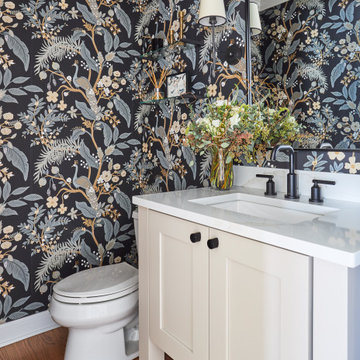
As the final touch, we also re-did the powder room to be in line with the rest of the first floor. We had the new vanity painted in the same oyster color as the kitchen cabinets and then covered the walls in a whimsical patterned wallpaper. Although the homeowners like subtle neutral colors they were willing to go a bit bold in the powder room for something unexpected. For more design inspiration go to: www.kitchenstudio-ge.com
 Studio Dearborn
A charming 1920s colonial had a dated dark kitchen that was not in keeping with the historic charm of the home. The owners, who adored British design, wanted a kitchen that was spacious and storage friendly, with the feel of a classic English kitchen. Designer Sarah Robertson of Studio Dearborn helped her client, while architect Greg Lewis redesigned the home to accommodate a larger kitchen, new primary bath, mudroom, and butlers pantry.
Photos Adam Macchia. For more information, you may visit our website at www.studiodearborn.com or email us at info@studiodearborn.com.
 TKS Design Group
Download our free ebook, Creating the Ideal Kitchen. DOWNLOAD NOW
This family from Wheaton was ready to remodel their kitchen, dining room and powder room. The project didn’t call for any structural or space planning changes but the makeover still had a massive impact on their home. The homeowners wanted to change their dated 1990’s brown speckled granite and light maple kitchen. They liked the welcoming feeling they got from the wood and warm tones in their current kitchen, but this style clashed with their vision of a deVOL type kitchen, a London-based furniture company. Their inspiration came from the country homes of the UK that mix the warmth of traditional detail with clean lines and modern updates.
To create their vision, we started with all new framed cabinets with a modified overlay painted in beautiful, understated colors. Our clients were adamant about “no white cabinets.” Instead we used an oyster color for the perimeter and a custom color match to a specific shade of green chosen by the homeowner. The use of a simple color pallet reduces the visual noise and allows the space to feel open and welcoming. We also painted the trim above the cabinets the same color to make the cabinets look taller. The room trim was painted a bright clean white to match the ceiling.
In true English fashion our clients are not coffee drinkers, but they LOVE tea. We created a tea station for them where they can prepare and serve tea. We added plenty of glass to showcase their tea mugs and adapted the cabinetry below to accommodate storage for their tea items. Function is also key for the English kitchen and the homeowners. They requested a deep farmhouse sink and a cabinet devoted to their heavy mixer because they bake a lot. We then got rid of the stovetop on the island and wall oven and replaced both of them with a range located against the far wall. This gives them plenty of space on the island to roll out dough and prepare any number of baked goods. We then removed the bifold pantry doors and created custom built-ins with plenty of usable storage for all their cooking and baking needs.
The client wanted a big change to the dining room but still wanted to use their own furniture and rug. We installed a toile-like wallpaper on the top half of the room and supported it with white wainscot paneling. We also changed out the light fixture, showing us once again that small changes can have a big impact.
As the final touch, we also re-did the powder room to be in line with the rest of the first floor. We had the new vanity painted in the same oyster color as the kitchen cabinets and then covered the walls in a whimsical patterned wallpaper. Although the homeowners like subtle neutral colors they were willing to go a bit bold in the powder room for something unexpected. For more design inspiration go to: www.kitchenstudio-ge.com

 NRC HOMES
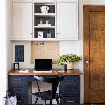
Contemporary furnishings bring the home office in this 1902 house into the twenty-first century. Architectural design by Board & Vellum. Photo by John G. Wilbanks.
 Studio Dearborn
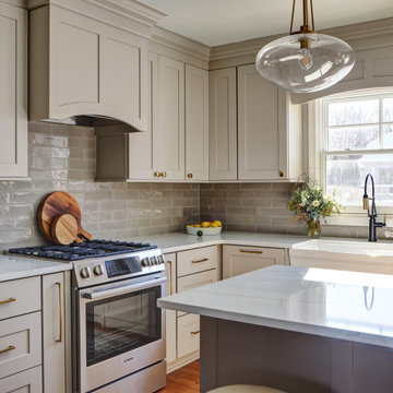
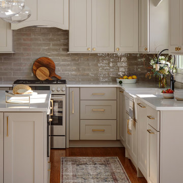
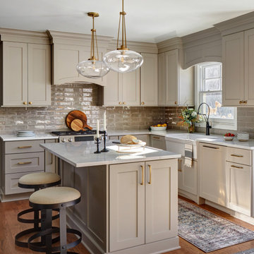
MULTIPLE AWARD WINNING KITCHEN. 2019 Westchester Home Design Awards Best Traditional Kitchen. KBDN magazine Award winner. Houzz Kitchen of the Week January 2019. Kitchen design and cabinetry – Studio Dearborn. This historic colonial in Edgemont NY was home in the 1930s and 40s to the world famous Walter Winchell, gossip commentator. The home underwent a 2 year gut renovation with an addition and relocation of the kitchen, along with other extensive renovations. Cabinetry by Studio Dearborn/Schrocks of Walnut Creek in Rockport Gray; Bluestar range; custom hood; Quartzmaster engineered quartz countertops; Rejuvenation Pendants; Waterstone faucet; Equipe subway tile; Foundryman hardware. Photos, Adam Kane Macchia.
 TKS Design Group
Download our free ebook, Creating the Ideal Kitchen. DOWNLOAD NOW
This family from Wheaton was ready to remodel their kitchen, dining room and powder room. The project didn’t call for any structural or space planning changes but the makeover still had a massive impact on their home. The homeowners wanted to change their dated 1990’s brown speckled granite and light maple kitchen. They liked the welcoming feeling they got from the wood and warm tones in their current kitchen, but this style clashed with their vision of a deVOL type kitchen, a London-based furniture company. Their inspiration came from the country homes of the UK that mix the warmth of traditional detail with clean lines and modern updates.
To create their vision, we started with all new framed cabinets with a modified overlay painted in beautiful, understated colors. Our clients were adamant about “no white cabinets.” Instead we used an oyster color for the perimeter and a custom color match to a specific shade of green chosen by the homeowner. The use of a simple color pallet reduces the visual noise and allows the space to feel open and welcoming. We also painted the trim above the cabinets the same color to make the cabinets look taller. The room trim was painted a bright clean white to match the ceiling.
In true English fashion our clients are not coffee drinkers, but they LOVE tea. We created a tea station for them where they can prepare and serve tea. We added plenty of glass to showcase their tea mugs and adapted the cabinetry below to accommodate storage for their tea items. Function is also key for the English kitchen and the homeowners. They requested a deep farmhouse sink and a cabinet devoted to their heavy mixer because they bake a lot. We then got rid of the stovetop on the island and wall oven and replaced both of them with a range located against the far wall. This gives them plenty of space on the island to roll out dough and prepare any number of baked goods. We then removed the bifold pantry doors and created custom built-ins with plenty of usable storage for all their cooking and baking needs.
The client wanted a big change to the dining room but still wanted to use their own furniture and rug. We installed a toile-like wallpaper on the top half of the room and supported it with white wainscot paneling. We also changed out the light fixture, showing us once again that small changes can have a big impact.
As the final touch, we also re-did the powder room to be in line with the rest of the first floor. We had the new vanity painted in the same oyster color as the kitchen cabinets and then covered the walls in a whimsical patterned wallpaper. Although the homeowners like subtle neutral colors they were willing to go a bit bold in the powder room for something unexpected. For more design inspiration go to: www.kitchenstudio-ge.com
 TKS Design Group
Download our free ebook, Creating the Ideal Kitchen. DOWNLOAD NOW
This family from Wheaton was ready to remodel their kitchen, dining room and powder room. The project didn’t call for any structural or space planning changes but the makeover still had a massive impact on their home. The homeowners wanted to change their dated 1990’s brown speckled granite and light maple kitchen. They liked the welcoming feeling they got from the wood and warm tones in their current kitchen, but this style clashed with their vision of a deVOL type kitchen, a London-based furniture company. Their inspiration came from the country homes of the UK that mix the warmth of traditional detail with clean lines and modern updates.
To create their vision, we started with all new framed cabinets with a modified overlay painted in beautiful, understated colors. Our clients were adamant about “no white cabinets.” Instead we used an oyster color for the perimeter and a custom color match to a specific shade of green chosen by the homeowner. The use of a simple color pallet reduces the visual noise and allows the space to feel open and welcoming. We also painted the trim above the cabinets the same color to make the cabinets look taller. The room trim was painted a bright clean white to match the ceiling.
In true English fashion our clients are not coffee drinkers, but they LOVE tea. We created a tea station for them where they can prepare and serve tea. We added plenty of glass to showcase their tea mugs and adapted the cabinetry below to accommodate storage for their tea items. Function is also key for the English kitchen and the homeowners. They requested a deep farmhouse sink and a cabinet devoted to their heavy mixer because they bake a lot. We then got rid of the stovetop on the island and wall oven and replaced both of them with a range located against the far wall. This gives them plenty of space on the island to roll out dough and prepare any number of baked goods. We then removed the bifold pantry doors and created custom built-ins with plenty of usable storage for all their cooking and baking needs.
The client wanted a big change to the dining room but still wanted to use their own furniture and rug. We installed a toile-like wallpaper on the top half of the room and supported it with white wainscot paneling. We also changed out the light fixture, showing us once again that small changes can have a big impact.
As the final touch, we also re-did the powder room to be in line with the rest of the first floor. We had the new vanity painted in the same oyster color as the kitchen cabinets and then covered the walls in a whimsical patterned wallpaper. Although the homeowners like subtle neutral colors they were willing to go a bit bold in the powder room for something unexpected. For more design inspiration go to: www.kitchenstudio-ge.com

 Kelly Scanlon Interior Design
a 1916 Craftsman in Oakland, CA gets new life. A complete overhaul of the original space while preserving all of the original detail in the casework and flooring. Overhead lighting (LED!) enhances the homeowners beautiful art collection, custom sized furniture provides increased seating and loads of texture and warmth, reducing any clutter. While remodeling the fireplace and adding period appropriate mantle detail, original windows were revealed, bringing more natural light into this illuminated living/family room.
Scott Hargis Photo

 Constantine Design Group, Inc.
This early 20th century Indianapolis, IN basement remodel was in desperate need of help. The original and still operating hydronic radiant heating system had its plumbing configured without regard to any other use of the space. Fearful of harming the aged system and the high cost of doing so, these Clients were adamant that the existing system remain intact. Architect Lee Constantine developed a design that maintained the existing heating system while creating "niches" around the perimeter that would conceal the unsightly plumbing. Additionally, by removing free-standing structural supporting posts, amore flexible and inviting space was achieved. Because of an already low ceiling condition, the floor-ceiling structure above was kept exposed, painted and highlighted with indirect lighting to avoid further reducing the ceiling height. Constantine incorporated "clouds" on this ceiling to conceal certain existing components that either were cost prohibitive to relocate or couldn't be relocated. These "clouds"become a "visual element" through their geometry and hidden "indirect" light source rather than an undesirable complication. Now this family entertains frequently in the basement and reports "it doesn't feel like we're in a basement anymore"

 Pacific Stoneworks Inc
Floor to ceiling fireplace face made from Calacatta Statuario marble with polished finish and mitered edges. Pacific Stoneworks, Inc. Proudly serving Santa Barbara & Ventura Counties since 1994.
 Studio Dearborn
MULTIPLE AWARD WINNING KITCHEN. 2019 Westchester Home Design Awards Best Traditional Kitchen. Another 2019 Award Soon to be Announced. Houzz Kitchen of the Week January 2019. Kitchen design and cabinetry – Studio Dearborn. This historic colonial in Edgemont NY was home in the 1930s and 40s to the world famous Walter Winchell, gossip commentator. The home underwent a 2 year gut renovation with an addition and relocation of the kitchen, along with other extensive renovations. Cabinetry by Studio Dearborn/Schrocks of Walnut Creek in Rockport Gray; Bluestar range; custom hood; Quartzmaster engineered quartz countertops; Rejuvenation Pendants; Waterstone faucet; Equipe subway tile; Foundryman hardware. Photos, Adam Kane Macchia.

 ELEVATIONS | Design Solutions by Myers
Visit Our Showroom
8000 Locust Mill St.
Ellicott City, MD 21043
Signature Serenity Series Adams door w/ full-lite s/l’s and half-round transom, Sapele, Brass Caming
Sapele, Knotty Alder, Oak and Pine
Custom door & glass designs available
Sturdy glue and dowel construction
Engineered stile and rail core to reduce twist and bow
Doors feature 6 3/8″ stiles
Raised molding and panel profile
Panels are engineered back to back to inhibit splitting and allow independent movement for expansion or contraction
Pre-hung units
CNC routed hardware preps for precision fit on hinges, mortise and multipoint lock systems
Panels are 2-piece, back to back to allow for expansion between interior & exterior
Glass is siliconed to door openings, allowing it to “float” while maintaining a weather tight seal
One year door warranty. For more details, please visit
Thickness: 1 3/4″
Door Widths: 2’8″, 3’0″
Side-lite Widths: 1’0″, 1’2″
Door Heights: 6’8″, 8’0″
Panels: 1 3/8″ Raised profile
Glass: 1″ I.G.

 INSPIRED KITCHEN DESIGN
One of the most impressive parts of the kitchen is that Adam installed it himself – even though he admits that initially the idea was daunting.
“When we found that IKEA cabinets might be a fit for our project, we took a trip to our closest IKEA to look at their cabinets. We found the choices both amazing and overwhelming,” he says.“We also felt that we could not renovate our kitchen by just using the IKEA design tool.We were looking to get some help on optimizing the space. A Google search brought IKD up as the option that best fit what our needs were – so we started working with IKD.”
Calling the design process with IKD “a breeze” Adam decided to take the next several months to research how to install the kitchen.
“We visited IKEA again to better understand how the cabinets were put together. I’m glad that I really focused on the IKEA kitchen installation guide at the beginning of the installation to help get my rails installed properly and to really speed up putting the cabinets onto the wall,” he adds.
He also points out that he got lucky as the BODBYN cabinet fronts were on sale when he was ready to purchase – making the cabinetry a cost effective choice as well.
He concludes: “We were really attracted to that fact that we could reduce our kitchen’s cost by installing it ourselves. Doing this required watching a number of YouTube videos and reading numerous articles on how to do it as well as having smaller scale home improvement projects to have the skillset necessary to do the work.”
 McAdams Remodeling & Design
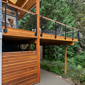
The homeowners wanted an updated aesthetic for their deck, and they wanted a portion of it to be under cover. They also wanted a heating option so that it could be used year-round regardless of the weather. Since the deck is immediately outside of their kitchen nook, it was also important to them that the new covering allow light to continue to come into the house. In addition, they wanted the option to access the backyard from the deck. Beyond that, there was a desire to connect the front and back yards underneath the deck, and to provide a privacy structure for their garbage and recycling cans while maintaining the secluded feel their wooded lot provides. The new deck design added six feet to the overall size, which allowed us to provide a covered area that included heaters and lighting for the darker, colder months without reducing the overall usable space. The couple selected an aluminum railing with stainless steel cables to complement the IPE decking. The back stairs featured ironwood rails and IPE boards on the horizontal sections to complement the concrete stairs and offer an industrial vibe. The railings are lit with LED strip lighting throughout, and disc lights were installed on either side of the concrete stairs to ensure safety at night.
1