
Search results for "Reduce modify" in Home Design Ideas

 AirField Systems, LLC
Robert Trent Jones Golf Club installs AirField Systems AirDrain.
The AirField Systems AirDrain for Golf Greens installed at Robert Trent Jones, home of The President’s Cup, continues to perform since 2004. Stronger roots, healthier turf, superior drainage and the ability to make it’s own nearly perfect perched water table without organics make AirDrain Golf Greens by AirField the choice of the most discriminating golf course architects, designers, owners and superintendents – and the savings in time, installation and maintenance make it the choice for everyone. View AirDrain Golf Greens in action after years of use at one of the most prestigious courses on the east coast.
Thru a research project conducted at Texas A&M, it was concluded that you can reduce your irrigation needs using AirField Systems AirDrain. The five year research project was jointly funded by the United States Golf Association and AirField Systems and was a collaborative effort between Texas A&M, AirField Systems and the United States Golf Association. The data from the research showed that the AirField Systems drainage profile provided between one to three more days of plant available water than a United States Golf Association recommended gravel and sand profile.
In addition, AirDrain by AirField Systems can significantly save on installation time because much less excavation is required compared to the traditional gravel drainage layers that have a much deeper profile. AirDrain arrives on site in 53” trailers, palletized and ready for install. Unlike gravel drainage, with AirDrain there is no need for heavy dump trucks that can compact your golf course.
Benefits of an AirField System Design for Golf Greens include:
1 to 3 more days of plant available water stored in the root zone (depending on climate)
Significantly reduces daily irrigation needs (as told to us by our customers)
Healthier turf / Stronger root system (as told to us by our customers)
100% Vertical Drainage under the entire playing surface
AirDrain is a 100% recycled copolymer with the impact modifier “metallocene” qualifying it as a “No Break” plastic
Helps eliminate standing water / Simplifies maintenance (as told to us by our customers)
Minimal site disturbance / Far less excavation and disposal
Several Installation days are saved over a gravel installation
Compact shipping that reduces overall storage and transportation costs
An AirDrain System sand profile creates its own perched water table without peat moss or clay
AirDrain’s sand profile and minimal organics puts it at very little risk for issues of mold or disease
http://www.rtjgc.com/Club/Scripts/Home/home.asp
 AirField Systems, LLC
Robert Trent Jones Golf Club installs AirField Systems AirDrain.
The AirField Systems AirDrain for Golf Greens installed at Robert Trent Jones, home of The President’s Cup, continues to perform since 2004. Stronger roots, healthier turf, superior drainage and the ability to make it’s own nearly perfect perched water table without organics make AirDrain Golf Greens by AirField the choice of the most discriminating golf course architects, designers, owners and superintendents – and the savings in time, installation and maintenance make it the choice for everyone. View AirDrain Golf Greens in action after years of use at one of the most prestigious courses on the east coast.
Thru a research project conducted at Texas A&M, it was concluded that you can reduce your irrigation needs using AirField Systems AirDrain. The five year research project was jointly funded by the United States Golf Association and AirField Systems and was a collaborative effort between Texas A&M, AirField Systems and the United States Golf Association. The data from the research showed that the AirField Systems drainage profile provided between one to three more days of plant available water than a United States Golf Association recommended gravel and sand profile.
In addition, AirDrain by AirField Systems can significantly save on installation time because much less excavation is required compared to the traditional gravel drainage layers that have a much deeper profile. AirDrain arrives on site in 53” trailers, palletized and ready for install. Unlike gravel drainage, with AirDrain there is no need for heavy dump trucks that can compact your golf course.
Benefits of an AirField System Design for Golf Greens include:
1 to 3 more days of plant available water stored in the root zone (depending on climate)
Significantly reduces daily irrigation needs (as told to us by our customers)
Healthier turf / Stronger root system (as told to us by our customers)
100% Vertical Drainage under the entire playing surface
AirDrain is a 100% recycled copolymer with the impact modifier “metallocene” qualifying it as a “No Break” plastic
Helps eliminate standing water / Simplifies maintenance (as told to us by our customers)
Minimal site disturbance / Far less excavation and disposal
Several Installation days are saved over a gravel installation
Compact shipping that reduces overall storage and transportation costs
An AirDrain System sand profile creates its own perched water table without peat moss or clay
AirDrain’s sand profile and minimal organics puts it at very little risk for issues of mold or disease
http://www.rtjgc.com/Club/Scripts/Home/home.asp

 Zelaya Properties LLC
We used: Custom cherry cabinetry in Arts & Crafts Shaker style by Kabinart in Boulder and Espresso stains. Liberty Hardware Venetian bronze 1-1/2" cabinet knobs. KitchenAid Architect II Series 22 CF counter-depth French door refrigerator. KitchenAid Architect Series II 27" convection single wall oven. KitchenAid 36" 6-burner dual fuel freestanding commercial-style range. KitchenAid Architect II Series 24" dishwasher. Sharp Insight Pro Series 24" built-in microwave drawer (Model #KB6524PS). Crystorama Solaris 12" wide pendant lights in English bronze. Granite countertops in Brown Fantasy. 3"x6" polished marble backsplash.
Paint colors:
Walls: Glidden Silver Cloud 30YY 63/024
Ceilings/Trims/Doors: Glidden Swan White GLC23
Robert B. Narod Photography
Find the right local pro for your project

 River Valley Landscapes
Blending contemporary forms and lush plantings, this Garden maximizes the sensory experience of the materials and planting from inside and outside the home. The garden occupies an interior courtyard framed by four interior walls. The home, designed by Architect Cliff May was built in 1948 and the following year was featured in House Beautiful Magazine. The clients list of needs and desires was brief. They wanted a space that would complement the mid century modern home and provide visual interest from inside the home. Some form of water was also requested. They had a budget of $30,000. In order to stay within their budget the clients performed the demolition of the old garden. The designer’s intent was to create a garden that would possess a clear sculptural quality and would be as visually striking from inside the home as it would be from inside the courtyard. The strategy behind the design was to use hardscape materials characterized by simple geometric forms and a planting palette that would emphasize form over color, and then to arrange the materials to achieve an interpretation of modern aesthetic.
The views from inside the homes three main living rooms present the garden as a graphic composition of space, hardscape materials and planting. Inside the courtyard the edges are defined by stone and planting. The floor is composed of rectangular slabs of Teakwood flagstone with a counterpoint of Mexican beach pebbles set within the joints and around the edges. Concrete along the edges of the Teakwood pads reduces migration of the modified stone and sand base. The contrast of the Mexican beach pebbles accentuates the pattern of the flagstone. The outside perimeter of the pebbles is contained with low profile edging. An existing catch drain was utilized for storm water runoff. A concrete block pier set on a concrete footing is covered with black stucco and provides a perch for a custom made copper bowl that circulates water into the L shaped water feature. The water features subterranean basin is constructed of pressure treated wood with a custom box liner insert. Since the Teakwood flagstone was unavailable as coping for the water feature, the designer chose Shawnee Buff stone to complement the Teakwood flagstone. The subtle sound of water spilling from the copper bowl and the reflective qualities of the water help to create an atmosphere of relaxation. The planting is composed of shades of green with white flowers in order to accentuate the graphic design. ‘Justin Brouwer’ Boxwood, ‘Sum and Substance’ Hosta, white Anemones, black bamboo and ornamental grasses contrast dramatically with the clean lines of the hardscape elements. The black bamboo is set in 30” diameter concrete containers to control the vigorous plant from spreading.
The construction of the interior courtyard space challenged the building team. They set up baffles between the front door and the door to the courtyard as well as temporary protection over the floor to allow the process to move forward without too much disturbance to the client’s lives. All of the materials were shuffled through the temporary portal.
The clients love the space and recently said that “the design is so well thought out and simple that they would never get tired of it.” The designs sculptural quality compliments the modern feel of the home and creates a sublime yet dramatic view from within the house or within the courtyard. The clients plan to purchase two black Bertoia Diamond chairs with red cushions which should perfectly integrate with the space.
 Hammersmith Structures
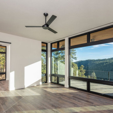
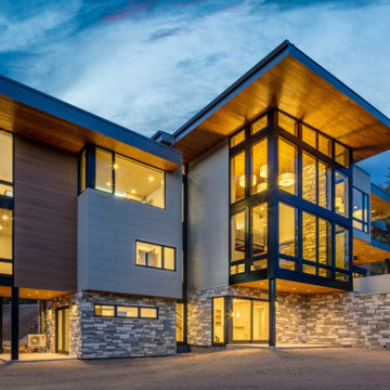
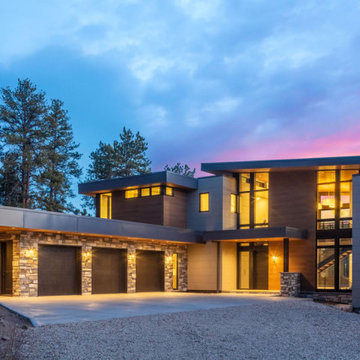
Nestled into the side of a mountain in the foothills west of Fort Collins CO, this home gives mountain views a whole new meaning.
To achieve the homeowners’ desire for floor-to-ceiling windows in just about every room, we started by constructing a steel superstructure anchored to the granite bedrock. And then we basically filled it with wood and windows.
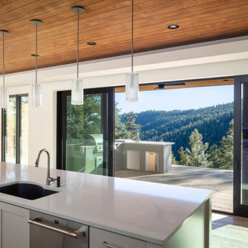
Speaking of windows, huge sliding windows open up the kitchen to the covered outdoor kitchen, blurring the lines between indoors and out. Upstairs, the observation deck accesses the same view, only from above the pines.
On the practical side, the exterior and interior wood lap and tile siding, with local stone accents, are both Nichiha brand products made from fiber cement. Nichiha siding is both fire resistant and weather resistant to give the homeowners peace of mind in the Colorado Front Range’s dry, sometimes challenging, climate.
Similarly, the tongue-and-groove ceiling and soffit woodwork is Pakari, a wood product made by thermally modifying (i.e., baking) wood to make it more durable and fire resistant as well.
The ballasted roof, accented by custom metal facia and built to handle the load from wet spring snows, also reduces the opportunity for flying embers to snag should a wildfire erupt near the home.
This grand home isn’t without comforts, either. In-floor radiant heat keeps it toasty when it’s chilly out, and an EPA-approved wood-burning fireplace provides warmth and ambiance without nasty emissions. A full home automation system senses motion and turns on the lights as one progresses from room to room. And the two home offices make use of custom built-in desks and storage to frame the view. Who needs artwork?

 Moderne Builders
Gorgeous master bath with dramatic retro "wave" tile. Peak Photography
Example of a 1950s bathroom design in Los Angeles
Example of a 1950s bathroom design in Los Angeles
 Hammersmith Structures
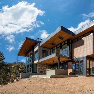
Nestled into the side of a mountain in the foothills west of Fort Collins CO, this home gives mountain views a whole new meaning.
To achieve the homeowners’ desire for floor-to-ceiling windows in just about every room, we started by constructing a steel superstructure anchored to the granite bedrock. And then we basically filled it with wood and windows.
Speaking of windows, huge sliding windows open up the kitchen to the covered outdoor kitchen, blurring the lines between indoors and out. Upstairs, the observation deck accesses the same view, only from above the pines.
On the practical side, the exterior and interior wood lap and tile siding, with local stone accents, are both Nichiha brand products made from fiber cement. Nichiha siding is both fire resistant and weather resistant to give the homeowners peace of mind in the Colorado Front Range’s dry, sometimes challenging, climate.
Similarly, the tongue-and-groove ceiling and soffit woodwork is Pakari, a wood product made by thermally modifying (i.e., baking) wood to make it more durable and fire resistant as well.
The ballasted roof, accented by custom metal facia and built to handle the load from wet spring snows, also reduces the opportunity for flying embers to snag should a wildfire erupt near the home.
This grand home isn’t without comforts, either. In-floor radiant heat keeps it toasty when it’s chilly out, and an EPA-approved wood-burning fireplace provides warmth and ambiance without nasty emissions. A full home automation system senses motion and turns on the lights as one progresses from room to room. And the two home offices make use of custom built-in desks and storage to frame the view. Who needs artwork?
 Hammersmith Structures
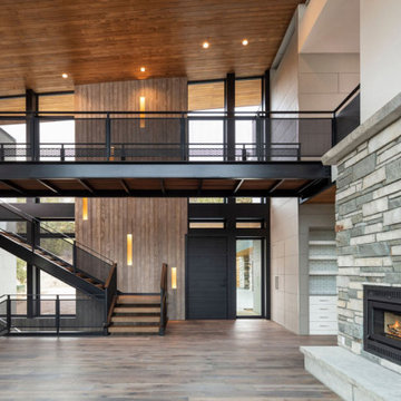
Nestled into the side of a mountain in the foothills west of Fort Collins CO, this home gives mountain views a whole new meaning.
To achieve the homeowners’ desire for floor-to-ceiling windows in just about every room, we started by constructing a steel superstructure anchored to the granite bedrock. And then we basically filled it with wood and windows.
Speaking of windows, huge sliding windows open up the kitchen to the covered outdoor kitchen, blurring the lines between indoors and out. Upstairs, the observation deck accesses the same view, only from above the pines.
On the practical side, the exterior and interior wood lap and tile siding, with local stone accents, are both Nichiha brand products made from fiber cement. Nichiha siding is both fire resistant and weather resistant to give the homeowners peace of mind in the Colorado Front Range’s dry, sometimes challenging, climate.
Similarly, the tongue-and-groove ceiling and soffit woodwork is Pakari, a wood product made by thermally modifying (i.e., baking) wood to make it more durable and fire resistant as well.
The ballasted roof, accented by custom metal facia and built to handle the load from wet spring snows, also reduces the opportunity for flying embers to snag should a wildfire erupt near the home.
This grand home isn’t without comforts, either. In-floor radiant heat keeps it toasty when it’s chilly out, and an EPA-approved wood-burning fireplace provides warmth and ambiance without nasty emissions. A full home automation system senses motion and turns on the lights as one progresses from room to room. And the two home offices make use of custom built-in desks and storage to frame the view. Who needs artwork?
 TKS Design Group
Download our free ebook, Creating the Ideal Kitchen. DOWNLOAD NOW
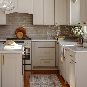
This family from Wheaton was ready to remodel their kitchen, dining room and powder room. The project didn’t call for any structural or space planning changes but the makeover still had a massive impact on their home. The homeowners wanted to change their dated 1990’s brown speckled granite and light maple kitchen. They liked the welcoming feeling they got from the wood and warm tones in their current kitchen, but this style clashed with their vision of a deVOL type kitchen, a London-based furniture company. Their inspiration came from the country homes of the UK that mix the warmth of traditional detail with clean lines and modern updates.
To create their vision, we started with all new framed cabinets with a modified overlay painted in beautiful, understated colors. Our clients were adamant about “no white cabinets.” Instead we used an oyster color for the perimeter and a custom color match to a specific shade of green chosen by the homeowner. The use of a simple color pallet reduces the visual noise and allows the space to feel open and welcoming. We also painted the trim above the cabinets the same color to make the cabinets look taller. The room trim was painted a bright clean white to match the ceiling.
In true English fashion our clients are not coffee drinkers, but they LOVE tea. We created a tea station for them where they can prepare and serve tea. We added plenty of glass to showcase their tea mugs and adapted the cabinetry below to accommodate storage for their tea items. Function is also key for the English kitchen and the homeowners. They requested a deep farmhouse sink and a cabinet devoted to their heavy mixer because they bake a lot. We then got rid of the stovetop on the island and wall oven and replaced both of them with a range located against the far wall. This gives them plenty of space on the island to roll out dough and prepare any number of baked goods. We then removed the bifold pantry doors and created custom built-ins with plenty of usable storage for all their cooking and baking needs.
The client wanted a big change to the dining room but still wanted to use their own furniture and rug. We installed a toile-like wallpaper on the top half of the room and supported it with white wainscot paneling. We also changed out the light fixture, showing us once again that small changes can have a big impact.
As the final touch, we also re-did the powder room to be in line with the rest of the first floor. We had the new vanity painted in the same oyster color as the kitchen cabinets and then covered the walls in a whimsical patterned wallpaper. Although the homeowners like subtle neutral colors they were willing to go a bit bold in the powder room for something unexpected. For more design inspiration go to: www.kitchenstudio-ge.com
 Hammersmith Structures
Nestled into the side of a mountain in the foothills west of Fort Collins CO, this home gives mountain views a whole new meaning.
To achieve the homeowners’ desire for floor-to-ceiling windows in just about every room, we started by constructing a steel superstructure anchored to the granite bedrock. And then we basically filled it with wood and windows.
Speaking of windows, huge sliding windows open up the kitchen to the covered outdoor kitchen, blurring the lines between indoors and out. Upstairs, the observation deck accesses the same view, only from above the pines.
On the practical side, the exterior and interior wood lap and tile siding, with local stone accents, are both Nichiha brand products made from fiber cement. Nichiha siding is both fire resistant and weather resistant to give the homeowners peace of mind in the Colorado Front Range’s dry, sometimes challenging, climate.
Similarly, the tongue-and-groove ceiling and soffit woodwork is Pakari, a wood product made by thermally modifying (i.e., baking) wood to make it more durable and fire resistant as well.
The ballasted roof, accented by custom metal facia and built to handle the load from wet spring snows, also reduces the opportunity for flying embers to snag should a wildfire erupt near the home.
This grand home isn’t without comforts, either. In-floor radiant heat keeps it toasty when it’s chilly out, and an EPA-approved wood-burning fireplace provides warmth and ambiance without nasty emissions. A full home automation system senses motion and turns on the lights as one progresses from room to room. And the two home offices make use of custom built-in desks and storage to frame the view. Who needs artwork?
 RemodelWest
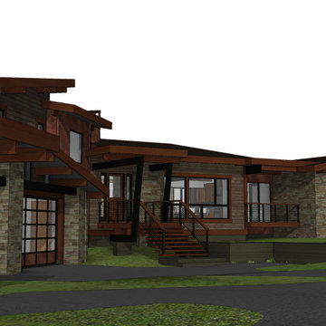
Lot 435 on Deer Trail offered our design team an opportunity to take our signature Mountain Modern architectural style floor plan as lot 178 and modify it to our clients desires and unique lot characteristics. This customization began with a preference to give the master suite its own retreat like setting isolated from the main home. Tailored to the slight slope of the lot our architectural staff nestled a large oversized two car garage, shop and office below the master suite. This sensitivity to the lot orientations differentiates our approach from a more conventional approach which often places the same exact home design on different lots within the community. The result is a home tailored to the site reducing the overall mass. Steel, wood and stone exterior materials balance practicality with aesthetics while keeping cost in mind.
A guest home adjacent to the garage is also carefully designed and situated to honor the main home while maintaining privacy for our clients. Similar architectural elements and materials fostered a harmony between the two structures. The main home is a tad over 3000sft plus the garage with the guest home in the 800 sft range. Currently in design development the plan is to break ground Spring of 2021.
Bill Reid and the Team of Reid Residential coupled with the Bills construction firm RemodelWest offer complete design-build packages for those desiring to escape to one of the best kept secrets in the Sierra-Nevada Mountains.
 Hammersmith Structures
Nestled into the side of a mountain in the foothills west of Fort Collins CO, this home gives mountain views a whole new meaning.
To achieve the homeowners’ desire for floor-to-ceiling windows in just about every room, we started by constructing a steel superstructure anchored to the granite bedrock. And then we basically filled it with wood and windows.
Speaking of windows, huge sliding windows open up the kitchen to the covered outdoor kitchen, blurring the lines between indoors and out. Upstairs, the observation deck accesses the same view, only from above the pines.
On the practical side, the exterior and interior wood lap and tile siding, with local stone accents, are both Nichiha brand products made from fiber cement. Nichiha siding is both fire resistant and weather resistant to give the homeowners peace of mind in the Colorado Front Range’s dry, sometimes challenging, climate.
Similarly, the tongue-and-groove ceiling and soffit woodwork is Pakari, a wood product made by thermally modifying (i.e., baking) wood to make it more durable and fire resistant as well.
The ballasted roof, accented by custom metal facia and built to handle the load from wet spring snows, also reduces the opportunity for flying embers to snag should a wildfire erupt near the home.
This grand home isn’t without comforts, either. In-floor radiant heat keeps it toasty when it’s chilly out, and an EPA-approved wood-burning fireplace provides warmth and ambiance without nasty emissions. A full home automation system senses motion and turns on the lights as one progresses from room to room. And the two home offices make use of custom built-in desks and storage to frame the view. Who needs artwork?
 Hammersmith Structures
Nestled into the side of a mountain in the foothills west of Fort Collins CO, this home gives mountain views a whole new meaning.
To achieve the homeowners’ desire for floor-to-ceiling windows in just about every room, we started by constructing a steel superstructure anchored to the granite bedrock. And then we basically filled it with wood and windows.
Speaking of windows, huge sliding windows open up the kitchen to the covered outdoor kitchen, blurring the lines between indoors and out. Upstairs, the observation deck accesses the same view, only from above the pines.
On the practical side, the exterior and interior wood lap and tile siding, with local stone accents, are both Nichiha brand products made from fiber cement. Nichiha siding is both fire resistant and weather resistant to give the homeowners peace of mind in the Colorado Front Range’s dry, sometimes challenging, climate.
Similarly, the tongue-and-groove ceiling and soffit woodwork is Pakari, a wood product made by thermally modifying (i.e., baking) wood to make it more durable and fire resistant as well.
The ballasted roof, accented by custom metal facia and built to handle the load from wet spring snows, also reduces the opportunity for flying embers to snag should a wildfire erupt near the home.
This grand home isn’t without comforts, either. In-floor radiant heat keeps it toasty when it’s chilly out, and an EPA-approved wood-burning fireplace provides warmth and ambiance without nasty emissions. A full home automation system senses motion and turns on the lights as one progresses from room to room. And the two home offices make use of custom built-in desks and storage to frame the view. Who needs artwork?
 TKS Design Group
Download our free ebook, Creating the Ideal Kitchen. DOWNLOAD NOW
This family from Wheaton was ready to remodel their kitchen, dining room and powder room. The project didn’t call for any structural or space planning changes but the makeover still had a massive impact on their home. The homeowners wanted to change their dated 1990’s brown speckled granite and light maple kitchen. They liked the welcoming feeling they got from the wood and warm tones in their current kitchen, but this style clashed with their vision of a deVOL type kitchen, a London-based furniture company. Their inspiration came from the country homes of the UK that mix the warmth of traditional detail with clean lines and modern updates.
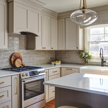
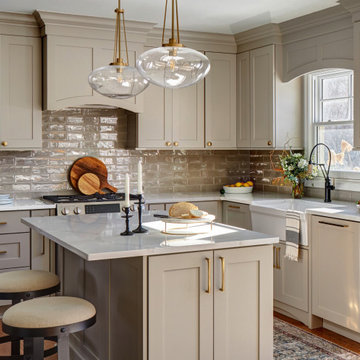
To create their vision, we started with all new framed cabinets with a modified overlay painted in beautiful, understated colors. Our clients were adamant about “no white cabinets.” Instead we used an oyster color for the perimeter and a custom color match to a specific shade of green chosen by the homeowner. The use of a simple color pallet reduces the visual noise and allows the space to feel open and welcoming. We also painted the trim above the cabinets the same color to make the cabinets look taller. The room trim was painted a bright clean white to match the ceiling.
In true English fashion our clients are not coffee drinkers, but they LOVE tea. We created a tea station for them where they can prepare and serve tea. We added plenty of glass to showcase their tea mugs and adapted the cabinetry below to accommodate storage for their tea items. Function is also key for the English kitchen and the homeowners. They requested a deep farmhouse sink and a cabinet devoted to their heavy mixer because they bake a lot. We then got rid of the stovetop on the island and wall oven and replaced both of them with a range located against the far wall. This gives them plenty of space on the island to roll out dough and prepare any number of baked goods. We then removed the bifold pantry doors and created custom built-ins with plenty of usable storage for all their cooking and baking needs.
The client wanted a big change to the dining room but still wanted to use their own furniture and rug. We installed a toile-like wallpaper on the top half of the room and supported it with white wainscot paneling. We also changed out the light fixture, showing us once again that small changes can have a big impact.
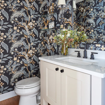
As the final touch, we also re-did the powder room to be in line with the rest of the first floor. We had the new vanity painted in the same oyster color as the kitchen cabinets and then covered the walls in a whimsical patterned wallpaper. Although the homeowners like subtle neutral colors they were willing to go a bit bold in the powder room for something unexpected. For more design inspiration go to: www.kitchenstudio-ge.com
 TKS Design Group
Download our free ebook, Creating the Ideal Kitchen. DOWNLOAD NOW
This family from Wheaton was ready to remodel their kitchen, dining room and powder room. The project didn’t call for any structural or space planning changes but the makeover still had a massive impact on their home. The homeowners wanted to change their dated 1990’s brown speckled granite and light maple kitchen. They liked the welcoming feeling they got from the wood and warm tones in their current kitchen, but this style clashed with their vision of a deVOL type kitchen, a London-based furniture company. Their inspiration came from the country homes of the UK that mix the warmth of traditional detail with clean lines and modern updates.
To create their vision, we started with all new framed cabinets with a modified overlay painted in beautiful, understated colors. Our clients were adamant about “no white cabinets.” Instead we used an oyster color for the perimeter and a custom color match to a specific shade of green chosen by the homeowner. The use of a simple color pallet reduces the visual noise and allows the space to feel open and welcoming. We also painted the trim above the cabinets the same color to make the cabinets look taller. The room trim was painted a bright clean white to match the ceiling.
In true English fashion our clients are not coffee drinkers, but they LOVE tea. We created a tea station for them where they can prepare and serve tea. We added plenty of glass to showcase their tea mugs and adapted the cabinetry below to accommodate storage for their tea items. Function is also key for the English kitchen and the homeowners. They requested a deep farmhouse sink and a cabinet devoted to their heavy mixer because they bake a lot. We then got rid of the stovetop on the island and wall oven and replaced both of them with a range located against the far wall. This gives them plenty of space on the island to roll out dough and prepare any number of baked goods. We then removed the bifold pantry doors and created custom built-ins with plenty of usable storage for all their cooking and baking needs.
The client wanted a big change to the dining room but still wanted to use their own furniture and rug. We installed a toile-like wallpaper on the top half of the room and supported it with white wainscot paneling. We also changed out the light fixture, showing us once again that small changes can have a big impact.
As the final touch, we also re-did the powder room to be in line with the rest of the first floor. We had the new vanity painted in the same oyster color as the kitchen cabinets and then covered the walls in a whimsical patterned wallpaper. Although the homeowners like subtle neutral colors they were willing to go a bit bold in the powder room for something unexpected. For more design inspiration go to: www.kitchenstudio-ge.com
 River Valley Landscapes
After - Blending contemporary forms and lush plantings, this Garden maximizes the sensory experience of the materials and planting from inside and outside the home. The garden occupies an interior courtyard framed by four interior walls. The home, designed by Architect Cliff May was built in 1948 and the following year was featured in House Beautiful Magazine. The clients list of needs and desires was brief. They wanted a space that would complement the mid century modern home and provide visual interest from inside the home. Some form of water was also requested. They had a budget of $30,000. In order to stay within their budget the clients performed the demolition of the old garden. The designer’s intent was to create a garden that would possess a clear sculptural quality and would be as visually striking from inside the home as it would be from inside the courtyard. The strategy behind the design was to use hardscape materials characterized by simple geometric forms and a planting palette that would emphasize form over color, and then to arrange the materials to achieve an interpretation of modern aesthetic.
The views from inside the homes three main living rooms present the garden as a graphic composition of space, hardscape materials and planting. Inside the courtyard the edges are defined by stone and planting. The floor is composed of rectangular slabs of Teakwood flagstone with a counterpoint of Mexican beach pebbles set within the joints and around the edges. Concrete along the edges of the Teakwood pads reduces migration of the modified stone and sand base. The contrast of the Mexican beach pebbles accentuates the pattern of the flagstone. The outside perimeter of the pebbles is contained with low profile edging. An existing catch drain was utilized for storm water runoff. A concrete block pier set on a concrete footing is covered with black stucco and provides a perch for a custom made copper bowl that circulates water into the L shaped water feature. The water features subterranean basin is constructed of pressure treated wood with a custom box liner insert. Since the Teakwood flagstone was unavailable as coping for the water feature, the designer chose Shawnee Buff stone to complement the Teakwood flagstone. The subtle sound of water spilling from the copper bowl and the reflective qualities of the water help to create an atmosphere of relaxation. The planting is composed of shades of green with white flowers in order to accentuate the graphic design. ‘Justin Brouwer’ Boxwood, ‘Sum and Substance’ Hosta, white Anemones, black bamboo and ornamental grasses contrast dramatically with the clean lines of the hardscape elements. The black bamboo is set in 30” diameter concrete containers to control the vigorous plant from spreading.
The construction of the interior courtyard space challenged the building team. They set up baffles between the front door and the door to the courtyard as well as temporary protection over the floor to allow the process to move forward without too much disturbance to the client’s lives. All of the materials were shuffled through the temporary portal.
The clients love the space and recently said that “the design is so well thought out and simple that they would never get tired of it.” The designs sculptural quality compliments the modern feel of the home and creates a sublime yet dramatic view from within the house or within the courtyard. The clients plan to purchase two black Bertoia Diamond chairs with red cushions which should perfectly integrate with the space.

 Custom Surface Solutions
Custom Surface Solutions (www.css-tile.com) - Owner Craig Thompson (512) 430-1215. This project shows new 12 x 24 tile installed vertically with offset layout pattern on wall and floor. Includes shower box with linear glass accent tile back and vertical glass accent band. Tile edges are finished with Schluter Jolly satin aluminum profile edge trim.

 KINGDOM WOODWORKS
Collaboration with Canonbury Homes and Frank Neely Design Associates.
Inspiration for a timeless open concept kitchen remodel in Atlanta with beaded inset cabinets and two islands
Inspiration for a timeless open concept kitchen remodel in Atlanta with beaded inset cabinets and two islands
 TKS Design Group
Download our free ebook, Creating the Ideal Kitchen. DOWNLOAD NOW
This family from Wheaton was ready to remodel their kitchen, dining room and powder room. The project didn’t call for any structural or space planning changes but the makeover still had a massive impact on their home. The homeowners wanted to change their dated 1990’s brown speckled granite and light maple kitchen. They liked the welcoming feeling they got from the wood and warm tones in their current kitchen, but this style clashed with their vision of a deVOL type kitchen, a London-based furniture company. Their inspiration came from the country homes of the UK that mix the warmth of traditional detail with clean lines and modern updates.
To create their vision, we started with all new framed cabinets with a modified overlay painted in beautiful, understated colors. Our clients were adamant about “no white cabinets.” Instead we used an oyster color for the perimeter and a custom color match to a specific shade of green chosen by the homeowner. The use of a simple color pallet reduces the visual noise and allows the space to feel open and welcoming. We also painted the trim above the cabinets the same color to make the cabinets look taller. The room trim was painted a bright clean white to match the ceiling.
In true English fashion our clients are not coffee drinkers, but they LOVE tea. We created a tea station for them where they can prepare and serve tea. We added plenty of glass to showcase their tea mugs and adapted the cabinetry below to accommodate storage for their tea items. Function is also key for the English kitchen and the homeowners. They requested a deep farmhouse sink and a cabinet devoted to their heavy mixer because they bake a lot. We then got rid of the stovetop on the island and wall oven and replaced both of them with a range located against the far wall. This gives them plenty of space on the island to roll out dough and prepare any number of baked goods. We then removed the bifold pantry doors and created custom built-ins with plenty of usable storage for all their cooking and baking needs.
The client wanted a big change to the dining room but still wanted to use their own furniture and rug. We installed a toile-like wallpaper on the top half of the room and supported it with white wainscot paneling. We also changed out the light fixture, showing us once again that small changes can have a big impact.
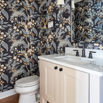
As the final touch, we also re-did the powder room to be in line with the rest of the first floor. We had the new vanity painted in the same oyster color as the kitchen cabinets and then covered the walls in a whimsical patterned wallpaper. Although the homeowners like subtle neutral colors they were willing to go a bit bold in the powder room for something unexpected. For more design inspiration go to: www.kitchenstudio-ge.com
 TKS Design Group
Download our free ebook, Creating the Ideal Kitchen. DOWNLOAD NOW
This family from Wheaton was ready to remodel their kitchen, dining room and powder room. The project didn’t call for any structural or space planning changes but the makeover still had a massive impact on their home. The homeowners wanted to change their dated 1990’s brown speckled granite and light maple kitchen. They liked the welcoming feeling they got from the wood and warm tones in their current kitchen, but this style clashed with their vision of a deVOL type kitchen, a London-based furniture company. Their inspiration came from the country homes of the UK that mix the warmth of traditional detail with clean lines and modern updates.
To create their vision, we started with all new framed cabinets with a modified overlay painted in beautiful, understated colors. Our clients were adamant about “no white cabinets.” Instead we used an oyster color for the perimeter and a custom color match to a specific shade of green chosen by the homeowner. The use of a simple color pallet reduces the visual noise and allows the space to feel open and welcoming. We also painted the trim above the cabinets the same color to make the cabinets look taller. The room trim was painted a bright clean white to match the ceiling.
In true English fashion our clients are not coffee drinkers, but they LOVE tea. We created a tea station for them where they can prepare and serve tea. We added plenty of glass to showcase their tea mugs and adapted the cabinetry below to accommodate storage for their tea items. Function is also key for the English kitchen and the homeowners. They requested a deep farmhouse sink and a cabinet devoted to their heavy mixer because they bake a lot. We then got rid of the stovetop on the island and wall oven and replaced both of them with a range located against the far wall. This gives them plenty of space on the island to roll out dough and prepare any number of baked goods. We then removed the bifold pantry doors and created custom built-ins with plenty of usable storage for all their cooking and baking needs.
The client wanted a big change to the dining room but still wanted to use their own furniture and rug. We installed a toile-like wallpaper on the top half of the room and supported it with white wainscot paneling. We also changed out the light fixture, showing us once again that small changes can have a big impact.
As the final touch, we also re-did the powder room to be in line with the rest of the first floor. We had the new vanity painted in the same oyster color as the kitchen cabinets and then covered the walls in a whimsical patterned wallpaper. Although the homeowners like subtle neutral colors they were willing to go a bit bold in the powder room for something unexpected. For more design inspiration go to: www.kitchenstudio-ge.com
5