
Search results for "Reduce room" in Home Design Ideas

 Boerne Kitchens and Baths
This large and bright kitchen was rethought from a dark cabinet, dark counter top and closed in feel. First the large separating wall from the kitchen into the back hallway overlooking the pool was reduced in height to allow light to spill into the room all day long. Navy Cabinets were repalinted white and the island was updated to a light grey. Absolute black counter tops were left on the perimeter cabinets but the center island and sink area were resurfaced in Cambria Ella. A apron front sign with Newport Brass bridge faucet was installed to accent the area. New pendant lights over the island and retro barstools complete the look. New undercabinet lighting, lighted cabinets and new recessed lighting finished out the kitchen in a new clean bright and welcoming room. Perfect for the grandkids to be in.

 ZeroEnergy Design
This renovated brick rowhome in Boston’s South End offers a modern aesthetic within a historic structure, creative use of space, exceptional thermal comfort, a reduced carbon footprint, and a passive stream of income.
DESIGN PRIORITIES. The goals for the project were clear - design the primary unit to accommodate the family’s modern lifestyle, rework the layout to create a desirable rental unit, improve thermal comfort and introduce a modern aesthetic. We designed the street-level entry as a shared entrance for both the primary and rental unit. The family uses it as their everyday entrance - we planned for bike storage and an open mudroom with bench and shoe storage to facilitate the change from shoes to slippers or bare feet as they enter their home. On the main level, we expanded the kitchen into the dining room to create an eat-in space with generous counter space and storage, as well as a comfortable connection to the living space. The second floor serves as master suite for the couple - a bedroom with a walk-in-closet and ensuite bathroom, and an adjacent study, with refinished original pumpkin pine floors. The upper floor, aside from a guest bedroom, is the child's domain with interconnected spaces for sleeping, work and play. In the play space, which can be separated from the work space with new translucent sliding doors, we incorporated recreational features inspired by adventurous and competitive television shows, at their son’s request.
MODERN MEETS TRADITIONAL. We left the historic front facade of the building largely unchanged - the security bars were removed from the windows and the single pane windows were replaced with higher performing historic replicas. We designed the interior and rear facade with a vision of warm modernism, weaving in the notable period features. Each element was either restored or reinterpreted to blend with the modern aesthetic. The detailed ceiling in the living space, for example, has a new matte monochromatic finish, and the wood stairs are covered in a dark grey floor paint, whereas the mahogany doors were simply refinished. New wide plank wood flooring with a neutral finish, floor-to-ceiling casework, and bold splashes of color in wall paint and tile, and oversized high-performance windows (on the rear facade) round out the modern aesthetic.
RENTAL INCOME. The existing rowhome was zoned for a 2-family dwelling but included an undesirable, single-floor studio apartment at the garden level with low ceiling heights and questionable emergency egress. In order to increase the quality and quantity of space in the rental unit, we reimagined it as a two-floor, 1 or 2 bedroom, 2 bathroom apartment with a modern aesthetic, increased ceiling height on the lowest level and provided an in-unit washer/dryer. The apartment was listed with Jackie O'Connor Real Estate and rented immediately, providing the owners with a source of passive income.
ENCLOSURE WITH BENEFITS. The homeowners sought a minimal carbon footprint, enabled by their urban location and lifestyle decisions, paired with the benefits of a high-performance home. The extent of the renovation allowed us to implement a deep energy retrofit (DER) to address air tightness, insulation, and high-performance windows. The historic front facade is insulated from the interior, while the rear facade is insulated on the exterior. Together with these building enclosure improvements, we designed an HVAC system comprised of continuous fresh air ventilation, and an efficient, all-electric heating and cooling system to decouple the house from natural gas. This strategy provides optimal thermal comfort and indoor air quality, improved acoustic isolation from street noise and neighbors, as well as a further reduced carbon footprint. We also took measures to prepare the roof for future solar panels, for when the South End neighborhood’s aging electrical infrastructure is upgraded to allow them.
URBAN LIVING. The desirable neighborhood location allows the both the homeowners and tenant to walk, bike, and use public transportation to access the city, while each charging their respective plug-in electric cars behind the building to travel greater distances.
OVERALL. The understated rowhouse is now ready for another century of urban living, offering the owners comfort and convenience as they live life as an expression of their values.
Eric Roth Photo
 Boerne Kitchens and Baths
This large and bright kitchen was rethought from a dark cabinet, dark counter top and closed in feel. First the large separating wall from the kitchen into the back hallway overlooking the pool was reduced in height to allow light to spill into the room all day long. Navy Cabinets were repalinted white and the island was updated to a light grey. Absolute black counter tops were left on the perimeter cabinets but the center island and sink area were resurfaced in Cambria Ella. A apron front sign with Newport Brass bridge faucet was installed to accent the area. New pendant lights over the island and retro barstools complete the look. New undercabinet lighting, lighted cabinets and new recessed lighting finished out the kitchen in a new clean bright and welcoming room. Perfect for the grandkids to be in.
Find the right local pro for your project
 Boerne Kitchens and Baths
This large and bright kitchen was rethought from a dark cabinet, dark counter top and closed in feel. First the large separating wall from the kitchen into the back hallway overlooking the pool was reduced in height to allow light to spill into the room all day long. Navy Cabinets were repalinted white and the island was updated to a light grey. Absolute black counter tops were left on the perimeter cabinets but the center island and sink area were resurfaced in Cambria Ella. A apron front sign with Newport Brass bridge faucet was installed to accent the area. New pendant lights over the island and retro barstools complete the look. New undercabinet lighting, lighted cabinets and new recessed lighting finished out the kitchen in a new clean bright and welcoming room. Perfect for the grandkids to be in.
 Boerne Kitchens and Baths
This large and bright kitchen was rethought from a dark cabinet, dark counter top and closed in feel. First the large separating wall from the kitchen into the back hallway overlooking the pool was reduced in height to allow light to spill into the room all day long. Navy Cabinets were repalinted white and the island was updated to a light grey. Absolute black counter tops were left on the perimeter cabinets but the center island and sink area were resurfaced in Cambria Ella. A apron front sign with Newport Brass bridge faucet was installed to accent the area. New pendant lights over the island and retro barstools complete the look. New undercabinet lighting, lighted cabinets and new recessed lighting finished out the kitchen in a new clean bright and welcoming room. Perfect for the grandkids to be in.

 Closet Factory
The home office has evolved into an indispensable space that seamlessly blends productivity and comfort. Tailored to the demands of remote work or personal projects, a well-designed home office often features ergonomic furniture, ample storage, and efficient technology integration.
Thoughtful placement of desks and chairs enhances workflow, while strategic lighting promotes focus and reduces eye strain. The home office is not only a functional workspace but also an expression of individual style, with personalized decor and organizational elements contributing to a conducive and inspiring atmosphere.
As the boundary between work and home blurs, the home office emerges as a versatile sanctuary that fosters concentration, creativity, and a harmonious work-life balance.

 DHD Architecture and Interior Design
The Watermill House is a beautiful example of a classic Hamptons wood shingle style home. The design and renovation would maintain the character of the exterior while transforming the interiors to create an open and airy getaway for a busy and active family. The house comfortably sits within its one acre lot surrounded by tall hedges, old growth trees, and beautiful hydrangeas. The landscape influenced the design approach of the main floor interiors. Walls were removed and the kitchen was relocated to the front of the house to create an open plan for better flow and views to both the front and rear yards. The kitchen was designed to be both practical and beautiful. The u-shape design features modern appliances, white cabinetry and Corian countertops, and is anchored by a beautiful island with a knife-edge marble countertop. The island and the dining room table create a strong axis to the living room at the rear of the house. To further strengthen the connection to the outdoor decks and pool area of the rear yard, a full height sliding glass window system was installed. The clean lines and modern profiles of the window frames create unobstructed views and virtually remove the barrier between the interior and exterior spaces. The open plan allowed a new sitting area to be created between the dining room and stair. A screen, comprised of vertical fins, allows for a degree of openness, while creating enough separation to make the sitting area feel comfortable and nestled in its own area. The stair at the entry of the house was redesigned to match the new elegant and sophisticated spaces connected to it. New treads were installed to articulate and contrast the soft palette of finishes of the floors, walls, and ceilings. The new metal and glass handrail was intended to reduce visual noise and create subtle reflections of light.
Photo by Guillaume Gaudet
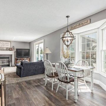
Sponsored
Sunbury, OH

J.Holderby - Renovations
Franklin County's Leading General Contractors - 2X Best of Houzz!


 Melinda Mandell Interior Design
This bathroom was designed to reduce stress and support healing for families and their children with critical illnesses. We bright blues, matte black, and white to create a sense of home, of safety, and of hope. The star of the bathroom is the porcelain tile that looks like patterned cement encaustic tile from All Natural Stone, San Jose.
The furnishings and accessories are durable, functional, and fun, and include: matte black sconce from Sonneman, industrial style dark bronze mirror, a branch table that can be pulled next to the tub for parents supervising kids in the bath, and soft goods from Vintage Bath Los Altos.
We are honored that Melinda Mandell Interior Design was selected to participate in “Where Hope Has a Home” at the Stanford Ronald McDonald House.
We believe in creating safe, nurturing, and healing spaces for all families!
 Boerne Kitchens and Baths
This large and bright kitchen was rethought from a dark cabinet, dark counter top and closed in feel. First the large separating wall from the kitchen into the back hallway overlooking the pool was reduced in height to allow light to spill into the room all day long. Navy Cabinets were repalinted white and the island was updated to a light grey. Absolute black counter tops were left on the perimeter cabinets but the center island and sink area were resurfaced in Cambria Ella. A apron front sign with Newport Brass bridge faucet was installed to accent the area. New pendant lights over the island and retro barstools complete the look. New undercabinet lighting, lighted cabinets and new recessed lighting finished out the kitchen in a new clean bright and welcoming room. Perfect for the grandkids to be in.
 Boerne Kitchens and Baths
This large and bright kitchen was rethought from a dark cabinet, dark counter top and closed in feel. First the large separating wall from the kitchen into the back hallway overlooking the pool was reduced in height to allow light to spill into the room all day long. Navy Cabinets were repalinted white and the island was updated to a light grey. Absolute black counter tops were left on the perimeter cabinets but the center island and sink area were resurfaced in Cambria Ella. A apron front sign with Newport Brass bridge faucet was installed to accent the area. New pendant lights over the island and retro barstools complete the look. New undercabinet lighting, lighted cabinets and new recessed lighting finished out the kitchen in a new clean bright and welcoming room. Perfect for the grandkids to be in.
 Boerne Kitchens and Baths
This large and bright kitchen was rethought from a dark cabinet, dark counter top and closed in feel. First the large separating wall from the kitchen into the back hallway overlooking the pool was reduced in height to allow light to spill into the room all day long. Navy Cabinets were repalinted white and the island was updated to a light grey. Absolute black counter tops were left on the perimeter cabinets but the center island and sink area were resurfaced in Cambria Ella. A apron front sign with Newport Brass bridge faucet was installed to accent the area. New pendant lights over the island and retro barstools complete the look. New undercabinet lighting, lighted cabinets and new recessed lighting finished out the kitchen in a new clean bright and welcoming room. Perfect for the grandkids to be in.
 Boerne Kitchens and Baths
This large and bright kitchen was rethought from a dark cabinet, dark counter top and closed in feel. First the large separating wall from the kitchen into the back hallway overlooking the pool was reduced in height to allow light to spill into the room all day long. Navy Cabinets were repalinted white and the island was updated to a light grey. Absolute black counter tops were left on the perimeter cabinets but the center island and sink area were resurfaced in Cambria Ella. A apron front sign with Newport Brass bridge faucet was installed to accent the area. New pendant lights over the island and retro barstools complete the look. New undercabinet lighting, lighted cabinets and new recessed lighting finished out the kitchen in a new clean bright and welcoming room. Perfect for the grandkids to be in.


 Azy LaBelle Design
Our overall design concept for the renovation of this space was to optimize the functional space for a family of five and accentuate the existing window. In the renovation, we eliminated a huge centrally located kitchen island which acted as an obstacle to the feeling of the space and focused on creating an elegant and balanced plan promoting movement, simplicity and precisely executed details. We held strong to having the kitchen cabinets, wherever possible, float off the floor to give the subtle impression of lightness avoiding a bottom heavy look. The cabinets were painted a pale tinted green to reduce the empty effect of light flooding a white kitchen leaving a softness and complementing the gray tiles.
To integrate the existing dining room with the kitchen, we simply added some classic dining chairs and a dynamic light fixture, juxtaposing the geometry of the boxy kitchen with organic curves and triangular lights to balance the clean design with an inviting warmth.


 Maxdia Home
More Projects, welcome to website: www.maxdiashop.com, or INS: @maxdia_home
1. Handmade with cotton and linen blended thick fabric. The color of the base fabric is cream.
2. Easily installed in minutes with all necessary hardware included, lift cords are on the right side.
3. Lifting track is made of a robust aircraft aluminum alloy. Each shade can be adjusted to any position due to our unique speed reducer and self-locking device.
4. Standard shade is unlined, can block out 65% of light, privacy lining and blackout lining can be selected for a custom order.
5. Attached to the headrail with a velcro strip that holds tightly for daily use but is easy to pull off when you want to wash them. They are great for people with dust allergies, families with small children or homeowners with pets.

 Musso Design Group
The garden accentuates and continues the central axis established by the alignment of the front and back doors of the house, which is key to classic villa design. The homeowners sought to establish a traditional villa garden, one that would be essentially an additional room and which would flow easily from the interior. The garden has a formal layout and uses classic boxwoods to establish the formality and expand on the existing walled courtyard, another feature of authentic villa gardens. Plant selections create a tapestry effect through the use of large blocks of various leaf shapes and foliage colors. Ferns and grasses chosen for ground cover offer the benefit of reduced maintenance. Taking inspiration from the name of the house, Villa Mira Flores, Musso and Cooke added blooming shrubs, trees and perennials including hydrangea, gardenia, crepe myrtle, clematis, iris, laurel and holly.


 User
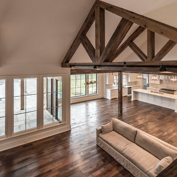
The open space plan on the main level of the Prairie Style home is deceiving of the actual separation of spaces. This home packs a punch with a private hot tub, craft room, library, and even a theater. The interior of the home features the same attention to place, as the natural world is evident in the use of granite, basalt, walnut, poplar, and natural river rock throughout. Floor to ceiling windows in strategic locations eliminates the sense of compression on the interior, while the overall window design promotes natural daylighting and cross-ventilation in nearly every space of the home.
Glo’s A5 Series in double pane was selected for the high performance values and clean, minimal frame profiles. High performance spacers, double pane glass, multiple air seals, and a larger continuous thermal break combine to reduce convection and eliminate condensation, ultimately providing energy efficiency and thermal performance unheard of in traditional aluminum windows. The A5 Series provides smooth operation and long-lasting durability without sacrificing style for this Prairie Style home.
 Azy LaBelle Design
Our overall design concept for the renovation of this space was to optimize the functional space for a family of five and accentuate the existing window. In the renovation, we eliminated a huge centrally located kitchen island which acted as an obstacle to the feeling of the space and focused on creating an elegant and balanced plan promoting movement, simplicity and precisely executed details. We held strong to having the kitchen cabinets, wherever possible, float off the floor to give the subtle impression of lightness avoiding a bottom heavy look. The cabinets were painted a pale tinted green to reduce the empty effect of light flooding a white kitchen leaving a softness and complementing the gray tiles.
To integrate the existing dining room with the kitchen, we simply added some classic dining chairs and a dynamic light fixture, juxtaposing the geometry of the boxy kitchen with organic curves and triangular lights to balance the clean design with an inviting warmth.
 TKS Design Group
Download our free ebook, Creating the Ideal Kitchen. DOWNLOAD NOW
This family from Wheaton was ready to remodel their kitchen, dining room and powder room. The project didn’t call for any structural or space planning changes but the makeover still had a massive impact on their home. The homeowners wanted to change their dated 1990’s brown speckled granite and light maple kitchen. They liked the welcoming feeling they got from the wood and warm tones in their current kitchen, but this style clashed with their vision of a deVOL type kitchen, a London-based furniture company. Their inspiration came from the country homes of the UK that mix the warmth of traditional detail with clean lines and modern updates.
To create their vision, we started with all new framed cabinets with a modified overlay painted in beautiful, understated colors. Our clients were adamant about “no white cabinets.” Instead we used an oyster color for the perimeter and a custom color match to a specific shade of green chosen by the homeowner. The use of a simple color pallet reduces the visual noise and allows the space to feel open and welcoming. We also painted the trim above the cabinets the same color to make the cabinets look taller. The room trim was painted a bright clean white to match the ceiling.
In true English fashion our clients are not coffee drinkers, but they LOVE tea. We created a tea station for them where they can prepare and serve tea. We added plenty of glass to showcase their tea mugs and adapted the cabinetry below to accommodate storage for their tea items. Function is also key for the English kitchen and the homeowners. They requested a deep farmhouse sink and a cabinet devoted to their heavy mixer because they bake a lot. We then got rid of the stovetop on the island and wall oven and replaced both of them with a range located against the far wall. This gives them plenty of space on the island to roll out dough and prepare any number of baked goods. We then removed the bifold pantry doors and created custom built-ins with plenty of usable storage for all their cooking and baking needs.
The client wanted a big change to the dining room but still wanted to use their own furniture and rug. We installed a toile-like wallpaper on the top half of the room and supported it with white wainscot paneling. We also changed out the light fixture, showing us once again that small changes can have a big impact.
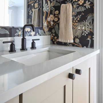
As the final touch, we also re-did the powder room to be in line with the rest of the first floor. We had the new vanity painted in the same oyster color as the kitchen cabinets and then covered the walls in a whimsical patterned wallpaper. Although the homeowners like subtle neutral colors they were willing to go a bit bold in the powder room for something unexpected. For more design inspiration go to: www.kitchenstudio-ge.com
190