
Search results for "Reduce same origin" in Home Design Ideas
 ZeroEnergy Design
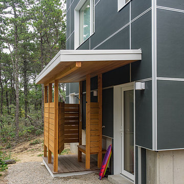
This modern green home offers both a vacation destination on Cape Cod near local family members and an opportunity for rental income.
FAMILY ROOTS. A West Coast couple living in the San Francisco Bay Area sought a permanent East Coast vacation home near family members living on Cape Cod. As academic professionals focused on sustainability, they sought a green, energy efficient home that was well-aligned with their values. With no green homes available for sale on Cape Cod, they decided to purchase land near their family and build their own.
SLOPED SITE. Comprised of a 3/4 acre lot nestled in the pines, the steeply sloping terrain called for a plan that embraced and took advantage of the slope. Of equal priority was optimizing solar exposure, preserving privacy from abutters, and creating outdoor living space. The design accomplished these goals with a simple, rectilinear form, offering living space on the both entry and lower/basement levels. The stepped foundation allows for a walk-out basement level with light-filled living space on the down-hill side of the home. The traditional basement on the eastern, up-hill side houses mechanical equipment and a home gym. The house welcomes natural light throughout, captures views of the forest, and delivers entertainment space that connects indoor living space to outdoor deck and dining patio.
MODERN VISION. The clean building form and uncomplicated finishes pay homage to the modern architectural legacy on the outer Cape. Durable and economical fiber cement panels, fixed with aluminum channels, clad the primary form. Cedar clapboards provide a visual accent at the south-facing living room, which extends a single roof plane to cover the entry porch.
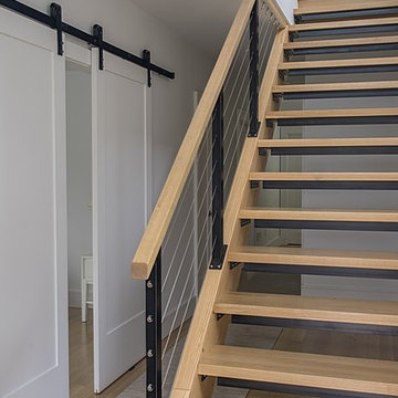
SMART USE OF SPACE. On the entry level, the “L”-shaped living, dining, and kitchen space connects to the exterior living, dining, and grilling spaces to effectively double the home’s summertime entertainment area. Placed at the western end of the entry level (where it can retain privacy but still claim expansive downhill views) is the master suite with a built-in study. The lower level has two guest bedrooms, a second full bathroom, and laundry. The flexibility of the space—crucial in a house with a modest footprint—emerges in one of the guest bedrooms, which doubles as home office by opening the barn-style double doors to connect it to the bright, airy open stair leading up to the entry level. Thoughtful design, generous ceiling heights and large windows transform the modest 1,100 sf* footprint into a well-lit, spacious home. *(total finished space is 1800 sf)
RENTAL INCOME. The property works for its owners by netting rental income when the owners are home in San Francisco. The house especially caters to vacationers bound for nearby Mayo Beach and includes an outdoor shower adjacent to the lower level entry door. In contrast to the bare bones cottages that are typically available on the Cape, this home offers prospective tenants a modern aesthetic, paired with luxurious and green features. Durable finishes inside and out will ensure longevity with the heavier use that comes with a rental property.
COMFORT YEAR-ROUND. The home is super-insulated and air-tight, with mechanical ventilation to provide continuous fresh air from the outside. High performance triple-paned windows complement the building enclosure and maximize passive solar gain while ensuring a warm, draft-free winter, even when sitting close to the glass. A properly sized air source heat pump offers efficient heating & cooling, and includes a carefully designed the duct distribution system to provide even comfort throughout the house. The super-insulated envelope allows us to significantly reduce the equipment capacity, duct size, and airflow quantities, while maintaining unparalleled thermal comfort.
ENERGY EFFICIENT. The building’s shell and mechanical systems play instrumental roles in the home’s exceptional performance. The building enclosure reduces the most significant energy glutton: heating. Continuous super-insulation, thorough air sealing, triple-pane windows, and passive solar gain work together to yield a miniscule heating load. All active energy consumers are extremely efficient: an air source heat pump for heating and cooling, a heat pump hot water heater, LED lighting, energy recovery ventilation (ERV), and high efficiency appliances. The result is a home that uses 70% less energy than a similar new home built to code requirements.
OVERALL. The home embodies the owners’ goals and values while comprehensively enabling thermal comfort, energy efficiency, a vacation respite, and supplementary income.
PROJECT TEAM
ZeroEnergy Design - Architect & Mechanical Designer
A.F. Hultin & Co. - Contractor
Pamet Valley Landscape Design - Landscape & Masonry
Lisa Finch - Original Artwork
European Architectural Supply - Windows
Eric Roth Photography - Photography
 TKS Design Group
Free ebook, Creating the Ideal Kitchen. DOWNLOAD NOW
The Klimala’s and their three kids are no strangers to moving, this being their fifth house in the same town over the 20-year period they have lived there. “It must be the 7-year itch, because every seven years, we seem to find ourselves antsy for a new project or a new environment. I think part of it is being a designer, I see my own taste evolve and I want my environment to reflect that. Having easy access to wonderful tradesmen and a knowledge of the process makes it that much easier”.
This time, Klimala’s fell in love with a somewhat unlikely candidate. The 1950’s ranch turned cape cod was a bit of a mutt, but it’s location 5 minutes from their design studio and backing up to the high school where their kids can roll out of bed and walk to school, coupled with the charm of its location on a private road and lush landscaping made it an appealing choice for them.
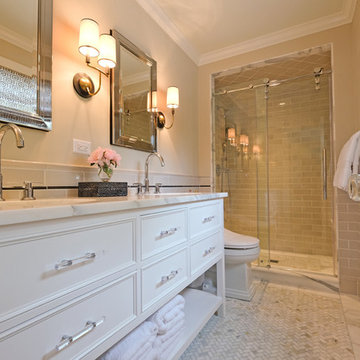
“The bones of the house were really charming. It was typical 1,500 square foot ranch that at some point someone added a second floor to. Its sloped roofline and dormered bedrooms gave it some charm.” With the help of architect Maureen McHugh, Klimala’s gutted and reworked the layout to make the house work for them. An open concept kitchen and dining room allows for more frequent casual family dinners and dinner parties that linger. A dingy 3-season room off the back of the original house was insulated, given a vaulted ceiling with skylights and now opens up to the kitchen. This room now houses an 8’ raw edge white oak dining table and functions as an informal dining room. “One of the challenges with these mid-century homes is the 8’ ceilings. I had to have at least one room that had a higher ceiling so that’s how we did it” states Klimala.
The kitchen features a 10’ island which houses a 5’0” Galley Sink. The Galley features two faucets, and double tiered rail system to which accessories such as cutting boards and stainless steel bowls can be added for ease of cooking. Across from the large sink is an induction cooktop. “My two teen daughters and I enjoy cooking, and the Galley and induction cooktop make it so easy.” A wall of tall cabinets features a full size refrigerator, freezer, double oven and built in coffeemaker. The area on the opposite end of the kitchen features a pantry with mirrored glass doors and a beverage center below.
The rest of the first floor features an entry way, a living room with views to the front yard’s lush landscaping, a family room where the family hangs out to watch TV, a back entry from the garage with a laundry room and mudroom area, one of the home’s four bedrooms and a full bath. There is a double sided fireplace between the family room and living room. The home features pops of color from the living room’s peach grass cloth to purple painted wall in the family room. “I’m definitely a traditionalist at heart but because of the home’s Midcentury roots, I wanted to incorporate some of those elements into the furniture, lighting and accessories which also ended up being really fun. We are not formal people so I wanted a house that my kids would enjoy, have their friends over and feel comfortable.”
The second floor houses the master bedroom suite, two of the kids’ bedrooms and a back room nicknamed “the library” because it has turned into a quiet get away area where the girls can study or take a break from the rest of the family. The area was originally unfinished attic, and because the home was short on closet space, this Jack and Jill area off the girls’ bedrooms houses two large walk-in closets and a small sitting area with a makeup vanity. “The girls really wanted to keep the exposed brick of the fireplace that runs up the through the space, so that’s what we did, and I think they feel like they are in their own little loft space in the city when they are up there” says Klimala.
Designed by: Susan Klimala, CKD, CBD
Photography by: Carlos Vergara
For more information on kitchen and bath design ideas go to: www.kitchenstudio-ge.com
 Balboa Design Group
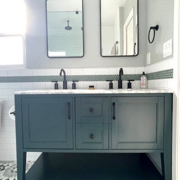
Our clients wanted a REAL master bathroom with enough space for both of them to be in there at the same time. Their house, built in the 1940’s, still had plenty of the original charm, but also had plenty of its original tiny spaces that just aren’t very functional for modern life.
The original bathroom had a tiny stall shower, and just a single vanity with very limited storage and counter space. Not to mention kitschy pink subway tile on every wall. With some creative reconfiguring, we were able to reclaim about 25 square feet of space from the bedroom. Which gave us the space we needed to introduce a double vanity with plenty of storage, and a HUGE walk-in shower that spans the entire length of the new bathroom!
While we knew we needed to stay true to the original character of the house, we also wanted to bring in some modern flair! Pairing strong graphic floor tile with some subtle (and not so subtle) green tones gave us the perfect blend of classic sophistication with a modern glow up.
Our clients were thrilled with the look of their new space, and were even happier about how large and open it now feels!
Find the right local pro for your project
 TKS Design Group
Free ebook, Creating the Ideal Kitchen. DOWNLOAD NOW
The Klimala’s and their three kids are no strangers to moving, this being their fifth house in the same town over the 20-year period they have lived there. “It must be the 7-year itch, because every seven years, we seem to find ourselves antsy for a new project or a new environment. I think part of it is being a designer, I see my own taste evolve and I want my environment to reflect that. Having easy access to wonderful tradesmen and a knowledge of the process makes it that much easier”.
This time, Klimala’s fell in love with a somewhat unlikely candidate. The 1950’s ranch turned cape cod was a bit of a mutt, but it’s location 5 minutes from their design studio and backing up to the high school where their kids can roll out of bed and walk to school, coupled with the charm of its location on a private road and lush landscaping made it an appealing choice for them.
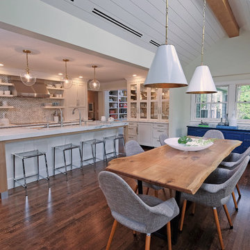
“The bones of the house were really charming. It was typical 1,500 square foot ranch that at some point someone added a second floor to. Its sloped roofline and dormered bedrooms gave it some charm.” With the help of architect Maureen McHugh, Klimala’s gutted and reworked the layout to make the house work for them. An open concept kitchen and dining room allows for more frequent casual family dinners and dinner parties that linger. A dingy 3-season room off the back of the original house was insulated, given a vaulted ceiling with skylights and now opens up to the kitchen. This room now houses an 8’ raw edge white oak dining table and functions as an informal dining room. “One of the challenges with these mid-century homes is the 8’ ceilings. I had to have at least one room that had a higher ceiling so that’s how we did it” states Klimala.
The kitchen features a 10’ island which houses a 5’0” Galley Sink. The Galley features two faucets, and double tiered rail system to which accessories such as cutting boards and stainless steel bowls can be added for ease of cooking. Across from the large sink is an induction cooktop. “My two teen daughters and I enjoy cooking, and the Galley and induction cooktop make it so easy.” A wall of tall cabinets features a full size refrigerator, freezer, double oven and built in coffeemaker. The area on the opposite end of the kitchen features a pantry with mirrored glass doors and a beverage center below.
The rest of the first floor features an entry way, a living room with views to the front yard’s lush landscaping, a family room where the family hangs out to watch TV, a back entry from the garage with a laundry room and mudroom area, one of the home’s four bedrooms and a full bath. There is a double sided fireplace between the family room and living room. The home features pops of color from the living room’s peach grass cloth to purple painted wall in the family room. “I’m definitely a traditionalist at heart but because of the home’s Midcentury roots, I wanted to incorporate some of those elements into the furniture, lighting and accessories which also ended up being really fun. We are not formal people so I wanted a house that my kids would enjoy, have their friends over and feel comfortable.”
The second floor houses the master bedroom suite, two of the kids’ bedrooms and a back room nicknamed “the library” because it has turned into a quiet get away area where the girls can study or take a break from the rest of the family. The area was originally unfinished attic, and because the home was short on closet space, this Jack and Jill area off the girls’ bedrooms houses two large walk-in closets and a small sitting area with a makeup vanity. “The girls really wanted to keep the exposed brick of the fireplace that runs up the through the space, so that’s what we did, and I think they feel like they are in their own little loft space in the city when they are up there” says Klimala.
Designed by: Susan Klimala, CKD, CBD
Photography by: Carlos Vergara
For more information on kitchen and bath design ideas go to: www.kitchenstudio-ge.com
 Custom Design & Construction
The homeowners had just purchased this home in El Segundo and they had remodeled the kitchen and one of the bathrooms on their own. However, they had more work to do. They felt that the rest of the project was too big and complex to tackle on their own and so they retained us to take over where they left off. The main focus of the project was to create a master suite and take advantage of the rather large backyard as an extension of their home. They were looking to create a more fluid indoor outdoor space.
When adding the new master suite leaving the ceilings vaulted along with French doors give the space a feeling of openness. The window seat was originally designed as an architectural feature for the exterior but turned out to be a benefit to the interior! They wanted a spa feel for their master bathroom utilizing organic finishes. Since the plan is that this will be their forever home a curbless shower was an important feature to them. The glass barn door on the shower makes the space feel larger and allows for the travertine shower tile to show through. Floating shelves and vanity allow the space to feel larger while the natural tones of the porcelain tile floor are calming. The his and hers vessel sinks make the space functional for two people to use it at once. The walk-in closet is open while the master bathroom has a white pocket door for privacy.
Since a new master suite was added to the home we converted the existing master bedroom into a family room. Adding French Doors to the family room opened up the floorplan to the outdoors while increasing the amount of natural light in this room. The closet that was previously in the bedroom was converted to built in cabinetry and floating shelves in the family room. The French doors in the master suite and family room now both open to the same deck space.
The homes new open floor plan called for a kitchen island to bring the kitchen and dining / great room together. The island is a 3” countertop vs the standard inch and a half. This design feature gives the island a chunky look. It was important that the island look like it was always a part of the kitchen. Lastly, we added a skylight in the corner of the kitchen as it felt dark once we closed off the side door that was there previously.
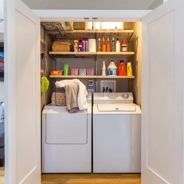
Repurposing rooms and opening the floor plan led to creating a laundry closet out of an old coat closet (and borrowing a small space from the new family room).
The floors become an integral part of tying together an open floor plan like this. The home still had original oak floors and the homeowners wanted to maintain that character. We laced in new planks and refinished it all to bring the project together.
To add curb appeal we removed the carport which was blocking a lot of natural light from the outside of the house. We also re-stuccoed the home and added exterior trim.
 Dimensions in Wood Inc
This client’s vision for their kitchen/hearth room remodel was to create a harmonious space for gathering and socializing with family and friends. Without the before and after photos, you would scarcely believe this was the same home.
This huge home renovation perfectly illustrates that Dimensions In Wood’s expert team can handle every aspect of your remodeling project. Plumbing, flooring, electrical wiring, custom cabinets, structural engineering, appliances, windows, interior and exterior doors, entertainment and more. Contact us today to discuss Translating Your Visions into Reality
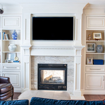
The client was interested in new appliance technology, cabinetry to the ceiling, and an Island large enough to seat 3. They also wanted a built-in breakfast nook, improved pantry space, more functional storage on either side of their fireplace, and a built-in appearance for the TV above the mantel. The original built-in desk was not used, and they preferred for that space to serve as a small bar area with refrigeration and a place to store their printer. We designed several plans for the space before selecting the final layout.
The new design required the removal of the soffit over the old sink, as well as a small wall beside the old refrigerator. The wall beside the stairwell had to be shortened 13 inches and a new beam installed to carry the load of the home’s 2nd story to gain enough space for the large central island. The existing closet pantry walls were also reconfigured as per the new plan.
This serves as a great reminder that Dimensions In Wood is much more than just custom cabinets.
Central to the entire custom kitchen is an 8-foot Walnut island. The huge island, which comfortably seats three, is topped with Essenza Blue quartzite. The stone’s natural striations are beautiful. Quartzite is harder than granite, and less likely to stain than other stones because of its density. The couple had to look through multiple slabs to find a piece they LOVED. The island’s custom Walnut cabinetry, built to resemble a piece of custom furniture, was stained Bronzed Walnut by Sherwin Williams.
The 4-foot Galley Workstation in the island, handles all the kitchen’s prep, serving, and cleanup needs. The Galley’s culinary tools include an upper tier cutting board, upper tier drying rack, 2 lower tier platforms, 11″ colander with non-slip handles, and 11” mixing bowl with lid and non-slip bottom. Learn more about the amazing Galley Workstation here. A Waterstone gantry faucet in a pewter finish combines a pull-down sprayer for maximum mobility and a articulated swivel spout. A water tap with reverse osmosis filter provides the highest quality drinking water. To keep a clean and sleek counter we installed a raised air switch for the garbage disposal and integrated soap dispenser. The island also houses the Thermador Sapphire 7-Program Dishwasher with a hidden touch control panel and a custom Walnut wood front. The cabinetry under the Galley Workstation features a trash roll out, as well as storage for the culinary tools.
Shortening the stairwell wall, and reframing around the stairs, which included shortening the handrail, also made room for a bi-fold door walk-in pantry with extra roll out storage and space for a small microwave. Above the panty doors is a remote controlled, electric motor powered, lift up cabinet door which hides a flat screen TV, used while the family is cooking.
To the right of the walk-in pantry is cold food storage. The Thermador, 30-inch Freedom Collection refrigerator and 24-inch built-in freezer column with internal ice maker are covered with matching cabinetry fronts. An open display space was designed above the units, creating an aesthetically beautiful wall. To the right of the refrigerator & freezer columns is a tall cabinet designed for the built-in Thermador steam and convection oven. The convention steam oven is a relatively new technology for homes, but its versatility and food quality is amazing. To the right of this is a pull-out appliance pantry which provides easy access and storage for a stand mixer, blender, and any other appliance you do not want to clutter the counter.
The most visible wall of the kitchen features the 36-inch Thermador Professional Series Harmony Gas Range with Griddle. Between the range and custom designed wood hood, a framed mosaic tile accent in the backsplash, creates a focal point. To clear the air, the Professional Series Thermador 42-inch ventilation insert provides excellent exhaust capabilities, as well as providing multi-level, vivid LED lights for beautiful illumination.
The wall cabinetry symmetrically flanks the custom hood, utilizing deeper wall cabinetry on each end, allowing for storage of oversized dishware. The base cabinetry on this wall is made up of drawers, except for the corner, which is a Kesseböhmer LeMans II. This specially designed shelf system allows ease of access in underutilized blind corners. The dual action articulation system with soft close mechanism ensures a smooth open and close.
Rounding the corner to the outside wall, the base cabinetry was built to a narrower depth, providing additional space for the island, as well as easier access to the new larger pass-thru window which serves the screen porch. The client selected Black Vermont granite countertops with an ogee edge to contrast the Linen White painted cabinetry.
The door to the screen porch was replaced with a Marvin Exterior Door with a raised panel at the bottom of the 3⁄4 glass door.
Marvin Windows replaced the other windows in the space increasing the energy efficiency and value of the home. To establish the breakfast nook, a bench with drawers and an upholstered seat was built into the bay area of the room.
Custom bookshelves were built with open shelves, cabinet doors, and drawers on either side of the fireplace. A new stone hearth and fireplace surround were installed. Above the existing mantel we built a recessed space for the flat screen television hiding all wiring inside the walls for a completely clean look.
The space that was once a desk was transformed into a bar area. The glass shelves and glass cabinet front liquor cabinet stand out. But this bar area has hidden secrets. Tucked beneath the black granite is a Thermador under-counter double drawer refrigerator with matching wood front panels. They blend in perfectly with the cabinets. A wireless printer is easily accessed on a slide out drawer. Plus, what looks like merely wooden panels on the wall are concealing recessed storage for more bottles and glasses!
Overhead recessed lighting and speaker system provide illumination and entertainment through the entire space.
This luxury home had original, solid oak flooring through most of the first floor which the homeowner obviously wanted to keep but were in desperate need of repair and refinishing. Our master craftsmen wove in new wood flooring to match the old where needed, particularly where walls had been changed and where the floor was damaged. We sanded the floors, smoothing away years of wear and tear. The entire wood floor was then uniformly stained, making it impossible to differentiate where any repairs were made.
If this renovation has inspired you, then contact us today! There is no limit to our Dimensions.
 Flavin Architects
Mid-Century Remodel on Tabor Hill
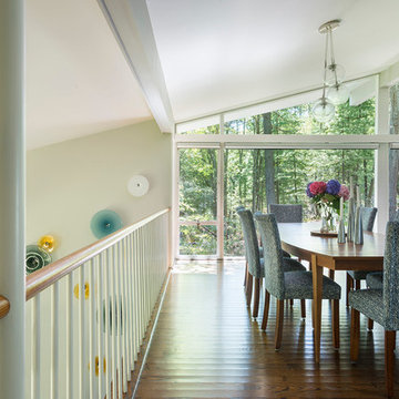
This sensitively sited house was designed by Robert Coolidge, a renowned architect and grandson of President Calvin Coolidge. The house features a symmetrical gable roof and beautiful floor to ceiling glass facing due south, smartly oriented for passive solar heating. Situated on a steep lot, the house is primarily a single story that steps down to a family room. This lower level opens to a New England exterior. Our goals for this project were to maintain the integrity of the original design while creating more modern spaces. Our design team worked to envision what Coolidge himself might have designed if he'd had access to modern materials and fixtures.
With the aim of creating a signature space that ties together the living, dining, and kitchen areas, we designed a variation on the 1950's "floating kitchen." In this inviting assembly, the kitchen is located away from exterior walls, which allows views from the floor-to-ceiling glass to remain uninterrupted by cabinetry.
We updated rooms throughout the house; installing modern features that pay homage to the fine, sleek lines of the original design. Finally, we opened the family room to a terrace featuring a fire pit. Since a hallmark of our design is the diminishment of the hard line between interior and exterior, we were especially pleased for the opportunity to update this classic work.

Sponsored
Sunbury, OH

J.Holderby - Renovations
Franklin County's Leading General Contractors - 2X Best of Houzz!
 Scott William Grady Architect
Additions, renovations, and restorations on established Boston-suburb streets.
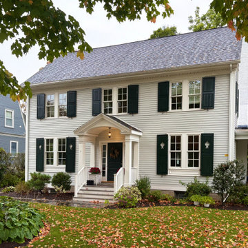
Winchester is where a lot of my Boston-area work has lived for years. The town has a residential character built on early 20th-century stock: Colonial Revival, Tudor Revival, Shingle style, the occasional Federal, on tree-lined streets where what you do to one house is visible to the rest of the block.
The projects below are additions, renovations, and restorations. The brief is almost always the same: keep what's working, fix what isn't, and make the new work look like it belongs to the original house. Done well, an addition is invisible from the street and the family lives in a house that looks like it was always that way. Done poorly, the work announces itself, and the house ends up reading as two houses: the original, and the one the architect tried to add.
When a project falls under Winchester's Historic Districts Commission, I work closely with the commission. When it doesn't, I still pay attention to the neighbors. The town has a strong sense of its own architectural fabric. The work that lasts here is the work that doesn't fight it.
 O'Brien Harris LLC
This deeply personal renovation took place in a home with rich family history—owned by the same family for generations and originally designed by notable architect, William Henry Kessler. Nestled in Harbor Springs, Michigan, the property hadn’t been touched since the 1970s. The clients, who had previously worked with O’Brien Harris on their main residence in the Detroit area, returned with a clear vision: honor the spirit of the home’s mid-century modern roots while creating something clean, smart, and unique.
The architecture itself is quirky and full of character, and the design team, led by Lily Dierkes of LK Studio, leaned into those details. Rather than imposing a new aesthetic, the design was built around the home’s original DNA.
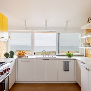
The kitchen—though small—was treated as a design-forward space. O’Brien Harris brought in full-height cabinetry that wraps the entire lower perimeter of the room with no exposed drawers, allowing a clean, sculptural feel. The wood cabinetry was finished in a soft, low-sheen white paint and contrasted with bright yellow upper cabinets—a bold choice that felt perfectly suited to the spirit of the home.
O’Brien Harris also crafted a built-in bookshelf and entertainment center for the living room, combining crisp painted cabinetry with leather cup pulls.
Because of O’Brien Harris’ custom capabilities, their work extended well beyond the kitchen. They were engaged to design and fabricate custom built-ins throughout the home, including bedroom cabinetry and bespoke bunk beds—showcasing the craftsmanship and creativity that distinguish their work. This project is a true reflection of how O’Brien Harris brings thoughtful craftsmanship and custom solutions to every corner of the home.
 MMW Architects
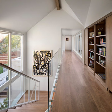
What the owners of the Madeline Ave Residence loved about the home when they bought it was the charm of the original 1920’s structure. However, a dissonance addition from the 1970’s shifted original charm to aesthetic awkwardness and poor flow. While maintaining the feel of the front façade, the rest of the home was reconfigured and choreographed to offer beauty and meet functional needs. Like many homes in historic districts, the homes grow organically to meet needs. Multiple forms and roof lines result.
Due to incorporating these same moves, this renovation fits seamlessly into the neighborhood. It is formal where it needs to be yet comfortable for the daily life. The people, the dog, the cats, the wine: all were carefully tended to throughout the design of the home. The spacious rooms and crisp white palette set the stage for vibrant tile and offers many locations for large scale art. Easy connections to the exterior spaces offer all-season gathering under the shade of the trellis or while making s’mores around the fire pit.
 MMW Architects
What the owners of the Madeline Ave Residence loved about the home when they bought it was the charm of the original 1920’s structure. However, a dissonance addition from the 1970’s shifted original charm to aesthetic awkwardness and poor flow. While maintaining the feel of the front façade, the rest of the home was reconfigured and choreographed to offer beauty and meet functional needs. Like many homes in historic districts, the homes grow organically to meet needs. Multiple forms and roof lines result.
Due to incorporating these same moves, this renovation fits seamlessly into the neighborhood. It is formal where it needs to be yet comfortable for the daily life. The people, the dog, the cats, the wine: all were carefully tended to throughout the design of the home. The spacious rooms and crisp white palette set the stage for vibrant tile and offers many locations for large scale art. Easy connections to the exterior spaces offer all-season gathering under the shade of the trellis or while making s’mores around the fire pit.
 DEANE Inc | Distinctive Design & Cabinetry
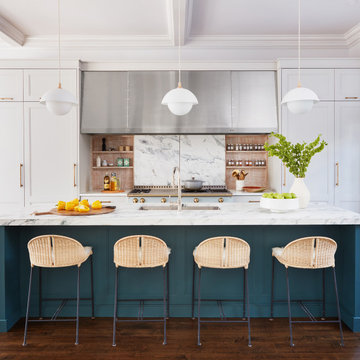
This stunning kitchen was completely transformed from its 1980s spec house origins. The homeowner came to visit our showroom and fell in love with the sliding backspace on display, deciding to create her new kitchen around the concept. The doors reveal storage for cooking spices and oils on hand-hewed, white-washed oak shelving and can be left open or closed at the owner's discretion. The La Cornue Chateau 150 in Tapestry Blue with unlacquered brass trim is the crowning jewel of the kitchen, framed by a custom stainless steel hood with rivet detailing. A creamy marble was selected for the backsplash, and a 2" mitered countertop for the ample island, painted in Farrow & Ball Inchyra-blue, that comfortably seats four. The perimeter cabinets are recessed panel doors with stepped framing bead, finished in decorator white and accented by burnished brass hardware
The wall opposite the range hosts a display unit with the same hand-hewed, white-washed oak shelving as the sliding backsplash, and a non-functioning fireplace was covered in horizontal shiplap to now house a shallow pantry with design elements in the top panels.
The dining side of the kitchen is anchored by the breakfast bar, which is fully independent of the kitchen appliances with its own sink, beverage drawers, dedicated trash, and storage, with the same marble and paint color as the island to integrate and unify the space.
 Create Construction
This 4,140 sqft Spanish-style home underwent an extensive, multi-space remodel designed to preserve its original character while elevating it with custom craftsmanship and high-end materials throughout. The kitchen, pantry, powder room, laundry room, primary closet, and primary bathroom were all thoughtfully redesigned with Spanish-inspired detailing and a refined, luxurious approach.
The kitchen is the heart of the remodel and showcases fully custom cabinetry with arched reed columns, bespoke door profiles, and an island wrapped in individually applied oak reeds. Pocket doors conceal a coffee nook, while arched metal-framed glass doors seamlessly integrate into custom arched cabinetry and pantry units. A custom ornamental metal detail doubles as a hanging bar for the banquette’s tailored blue cushions. Cabinet finishes combine soft off-white with lightly stained natural oak.
A dramatic custom arched lime-plaster hood anchors the space, featuring hidden storage and a striking Zia tile backsplash above a custom blue BlueStar range. Taj Mahal quartzite wraps the countertops and backsplash, while walls and ceilings are finished in Patagonia Roman clay for added depth and texture. Dornbracht fixtures in brushed champagne gold, Top Knobs hardware, and a blue marble banquette tabletop complete the space.
The powder room continues the artisanal theme with a floating microcement countertop, Oska vessel sink by Kast, warm bronze wall-mounted faucet by Graff, alabaster sconces, handmade Moroccan zellige tile flooring, original painted glass windows, and Roman clay walls and ceiling.
In the laundry room, custom cabinetry, generous storage, and patterned painted limestone tile flooring maintain the Spanish influence while maximizing function.
The primary closet features a custom dark blue closet system, highlighted by an arched illuminated glass display cabinet set atop a Viola marble countertop. Roman clay walls in a deeper blue tone and a sculptural glass chandelier complete the space.
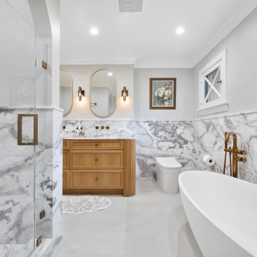
The primary bathroom is one of the most distinctive spaces in the home. A custom layout includes a freestanding tub, arched walk-in shower, and bespoke double vanity. Dramatic Dover White marble slabs were bookmatched and carried across half-height walls, shower walls, vanity surfaces, and backsplash. The same marble was meticulously fabricated into custom 4”x4” pieces for the shower pan, allowing the veining to flow seamlessly while maintaining slip resistance. The remaining walls are finished in Concretta microcement for a soft plaster effect.
The rift white oak double vanity features curved edges, ribbed side details, and six-panel drawer fronts. Warm bronze fixtures by Graff, arched niches, elliptical mirrors, and custom handmade Voyager sconces by Allied Maker complete this Spanish-inspired sanctuary.
This project is a true celebration of craftsmanship, material integrity, and timeless Spanish design, reimagined for modern luxury living.

Sponsored
Delaware, OH

Buckeye Basements, Inc.
Central Ohio's Basement Finishing ExpertsBest Of Houzz '13-'21
 O'Brien Harris LLC
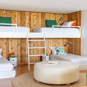
This deeply personal renovation took place in a home with rich family history—owned by the same family for generations and originally designed by notable architect, William Henry Kessler. Nestled in Harbor Springs, Michigan, the property hadn’t been touched since the 1970s. The clients, who had previously worked with O’Brien Harris on their main residence in the Detroit area, returned with a clear vision: honor the spirit of the home’s mid-century modern roots while creating something clean, smart, and unique.
The architecture itself is quirky and full of character, and the design team, led by Lily Dierkes of LK Studio, leaned into those details. Rather than imposing a new aesthetic, the design was built around the home’s original DNA.
The kitchen—though small—was treated as a design-forward space. O’Brien Harris brought in full-height cabinetry that wraps the entire lower perimeter of the room with no exposed drawers, allowing a clean, sculptural feel. The wood cabinetry was finished in a soft, low-sheen white paint and contrasted with bright yellow upper cabinets—a bold choice that felt perfectly suited to the spirit of the home.
O’Brien Harris also crafted a built-in bookshelf and entertainment center for the living room, combining crisp painted cabinetry with leather cup pulls.
Because of O’Brien Harris’ custom capabilities, their work extended well beyond the kitchen. They were engaged to design and fabricate custom built-ins throughout the home, including bedroom cabinetry and bespoke bunk beds—showcasing the craftsmanship and creativity that distinguish their work. This project is a true reflection of how O’Brien Harris brings thoughtful craftsmanship and custom solutions to every corner of the home.
 Advance Design Studio, Ltd.
Mike and Anne of Barrington Hills desperately needed to update and renovate both their kid’s hall bath and guest bath, and in their 1980’s home each project presented a different set of unique challenges to overcome. When they set out to identify the right remodeling company to partner with, it was important to find a company that could help them to visualize design solutions for the bath renovations. When they came across Advance Design Studio’s website, they were immediately drawn to the solution-oriented remodeling process and the family friendly company.
They say they chose Advance Design because of the integrated approach of “Common Sense Remodeling”, making the design, project management and construction all happen in one place. When they met with Project Designer Michelle Lecinski, they knew they chose the right company. “Michelle’s excellent work on the initial designs made it easy to proceed with Advance Design Studio,” Mike said.
Like most homeowners anticipating a big renovation project, they had some healthy fears; with two bathrooms being remodeled at the same time they worried about timeframes and staying within budget. With the help of Michelle, and the “Common Sense” guidelines, they were confident that Advance Design would stay true, orchestrating all the moving parts to stay within both the estimated timeline and budget.
The guest bath offered the biggest design challenge. A dormer obstruction made the already cramped shower awkward to access. Mike and Anne also wanted the shower size to be expanded, making it more accommodating. Working with Advance’s construction expert DJ Yurik, Michelle relocated the shower concealing the original dormer and creating a larger, more comfortable and aesthetically pleasing guest shower.
The unsightly and not at all user-friendly closet was removed and replaced with elegant White Maple Dura Supreme cabinetry with much improved function featuring dual tall linen cabinets, a special makeup area and two sinks, providing a dual vanity which was extremely important for better guest use.
The Fossil Brown quartz countertop is in pleasing contrast to the white cabinetry, and coordinates nicely with the mocha porcelain tile gracing the shower for an accent. The decorative glazed turquoise tile backsplash, tile border, and bottle niche adds a taste of marine green to the room, while marble-looking porcelain tile makes guests feel they are staying in a 5-star hotel. Polished nickel Kohler plumbing fixtures were chosen to add a touch of sophistication. This renovated guest bath is comfortable and elegant, and Anne and Mike’s house guests may never want to leave!
“The end result was updated and restyled bathrooms that the client will enjoy and increase the value of their home,” Designer Michelle said.
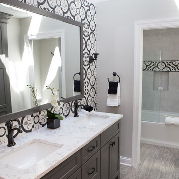
The children’s hall bath had its own set of challenges. The current placement of the sink was not conducive to the best use of the existing space, nor did it allow for any visual interest, something Advance’s designers always work to achieve even within the tight confines of a small bath. Advance removed the linen closet and used the gain in wall space to create a dramatic focal point on the vanity wall. They also took additional space that wasn’t being used for new Storm Gray Dura Supreme tall built-in linen cabinets, creating functional storage space that the former bath lacked. A customized glass splash panel was created for the bath, and the high ceilings with skylights were accented with a custom-made track lighting fixture featuring industrial pipe and cage materials.
Authentic cement encaustic tile was used wall to wall surrounding the vanity to create a dramatic and interesting back drop for the new elegant and stately furniture-like double sink wall. Hand-made encaustic tile originated in Western Europe beginning in the 1850’s and reminded Mike and Anne of tile they had seen and loved from their travels overseas. Today, encaustic tile has made a re-appearance in today’s modern bath design with its wide array of appealing patterns and artistic use of color.
Oil rubbed bronze Kohler fixtures echo the black accents in the beautiful tile pattern and reflect the matte black of the unique lighting detail. Easy to maintain Blanca Arabescato Quartz countertops add practicality and natural beauty and compliments the warm wood porcelain tile floors. This handsome bath has generated praise from friends and family even before it’s complete unveiling as photos of the space leaked out on social media! It’s not only completely functional to use, but especially pretty to look at.
“Advance Design Studio did a terrific job for us. We really appreciated how easy it was to work with them on a complex project of the complete remodeling of two bathrooms. They very capably handled all the details from design, to project management, to construction. It is a great group of people to work with and we would welcome the opportunity to work with them again anytime,” Mike said.
 Flying Dormer
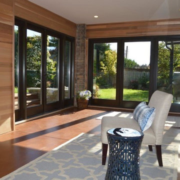
The European homeowners wanted to create a space for a new sauna and hot tub, as well as a place to relax afterwards. It needed to be light and bright, and have a warm but modern feel. We built this addition under the existing deck, and spruced up the deck at the same time to enjoy the nice territorial views.
The walls of the addition are cedar, with built-ins and deep cabinets for storage. There is a walk-in, tiled shower with built-in bench just off the sauna, and a seating area with tv for relaxing. The floor is stained concrete.
The 14-foot wall of windows (including a door to the hot tub), and the secondary window wall that includes french doors allows the maximum amount of light into the space and really creates that spa feeling.
The plans evolved during construction to include a larger sauna (thereby reducing the shower size somewhat) and a much larger hot tub than originally planned. The solution was to move the hot tub outside, which had the benefit of opening up more space inside for a yoga/ workout area. The hot tub is covered by a glass roof so it can be enjoyed year-round under the stars.
 ZeroEnergy Design
This modern green home offers both a vacation destination on Cape Cod near local family members and an opportunity for rental income.
FAMILY ROOTS. A West Coast couple living in the San Francisco Bay Area sought a permanent East Coast vacation home near family members living on Cape Cod. As academic professionals focused on sustainability, they sought a green, energy efficient home that was well-aligned with their values. With no green homes available for sale on Cape Cod, they decided to purchase land near their family and build their own.
SLOPED SITE. Comprised of a 3/4 acre lot nestled in the pines, the steeply sloping terrain called for a plan that embraced and took advantage of the slope. Of equal priority was optimizing solar exposure, preserving privacy from abutters, and creating outdoor living space. The design accomplished these goals with a simple, rectilinear form, offering living space on the both entry and lower/basement levels. The stepped foundation allows for a walk-out basement level with light-filled living space on the down-hill side of the home. The traditional basement on the eastern, up-hill side houses mechanical equipment and a home gym. The house welcomes natural light throughout, captures views of the forest, and delivers entertainment space that connects indoor living space to outdoor deck and dining patio.
MODERN VISION. The clean building form and uncomplicated finishes pay homage to the modern architectural legacy on the outer Cape. Durable and economical fiber cement panels, fixed with aluminum channels, clad the primary form. Cedar clapboards provide a visual accent at the south-facing living room, which extends a single roof plane to cover the entry porch.
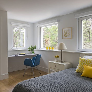
SMART USE OF SPACE. On the entry level, the “L”-shaped living, dining, and kitchen space connects to the exterior living, dining, and grilling spaces to effectively double the home’s summertime entertainment area. Placed at the western end of the entry level (where it can retain privacy but still claim expansive downhill views) is the master suite with a built-in study. The lower level has two guest bedrooms, a second full bathroom, and laundry. The flexibility of the space—crucial in a house with a modest footprint—emerges in one of the guest bedrooms, which doubles as home office by opening the barn-style double doors to connect it to the bright, airy open stair leading up to the entry level. Thoughtful design, generous ceiling heights and large windows transform the modest 1,100 sf* footprint into a well-lit, spacious home. *(total finished space is 1800 sf)
RENTAL INCOME. The property works for its owners by netting rental income when the owners are home in San Francisco. The house especially caters to vacationers bound for nearby Mayo Beach and includes an outdoor shower adjacent to the lower level entry door. In contrast to the bare bones cottages that are typically available on the Cape, this home offers prospective tenants a modern aesthetic, paired with luxurious and green features. Durable finishes inside and out will ensure longevity with the heavier use that comes with a rental property.
COMFORT YEAR-ROUND. The home is super-insulated and air-tight, with mechanical ventilation to provide continuous fresh air from the outside. High performance triple-paned windows complement the building enclosure and maximize passive solar gain while ensuring a warm, draft-free winter, even when sitting close to the glass. A properly sized air source heat pump offers efficient heating & cooling, and includes a carefully designed the duct distribution system to provide even comfort throughout the house. The super-insulated envelope allows us to significantly reduce the equipment capacity, duct size, and airflow quantities, while maintaining unparalleled thermal comfort.
ENERGY EFFICIENT. The building’s shell and mechanical systems play instrumental roles in the home’s exceptional performance. The building enclosure reduces the most significant energy glutton: heating. Continuous super-insulation, thorough air sealing, triple-pane windows, and passive solar gain work together to yield a miniscule heating load. All active energy consumers are extremely efficient: an air source heat pump for heating and cooling, a heat pump hot water heater, LED lighting, energy recovery ventilation (ERV), and high efficiency appliances. The result is a home that uses 70% less energy than a similar new home built to code requirements.
OVERALL. The home embodies the owners’ goals and values while comprehensively enabling thermal comfort, energy efficiency, a vacation respite, and supplementary income.
PROJECT TEAM
ZeroEnergy Design - Architect & Mechanical Designer
A.F. Hultin & Co. - Contractor
Pamet Valley Landscape Design - Landscape & Masonry
Lisa Finch - Original Artwork
European Architectural Supply - Windows
Eric Roth Photography - Photography

 Coco Design & Build Co.
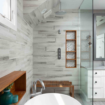
Simple clean design...in this master bathroom renovation things were kept in the same place but in a very different interpretation. The shower is where the exiting one was, but the walls surrounding it were taken out, a curbless floor was installed with a sleek tile-over linear drain that really goes away. A free-standing bathtub is in the same location that the original drop in whirlpool tub lived prior to the renovation. The result is a clean, contemporary design with some interesting "bling" effects like the bubble chandelier and the mirror rounds mosaic tile located in the back of the niche.
 Balboa Design Group
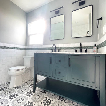
Our clients wanted a REAL master bathroom with enough space for both of them to be in there at the same time. Their house, built in the 1940’s, still had plenty of the original charm, but also had plenty of its original tiny spaces that just aren’t very functional for modern life.
The original bathroom had a tiny stall shower, and just a single vanity with very limited storage and counter space. Not to mention kitschy pink subway tile on every wall. With some creative reconfiguring, we were able to reclaim about 25 square feet of space from the bedroom. Which gave us the space we needed to introduce a double vanity with plenty of storage, and a HUGE walk-in shower that spans the entire length of the new bathroom!
While we knew we needed to stay true to the original character of the house, we also wanted to bring in some modern flair! Pairing strong graphic floor tile with some subtle (and not so subtle) green tones gave us the perfect blend of classic sophistication with a modern glow up.
Our clients were thrilled with the look of their new space, and were even happier about how large and open it now feels!
 ZeroEnergy Design
This modern green home offers both a vacation destination on Cape Cod near local family members and an opportunity for rental income.
FAMILY ROOTS. A West Coast couple living in the San Francisco Bay Area sought a permanent East Coast vacation home near family members living on Cape Cod. As academic professionals focused on sustainability, they sought a green, energy efficient home that was well-aligned with their values. With no green homes available for sale on Cape Cod, they decided to purchase land near their family and build their own.
SLOPED SITE. Comprised of a 3/4 acre lot nestled in the pines, the steeply sloping terrain called for a plan that embraced and took advantage of the slope. Of equal priority was optimizing solar exposure, preserving privacy from abutters, and creating outdoor living space. The design accomplished these goals with a simple, rectilinear form, offering living space on the both entry and lower/basement levels. The stepped foundation allows for a walk-out basement level with light-filled living space on the down-hill side of the home. The traditional basement on the eastern, up-hill side houses mechanical equipment and a home gym. The house welcomes natural light throughout, captures views of the forest, and delivers entertainment space that connects indoor living space to outdoor deck and dining patio.
MODERN VISION. The clean building form and uncomplicated finishes pay homage to the modern architectural legacy on the outer Cape. Durable and economical fiber cement panels, fixed with aluminum channels, clad the primary form. Cedar clapboards provide a visual accent at the south-facing living room, which extends a single roof plane to cover the entry porch.
SMART USE OF SPACE. On the entry level, the “L”-shaped living, dining, and kitchen space connects to the exterior living, dining, and grilling spaces to effectively double the home’s summertime entertainment area. Placed at the western end of the entry level (where it can retain privacy but still claim expansive downhill views) is the master suite with a built-in study. The lower level has two guest bedrooms, a second full bathroom, and laundry. The flexibility of the space—crucial in a house with a modest footprint—emerges in one of the guest bedrooms, which doubles as home office by opening the barn-style double doors to connect it to the bright, airy open stair leading up to the entry level. Thoughtful design, generous ceiling heights and large windows transform the modest 1,100 sf* footprint into a well-lit, spacious home. *(total finished space is 1800 sf)
RENTAL INCOME. The property works for its owners by netting rental income when the owners are home in San Francisco. The house especially caters to vacationers bound for nearby Mayo Beach and includes an outdoor shower adjacent to the lower level entry door. In contrast to the bare bones cottages that are typically available on the Cape, this home offers prospective tenants a modern aesthetic, paired with luxurious and green features. Durable finishes inside and out will ensure longevity with the heavier use that comes with a rental property.
COMFORT YEAR-ROUND. The home is super-insulated and air-tight, with mechanical ventilation to provide continuous fresh air from the outside. High performance triple-paned windows complement the building enclosure and maximize passive solar gain while ensuring a warm, draft-free winter, even when sitting close to the glass. A properly sized air source heat pump offers efficient heating & cooling, and includes a carefully designed the duct distribution system to provide even comfort throughout the house. The super-insulated envelope allows us to significantly reduce the equipment capacity, duct size, and airflow quantities, while maintaining unparalleled thermal comfort.
ENERGY EFFICIENT. The building’s shell and mechanical systems play instrumental roles in the home’s exceptional performance. The building enclosure reduces the most significant energy glutton: heating. Continuous super-insulation, thorough air sealing, triple-pane windows, and passive solar gain work together to yield a miniscule heating load. All active energy consumers are extremely efficient: an air source heat pump for heating and cooling, a heat pump hot water heater, LED lighting, energy recovery ventilation (ERV), and high efficiency appliances. The result is a home that uses 70% less energy than a similar new home built to code requirements.
OVERALL. The home embodies the owners’ goals and values while comprehensively enabling thermal comfort, energy efficiency, a vacation respite, and supplementary income.
PROJECT TEAM
ZeroEnergy Design - Architect & Mechanical Designer
A.F. Hultin & Co. - Contractor
Pamet Valley Landscape Design - Landscape & Masonry
Lisa Finch - Original Artwork
European Architectural Supply - Windows
Eric Roth Photography - Photography
17