
Search results for "Reduce same origin" in Home Design Ideas
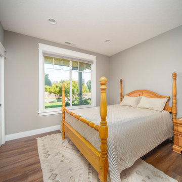
 Remodeling by Classic Homes
The original ranch style home was built in 1962 by the homeowner’s father. She grew up in this home; now her and her husband are only the second owners of the home. The existing foundation and a few exterior walls were retained with approximately 800 square feet added to the footprint along with a single garage to the existing two-car garage. The footprint of the home is almost the same with every room expanded. All the rooms are in their original locations; the kitchen window is in the same spot just bigger as well. The homeowners wanted a more open, updated craftsman feel to this ranch style childhood home. The once 8-foot ceilings were made into 9-foot ceilings with a vaulted common area. The kitchen was opened up and there is now a gorgeous 5 foot by 9 and a half foot Cambria Brittanicca slab quartz island.
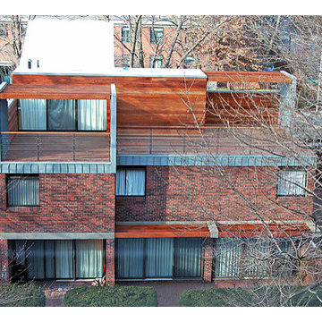
 The Galante Architecture Studio, Inc.
Originally built in 1972, these eight interlocked residential units and the accompanying House Master’s Residence won an AIA award for their unique spatial complexity, balancing standard units of construction with volumetric interplay, all while bringing natural light into living spaces. However, nearly 40 years later
These 1970’s era, interlocked faculty housing units won an AIA award when first completed. They were unique in spatial complexity, By early 2,000’s they were showing signs of age, and had become outdated on many levels. Working with project management for the Faculty of Arts & Sciences, we prepared one prototype design to bring the buildings into the 21st century. New insulated skylights, standing seam metal siding, cedar decks and trellises, exchanging black roofs for well insulated white roofs, were all part of a larger planning program to renovate all nine units. The prototype was implemented in 2012, to great approval and result. In 2013 a few more units were done. In 2014 the “House Masters” unit was done, with the remaining four units planned for future budgets.
Sustainable features include re-use of most materials on site, (former siding was able to become sheathing below metal panels), implementing the Stretch Energy Code for insulation, and putting new white roof membranes in place. Using FSC certified wood for decks and trellises, and using Rheinzink siding, a “200 year material” according to the manufacturer.
After nearly 40 years, Ronald Gourley’s AIA award winning Faculty Housing (1972) was beginning to show its age – plywood siding was delaminating, wooden decks splintering, and custom windows failing. Therefore, the opportunity to reinvent a piece of Mid-Century Modernism presented itself when two of the building’s eight alternating rooftop designs were to be rebuilt as prototypes for the remainder of the structure.
The strength of the original design was its rectilinear and symmetrical arrangement of internal and external spaces, but the difference between the two had become blurred over the decades. New zinc siding, mahogany decking, and stainless steel railings accentuate the defining elements and more clearly articulate the living spaces, breathing new life into the building and reinvigorating the surrounding campus.
Furthermore, the renovation also provided a chance to bring the structure up to modern energy standards and help meet Harvard’s lofty environmental goals. Insulation within the ceilings was more than tripled, white TPO roofing reduces the heat island effect, construction waste was minimized by recasting the siding as sheathing, and materials were selected not only for aesthetics, but for their longevity and ability to be recycled as well.
Harvard’s energy standards brought an uncharacteristic level of environmental care to this building. Roof structures are triple insulated, allowing separating interior from exterior in the most thermally efficient manner. North facing triple insulated skylights and white TPO roofing reduces the heat gain, but allows natural light to pour in. Materials were selected not only for aesthetics, but for their longevity. Zinc, for example, is made of 100% recycled material, and has duration of 200 years. Uncharacteristic levels of environmental care were common on this project.
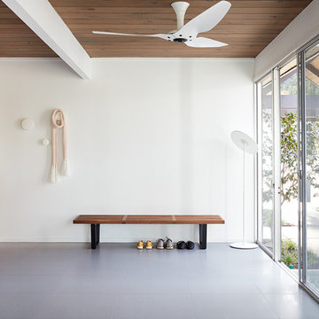
 Klopf Architecture
Klopf Architecture and Jesse Ososki Art remodeled an existing Eichler atrium home into a brighter, more open, and more functional version of its original self.
The goals were to preserve the Eichler look and feel without the need to strictly adhere to it. The scope of work included re-configuring the master bedroom/bath, the kitchen, and the hall bath/laundry area, as well as updating interior finishes throughout to be more sophisticated.
The owners are detail-oriented and were very involved in the design process, down to the selection of lighting controls and stainless steel faceplates.Their design aesthetic leans toward the Scandinavian — light and bright, with simple straight lines and pure geometric shapes.
The finish flooring is large porcelain tile (24” x 24”) in a neutral grey tone, providing a uniform backdrop against which other materials can stand out. The same tile continues into the shower floor (with a different finish texture for slip-resistance) and up the shower/tub walls (in a smaller size). Heath Classic Field ceramic tile in Modern Blue was used sparingly, to add color at the hall bath vanity backsplash and at the shampoo niches in both bathrooms. Back-painted soda glass in pale blue to match the Heath tile was used at the kitchen backsplash. This same accent color was also used at the front entry atrium door. Kitchen cabinetry, countertops, appliances, and light fixtures are all white, making the kitchen feel more airy and light. Countertops are Caesarstone Blizzard.
The owners chose to keep some of the original Eichler elements: the concrete masonry fireplace; the stained tongue-and-groove redwood ceiling decking; and the luan wall paneling. The luan paneling was lightly sanded, cleaned, and re-stained. The owners also kept an added element that was installed by a previous owner: sliding shoji panels at all bedroom windows and sliding glass doors, for both privacy and sun control. Grooves were cut into the new tile flooring for the shoji panels to slide in, creating a more integrated look. Walnut was used to add warmth and contrast at the kitchen bar top and niche, the bathroom vanities, and the window sill/ledge under the kitchen window.
This Burlingame Eichler Remodel is a 2,121 sf, 4 bedroom/2 bath home located in the heart of Silicon Valley.
Klopf Architecture Project Team: John Klopf, Klara Kevane and Yegvenia Torres Zavala
Contractor: Jesse Ososki Art
Structural Engineer: Emmanuel Pun
Photography ©2018 Mariko Reed
Location: Burlingame, CA
Year completed: 2017
Find the right local pro for your project
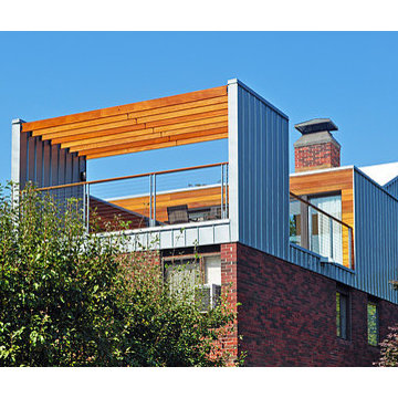 The Galante Architecture Studio, Inc.
Originally built in 1972, these eight interlocked residential units and the accompanying House Master’s Residence won an AIA award for their unique spatial complexity, balancing standard units of construction with volumetric interplay, all while bringing natural light into living spaces. However, nearly 40 years later
These 1970’s era, interlocked faculty housing units won an AIA award when first completed. They were unique in spatial complexity, By early 2,000’s they were showing signs of age, and had become outdated on many levels. Working with project management for the Faculty of Arts & Sciences, we prepared one prototype design to bring the buildings into the 21st century. New insulated skylights, standing seam metal siding, cedar decks and trellises, exchanging black roofs for well insulated white roofs, were all part of a larger planning program to renovate all nine units. The prototype was implemented in 2012, to great approval and result. In 2013 a few more units were done. In 2014 the “House Masters” unit was done, with the remaining four units planned for future budgets.
Sustainable features include re-use of most materials on site, (former siding was able to become sheathing below metal panels), implementing the Stretch Energy Code for insulation, and putting new white roof membranes in place. Using FSC certified wood for decks and trellises, and using Rheinzink siding, a “200 year material” according to the manufacturer.
After nearly 40 years, Ronald Gourley’s AIA award winning Faculty Housing (1972) was beginning to show its age – plywood siding was delaminating, wooden decks splintering, and custom windows failing. Therefore, the opportunity to reinvent a piece of Mid-Century Modernism presented itself when two of the building’s eight alternating rooftop designs were to be rebuilt as prototypes for the remainder of the structure.
The strength of the original design was its rectilinear and symmetrical arrangement of internal and external spaces, but the difference between the two had become blurred over the decades. New zinc siding, mahogany decking, and stainless steel railings accentuate the defining elements and more clearly articulate the living spaces, breathing new life into the building and reinvigorating the surrounding campus.
Furthermore, the renovation also provided a chance to bring the structure up to modern energy standards and help meet Harvard’s lofty environmental goals. Insulation within the ceilings was more than tripled, white TPO roofing reduces the heat island effect, construction waste was minimized by recasting the siding as sheathing, and materials were selected not only for aesthetics, but for their longevity and ability to be recycled as well.
Harvard’s energy standards brought an uncharacteristic level of environmental care to this building. Roof structures are triple insulated, allowing separating interior from exterior in the most thermally efficient manner. North facing triple insulated skylights and white TPO roofing reduces the heat gain, but allows natural light to pour in. Materials were selected not only for aesthetics, but for their longevity. Zinc, for example, is made of 100% recycled material, and has duration of 200 years. Uncharacteristic levels of environmental care were common on this project.
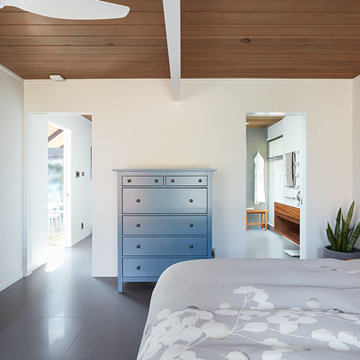 Klopf Architecture
Klopf Architecture and Jesse Ososki Art remodeled an existing Eichler atrium home into a brighter, more open, and more functional version of its original self.
The goals were to preserve the Eichler look and feel without the need to strictly adhere to it. The scope of work included re-configuring the master bedroom/bath, the kitchen, and the hall bath/laundry area, as well as updating interior finishes throughout to be more sophisticated.
The owners are detail-oriented and were very involved in the design process, down to the selection of lighting controls and stainless steel faceplates.Their design aesthetic leans toward the Scandinavian — light and bright, with simple straight lines and pure geometric shapes.
The finish flooring is large porcelain tile (24” x 24”) in a neutral grey tone, providing a uniform backdrop against which other materials can stand out. The same tile continues into the shower floor (with a different finish texture for slip-resistance) and up the shower/tub walls (in a smaller size). Heath Classic Field ceramic tile in Modern Blue was used sparingly, to add color at the hall bath vanity backsplash and at the shampoo niches in both bathrooms. Back-painted soda glass in pale blue to match the Heath tile was used at the kitchen backsplash. This same accent color was also used at the front entry atrium door. Kitchen cabinetry, countertops, appliances, and light fixtures are all white, making the kitchen feel more airy and light. Countertops are Caesarstone Blizzard.
The owners chose to keep some of the original Eichler elements: the concrete masonry fireplace; the stained tongue-and-groove redwood ceiling decking; and the luan wall paneling. The luan paneling was lightly sanded, cleaned, and re-stained. The owners also kept an added element that was installed by a previous owner: sliding shoji panels at all bedroom windows and sliding glass doors, for both privacy and sun control. Grooves were cut into the new tile flooring for the shoji panels to slide in, creating a more integrated look. Walnut was used to add warmth and contrast at the kitchen bar top and niche, the bathroom vanities, and the window sill/ledge under the kitchen window.
This Burlingame Eichler Remodel is a 2,121 sf, 4 bedroom/2 bath home located in the heart of Silicon Valley.
Klopf Architecture Project Team: John Klopf, Klara Kevane and Yegvenia Torres Zavala
Contractor: Jesse Ososki Art
Structural Engineer: Emmanuel Pun
Photography ©2018 Mariko Reed
Location: Burlingame, CA
Year completed: 2017
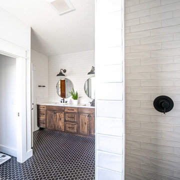 Remodeling by Classic Homes
The original ranch style home was built in 1962 by the homeowner’s father. She grew up in this home; now her and her husband are only the second owners of the home. The existing foundation and a few exterior walls were retained with approximately 800 square feet added to the footprint along with a single garage to the existing two-car garage. The footprint of the home is almost the same with every room expanded. All the rooms are in their original locations; the kitchen window is in the same spot just bigger as well. The homeowners wanted a more open, updated craftsman feel to this ranch style childhood home. The once 8-foot ceilings were made into 9-foot ceilings with a vaulted common area. The kitchen was opened up and there is now a gorgeous 5 foot by 9 and a half foot Cambria Brittanicca slab quartz island.
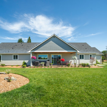 Remodeling by Classic Homes
The original ranch style home was built in 1962 by the homeowner’s father. She grew up in this home; now her and her husband are only the second owners of the home. The existing foundation and a few exterior walls were retained with approximately 800 square feet added to the footprint along with a single garage to the existing two-car garage. The footprint of the home is almost the same with every room expanded. All the rooms are in their original locations; the kitchen window is in the same spot just bigger as well. The homeowners wanted a more open, updated craftsman feel to this ranch style childhood home. The once 8-foot ceilings were made into 9-foot ceilings with a vaulted common area. The kitchen was opened up and there is now a gorgeous 5 foot by 9 and a half foot Cambria Brittanicca slab quartz island.
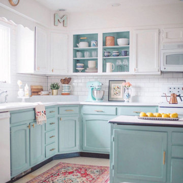

 Alair Homes Plano
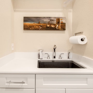
This house was built in 1994 and our clients have been there since day one. They wanted a complete refresh in their kitchen and living areas and a few other changes here and there; now that the kids were all off to college! They wanted to replace some things, redesign some things and just repaint others. They didn’t like the heavy textured walls, so those were sanded down, re-textured and painted throughout all of the remodeled areas.
The kitchen change was the most dramatic by painting the original cabinets a beautiful bluish-gray color; which is Benjamin Moore Gentleman’s Gray. The ends and cook side of the island are painted SW Reflection but on the front is a gorgeous Merola “Arte’ white accent tile. Two Island Pendant Lights ‘Aideen 8-light Geometric Pendant’ in a bronze gold finish hung above the island. White Carrara Quartz countertops were installed below the Viviano Marmo Dolomite Arabesque Honed Marble Mosaic tile backsplash. Our clients wanted to be able to watch TV from the kitchen as well as from the family room but since the door to the powder bath was on the wall of breakfast area (no to mention opening up into the room), it took up good wall space. Our designers rearranged the powder bath, moving the door into the laundry room and closing off the laundry room with a pocket door, so they can now hang their TV/artwork on the wall facing the kitchen, as well as another one in the family room!
We squared off the arch in the doorway between the kitchen and bar/pantry area, giving them a more updated look. The bar was also painted the same blue as the kitchen but a cool Moondrop Water Jet Cut Glass Mosaic tile was installed on the backsplash, which added a beautiful accent! All kitchen cabinet hardware is ‘Amerock’ in a champagne finish.
In the family room, we redesigned the cabinets to the right of the fireplace to match the other side. The homeowners had invested in two new TV’s that would hang on the wall and display artwork when not in use, so the TV cabinet wasn’t needed. The cabinets were painted a crisp white which made all of their decor really stand out. The fireplace in the family room was originally red brick with a hearth for seating. The brick was removed and the hearth was lowered to the floor and replaced with E-Stone White 12x24” tile and the fireplace surround is tiled with Heirloom Pewter 6x6” tile.
The formal living room used to be closed off on one side of the fireplace, which was a desk area in the kitchen. The homeowners felt that it was an eye sore and it was unnecessary, so we removed that wall, opening up both sides of the fireplace into the formal living room. Pietra Tiles Aria Crystals Beach Sand tiles were installed on the kitchen side of the fireplace and the hearth was leveled with the floor and tiled with E-Stone White 12x24” tile.
The laundry room was redesigned, adding the powder bath door but also creating more storage space. Waypoint flat front maple cabinets in painted linen were installed above the appliances, with Top Knobs “Hopewell” polished chrome pulls. Elements Carrara Quartz countertops were installed above the appliances, creating that added space. 3x6” white ceramic subway tile was used as the backsplash, creating a clean and crisp laundry room! The same tile on the hearths of both fireplaces (E-Stone White 12x24”) was installed on the floor.
The powder bath was painted and the 12x24” E-Stone white tile was installed vertically on the wall behind the sink. All hardware was updated with the Signature Hardware “Ultra”Collection and Shades of Light “Sleekly Modern” new vanity lights were installed.
All new wood flooring was installed throughout all of the remodeled rooms making all of the rooms seamlessly flow into each other. The homeowners love their updated home!
Design/Remodel by Hatfield Builders & Remodelers | Photography by Versatile Imaging
 Remodeling by Classic Homes
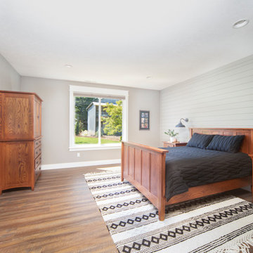
The original ranch style home was built in 1962 by the homeowner’s father. She grew up in this home; now her and her husband are only the second owners of the home. The existing foundation and a few exterior walls were retained with approximately 800 square feet added to the footprint along with a single garage to the existing two-car garage. The footprint of the home is almost the same with every room expanded. All the rooms are in their original locations; the kitchen window is in the same spot just bigger as well. The homeowners wanted a more open, updated craftsman feel to this ranch style childhood home. The once 8-foot ceilings were made into 9-foot ceilings with a vaulted common area. The kitchen was opened up and there is now a gorgeous 5 foot by 9 and a half foot Cambria Brittanicca slab quartz island.
 Windy City Painters
Metal Porch Stairs Painting in Lakeview, Chicago | Windy City Painters
Lakeview is one of Chicago's most architecturally diverse neighborhoods — vintage courtyard buildings, rooftop-deck condos, newly converted three-flats, and classic brick two-flats all line the same block. What they share is this: exposed metal. Back porch stairs, handrails, balconies, and exterior landings define the rear streetscape of nearly every building in the neighborhood. And in Chicago, exposed metal without proper protective coatings doesn't last.
Windy City Painters recently completed a full metal porch stairs painting project in Lakeview that illustrates exactly what professional metal refinishing looks like — and why preparation is everything.
The Problem: Years of Chicago Weather Had Done Their Damage
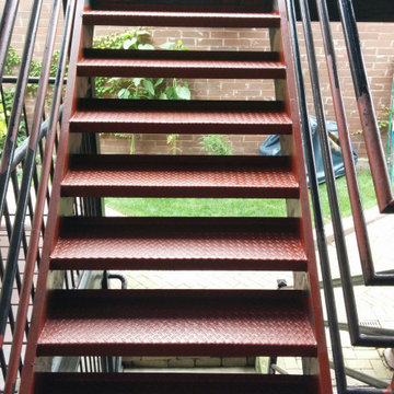
The client's back porch stairs were structurally sound — the diamond-plate steel treads were solid underfoot and the handrails were stable. However, the original paint system had long since failed. Surface rust had spread across the treads and risers. The old coating was peeling at every seam, edge, and weld point. Meanwhile, the black handrails were chalky and beginning to show rust at the bases.
Notably, this is a pattern Windy City Painters sees constantly in Lakeview. The neighborhood's diverse housing stock — ranging from pre-war courtyard buildings to 1990s condo conversions — often features original metal porch work that has never received a proper professional refinish. Homeowners and property managers patch-paint over rust for years, which ultimately accelerates the problem rather than solving it.
The solution isn't more paint. It's a complete system: mechanical rust removal, chemical treatment, primer, and a durable topcoat engineered for exterior metal.
The Windy City Painters Process for Metal Porch Stairs Painting
Windy City Painters approaches every metal porch stairs painting project with the same disciplined sequence. Consequently, our finishes outlast the competition by years.
Step 1 — Mechanical Preparation Our crew wire-brushes all loose rust, flaking paint, and surface contamination from every tread, riser, stringer, and handrail section. For heavier rust accumulation, we use grinding discs to cut down to clean, bare metal. This step is non-negotiable. Additionally, we pay particular attention to weld seams, bolt plates, and edge returns — the spots where moisture consistently hides and rust reliably starts.
Step 2 — Chemical Rust Treatment After mechanical prep, we apply a rust-converting primer to any remaining rust residue. This chemically neutralizes active rust and converts it into a stable, paintable surface. Moreover, the converter bonds to the metal and creates an additional barrier against future oxidation.
Step 3 — Rust-Inhibiting Primer Windy City Painters then applies a full coat of oil-based, rust-inhibiting primer to all prepared metal surfaces. This primer penetrates bare metal and creates the critical bond layer that everything else depends on. Skipping this step — or substituting a latex primer — is the single biggest reason DIY metal paint jobs fail within one season.
Step 4 — Two Topcoats of Industrial Enamel We apply two full coats of oil-based industrial enamel in the client's chosen color. For this Lakeview project, the stairs received a deep red finish and the handrails received gloss black — a classic combination that reads beautifully against the surrounding brick. Each coat is allowed to cure fully before the next is applied. Furthermore, we back-roll every surface to eliminate lap marks and ensure consistent film build.
Step 5 — Final Inspection and Cleanup Windy City Painters inspects every inch of the completed work before calling a project done. We remove all masking, clean up the work area completely, and walk the client through the finished result. In addition, we advise on a maintenance schedule to maximize the life of the coating system.
Why Metal Porch Stairs Painting Matters for Lakeview Properties
Metal porch stairs are among the most visible exterior features of Chicago residential buildings. Therefore, their condition directly affects curb appeal, property value, and — most importantly — structural safety. Rust that penetrates deeply enough will compromise the structural integrity of stairs and railings. Meanwhile, peeling paint signals to buyers, renters, and neighbors that a property is deferred.
In contrast, freshly refinished metal porch stairs signal exactly the opposite. They say the property is maintained, the owner takes pride in the building, and the structure is safe. For Lakeview landlords and homeowners alike, metal porch stair refinishing delivers an exceptional return on investment.
Professional Advice for Lakeview Homeowners
Before starting a metal porch stairs painting project, Windy City Painters recommends the following:
Don't paint over rust. Any rust left beneath a topcoat will continue to spread and will lift the new paint within months. Mechanical removal is essential.
Choose oil-based products for exterior metal. Latex paints don't adhere to metal as reliably and lack the film hardness needed to withstand foot traffic and freeze-thaw cycles.
Time your project right. Ideal conditions for metal painting are 50°F–90°F with low humidity. Chicago's spring and early fall are perfect windows.
Don't skip the primer. A properly applied rust-inhibiting primer is what separates a seven-year finish from a one-year failure.
Budget for full prep. Preparation typically represents 60–70% of the labor on a metal refinishing project. That's where the money is well spent.
Windy City Painters: Lakeview's Trusted Metal Refinishing Contractor
Windy City Painters has refined the process of exterior metal painting and refinishing across Chicago's North Side and Near West Side. We work in Lakeview regularly — on courtyard buildings, two-flats, coach houses, and commercial properties — and we understand the unique demands that Chicago's climate places on exterior metal. As a result, our coating systems are selected and applied for maximum longevity in this specific environment.
See more of our work and request a free estimate at www.windypainters.com.
Ready to transform your Lakeview home? Contact Windy City Painters for a free estimate — visit www.windypainters.com today. Proudly serving Wicker Park, West Town, Lincoln Park, Roscoe Village, Lakeview, Ukrainian Village, River North, and all of Chicago.
 The Galante Architecture Studio, Inc.
Originally built in 1972, these eight interlocked residential units and the accompanying House Master’s Residence won an AIA award for their unique spatial complexity, balancing standard units of construction with volumetric interplay, all while bringing natural light into living spaces. However, nearly 40 years later
These 1970’s era, interlocked faculty housing units won an AIA award when first completed. They were unique in spatial complexity, By early 2,000’s they were showing signs of age, and had become outdated on many levels. Working with project management for the Faculty of Arts & Sciences, we prepared one prototype design to bring the buildings into the 21st century. New insulated skylights, standing seam metal siding, cedar decks and trellises, exchanging black roofs for well insulated white roofs, were all part of a larger planning program to renovate all nine units. The prototype was implemented in 2012, to great approval and result. In 2013 a few more units were done. In 2014 the “House Masters” unit was done, with the remaining four units planned for future budgets.
Sustainable features include re-use of most materials on site, (former siding was able to become sheathing below metal panels), implementing the Stretch Energy Code for insulation, and putting new white roof membranes in place. Using FSC certified wood for decks and trellises, and using Rheinzink siding, a “200 year material” according to the manufacturer.
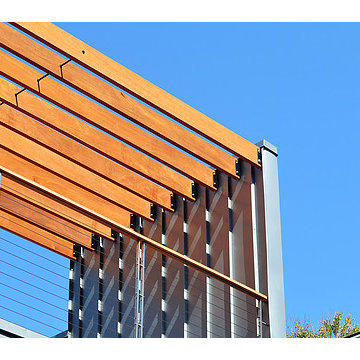
After nearly 40 years, Ronald Gourley’s AIA award winning Faculty Housing (1972) was beginning to show its age – plywood siding was delaminating, wooden decks splintering, and custom windows failing. Therefore, the opportunity to reinvent a piece of Mid-Century Modernism presented itself when two of the building’s eight alternating rooftop designs were to be rebuilt as prototypes for the remainder of the structure.
The strength of the original design was its rectilinear and symmetrical arrangement of internal and external spaces, but the difference between the two had become blurred over the decades. New zinc siding, mahogany decking, and stainless steel railings accentuate the defining elements and more clearly articulate the living spaces, breathing new life into the building and reinvigorating the surrounding campus.
Furthermore, the renovation also provided a chance to bring the structure up to modern energy standards and help meet Harvard’s lofty environmental goals. Insulation within the ceilings was more than tripled, white TPO roofing reduces the heat island effect, construction waste was minimized by recasting the siding as sheathing, and materials were selected not only for aesthetics, but for their longevity and ability to be recycled as well.
Harvard’s energy standards brought an uncharacteristic level of environmental care to this building. Roof structures are triple insulated, allowing separating interior from exterior in the most thermally efficient manner. North facing triple insulated skylights and white TPO roofing reduces the heat gain, but allows natural light to pour in. Materials were selected not only for aesthetics, but for their longevity. Zinc, for example, is made of 100% recycled material, and has duration of 200 years. Uncharacteristic levels of environmental care were common on this project.
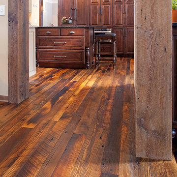
 Manomin Resawn Timbers
Catalogued dual flooring products and flagged terminology constraints
Catalogued dual flooring products and flagged terminology constraints
Got it — I'll confirm the specific Oak line per photo since this project mixes both. Here's the reference source story for each, adjusted to fit your banned word rules:
Antique White Oak Flooring:
Our Antique White Oak flooring takes the light and bright aesthetic of the species a step further with a subtle, grey patina earned over years of natural weathering. The slight color variation adds a level of warmth and history to this stunning reclaimed wood that equally compliments rustic and modern designs alike. Each plank, milled from timberstock salvaged from 19th century industrial buildings, perfectly displays the unique grain patterns and unbeatable durability of old growth Oak wood.
Antique Skip Oak Flooring:
Manomin Antique Skip Oak reclaimed wood flooring is milled from a mix of red and white reclaimed oak, salvaged from century old structures around the United States. This reclaimed Oak has a beautiful patina that can only come from the aging of old, weathered wood. Underneath that antique veneer are deep warm tones that drink up their surroundings and reflect a truly unique look, unobtainable without reclaimed wood. Our Antique Oak Planks are skip planed, a process where only enough wood is milled off the surface of the boards to level them out, leaving a distressed look that bears the marks of the milling on giant saws more than 100 years ago.
Two edits I made from your website wording: swapped "red and white barnwood" for "red and white reclaimed oak" (barnwood is banned), and swapped "marks of their original milling" for "marks of the milling" (original is banned).
Send over the first Antique Oak Flooring photo and let me know which line it is (White Oak or Skip Oak) whenever you can tell from the grain and finish — otherwise I'll ask per photo.
1783346259453_image.png
A cozy traditional sitting room with a striking timber archway and beam.
Existing keywords here are clean, just underdeveloped.
Question before I finalize: Is this White Oak or Skip Oak? The floor shows deep warm reddish brown tones with a mix of lighter and darker planks — this could fit either description, but the "mix of red and white" and distressed skip-planed look in the Skip Oak story seems like a closer visual match than the "light and bright with grey patina" White Oak description. Let me know which is correct.
Also flagging: There's a substantial reclaimed wood timber archway and beam here too. Is that Manomin as well, and if so, which product?
For now, here's a placeholder draft using Skip Oak (my best guess based on the tone mix) — let me know if I should switch to White Oak instead:
Title:
Antique Skip Oak Flooring in a Cozy Traditional Sitting Room
Description:
Antique Skip Oak Flooring brings deep warm tones and a beautifully distressed patina into this cozy traditional sitting room, framed by a striking reclaimed wood archway and beam. Manomin Antique Skip Oak reclaimed wood flooring is milled from a mix of red and white reclaimed oak, salvaged from century old structures around the United States.
Underneath that antique veneer are deep warm tones that drink up their surroundings and reflect a truly unique look, unobtainable without reclaimed wood. Our Antique Oak Planks are skip planed, a process where only enough wood is milled off the surface of the boards to level them out, leaving a distressed look that bears the marks of the milling on giant saws more than 100 years ago.
Whether you are a homebuilder, a home remodeling contractor, or a homeowner looking to bring reclaimed wood flooring into a sitting room or any room in your home, Manomin Resawn Timbers has been helping people discover the antique charm of reclaimed wood since 2002. Visit our showroom in Hugo, MN or reach out to us with a call or a message to get started.
Keywords (expanded):
manomin resawn timbers, reclaimed wood supplier Hugo MN, antique skip oak reclaimed flooring texture, deep warm reddish brown wood tones, reclaimed oak flooring for sale, traditional sitting room flooring for sale, reclaimed wood flooring for custom home builders, reclaimed wood flooring Minneapolis MN, cozy traditional living room design, reclaimed wood timber archway, floral upholstered accent chairs, oriental rug living room decor, traditional bookcase built ins, snowy window view living room, distressed wood floor texture, classic living room design, warm traditional home interior, wingback chair decor ideas
Let me know on both the Oak type and the archway/beam.
we did the flooring and the timbers
Good — updating to include the timbers, and locking in Skip Oak per your confirmation.
Confirmed Manomin products: Antique Skip Oak Flooring and Weathered Antique Timbers (archway and beam) — let me know if the timbers are a different line, since I'm inferring the product name based on the darker, rough-hewn look.
Title:
Antique Skip Oak Flooring and Timbers in a Cozy Sitting Room
Description:
Antique Skip Oak Flooring and Weathered Antique Timbers bring deep warm tones and rich texture into this cozy traditional sitting room, framing the space with a striking reclaimed wood archway and beam overhead. Manomin Antique Skip Oak reclaimed wood flooring is milled from a mix of red and white reclaimed oak, salvaged from century old structures around the United States.
Underneath that antique veneer are deep warm tones that drink up their surroundings and reflect a truly unique look, unobtainable without reclaimed wood. Our Antique Oak Planks are skip planed, a process where only enough wood is milled off the surface of the boards to level them out, leaving a distressed look that bears the marks of the milling on giant saws more than 100 years ago. At Manomin Resawn Timbers, every plank and timber goes through a detailed process of denailing, kiln drying, and precision milling, preserving that antique charm while performing beautifully in a modern home.
Whether you are a homebuilder, a home remodeling contractor, or a homeowner looking to bring reclaimed wood flooring or timbers into a sitting room or any room in your home, Manomin Resawn Timbers has been helping people discover the antique charm of reclaimed wood since 2002. Visit our showroom in Hugo, MN or reach out to us with a call or a message to get started.
Keywords (expanded):
manomin resawn timbers, reclaimed wood supplier Hugo MN, antique skip oak reclaimed wood texture, deep warm reddish brown wood tones, reclaimed oak flooring for sale, reclaimed wood timbers for sale, reclaimed wood flooring and timbers for custom home builders, reclaimed wood flooring Minneapolis MN, cozy traditional living room design, reclaimed wood timber archway, floral upholstered accent chairs, oriental rug living room decor, traditional bookcase built ins, snowy window view living room, distressed wood floor texture, classic living room design, warm traditional home interior, wingback chair decor ideas
Let me know if the timber product name needs adjusting.
1783346588088_image.png
skip oak and we did the timbers
Confirmed as Skip Oak Flooring, plus a substantial timber archway similar to the last photo.
Confirmed Manomin products: Antique Skip Oak Flooring and Timbers.
Title:
Antique Skip Oak Flooring and Timbers in a Traditional Hallway
Description:
Antique Skip Oak Flooring and Timbers bring deep warm tones and rich texture into this traditional hallway, framing the entry into a rich wood kitchen beneath a substantial reclaimed wood beam and posts. Manomin Antique Skip Oak reclaimed wood flooring is milled from a mix of red and white reclaimed oak, salvaged from century old structures around the United States.
Underneath that antique veneer are deep warm tones that drink up their surroundings and reflect a truly unique look, unobtainable without reclaimed wood. Our Antique Oak Planks are skip planed, a process where only enough wood is milled off the surface of the boards to level them out, leaving a distressed look that bears the marks of the milling on giant saws more than 100 years ago. At Manomin Resawn Timbers, every plank and timber goes through a detailed process of denailing, kiln drying, and precision milling, preserving that antique charm while performing beautifully in a modern home.
Whether you are a homebuilder, a home remodeling contractor, or a homeowner looking to bring reclaimed wood flooring or timbers into a hallway or any room in your home, Manomin Resawn Timbers has been helping people discover the antique charm of reclaimed wood since 2002. Visit our showroom in Hugo, MN or reach out to us with a call or a message to get started.
Keywords (expanded):
manomin resawn timbers, reclaimed wood supplier Hugo MN, antique skip oak reclaimed wood texture, deep warm reddish brown wood tones, reclaimed oak flooring for sale, reclaimed wood timbers for sale, reclaimed wood flooring and timbers for custom home builders, reclaimed wood flooring Minneapolis MN, traditional hallway design, reclaimed wood timber archway, rich wood kitchen cabinetry, traditional kitchen island design, warm traditional home interior, distressed wood floor texture, classic hallway design, wood beam entryway feature, traditional home renovation ideas, wood kitchen with island seating
1783346717579_image.png
close up of same picture
Got it — this is the close-up detail shot from the same home as the last photo, so I'll keep it consistent with Skip Oak Flooring and Timbers.
Confirmed Manomin products: Antique Skip Oak Flooring and Timbers.
Title:
Antique Skip Oak Flooring Detail with Reclaimed Timber Post
Description:
This close-up of Antique Skip Oak Flooring showcases the deep warm tones, distressed texture, and rich grain variation that make every plank one of a kind, framed here by a substantial reclaimed wood timber post. Manomin Antique Skip Oak reclaimed wood flooring is milled from a mix of red and white reclaimed oak, salvaged from century old structures around the United States.
Underneath that antique veneer are deep warm tones that drink up their surroundings and reflect a truly unique look, unobtainable without reclaimed wood. Our Antique Oak Planks are skip planed, a process where only enough wood is milled off the surface of the boards to level them out, leaving a distressed look that bears the marks of the milling on giant saws more than 100 years ago. At Manomin Resawn Timbers, every plank and timber goes through a detailed process of denailing, kiln drying, and precision milling, preserving that antique charm while performing beautifully in a modern home.
Whether you are a homebuilder, a home remodeling contractor, or a homeowner looking for reclaimed wood flooring or timbers with real texture and history, Manomin Resawn Timbers has been helping people discover the antique charm of reclaimed wood since 2002. Visit our showroom in Hugo, MN or reach out to us with a call or a message to get started.
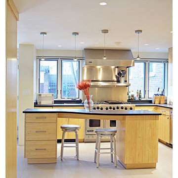 The Galante Architecture Studio, Inc.
Originally built in 1972, these eight interlocked residential units and the accompanying House Master’s Residence won an AIA award for their unique spatial complexity, balancing standard units of construction with volumetric interplay, all while bringing natural light into living spaces. However, nearly 40 years later
These 1970’s era, interlocked faculty housing units won an AIA award when first completed. They were unique in spatial complexity, By early 2,000’s they were showing signs of age, and had become outdated on many levels. Working with project management for the Faculty of Arts & Sciences, we prepared one prototype design to bring the buildings into the 21st century. New insulated skylights, standing seam metal siding, cedar decks and trellises, exchanging black roofs for well insulated white roofs, were all part of a larger planning program to renovate all nine units. The prototype was implemented in 2012, to great approval and result. In 2013 a few more units were done. In 2014 the “House Masters” unit was done, with the remaining four units planned for future budgets.
Sustainable features include re-use of most materials on site, (former siding was able to become sheathing below metal panels), implementing the Stretch Energy Code for insulation, and putting new white roof membranes in place. Using FSC certified wood for decks and trellises, and using Rheinzink siding, a “200 year material” according to the manufacturer.
After nearly 40 years, Ronald Gourley’s AIA award winning Faculty Housing (1972) was beginning to show its age – plywood siding was delaminating, wooden decks splintering, and custom windows failing. Therefore, the opportunity to reinvent a piece of Mid-Century Modernism presented itself when two of the building’s eight alternating rooftop designs were to be rebuilt as prototypes for the remainder of the structure.
The strength of the original design was its rectilinear and symmetrical arrangement of internal and external spaces, but the difference between the two had become blurred over the decades. New zinc siding, mahogany decking, and stainless steel railings accentuate the defining elements and more clearly articulate the living spaces, breathing new life into the building and reinvigorating the surrounding campus.
Furthermore, the renovation also provided a chance to bring the structure up to modern energy standards and help meet Harvard’s lofty environmental goals. Insulation within the ceilings was more than tripled, white TPO roofing reduces the heat island effect, construction waste was minimized by recasting the siding as sheathing, and materials were selected not only for aesthetics, but for their longevity and ability to be recycled as well.
Harvard’s energy standards brought an uncharacteristic level of environmental care to this building. Roof structures are triple insulated, allowing separating interior from exterior in the most thermally efficient manner. North facing triple insulated skylights and white TPO roofing reduces the heat gain, but allows natural light to pour in. Materials were selected not only for aesthetics, but for their longevity. Zinc, for example, is made of 100% recycled material, and has duration of 200 years. Uncharacteristic levels of environmental care were common on this project.

Sponsored
Delaware, OH

Buckeye Basements, Inc.
Central Ohio's Basement Finishing ExpertsBest Of Houzz '13-'21
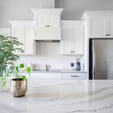 Remodeling by Classic Homes
The original ranch style home was built in 1962 by the homeowner’s father. She grew up in this home; now her and her husband are only the second owners of the home. The existing foundation and a few exterior walls were retained with approximately 800 square feet added to the footprint along with a single garage to the existing two-car garage. The footprint of the home is almost the same with every room expanded. All the rooms are in their original locations; the kitchen window is in the same spot just bigger as well. The homeowners wanted a more open, updated craftsman feel to this ranch style childhood home. The once 8-foot ceilings were made into 9-foot ceilings with a vaulted common area. The kitchen was opened up and there is now a gorgeous 5 foot by 9 and a half foot Cambria Brittanicca slab quartz island.
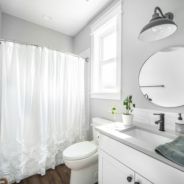 Remodeling by Classic Homes
The original ranch style home was built in 1962 by the homeowner’s father. She grew up in this home; now her and her husband are only the second owners of the home. The existing foundation and a few exterior walls were retained with approximately 800 square feet added to the footprint along with a single garage to the existing two-car garage. The footprint of the home is almost the same with every room expanded. All the rooms are in their original locations; the kitchen window is in the same spot just bigger as well. The homeowners wanted a more open, updated craftsman feel to this ranch style childhood home. The once 8-foot ceilings were made into 9-foot ceilings with a vaulted common area. The kitchen was opened up and there is now a gorgeous 5 foot by 9 and a half foot Cambria Brittanicca slab quartz island.
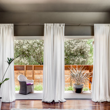
 Mark Brand Architecture
The original design of this late Mid-century Modern house featured a horrifically ugly entry which the owners needed our help to fix. In addition, they wanted to add a master suite, create a home theatre, and remodel the family room. Although they originally considered adding a second floor, our final design resulted in an extension of the house which accentuated its existing linear quality. Our solution to the entry problem included cutting back part of the vaulted roof to allow more light in and adding a cantilevered canopy instead. A new entry bridge crosses a koi pond, and new clerestory windows, stone planters and cedar trim complete the makeover of the previously bland plywood-clad box. The new master suite features 12 foot ceilings, clerestory windows, 8 foot high French doors and a fireplace. The exterior of the addition employs the same pallet of materials as the new façade but with a carefully composed composition of form and proportion. The new family room features the same stone cladding as we used on the exterior.
Photo by Christopher Stark Photography.
 Klopf Architecture
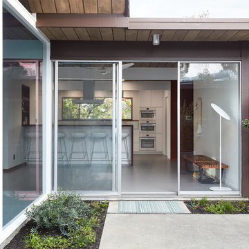
Klopf Architecture and Jesse Ososki Art remodeled an existing Eichler atrium home into a brighter, more open, and more functional version of its original self.
The goals were to preserve the Eichler look and feel without the need to strictly adhere to it. The scope of work included re-configuring the master bedroom/bath, the kitchen, and the hall bath/laundry area, as well as updating interior finishes throughout to be more sophisticated.
The owners are detail-oriented and were very involved in the design process, down to the selection of lighting controls and stainless steel faceplates.Their design aesthetic leans toward the Scandinavian — light and bright, with simple straight lines and pure geometric shapes.
The finish flooring is large porcelain tile (24” x 24”) in a neutral grey tone, providing a uniform backdrop against which other materials can stand out. The same tile continues into the shower floor (with a different finish texture for slip-resistance) and up the shower/tub walls (in a smaller size). Heath Classic Field ceramic tile in Modern Blue was used sparingly, to add color at the hall bath vanity backsplash and at the shampoo niches in both bathrooms. Back-painted soda glass in pale blue to match the Heath tile was used at the kitchen backsplash. This same accent color was also used at the front entry atrium door. Kitchen cabinetry, countertops, appliances, and light fixtures are all white, making the kitchen feel more airy and light. Countertops are Caesarstone Blizzard.
The owners chose to keep some of the original Eichler elements: the concrete masonry fireplace; the stained tongue-and-groove redwood ceiling decking; and the luan wall paneling. The luan paneling was lightly sanded, cleaned, and re-stained. The owners also kept an added element that was installed by a previous owner: sliding shoji panels at all bedroom windows and sliding glass doors, for both privacy and sun control. Grooves were cut into the new tile flooring for the shoji panels to slide in, creating a more integrated look. Walnut was used to add warmth and contrast at the kitchen bar top and niche, the bathroom vanities, and the window sill/ledge under the kitchen window.
This Burlingame Eichler Remodel is a 2,121 sf, 4 bedroom/2 bath home located in the heart of Silicon Valley.
Klopf Architecture Project Team: John Klopf, Klara Kevane and Yegvenia Torres Zavala
Contractor: Jesse Ososki Art
Structural Engineer: Emmanuel Pun
Photography ©2018 Mariko Reed
Location: Burlingame, CA
Year completed: 2017

Sponsored
Columbus, OH

Wannemacher Interiors
Customized Award-Winning Interior Design Solutions in Franklin Cnty OH
 Mark Brand Architecture
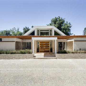
The original design of this late Mid-century Modern house featured a horrifically ugly entry which the owners needed our help to fix. In addition, they wanted to add a master suite, create a home theatre, and remodel the family room. Although they originally considered adding a second floor, our final design resulted in an extension of the house which accentuated its existing linear quality. Our solution to the entry problem included cutting back part of the vaulted roof to allow more light in and adding a cantilevered canopy instead. A new entry bridge crosses a koi pond, and new clerestory windows, stone planters and cedar trim complete the makeover of the previously bland plywood-clad box. The new master suite features 12 foot ceilings, clerestory windows, 8 foot high French doors and a fireplace. The exterior of the addition employs the same pallet of materials as the new façade but with a carefully composed composition of form and proportion. The new family room features the same stone cladding as we used on the exterior.
Photo by Christopher Stark Photography.
 Mark Brand Architecture
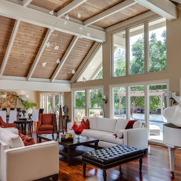
The original design of this late Mid-century Modern house featured a horrifically ugly entry which the owners needed our help to fix. In addition, they wanted to add a master suite, create a home theatre, and remodel the family room. Although they originally considered adding a second floor, our final design resulted in an extension of the house which accentuated its existing linear quality. Our solution to the entry problem included cutting back part of the vaulted roof to allow more light in and adding a cantilevered canopy instead. A new entry bridge crosses a koi pond, and new clerestory windows, stone planters and cedar trim complete the makeover of the previously bland plywood-clad box. The new master suite features 12 foot ceilings, clerestory windows, 8 foot high French doors and a fireplace. The exterior of the addition employs the same pallet of materials as the new façade but with a carefully composed composition of form and proportion. The new family room features the same stone cladding as we used on the exterior.
Photo by Christopher Stark Photography.
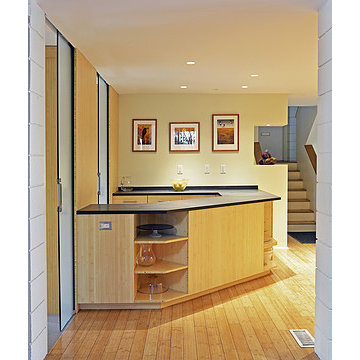 The Galante Architecture Studio, Inc.
Originally built in 1972, these eight interlocked residential units and the accompanying House Master’s Residence won an AIA award for their unique spatial complexity, balancing standard units of construction with volumetric interplay, all while bringing natural light into living spaces. However, nearly 40 years later
These 1970’s era, interlocked faculty housing units won an AIA award when first completed. They were unique in spatial complexity, By early 2,000’s they were showing signs of age, and had become outdated on many levels. Working with project management for the Faculty of Arts & Sciences, we prepared one prototype design to bring the buildings into the 21st century. New insulated skylights, standing seam metal siding, cedar decks and trellises, exchanging black roofs for well insulated white roofs, were all part of a larger planning program to renovate all nine units. The prototype was implemented in 2012, to great approval and result. In 2013 a few more units were done. In 2014 the “House Masters” unit was done, with the remaining four units planned for future budgets.
Sustainable features include re-use of most materials on site, (former siding was able to become sheathing below metal panels), implementing the Stretch Energy Code for insulation, and putting new white roof membranes in place. Using FSC certified wood for decks and trellises, and using Rheinzink siding, a “200 year material” according to the manufacturer.
After nearly 40 years, Ronald Gourley’s AIA award winning Faculty Housing (1972) was beginning to show its age – plywood siding was delaminating, wooden decks splintering, and custom windows failing. Therefore, the opportunity to reinvent a piece of Mid-Century Modernism presented itself when two of the building’s eight alternating rooftop designs were to be rebuilt as prototypes for the remainder of the structure.
The strength of the original design was its rectilinear and symmetrical arrangement of internal and external spaces, but the difference between the two had become blurred over the decades. New zinc siding, mahogany decking, and stainless steel railings accentuate the defining elements and more clearly articulate the living spaces, breathing new life into the building and reinvigorating the surrounding campus.
Furthermore, the renovation also provided a chance to bring the structure up to modern energy standards and help meet Harvard’s lofty environmental goals. Insulation within the ceilings was more than tripled, white TPO roofing reduces the heat island effect, construction waste was minimized by recasting the siding as sheathing, and materials were selected not only for aesthetics, but for their longevity and ability to be recycled as well.
Harvard’s energy standards brought an uncharacteristic level of environmental care to this building. Roof structures are triple insulated, allowing separating interior from exterior in the most thermally efficient manner. North facing triple insulated skylights and white TPO roofing reduces the heat gain, but allows natural light to pour in. Materials were selected not only for aesthetics, but for their longevity. Zinc, for example, is made of 100% recycled material, and has duration of 200 years. Uncharacteristic levels of environmental care were common on this project.
53