
Search results for "Reduce same origin" in Home Design Ideas
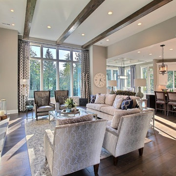
 Cascade West Development
Paint by Sherwin Williams - https://goo.gl/nb9e74
Body - Anew Grey - SW7030 - https://goo.gl/rfBJBn
Trim - Dover White - SW6385 - https://goo.gl/2x84RY
Fireplace by Pro Electric Fireplace - https://goo.gl/dWX48i
Fireplace Surround by Eldorado Stone - https://goo.gl/q1ZB2z
Vantage30 in White Elm - https://goo.gl/T6i22G
Hearthstone by Stone NW Inc - Polished Pioneer Sandstone - https://goo.gl/hu0luL
Flooring by Macadam Floor + Design - https://goo.gl/r5rCto
Metropolitan Floor's Wild Thing Maple in Hearth Stone - https://goo.gl/DuC9G8
Windows by Milgard Window + Door - https://goo.gl/fYU68l
Style Line Series - https://goo.gl/ISdDZL
Supplied by TroyCo - https://goo.gl/wihgo9
Lighting by Destination Lighting - https://goo.gl/mA8XYX
Golden Lighting - Modern Chandelier - https://goo.gl/qE8RUD
Kichler Lighting - Modern Pendants - https://goo.gl/RcOqsa
Interior Design by Creative Interiors & Design - https://goo.gl/zsZtj6
Partially Furnished by Uttermost Lighting & Furniture - https://goo.gl/46Fi0h
All Root Company - https://goo.gl/4oTWJS
Built by Cascade West Development Inc
Cascade West Facebook: https://goo.gl/MCD2U1
Cascade West Website: https://goo.gl/XHm7Un
Photography by ExposioHDR - Portland, Or
Exposio Facebook: https://goo.gl/SpSvyo
Exposio Website: https://goo.gl/Cbm8Ya
Original Plans by Alan Mascord Design Associates - https://goo.gl/Fg3nFk
Plan 2476 - The Thatcher - https://goo.gl/5o0vyw
 Klopf Architecture
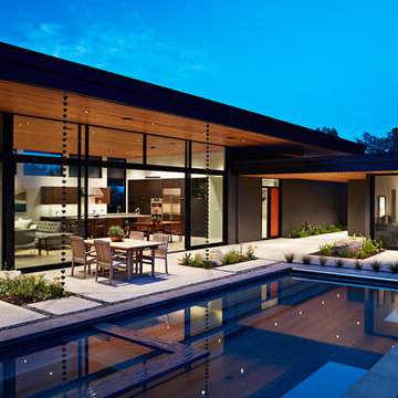
Klopf Architecture, Arterra Landscape Architects and Henry Calvert of Calvert Ventures Designed and built a new warm, modern, Eichler-inspired, open, indoor-outdoor home on a deeper-than-usual San Mateo Highlands property where an original Eichler house had burned to the ground.
The owners wanted multi-generational living and larger spaces than the original home offered, but all parties agreed that the house should respect the neighborhood and blend in stylistically with the other Eichlers. At first the Klopf team considered re-using what little was left of the original home and expanding on it. But after discussions with the owner and builder, all parties agreed that the last few remaining elements of the house were not practical to re-use, so Klopf Architecture designed a new home that pushes the Eichler approach in new directions.
One disadvantage of Eichler production homes is that the house designs were not optimized for each specific lot. A new custom home offered the team a chance to start over. In this case, a longer house that opens up sideways to the south fit the lot better than the original square-ish house that used to open to the rear (west). Accordingly, the Klopf team designed an L-shaped “bar” house with a large glass wall with large sliding glass doors that faces sideways instead of to the rear like a typical Eichler. This glass wall opens to a pool and landscaped yard designed by Arterra Landscape Architects.
Driving by the house, one might assume at first glance it is an Eichler because of the horizontality, the overhanging flat roof eaves, the dark gray vertical siding, and orange solid panel front door, but the house is designed for the 21st Century and is not meant to be a “Likeler.” You won't see any posts and beams in this home. Instead, the ceiling decking is a western red cedar that covers over all the beams. Like Eichlers, this cedar runs continuously from inside to out, enhancing the indoor / outdoor feeling of the house, but unlike Eichlers it conceals a cavity for lighting, wiring, and insulation. Ceilings are higher, rooms are larger and more open, the master bathroom is light-filled and more generous, with a separate tub and shower and a separate toilet compartment, and there is plenty of storage. The garage even easily fits two of today's vehicles with room to spare.
A massive 49-foot by 12-foot wall of glass and the continuity of materials from inside to outside enhance the inside-outside living concept, so the owners and their guests can flow freely from house to pool deck to BBQ to pool and back.
During construction in the rough framing stage, Klopf thought the front of the house appeared too tall even though the house had looked right in the design renderings (probably because the house is uphill from the street). So Klopf Architecture paid the framer to change the roofline from how we had designed it to be lower along the front, allowing the home to blend in better with the neighborhood. One project goal was for people driving up the street to pass the home without immediately noticing there is an "imposter" on this lot, and making that change was essential to achieve that goal.
This 2,606 square foot, 3 bedroom, 3 bathroom Eichler-inspired new house is located in San Mateo in the heart of the Silicon Valley.
Klopf Architecture Project Team: John Klopf, AIA, Klara Kevane
Landscape Architect: Arterra Landscape Architects
Contractor: Henry Calvert of Calvert Ventures
Photography ©2016 Mariko Reed
Location: San Mateo, CA
Year completed: 2016
 Nathan Taylor for Obelisk Home
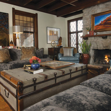
An over scaled family room with dark original shadow box paneling, large Carthage stone fireplace, and leaded windows, required a design esthetic that paid homage to the history of the home, yet created a space for entertaining large groups, while at the same time feeling warm and comfortable, and would also allow the homeowners to take Sunday naps in the often unused room. With the entry to the home also included in the overall dimensions, creating definition without walls was the challenge. Using an antique table that was purchased by the client many years ago as an entry table was the perfect answer. We took the Italian chandelier from the dining room, had it refinished to look old, and re-hung it as the entry fixture. An antique, nearly 18’ foot rug was found, and was the anchor to the room. Over scaled sofa’s, large cocktail truck, antique console tables, new “shiny” lamps, modern tables, and plush pillows all add to the warmth of this space. The room was also painted a warm gray/green to pull all the warm colors and textures together. Original artwork was also very important to the client, and represents their travels an individual taste.
Original Artwork by Karen Schneider
Original Artwork by Gavyn Sky
Photos by Randy Colwell
Find the right local pro for your project
 Roeser Home Remodeling
This Mid-Century home had been updated except for the kitchen and master bath. After a few years of being empty nesters, and with the neighborhood turning over drastically to infill property in the millions, this couple decided the time was right to update the last remaining rooms.
Starting in the Kitchen
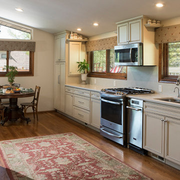
Taking a dark, u-shaped kitchen out of the past and updating it for the future, was a dream come true for this family. They knew what they wanted in order to entertain their large extended family, which included their three kids; plus, his family, consisting of nine children, spouses, and now grandchildren. Requirements of an open space to hang out and help out, a banquet for food presentation without obstruction, bright and clean, easy storage, a place for her mother’s china decanters, and an instant hot for tea were all part of the “must haves” for this kitchen. We also needed to work around the homeowners’ existing appliances since many of them were practically new.
Vaulted ceilings, lots of high windows, and large openings to other spaces in the house, were challenges that only a galley style kitchen could address. Blending and lacing the hardwood floor with new flooring required both the new and existing to be sanded down and refinished. This provided a coherent look to the entire first floor of this home. Matching casings, baseboards and base shoe helped to make the updates look fresh, but original to the house.
In the kitchen, choosing the sandstone slate finish on our Wellborn Maple select series cabinets kept the space soft; but really opened it, making the space lighter and brighter. The Harmony style door choice blended with the décor in the rest of the house, while also giving straight clean lines the homeowner desired. Grounding the row of cabinets with their refrigerator and a pantry cabinet, gave symmetry to this side of the kitchen.
On the opposite side, a built-in pantry cabinet mirrors the refrigerator. A row of drawer cabinets expanded the storage and banquet space, to lay out food for entertaining. Also added were some much-needed wall cabinets with glass inserts to mirror the windows and keep the space open. This also allowed the taller canister to be displayed and admired. A few smaller shelves were added above the window space, to house the smaller canisters so loved by the homeowner.
An artist by trade, this homeowner added two narrow cabinets to the side of the pantry and the side of the refrigerator panel to house and create easy access to the various spices her husband loves to use while cooking. She painted them to blend with Wellborn’s Sandstone finish. The Caesarstone countertop with a 3cm eased edge in London Gray has a small pattern that is subtle and interesting. Cutting down the Caesarstone to 2 cm and carrying the same London Gray pattern up the backsplash area, lended to the clean lines and easy cleaning this homeowner requested.
Choosing chrome plumbing fixtures from Moen’s Brantford line is timeless choice. Chrome is always popular and yet in today’s market, also very trendy. The Brantford faucet has a pull-down spray and one side handle, leaving space for the all-important request of a Transcape hot water dispenser, also in chrome.
Scraping away the past included smoothing out the popcorn ceiling. Adding LED slope cans to the vaulted ceilings provided the necessary task lighting to elevate these homeowners’ joy of cooking. Removing the dated “popcorn look” enhanced the clean and spacious feel created by the architecture of the ceiling. Adding Top Knob chrome hardware was the final element that tied the kitchen all together.
Master Bathroom
The original dated Master Bathroom had dark cabinets, a huge Jacuzzi tub and a small shower stall that provided barely enough room for even a child to shower. Removing the Jacuzzi tub that was never used, opened this floor plan to a grand shower that is comfortable and spacious. For easy cleaning, these homeowners opted for a panel system in their shower. Onyx shower walls with a shower seat and recess wide shower caddy were installed in place of the old Jacuzzi style tub.
The large panels were quite a challenge for our team, with an eight foot door and vaulted ceilings; but they were determined not to have a seam. These seamless panels are beautiful and very easy to clean. Keeping with the original floor plan, a double sink vanity from Wellborn’s select line with the Harmony door style in a pebble finish was installed. New Kohler Caxton under mount sinks were installed, along with the Moen Kinsley 8” wide spread faucets in chrome. Matching Kingsley 18” grab bars were added to the shower area, along with the Kohler Brantford fixed shower head and handheld slide bar.
The countertop was a beautiful Caesarstone in Frosty Carrina with an eased edge and 4” back and side splash. Matching Kinsley towel hooks were added, along with mirrors the homeowner purchased and we installed for her. Top Knobs chrome cabinet hardware finished the look along with a beautiful tile floor AO Mira 1224-S Silver Maple laid in a broken joint pattern. Matching marble sills were added on top of the knee walls and threshold in the doorway. A 3/8” frameless custom shower door with fixed panels surrounded the shower creating an open airy feel to the space.
Not shown: Kohler’s Wellworth highline toilet with a slow-close seat replaces the original toilet. The original shower stall became a space used to house a stackable washer and dryer, a top a safety pan and drain to slop sink in the basement. There was even enough room for small shelving to provide storage for laundry essentials. Adding a louver door keeps the laundry area behind the scene and opens the master area to multiple tasks needed.
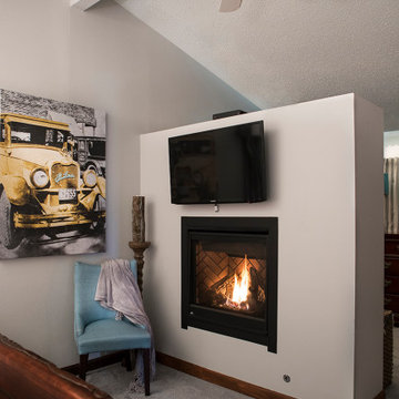
Master Bedroom Fireplace
This homeowner really missed a bedroom fireplace they had in a previous home. Since we were going to be working on their master bathroom anyway; was there a way to create a fireplace without making it feel too odd in their large bedroom area? They had purchased a ventless gas fireplace and they had their original television as well.
Challenged by windows, a vaulted ceiling and the natural light streaming from the back window; this divided wall was created, keeping the lighting from the other side of the room and providing a dressing area opposite the fireplace. This was a perfect idea since the closets are now in the dressing area and the creative wall houses the fireplace and TV for cold winter nights of snuggling to a movie. Better yet, the fireplace and TV are all on remote control!
 Roeser Home Remodeling
This Mid-Century home had been updated except for the kitchen and master bath. After a few years of being empty nesters, and with the neighborhood turning over drastically to infill property in the millions, this couple decided the time was right to update the last remaining rooms.
Starting in the Kitchen
Taking a dark, u-shaped kitchen out of the past and updating it for the future, was a dream come true for this family. They knew what they wanted in order to entertain their large extended family, which included their three kids; plus, his family, consisting of nine children, spouses, and now grandchildren. Requirements of an open space to hang out and help out, a banquet for food presentation without obstruction, bright and clean, easy storage, a place for her mother’s china decanters, and an instant hot for tea were all part of the “must haves” for this kitchen. We also needed to work around the homeowners’ existing appliances since many of them were practically new.
Vaulted ceilings, lots of high windows, and large openings to other spaces in the house, were challenges that only a galley style kitchen could address. Blending and lacing the hardwood floor with new flooring required both the new and existing to be sanded down and refinished. This provided a coherent look to the entire first floor of this home. Matching casings, baseboards and base shoe helped to make the updates look fresh, but original to the house.
In the kitchen, choosing the sandstone slate finish on our Wellborn Maple select series cabinets kept the space soft; but really opened it, making the space lighter and brighter. The Harmony style door choice blended with the décor in the rest of the house, while also giving straight clean lines the homeowner desired. Grounding the row of cabinets with their refrigerator and a pantry cabinet, gave symmetry to this side of the kitchen.
On the opposite side, a built-in pantry cabinet mirrors the refrigerator. A row of drawer cabinets expanded the storage and banquet space, to lay out food for entertaining. Also added were some much-needed wall cabinets with glass inserts to mirror the windows and keep the space open. This also allowed the taller canister to be displayed and admired. A few smaller shelves were added above the window space, to house the smaller canisters so loved by the homeowner.
An artist by trade, this homeowner added two narrow cabinets to the side of the pantry and the side of the refrigerator panel to house and create easy access to the various spices her husband loves to use while cooking. She painted them to blend with Wellborn’s Sandstone finish. The Caesarstone countertop with a 3cm eased edge in London Gray has a small pattern that is subtle and interesting. Cutting down the Caesarstone to 2 cm and carrying the same London Gray pattern up the backsplash area, lended to the clean lines and easy cleaning this homeowner requested.
Choosing chrome plumbing fixtures from Moen’s Brantford line is timeless choice. Chrome is always popular and yet in today’s market, also very trendy. The Brantford faucet has a pull-down spray and one side handle, leaving space for the all-important request of a Transcape hot water dispenser, also in chrome.
Scraping away the past included smoothing out the popcorn ceiling. Adding LED slope cans to the vaulted ceilings provided the necessary task lighting to elevate these homeowners’ joy of cooking. Removing the dated “popcorn look” enhanced the clean and spacious feel created by the architecture of the ceiling. Adding Top Knob chrome hardware was the final element that tied the kitchen all together.
Master Bathroom
The original dated Master Bathroom had dark cabinets, a huge Jacuzzi tub and a small shower stall that provided barely enough room for even a child to shower. Removing the Jacuzzi tub that was never used, opened this floor plan to a grand shower that is comfortable and spacious. For easy cleaning, these homeowners opted for a panel system in their shower. Onyx shower walls with a shower seat and recess wide shower caddy were installed in place of the old Jacuzzi style tub.
The large panels were quite a challenge for our team, with an eight foot door and vaulted ceilings; but they were determined not to have a seam. These seamless panels are beautiful and very easy to clean. Keeping with the original floor plan, a double sink vanity from Wellborn’s select line with the Harmony door style in a pebble finish was installed. New Kohler Caxton under mount sinks were installed, along with the Moen Kinsley 8” wide spread faucets in chrome. Matching Kingsley 18” grab bars were added to the shower area, along with the Kohler Brantford fixed shower head and handheld slide bar.
The countertop was a beautiful Caesarstone in Frosty Carrina with an eased edge and 4” back and side splash. Matching Kinsley towel hooks were added, along with mirrors the homeowner purchased and we installed for her. Top Knobs chrome cabinet hardware finished the look along with a beautiful tile floor AO Mira 1224-S Silver Maple laid in a broken joint pattern. Matching marble sills were added on top of the knee walls and threshold in the doorway. A 3/8” frameless custom shower door with fixed panels surrounded the shower creating an open airy feel to the space.
Not shown: Kohler’s Wellworth highline toilet with a slow-close seat replaces the original toilet. The original shower stall became a space used to house a stackable washer and dryer, a top a safety pan and drain to slop sink in the basement. There was even enough room for small shelving to provide storage for laundry essentials. Adding a louver door keeps the laundry area behind the scene and opens the master area to multiple tasks needed.
Master Bedroom Fireplace
This homeowner really missed a bedroom fireplace they had in a previous home. Since we were going to be working on their master bathroom anyway; was there a way to create a fireplace without making it feel too odd in their large bedroom area? They had purchased a ventless gas fireplace and they had their original television as well.
Challenged by windows, a vaulted ceiling and the natural light streaming from the back window; this divided wall was created, keeping the lighting from the other side of the room and providing a dressing area opposite the fireplace. This was a perfect idea since the closets are now in the dressing area and the creative wall houses the fireplace and TV for cold winter nights of snuggling to a movie. Better yet, the fireplace and TV are all on remote control!
 Kitchen Kraft
John Evans
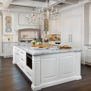
Inspiration for a huge timeless u-shaped dark wood floor kitchen remodel in Columbus with beaded inset cabinets, white cabinets, white backsplash, paneled appliances, an island, granite countertops and stone tile backsplash
Inspiration for a huge timeless u-shaped dark wood floor kitchen remodel in Columbus with beaded inset cabinets, white cabinets, white backsplash, paneled appliances, an island, granite countertops and stone tile backsplash
 Bridget Cooper Interiors
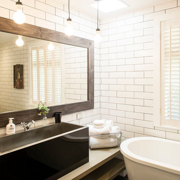
The original bathroom was split into three rooms. I made it into one adding a big window over the bath.
Huge transitional subway tile and white tile ceramic tile bathroom photo in Other with white cabinets, a wall-mount toilet, white walls, concrete countertops, a vessel sink and gray countertops
Huge transitional subway tile and white tile ceramic tile bathroom photo in Other with white cabinets, a wall-mount toilet, white walls, concrete countertops, a vessel sink and gray countertops

 ODS Architecture
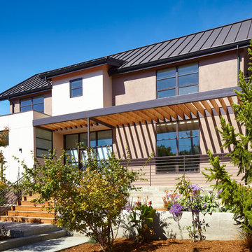
Originally a nearly three-story tall 1920’s European-styled home was turned into a modern villa for work and home. A series of low concrete retaining wall planters and steps gradually takes you up to the second level entry, grounding or anchoring the house into the site, as does a new wrap around veranda and trellis. Large eave overhangs on the upper roof were designed to give the home presence and were accented with a Mid-century orange color. The new master bedroom addition white box creates a better sense of entry and opens to the wrap around veranda at the opposite side. Inside the owners live on the lower floor and work on the upper floor with the garage basement for storage, archives and a ceramics studio. New windows and open spaces were created for the graphic designer owners; displaying their mid-century modern furnishings collection.
A lot of effort went into attempting to lower the house visually by bringing the ground plane higher with the concrete retaining wall planters, steps, wrap around veranda and trellis, and the prominent roof with exaggerated overhangs. That the eaves were painted orange is a cool reflection of the owner’s Dutch heritage. Budget was a driver for the project and it was determined that the footprint of the home should have minimal extensions and that the new windows remain in the same relative locations as the old ones. Wall removal was utilized versus moving and building new walls where possible.
Photo Credit: John Sutton Photography.
 Kitchen Design Concepts
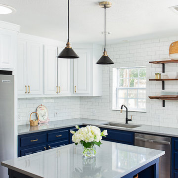
We introduce to you one of our newer services we are providing here at Kitchen Design Concepts: spaces that just need a little reviving! As of recent, we are taking on projects that are in need of minimal updating, as in, spaces that don’t need a full-on remodel. Yes, you heard right! If your space has good bones, you like the layout of your kitchen, and you just need a few cosmetic changes, then today’s feature is for you! Recently, we updated a space where we did just this! The kitchen was in need of a little love, some fresh paint, and new finishes. And if we’re being honest here, the result looks almost as if the kitchen had a full-on remodel! To learn more about this space and how we did our magic, continue reading below:
The Before and After
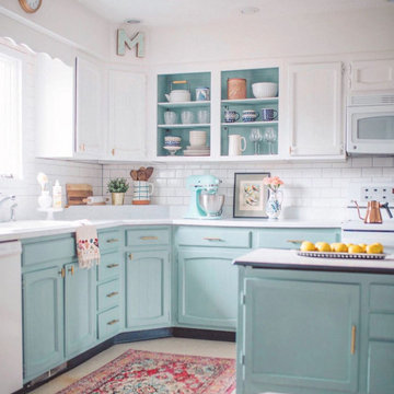
First, see what an impact new finishes can make! The “before” image shows a kitchen with outdated finishes such as the tile countertops, backsplash, and cabinetry finish. The “after” image, is a kitchen that looks almost as if its brand new, the image speaks for itself!
Cabinetry
With the wooden cabinetry in this kitchen already having great bones, all we needed to do was our refinishing process that involved removing door and drawer fronts, sanding, priming, and painting. The main color of the cabinetry is white (Sherwin Williams Pure White 7005) and as an accent, we applied a deep navy blue that really pops in this space (Sherwin Willaims Naval 6244). As a special design element, we incorporated a natural wooden band across the hood which is subtle but adds an element of surprise.
Countertops
The original countertops in this space were a 12×12 tile with cracks and discolored grout from all the wear and tear. To replace the countertops, we installed a clean and crisp quartz that is not only durable but easy to maintain (no grout here!). The 3cm countertops are a Cambria quartz in a grey-tone color (Carrick).
Backsplash
Keeping things simple, yet classic, we installed a 3×6 subway tile from Interceramic. The crisp white pairs well with all the other finishes of the space and really brighten the space up! To spice things up, we paired the white tile with a contrasting grout color (Cape Grey) that matches the countertop. This is a simple method to add interest to your white backsplash!
Fixtures and Fittings
For the fixtures and fittings of the kitchen, we wanted pieces that made a statement. That’s why we selected this industrial style faucet from Brizo! The faucet is a Brizo LITZE™ PULL-DOWN FAUCET WITH ARC SPOUT AND INDUSTRIAL HANDLE (63044LF-BLGL). The matte black paired with the luxe gold elements really make a statement! To match the gold elements of the faucet, we installed cabinetry hardware from Topknobs in the same gold finish. The hardware is a Channing pull TK743HB. Lastly, the large single bowl sink (who doesn’t want a large sink?!) is a great functional touch to the kitchen. The sink is a Blanco Precision 16″ R10 super single with 16″ Drainer in stainless steel (516216).
 Copper Sky Design + Remodel
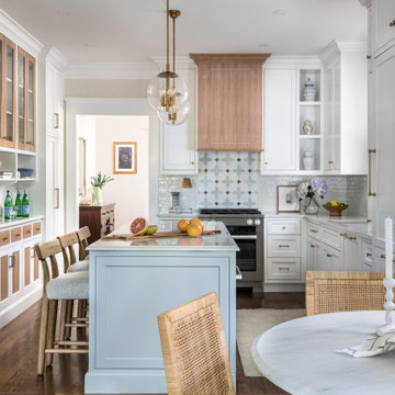
A quintessential 1925 bungalow located in the charming neighborhood of Virginia Highland in Atlanta, this project included a renovation of the kitchen, family room and powder room on the first floor, and the laundry and primary bath on the second. The Copper Sky Design + Remodel team reconfigured the first floor to better accommodate additional cabinetry and an island in the kitchen by borrowing space from what was a full bathroom and converting it to a half bath. Upstairs, unfinished attic space was converted to a roomy laundry room while the 200 square foot primary bath remained in its original footprint.
 Ellsworth Design Build
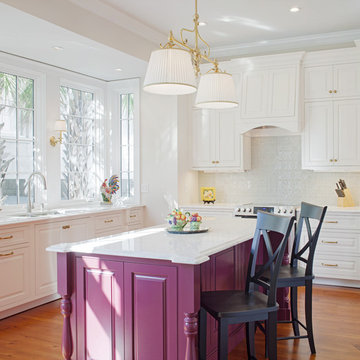
Traditional home in the heart of Savannah's Historic Landmark District that was built in 1999 had an 8' by 11' kitchen completely cut off from the rest of the house. We pushed out the back of the house three feet to create a bay to hold a sink, allowing us to completely open up the floorplan. The island color was based on the clients favorite shade of red (it also matches the front door). The rest of the palette is kept light and soft with a play of materials like the original pine floors, grass cloth wallpaper, Walker Zanger backsplash tile, and Viaterra Quartz 'marble' counters. The cabinets are all fully custom including an integrated dishwasher. It is a complete transformation from where we started!
Photos by Richard Leo Johnson of Atlantic Archives
 TKS Design Group
Free ebook, Creating the Ideal Kitchen. DOWNLOAD NOW
The Klimala’s and their three kids are no strangers to moving, this being their fifth house in the same town over the 20-year period they have lived there. “It must be the 7-year itch, because every seven years, we seem to find ourselves antsy for a new project or a new environment. I think part of it is being a designer, I see my own taste evolve and I want my environment to reflect that. Having easy access to wonderful tradesmen and a knowledge of the process makes it that much easier”.
This time, Klimala’s fell in love with a somewhat unlikely candidate. The 1950’s ranch turned cape cod was a bit of a mutt, but it’s location 5 minutes from their design studio and backing up to the high school where their kids can roll out of bed and walk to school, coupled with the charm of its location on a private road and lush landscaping made it an appealing choice for them.
“The bones of the house were really charming. It was typical 1,500 square foot ranch that at some point someone added a second floor to. Its sloped roofline and dormered bedrooms gave it some charm.” With the help of architect Maureen McHugh, Klimala’s gutted and reworked the layout to make the house work for them. An open concept kitchen and dining room allows for more frequent casual family dinners and dinner parties that linger. A dingy 3-season room off the back of the original house was insulated, given a vaulted ceiling with skylights and now opens up to the kitchen. This room now houses an 8’ raw edge white oak dining table and functions as an informal dining room. “One of the challenges with these mid-century homes is the 8’ ceilings. I had to have at least one room that had a higher ceiling so that’s how we did it” states Klimala.
The kitchen features a 10’ island which houses a 5’0” Galley Sink. The Galley features two faucets, and double tiered rail system to which accessories such as cutting boards and stainless steel bowls can be added for ease of cooking. Across from the large sink is an induction cooktop. “My two teen daughters and I enjoy cooking, and the Galley and induction cooktop make it so easy.” A wall of tall cabinets features a full size refrigerator, freezer, double oven and built in coffeemaker. The area on the opposite end of the kitchen features a pantry with mirrored glass doors and a beverage center below.
The rest of the first floor features an entry way, a living room with views to the front yard’s lush landscaping, a family room where the family hangs out to watch TV, a back entry from the garage with a laundry room and mudroom area, one of the home’s four bedrooms and a full bath. There is a double sided fireplace between the family room and living room. The home features pops of color from the living room’s peach grass cloth to purple painted wall in the family room. “I’m definitely a traditionalist at heart but because of the home’s Midcentury roots, I wanted to incorporate some of those elements into the furniture, lighting and accessories which also ended up being really fun. We are not formal people so I wanted a house that my kids would enjoy, have their friends over and feel comfortable.”
The second floor houses the master bedroom suite, two of the kids’ bedrooms and a back room nicknamed “the library” because it has turned into a quiet get away area where the girls can study or take a break from the rest of the family. The area was originally unfinished attic, and because the home was short on closet space, this Jack and Jill area off the girls’ bedrooms houses two large walk-in closets and a small sitting area with a makeup vanity. “The girls really wanted to keep the exposed brick of the fireplace that runs up the through the space, so that’s what we did, and I think they feel like they are in their own little loft space in the city when they are up there” says Klimala.
Designed by: Susan Klimala, CKD, CBD
Photography by: Carlos Vergara
For more information on kitchen and bath design ideas go to: www.kitchenstudio-ge.com
 Stoneshop
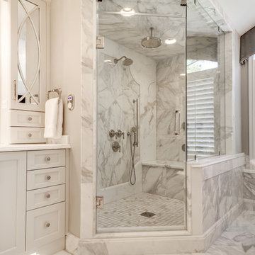
This spacious master bathroom is bright and elegant. It features white Calacatta marble tile on the floor, wainscoting treatment, and enclosed glass shower. The same Calacatta marble is also used on the two vanity countertops. Our crew spent time planning out the installation of the gorgeous water-jet floor tile insert, as well as the detailed Calacatta slab wall treatment in the shower.
This beautiful space was designed by Arnie of Green Eyed Designs.
Photography by Joseph Alfano.
Sponsored
Sunbury, OH

J.Holderby - Renovations
Franklin County's Leading General Contractors - 2X Best of Houzz!
 Savoir Faire Home
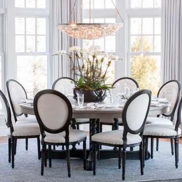
The chandelier is hand strung oyster shells from Low Country Originals
Elegant medium tone wood floor dining room photo in Boston with white walls
Elegant medium tone wood floor dining room photo in Boston with white walls
 Leib Designs
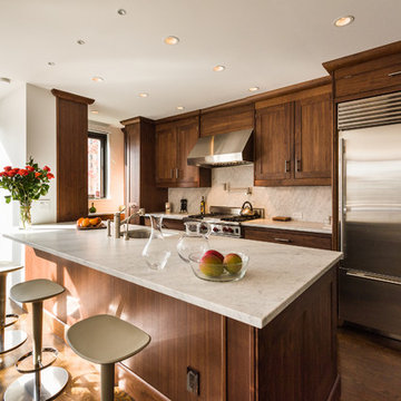
The kitchen was created in collaboration with Smallbone of Devizes. The electronic stove from Wolf has a stainless steel finish and allows residents to choose from ten different cooking modes with even temperatures and airflow throughout. The available dual fuel ranges are natural or LP gas. The refrigerator is a product of Sub-Zero and is built into the surrounding cabinetry. To ensure freshness of food and water, the refrigerator features an air purification system, that reduces stench, odors, bacteria and viruses. The residents will be accustom to cleaning without error, with the help of their fully integrated dishwasher from Miele.
 neely architecture
Barry Halkin
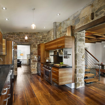
Trendy galley kitchen photo in Philadelphia with an undermount sink, flat-panel cabinets, medium tone wood cabinets and stainless steel appliances
Trendy galley kitchen photo in Philadelphia with an undermount sink, flat-panel cabinets, medium tone wood cabinets and stainless steel appliances
 Klopf Architecture
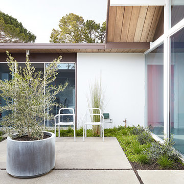
Klopf Architecture and Jesse Ososki Art remodeled an existing Eichler atrium home into a brighter, more open, and more functional version of its original self.
The goals were to preserve the Eichler look and feel without the need to strictly adhere to it. The scope of work included re-configuring the master bedroom/bath, the kitchen, and the hall bath/laundry area, as well as updating interior finishes throughout to be more sophisticated.
The owners are detail-oriented and were very involved in the design process, down to the selection of lighting controls and stainless steel faceplates.Their design aesthetic leans toward the Scandinavian — light and bright, with simple straight lines and pure geometric shapes.
The finish flooring is large porcelain tile (24” x 24”) in a neutral grey tone, providing a uniform backdrop against which other materials can stand out. The same tile continues into the shower floor (with a different finish texture for slip-resistance) and up the shower/tub walls (in a smaller size). Heath Classic Field ceramic tile in Modern Blue was used sparingly, to add color at the hall bath vanity backsplash and at the shampoo niches in both bathrooms. Back-painted soda glass in pale blue to match the Heath tile was used at the kitchen backsplash. This same accent color was also used at the front entry atrium door. Kitchen cabinetry, countertops, appliances, and light fixtures are all white, making the kitchen feel more airy and light. Countertops are Caesarstone Blizzard.
The owners chose to keep some of the original Eichler elements: the concrete masonry fireplace; the stained tongue-and-groove redwood ceiling decking; and the luan wall paneling. The luan paneling was lightly sanded, cleaned, and re-stained. The owners also kept an added element that was installed by a previous owner: sliding shoji panels at all bedroom windows and sliding glass doors, for both privacy and sun control. Grooves were cut into the new tile flooring for the shoji panels to slide in, creating a more integrated look. Walnut was used to add warmth and contrast at the kitchen bar top and niche, the bathroom vanities, and the window sill/ledge under the kitchen window.
This Burlingame Eichler Remodel is a 2,121 sf, 4 bedroom/2 bath home located in the heart of Silicon Valley.
Klopf Architecture Project Team: John Klopf, Klara Kevane and Yegvenia Torres Zavala
Contractor: Jesse Ososki Art
Structural Engineer: Emmanuel Pun
Photography ©2018 Mariko Reed
Location: Burlingame, CA
Year completed: 2017

Sponsored
Columbus, OH

Wannemacher Interiors
Customized Award-Winning Interior Design Solutions in Franklin Cnty OH
 dcap pllc
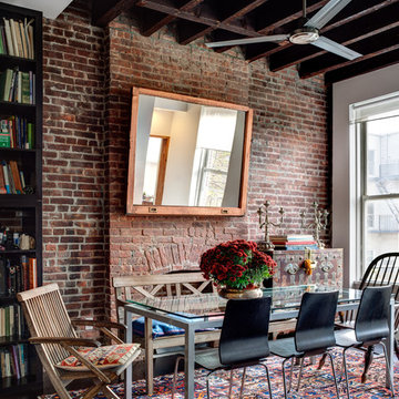
Adding a penthouse perch to this 1899 row house with a harbor view demanded unusual tactics. To circumvent municipal limitations on floor area, a section of floor was removed from one level and “transferred” to the roof as a new studio space. To comply with local height limitations, an innovative structure of solid wood studs was deployed to reduce floor and ceiling thicknesses to the bare minimum. Aside from creating the desired rooftop refuge, these gymnastics also created a dynamic cascade of interior living spaces for an urban designer and his family.
Photos by Bruce Buck.
 Simply Home Decorating
This beautiful North Vancouver home belongs to a nature-loving and health-conscious couple, Emma and Vince (names changed), their two young children, and their dog, Jasper. When they contacted us about renovating and furnishing their kitchen and family room, we walked in and saw a world of potential waiting to be uncovered.
Before: Larkhall Crescent Home:
Like many original North Vancouver homes, the interior was definitely dated. We encountered late ‘80s finishes in powder pink and teal green, old carpet, and a kitchen that wasn’t maximized to suit this family’s modern-day lifestyle. However, the size of the rooms offered us a ton of space with which to get creative.
Knowing our clients’ love of cooking, need for work spaces (Emma and Vince both work remotely), and growing family, we developed a design concept that would increase usable space, optimize storage, and create intimacy in this large area. As for the style, we were inspired by their European roots, inventing a new and modern take on “Belgian Farmhouse” style. Now, the home is truly one-of-a-kind.
After: Warm & Cozy Family Room:
Fresh, bright, and comfortable, this living area has been transformed! We started with the fireplace as a focal point, selecting aged brick tiles for added texture and a crisp wood mantle. The taupe-coloured sectional infuses the room with visual warmth and serves the added purpose of separating the family room from the kitchen.
Emma and Vince were also keen on using non-toxic materials in their home, and we were happy to oblige. To meet their needs, we sourced natural wood elements and sought out Canadian-made products - that adhere to high health standards - whenever possible.
Look closer at the elements of this space, and you will find this stunning, honeycomb-patterned rug in earthy gold, beige, and charcoal tones. It’s plush to the touch and full of visual texture that brings this room’s colour palette together. We sourced these two-tone chairs with caning, petrified wood side table, black sconces, and botanical prints in greyscale from local artist, Heather Johnston.
We topped off the space with this dark wood and rattan console that offers storage facing the kitchen and presents an opportunity to display cherished items. The result is a cozy lounging space brimming with comfort and functionality. It’s perfect for enjoying quality family time, or Emma can simply slide the coffee table away to make room for her morning yoga practice.
Now, let’s turn around and give some attention to the kitchen. Do you remember what the original kitchen looked like? If not, scroll back up, because the transformation is shocking…
Moody & Welcoming Kitchen for Healthy Living:
This kitchen looks very different from how it started, right? Though we didn’t touch any walls, the kitchen has almost doubled in usable space! We created a long, extended island with storage, an outlet for small appliances, and seating for comfortable prep, after-school snacking, or mingling among friends.
On the other side of the island, the family has even more storage and an integrated dishwasher within easy reach of the sink, perfect for quick clean-up. From this angle, you can also see the expansive custom Shaker cabinetry in white and the integrated double ovens. These facilitate their cooking experience and gave us the opportunity to add an additional surprise…
A coffee garage station and more hidden storage! Keeping these items located along the perimeter allows them to be accessed by the family or their guests without someone getting under the cook’s feet. These are the little details that make everyday life easier and more enjoyable.
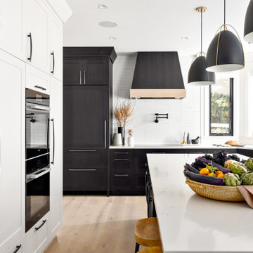
Moving deeper into the kitchen, the seamless induction cooktop topped with a freestanding concealed hood fan commands attention in a soft yet prominent way. The natural wood accent mirrors the fireplace mantle, and the choice of off-black wood-grain cabinets not only continues our black-and-white colour palette but adds a sense of depth and contrast. The corner sink is located to the right and perfectly positioned with a view of their thriving backyard.
To invite more of this family’s character into the space, we mixed metals for interest — matte black, dark pewter, and warm brass — and created open shelves in white oak for their plants and decor. You can also glimpse the tumbled edge of the backsplash tile, which echoes the rustic brick of the fireplace. It adds that farmhouse charm while still feeling timeless and sophisticated.
Last but not least, we designed this dining banquette in the bay window (with integrated bench storage, of course), where the family can share a meal together, the kids can do homework, or Emma and Vince can work and enjoy a change of scenery from their offices. Like the other spaces in the home, it was designed to be beautiful, multi-functional, and long-lasting.
Praise from Our Clients:
It is clear that we love this home, but what did our clients have to say?
“Lori is a visionary and masters execution to the finest detail all at the same time. When she first met us to know more about who we are and how we live, she could right away envision how we could use the space in our kitchen and living room…The results exceeded our expectations.
Lori and her team were also a delight to work with — coordination with all the trades, fast problem-solving, regular updates, professional and friendly attitude of her entire team — made it the dream team. Thank you SHD for making our space so beautiful!”
In turn, we are so grateful for this family’s trust, their open communication, and for being wonderful people with whom to work. (So, thank you!)
 Ashton Renovations
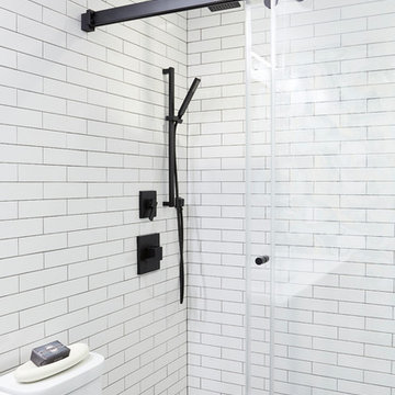
The original ensuite bathroom in this condominium required renovations to replace problematic Kitec plumbing. The layout in the space remained the same, but improvements were made to address certain design challenges with lighting, automation, and space. The aim was to create a modern bathroom design with textured wood features, and the feel of metallic black accents.
A number of prominent changes were made to improve the use of space. The original entry, a left-handed door swinging into the bathroom, was replaced. It interfered with the vanity clear floor space. It also made the use of the bathroom difficult when two users were present. It was changed to a soft closing pocket door. To avoid losing space it was installed by creating a wall cavity on the outside of the bathroom. This door also included frosted glass panels to allow natural light into the space. Double sliding glass shower doors were also installed to address access issues to the shower valve.
Storage improvements included the installation of dual inset medicine cabinets, and pull out drawers within the wall hung vanity. The depth of the medicine cabinets were extended outwards, and this nice detail was finished with a textured wood finish. The addition of the wall hung vanity also created the feeling of more space beneath the units and allowed for under cabinet lighting.
Lighting and automation improvements included the addition of HUE LED lighting. This was done by installing two shower pot lights, a 6” main potlight, and under cabinet lighting. These are all controlled by the Philips Hue App that programs routines, scenes, and other settings.
Some of the other highlights of this modern bathroom include dark grout, which contrasts nicely with the elongated white tile, a thermostatic shower system, herringbone textured porcelain floor tile, and a Schluter Kerdi waterproofing shower system. This bathroom is made most unique though with the choice of wallpaper, which can be described as modern luxury, a graphic take on agate stone patterns with metallic embellishments.
50