
Search results for "Reduce same origin" in Home Design Ideas
 MDB Design Group
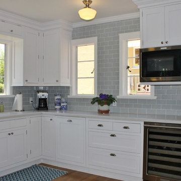
We discussed the location of the sink and decided if we moved it to the other wall, it could be centered under the window, thus making it a more pleasurable when working at it. This created a long and more functional countertop to the right. We chose Caesarstone for the durability and ease of maintenance in a Carrera marble look for the countertops. This is complimented by the gray subway style tile backsplash with crisp white grout.
State-of-the-art appliances were included in the new floor plan: a microwave set in the upper cabinet, wine cooler below, new dishwasher with a panel to match the cabinets, a new stainless steel refrigerator, and a new professional style range and hood. The alcove for the range received the same tile backsplash, but we used a herringbone pattern to accent the feature wall. We also created a niche in the side wall to provide handy storage for spices. The base cabinets contain spice pullout storage. The original wood framing around the alcove was treated to a new coat of white paint to match the cabinets.
Mary Broerman, CCIDC
 Charmean Neithart Interiors
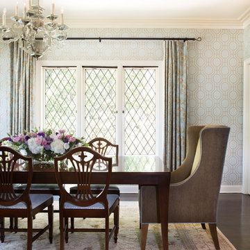
This cottage tudor home in the heart of Pasadena showcases original details and traditional elegance for a busy family of four.
Photography by Erika Bierman
www.erikabiermanphotography.com

Find the right local pro for your project

 ZeroEnergy Design
This LEED Platinum certified house reflects the homeowner's desire for an exceptionally healthy and comfortable living environment, within a traditional neighborhood.
INFILL SITE. The family, who moved from another area of Wellesley, sought out this property to be within walking distance of the high school and downtown area. An existing structure on the tight lot was removed to make way for the new home. 84% of the construction waste, from both the previous structure and the new home, was diverted from a landfill. ZED designed to preserve the existing mature trees on the perimeter of the property to minimize site impacts, and to maintain the character of the neighborhood as well as privacy on the site.
EXTERIOR EXPRESSION. The street facade of the home relates to the local New England vernacular. The rear uses contemporary language, a nod to the family’s Californian roots, to incorporate a roof deck, solar panels, outdoor living space, and the backyard swimming pool. ZED’s careful planning avoided to the need to face the garage doors towards the street, a common syndrome of a narrow lot.
THOUGHTFUL SPACE. Homes with dual entries can often result in duplicate and unused spaces. In this home, the everyday and formal entry areas are one and the same; the front and garage doors share the entry program of coat closets, mudroom storage with bench for removing your shoes, and a laundry room with generous closets for the children's sporting equipment. The entry area leads directly to the living space, encompassing the kitchen, dining and sitting area areas in an L-shaped open plan arrangement. The kitchen is placed at the south-west corner of the space to allow for a strong connection to the dining, sitting and outdoor living spaces. A fire pit on the deck satisfies the family’s desire for an open flame while a sealed gas fireplace is used indoors - ZED’s preference after omitting gas burning appliances completely from an airtight home. A small study, with a window seat, is conveniently located just off of the living space. A first floor guest bedroom includes an accessible bathroom for aging visitors and can be used as a master suite to accommodate aging in place.
HEALTHY LIVING. The client requested a home that was easy to clean and would provide a respite from seasonal allergies and common contaminants that are found in many indoor spaces. ZED selected easy to clean solid surface flooring throughout, provided ample space for cleaning supplies on each floor, and designed a mechanical system with ventilation that provides a constant supply of fresh outdoor air. ZED selected durable materials, finishes, cabinetry, and casework with low or no volatile organic compounds (VOCs) and no added urea formaldehyde.
YEAR-ROUND COMFORT. The home is super insulated and air-tight, paired with high performance triple-paned windows, to ensure it is draft-free throughout the winter (even when in front of the large windows and doors). ZED designed a right-sized heating and cooling system to pair with the thermally improved building enclosure to ensure year-round comfort. The glazing on the home maximizes passive solar gains, and facilitates cross ventilation and daylighting.
ENERGY EFFICIENT. As one of the most energy efficient houses built to date in Wellesley, the home highlights a practical solution for Massachusetts. First, the building enclosure reduces the largest energy requirement for typical houses (heating). Super-insulation, exceptional air sealing, a thermally broken wall assembly, triple pane windows, and passive solar gain combine for a sizable heating load reduction. Second, within the house only efficient systems consume energy. These include an air source heat pump for heating & cooling, a heat pump hot water heater, LED lighting, energy recovery ventilation, and high efficiency appliances. Lastly, photovoltaics provide renewable energy help offset energy consumption. The result is an 89% reduction in energy use compared to a similar brand new home built to code requirements.
RESILIENT. The home will fare well in extreme weather events. During a winter power outage, heat loss will be very slow due to the super-insulated and airtight envelope– taking multiple days to drop to 60 degrees even with no heat source. An engineered drainage system, paired with careful the detailing of the foundation, will help to keep the finished basement dry. A generator will provide full operation of the all-electric house during a power outage.
OVERALL. The home is a reflection of the family goals and an expression of their values, beautifully enabling health, comfort, safety, resilience, and utility, all while respecting the planet.
ZED - Architect & Mechanical Designer
Bevilacqua Builders Inc - Contractor
Creative Land & Water Engineering - Civil Engineering
Barbara Peterson Landscape - Landscape Design
Nest & Company - Interior Furnishings
Eric Roth Photography - Photography
 Accent Window Fashions LLC
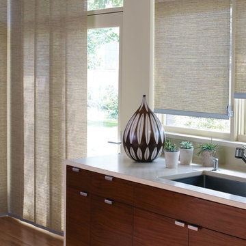
With the same patented design as the original Skyline®, Alustra® Skyline® Gliding Window Panels are distinguished by rich materials and textures handpicked from around the world for their distinction.
Hunter Douglas Skyline® Gliding Window Panels are a patented twist on vertical blinds. A sleek, contemporary design lends drama to any décor, whether covering large windows or when used as a unique room divider.
UV protection SUNSCREEN FOR YOUR VALUABLES
Protect your furniture, flooring and artwork from fading with at least 75% protection from harmful UV rays.
Platinum™ Technology REMOTE CONTROL FROM YOUR PHONE OR TABLET
Controlling your window treatments with a mobile device means you can set your blinds to movie mode, work mode, or 8 a.m. mode with the touch of a button, without leaving your seat. It’s effortless, fun and smart—with perfectly smooth operation.
Lifetime Guarantee FOR LIFE
Hunter Douglas products are designed and custom-assembled in the U.S. with the highest level of quality. But just in case, every window treatment from Hunter Douglas is covered by our lifetime limited guarantee. Read the Hunter Douglas Warranty to learn more.
Hunter Douglas Alustra® Woven Textures® Roller Shades
Hunter Douglas Alustra® Woven Textures® Roller Shades with Chelsea™ PowerGlide 2.1 with Platinum Technology
Operating Systems: Chelsea PowerGlide 2.1 with Platinum Technology
Room: Kitchen
Room Styles: Transitional
Available from Accent Window Fashions LLC
Hunter Douglas Showcase Priority Dealer
Hunter Douglas Certified Installer
Hunter Douglas Certified Professional Dealer
#Hunter_Douglas #Alustra #Woven_Textures #Roller_Shades #Chelsea #PowerGlide #Kitchen #Kitchen_Ideas #Transitional #Window_Treatments #HunterDouglas #Accent_Window_Fashions
Copyright 2001-2014 Hunter Douglas, Inc. All rights reserved.
 LuxeMark Company
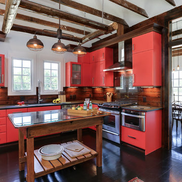
This homeowner has long since moved away from his family farm but still visits often and thought it was time to fix up this little house that had been neglected for years. He brought home ideas and objects he was drawn to from travels around the world and allowed a team of us to help bring them together in this old family home that housed many generations through the years. What it grew into is not your typical 150 year old NC farm house but the essence is still there and shines through in the original wood and beams in the ceiling and on some of the walls, old flooring, re-purposed objects from the farm and the collection of cherished finds from his travels.
Photos by Tad Davis Photography
 Innovative Design Build
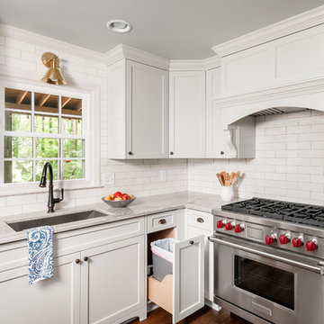
"I cannot say enough good things about the Innovative Construction team and work product.
They remodeled our water-damaged, 1930s basement, and exceeded all of our expectations - before and after photos simply cannot do this project justice. The original basement included an awkward staircase in an awkward location, one bedroom, one bathroom, a kitchen and small living space. We had a difficult time imagining that it could be much more than that. Innovative Construction's design team was creative, and thought completely out of the box. They relocated the stairwell in a way we did not think was possible, opening up the basement to reconfigure the bedroom, bathroom, kitchenette, living space, but also adding an office and finished storage room. The end result is as functional as it is beautiful.
As with all construction, particularly a renovation of an old house, there will be inconveniences, it will be messy, and plenty of surprises behind the old walls. The Innovative Construction team maintained a clean and safe work site for 100% of the project, with minimal disruption to our daily lives, even when there was a large hole cut into our main living room floor to accommodate new stairs down to the basement. The team showed creativity and an eye for design when working around some of the unexpected "character" revealed when opening the walls.
The team effectively uses technology to keep everyone on the same page about changes, requests, schedules, contracts, invoices, etc. Everyone is friendly, competent, helpful, and responsive. I felt heard throughout the process, and my requests were responded to quickly and thoroughly. I recommend Innovative Construction without reservation."

Sponsored
Fredericksburg, OH

High Point Cabinets
Columbus' Experienced Custom Cabinet Builder | 4x Best of Houzz Winner
 StudioLAB
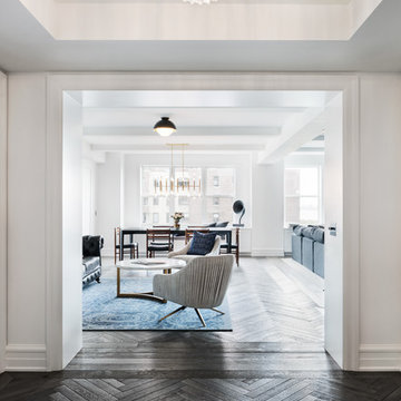
Across from Hudson River Park, the Classic 7 pre-war apartment had not renovated in over 50 years. The new owners, a young family with two kids, desired to open up the existing closed in spaces while keeping some of the original, classic pre-war details. Dark, dimly-lit corridors and clustered rooms that were a detriment to the brilliant natural light and expansive views the existing apartment inherently possessed, were demolished to create a new open plan for a more functional style of living. Custom charcoal stained white oak herringbone floors were laid throughout the space. The dark blue lacquered kitchen cabinets provide a sharp contrast to the otherwise neutral colored space. A wall unit in the same blue lacquer floats on the wall in the Den.

 Denise Quade Design
A bar was built in to the side of this family room to showcase the homeowner's Bourbon collection. Reclaimed wood was used to add texture to the wall and the same wood was used to create the custom shelves. A bar sink and paneled beverage center provide the functionality the room needs. The paneling on the other walls are all original to the home.
 Progressive Design Build
Challenge
This 2001 riverfront home was purchased by the owners in 2015 and immediately renovated. Progressive Design Build was hired at that time to remodel the interior, with tentative plans to remodel their outdoor living space as a second phase design/build remodel. True to their word, after completing the interior remodel, this young family turned to Progressive Design Build in 2017 to address known zoning regulations and restrictions in their backyard and build an outdoor living space that was fit for entertaining and everyday use.
The homeowners wanted a pool and spa, outdoor living room, kitchen, fireplace and covered patio. They also wanted to stay true to their home’s Old Florida style architecture while also adding a Jamaican influence to the ceiling detail, which held sentimental value to the homeowners who honeymooned in Jamaica.
Solution
To tackle the known zoning regulations and restrictions in the backyard, the homeowners researched and applied for a variance. With the variance in hand, Progressive Design Build sat down with the homeowners to review several design options. These options included:
Option 1) Modifications to the original pool design, changing it to be longer and narrower and comply with an existing drainage easement
Option 2) Two different layouts of the outdoor living area
Option 3) Two different height elevations and options for the fire pit area
Option 4) A proposed breezeway connecting the new area with the existing home
After reviewing the options, the homeowners chose the design that placed the pool on the backside of the house and the outdoor living area on the west side of the home (Option 1).
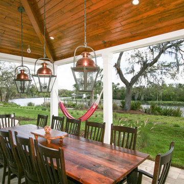
It was important to build a patio structure that could sustain a hurricane (a Southwest Florida necessity), and provide substantial sun protection. The new covered area was supported by structural columns and designed as an open-air porch (with no screens) to allow for an unimpeded view of the Caloosahatchee River. The open porch design also made the area feel larger, and the roof extension was built with substantial strength to survive severe weather conditions.
The pool and spa were connected to the adjoining patio area, designed to flow seamlessly into the next. The pool deck was designed intentionally in a 3-color blend of concrete brick with freeform edge detail to mimic the natural river setting. Bringing the outdoors inside, the pool and fire pit were slightly elevated to create a small separation of space.
Result
All of the desirable amenities of a screened porch were built into an open porch, including electrical outlets, a ceiling fan/light kit, TV, audio speakers, and a fireplace. The outdoor living area was finished off with additional storage for cushions, ample lighting, an outdoor dining area, a smoker, a grill, a double-side burner, an under cabinet refrigerator, a major ventilation system, and water supply plumbing that delivers hot and cold water to the sinks.
Because the porch is under a roof, we had the option to use classy woods that would give the structure a natural look and feel. We chose a dark cypress ceiling with a gloss finish, replicating the same detail that the homeowners experienced in Jamaica. This created a deep visceral and emotional reaction from the homeowners to their new backyard.
The family now spends more time outdoors enjoying the sights, sounds and smells of nature. Their professional lives allow them to take a trip to paradise right in their backyard—stealing moments that reflect on the past, but are also enjoyed in the present.
 User
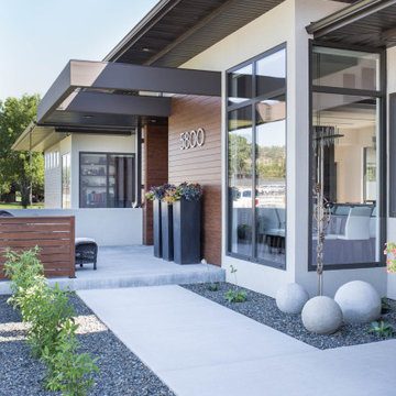
UserThe open space plan on the main level of the Prairie Style home is deceiving of the actual separation of spaces. This home packs a punch with a private hot tub, craft room, library, and even a theater. The interior of the home features the same attention to place, as the natural world is evident in the use of granite, basalt, walnut, poplar, and natural river rock throughout. Floor to ceiling windows in strategic locations eliminates the sense of compression on the interior, while the overall window design promotes natural daylighting and cross-ventilation in nearly every space of the home.
Glo’s A5 Series in double pane was selected for the high performance values and clean, minimal frame profiles. High performance spacers, double pane glass, multiple air seals, and a larger continuous thermal break combine to reduce convection and eliminate condensation, ultimately providing energy efficiency and thermal performance unheard of in traditional aluminum windows. The A5 Series provides smooth operation and long-lasting durability without sacrificing style for this Prairie Style home.
 Dimensions in Wood Inc
This client’s vision for their kitchen/hearth room remodel was to create a harmonious space for gathering and socializing with family and friends. Without the before and after photos, you would scarcely believe this was the same home.
This huge home renovation perfectly illustrates that Dimensions In Wood’s expert team can handle every aspect of your remodeling project. Plumbing, flooring, electrical wiring, custom cabinets, structural engineering, appliances, windows, interior and exterior doors, entertainment and more. Contact us today to discuss Translating Your Visions into Reality
The client was interested in new appliance technology, cabinetry to the ceiling, and an Island large enough to seat 3. They also wanted a built-in breakfast nook, improved pantry space, more functional storage on either side of their fireplace, and a built-in appearance for the TV above the mantel. The original built-in desk was not used, and they preferred for that space to serve as a small bar area with refrigeration and a place to store their printer. We designed several plans for the space before selecting the final layout.
The new design required the removal of the soffit over the old sink, as well as a small wall beside the old refrigerator. The wall beside the stairwell had to be shortened 13 inches and a new beam installed to carry the load of the home’s 2nd story to gain enough space for the large central island. The existing closet pantry walls were also reconfigured as per the new plan.
This serves as a great reminder that Dimensions In Wood is much more than just custom cabinets.
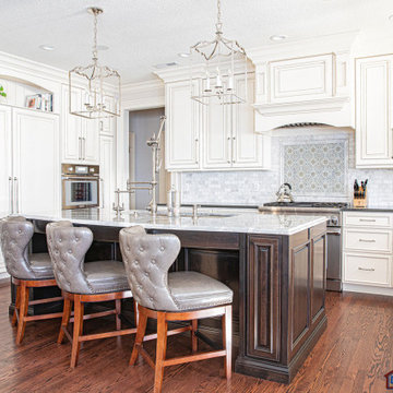
Central to the entire custom kitchen is an 8-foot Walnut island. The huge island, which comfortably seats three, is topped with Essenza Blue quartzite. The stone’s natural striations are beautiful. Quartzite is harder than granite, and less likely to stain than other stones because of its density. The couple had to look through multiple slabs to find a piece they LOVED. The island’s custom Walnut cabinetry, built to resemble a piece of custom furniture, was stained Bronzed Walnut by Sherwin Williams.
The 4-foot Galley Workstation in the island, handles all the kitchen’s prep, serving, and cleanup needs. The Galley’s culinary tools include an upper tier cutting board, upper tier drying rack, 2 lower tier platforms, 11″ colander with non-slip handles, and 11” mixing bowl with lid and non-slip bottom. Learn more about the amazing Galley Workstation here. A Waterstone gantry faucet in a pewter finish combines a pull-down sprayer for maximum mobility and a articulated swivel spout. A water tap with reverse osmosis filter provides the highest quality drinking water. To keep a clean and sleek counter we installed a raised air switch for the garbage disposal and integrated soap dispenser. The island also houses the Thermador Sapphire 7-Program Dishwasher with a hidden touch control panel and a custom Walnut wood front. The cabinetry under the Galley Workstation features a trash roll out, as well as storage for the culinary tools.
Shortening the stairwell wall, and reframing around the stairs, which included shortening the handrail, also made room for a bi-fold door walk-in pantry with extra roll out storage and space for a small microwave. Above the panty doors is a remote controlled, electric motor powered, lift up cabinet door which hides a flat screen TV, used while the family is cooking.
To the right of the walk-in pantry is cold food storage. The Thermador, 30-inch Freedom Collection refrigerator and 24-inch built-in freezer column with internal ice maker are covered with matching cabinetry fronts. An open display space was designed above the units, creating an aesthetically beautiful wall. To the right of the refrigerator & freezer columns is a tall cabinet designed for the built-in Thermador steam and convection oven. The convention steam oven is a relatively new technology for homes, but its versatility and food quality is amazing. To the right of this is a pull-out appliance pantry which provides easy access and storage for a stand mixer, blender, and any other appliance you do not want to clutter the counter.
The most visible wall of the kitchen features the 36-inch Thermador Professional Series Harmony Gas Range with Griddle. Between the range and custom designed wood hood, a framed mosaic tile accent in the backsplash, creates a focal point. To clear the air, the Professional Series Thermador 42-inch ventilation insert provides excellent exhaust capabilities, as well as providing multi-level, vivid LED lights for beautiful illumination.
The wall cabinetry symmetrically flanks the custom hood, utilizing deeper wall cabinetry on each end, allowing for storage of oversized dishware. The base cabinetry on this wall is made up of drawers, except for the corner, which is a Kesseböhmer LeMans II. This specially designed shelf system allows ease of access in underutilized blind corners. The dual action articulation system with soft close mechanism ensures a smooth open and close.
Rounding the corner to the outside wall, the base cabinetry was built to a narrower depth, providing additional space for the island, as well as easier access to the new larger pass-thru window which serves the screen porch. The client selected Black Vermont granite countertops with an ogee edge to contrast the Linen White painted cabinetry.
The door to the screen porch was replaced with a Marvin Exterior Door with a raised panel at the bottom of the 3⁄4 glass door.
Marvin Windows replaced the other windows in the space increasing the energy efficiency and value of the home. To establish the breakfast nook, a bench with drawers and an upholstered seat was built into the bay area of the room.
Custom bookshelves were built with open shelves, cabinet doors, and drawers on either side of the fireplace. A new stone hearth and fireplace surround were installed. Above the existing mantel we built a recessed space for the flat screen television hiding all wiring inside the walls for a completely clean look.
The space that was once a desk was transformed into a bar area. The glass shelves and glass cabinet front liquor cabinet stand out. But this bar area has hidden secrets. Tucked beneath the black granite is a Thermador under-counter double drawer refrigerator with matching wood front panels. They blend in perfectly with the cabinets. A wireless printer is easily accessed on a slide out drawer. Plus, what looks like merely wooden panels on the wall are concealing recessed storage for more bottles and glasses!
Overhead recessed lighting and speaker system provide illumination and entertainment through the entire space.
This luxury home had original, solid oak flooring through most of the first floor which the homeowner obviously wanted to keep but were in desperate need of repair and refinishing. Our master craftsmen wove in new wood flooring to match the old where needed, particularly where walls had been changed and where the floor was damaged. We sanded the floors, smoothing away years of wear and tear. The entire wood floor was then uniformly stained, making it impossible to differentiate where any repairs were made.
If this renovation has inspired you, then contact us today! There is no limit to our Dimensions.
 Klopf Architecture
Klopf Architecture and Jesse Ososki Art remodeled an existing Eichler atrium home into a brighter, more open, and more functional version of its original self.
The goals were to preserve the Eichler look and feel without the need to strictly adhere to it. The scope of work included re-configuring the master bedroom/bath, the kitchen, and the hall bath/laundry area, as well as updating interior finishes throughout to be more sophisticated.
The owners are detail-oriented and were very involved in the design process, down to the selection of lighting controls and stainless steel faceplates.Their design aesthetic leans toward the Scandinavian — light and bright, with simple straight lines and pure geometric shapes.
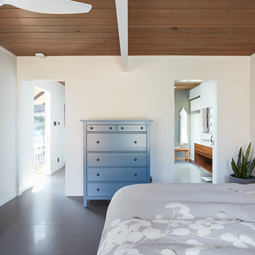
The finish flooring is large porcelain tile (24” x 24”) in a neutral grey tone, providing a uniform backdrop against which other materials can stand out. The same tile continues into the shower floor (with a different finish texture for slip-resistance) and up the shower/tub walls (in a smaller size). Heath Classic Field ceramic tile in Modern Blue was used sparingly, to add color at the hall bath vanity backsplash and at the shampoo niches in both bathrooms. Back-painted soda glass in pale blue to match the Heath tile was used at the kitchen backsplash. This same accent color was also used at the front entry atrium door. Kitchen cabinetry, countertops, appliances, and light fixtures are all white, making the kitchen feel more airy and light. Countertops are Caesarstone Blizzard.
The owners chose to keep some of the original Eichler elements: the concrete masonry fireplace; the stained tongue-and-groove redwood ceiling decking; and the luan wall paneling. The luan paneling was lightly sanded, cleaned, and re-stained. The owners also kept an added element that was installed by a previous owner: sliding shoji panels at all bedroom windows and sliding glass doors, for both privacy and sun control. Grooves were cut into the new tile flooring for the shoji panels to slide in, creating a more integrated look. Walnut was used to add warmth and contrast at the kitchen bar top and niche, the bathroom vanities, and the window sill/ledge under the kitchen window.
This Burlingame Eichler Remodel is a 2,121 sf, 4 bedroom/2 bath home located in the heart of Silicon Valley.
Klopf Architecture Project Team: John Klopf, Klara Kevane and Yegvenia Torres Zavala
Contractor: Jesse Ososki Art
Structural Engineer: Emmanuel Pun
Photography ©2018 Mariko Reed
Location: Burlingame, CA
Year completed: 2017

Sponsored
Columbus, OH

Wannemacher Interiors
Customized Award-Winning Interior Design Solutions in Franklin Cnty OH
 The Galante Architecture Studio, Inc.
Originally built in 1972, these eight interlocked residential units and the accompanying House Master’s Residence won an AIA award for their unique spatial complexity, balancing standard units of construction with volumetric interplay, all while bringing natural light into living spaces. However, nearly 40 years later
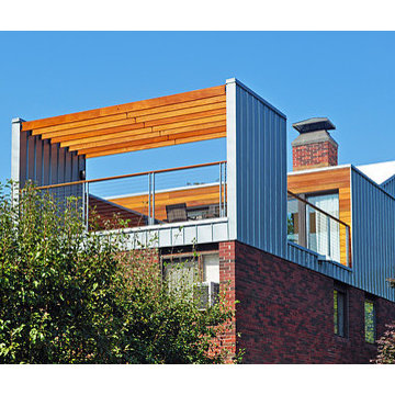
These 1970’s era, interlocked faculty housing units won an AIA award when first completed. They were unique in spatial complexity, By early 2,000’s they were showing signs of age, and had become outdated on many levels. Working with project management for the Faculty of Arts & Sciences, we prepared one prototype design to bring the buildings into the 21st century. New insulated skylights, standing seam metal siding, cedar decks and trellises, exchanging black roofs for well insulated white roofs, were all part of a larger planning program to renovate all nine units. The prototype was implemented in 2012, to great approval and result. In 2013 a few more units were done. In 2014 the “House Masters” unit was done, with the remaining four units planned for future budgets.
Sustainable features include re-use of most materials on site, (former siding was able to become sheathing below metal panels), implementing the Stretch Energy Code for insulation, and putting new white roof membranes in place. Using FSC certified wood for decks and trellises, and using Rheinzink siding, a “200 year material” according to the manufacturer.
After nearly 40 years, Ronald Gourley’s AIA award winning Faculty Housing (1972) was beginning to show its age – plywood siding was delaminating, wooden decks splintering, and custom windows failing. Therefore, the opportunity to reinvent a piece of Mid-Century Modernism presented itself when two of the building’s eight alternating rooftop designs were to be rebuilt as prototypes for the remainder of the structure.
The strength of the original design was its rectilinear and symmetrical arrangement of internal and external spaces, but the difference between the two had become blurred over the decades. New zinc siding, mahogany decking, and stainless steel railings accentuate the defining elements and more clearly articulate the living spaces, breathing new life into the building and reinvigorating the surrounding campus.
Furthermore, the renovation also provided a chance to bring the structure up to modern energy standards and help meet Harvard’s lofty environmental goals. Insulation within the ceilings was more than tripled, white TPO roofing reduces the heat island effect, construction waste was minimized by recasting the siding as sheathing, and materials were selected not only for aesthetics, but for their longevity and ability to be recycled as well.
Harvard’s energy standards brought an uncharacteristic level of environmental care to this building. Roof structures are triple insulated, allowing separating interior from exterior in the most thermally efficient manner. North facing triple insulated skylights and white TPO roofing reduces the heat gain, but allows natural light to pour in. Materials were selected not only for aesthetics, but for their longevity. Zinc, for example, is made of 100% recycled material, and has duration of 200 years. Uncharacteristic levels of environmental care were common on this project.
 Remodeling by Classic Homes
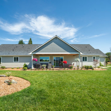
The original ranch style home was built in 1962 by the homeowner’s father. She grew up in this home; now her and her husband are only the second owners of the home. The existing foundation and a few exterior walls were retained with approximately 800 square feet added to the footprint along with a single garage to the existing two-car garage. The footprint of the home is almost the same with every room expanded. All the rooms are in their original locations; the kitchen window is in the same spot just bigger as well. The homeowners wanted a more open, updated craftsman feel to this ranch style childhood home. The once 8-foot ceilings were made into 9-foot ceilings with a vaulted common area. The kitchen was opened up and there is now a gorgeous 5 foot by 9 and a half foot Cambria Brittanicca slab quartz island.
 Remodeling by Classic Homes
The original ranch style home was built in 1962 by the homeowner’s father. She grew up in this home; now her and her husband are only the second owners of the home. The existing foundation and a few exterior walls were retained with approximately 800 square feet added to the footprint along with a single garage to the existing two-car garage. The footprint of the home is almost the same with every room expanded. All the rooms are in their original locations; the kitchen window is in the same spot just bigger as well. The homeowners wanted a more open, updated craftsman feel to this ranch style childhood home. The once 8-foot ceilings were made into 9-foot ceilings with a vaulted common area. The kitchen was opened up and there is now a gorgeous 5 foot by 9 and a half foot Cambria Brittanicca slab quartz island.
 Thyme & Place Design LLC
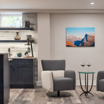
When my client had to move from her company office to work at home, she set up in the dining room. Despite her best efforts, this was not the long-term solution she was looking for. My client realized she needed a dedicated space not on the main floor of the home. On one hand, having your office space right next to the kitchen is handy. On the other hand, it made separating work and home life was not that easy.
The house was a ranch. In essence, the basement would run entire length of the home. As we came down the steps, we entered a time capsule. The house was built in the 1950’s. The walls were covered with original knotty pine paneling. There was a wood burning fireplace and considering this was a basement, high ceilings. In addition, there was everything her family could not store at their own homes. As we wound though the space, I though “wow this has potential”, Eventually, after walking through the laundry room we came to a small nicely lit room. This would be the office.
My client looked at me and asked what I thought. Undoubtedly, I said, this can be a great workspace, but do you really want to walk through this basement and laundry to get here? Without reservation, my client said where do we start?
Once the design was in place, we started the renovation. The knotty pine paneling had to go. Specifically, to add some insulation and control the dampness and humidity. The laundry room wall was relocated to create a hallway to the office.
At the far end of the room, we designated a workout zone. Weights, mats, exercise bike and television are at the ready for morning or afternoon workouts. The space can be concealed by a folding screen for party time. Doors to an old closet under the stairs were relocated to the workout area for hidden storage. Now we had nice wall for a beautiful console and mirror for storage and serving during parties.
In order to add architectural details, we covered the old ugly support columns with simple recessed millwork panels. This detail created a visual division between the bar area and the seating area in front of the fireplace. The old red brick on the fireplace surround was replaced with stack stone. A mantle was made from reclaimed wood. Additional reclaimed wood floating shelves left and right of the fireplace provides decorative display while maintaining a rustic element balancing the copper end table and leather swivel rocker.
We found an amazing rug which tied all of the colors together further defining the gathering space. Russet and burnt orange became the accent color unifying each space. With a bit of whimsy, a rather unusual light fixture which looks like roots from a tree growing through the ceiling is a conversation piece.
The office space is quite and removed from the main part of the basement. There is a desk large enough for multiple screens, a small bookcase holding office supplies and a comfortable chair for conference calls. Because working from home requires many online meetings, we added a shiplap wall painted in Hale Navy to contrast with the orange fabric on the chair. We finished the décor with a painting from my client’s father. This is the background online visitors will see.
The last and best part of the renovation is the beautiful bar. My client is an avid collector of wine. She already had the EuroCave refrigerator, so I incorporated it into the design. The cabinets are painted Temptation Grey from Benjamin Moore. The counter tops are my favorite hard working quartzite Brown Fantasy. The backsplash is a combination of rustic wood and old tin ceiling like porcelain tiles. Together with the textures of the reclaimed wood and hide poofs balanced against the smooth finish of the cabinets, we created a comfortable luxury for relaxing.
There is ample storage for bottles, cans, glasses, and anything else you can think of for a great party. In addition to the wine storage, we incorporated a beverage refrigerator, an ice maker, and a sink. Floating shelves with integrated lighting illuminate the back bar. The raised height of the front bar provides the perfect wine tasting and paring spot. I especially love the pendant lights which look like wine glasses.
Finally, I selected carpet for the stairs and office. It is perfect for noise reduction. Meanwhile for the overall flooring, I specifically selected a high-performance vinyl plank floor. We often use this product as it is perfect to install on a concrete floor. It is soft to walk on, easy to clean and does not reduce the overall height of the space.

Sponsored
Sunbury, OH

J.Holderby - Renovations
Franklin County's Leading General Contractors - 2X Best of Houzz!
 Klopf Architecture
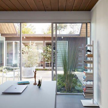
Klopf Architecture and Jesse Ososki Art remodeled an existing Eichler atrium home into a brighter, more open, and more functional version of its original self.
The goals were to preserve the Eichler look and feel without the need to strictly adhere to it. The scope of work included re-configuring the master bedroom/bath, the kitchen, and the hall bath/laundry area, as well as updating interior finishes throughout to be more sophisticated.
The owners are detail-oriented and were very involved in the design process, down to the selection of lighting controls and stainless steel faceplates.Their design aesthetic leans toward the Scandinavian — light and bright, with simple straight lines and pure geometric shapes.
The finish flooring is large porcelain tile (24” x 24”) in a neutral grey tone, providing a uniform backdrop against which other materials can stand out. The same tile continues into the shower floor (with a different finish texture for slip-resistance) and up the shower/tub walls (in a smaller size). Heath Classic Field ceramic tile in Modern Blue was used sparingly, to add color at the hall bath vanity backsplash and at the shampoo niches in both bathrooms. Back-painted soda glass in pale blue to match the Heath tile was used at the kitchen backsplash. This same accent color was also used at the front entry atrium door. Kitchen cabinetry, countertops, appliances, and light fixtures are all white, making the kitchen feel more airy and light. Countertops are Caesarstone Blizzard.
The owners chose to keep some of the original Eichler elements: the concrete masonry fireplace; the stained tongue-and-groove redwood ceiling decking; and the luan wall paneling. The luan paneling was lightly sanded, cleaned, and re-stained. The owners also kept an added element that was installed by a previous owner: sliding shoji panels at all bedroom windows and sliding glass doors, for both privacy and sun control. Grooves were cut into the new tile flooring for the shoji panels to slide in, creating a more integrated look. Walnut was used to add warmth and contrast at the kitchen bar top and niche, the bathroom vanities, and the window sill/ledge under the kitchen window.
This Burlingame Eichler Remodel is a 2,121 sf, 4 bedroom/2 bath home located in the heart of Silicon Valley.
Klopf Architecture Project Team: John Klopf, Klara Kevane and Yegvenia Torres Zavala
Contractor: Jesse Ososki Art
Structural Engineer: Emmanuel Pun
Photography ©2018 Mariko Reed
Location: Burlingame, CA
Year completed: 2017
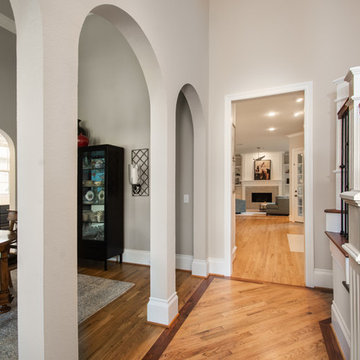
 Alair Homes Plano
This house was built in 1994 and our clients have been there since day one. They wanted a complete refresh in their kitchen and living areas and a few other changes here and there; now that the kids were all off to college! They wanted to replace some things, redesign some things and just repaint others. They didn’t like the heavy textured walls, so those were sanded down, re-textured and painted throughout all of the remodeled areas.
The kitchen change was the most dramatic by painting the original cabinets a beautiful bluish-gray color; which is Benjamin Moore Gentleman’s Gray. The ends and cook side of the island are painted SW Reflection but on the front is a gorgeous Merola “Arte’ white accent tile. Two Island Pendant Lights ‘Aideen 8-light Geometric Pendant’ in a bronze gold finish hung above the island. White Carrara Quartz countertops were installed below the Viviano Marmo Dolomite Arabesque Honed Marble Mosaic tile backsplash. Our clients wanted to be able to watch TV from the kitchen as well as from the family room but since the door to the powder bath was on the wall of breakfast area (no to mention opening up into the room), it took up good wall space. Our designers rearranged the powder bath, moving the door into the laundry room and closing off the laundry room with a pocket door, so they can now hang their TV/artwork on the wall facing the kitchen, as well as another one in the family room!
We squared off the arch in the doorway between the kitchen and bar/pantry area, giving them a more updated look. The bar was also painted the same blue as the kitchen but a cool Moondrop Water Jet Cut Glass Mosaic tile was installed on the backsplash, which added a beautiful accent! All kitchen cabinet hardware is ‘Amerock’ in a champagne finish.
In the family room, we redesigned the cabinets to the right of the fireplace to match the other side. The homeowners had invested in two new TV’s that would hang on the wall and display artwork when not in use, so the TV cabinet wasn’t needed. The cabinets were painted a crisp white which made all of their decor really stand out. The fireplace in the family room was originally red brick with a hearth for seating. The brick was removed and the hearth was lowered to the floor and replaced with E-Stone White 12x24” tile and the fireplace surround is tiled with Heirloom Pewter 6x6” tile.
The formal living room used to be closed off on one side of the fireplace, which was a desk area in the kitchen. The homeowners felt that it was an eye sore and it was unnecessary, so we removed that wall, opening up both sides of the fireplace into the formal living room. Pietra Tiles Aria Crystals Beach Sand tiles were installed on the kitchen side of the fireplace and the hearth was leveled with the floor and tiled with E-Stone White 12x24” tile.
The laundry room was redesigned, adding the powder bath door but also creating more storage space. Waypoint flat front maple cabinets in painted linen were installed above the appliances, with Top Knobs “Hopewell” polished chrome pulls. Elements Carrara Quartz countertops were installed above the appliances, creating that added space. 3x6” white ceramic subway tile was used as the backsplash, creating a clean and crisp laundry room! The same tile on the hearths of both fireplaces (E-Stone White 12x24”) was installed on the floor.
The powder bath was painted and 12x36” Ash Fiber Ceramic tile was installed vertically on the wall behind the sink. All hardware was updated with the Signature Hardware “Ultra”Collection and Shades of Light “Sleekly Modern” new vanity lights were installed.
All new wood flooring was installed throughout all of the remodeled rooms making all of the rooms seamlessly flow into each other. The homeowners love their updated home!
Design/Remodel by Hatfield Builders & Remodelers | Photography by Versatile Imaging
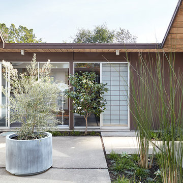 Klopf Architecture
Klopf Architecture and Jesse Ososki Art remodeled an existing Eichler atrium home into a brighter, more open, and more functional version of its original self.
The goals were to preserve the Eichler look and feel without the need to strictly adhere to it. The scope of work included re-configuring the master bedroom/bath, the kitchen, and the hall bath/laundry area, as well as updating interior finishes throughout to be more sophisticated.
The owners are detail-oriented and were very involved in the design process, down to the selection of lighting controls and stainless steel faceplates.Their design aesthetic leans toward the Scandinavian — light and bright, with simple straight lines and pure geometric shapes.
The finish flooring is large porcelain tile (24” x 24”) in a neutral grey tone, providing a uniform backdrop against which other materials can stand out. The same tile continues into the shower floor (with a different finish texture for slip-resistance) and up the shower/tub walls (in a smaller size). Heath Classic Field ceramic tile in Modern Blue was used sparingly, to add color at the hall bath vanity backsplash and at the shampoo niches in both bathrooms. Back-painted soda glass in pale blue to match the Heath tile was used at the kitchen backsplash. This same accent color was also used at the front entry atrium door. Kitchen cabinetry, countertops, appliances, and light fixtures are all white, making the kitchen feel more airy and light. Countertops are Caesarstone Blizzard.
The owners chose to keep some of the original Eichler elements: the concrete masonry fireplace; the stained tongue-and-groove redwood ceiling decking; and the luan wall paneling. The luan paneling was lightly sanded, cleaned, and re-stained. The owners also kept an added element that was installed by a previous owner: sliding shoji panels at all bedroom windows and sliding glass doors, for both privacy and sun control. Grooves were cut into the new tile flooring for the shoji panels to slide in, creating a more integrated look. Walnut was used to add warmth and contrast at the kitchen bar top and niche, the bathroom vanities, and the window sill/ledge under the kitchen window.
This Burlingame Eichler Remodel is a 2,121 sf, 4 bedroom/2 bath home located in the heart of Silicon Valley.
Klopf Architecture Project Team: John Klopf, Klara Kevane and Yegvenia Torres Zavala
Contractor: Jesse Ososki Art
Structural Engineer: Emmanuel Pun
Photography ©2018 Mariko Reed
Location: Burlingame, CA
Year completed: 2017
52