
Search results for "Reduce unit" in Home Design Ideas
 SGA Companies
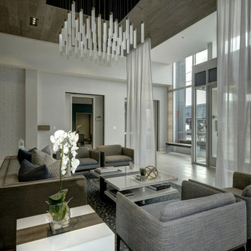
SGA designed this 140,000 sq ft building, completed in 2015, to provide 150 residential units, 6,000 sq ft of retail space, and parking. The building is comprised of four levels and a penthouse with a roof garden, and two levels of below-grade parking. The building was designed with environmentally friendly principles in mind in the interest of reducing its impact on the community. A green roof system reduces the heat effect on the neighborhood as well as the impact on the storm water sewer system, while increasing the building’s energy efficiency.
 Vetter Architects
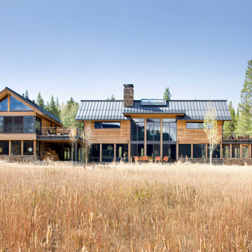
The owners requested that their home harmonize with the spirit of the surrounding Colorado mountain setting and enhance their outdoor recreational lifestyle - while reflecting their contemporary architectural tastes. The site was burdened with a myriad of strict design criteria enforced by the neighborhood covenants and architectural review board. Creating a distinct design challenge, the covenants included a narrow interpretation of a “mountain style” home which established predetermined roof pitches, glazing percentages and material palettes - at direct odds with the client‘s vision of a flat-roofed, glass, “contemporary” home.
Our solution finds inspiration and opportunities within the site covenant’s strict definitions. It promotes and celebrates the client’s outdoor lifestyle and resolves the definition of a contemporary “mountain style” home by reducing the architecture to its most basic vernacular forms and relying upon local materials.
The home utilizes a simple base, middle and top that echoes the surrounding mountains and vegetation. The massing takes its cues from the prevalent lodgepole pine trees that grow at the mountain’s high altitudes. These pine trees have a distinct growth pattern, highlighted by a single vertical trunk and a peaked, densely foliated growth zone above a sparse base. This growth pattern is referenced by placing the wood-clad body of the home at the second story above an open base composed of wood posts and glass. A simple peaked roof rests lightly atop the home - visually floating above a triangular glass transom. The home itself is neatly inserted amongst an existing grove of lodgepole pines and oriented to take advantage of panoramic views of the adjacent meadow and Continental Divide beyond.
The main functions of the house are arranged into public and private areas and this division is made apparent on the home’s exterior. Two large roof forms, clad in pre-patinated zinc, are separated by a sheltering central deck - which signals the main entry to the home. At this connection, the roof deck is opened to allow a cluster of aspen trees to grow – further reinforcing nature as an integral part of arrival.
Outdoor living spaces are provided on all levels of the house and are positioned to take advantage of sunrise and sunset moments. The distinction between interior and exterior space is blurred via the use of large expanses of glass. The dry stacked stone base and natural cedar cladding both reappear within the home’s interior spaces.
This home offers a unique solution to the client’s requests while satisfying the design requirements of the neighborhood covenants. The house provides a variety of indoor and outdoor living spaces that can be utilized in all seasons. Most importantly, the house takes its cues directly from its natural surroundings and local building traditions to become a prototype solution for the “modern mountain house”.
Overview
Ranch Creek Ranch
Winter Park, Colorado
Completion Date
October, 2007
Services
Architecture, Interior Design, Landscape Architecture
 Klopf Architecture
Klopf Architecture, Arterra Landscape Architects and Henry Calvert of Calvert Ventures Designed and built a new warm, modern, Eichler-inspired, open, indoor-outdoor home on a deeper-than-usual San Mateo Highlands property where an original Eichler house had burned to the ground.
The owners wanted multi-generational living and larger spaces than the original home offered, but all parties agreed that the house should respect the neighborhood and blend in stylistically with the other Eichlers. At first the Klopf team considered re-using what little was left of the original home and expanding on it. But after discussions with the owner and builder, all parties agreed that the last few remaining elements of the house were not practical to re-use, so Klopf Architecture designed a new home that pushes the Eichler approach in new directions.
One disadvantage of Eichler production homes is that the house designs were not optimized for each specific lot. A new custom home offered the team a chance to start over. In this case, a longer house that opens up sideways to the south fit the lot better than the original square-ish house that used to open to the rear (west). Accordingly, the Klopf team designed an L-shaped “bar” house with a large glass wall with large sliding glass doors that faces sideways instead of to the rear like a typical Eichler. This glass wall opens to a pool and landscaped yard designed by Arterra Landscape Architects.
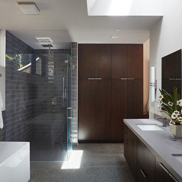
Driving by the house, one might assume at first glance it is an Eichler because of the horizontality, the overhanging flat roof eaves, the dark gray vertical siding, and orange solid panel front door, but the house is designed for the 21st Century and is not meant to be a “Likeler.” You won't see any posts and beams in this home. Instead, the ceiling decking is a western red cedar that covers over all the beams. Like Eichlers, this cedar runs continuously from inside to out, enhancing the indoor / outdoor feeling of the house, but unlike Eichlers it conceals a cavity for lighting, wiring, and insulation. Ceilings are higher, rooms are larger and more open, the master bathroom is light-filled and more generous, with a separate tub and shower and a separate toilet compartment, and there is plenty of storage. The garage even easily fits two of today's vehicles with room to spare.
A massive 49-foot by 12-foot wall of glass and the continuity of materials from inside to outside enhance the inside-outside living concept, so the owners and their guests can flow freely from house to pool deck to BBQ to pool and back.
During construction in the rough framing stage, Klopf thought the front of the house appeared too tall even though the house had looked right in the design renderings (probably because the house is uphill from the street). So Klopf Architecture paid the framer to change the roofline from how we had designed it to be lower along the front, allowing the home to blend in better with the neighborhood. One project goal was for people driving up the street to pass the home without immediately noticing there is an "imposter" on this lot, and making that change was essential to achieve that goal.
This 2,606 square foot, 3 bedroom, 3 bathroom Eichler-inspired new house is located in San Mateo in the heart of the Silicon Valley.
Klopf Architecture Project Team: John Klopf, AIA, Klara Kevane
Landscape Architect: Arterra Landscape Architects
Contractor: Henry Calvert of Calvert Ventures
Photography ©2016 Mariko Reed
Location: San Mateo, CA
Year completed: 2016
Find the right local pro for your project
 SGA Companies
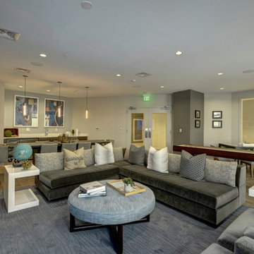
SGA designed this 140,000 sq ft building, completed in 2015, to provide 150 residential units, 6,000 sq ft of retail space, and parking. The building is comprised of four levels and a penthouse with a roof garden, and two levels of below-grade parking. The building was designed with environmentally friendly principles in mind in the interest of reducing its impact on the community. A green roof system reduces the heat effect on the neighborhood as well as the impact on the storm water sewer system, while increasing the building’s energy efficiency.
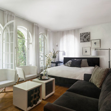
 Carolyn Reyes
Photo: Carolyn Reyes Photography © 2017 Houzz
Design: franklinAve
Inspiration for a transitional living room remodel in Los Angeles
Inspiration for a transitional living room remodel in Los Angeles
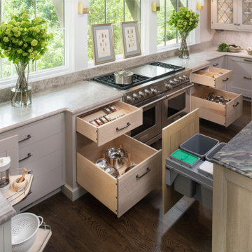

 SGA Companies
SGA designed this 140,000 sq ft building, completed in 2015, to provide 150 residential units, 6,000 sq ft of retail space, and parking. The building is comprised of four levels and a penthouse with a roof garden, and two levels of below-grade parking. The building was designed with environmentally friendly principles in mind in the interest of reducing its impact on the community. A green roof system reduces the heat effect on the neighborhood as well as the impact on the storm water sewer system, while increasing the building’s energy efficiency.


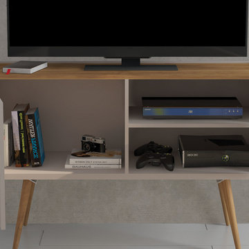
 User
UserThe Jazzy TV Stand is ideal for reduced spaces. It can fit a 50 inches TV and with its unique design in off white the, it can be simple and elegant.
Small danish dining room photo in Orlando
Small danish dining room photo in Orlando
 The Brooklyn Studio
This residence was a complete gut renovation of a 4-story row house in Park Slope, and included a new rear extension and penthouse addition. The owners wished to create a warm, family home using a modern language that would act as a clean canvas to feature rich textiles and items from their world travels. As with most Brooklyn row houses, the existing house suffered from a lack of natural light and connection to exterior spaces, an issue that Principal Brendan Coburn is acutely aware of from his experience re-imagining historic structures in the New York area. The resulting architecture is designed around moments featuring natural light and views to the exterior, of both the private garden and the sky, throughout the house, and a stripped-down language of detailing and finishes allows for the concept of the modern-natural to shine.
Upon entering the home, the kitchen and dining space draw you in with views beyond through the large glazed opening at the rear of the house. An extension was built to allow for a large sunken living room that provides a family gathering space connected to the kitchen and dining room, but remains distinctly separate, with a strong visual connection to the rear garden. The open sculptural stair tower was designed to function like that of a traditional row house stair, but with a smaller footprint. By extending it up past the original roof level into the new penthouse, the stair becomes an atmospheric shaft for the spaces surrounding the core. All types of weather – sunshine, rain, lightning, can be sensed throughout the home through this unifying vertical environment. The stair space also strives to foster family communication, making open living spaces visible between floors. At the upper-most level, a free-form bench sits suspended over the stair, just by the new roof deck, which provides at-ease entertaining. Oak was used throughout the home as a unifying material element. As one travels upwards within the house, the oak finishes are bleached to further degrees as a nod to how light enters the home.
The owners worked with CWB to add their own personality to the project. The meter of a white oak and blackened steel stair screen was designed by the family to read “I love you” in Morse Code, and tile was selected throughout to reference places that hold special significance to the family. To support the owners’ comfort, the architectural design engages passive house technologies to reduce energy use, while increasing air quality within the home – a strategy which aims to respect the environment while providing a refuge from the harsh elements of urban living.
This project was published by Wendy Goodman as her Space of the Week, part of New York Magazine’s Design Hunting on The Cut.
Photography by Kevin Kunstadt
 Masaya Homes
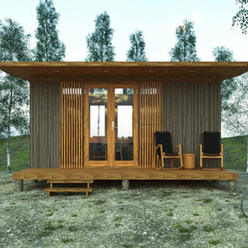
The Suite is a fully equipped ADU (Accessory Dwelling Unit) with a bathroom and kitchenette.
Our prefabricated homes are made completely out of sustainable teak grown on deforested cattle lands through reforestation efforts. You are capturing carbon and reducing your footprint while gaining rental income.

 Authenticity, LLC
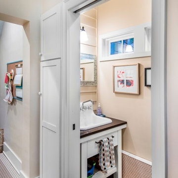
Architect: Michelle Penn, AIA This is remodel & addition project of an Arts & Crafts two-story home. It included the Kitchen & Dining remodel and an addition of an Office, Dining, Mudroom & 1/2 Bath. This very compact bathroom utilizes a pocket door to reduce door conflict. The farmhouse sink is directly opposite the toilet. There are high upper windows to allow light to come in, but keep the privacy! Notice the doors to the left of the opening...every nook and cranny was used for storage! Even this small space carved between studs! Photo Credit: Jackson Studios


 NS Designs
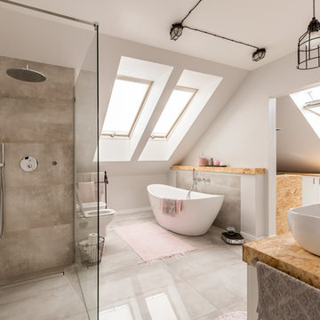
This modern bathroom oasis encompasses many elements that speak of minimalism, luxury and even industrial design. The white vessel sinks and freestanding modern bathtub give the room a slick and polished appearance, while the exposed piping and black hanging lights provide some aesthetic diversity. The angled ceiling and skylights allow so much light, that the room feels even more spacious than it already is. The marble floors give the room a gleaming appearance, and the chrome accents, seen on the cabinet pulls and bathroom fixtures, reminds us that sleek is in.
NS Designs, Pasadena, CA
http://nsdesignsonline.com
626-491-9411
 Adam Gibson Design
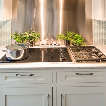
The homeowners wanted to take advantage of induction cooking, but were hesitant because of their unfamiliarity. I suggested reducing their cooktop from 36” to 30” and adding a 15” gas cooktop. The jury’s still out as to whether they'll use the gas, as they've fallen in love with induction.
Photography ©2014 Adam Gibson
 Precision Glass Tint, LLC
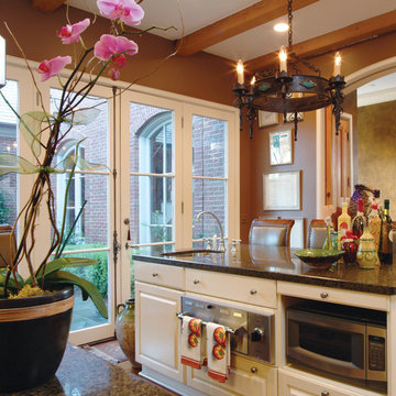
Homeowner’s kitchen with reduced glare while maintaining the natural light Photo Courtesy of Eastman
Inspiration for a mid-sized timeless single-wall light wood floor eat-in kitchen remodel in Newark with an undermount sink, raised-panel cabinets, white cabinets, granite countertops, stainless steel appliances and an island
Inspiration for a mid-sized timeless single-wall light wood floor eat-in kitchen remodel in Newark with an undermount sink, raised-panel cabinets, white cabinets, granite countertops, stainless steel appliances and an island
 Custom Kitchens by John Wilkins, Inc.
Mike Kaskel
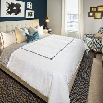
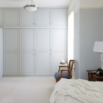
Example of a large ornate master carpeted and beige floor bedroom design in San Francisco with blue walls
Example of a large ornate master carpeted and beige floor bedroom design in San Francisco with blue walls
 MF Reynolds Inc
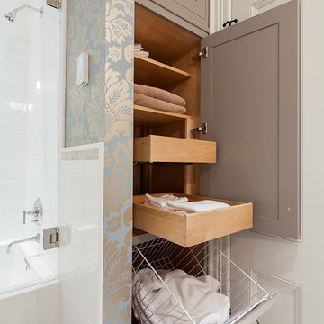
Clever bathroom cabinet - Photo credits: Jane Messinger
Example of a minimalist bathroom design in Boston
Example of a minimalist bathroom design in Boston
 MIG Furniture Design, Inc.
Final Sale! Price reduced below wholesale. FIRST CAME - FIRST SERVED
SPECIAL ORDER 8-16 WEEKS
Made in Italy by SPAR
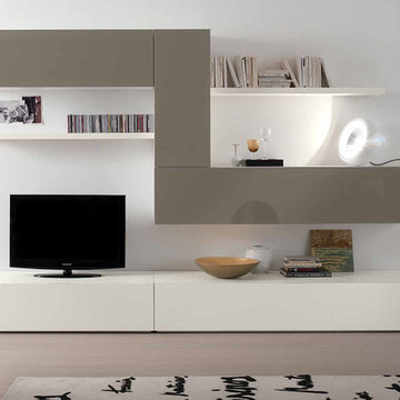
Modern Italian Wall Unit Logika LK18 by Spar. This modern modular wall unit consists of individual pieces that can be arranged to create an excellent design solution for any living room. All the modules can be arranged in any composition, so you could either shorten or enlarge the TV area according to your needs. The entertainment center provides an abundance of storage space, both hidden and exposed, to aid with organization.
The Wall Unit Composition LK18 is shown in the next colors/finishes:
Structure - White Ash finish;
Front - Mink Gloss lacquer.
PLEASE NOTE: The Logika is a modular wall unit line offering a variety of units in different sizes. You can order this wall unit either as a complete composition, as shown in the main picture, or build your own composition according to your own dimensions and preferences. Please contact our office about details on the customization of this wall unit.
MATERIAL/CONSTRUCTION:
Structure: Made with particle board of wood, covered with E1 melamine finishes or high gloss / matt lacquered
Glass: 4 mm glass
Drawers: Made with panels of wood particles in E1-coated finish PVC beech. Metal runners with fine race to fall
The starting price is for the Wall Unit Composition LK18 as shown in the main picture.
Dimensions:
Shown Wall Unit Composition: W118.1" x D22.8" x H76.8"
 Gabriel Builders Inc.
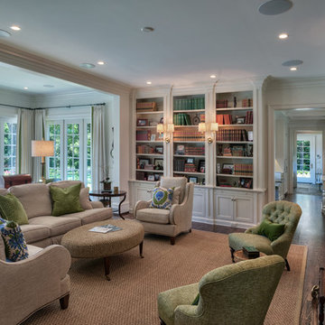
informal family room with bookcases, limestone fireplace, tv mounted over fireplace, expansive windows
Example of a classic open concept dark wood floor family room library design with white walls, a standard fireplace, a stone fireplace and a wall-mounted tv
Example of a classic open concept dark wood floor family room library design with white walls, a standard fireplace, a stone fireplace and a wall-mounted tv
8