
Search results for "Reduce user friendly" in Home Design Ideas
 Kirby Mast of Hartville Hardware
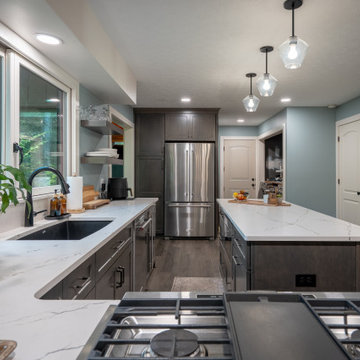
Dramatically changed the layout from a very tight kitchen into a more user-friendly layout as well as opened up the area behind the stove / dining room to give the feel of a much larger kitchen. Open shelving added to the more spacious feel.
 Media Rooms Inc
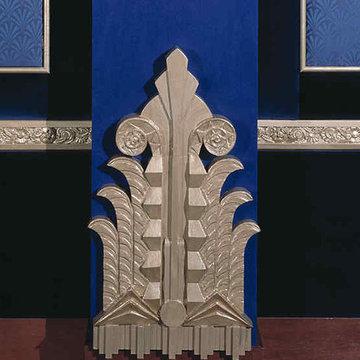
Theater column medallion designed and fabricated in our in-house cabinet shop.
Our company is unique in that we actually design and build cabinets and theater interiors in-house. We do not subcontract these services out to others. We take a highly creative approach when designing custom cabinetry. We are extremely sensitive to the leading role that media and entertainment centers play in today’s interior design.
Every facet of each cabinet is evaluated for function and appearance. First, we look at how the furniture will blend with the existing environment. We build any style of furniture from traditional to contemporary and in all cases strive for harmony in the design. Secondly, we evaluate how the client will use the cabinetry, such as, where is the best TV viewing angle, component accessibility and how the size, shape and location will affect other elements in the room.
In addition to the artistic beauty of our cabinetry, good design is the key element to well built, long-lasting and user-friendly furniture crafted specifically for each customer’s lifestyle. We only use premium-grade veneered plywoods and hardwood, and premium quality hardware.
All Cabinets, Theater Interiors and Electronic Installations shown were Designed, Built and Installed by Media Rooms Inc.
 Nathan Taylor for Obelisk Home
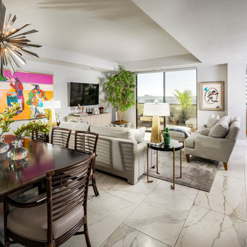
Living room - large transitional open concept living room idea in Other with a wall-mounted tv
Find the right local pro for your project
 Chester County Kitchen & Bath
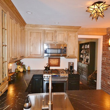
Small West Chester Kitchen with lots of charm. We completely removed the existing kitchen, flooring, cabinetry, etc. We changed the layout along with a doorway location to achieve a more user friendly layout. In keeping with the older charm of the home the client and our designer made great material and finish selections to perfectly tie the new kitchen into the rest of the home. The base cabinetry in Aged Ebony finish from Kabinart Cabinetry blends perfect with the new Soapstone countertops and stainless steel farm sink. The wall and fridge area cabinetry in Honeywood Maple with Coffee glaze add a great contrast but coordinate seamlessly. Adding a brick wall to the space along with the wall sconces really bring the whole look together. This project is a perfect example of not having to have a big kitchen to have a great kitchen. Thank you for the kitchen designer, Michele Hensey working with the customer to assist with the design elements!
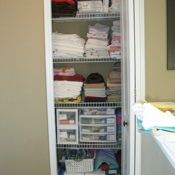
 'Naoko' Organize Me
Having access to products and items in the closet makes for easy 'get aways', both for work and fun. A closet that is well organized is user friendly and solves the question of where does it go. It's easy to keep up because it just makes sense.
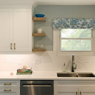
 Revival House
This small kitchen remodel by Revival House's Bre Perrigo is a dramatic update, bringing the kitchen into the 21st century! The main elements include white shaker cabinetry with blue accents, bronze hardware, and stainless steel appliances. These new selections along with the new layout add some serious aesthetic value, not to mention functionality, creating a space that feels fresh and inviting.
The Decor's shaker cabinetry in Chantilly Lace is the main focal point of the kitchen, accented by touches of Santorini Blue. The simplicity of the shaker style contributes to the overall clean and timeless look. Top Knobs' Ellis Pull in Honey Bronze hardware adds a touch of elegance and warmth to the space. This combination of white and bronze creates a classic and sophisticated feel. The blue accents break up the white and bronze color scheme, adding depth and visual interest to the space.
The new kitchen design focuses on maximizing storage and improving the layout. The new cabinetry provides ample storage space while ensuring that everything has its designated place. The layout was reconfigured to create a more efficient and user-friendly space, making cooking and entertaining a breeze.
Overall, this small kitchen remodel aims to create a clean and quaint space with white shaker cabinetry, bronze hardware, stainless steel appliances, and blue accents. The result is a kitchen that not only looks beautiful but also offers improved storage and layout functionality compared to the original kitchen.
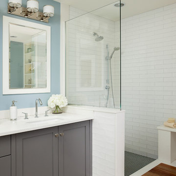
 Howell Custom Building Group
This project involved a complete gut of an existing master bath space. The fixtures and finishes were far beyond their prime. The space itself was a nice size, especially for a Victorian home, but the arrangement of the fixtures was all wrong. The solution was to rearrange all of the primary bath functions and make the space more user friendly. A new walk-in shower with a wood drying platform became a focal point at one end of the room. Pale grey cabinets, with a clean and light counter surface, is enhanced by the huge amount of natural light that pours in from an existing sky light. Being consistent with materials around the room helped to unify the space. The solid surface material at shower bench, vanity counter, curbing and wall caps all stay quiet, allowing the color elements to pop. Contemporary, polished nickel fixtures give the space a modern edge. The end result is an awake, bright and lively place to start the day. Photography by Emily O'brien
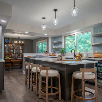 Kirby Mast of Hartville Hardware
Dramatically changed the layout from a very tight kitchen into a more user-friendly layout as well as opened up the area behind the stove / dining room to give the feel of a much larger kitchen. Open shelving added to the more spacious feel.
 Forward Design Build Remodel
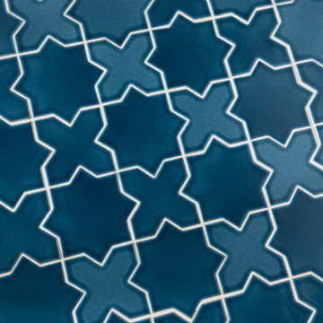
Our clients loved their neighborhood and being able to walk to work. While they knew it was their forever home, they needed more space. Their goals were to completely update the interior while keeping the original charm. They also wanted to add an addition for more space for their growing family.
On the first floor we relocated the kitchen, dining, and laundry room. With the rear addition we were able to enlarge the kitchen and dining and add in a powder room, secondary playroom, mudroom and back entry.
On the second floor, the back half was entirely reconfigured. We added a primary suite and a hallway bathroom.
With this being a historic home, we left the existing windows in place as well as the trim and baseboards. We kept and refinished the existing stairway railing. The primary bathroom was moved to be more user friendly.
We made cosmetic upgrades throughout the home for a cohesive look that matches the homeowner’s style which was transitional with industrial elements.
 BCT Group
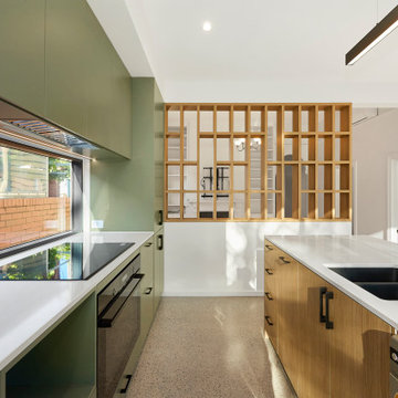
 Take a peek at this stunning, user-friendly kitchen from our Yarraville 12 renovation and extension project. A feature timber screen adds privacy, while the window splashback and topiary cabinetry create the perfect blend of elegance and functionality.?
 Leicht Toronto
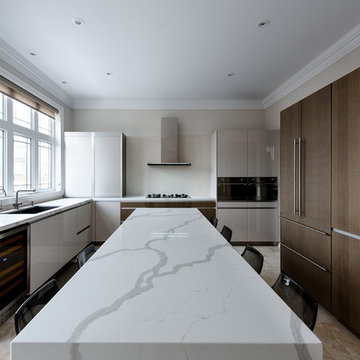
An all-new kitchen with a user-friendly layout and a few unexpected contemporary details. Kitchen cabinets from LEICHT improves views, flow, storage and function. This well-designed layout achieves a light and upbeat look with the help of a stunning Miele gas cooktop.
Photo Credits: Alex UA Photography
 Nathan Taylor for Obelisk Home
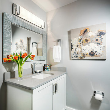
Alcove shower - mid-sized transitional 3/4 alcove shower idea in Other with an undermount sink and a hinged shower door
 Reico Kitchen & Bath
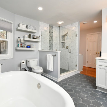
Designed by Kelsey McDaniel of Reico Kitchen & Bath in Richmond, VA this bathroom remodeling project features a transitional style inspired design with Merillat Classic cabinets in the door style Rowan in the Mist finish paired with Vicostone countertops in Valley White with 1/4" Bevel Edge.
The bathroom includes Kohler fixtures along with Marazzi Blue Gray Matte 8" Hex floor tile, Roca Statuary White 4 x 10 Subway shower wall tile, MSI Stone Blend Glass 12 x 12 Sheets shower accent tile and Marazzi Blue Gray Matte 1 1/2" Hex shower floor tile.
“I am in love with my new bathroom,” said the client. “I have a gorgeous free standing bathtub that is the first thing your eyes settle on as you step into the room and is the centerpiece of the entire room while still allowing plenty of room to walk around to the windows and rest of the room.”
“The hardest part of the remodeling project was envisioning how to use the existing space in a different and more user friendly way. My Reico designer Kelsey was invaluable in this regard and helped me to create the bathroom I had always hoped to have. I am extremely happy and grateful that I went to Reico for my project.”
“The biggest design challenge of this space was to maximize the entirety of the bathroom without making it feel overly done. The client had a desire to enlarge the shower, remove the existing jacuzzi and surround, as well as incorporate a soaking tub for relaxation,” said Kelsey.
“Because this was a massive space, we wanted to incorporate larger tile for a pop of color and dimension to reel in the openness a bit and draw your eye inward. We offset that dark tile with satin nickel fixtures, light cabinets, and light counter tops. It was a perfect balance of contrast throughout. The client had a vision and needed someone to make that a reality for her. I was very grateful to be that designer.”
Photos courtesy of Tim Snyder Photography.
 Reico Kitchen & Bath
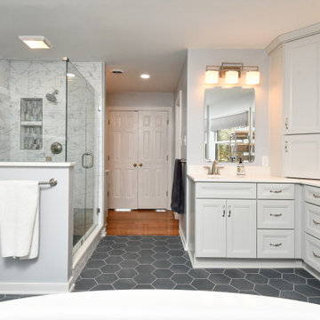
Designed by Kelsey McDaniel of Reico Kitchen & Bath in Richmond, VA this bathroom remodeling project features a transitional style inspired design with Merillat Classic cabinets in the door style Rowan in the Mist finish paired with Vicostone countertops in Valley White with 1/4" Bevel Edge.
The bathroom includes Kohler fixtures along with Marazzi Blue Gray Matte 8" Hex floor tile, Roca Statuary White 4 x 10 Subway shower wall tile, MSI Stone Blend Glass 12 x 12 Sheets shower accent tile and Marazzi Blue Gray Matte 1 1/2" Hex shower floor tile.
“I am in love with my new bathroom,” said the client. “I have a gorgeous free standing bathtub that is the first thing your eyes settle on as you step into the room and is the centerpiece of the entire room while still allowing plenty of room to walk around to the windows and rest of the room.”
“The hardest part of the remodeling project was envisioning how to use the existing space in a different and more user friendly way. My Reico designer Kelsey was invaluable in this regard and helped me to create the bathroom I had always hoped to have. I am extremely happy and grateful that I went to Reico for my project.”
“The biggest design challenge of this space was to maximize the entirety of the bathroom without making it feel overly done. The client had a desire to enlarge the shower, remove the existing jacuzzi and surround, as well as incorporate a soaking tub for relaxation,” said Kelsey.
“Because this was a massive space, we wanted to incorporate larger tile for a pop of color and dimension to reel in the openness a bit and draw your eye inward. We offset that dark tile with satin nickel fixtures, light cabinets, and light counter tops. It was a perfect balance of contrast throughout. The client had a vision and needed someone to make that a reality for her. I was very grateful to be that designer.”
Photos courtesy of Tim Snyder Photography.
 Louise Pascale, Willow Design Group
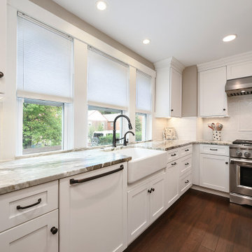
This traditional shaker style home remodel, had a very dysfunctional small kitchen approx. 10'x 12' and an oversized dining room. To make the space more open and user friendly, we moved the kitchen where the dining room was and incorporate a large island with seating for 5. At the back entrance, space for coats and shoes were placed along with a much needed new powder room.
 Paul Davis Remodeling of Greenville & Spartanburg
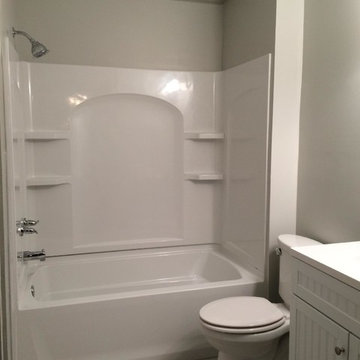
A pretty new vanity in a much more practical location make this bathroom much more user friendly than it was before the remodeling. The upgrade to a tile floor also makes the room that much nicer. A colorful shower curtain, towels and other accessories will complete the look.
Photo by -D.D.
 BLIS REAL ESTATE & HOME DESIGN
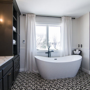
Exuding Opulent Old-World Charm: A Master Bathroom Oasis
The ornate floor tiles are the pièce de résistance in this lavishly designed master bathroom. Their intricate patterns effortlessly unify the various colors within the room, creating an ambiance of timeless elegance.
The subway-style shower tiles, adorned in exquisite earthy tones, serve as the cornerstone of this pristine aesthetic. These hues gracefully dance between the realms of brown and black, resulting in a striking contrast that is beautifully complemented by the surrounding shades of white. This harmonious interplay of warm and neutral tones not only imparts a sense of sophistication but also ensures a welcoming and user-friendly atmosphere throughout the space.
 Kala Interior Design
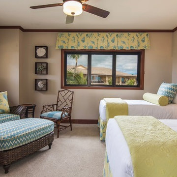
Step through the door into this luxurious Kaua’i penthouse and be enveloped in soothing hues of sea glass crystal waters and gently curling ocean waves. Elegantly appointed in classic island style with furnishings by Tommy Bahama, this space is beautiful, relaxing and very livable. Special touches, such as art prints by artist Wade Koniakowsky, add personal distinctive Kaua’i ambiance. Some existing furnishings were repurposed and rearranged to create a more functional and user friendly unit, as well as showcase the magnificent ocean views.

 Forward Design Build Remodel
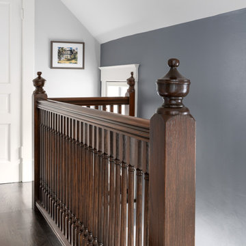
Our clients loved their neighborhood and being able to walk to work. While they knew it was their forever home, they needed more space. Their goals were to completely update the interior while keeping the original charm. They also wanted to add an addition for more space for their growing family.
On the first floor we relocated the kitchen, dining, and laundry room. With the rear addition we were able to enlarge the kitchen and dining and add in a powder room, secondary playroom, mudroom and back entry.
On the second floor, the back half was entirely reconfigured. We added a primary suite and a hallway bathroom.
With this being a historic home, we left the existing windows in place as well as the trim and baseboards. We kept and refinished the existing stairway railing. The primary bathroom was moved to be more user friendly.
We made cosmetic upgrades throughout the home for a cohesive look that matches the homeowner’s style which was transitional with industrial elements.
104