Search results for "Reflective add ons" in Home Design Ideas
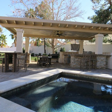
This backyard landscape design is inspired by our Blu Grande Smooth patio slab. Perfect paving slab for modern poolsides and backyard design, Blu Grande Smooth is a large concrete patio stone available in multiple colors. It's smooth texture is sleek to the eye but rougher to the touch which avoids it from getting slippery when wet. The large rectangular shape works as an easy add-on into Blu 60 regular modular patterns but can also work as a stand-alone to create a very linear look. Check out the HD2 Blu Grande Smooth which is all about seamless looks with a tighter/poreless texture and anti-aging technology. Check out our website to shop the look! https://www.techo-bloc.com/shop/slabs/blu-grande-smooth/

Our clients wanted the ultimate modern farmhouse custom dream home. They found property in the Santa Rosa Valley with an existing house on 3 ½ acres. They could envision a new home with a pool, a barn, and a place to raise horses. JRP and the clients went all in, sparing no expense. Thus, the old house was demolished and the couple’s dream home began to come to fruition.
The result is a simple, contemporary layout with ample light thanks to the open floor plan. When it comes to a modern farmhouse aesthetic, it’s all about neutral hues, wood accents, and furniture with clean lines. Every room is thoughtfully crafted with its own personality. Yet still reflects a bit of that farmhouse charm.
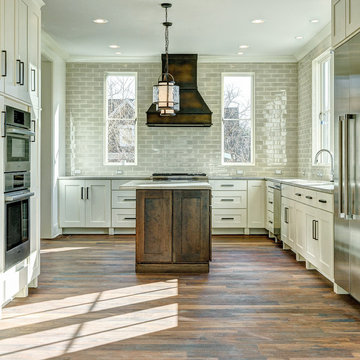
Their considerable-sized kitchen is a union of rustic warmth and industrial simplicity. The all-white shaker cabinetry and subway backsplash light up the room. All white everything complimented by warm wood flooring and matte black fixtures. The stunning custom Raw Urth reclaimed steel hood is also a star focal point in this gorgeous space. Not to mention the wet bar area with its unique open shelves above not one, but two integrated wine chillers. It’s also thoughtfully positioned next to the large pantry with a farmhouse style staple: a sliding barn door.
The master bathroom is relaxation at its finest. Monochromatic colors and a pop of pattern on the floor lend a fashionable look to this private retreat. Matte black finishes stand out against a stark white backsplash, complement charcoal veins in the marble looking countertop, and is cohesive with the entire look. The matte black shower units really add a dramatic finish to this luxurious large walk-in shower.
Photographer: Andrew - OpenHouse VC

Million Dollar Listing’s celebrity broker Ryan Serhant reached out to Decor Aid to stage a luxurious Brooklyn condo development. The only caveat was that our interior designers had 48 hours to come up with the design, concept, and source all the furniture. Always up for a challenge, we partnered with Mitchell Gold & Bob Williams to create this contemporary gem.
Staying true to their contemporary vision, our interior decorators sourced all pieces through MGBW. Starting in the living room, we placed the Gunner Sofa, a piece that offers clean-lined living. The thin arms and slanted profile emphasize the modern elegance of the home. Through the use of various contemporary patterns and textures we were able to avoid the one-dimensional ambiance, and instead, the apartment’s living room feels detailed and thought out, without making anyone who enters overcrowded with home decor.
The Melrose cocktail table was sourced for its sleek, stainless steel and glass design that contrasts with more substantial pieces in the space, while also complementing the contemporary style. The glass design gives the illusion that this table takes up less space, giving the living room design a light and airy feel all around. The living space transformed into something out of a decor catalog with just the right amount of personality, creating a room that follows through with our starting design, yet functional for everyday use.
After the living room area, we set our eyes on designing the master bedroom. Our interior decorators were immediately drawn to the Celina Floating Rail Bed, it’s opulent nailhead trim, and dramatic design brings fresh sophistication to the bedroom design, while also standing out as a timeless piece that can complement various trends or styles that might be added later on to the bedroom decoration. We sourced the Roland Table Lamp to add texture, with its elaborate ribbed design, that compliments the air of masculinity the Carmen Leather Ottoman add while contrasting with the light, sleeker pieces. This difference in weight left us with a bedroom decoration that lives up to the trending modern standards, yet a space that is timeless and stylish no matter the decor trends.
Once we finished and the project was completed, our senior designers took a step back and took in all of their hard labor. Decor Aid was able to make this newly built blank space and design it into a modern wonder small brooklyn apartment. The MGBW furnishings were all hand-picked to keep an even balance of complementing and contrasting contemporary pieces, which was one of our more critical apartment decorating ideas. The apartment home decor brings to life this modern concept in a way that isn’t overbearing and shows off their style making the space in every sense an accurate reflection of a chic contemporary style.
Find the right local pro for your project
Our Austin studio decided to go bold with this project by ensuring that each space had a unique identity in the Mid-Century Modern style bathroom, butler's pantry, and mudroom. We covered the bathroom walls and flooring with stylish beige and yellow tile that was cleverly installed to look like two different patterns. The mint cabinet and pink vanity reflect the mid-century color palette. The stylish knobs and fittings add an extra splash of fun to the bathroom.
The butler's pantry is located right behind the kitchen and serves multiple functions like storage, a study area, and a bar. We went with a moody blue color for the cabinets and included a raw wood open shelf to give depth and warmth to the space. We went with some gorgeous artistic tiles that create a bold, intriguing look in the space.
In the mudroom, we used siding materials to create a shiplap effect to create warmth and texture – a homage to the classic Mid-Century Modern design. We used the same blue from the butler's pantry to create a cohesive effect. The large mint cabinets add a lighter touch to the space.

This pretty powder bath is part of a whole house design and renovation by Haven Design and Construction. The herringbone marble flooring provides a subtle pattern that reflects the gray and white color scheme of this elegant powder bath. A soft gray wallpaper with beaded octagon geometric design provides sophistication to the tiny jewelbox powder room, while the gold and glass chandelier adds drama. The furniture detailing of the custom vanity cabinet adds further detail. This powder bath is sure to impress guests.

This project was a complete renovation. It was the first project a newlywed couple did together. In one of the first meetings we all agreed we loved the Osborne and Little striped polka dot fabric (pillow on the chairs and sofa). The room grew from there. A main objective was to enhance the view of Central Park all the way to the Palisades. We kept the walls light and the upholstery monochromatic, except for a dash of off white in the Hugues Chevalier (Ying Armchair). The area rug is large and almost square we had it made by Royce wool carpets. Joanne and Bill Riley custom designed it. The background was kept the blue of the upholstery further grounding the space yet keeping it quiet enough with only red and gold accents (there are actually 9 colors in the rug, but they are the same hues as the 3 main colors) The wood of the dining area adds a solid feel. (Table and chairs by Stanley furniture) Along the long wall is a 20' built-in with a Costa Smerelda granite counter top, as. storage space is at a premium in NYC. There is enough room for a small bar area on the left, dining area storage in the middle and to the far right. Also, in the middle is a 50" TV that comes up out of the granite and audio equipment. Above the built-in are wall to wall mirrors with glass shelves hanging from them. This keeps an open and spacious feel. The accessories keep it welcoming. The wall sconces (also on the mirrors) are by Currey and Co. The large crown molding and the high gloss ceiling add to the subtle drama. The small custom wood cabinet is made of Claro Walnut with ebonized Ash legs and handles by Hubel Handcrafted. It sits between the window and the door keeping you centered in the space. All in all an easy space to enjoy!

When my client had to move from her company office to work at home, she set up in the dining room. Despite her best efforts, this was not the long-term solution she was looking for. My client realized she needed a dedicated space not on the main floor of the home. On one hand, having your office space right next to the kitchen is handy. On the other hand, it made separating work and home life was not that easy.
The house was a ranch. In essence, the basement would run entire length of the home. As we came down the steps, we entered a time capsule. The house was built in the 1950’s. The walls were covered with original knotty pine paneling. There was a wood burning fireplace and considering this was a basement, high ceilings. In addition, there was everything her family could not store at their own homes. As we wound though the space, I though “wow this has potential”, Eventually, after walking through the laundry room we came to a small nicely lit room. This would be the office.
My client looked at me and asked what I thought. Undoubtedly, I said, this can be a great workspace, but do you really want to walk through this basement and laundry to get here? Without reservation, my client said where do we start?
Once the design was in place, we started the renovation. The knotty pine paneling had to go. Specifically, to add some insulation and control the dampness and humidity. The laundry room wall was relocated to create a hallway to the office.
At the far end of the room, we designated a workout zone. Weights, mats, exercise bike and television are at the ready for morning or afternoon workouts. The space can be concealed by a folding screen for party time. Doors to an old closet under the stairs were relocated to the workout area for hidden storage. Now we had nice wall for a beautiful console and mirror for storage and serving during parties.
In order to add architectural details, we covered the old ugly support columns with simple recessed millwork panels. This detail created a visual division between the bar area and the seating area in front of the fireplace. The old red brick on the fireplace surround was replaced with stack stone. A mantle was made from reclaimed wood. Additional reclaimed wood floating shelves left and right of the fireplace provides decorative display while maintaining a rustic element balancing the copper end table and leather swivel rocker.
We found an amazing rug which tied all of the colors together further defining the gathering space. Russet and burnt orange became the accent color unifying each space. With a bit of whimsy, a rather unusual light fixture which looks like roots from a tree growing through the ceiling is a conversation piece.
The office space is quite and removed from the main part of the basement. There is a desk large enough for multiple screens, a small bookcase holding office supplies and a comfortable chair for conference calls. Because working from home requires many online meetings, we added a shiplap wall painted in Hale Navy to contrast with the orange fabric on the chair. We finished the décor with a painting from my client’s father. This is the background online visitors will see.
The last and best part of the renovation is the beautiful bar. My client is an avid collector of wine. She already had the EuroCave refrigerator, so I incorporated it into the design. The cabinets are painted Temptation Grey from Benjamin Moore. The counter tops are my favorite hard working quartzite Brown Fantasy. The backsplash is a combination of rustic wood and old tin ceiling like porcelain tiles. Together with the textures of the reclaimed wood and hide poofs balanced against the smooth finish of the cabinets, we created a comfortable luxury for relaxing.
There is ample storage for bottles, cans, glasses, and anything else you can think of for a great party. In addition to the wine storage, we incorporated a beverage refrigerator, an ice maker, and a sink. Floating shelves with integrated lighting illuminate the back bar. The raised height of the front bar provides the perfect wine tasting and paring spot. I especially love the pendant lights which look like wine glasses.
Finally, I selected carpet for the stairs and office. It is perfect for noise reduction. Meanwhile for the overall flooring, I specifically selected a high-performance vinyl plank floor. We often use this product as it is perfect to install on a concrete floor. It is soft to walk on, easy to clean and does not reduce the overall height of the space.

Sponsored
Fredericksburg, OH
High Point Cabinets
Columbus' Experienced Custom Cabinet Builder | 4x Best of Houzz Winner

The bold and rustic kitchen is large enough to cook and entertain for many guests. The edges of the soapstone counter tops were left unfinished to add to the home's rustic charm.
Interior Design: Megan at M Design and Interiors

 
Download our free ebook, Creating the Ideal Kitchen. DOWNLOAD NOW
 
Lakefront property in the northwest suburbs of Chicago is hard to come by, so when we were hired by this young family with exactly that, we were immediately inspired by not just the unusually large footprint of this 1950’s colonial revival but also the lovely views of the manmade lake it was sited on. The large 5-bedroom home was solidly stuck in the 1980’s, but we saw tons of potential. We started out by updating the existing staircase with a fresh coat of paint and adding new herringbone slate to the entry hall.
The powder room off the entryway also got a refresh - new flooring, new cabinets and fixtures. We ran the new slate right through into this space for some consistency. A fun wallpaper and shiplap trim add a welcoming feel and set the tone for the home.
Next, we tackled the kitchen. Located away from the rest of the first floor, the kitchen felt a little isolated, so we immediately began planning for how to better connect it to the rest of the first floor. We landed on removing the wall between the kitchen and dining room and designed a modified galley style space with separate cooking and clean up zones. The cooking zone consists of the refrigerator, prep sink and cooktop, along with a nice long run of prep space at the island. The cleanup side of the kitchen consists of the main sink and dishwasher. Both areas are situated so that the user can view the lake during prep work and cleanup!
One of the home’s main puzzles was how to incorporate the mudroom and area in front of the patio doors at the back of the house. We already had a breakfast table area, so the space by the patio doors was a bit of a no man’s land. We decided to separate the kitchen proper from what became the new mudroom with a large set of barn doors. That way you can quickly hide any mudroom messes but have easy access to the light coming in through the patio doors as well as the outdoor grilling station. We also love the impact the barn doors add to the overall space.
The homeowners’ first words to us were “it’s time to ditch the brown,” so we did! We chose a lovely blue pallet that reflects the home’s location on the lake which is also vibrant yet easy on the eye. Countertops are white quartz, and the natural oak floor works well with the other honey accents. The breakfast table was given a refresh with new chairs, chandelier and window treatments that frame the gorgeous views of the lake out the back.
We coordinated the slate mudroom flooring with that used in the home’s main entrance for a consistent feel. The storage area consists of open and closed storage to allow for some clutter control as needed.
Next on our “to do” list was revamping the dated brown bar area in the neighboring dining room. We eliminated the clutter by adding some closed cabinets and did some easy updates to help the space feel more current. One snag we ran into here was the discovery of a beam above the existing open shelving that had to be modified with a smaller structural beam to allow for our new design to work. This was an unexpected surprise, but in the end we think it was well worth it!
We kept the colors here a bit more muted to blend with the homeowner’s existing furnishings. Open shelving and polished nickel hardware add some simple detail to the new entertainment zone which also looks out onto the lake!
Next we tackled the upstairs starting with the homeowner’s son’s bath. The bath originally had both a tub shower and a separate shower, so we decided to swap out the shower for a new laundry area. This freed up some space downstairs in what used to be the mudroom/laundry room and is much more convenient for daily laundry needs.
We continued the blue palette here with navy cabinetry and the navy tile in the shower. Porcelain floor tile and chrome fixtures keep maintenance to a minimum while matte black mirrors and lighting add some depth the design. A low maintenance runner adds some warmth underfoot and ties the whole space together.
We added a pocket door to the bathroom to minimize interference with the door swings. The left door of the laundry closet is on a 180 degree hinge to allow for easy full access to the machines. Next we tackled the master bath which is an en suite arrangement. The original was typical of the 1980’s with the vanity outside of the bathroom, situated near the master closet. And the brown theme continued here with multiple shades of brown.
Our first move was to segment off the bath and the closet from the master bedroom. We created a short hall from the bedroom to the bathroom with his and hers walk-in closets on the left and right as well as a separate toilet closet outside of the main bathroom for privacy and flexibility.
The original bathroom had a giant soaking tub with steps (dangerous!) as well as a small shower that did not work well for our homeowner who is 6’3”. With other bathtubs in the home, they decided to eliminate the tub and create an oversized shower which takes up the space where the old tub was located. The double vanity is on the opposite wall and a bench is located under the window for morning conversations and a place to set a couple of towels.
The pallet in here is light and airy with a mix of blond wood, creamy porcelain and marble tile, and brass accents. A simple roman shade adds some texture and it’s top-down mechanism allows for light and privacy.
This large whole house remodel gave our homeowners not only the ability to maximize the potential of their home but also created a lovely new frame from which to view their fabulous lake views.
Designed by: Susan Klimala, CKD, CBD
Photography by: Michael Kaskel
For more information on kitchen and bath design ideas go to: www.kitchenstudio-ge.com

This stylish kitchen combines luxury with warmth through intentional material choices and layered design. Green velvet bar stools line the island, adding a pop of color and plush texture against the natural wood accents found in the cabinetry and under the island. A black and gold sink faucet and matching water spout add a bold, modern contrast. Above the cooktop, a minimalist floating shelf keeps essentials within reach while maintaining a clean look. Overhead, elegant floating mirror lights dangle above the island, reflecting light and adding a contemporary touch to the space.

Our Austin studio decided to go bold with this project by ensuring that each space had a unique identity in the Mid-Century Modern style bathroom, butler's pantry, and mudroom. We covered the bathroom walls and flooring with stylish beige and yellow tile that was cleverly installed to look like two different patterns. The mint cabinet and pink vanity reflect the mid-century color palette. The stylish knobs and fittings add an extra splash of fun to the bathroom.
The butler's pantry is located right behind the kitchen and serves multiple functions like storage, a study area, and a bar. We went with a moody blue color for the cabinets and included a raw wood open shelf to give depth and warmth to the space. We went with some gorgeous artistic tiles that create a bold, intriguing look in the space.
In the mudroom, we used siding materials to create a shiplap effect to create warmth and texture – a homage to the classic Mid-Century Modern design. We used the same blue from the butler's pantry to create a cohesive effect. The large mint cabinets add a lighter touch to the space.

Our clients wanted the ultimate modern farmhouse custom dream home. They found property in the Santa Rosa Valley with an existing house on 3 ½ acres. They could envision a new home with a pool, a barn, and a place to raise horses. JRP and the clients went all in, sparing no expense. Thus, the old house was demolished and the couple’s dream home began to come to fruition.
The result is a simple, contemporary layout with ample light thanks to the open floor plan. When it comes to a modern farmhouse aesthetic, it’s all about neutral hues, wood accents, and furniture with clean lines. Every room is thoughtfully crafted with its own personality. Yet still reflects a bit of that farmhouse charm.
Their considerable-sized kitchen is a union of rustic warmth and industrial simplicity. The all-white shaker cabinetry and subway backsplash light up the room. All white everything complimented by warm wood flooring and matte black fixtures. The stunning custom Raw Urth reclaimed steel hood is also a star focal point in this gorgeous space. Not to mention the wet bar area with its unique open shelves above not one, but two integrated wine chillers. It’s also thoughtfully positioned next to the large pantry with a farmhouse style staple: a sliding barn door.
The master bathroom is relaxation at its finest. Monochromatic colors and a pop of pattern on the floor lend a fashionable look to this private retreat. Matte black finishes stand out against a stark white backsplash, complement charcoal veins in the marble looking countertop, and is cohesive with the entire look. The matte black shower units really add a dramatic finish to this luxurious large walk-in shower.
Photographer: Andrew - OpenHouse VC

This boy's bathroom was designed to stay current as the boy ages with the use of neutral colors. The walls are a very cool fossilized limestone and the glass mosaic floor and accent border add reflective light and interest. The walk-through closet has plenty of storage space in the built-in units with hanging space on the opposite wall. Alex Kotlik Photography

This backyard landscape design is inspired by our Blu Grande Smooth patio slab. Perfect paving slab for modern poolsides and backyard design, Blu Grande Smooth is a large concrete patio stone available in multiple colors. It's smooth texture is sleek to the eye but rougher to the touch which avoids it from getting slippery when wet. The large rectangular shape works as an easy add-on into Blu 60 regular modular patterns but can also work as a stand-alone to create a very linear look. Check out the HD2 Blu Grande Smooth which is all about seamless looks with a tighter/poreless texture and anti-aging technology. Check out our website to shop the look! https://www.techo-bloc.com/shop/slabs/blu-grande-smooth/

The owners of this 1956 ranch home in Atlanta partnered with Copper Sky Design + Remodel to modernize the space while enhancing its mid-century character. The standout feature of the project is the kitchen, where a custom curved wood tambour island adds a striking retro element. This open-concept space is warmed by wood ceiling beams and tongue-and-groove planks, creating a blend of mid-century charm and modern functionality. The adjacent breakfast nook offers a cozy spot for morning coffee, while geometric tile patterns and asymmetrical designs throughout the kitchen honor the home's original era.
The remodel included reconfiguring the floor plan to add practical spaces like a laundry room, jack-and-jill bathroom, and pantry. The primary bathroom was updated with retro-inspired hexagon tiles, tying the room's design into the home's mid-century aesthetic. In the entryway, a vibrant front door and modern tile work, paired with clerestory windows, create a bright and welcoming atmosphere.
On the exterior, new wood-look garage doors and vintage breeze blocks enhance the home's curb appeal, while a fresh coat of paint ties everything together. These thoughtful updates to both the interior and exterior reflect a harmonious balance between mid-century nostalgia and modern living.

Download our free ebook, Creating the Ideal Kitchen. DOWNLOAD NOW
For many, extra time at home during COVID left them wanting more from their homes. Whether you realized the shortcomings of your space or simply wanted to combat boredom, a well-designed and functional home was no longer a want, it became a need. Tina found herself wanting more from her Old Irving Park home and reached out to The Kitchen Studio about adding function to her kitchen to make the most of the available real estate.
At the end of the day, there is nothing better than returning home to a bright and happy space you love. And this kitchen wasn’t that for Tina. Dark and dated, with a palette from the past and features that didn’t make the most of the available square footage, this remodel required vision and a fresh approach to the space. Lead designer, Stephanie Cole’s main design goal was better flow, while adding greater functionality with organized storage, accessible open shelving, and an overall sense of cohesion with the adjoining family room.
The original kitchen featured a large pizza oven, which was rarely used, yet its footprint limited storage space. The nearby pantry had become a catch-all, lacking the organization needed in the home. The initial plan was to keep the pizza oven, but eventually Tina realized she preferred the design possibilities that came from removing this cumbersome feature, with the goal of adding function throughout the upgraded and elevated space. Eliminating the pantry added square footage and length to the kitchen for greater function and more storage. This redesigned space reflects how she lives and uses her home, as well as her love for entertaining.
The kitchen features a classic, clean, and timeless palette. White cabinetry, with brass and bronze finishes, contrasts with rich wood flooring, and lets the large, deep blue island in Woodland’s custom color Harbor – a neutral, yet statement color – draw your eye.
The kitchen was the main priority. In addition to updating and elevating this space, Tina wanted to maximize what her home had to offer. From moving the location of the patio door and eliminating a window to removing an existing closet in the mudroom and the cluttered pantry, the kitchen footprint grew. Once the floorplan was set, it was time to bring cohesion to her home, creating connection between the kitchen and surrounding spaces.
The color palette carries into the mudroom, where we added beautiful new cabinetry, practical bench seating, and accessible hooks, perfect for guests and everyday living. The nearby bar continues the aesthetic, with stunning Carrara marble subway tile, hints of brass and bronze, and a design that further captures the vibe of the kitchen.
Every home has its unique design challenges. But with a fresh perspective and a bit of creativity, there is always a way to give the client exactly what they want [and need]. In this particular kitchen, the existing soffits and high slanted ceilings added a layer of complexity to the lighting layout and upper perimeter cabinets.
While a space needs to look good, it also needs to function well. This meant making the most of the height of the room and accounting for the varied ceiling features, while also giving Tina everything she wanted and more. Pendants and task lighting paired with an abundance of natural light amplify the bright aesthetic. The cabinetry layout and design compliments the soffits with subtle profile details that bring everything together. The tile selections add visual interest, drawing the eye to the focal area above the range. Glass-doored cabinets further customize the space and give the illusion of even more height within the room.
While her family may be grown and out of the house, Tina was focused on adding function without sacrificing a stunning aesthetic and dreamy finishes that make the kitchen the gathering place of any home. It was time to love her kitchen again, and if you’re wondering what she loves most, it’s the niche with glass door cabinetry and open shelving for display paired with the marble mosaic backsplash over the range and complimenting hood. Each of these features is a stunning point of interest within the kitchen – both brag-worthy additions to a perimeter layout that previously felt limited and lacking.
Whether your remodel is the result of special needs in your home or simply the excitement of focusing your energy on creating a fun new aesthetic, we are here for it. We love a good challenge because there is always a way to make a space better – adding function and beauty simultaneously.

This project was not only full of many bathrooms but also many different aesthetics. The goals were fourfold, create a new master suite, update the basement bath, add a new powder bath and my favorite, make them all completely different aesthetics.
Primary Bath-This was originally a small 60SF full bath sandwiched in between closets and walls of built-in cabinetry that blossomed into a 130SF, five-piece primary suite. This room was to be focused on a transitional aesthetic that would be adorned with Calcutta gold marble, gold fixtures and matte black geometric tile arrangements.
Powder Bath-A new addition to the home leans more on the traditional side of the transitional movement using moody blues and greens accented with brass. A fun play was the asymmetry of the 3-light sconce brings the aesthetic more to the modern side of transitional. My favorite element in the space, however, is the green, pink black and white deco tile on the floor whose colors are reflected in the details of the Australian wallpaper.
Hall Bath-Looking to touch on the home's 70's roots, we went for a mid-mod fresh update. Black Calcutta floors, linear-stacked porcelain tile, mixed woods and strong black and white accents. The green tile may be the star but the matte white ribbed tiles in the shower and behind the vanity are the true unsung heroes.

A Cool and Moody Kitchen
AS SEEN ON: SEASON 3, EPISODE 7 OF MASTERS OF FLIP
The perfect place for a hot cup of coffee on a rainy day, the custom kitchen in this modern-meets-industrial home is dark, stormy, and full of character.
Polished slate countertops team up with the dark Wren stain on our Gallatin cabinets to create a moody take on modern style. The upper cabinets feature unique up-open hinged doors that add an unexpected element while floating shelves let the penny tile on the backsplash shine. Greenery, copper trinkets, and small clay pots add eye-catching detail throughout the space, creating a curated yet comfortable atmosphere.
To maintain the sleek design that this space works so hard for, all of those crucial – yet perhaps not so stylish – amenities are tucked away in the base cabinets, including an under counter microwave unit and a lazy susan in the corner cabinets.

To add a serene and soothing ambience to this 64th-floor pied-à-terre, our NYC design studio chose a relaxing color palette of soft blues, grays, and creams to reflect the light streaming in through floor-to-ceiling windows. A custom work desk perfectly matches the curved windows for expansive views of Downtown, the Hudson River, and Uptown. The bedroom is a peaceful sanctuary for the soul, with soft colors and bedding to induce instant relaxation. Elegant bar chairs in the spacious open-concept kitchen reflect the calming feel of the rest of the home.

Our clients wanted the ultimate modern farmhouse custom dream home. They found property in the Santa Rosa Valley with an existing house on 3 ½ acres. They could envision a new home with a pool, a barn, and a place to raise horses. JRP and the clients went all in, sparing no expense. Thus, the old house was demolished and the couple’s dream home began to come to fruition.
The result is a simple, contemporary layout with ample light thanks to the open floor plan. When it comes to a modern farmhouse aesthetic, it’s all about neutral hues, wood accents, and furniture with clean lines. Every room is thoughtfully crafted with its own personality. Yet still reflects a bit of that farmhouse charm.
Their considerable-sized kitchen is a union of rustic warmth and industrial simplicity. The all-white shaker cabinetry and subway backsplash light up the room. All white everything complimented by warm wood flooring and matte black fixtures. The stunning custom Raw Urth reclaimed steel hood is also a star focal point in this gorgeous space. Not to mention the wet bar area with its unique open shelves above not one, but two integrated wine chillers. It’s also thoughtfully positioned next to the large pantry with a farmhouse style staple: a sliding barn door.
The master bathroom is relaxation at its finest. Monochromatic colors and a pop of pattern on the floor lend a fashionable look to this private retreat. Matte black finishes stand out against a stark white backsplash, complement charcoal veins in the marble looking countertop, and is cohesive with the entire look. The matte black shower units really add a dramatic finish to this luxurious large walk-in shower.
Photographer: Andrew - OpenHouse VC
1