
Search results for "Reflective add ons" in Home Design Ideas
 Rudloff Custom Builders
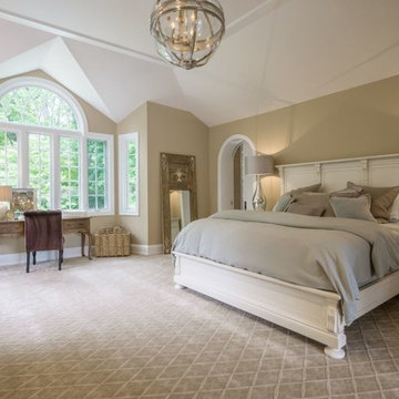
This Master Bedroom boast elegance and serenity throughout.
The "Tray" and vaulted ceiling add architectural drama to the room and is further accentuated by an orb shaped hanging pendant light fixture.
Over the center window panels we see a decorative half round window with curved mullions. This architectural detail is repeated through out the home.
Furnished and finished using light colors make the room light and airy.
This home was featured in Philadelphia Magazine August 2014 issue to showcase its beauty and excellence.
Photo by Alicia's Art, LLC
RUDLOFF Custom Builders, is a residential construction company that connects with clients early in the design phase to ensure every detail of your project is captured just as you imagined. RUDLOFF Custom Builders will create the project of your dreams that is executed by on-site project managers and skilled craftsman, while creating lifetime client relationships that are build on trust and integrity.
We are a full service, certified remodeling company that covers all of the Philadelphia suburban area including West Chester, Gladwynne, Malvern, Wayne, Haverford and more.
As a 6 time Best of Houzz winner, we look forward to working with you on your next project.
 Lori Carroll & Associates
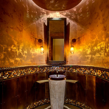
A reflective, specialty wall finish adds dimension to a small space.
Example of a tuscan multicolored tile and mosaic tile powder room design in Phoenix with a vessel sink
Example of a tuscan multicolored tile and mosaic tile powder room design in Phoenix with a vessel sink
 Techo-Bloc
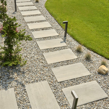
This backyard landscape design is inspired by our Blu Grande Smooth patio slab. Perfect paving slab for modern poolsides and backyard design, Blu Grande Smooth is a large concrete patio stone available in multiple colors. It's smooth texture is sleek to the eye but rougher to the touch which avoids it from getting slippery when wet. The large rectangular shape works as an easy add-on into Blu 60 regular modular patterns but can also work as a stand-alone to create a very linear look. Check out the HD2 Blu Grande Smooth which is all about seamless looks with a tighter/poreless texture and anti-aging technology. Check out our website to shop the look! https://www.techo-bloc.com/shop/slabs/blu-grande-smooth/
Find the right local pro for your project
 Breathe Design Studio
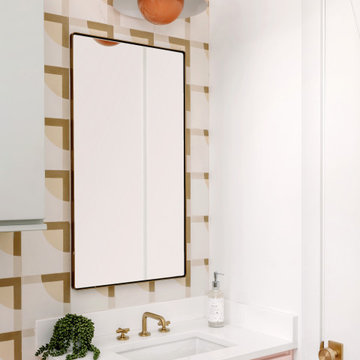
Our Austin studio decided to go bold with this project by ensuring that each space had a unique identity in the Mid-Century Modern style bathroom, butler's pantry, and mudroom. We covered the bathroom walls and flooring with stylish beige and yellow tile that was cleverly installed to look like two different patterns. The mint cabinet and pink vanity reflect the mid-century color palette. The stylish knobs and fittings add an extra splash of fun to the bathroom.
The butler's pantry is located right behind the kitchen and serves multiple functions like storage, a study area, and a bar. We went with a moody blue color for the cabinets and included a raw wood open shelf to give depth and warmth to the space. We went with some gorgeous artistic tiles that create a bold, intriguing look in the space.
In the mudroom, we used siding materials to create a shiplap effect to create warmth and texture – a homage to the classic Mid-Century Modern design. We used the same blue from the butler's pantry to create a cohesive effect. The large mint cabinets add a lighter touch to the space.
 Décor Aid
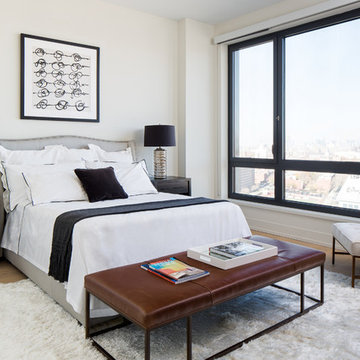
Million Dollar Listing’s celebrity broker Ryan Serhant reached out to Decor Aid to stage a luxurious Brooklyn condo development. The only caveat was that our interior designers had 48 hours to come up with the design, concept, and source all the furniture. Always up for a challenge, we partnered with Mitchell Gold & Bob Williams to create this contemporary gem.
Staying true to their contemporary vision, our interior decorators sourced all pieces through MGBW. Starting in the living room, we placed the Gunner Sofa, a piece that offers clean-lined living. The thin arms and slanted profile emphasize the modern elegance of the home. Through the use of various contemporary patterns and textures we were able to avoid the one-dimensional ambiance, and instead, the apartment’s living room feels detailed and thought out, without making anyone who enters overcrowded with home decor.
The Melrose cocktail table was sourced for its sleek, stainless steel and glass design that contrasts with more substantial pieces in the space, while also complementing the contemporary style. The glass design gives the illusion that this table takes up less space, giving the living room design a light and airy feel all around. The living space transformed into something out of a decor catalog with just the right amount of personality, creating a room that follows through with our starting design, yet functional for everyday use.
After the living room area, we set our eyes on designing the master bedroom. Our interior decorators were immediately drawn to the Celina Floating Rail Bed, it’s opulent nailhead trim, and dramatic design brings fresh sophistication to the bedroom design, while also standing out as a timeless piece that can complement various trends or styles that might be added later on to the bedroom decoration. We sourced the Roland Table Lamp to add texture, with its elaborate ribbed design, that compliments the air of masculinity the Carmen Leather Ottoman add while contrasting with the light, sleeker pieces. This difference in weight left us with a bedroom decoration that lives up to the trending modern standards, yet a space that is timeless and stylish no matter the decor trends.
Once we finished and the project was completed, our senior designers took a step back and took in all of their hard labor. Decor Aid was able to make this newly built blank space and design it into a modern wonder small brooklyn apartment. The MGBW furnishings were all hand-picked to keep an even balance of complementing and contrasting contemporary pieces, which was one of our more critical apartment decorating ideas. The apartment home decor brings to life this modern concept in a way that isn’t overbearing and shows off their style making the space in every sense an accurate reflection of a chic contemporary style.
 Curated Nest
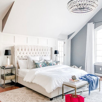
Master Bedroom: This suburban New Jersey couple wanted the architectural features of this expansive bedroom to truly shine, and we couldn't agree more. We painted the walls a rich color to highlight the vaulted ceilings and brick fireplace, and kept draperies simple to show off of the huge windows and lovely country view. We added a batten board treatment on the back wall to enhance the bed as the focal point and create a farmhouse chic feel. We love the chandelier floating above, reflecting light across the room off of each dangling crystal teardrop. Similar to the dining room, we let texture do the heavy lifting to add visual depth as opposed to color or pattern. Neutral tones in linen, metallic, shagreen, brick (fireplace), and wood create a light and airy space with plenty of textural details to appreciate.
Photo Credit: Erin Coren, Curated Nest Interiors
 JRP Design & Remodel
Our clients wanted the ultimate modern farmhouse custom dream home. They found property in the Santa Rosa Valley with an existing house on 3 ½ acres. They could envision a new home with a pool, a barn, and a place to raise horses. JRP and the clients went all in, sparing no expense. Thus, the old house was demolished and the couple’s dream home began to come to fruition.
The result is a simple, contemporary layout with ample light thanks to the open floor plan. When it comes to a modern farmhouse aesthetic, it’s all about neutral hues, wood accents, and furniture with clean lines. Every room is thoughtfully crafted with its own personality. Yet still reflects a bit of that farmhouse charm.
Their considerable-sized kitchen is a union of rustic warmth and industrial simplicity. The all-white shaker cabinetry and subway backsplash light up the room. All white everything complimented by warm wood flooring and matte black fixtures. The stunning custom Raw Urth reclaimed steel hood is also a star focal point in this gorgeous space. Not to mention the wet bar area with its unique open shelves above not one, but two integrated wine chillers. It’s also thoughtfully positioned next to the large pantry with a farmhouse style staple: a sliding barn door.
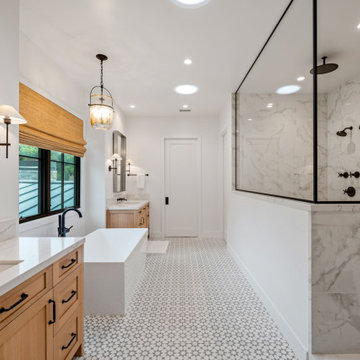
The master bathroom is relaxation at its finest. Monochromatic colors and a pop of pattern on the floor lend a fashionable look to this private retreat. Matte black finishes stand out against a stark white backsplash, complement charcoal veins in the marble looking countertop, and is cohesive with the entire look. The matte black shower units really add a dramatic finish to this luxurious large walk-in shower.
Photographer: Andrew - OpenHouse VC

 KohlMark Architects and Builders
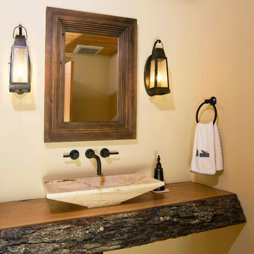
The design of this home was driven by the owners’ desire for a three-bedroom waterfront home that showcased the spectacular views and park-like setting. As nature lovers, they wanted their home to be organic, minimize any environmental impact on the sensitive site and embrace nature.
This unique home is sited on a high ridge with a 45° slope to the water on the right and a deep ravine on the left. The five-acre site is completely wooded and tree preservation was a major emphasis. Very few trees were removed and special care was taken to protect the trees and environment throughout the project. To further minimize disturbance, grades were not changed and the home was designed to take full advantage of the site’s natural topography. Oak from the home site was re-purposed for the mantle, powder room counter and select furniture.
The visually powerful twin pavilions were born from the need for level ground and parking on an otherwise challenging site. Fill dirt excavated from the main home provided the foundation. All structures are anchored with a natural stone base and exterior materials include timber framing, fir ceilings, shingle siding, a partial metal roof and corten steel walls. Stone, wood, metal and glass transition the exterior to the interior and large wood windows flood the home with light and showcase the setting. Interior finishes include reclaimed heart pine floors, Douglas fir trim, dry-stacked stone, rustic cherry cabinets and soapstone counters.
Exterior spaces include a timber-framed porch, stone patio with fire pit and commanding views of the Occoquan reservoir. A second porch overlooks the ravine and a breezeway connects the garage to the home.
Numerous energy-saving features have been incorporated, including LED lighting, on-demand gas water heating and special insulation. Smart technology helps manage and control the entire house.
Greg Hadley Photography

 TKS Design Group
Download our free ebook, Creating the Ideal Kitchen. DOWNLOAD NOW
Lakefront property in the northwest suburbs of Chicago is hard to come by, so when we were hired by this young family with exactly that, we were immediately inspired by not just the unusually large footprint of this 1950’s colonial revival but also the lovely views of the manmade lake it was sited on. The large 5-bedroom home was solidly stuck in the 1980’s, but we saw tons of potential. We started out by updating the existing staircase with a fresh coat of paint and adding new herringbone slate to the entry hall.
The powder room off the entryway also got a refresh - new flooring, new cabinets and fixtures. We ran the new slate right through into this space for some consistency. A fun wallpaper and shiplap trim add a welcoming feel and set the tone for the home.
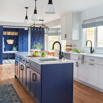
Next, we tackled the kitchen. Located away from the rest of the first floor, the kitchen felt a little isolated, so we immediately began planning for how to better connect it to the rest of the first floor. We landed on removing the wall between the kitchen and dining room and designed a modified galley style space with separate cooking and clean up zones. The cooking zone consists of the refrigerator, prep sink and cooktop, along with a nice long run of prep space at the island. The cleanup side of the kitchen consists of the main sink and dishwasher. Both areas are situated so that the user can view the lake during prep work and cleanup!
One of the home’s main puzzles was how to incorporate the mudroom and area in front of the patio doors at the back of the house. We already had a breakfast table area, so the space by the patio doors was a bit of a no man’s land. We decided to separate the kitchen proper from what became the new mudroom with a large set of barn doors. That way you can quickly hide any mudroom messes but have easy access to the light coming in through the patio doors as well as the outdoor grilling station. We also love the impact the barn doors add to the overall space.
The homeowners’ first words to us were “it’s time to ditch the brown,” so we did! We chose a lovely blue pallet that reflects the home’s location on the lake which is also vibrant yet easy on the eye. Countertops are white quartz, and the natural oak floor works well with the other honey accents. The breakfast table was given a refresh with new chairs, chandelier and window treatments that frame the gorgeous views of the lake out the back.
We coordinated the slate mudroom flooring with that used in the home’s main entrance for a consistent feel. The storage area consists of open and closed storage to allow for some clutter control as needed.
Next on our “to do” list was revamping the dated brown bar area in the neighboring dining room. We eliminated the clutter by adding some closed cabinets and did some easy updates to help the space feel more current. One snag we ran into here was the discovery of a beam above the existing open shelving that had to be modified with a smaller structural beam to allow for our new design to work. This was an unexpected surprise, but in the end we think it was well worth it!
We kept the colors here a bit more muted to blend with the homeowner’s existing furnishings. Open shelving and polished nickel hardware add some simple detail to the new entertainment zone which also looks out onto the lake!
Next we tackled the upstairs starting with the homeowner’s son’s bath. The bath originally had both a tub shower and a separate shower, so we decided to swap out the shower for a new laundry area. This freed up some space downstairs in what used to be the mudroom/laundry room and is much more convenient for daily laundry needs.
We continued the blue palette here with navy cabinetry and the navy tile in the shower. Porcelain floor tile and chrome fixtures keep maintenance to a minimum while matte black mirrors and lighting add some depth the design. A low maintenance runner adds some warmth underfoot and ties the whole space together.
We added a pocket door to the bathroom to minimize interference with the door swings. The left door of the laundry closet is on a 180 degree hinge to allow for easy full access to the machines. Next we tackled the master bath which is an en suite arrangement. The original was typical of the 1980’s with the vanity outside of the bathroom, situated near the master closet. And the brown theme continued here with multiple shades of brown.
Our first move was to segment off the bath and the closet from the master bedroom. We created a short hall from the bedroom to the bathroom with his and hers walk-in closets on the left and right as well as a separate toilet closet outside of the main bathroom for privacy and flexibility.
The original bathroom had a giant soaking tub with steps (dangerous!) as well as a small shower that did not work well for our homeowner who is 6’3”. With other bathtubs in the home, they decided to eliminate the tub and create an oversized shower which takes up the space where the old tub was located. The double vanity is on the opposite wall and a bench is located under the window for morning conversations and a place to set a couple of towels.
The pallet in here is light and airy with a mix of blond wood, creamy porcelain and marble tile, and brass accents. A simple roman shade adds some texture and it’s top-down mechanism allows for light and privacy.
This large whole house remodel gave our homeowners not only the ability to maximize the potential of their home but also created a lovely new frame from which to view their fabulous lake views.
Designed by: Susan Klimala, CKD, CBD
Photography by: Michael Kaskel
For more information on kitchen and bath design ideas go to: www.kitchenstudio-ge.com
 TKS Design Group
Download our free ebook, Creating the Ideal Kitchen. DOWNLOAD NOW
Lakefront property in the northwest suburbs of Chicago is hard to come by, so when we were hired by this young family with exactly that, we were immediately inspired by not just the unusually large footprint of this 1950’s colonial revival but also the lovely views of the manmade lake it was sited on. The large 5-bedroom home was solidly stuck in the 1980’s, but we saw tons of potential. We started out by updating the existing staircase with a fresh coat of paint and adding new herringbone slate to the entry hall.
The powder room off the entryway also got a refresh - new flooring, new cabinets and fixtures. We ran the new slate right through into this space for some consistency. A fun wallpaper and shiplap trim add a welcoming feel and set the tone for the home.
Next, we tackled the kitchen. Located away from the rest of the first floor, the kitchen felt a little isolated, so we immediately began planning for how to better connect it to the rest of the first floor. We landed on removing the wall between the kitchen and dining room and designed a modified galley style space with separate cooking and clean up zones. The cooking zone consists of the refrigerator, prep sink and cooktop, along with a nice long run of prep space at the island. The cleanup side of the kitchen consists of the main sink and dishwasher. Both areas are situated so that the user can view the lake during prep work and cleanup!
One of the home’s main puzzles was how to incorporate the mudroom and area in front of the patio doors at the back of the house. We already had a breakfast table area, so the space by the patio doors was a bit of a no man’s land. We decided to separate the kitchen proper from what became the new mudroom with a large set of barn doors. That way you can quickly hide any mudroom messes but have easy access to the light coming in through the patio doors as well as the outdoor grilling station. We also love the impact the barn doors add to the overall space.
The homeowners’ first words to us were “it’s time to ditch the brown,” so we did! We chose a lovely blue pallet that reflects the home’s location on the lake which is also vibrant yet easy on the eye. Countertops are white quartz, and the natural oak floor works well with the other honey accents. The breakfast table was given a refresh with new chairs, chandelier and window treatments that frame the gorgeous views of the lake out the back.
We coordinated the slate mudroom flooring with that used in the home’s main entrance for a consistent feel. The storage area consists of open and closed storage to allow for some clutter control as needed.
Next on our “to do” list was revamping the dated brown bar area in the neighboring dining room. We eliminated the clutter by adding some closed cabinets and did some easy updates to help the space feel more current. One snag we ran into here was the discovery of a beam above the existing open shelving that had to be modified with a smaller structural beam to allow for our new design to work. This was an unexpected surprise, but in the end we think it was well worth it!
We kept the colors here a bit more muted to blend with the homeowner’s existing furnishings. Open shelving and polished nickel hardware add some simple detail to the new entertainment zone which also looks out onto the lake!
Next we tackled the upstairs starting with the homeowner’s son’s bath. The bath originally had both a tub shower and a separate shower, so we decided to swap out the shower for a new laundry area. This freed up some space downstairs in what used to be the mudroom/laundry room and is much more convenient for daily laundry needs.
We continued the blue palette here with navy cabinetry and the navy tile in the shower. Porcelain floor tile and chrome fixtures keep maintenance to a minimum while matte black mirrors and lighting add some depth the design. A low maintenance runner adds some warmth underfoot and ties the whole space together.
We added a pocket door to the bathroom to minimize interference with the door swings. The left door of the laundry closet is on a 180 degree hinge to allow for easy full access to the machines. Next we tackled the master bath which is an en suite arrangement. The original was typical of the 1980’s with the vanity outside of the bathroom, situated near the master closet. And the brown theme continued here with multiple shades of brown.
Our first move was to segment off the bath and the closet from the master bedroom. We created a short hall from the bedroom to the bathroom with his and hers walk-in closets on the left and right as well as a separate toilet closet outside of the main bathroom for privacy and flexibility.
The original bathroom had a giant soaking tub with steps (dangerous!) as well as a small shower that did not work well for our homeowner who is 6’3”. With other bathtubs in the home, they decided to eliminate the tub and create an oversized shower which takes up the space where the old tub was located. The double vanity is on the opposite wall and a bench is located under the window for morning conversations and a place to set a couple of towels.
The pallet in here is light and airy with a mix of blond wood, creamy porcelain and marble tile, and brass accents. A simple roman shade adds some texture and it’s top-down mechanism allows for light and privacy.
This large whole house remodel gave our homeowners not only the ability to maximize the potential of their home but also created a lovely new frame from which to view their fabulous lake views.
Designed by: Susan Klimala, CKD, CBD
Photography by: Michael Kaskel
For more information on kitchen and bath design ideas go to: www.kitchenstudio-ge.com
 Techo-Bloc
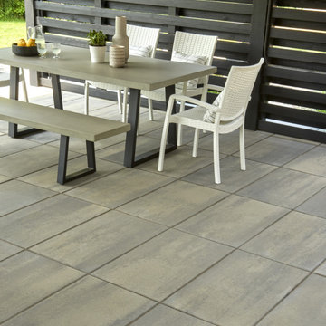
This backyard landscape design is inspired by our Blu Grande Smooth patio slab. Perfect paving slab for modern poolsides and backyard design, Blu Grande Smooth is a large concrete patio stone available in multiple colors. It's smooth texture is sleek to the eye but rougher to the touch which avoids it from getting slippery when wet. The large rectangular shape works as an easy add-on into Blu 60 regular modular patterns but can also work as a stand-alone to create a very linear look. Check out the HD2 Blu Grande Smooth which is all about seamless looks with a tighter/poreless texture and anti-aging technology. Check out our website to shop the look! https://www.techo-bloc.com/shop/slabs/blu-grande-smooth/
 Thyme & Place Design LLC
The client requested a kitchen that would not only provide a great space to cook and enjoy family meals but one that would fit in with her unique design sense. An avid collector of contemporary art, she wanted something unexpected in her 100-year-old home in both color and finishes but still providing a great layout with improved lighting, storage, and superior cooking abilities. The existing kitchen was in a closed off space trapped between the family room and the living. If you were in the kitchen, you were isolated from the rest of the house. Making the kitchen an integrated part of the home was a paramount request.
Step one, remove the wall separating the kitchen from the other rooms in the home which allowed the new kitchen to become an integrated space instead of an isolation room for the cook. Next, we relocated the pantry access which was in the family room to the kitchen integrating a poorly used recess which had become a catch all area which did not provide any usable space for storage or working area. To add valuable function in the kitchen we began by capturing unused "cubbies", adding a walk-in pantry from the kitchen, increasing the storage lost to un-needed drop ceilings and bring light and design to the space with a new large awning window, improved lighting, and combining interesting finishes and colors to reflect the artistic attitude of the client.
A bathroom located above the kitchen had been leaking into the plaster ceiling for several years. That along with knob and tube wiring, rotted beams and a brick wall from the back of the fireplace in the adjacent living room all needed to be brought to code. The walls, ceiling and floors in this 100+ year old home were completely out of level and the room’s foot print could not be increased.
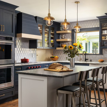
The choice of a Sub-Zero wolf product is a standard in my kitchen designs. The quality of the product, its manufacturing and commitment to food preservation is the reason I specify Sub Zero Wolf. For the cook top, the integrated line of the contemporary cooktop and the signature red knobs against the navy blue of the cabinets added to the design vibe of the kitchen. The cooking performance and the large continuous grate on the cooktop makes it an obvious choice for a cook looking for a great cook top with professional results in a more streamlined profile. We selected a Sharp microwave drawer for the island, an XO wine refrigerator, Bosch dishwasher and Kitchen Aid double convection wall ovens to round out the appliance package.
A recess created by the fireplace was outfitted with a cabinet which now holds small appliances within easy reach of my very petite client. Natural maple accents were used inside all the wall cabinets and repeated on the front of the hood and for the sliding door appliance cabinet and the floating shelves. This allows a brighter interior for the painted cabinets instead of the traditional same interior as exterior finish choice. The was an amazing transformation from the old to the new.
The final touches are the honey bronze hardware from Top Knobs, Mitzi pendants from Hudson Valley Lighting group,
a fabulous faucet from Brizo. To eliminate the old freestanding bottled water cooler, we specified a matching water filter faucet.
 Concept Renovations, Inc.
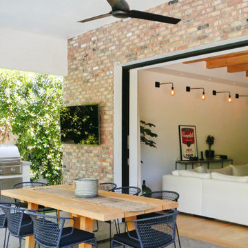
The Stunning Encino Modern Ranch Style Home Transformation was a complete interior and exterior remodel that perfectly balanced modern elegance with cozy, ranch-style charm. The homeowners envisioned a seamless indoor-outdoor living experience, and we brought this vision to life by installing large glass doors that open to a beautifully designed patio. Inside, the living spaces were reconfigured to create an open-concept layout, allowing for effortless flow between the living room, dining area, and kitchen. On the exterior, we updated the facade with smooth stucco and natural stone accents to enhance the home’s curb appeal.
Throughout the project, we worked closely with the homeowners to choose materials and finishes that would reflect their style while embracing the relaxed Encino lifestyle. This included a mix of rustic wood elements, sleek built-in shelving, and chic lighting fixtures to add warmth and sophistication. Being local to Encino, we took pride in using materials from nearby suppliers, ensuring a high-quality finish with a community touch. The final result is a stunning modern ranch home that truly embodies California living and has become a beautiful, functional space for family and friends to enjoy.
We can't wait to help you reimagine your property!
Sponsored
Columbus, OH
Free consultation for landscape design!

Peabody Landscape Group
Franklin County's Reliable Landscape Design & Contracting
 Techo-Bloc
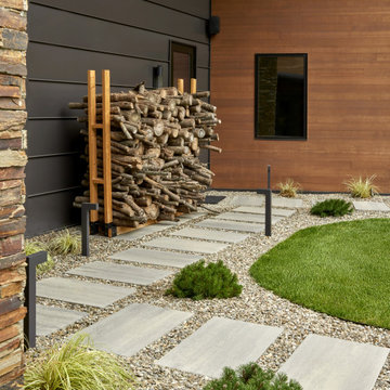
This backyard landscape design is inspired by our Blu Grande Smooth patio slab. Perfect paving slab for modern poolsides and backyard design, Blu Grande Smooth is a large concrete patio stone available in multiple colors. It's smooth texture is sleek to the eye but rougher to the touch which avoids it from getting slippery when wet. The large rectangular shape works as an easy add-on into Blu 60 regular modular patterns but can also work as a stand-alone to create a very linear look. Check out the HD2 Blu Grande Smooth which is all about seamless looks with a tighter/poreless texture and anti-aging technology. Check out our website to shop the look! https://www.techo-bloc.com/shop/slabs/blu-grande-smooth/
 TKS Design Group
Download our free ebook, Creating the Ideal Kitchen. DOWNLOAD NOW
Lakefront property in the northwest suburbs of Chicago is hard to come by, so when we were hired by this young family with exactly that, we were immediately inspired by not just the unusually large footprint of this 1950’s colonial revival but also the lovely views of the manmade lake it was sited on. The large 5-bedroom home was solidly stuck in the 1980’s, but we saw tons of potential. We started out by updating the existing staircase with a fresh coat of paint and adding new herringbone slate to the entry hall.
The powder room off the entryway also got a refresh - new flooring, new cabinets and fixtures. We ran the new slate right through into this space for some consistency. A fun wallpaper and shiplap trim add a welcoming feel and set the tone for the home.
Next, we tackled the kitchen. Located away from the rest of the first floor, the kitchen felt a little isolated, so we immediately began planning for how to better connect it to the rest of the first floor. We landed on removing the wall between the kitchen and dining room and designed a modified galley style space with separate cooking and clean up zones. The cooking zone consists of the refrigerator, prep sink and cooktop, along with a nice long run of prep space at the island. The cleanup side of the kitchen consists of the main sink and dishwasher. Both areas are situated so that the user can view the lake during prep work and cleanup!
One of the home’s main puzzles was how to incorporate the mudroom and area in front of the patio doors at the back of the house. We already had a breakfast table area, so the space by the patio doors was a bit of a no man’s land. We decided to separate the kitchen proper from what became the new mudroom with a large set of barn doors. That way you can quickly hide any mudroom messes but have easy access to the light coming in through the patio doors as well as the outdoor grilling station. We also love the impact the barn doors add to the overall space.
The homeowners’ first words to us were “it’s time to ditch the brown,” so we did! We chose a lovely blue pallet that reflects the home’s location on the lake which is also vibrant yet easy on the eye. Countertops are white quartz, and the natural oak floor works well with the other honey accents. The breakfast table was given a refresh with new chairs, chandelier and window treatments that frame the gorgeous views of the lake out the back.
We coordinated the slate mudroom flooring with that used in the home’s main entrance for a consistent feel. The storage area consists of open and closed storage to allow for some clutter control as needed.
Next on our “to do” list was revamping the dated brown bar area in the neighboring dining room. We eliminated the clutter by adding some closed cabinets and did some easy updates to help the space feel more current. One snag we ran into here was the discovery of a beam above the existing open shelving that had to be modified with a smaller structural beam to allow for our new design to work. This was an unexpected surprise, but in the end we think it was well worth it!
We kept the colors here a bit more muted to blend with the homeowner’s existing furnishings. Open shelving and polished nickel hardware add some simple detail to the new entertainment zone which also looks out onto the lake!
Next we tackled the upstairs starting with the homeowner’s son’s bath. The bath originally had both a tub shower and a separate shower, so we decided to swap out the shower for a new laundry area. This freed up some space downstairs in what used to be the mudroom/laundry room and is much more convenient for daily laundry needs.
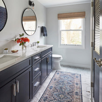
We continued the blue palette here with navy cabinetry and the navy tile in the shower. Porcelain floor tile and chrome fixtures keep maintenance to a minimum while matte black mirrors and lighting add some depth the design. A low maintenance runner adds some warmth underfoot and ties the whole space together.
We added a pocket door to the bathroom to minimize interference with the door swings. The left door of the laundry closet is on a 180 degree hinge to allow for easy full access to the machines. Next we tackled the master bath which is an en suite arrangement. The original was typical of the 1980’s with the vanity outside of the bathroom, situated near the master closet. And the brown theme continued here with multiple shades of brown.
Our first move was to segment off the bath and the closet from the master bedroom. We created a short hall from the bedroom to the bathroom with his and hers walk-in closets on the left and right as well as a separate toilet closet outside of the main bathroom for privacy and flexibility.
The original bathroom had a giant soaking tub with steps (dangerous!) as well as a small shower that did not work well for our homeowner who is 6’3”. With other bathtubs in the home, they decided to eliminate the tub and create an oversized shower which takes up the space where the old tub was located. The double vanity is on the opposite wall and a bench is located under the window for morning conversations and a place to set a couple of towels.
The pallet in here is light and airy with a mix of blond wood, creamy porcelain and marble tile, and brass accents. A simple roman shade adds some texture and it’s top-down mechanism allows for light and privacy.
This large whole house remodel gave our homeowners not only the ability to maximize the potential of their home but also created a lovely new frame from which to view their fabulous lake views.
Designed by: Susan Klimala, CKD, CBD
Photography by: Michael Kaskel
For more information on kitchen and bath design ideas go to: www.kitchenstudio-ge.com
 Tate Studio Architects
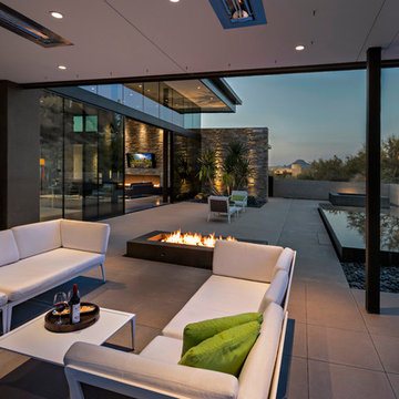
Shaded seating area on the back patio with a firepit to enjoy both warm sunny days and cool evenings. The reflecting pool adds a beautiful calm backdrop to the backyard experience. Builder - Build Inc, Interior Design - Tate Studio Architects, Landscape - Desert Foothills Landscape, Photography - Thompson Photographic.
 Breathe Design Studio
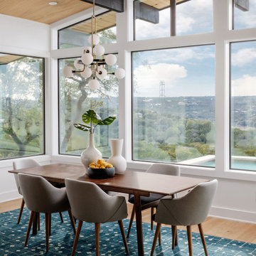
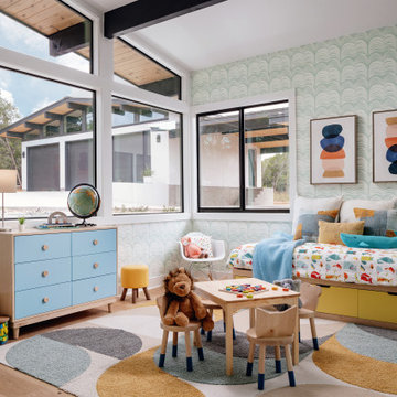
Our Austin studio decided to go bold with this project by ensuring that each space had a unique identity in the Mid-Century Modern style bathroom, butler's pantry, and mudroom. We covered the bathroom walls and flooring with stylish beige and yellow tile that was cleverly installed to look like two different patterns. The mint cabinet and pink vanity reflect the mid-century color palette. The stylish knobs and fittings add an extra splash of fun to the bathroom.
The butler's pantry is located right behind the kitchen and serves multiple functions like storage, a study area, and a bar. We went with a moody blue color for the cabinets and included a raw wood open shelf to give depth and warmth to the space. We went with some gorgeous artistic tiles that create a bold, intriguing look in the space.
In the mudroom, we used siding materials to create a shiplap effect to create warmth and texture – a homage to the classic Mid-Century Modern design. We used the same blue from the butler's pantry to create a cohesive effect. The large mint cabinets add a lighter touch to the space.

 Rocco J Lettieri
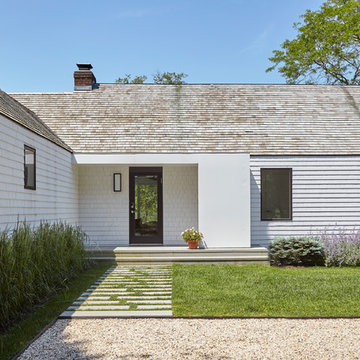
This fresh modern farmhouse began as a cape home with years of additions and adds on, creating no formal structure. Rocco J Lettieri worked to keep the footprint of the home due to limitations based on the wetland conservations on the property and opted to go from a traditional home to a modern barn with a semi-open plan. The goal was to feel clean and crisp throughout all of the seasons. It was built for a close family so the layout is designed to be inviting for their children as well.
Photo Credit: Tria Giovan
 Breathe Design Studio
Our Austin studio decided to go bold with this project by ensuring that each space had a unique identity in the Mid-Century Modern style bathroom, butler's pantry, and mudroom. We covered the bathroom walls and flooring with stylish beige and yellow tile that was cleverly installed to look like two different patterns. The mint cabinet and pink vanity reflect the mid-century color palette. The stylish knobs and fittings add an extra splash of fun to the bathroom.
The butler's pantry is located right behind the kitchen and serves multiple functions like storage, a study area, and a bar. We went with a moody blue color for the cabinets and included a raw wood open shelf to give depth and warmth to the space. We went with some gorgeous artistic tiles that create a bold, intriguing look in the space.
In the mudroom, we used siding materials to create a shiplap effect to create warmth and texture – a homage to the classic Mid-Century Modern design. We used the same blue from the butler's pantry to create a cohesive effect. The large mint cabinets add a lighter touch to the space.
 Banker Wire
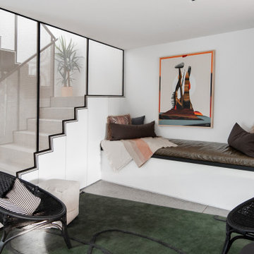
When envisioning the Hygeia Lot 3 single family residential home in Encinitas, California, Lindsay and Rory Brown of The Brown Studio sought to weave unique architectural details throughout the minimalist design scheme. To add depth to the overall look and feel of the space, and to complement the home’s existing ‘hard’ angles, the team selected Banker Wire’s IPZ-25 woven wire mesh. Specified in a stainless steel and brass finish, the wire mesh was utilized to create the interior stairway railing, which functions as the focal point of the lower lounge room area.
Adding an elegant touchpoint to the space, the wire mesh reiterates the angular look and feel while providing much-needed depth through the stainless steel and brass finish. Similarly, for the project-at-large, the design team favored a seamless indoor/outdoor design scheme, with the Banker Wire mesh application helping to achieve this; the exterior of the home features Gabion rock walls, created using an enclosing wire structure to secure the rocks into a wall formation. By adding the wire mesh interior stairway railing, the design team was able to create an indoor/outdoor connection through highlighting these unique wire touchpoints.
“The Hygeia Lot 3 house is full of unique angles and architectural details—it’s two levels of playful design and carefully crafted architectural details,” says Loryn Cook, Designer, The Brown Studio. “We wanted to use materials that reflect this line of thinking, and Banker Wire’s architectural mesh provided the stability and breathability we were after.”
The simple, lightweight material of the IPZ-25 wire mesh pattern—which has a 54% open area—utilizes a mixture of stainless steel to achieve balanced sturdiness; when mixed with the copper-based alloy of brass, a beautiful contrast occurs, while the team’s custom system holds the wire in place. Through utilizing different wire diameters for the warp and shute—achieving balanced stiffness in both directions—the intercrimp surface gives the material a high degree of reflective energy. As a result, the mesh pattern imitates an array of colors that changes as the viewer moves throughout the space.
“For this project, we wanted a material that was permeable enough to see through, but detailed enough to catch the eye,” adds Cook. “IPZ-25 provides a myriad of different textures and colors, depending on the perspective from which it is viewed from—we love it specifically for this effect.”
In regards to the fabrication process, Robert Richter, Owner of Flur Metals, notes that although it was initially a challenge, this project is proof that the outcome is well worth it.
“We typically utilize more rigid mesh types for this kind of application, but because of how unique IPZ-25 is, The Brown Studio came to us asking if we could make it work,” says Richter. “We did not shy away from the challenge; this project was exciting, as we were able to utilize such a delicate, beautiful mesh, but a non-traditional way. Once one side was ‘tac’d in,’ we pulled it tight, and ‘tac’d’ the other side to the frame. Then, the border was welded to another frame that sandwiched the mesh in place,” adds Richter. “This application is proof that it can be done! It’s still one of my favorite projects we have ever worked on.”
5