Search results for "Reflective add ons" in Home Design Ideas
A Cool and Moody Kitchen
AS SEEN ON: SEASON 3, EPISODE 7 OF MASTERS OF FLIP
The perfect place for a hot cup of coffee on a rainy day, the custom kitchen in this modern-meets-industrial home is dark, stormy, and full of character.
Polished slate countertops team up with the dark Wren stain on our Gallatin cabinets to create a moody take on modern style. The upper cabinets feature unique up-open hinged doors that add an unexpected element while floating shelves let the penny tile on the backsplash shine. Greenery, copper trinkets, and small clay pots add eye-catching detail throughout the space, creating a curated yet comfortable atmosphere.
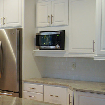
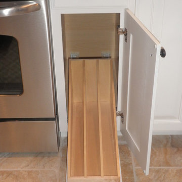
To maintain the sleek design that this space works so hard for, all of those crucial – yet perhaps not so stylish – amenities are tucked away in the base cabinets, including an under counter microwave unit and a lazy susan in the corner cabinets.

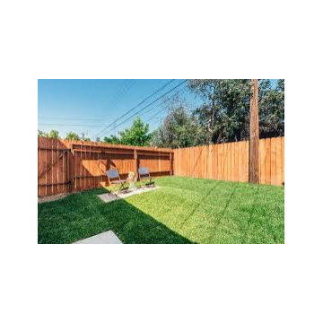
This backyard landscape design is inspired by our Blu Grande Smooth patio slab. Perfect paving slab for modern poolsides and backyard design, Blu Grande Smooth is a large concrete patio stone available in multiple colors. It's smooth texture is sleek to the eye but rougher to the touch which avoids it from getting slippery when wet. The large rectangular shape works as an easy add-on into Blu 60 regular modular patterns but can also work as a stand-alone to create a very linear look. Check out the HD2 Blu Grande Smooth which is all about seamless looks with a tighter/poreless texture and anti-aging technology. Check out our website to shop the look! https://www.techo-bloc.com/shop/slabs/blu-grande-smooth/

This backyard landscape design is inspired by our Blu Grande Smooth patio slab. Perfect paving slab for modern poolsides and backyard design, Blu Grande Smooth is a large concrete patio stone available in multiple colors. It's smooth texture is sleek to the eye but rougher to the touch which avoids it from getting slippery when wet. The large rectangular shape works as an easy add-on into Blu 60 regular modular patterns but can also work as a stand-alone to create a very linear look. Check out the HD2 Blu Grande Smooth which is all about seamless looks with a tighter/poreless texture and anti-aging technology. Check out our website to shop the look! https://www.techo-bloc.com/shop/slabs/blu-grande-smooth/
Find the right local pro for your project
This landscape design is inspired by our Blu Grande slab. Perfect paving slab for modern poolsides and backyard design, Blu Grande Smooth is a large concrete patio stone available in multiple colors. It's smooth texture is sleek to the eye but rougher to the touch which avoids it from getting slippery when wet. The large rectangular shape works as an easy add-on into Blu 60 regular modular patterns but can also work as a stand-alone to create a very linear look. Check out the HD2 Blu Grande Smooth which is all about seamless looks with a tighter/poreless texture and anti-aging technology. Check out our website to shop the look! https://www.techo-bloc.com/shop/slabs/blu-grande-smooth/

Our clients wanted the ultimate modern farmhouse custom dream home. They found property in the Santa Rosa Valley with an existing house on 3 ½ acres. They could envision a new home with a pool, a barn, and a place to raise horses. JRP and the clients went all in, sparing no expense. Thus, the old house was demolished and the couple’s dream home began to come to fruition.
The result is a simple, contemporary layout with ample light thanks to the open floor plan. When it comes to a modern farmhouse aesthetic, it’s all about neutral hues, wood accents, and furniture with clean lines. Every room is thoughtfully crafted with its own personality. Yet still reflects a bit of that farmhouse charm.
Their considerable-sized kitchen is a union of rustic warmth and industrial simplicity. The all-white shaker cabinetry and subway backsplash light up the room. All white everything complimented by warm wood flooring and matte black fixtures. The stunning custom Raw Urth reclaimed steel hood is also a star focal point in this gorgeous space. Not to mention the wet bar area with its unique open shelves above not one, but two integrated wine chillers. It’s also thoughtfully positioned next to the large pantry with a farmhouse style staple: a sliding barn door.
The master bathroom is relaxation at its finest. Monochromatic colors and a pop of pattern on the floor lend a fashionable look to this private retreat. Matte black finishes stand out against a stark white backsplash, complement charcoal veins in the marble looking countertop, and is cohesive with the entire look. The matte black shower units really add a dramatic finish to this luxurious large walk-in shower.
Photographer: Andrew - OpenHouse VC

Master Bedroom: This suburban New Jersey couple wanted the architectural features of this expansive bedroom to truly shine, and we couldn't agree more. We painted the walls a rich color to highlight the vaulted ceilings and brick fireplace, and kept draperies simple to show off of the huge windows and lovely country view. We added a batten board treatment on the back wall to enhance the bed as the focal point and create a farmhouse chic feel. We love the chandelier floating above, reflecting light across the room off of each dangling crystal teardrop. Similar to the dining room, we let texture do the heavy lifting to add visual depth as opposed to color or pattern. Neutral tones in linen, metallic, shagreen, brick (fireplace), and wood create a light and airy space with plenty of textural details to appreciate.
Photo Credit: Erin Coren, Curated Nest Interiors

This project was not only full of many bathrooms but also many different aesthetics. The goals were fourfold, create a new master suite, update the basement bath, add a new powder bath and my favorite, make them all completely different aesthetics.
Primary Bath-This was originally a small 60SF full bath sandwiched in between closets and walls of built-in cabinetry that blossomed into a 130SF, five-piece primary suite. This room was to be focused on a transitional aesthetic that would be adorned with Calcutta gold marble, gold fixtures and matte black geometric tile arrangements.
Powder Bath-A new addition to the home leans more on the traditional side of the transitional movement using moody blues and greens accented with brass. A fun play was the asymmetry of the 3-light sconce brings the aesthetic more to the modern side of transitional. My favorite element in the space, however, is the green, pink black and white deco tile on the floor whose colors are reflected in the details of the Australian wallpaper.
Hall Bath-Looking to touch on the home's 70's roots, we went for a mid-mod fresh update. Black Calcutta floors, linear-stacked porcelain tile, mixed woods and strong black and white accents. The green tile may be the star but the matte white ribbed tiles in the shower and behind the vanity are the true unsung heroes.

Sponsored
Columbus, OH
Hope Restoration & General Contracting
Columbus Design-Build, Kitchen & Bath Remodeling, Historic Renovations

Shaded seating area on the back patio with a firepit to enjoy both warm sunny days and cool evenings. The reflecting pool adds a beautiful calm backdrop to the backyard experience. Builder - Build Inc, Interior Design - Tate Studio Architects, Landscape - Desert Foothills Landscape, Photography - Thompson Photographic.

From Mid-Century Classic to the Present
An iconic design updated with comfort, function, and flow for today.
A Remodel That Balances Past and Present
What started as a desire to update a classic Eichler soon became an exploration of how Mid-Century Modern design can successfully evolve for today. The client, a tech professional with a passion for scuba diving and underwater photography, wanted a home that would both honor its original character and feel tailored to his daily life. A lifelong technology enthusiast, he still owns the very first Mac desktop he saved up for as a teenager working at Radio Shack, a detail that underscores his appreciation for design that melds function and form.
Honoring Separation While Expanding Possibility
Unlike many contemporary remodels where walls are opened up to create expansive living spaces, this project took a more restrained approach. The client valued the defined rooms of the original plan and wanted to preserve as much wall space as possible for displaying his large-format underwater photography. The emphasis was not on dramatic spatial reinvention, but on thoughtful refinements. Klopf Architecture shaped a gallery-like backdrop while also expanding the primary suite, modernizing materials and fixtures throughout the home, and improving the functionality and layout of the kitchen. The finished home feels at once timeless and renewed, an Eichler that continues to inspire while fully supporting the lifestyle of its present-day owner.
A major turning point came mid-design. The original project brief had not included an addition, but as the reconfiguration of the primary bedroom and bath unfolded, it became clear that an expansion was the best approach to achieve the client’s vision of a more spacious suite. Fortunately, the adjustment came at a stage when revisions were still manageable and was integrated seamlessly, showing how thoughtful course corrections can strengthen a project rather than hinder it.
Navigating Challenges With Precision
The design development included multiple conceptual rounds, balancing preservation with subtle expansion. During construction, an existing post previously thought to be load-bearing turned out not to be. The structural engineer was able to pivot quickly, and both the post and the cross beam that had been intended to replace it could be omitted, allowing the original rhythm of the Eichler beam bays to be preserved.
Sustainability was not just a checklist item, but a way to align the home with the client’s values of simplicity, efficiency, and long-term functionality. R-38 roof insulation reduced energy usage, solar panels with battery storage provided independence and resilience, and passive comfort strategies eliminated the need forenergy-intensive air conditioning. An electric vehicle charger and an on-demand hot water recirculation system (with call buttons as opposed to having constant circulation) add to the home’s long-term efficiency factors. Together, these moves created a home that is quieter, more comfortable, and better equipped for the future, qualities that supported the client’s pragmatic approach to design and living lightly.
Details That Respect the Eichler DNA
The remodel carries forward the Eichler’s original spirit while introducing new layers of modern livability. Originally, the house was approached along a deep, narrow walk, with the garage on one side and the house on the other, leaving the front door tucked far back within this chasm-like space. By pulling the entry forward, the design reshaped the arrival experience, creating a clearer threshold and a natural drop-off zone for bags, shoes, and keys. This shift also made room for a custom bench at the entry that extends seamlessly through the glass sidelight. The bench and drop-off zone now work together as a single, integrated sequence that supports everyday living while offering a tactile reminder of Eichler’s philosophy of connectedness.
At the client’s request, Klopf reintroduced a classic Eichler gesture by extending the exterior siding into the entry and living room. The detail reinforces a sense of indoor/outdoor continuity while providing a subtle architectural surface that allows the client’s photography to take visual precedence.
The signature concrete masonry wall at the front was reconstructed using blocks sourced to match the originals, now strengthened with rebar for seismic resilience while maintaining a private outdoor courtyard, visually extending the kitchen outward. A decorative trellis element, a detail borrowed from a neighboring Eichler, restores a familiar mid-century modern architectural motif. At the courtyard entry door, a custom etched glass sidelight with an ocean-themed design featuring kelp and jellyfish serves as a subtle homage to the client’s passion for deep-sea diving.
Landscaping became an integral part of the overall transformation. The homeowner engaged landscape architect Randi Johnsen of Third Nature Studio to shape a series of calm, inviting outdoor rooms that read as a natural extension of the interiors. While technically outside of the core construction scope, the landscape design proved central to achieving a sense of completeness and connectedness across the property. Such whole-property considerations often emerge as design ideas take shape, underscoring the importance of flexibility in planning and budgeting, as well as close collaboration among the design team starting early in the process.
The Value of Evolving Scope
As with many custom residential projects, the scope evolved during the design process. What began as a targeted remodel grew to include a new/expanded primary suite, a rebuilt CMU patio wall for strength and longevity, and a solar panel array and battery storage for energy resilience and carbon-reduction. Each thoughtful decision represented a conscious investment in the home’s performance and character, rather than a cost overrun.
The result was a project delivered on schedule, tailored precisely to the client’s lifestyle, and positioned to add long-term value both functionally and aesthetically. By embracing scope evolution as an opportunity rather than a challenge, and relying on good design paired with transparent communication, this remodel demonstrates how Eichler homes can be adapted for contemporary living without erasing their DNA.
Klopf Architecture project team: John Klopf, AIA, and Klara Kevane, Elise Webb and Nicholas LaNasa.
Contractor: Golden Cove Construction
Landscape Design: Third Nature Studio
Structural Engineer: Daniel Bastiao Design
Photography: ©2025 Mariko Reed
Year Completed: 2024
Location: Sunnyvale, CA

The bold and rustic kitchen is large enough to cook and entertain for many guests. The edges of the soapstone counter tops were left unfinished to add to the home's rustic charm.
Interior Design: Megan at M Design and Interiors

The Stunning Encino Modern Ranch Style Home Transformation was a complete interior and exterior remodel that perfectly balanced modern elegance with cozy, ranch-style charm. The homeowners envisioned a seamless indoor-outdoor living experience, and we brought this vision to life by installing large glass doors that open to a beautifully designed patio. Inside, the living spaces were reconfigured to create an open-concept layout, allowing for effortless flow between the living room, dining area, and kitchen. On the exterior, we updated the facade with smooth stucco and natural stone accents to enhance the home’s curb appeal.
Throughout the project, we worked closely with the homeowners to choose materials and finishes that would reflect their style while embracing the relaxed Encino lifestyle. This included a mix of rustic wood elements, sleek built-in shelving, and chic lighting fixtures to add warmth and sophistication. Being local to Encino, we took pride in using materials from nearby suppliers, ensuring a high-quality finish with a community touch. The final result is a stunning modern ranch home that truly embodies California living and has become a beautiful, functional space for family and friends to enjoy.
We can't wait to help you reimagine your property!

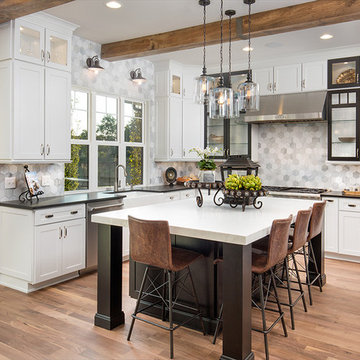
This stunning home is a combination of the best of traditional styling with clean and modern design, creating a look that will be as fresh tomorrow as it is today. Traditional white painted cabinetry in the kitchen, combined with the slab backsplash, a simpler door style and crown moldings with straight lines add a sleek, non-fussy style. An architectural hood with polished brass accents and stainless steel appliances dress up this painted kitchen for upscale, contemporary appeal. The kitchen islands offers a notable color contrast with their rich, dark, gray finish.
The stunning bar area is the entertaining hub of the home. The second bar allows the homeowners an area for their guests to hang out and keeps them out of the main work zone.
The family room used to be shut off from the kitchen. Opening up the wall between the two rooms allows for the function of modern living. The room was full of built ins that were removed to give the clean esthetic the homeowners wanted. It was a joy to redesign the fireplace to give it the contemporary feel they longed for.
Their used to be a large angled wall in the kitchen (the wall the double oven and refrigerator are on) by straightening that out, the homeowners gained better function in the kitchen as well as allowing for the first floor laundry to now double as a much needed mudroom room as well.

Our Austin studio decided to go bold with this project by ensuring that each space had a unique identity in the Mid-Century Modern style bathroom, butler's pantry, and mudroom. We covered the bathroom walls and flooring with stylish beige and yellow tile that was cleverly installed to look like two different patterns. The mint cabinet and pink vanity reflect the mid-century color palette. The stylish knobs and fittings add an extra splash of fun to the bathroom.
The butler's pantry is located right behind the kitchen and serves multiple functions like storage, a study area, and a bar. We went with a moody blue color for the cabinets and included a raw wood open shelf to give depth and warmth to the space. We went with some gorgeous artistic tiles that create a bold, intriguing look in the space.
In the mudroom, we used siding materials to create a shiplap effect to create warmth and texture – a homage to the classic Mid-Century Modern design. We used the same blue from the butler's pantry to create a cohesive effect. The large mint cabinets add a lighter touch to the space.

A captivating transformation in the coveted neighborhood of University Park, Dallas
The heart of this home lies in the kitchen, where we embarked on a design endeavor that would leave anyone speechless. By opening up the main kitchen wall, we created a magnificent window system that floods the space with natural light and offers a breathtaking view of the picturesque surroundings. Suspended from the ceiling, a steel-framed marble vent hood floats a few inches from the window, showcasing a mesmerizing Lilac Marble. The same marble is skillfully applied to the backsplash and island, featuring a bold combination of color and pattern that exudes elegance.
Adding to the kitchen's allure is the Italian range, which not only serves as a showstopper but offers robust culinary features for even the savviest of cooks. However, the true masterpiece of the kitchen lies in the honed reeded marble-faced island. Each marble strip was meticulously cut and crafted by artisans to achieve a half-rounded profile, resulting in an island that is nothing short of breathtaking. This intricate process took several months, but the end result speaks for itself.
To complement the grandeur of the kitchen, we designed a combination of stain-grade and paint-grade cabinets in a thin raised panel door style. This choice adds an elegant yet simple look to the overall design. Inside each cabinet and drawer, custom interiors were meticulously designed to provide maximum functionality and organization for the day-to-day cooking activities. A vintage Turkish runner dating back to the 1960s, evokes a sense of history and character.
The breakfast nook boasts a stunning, vivid, and colorful artwork created by one of Dallas' top artist, Kyle Steed, who is revered for his mastery of his craft. Some of our favorite art pieces from the inspiring Haylee Yale grace the coffee station and media console, adding the perfect moment to pause and loose yourself in the story of her art.
The project extends beyond the kitchen into the living room, where the family's changing needs and growing children demanded a new design approach. Accommodating their new lifestyle, we incorporated a large sectional for family bonding moments while watching TV. The living room now boasts bolder colors, striking artwork a coffered accent wall, and cayenne velvet curtains that create an inviting atmosphere. Completing the room is a custom 22' x 15' rug, adding warmth and comfort to the space. A hidden coat closet door integrated into the feature wall adds an element of surprise and functionality.
This project is not just about aesthetics; it's about pushing the boundaries of design and showcasing the possibilities. By curating an out-of-the-box approach, we bring texture and depth to the space, employing different materials and original applications. The layered design achieved through repeated use of the same material in various forms, shapes, and locations demonstrates that unexpected elements can create breathtaking results.
The reason behind this redesign and remodel was the homeowners' desire to have a kitchen that not only provided functionality but also served as a beautiful backdrop to their cherished family moments. The previous kitchen lacked the "wow" factor they desired, prompting them to seek our expertise in creating a space that would be a source of joy and inspiration.
Inspired by well-curated European vignettes, sculptural elements, clean lines, and a natural color scheme with pops of color, this design reflects an elegant organic modern style. Mixing metals, contrasting textures, and utilizing clean lines were key elements in achieving the desired aesthetic. The living room introduces bolder moments and a carefully chosen color scheme that adds character and personality.
The client's must-haves were clear: they wanted a show stopping centerpiece for their home, enhanced natural light in the kitchen, and a design that reflected their family's dynamic. With the transformation of the range wall into a wall of windows, we fulfilled their desire for abundant natural light and breathtaking views of the surrounding landscape.
Our favorite rooms and design elements are numerous, but the kitchen remains a standout feature. The painstaking process of hand-cutting and crafting each reeded panel in the island to match the marble's veining resulted in a labor of love that emanates warmth and hospitality to all who enter.
In conclusion, this tastefully lux project in University Park, Dallas is an extraordinary example of a full gut remodel that has surpassed all expectations. The meticulous attention to detail, the masterful use of materials, and the seamless blend of functionality and aesthetics create an unforgettable space. It serves as a testament to the power of design and the transformative impact it can have on a home and its inhabitants.
Project by Texas' Urbanology Designs. Their North Richland Hills-based interior design studio serves Dallas, Highland Park, University Park, Fort Worth, and upscale clients nationwide.

This Master Bedroom boast elegance and serenity throughout.
The "Tray" and vaulted ceiling add architectural drama to the room and is further accentuated by an orb shaped hanging pendant light fixture.
Over the center window panels we see a decorative half round window with curved mullions. This architectural detail is repeated through out the home.
Furnished and finished using light colors make the room light and airy.
This home was featured in Philadelphia Magazine August 2014 issue to showcase its beauty and excellence.
Photo by Alicia's Art, LLC
RUDLOFF Custom Builders, is a residential construction company that connects with clients early in the design phase to ensure every detail of your project is captured just as you imagined. RUDLOFF Custom Builders will create the project of your dreams that is executed by on-site project managers and skilled craftsman, while creating lifetime client relationships that are build on trust and integrity.
We are a full service, certified remodeling company that covers all of the Philadelphia suburban area including West Chester, Gladwynne, Malvern, Wayne, Haverford and more.
As a 6 time Best of Houzz winner, we look forward to working with you on your next project.

 
Download our free ebook, Creating the Ideal Kitchen. DOWNLOAD NOW
 
Lakefront property in the northwest suburbs of Chicago is hard to come by, so when we were hired by this young family with exactly that, we were immediately inspired by not just the unusually large footprint of this 1950’s colonial revival but also the lovely views of the manmade lake it was sited on. The large 5-bedroom home was solidly stuck in the 1980’s, but we saw tons of potential. We started out by updating the existing staircase with a fresh coat of paint and adding new herringbone slate to the entry hall.
The powder room off the entryway also got a refresh - new flooring, new cabinets and fixtures. We ran the new slate right through into this space for some consistency. A fun wallpaper and shiplap trim add a welcoming feel and set the tone for the home.
Next, we tackled the kitchen. Located away from the rest of the first floor, the kitchen felt a little isolated, so we immediately began planning for how to better connect it to the rest of the first floor. We landed on removing the wall between the kitchen and dining room and designed a modified galley style space with separate cooking and clean up zones. The cooking zone consists of the refrigerator, prep sink and cooktop, along with a nice long run of prep space at the island. The cleanup side of the kitchen consists of the main sink and dishwasher. Both areas are situated so that the user can view the lake during prep work and cleanup!
One of the home’s main puzzles was how to incorporate the mudroom and area in front of the patio doors at the back of the house. We already had a breakfast table area, so the space by the patio doors was a bit of a no man’s land. We decided to separate the kitchen proper from what became the new mudroom with a large set of barn doors. That way you can quickly hide any mudroom messes but have easy access to the light coming in through the patio doors as well as the outdoor grilling station. We also love the impact the barn doors add to the overall space.
The homeowners’ first words to us were “it’s time to ditch the brown,” so we did! We chose a lovely blue pallet that reflects the home’s location on the lake which is also vibrant yet easy on the eye. Countertops are white quartz, and the natural oak floor works well with the other honey accents. The breakfast table was given a refresh with new chairs, chandelier and window treatments that frame the gorgeous views of the lake out the back.
We coordinated the slate mudroom flooring with that used in the home’s main entrance for a consistent feel. The storage area consists of open and closed storage to allow for some clutter control as needed.
Next on our “to do” list was revamping the dated brown bar area in the neighboring dining room. We eliminated the clutter by adding some closed cabinets and did some easy updates to help the space feel more current. One snag we ran into here was the discovery of a beam above the existing open shelving that had to be modified with a smaller structural beam to allow for our new design to work. This was an unexpected surprise, but in the end we think it was well worth it!
We kept the colors here a bit more muted to blend with the homeowner’s existing furnishings. Open shelving and polished nickel hardware add some simple detail to the new entertainment zone which also looks out onto the lake!
Next we tackled the upstairs starting with the homeowner’s son’s bath. The bath originally had both a tub shower and a separate shower, so we decided to swap out the shower for a new laundry area. This freed up some space downstairs in what used to be the mudroom/laundry room and is much more convenient for daily laundry needs.
We continued the blue palette here with navy cabinetry and the navy tile in the shower. Porcelain floor tile and chrome fixtures keep maintenance to a minimum while matte black mirrors and lighting add some depth the design. A low maintenance runner adds some warmth underfoot and ties the whole space together.
We added a pocket door to the bathroom to minimize interference with the door swings. The left door of the laundry closet is on a 180 degree hinge to allow for easy full access to the machines. Next we tackled the master bath which is an en suite arrangement. The original was typical of the 1980’s with the vanity outside of the bathroom, situated near the master closet. And the brown theme continued here with multiple shades of brown.
Our first move was to segment off the bath and the closet from the master bedroom. We created a short hall from the bedroom to the bathroom with his and hers walk-in closets on the left and right as well as a separate toilet closet outside of the main bathroom for privacy and flexibility.
The original bathroom had a giant soaking tub with steps (dangerous!) as well as a small shower that did not work well for our homeowner who is 6’3”. With other bathtubs in the home, they decided to eliminate the tub and create an oversized shower which takes up the space where the old tub was located. The double vanity is on the opposite wall and a bench is located under the window for morning conversations and a place to set a couple of towels.
The pallet in here is light and airy with a mix of blond wood, creamy porcelain and marble tile, and brass accents. A simple roman shade adds some texture and it’s top-down mechanism allows for light and privacy.
This large whole house remodel gave our homeowners not only the ability to maximize the potential of their home but also created a lovely new frame from which to view their fabulous lake views.
Designed by: Susan Klimala, CKD, CBD
Photography by: Michael Kaskel
For more information on kitchen and bath design ideas go to: www.kitchenstudio-ge.com

Our Austin studio decided to go bold with this project by ensuring that each space had a unique identity in the Mid-Century Modern style bathroom, butler's pantry, and mudroom. We covered the bathroom walls and flooring with stylish beige and yellow tile that was cleverly installed to look like two different patterns. The mint cabinet and pink vanity reflect the mid-century color palette. The stylish knobs and fittings add an extra splash of fun to the bathroom.
The butler's pantry is located right behind the kitchen and serves multiple functions like storage, a study area, and a bar. We went with a moody blue color for the cabinets and included a raw wood open shelf to give depth and warmth to the space. We went with some gorgeous artistic tiles that create a bold, intriguing look in the space.
In the mudroom, we used siding materials to create a shiplap effect to create warmth and texture – a homage to the classic Mid-Century Modern design. We used the same blue from the butler's pantry to create a cohesive effect. The large mint cabinets add a lighter touch to the space.

Sponsored
Columbus, OH
Free consultation for landscape design!
Peabody Landscape Group
Columbus' Reliable Landscape Design & Contracting

Our clients wanted the ultimate modern farmhouse custom dream home. They found property in the Santa Rosa Valley with an existing house on 3 ½ acres. They could envision a new home with a pool, a barn, and a place to raise horses. JRP and the clients went all in, sparing no expense. Thus, the old house was demolished and the couple’s dream home began to come to fruition.
The result is a simple, contemporary layout with ample light thanks to the open floor plan. When it comes to a modern farmhouse aesthetic, it’s all about neutral hues, wood accents, and furniture with clean lines. Every room is thoughtfully crafted with its own personality. Yet still reflects a bit of that farmhouse charm.
Their considerable-sized kitchen is a union of rustic warmth and industrial simplicity. The all-white shaker cabinetry and subway backsplash light up the room. All white everything complimented by warm wood flooring and matte black fixtures. The stunning custom Raw Urth reclaimed steel hood is also a star focal point in this gorgeous space. Not to mention the wet bar area with its unique open shelves above not one, but two integrated wine chillers. It’s also thoughtfully positioned next to the large pantry with a farmhouse style staple: a sliding barn door.
The master bathroom is relaxation at its finest. Monochromatic colors and a pop of pattern on the floor lend a fashionable look to this private retreat. Matte black finishes stand out against a stark white backsplash, complement charcoal veins in the marble looking countertop, and is cohesive with the entire look. The matte black shower units really add a dramatic finish to this luxurious large walk-in shower.
Photographer: Andrew - OpenHouse VC

The functionality of this spacious kitchen is a far cry from its humble beginnings as a lackluster 9 x 12 foot stretch. The exterior wall was blown out to allow for a 10 ft addition. The daring slab of Calacatta Vagli marble with intrepid British racing green veining was the inspiration for the expansion. Spanish Revival pendants reclaimed from a local restaurant, long forgotten, are a pinnacle feature over the island. Reclaimed wood drawers, juxtaposed with custom glass cupboards add gobs of storage. Cabinets are painted the same luxe green hue and the warmth of butcher block counters create a hard working bar area begging for character-worn use. The perimeter of the kitchen features soapstone counters and that nicely balance the whisper of mushroom-colored custom cabinets. Hand-made 4x4 zellige tiles, hung in a running bond pattern, pay sweet homage to the 1950’s era of the home. A large window flanked by antique brass sconces adds bonus natural light over the sink. Textural, centuries-old barn wood surrounding the range hood adds a cozy surprise element. Matte white appliances with brushed bronze and copper hardware tie in the mixed metals throughout the kitchen helping meld the overall dramatic design.

Cooking for Two
Location: Plymouth, MN, United States
When this couple’s last child graduated from college they began the process of looking for a new home. After a lengthy search they decided to stay with the neighborhood they loved, saving money by remodeling rather than starting over.
The top priorities on their wish list were adding character to their 1990’s era home with a classic white kitchen and a larger island while keeping within the existing footprint. With the intention of honing their cooking skills, they were also considering better appliances and two ovens.
Challenges and Solutions
Design a larger island with seating for at least two. The existing island was small and the area behind the seating was less than recommended clearances.
To solve this challenge, the seating area of the island was extended out into the open area of the kitchen. This created a larger island with seating for three, extra storage and a bookshelf across from the range.
The original kitchen had a range with microwave above, so adding another oven was a challenge with limited wall space.
Because the adjoining dining room is used infrequently, the homeowner was open to placing the second oven and microwave in the walkway. This made room for the small buffet between the built in refrigerator and ovens, creating one of her favorite areas.
The client requested a white painted kitchen but wanted to make sure it had warmth and character. To achieve this the following elements were chosen:
1) Cabinets painted with Benjamin Moore Capitol White, a luminous and warm shade of white.
2) The Range hood was painted with warm metallic shades to reflect the bronze of the Ashley Norton hardware.
3) Black Aqua Grantique granite was chosen for countertops because it looks like soapstone and adds contrast.
4) Walker Zanger Café tile in Latte was chosen for it’s handmade look with uneven edges.
5) The to-the-counter-cabinet with glass door shows off serving dishes and lends sophisticated charm.
The result is a welcoming classic kitchen, where this couple enjoys cooking more often and sharpening their skills with gourmet appliances.
Liz Schupanitz Designs
Photographed by: Andrea Rugg Photography
2