
Search results for "Reflective add ons" in Home Design Ideas
 TKS Design Group
Download our free ebook, Creating the Ideal Kitchen. DOWNLOAD NOW
Lakefront property in the northwest suburbs of Chicago is hard to come by, so when we were hired by this young family with exactly that, we were immediately inspired by not just the unusually large footprint of this 1950’s colonial revival but also the lovely views of the manmade lake it was sited on. The large 5-bedroom home was solidly stuck in the 1980’s, but we saw tons of potential. We started out by updating the existing staircase with a fresh coat of paint and adding new herringbone slate to the entry hall.
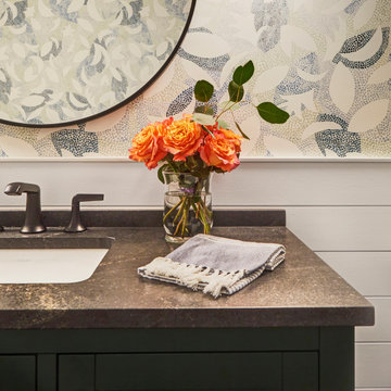
The powder room off the entryway also got a refresh - new flooring, new cabinets and fixtures. We ran the new slate right through into this space for some consistency. A fun wallpaper and shiplap trim add a welcoming feel and set the tone for the home.
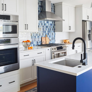
Next, we tackled the kitchen. Located away from the rest of the first floor, the kitchen felt a little isolated, so we immediately began planning for how to better connect it to the rest of the first floor. We landed on removing the wall between the kitchen and dining room and designed a modified galley style space with separate cooking and clean up zones. The cooking zone consists of the refrigerator, prep sink and cooktop, along with a nice long run of prep space at the island. The cleanup side of the kitchen consists of the main sink and dishwasher. Both areas are situated so that the user can view the lake during prep work and cleanup!
One of the home’s main puzzles was how to incorporate the mudroom and area in front of the patio doors at the back of the house. We already had a breakfast table area, so the space by the patio doors was a bit of a no man’s land. We decided to separate the kitchen proper from what became the new mudroom with a large set of barn doors. That way you can quickly hide any mudroom messes but have easy access to the light coming in through the patio doors as well as the outdoor grilling station. We also love the impact the barn doors add to the overall space.
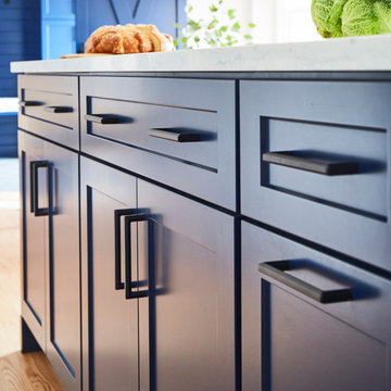
The homeowners’ first words to us were “it’s time to ditch the brown,” so we did! We chose a lovely blue pallet that reflects the home’s location on the lake which is also vibrant yet easy on the eye. Countertops are white quartz, and the natural oak floor works well with the other honey accents. The breakfast table was given a refresh with new chairs, chandelier and window treatments that frame the gorgeous views of the lake out the back.
We coordinated the slate mudroom flooring with that used in the home’s main entrance for a consistent feel. The storage area consists of open and closed storage to allow for some clutter control as needed.
Next on our “to do” list was revamping the dated brown bar area in the neighboring dining room. We eliminated the clutter by adding some closed cabinets and did some easy updates to help the space feel more current. One snag we ran into here was the discovery of a beam above the existing open shelving that had to be modified with a smaller structural beam to allow for our new design to work. This was an unexpected surprise, but in the end we think it was well worth it!
We kept the colors here a bit more muted to blend with the homeowner’s existing furnishings. Open shelving and polished nickel hardware add some simple detail to the new entertainment zone which also looks out onto the lake!
Next we tackled the upstairs starting with the homeowner’s son’s bath. The bath originally had both a tub shower and a separate shower, so we decided to swap out the shower for a new laundry area. This freed up some space downstairs in what used to be the mudroom/laundry room and is much more convenient for daily laundry needs.
We continued the blue palette here with navy cabinetry and the navy tile in the shower. Porcelain floor tile and chrome fixtures keep maintenance to a minimum while matte black mirrors and lighting add some depth the design. A low maintenance runner adds some warmth underfoot and ties the whole space together.
We added a pocket door to the bathroom to minimize interference with the door swings. The left door of the laundry closet is on a 180 degree hinge to allow for easy full access to the machines. Next we tackled the master bath which is an en suite arrangement. The original was typical of the 1980’s with the vanity outside of the bathroom, situated near the master closet. And the brown theme continued here with multiple shades of brown.
Our first move was to segment off the bath and the closet from the master bedroom. We created a short hall from the bedroom to the bathroom with his and hers walk-in closets on the left and right as well as a separate toilet closet outside of the main bathroom for privacy and flexibility.
The original bathroom had a giant soaking tub with steps (dangerous!) as well as a small shower that did not work well for our homeowner who is 6’3”. With other bathtubs in the home, they decided to eliminate the tub and create an oversized shower which takes up the space where the old tub was located. The double vanity is on the opposite wall and a bench is located under the window for morning conversations and a place to set a couple of towels.
The pallet in here is light and airy with a mix of blond wood, creamy porcelain and marble tile, and brass accents. A simple roman shade adds some texture and it’s top-down mechanism allows for light and privacy.
This large whole house remodel gave our homeowners not only the ability to maximize the potential of their home but also created a lovely new frame from which to view their fabulous lake views.
Designed by: Susan Klimala, CKD, CBD
Photography by: Michael Kaskel
For more information on kitchen and bath design ideas go to: www.kitchenstudio-ge.com
 Techo-Bloc
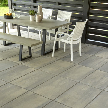
This backyard landscape design is inspired by our Blu Grande Smooth patio slab. Perfect paving slab for modern poolsides and backyard design, Blu Grande Smooth is a large concrete patio stone available in multiple colors. It's smooth texture is sleek to the eye but rougher to the touch which avoids it from getting slippery when wet. The large rectangular shape works as an easy add-on into Blu 60 regular modular patterns but can also work as a stand-alone to create a very linear look. Check out the HD2 Blu Grande Smooth which is all about seamless looks with a tighter/poreless texture and anti-aging technology. Check out our website to shop the look! https://www.techo-bloc.com/shop/slabs/blu-grande-smooth/
 JRP Design & Remodel
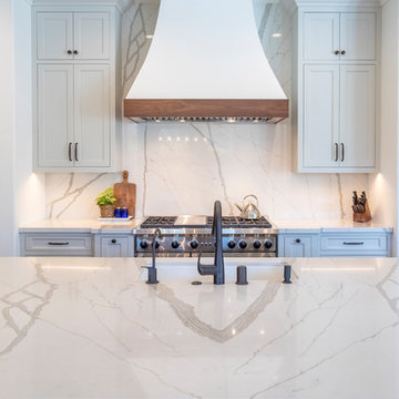
Our clients wanted to incorporate an East Coast vibe into their home. The kitchen had a great layout, but a wilted palette of earth tones looked outdated and uninspired. With a busy lifestyle and two kids in school, the couple needed a highly functional space that didn't skimp on style. Their research of design-build firms led them to the JRP website, and they called for a consultation the same day. After years of living with dark cabinets and a mix of heavy colors, the couple craved lightness. They wanted an airy kitchen with smooth, light-reflecting surfaces and a full-slab backsplash. A plan was drawn up for a complete rebuild that would change everything in the kitchen except the layout and the original tile-and-wood floors.
Now bright and uncluttered, this transitional kitchen is truly a space where the family can gather for years to come. Every part of the room draws you in, creating an atmosphere that embraces lingering conversations. The holistic design balances East Coast cool with California chic. Layers of contrasting textures achieve a high level of polish that looks and feels exceptional. The full-slab backsplash in Calacatta quartz stands out as a work of art, its glossy surface softly reflecting natural light. Matching quartz countertops add lustrous movement, where painted and natural wood textures quietly anchor the room. New, two-tone cabinetry is fresh and on-trend. A stunning linear chandelier in bronze evokes classical warmth. Where a built-in desk once collected clutter, stacked shaker cabinets now incorporate storage and visual interest. Integrated appliances, beautifully concealed behind DeWils cabinetry, hint at minimalist sophistication.
Cabinets (Manufacturer, Door Style, Material, Color/Stain or Finish)
- KITCHEN PERIMETER & PANTRY: DeWils, Sheffield, Maple, Limestone
- KITCHEN ISLAND: DeWils, Sheffield, Walnut, Nutmeg
Countertops (Material Type - Manufacturer, Collection, Color)
- Quartz – Vadara, Paris Collection, Calacatta Blanco
Light Fixture (Type - Manufacturer, Collection, Color)
- Chandelier - Visual Comfort & Co, Darlana Large Linear Lantern
Plumbing Fixture (Type - Manufacturer, Color)
- Faucet – Grohe, Antique Bronze
Sink (Type – Manufacturer, Material)
- Undermount - Kohler, Cast Iron
Hardware (Type – Manufacturer, Color)
- Cabinet Pulls - Top Knobs, Oil Rubbed Bronze
- Cabinet Knobs - Top Knobs, Oil Rubbed Bronze
Color of wall:
- Dunn Edwards Bone China
Photographer: J.R. Maddox
Find the right local pro for your project
 TKS Design Group
Download our free ebook, Creating the Ideal Kitchen. DOWNLOAD NOW
Lakefront property in the northwest suburbs of Chicago is hard to come by, so when we were hired by this young family with exactly that, we were immediately inspired by not just the unusually large footprint of this 1950’s colonial revival but also the lovely views of the manmade lake it was sited on. The large 5-bedroom home was solidly stuck in the 1980’s, but we saw tons of potential. We started out by updating the existing staircase with a fresh coat of paint and adding new herringbone slate to the entry hall.
The powder room off the entryway also got a refresh - new flooring, new cabinets and fixtures. We ran the new slate right through into this space for some consistency. A fun wallpaper and shiplap trim add a welcoming feel and set the tone for the home.
Next, we tackled the kitchen. Located away from the rest of the first floor, the kitchen felt a little isolated, so we immediately began planning for how to better connect it to the rest of the first floor. We landed on removing the wall between the kitchen and dining room and designed a modified galley style space with separate cooking and clean up zones. The cooking zone consists of the refrigerator, prep sink and cooktop, along with a nice long run of prep space at the island. The cleanup side of the kitchen consists of the main sink and dishwasher. Both areas are situated so that the user can view the lake during prep work and cleanup!
One of the home’s main puzzles was how to incorporate the mudroom and area in front of the patio doors at the back of the house. We already had a breakfast table area, so the space by the patio doors was a bit of a no man’s land. We decided to separate the kitchen proper from what became the new mudroom with a large set of barn doors. That way you can quickly hide any mudroom messes but have easy access to the light coming in through the patio doors as well as the outdoor grilling station. We also love the impact the barn doors add to the overall space.
The homeowners’ first words to us were “it’s time to ditch the brown,” so we did! We chose a lovely blue pallet that reflects the home’s location on the lake which is also vibrant yet easy on the eye. Countertops are white quartz, and the natural oak floor works well with the other honey accents. The breakfast table was given a refresh with new chairs, chandelier and window treatments that frame the gorgeous views of the lake out the back.
We coordinated the slate mudroom flooring with that used in the home’s main entrance for a consistent feel. The storage area consists of open and closed storage to allow for some clutter control as needed.
Next on our “to do” list was revamping the dated brown bar area in the neighboring dining room. We eliminated the clutter by adding some closed cabinets and did some easy updates to help the space feel more current. One snag we ran into here was the discovery of a beam above the existing open shelving that had to be modified with a smaller structural beam to allow for our new design to work. This was an unexpected surprise, but in the end we think it was well worth it!
We kept the colors here a bit more muted to blend with the homeowner’s existing furnishings. Open shelving and polished nickel hardware add some simple detail to the new entertainment zone which also looks out onto the lake!
Next we tackled the upstairs starting with the homeowner’s son’s bath. The bath originally had both a tub shower and a separate shower, so we decided to swap out the shower for a new laundry area. This freed up some space downstairs in what used to be the mudroom/laundry room and is much more convenient for daily laundry needs.
We continued the blue palette here with navy cabinetry and the navy tile in the shower. Porcelain floor tile and chrome fixtures keep maintenance to a minimum while matte black mirrors and lighting add some depth the design. A low maintenance runner adds some warmth underfoot and ties the whole space together.
We added a pocket door to the bathroom to minimize interference with the door swings. The left door of the laundry closet is on a 180 degree hinge to allow for easy full access to the machines. Next we tackled the master bath which is an en suite arrangement. The original was typical of the 1980’s with the vanity outside of the bathroom, situated near the master closet. And the brown theme continued here with multiple shades of brown.
Our first move was to segment off the bath and the closet from the master bedroom. We created a short hall from the bedroom to the bathroom with his and hers walk-in closets on the left and right as well as a separate toilet closet outside of the main bathroom for privacy and flexibility.
The original bathroom had a giant soaking tub with steps (dangerous!) as well as a small shower that did not work well for our homeowner who is 6’3”. With other bathtubs in the home, they decided to eliminate the tub and create an oversized shower which takes up the space where the old tub was located. The double vanity is on the opposite wall and a bench is located under the window for morning conversations and a place to set a couple of towels.
The pallet in here is light and airy with a mix of blond wood, creamy porcelain and marble tile, and brass accents. A simple roman shade adds some texture and it’s top-down mechanism allows for light and privacy.
This large whole house remodel gave our homeowners not only the ability to maximize the potential of their home but also created a lovely new frame from which to view their fabulous lake views.
Designed by: Susan Klimala, CKD, CBD
Photography by: Michael Kaskel
For more information on kitchen and bath design ideas go to: www.kitchenstudio-ge.com

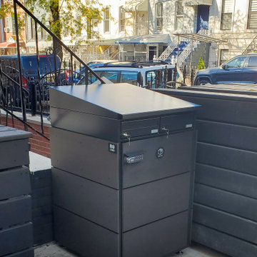
 CitiBin
Say goodbye to mail tampering and package theft. PARCELBIN package lockbox with an add-on Mailbox is a great solution to keep your mail and packages safe and keep all your mail under lock and key.

Sponsored
Columbus, OH

Hope Restoration & General Contracting
Columbus Design-Build, Kitchen & Bath Remodeling, Historic Renovations
 TKS Design Group
Download our free ebook, Creating the Ideal Kitchen. DOWNLOAD NOW
Lakefront property in the northwest suburbs of Chicago is hard to come by, so when we were hired by this young family with exactly that, we were immediately inspired by not just the unusually large footprint of this 1950’s colonial revival but also the lovely views of the manmade lake it was sited on. The large 5-bedroom home was solidly stuck in the 1980’s, but we saw tons of potential. We started out by updating the existing staircase with a fresh coat of paint and adding new herringbone slate to the entry hall.
The powder room off the entryway also got a refresh - new flooring, new cabinets and fixtures. We ran the new slate right through into this space for some consistency. A fun wallpaper and shiplap trim add a welcoming feel and set the tone for the home.
Next, we tackled the kitchen. Located away from the rest of the first floor, the kitchen felt a little isolated, so we immediately began planning for how to better connect it to the rest of the first floor. We landed on removing the wall between the kitchen and dining room and designed a modified galley style space with separate cooking and clean up zones. The cooking zone consists of the refrigerator, prep sink and cooktop, along with a nice long run of prep space at the island. The cleanup side of the kitchen consists of the main sink and dishwasher. Both areas are situated so that the user can view the lake during prep work and cleanup!
One of the home’s main puzzles was how to incorporate the mudroom and area in front of the patio doors at the back of the house. We already had a breakfast table area, so the space by the patio doors was a bit of a no man’s land. We decided to separate the kitchen proper from what became the new mudroom with a large set of barn doors. That way you can quickly hide any mudroom messes but have easy access to the light coming in through the patio doors as well as the outdoor grilling station. We also love the impact the barn doors add to the overall space.
The homeowners’ first words to us were “it’s time to ditch the brown,” so we did! We chose a lovely blue pallet that reflects the home’s location on the lake which is also vibrant yet easy on the eye. Countertops are white quartz, and the natural oak floor works well with the other honey accents. The breakfast table was given a refresh with new chairs, chandelier and window treatments that frame the gorgeous views of the lake out the back.
We coordinated the slate mudroom flooring with that used in the home’s main entrance for a consistent feel. The storage area consists of open and closed storage to allow for some clutter control as needed.
Next on our “to do” list was revamping the dated brown bar area in the neighboring dining room. We eliminated the clutter by adding some closed cabinets and did some easy updates to help the space feel more current. One snag we ran into here was the discovery of a beam above the existing open shelving that had to be modified with a smaller structural beam to allow for our new design to work. This was an unexpected surprise, but in the end we think it was well worth it!
We kept the colors here a bit more muted to blend with the homeowner’s existing furnishings. Open shelving and polished nickel hardware add some simple detail to the new entertainment zone which also looks out onto the lake!
Next we tackled the upstairs starting with the homeowner’s son’s bath. The bath originally had both a tub shower and a separate shower, so we decided to swap out the shower for a new laundry area. This freed up some space downstairs in what used to be the mudroom/laundry room and is much more convenient for daily laundry needs.
We continued the blue palette here with navy cabinetry and the navy tile in the shower. Porcelain floor tile and chrome fixtures keep maintenance to a minimum while matte black mirrors and lighting add some depth the design. A low maintenance runner adds some warmth underfoot and ties the whole space together.
We added a pocket door to the bathroom to minimize interference with the door swings. The left door of the laundry closet is on a 180 degree hinge to allow for easy full access to the machines. Next we tackled the master bath which is an en suite arrangement. The original was typical of the 1980’s with the vanity outside of the bathroom, situated near the master closet. And the brown theme continued here with multiple shades of brown.
Our first move was to segment off the bath and the closet from the master bedroom. We created a short hall from the bedroom to the bathroom with his and hers walk-in closets on the left and right as well as a separate toilet closet outside of the main bathroom for privacy and flexibility.
The original bathroom had a giant soaking tub with steps (dangerous!) as well as a small shower that did not work well for our homeowner who is 6’3”. With other bathtubs in the home, they decided to eliminate the tub and create an oversized shower which takes up the space where the old tub was located. The double vanity is on the opposite wall and a bench is located under the window for morning conversations and a place to set a couple of towels.
The pallet in here is light and airy with a mix of blond wood, creamy porcelain and marble tile, and brass accents. A simple roman shade adds some texture and it’s top-down mechanism allows for light and privacy.
This large whole house remodel gave our homeowners not only the ability to maximize the potential of their home but also created a lovely new frame from which to view their fabulous lake views.
Designed by: Susan Klimala, CKD, CBD
Photography by: Michael Kaskel
For more information on kitchen and bath design ideas go to: www.kitchenstudio-ge.com
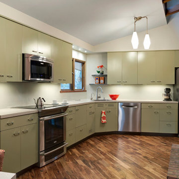
 Che Bella Interiors Design + Remodeling
Prior to the remodel, this home was 100% original and left to age while the homeowner moved on. Our clients are the second homeowner to the home, and we helped to keep the original feeling of the home as well as worked to reuse the original St. Charles steel cabinets where possible. The clients found a second steel cabinet kitchen out of state with taller upper cabinets than the original and with a lift of the original soffit we were able to combine the original and additional cabinets to create a wonderful and more functional Kitchen. Each cabinet was relocated, painted, and reinstalled. It’s hard to imagine that the Kitchen previously featured terra cotta painted cabinets with a pink countertop and backsplash 4×4 tile. The lighting, windows, and many other design details are still original throughout the home. As the home has many interesting minor angles – we had the flooring installed on an angle of its own to add a wonderful detail and not fight with the other angles within.
In the Mudroom entry near the Garage we purposefully organized several of the excess cabinets which allowed for additional storage. The terra cotta cabinet color reflected the original cabinet color in the Kitchen.
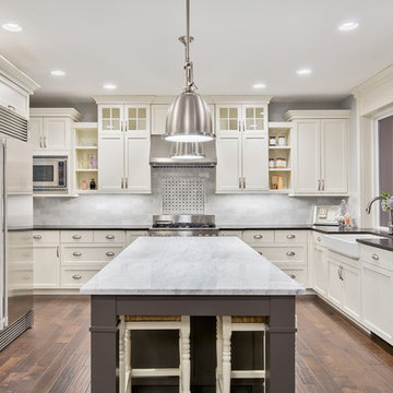
 Metropolis Drafting and Construction Inc
This vast and open kitchen showcases the great match of a white shaker cabinets with Raven caeser stone quartz counter and the island made of gray shaker cabinets with white Carrara marble counter.
To tie the two of them together we have used 6x3 tumbled white Carrara back-splash tile in a staggered layout with a center mosaic deco area above the Range unit.
To give it the additional modern feel you have the stainless steel appliances such as a Sub-zero build-in fridge, the range unit and the large stainless steel pendant lights.
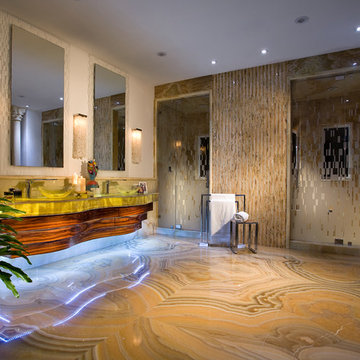
 Equilibrium Interior Design Inc
The design of this master bathroom is set to compliment the natural stone slab floor that sets the tone for this room. Because the entire second floor of the house was renovated into a master suite, the client requested an open concept plan for the entire suite.
This allowed Equilibrium to increase the floor area of the bathroom and design an incredible statement piece which is the floor. Honey onyx slabs were cut into oversized tiles to make them more manageable and installed in a diamond pattern preserving continuity of lines from tile to tile, and slab to slab. Furthermore, what otherwise would be waste cut material, it was chiseled, flamed, and fabricated into custom mosaic installed on the back wall of the bathroom and on shower floor.
To ensure Client’s safety, slabs were treated with anti slippage treatment and shower floor was finished with matching mosaic.
Client requested that the shower is oversized and feels like showering under a waterfall. This was accomplished by running four separate water lines to feed the shower plumbing. When the two oversized rain heads, two shower heads, and six water jets are all on, you get the feeling of being under a natural waterfall in the Amazon. Non of this would be possible in today’s water starved world if it wasn’t for harvesting and special filtration system installed on this property that allows recirculation of water.
Variation of lighting types allows for various theme settings, and energy efficient LED lighting further enhance the beauty of this bathroom with minimum energy consumption.
Even edges of slabs were polished to ensure maximum light refraction with beveled seams that create purposeful patterns instead of hiding seams. Shower doors were etched with a pattern that adds dimension and provides privacy while complimenting the mosaic pattern on the back wall.
The double sink vanity was floated off the floor allowing for maximum visibility of this artistic installation. It was made of rosewood and designed with three sections for drawers and storage. The three levels create a scalloping effect allowing each to be illuminated by LED lights which reflect elegantly in the onyx slab floor. Complimented by honey onyx top, and placed against a 42” high onyx wainscot, it is a functional and beautiful millwork.
This master bathroom is a testament to engineering, originality, and beauty seen in every detail.
Interior Design, Decorating & Project Management by Equilibrium Interior Design Inc
Photography by Craig Denis
 TKS Design Group
Download our free ebook, Creating the Ideal Kitchen. DOWNLOAD NOW
Lakefront property in the northwest suburbs of Chicago is hard to come by, so when we were hired by this young family with exactly that, we were immediately inspired by not just the unusually large footprint of this 1950’s colonial revival but also the lovely views of the manmade lake it was sited on. The large 5-bedroom home was solidly stuck in the 1980’s, but we saw tons of potential. We started out by updating the existing staircase with a fresh coat of paint and adding new herringbone slate to the entry hall.
The powder room off the entryway also got a refresh - new flooring, new cabinets and fixtures. We ran the new slate right through into this space for some consistency. A fun wallpaper and shiplap trim add a welcoming feel and set the tone for the home.
Next, we tackled the kitchen. Located away from the rest of the first floor, the kitchen felt a little isolated, so we immediately began planning for how to better connect it to the rest of the first floor. We landed on removing the wall between the kitchen and dining room and designed a modified galley style space with separate cooking and clean up zones. The cooking zone consists of the refrigerator, prep sink and cooktop, along with a nice long run of prep space at the island. The cleanup side of the kitchen consists of the main sink and dishwasher. Both areas are situated so that the user can view the lake during prep work and cleanup!
One of the home’s main puzzles was how to incorporate the mudroom and area in front of the patio doors at the back of the house. We already had a breakfast table area, so the space by the patio doors was a bit of a no man’s land. We decided to separate the kitchen proper from what became the new mudroom with a large set of barn doors. That way you can quickly hide any mudroom messes but have easy access to the light coming in through the patio doors as well as the outdoor grilling station. We also love the impact the barn doors add to the overall space.
The homeowners’ first words to us were “it’s time to ditch the brown,” so we did! We chose a lovely blue pallet that reflects the home’s location on the lake which is also vibrant yet easy on the eye. Countertops are white quartz, and the natural oak floor works well with the other honey accents. The breakfast table was given a refresh with new chairs, chandelier and window treatments that frame the gorgeous views of the lake out the back.
We coordinated the slate mudroom flooring with that used in the home’s main entrance for a consistent feel. The storage area consists of open and closed storage to allow for some clutter control as needed.
Next on our “to do” list was revamping the dated brown bar area in the neighboring dining room. We eliminated the clutter by adding some closed cabinets and did some easy updates to help the space feel more current. One snag we ran into here was the discovery of a beam above the existing open shelving that had to be modified with a smaller structural beam to allow for our new design to work. This was an unexpected surprise, but in the end we think it was well worth it!
We kept the colors here a bit more muted to blend with the homeowner’s existing furnishings. Open shelving and polished nickel hardware add some simple detail to the new entertainment zone which also looks out onto the lake!
Next we tackled the upstairs starting with the homeowner’s son’s bath. The bath originally had both a tub shower and a separate shower, so we decided to swap out the shower for a new laundry area. This freed up some space downstairs in what used to be the mudroom/laundry room and is much more convenient for daily laundry needs.
We continued the blue palette here with navy cabinetry and the navy tile in the shower. Porcelain floor tile and chrome fixtures keep maintenance to a minimum while matte black mirrors and lighting add some depth the design. A low maintenance runner adds some warmth underfoot and ties the whole space together.
We added a pocket door to the bathroom to minimize interference with the door swings. The left door of the laundry closet is on a 180 degree hinge to allow for easy full access to the machines. Next we tackled the master bath which is an en suite arrangement. The original was typical of the 1980’s with the vanity outside of the bathroom, situated near the master closet. And the brown theme continued here with multiple shades of brown.
Our first move was to segment off the bath and the closet from the master bedroom. We created a short hall from the bedroom to the bathroom with his and hers walk-in closets on the left and right as well as a separate toilet closet outside of the main bathroom for privacy and flexibility.
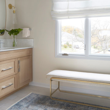
The original bathroom had a giant soaking tub with steps (dangerous!) as well as a small shower that did not work well for our homeowner who is 6’3”. With other bathtubs in the home, they decided to eliminate the tub and create an oversized shower which takes up the space where the old tub was located. The double vanity is on the opposite wall and a bench is located under the window for morning conversations and a place to set a couple of towels.
The pallet in here is light and airy with a mix of blond wood, creamy porcelain and marble tile, and brass accents. A simple roman shade adds some texture and it’s top-down mechanism allows for light and privacy.
This large whole house remodel gave our homeowners not only the ability to maximize the potential of their home but also created a lovely new frame from which to view their fabulous lake views.
Designed by: Susan Klimala, CKD, CBD
Photography by: Michael Kaskel
For more information on kitchen and bath design ideas go to: www.kitchenstudio-ge.com
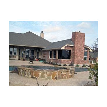
 Medford Design-Build
The finished backyard with pool and custom add-on. Photo by Mike Medford.
Inspiration for a modern family room remodel in Dallas
Inspiration for a modern family room remodel in Dallas


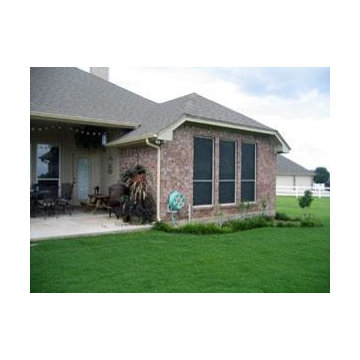 Medford Design-Build
This is the client's backyard and patio before the room addition and pool installation. Photo by Mike Medford.
Minimalist family room photo in Dallas
Minimalist family room photo in Dallas
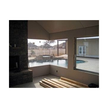 Medford Design-Build
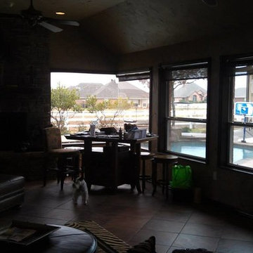
Check out the view through this custom corner window! Photo by Mike Medford.
Family room - modern family room idea in Dallas
Family room - modern family room idea in Dallas

 Restaurant Equipment Parts
Order T&S Brass 0133ADF12B Pre Rinse Wall Mount W/ Add-On today! Shop Restaurant Equipment Parts & Accessories at PartsFe with same-day shipping, available at the best prices.

 Medford Design-Build
The new living space overlooking the pool and yard. Photo by Mike Medford.
Inspiration for a modern family room remodel in Dallas
Inspiration for a modern family room remodel in Dallas
 Robeson Design
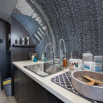
Designing a completely round home is challenging! Add to that, the two tubes are merely 8' wide. This requires EVERY piece of furniture to be custom built to fit the continuous rounding walls, floors and ceiling. We used every possible inch to provide storage for our clients personal belongings and household needs... sustainable for 3 years!
Solid walnut wood paneling and custom built shelving was used throughout as well as tons of hidden storage... in, under and atop every possible inch of this project was locate and utilized! Backsplash above the Kitchen sink is super thinly cut mosaic tile made out of MIRROR! It's reflective, creates an illusion of space and light, It sparkles and looks AMAZING!
MMM Photography
7