
Search results for "Reflective add ons" in Home Design Ideas
 Morgante Wilson Architects
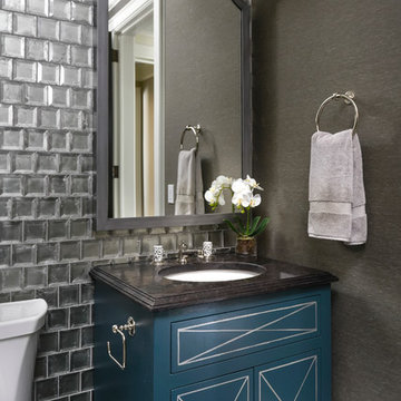
Morgante Wilson Architects used Anne Sacks tile behind the vanity to add glamour to this Powder Room. The THG faucet is in polished nickel to add even more sparkle to this Powder Room.
 Ammirato Construction, Inc.
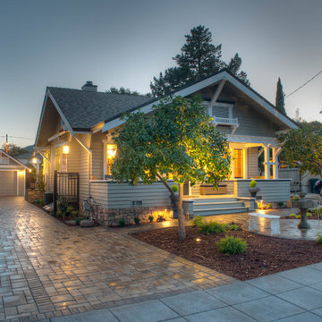
Every inch of the exterior, from the chimney down to the sagging front porch, was meticulously restored to it's original beauty. Years of poorly done add-on's were removed, while features such as the hanging lights along the driveway were added for safety and convenience.
 Creative Cabinets and Fine Finishes, LLC
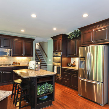
Perimeter cabinets restained to an updated darker stain finish. Island refinished to a black distressed finish. Add ons include new raised side panels to replace beadboard. New decorative legs, corbels and crown molding. All new knobs and pulls added to all the cabinet doors and drawers.
Find the right local pro for your project
 Haus Interior Design
**Featured in Home & Design Magazine!
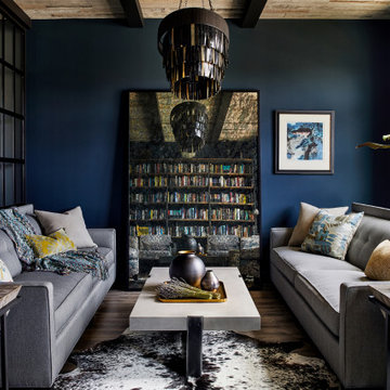
The inspiration for this unique project draws on the clients’ love of Paris and the city’s vibrant romanticism and mix of architectural styles. Our challenge was to elevate builder-grade finishes in a newly-constructed townhome to create an urban retreat with aged patina for this young couple. Soft industrial elements were layered over Old-World inspired details on nearly every surface for maximum impact. We added rustic wood ceilings and industrial beams to create drama, texture, and value throughout.
A Parisian-inspired glass/iron wall divider relieves the open concept floor plan, creating a more intimate seating space. Oversized pendants of steel, blown glass, horsehair and faux horn provide soft illumination while drawing the eye upward to architectural ceiling details. Custom midnight blue built-ins create a library that frames the entry and study. The deep and dramatic color palette of paint and wallpaper that adorns the walls is a vibrant mix of cobalt, citron, teal and smoky lavender. Light pours into the rooms from the large windows, reflects off the oversized acid-wash mirror, and forms dramatic shadows on the walls, setting the mood for this home.
 KBC Developments
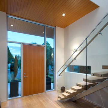
Placed within an idyllic beach community, this modern family home is filled with both playful and functional spaces. Natural light reflects throughout and oversized openings allow for movement to the outdoor spaces. Custom millwork completes the kitchen with concealed appliances, and creates a space well suited for entertaining. Accents of concrete add strength and architectural context to the spaces. Livable finishes of white oak and quartz are simple and hardworking. High ceilings in the bedroom level allowed for creativity in children’s spaces, and the addition of colour brings in that sense of playfulness. Art pieces reflect the owner’s time spent abroad, and exude their love of life – which is fitting in a place where the only boundaries to roam are the ocean and railways.
KBC Developments
Photography by Ema Peter
www.emapeter.com
 Keechi Creek Builders
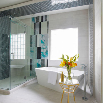
This luxury bathroom renovation in Memorial, Houston by Keechi Creek Builders combines spa-like serenity with modern architectural detail. Featuring a frameless glass shower, soaking tub, and striking vertical tilework in shades of blue, gray, and stone, the space invites relaxation without compromising on style. A mix of matte and reflective surfaces adds depth, while the floor-to-ceiling tile accent wall grounds the space in contemporary sophistication. Keechi Creek Builders delivers high-end bathroom renovations designed for comfort, beauty, and timeless appeal.
 Hom Personal Interiors
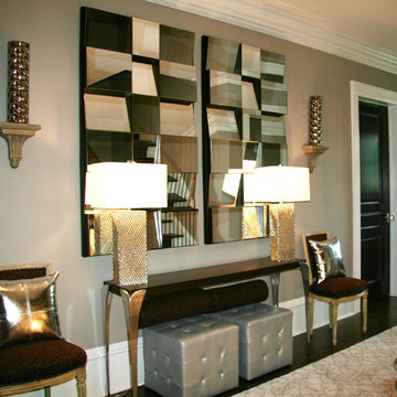
And at the TOP OF THE STAIRS between the Second and third floors, the Family's private zone, Greenwich Glamor gleams on. The Mirrors act as sculpture while reflecting and refracting light. The side chairs are from the owners home in Paris they brought back but Paul jolted with silver leather pillows to add to the other pieces in the hallway that make coming down the stairs in the morning a true reminder that yes you are now in Greenwich. The doors are all lacquered black with crystal knobs. Even opening a door in this HOM. is an event.

 Native Edge Landscape
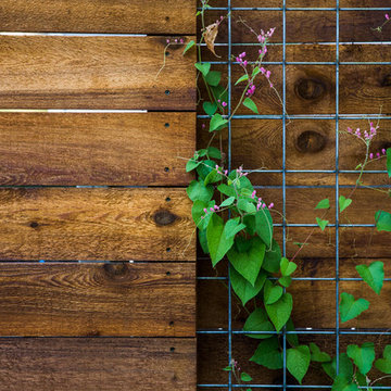
Another fun Crestview project! This young couple wanted a back yard that reflected their bohemian-eclectic style and could add additional privacy from the ever climbing construction around them. A place for “hanging out and drinking coffee or beer in the backyard.” But what was most exciting, was the air stream they had just purchased and were in the process of restoring. With the end goal of using it as a guest home for family and friends, we were challenged with creating a space that was cohesive and connected this new living space with the rest of the yard.
In the front we had another quark to fix. The sidewalk from their front door to the street suddenly stopped 5 feet from the curb, making a less than inviting entry for guests. So, creating a new usable entryway with additional curb appeal was a top priority.
We managed the entertainment space by using modern poured concrete pad’s as a focal. A poured concrete wall serves as a bench as well as creates a visual anchor for the patio area. To soften the hard materials, small plantings of succulents and ground cover were planted in the spaces between the pads. For a backdrop, a custom Cedar Plank wall and trellis combined to soften the vertical space and add plenty of privacy. The trellis is anchored by a Coral Vine to add interest. Cafe style lighting was strung across the area create a sense of intimacy.
We also completed the fence transition, and eliminated the grass areas that were not being utilized to reduce the amount of water waste in the landscape, and replaced these areas with beneficial plantings for the wildlife.
Overall, this landscape was completed with a cohesive Austin-friendly design in mind for these busy young professionals!
Caleb Kerr - http://www.calebkerr.com
 bathstore
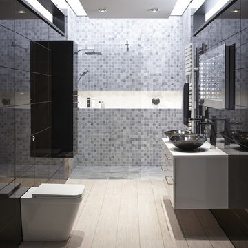
Simply beautiful and truly functional spaces, reflective surfaces and textures that accentuate the feeling of space. Large mirrors reflect the high gloss furniture while clever tiling and a walk-in shower divides the space into function-led areas. To ensure every detail is perfect, trust bathstore’s Expert Installation Service, with a 5-year craftsmanship guarantee.
 Breathe Design Studio
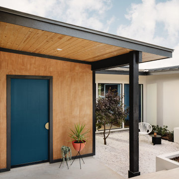
Our Austin studio decided to go bold with this project by ensuring that each space had a unique identity in the Mid-Century Modern style bathroom, butler's pantry, and mudroom. We covered the bathroom walls and flooring with stylish beige and yellow tile that was cleverly installed to look like two different patterns. The mint cabinet and pink vanity reflect the mid-century color palette. The stylish knobs and fittings add an extra splash of fun to the bathroom.
The butler's pantry is located right behind the kitchen and serves multiple functions like storage, a study area, and a bar. We went with a moody blue color for the cabinets and included a raw wood open shelf to give depth and warmth to the space. We went with some gorgeous artistic tiles that create a bold, intriguing look in the space.
In the mudroom, we used siding materials to create a shiplap effect to create warmth and texture – a homage to the classic Mid-Century Modern design. We used the same blue from the butler's pantry to create a cohesive effect. The large mint cabinets add a lighter touch to the space.
 Lush Interiors Inc.
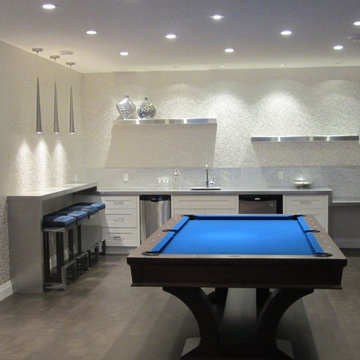
Starting with a blank slate, we transformed this basement into a sleek modern space to hang out and entertain. With a full bar, guests are invited to sit down and relax or engage in a game of pool. Inspired by the reflective quality of metal we were able to select materials that created visual interest with very little contrast in color. With so many hard materials used for the cabinetry and counter tops, it was important to add a touch of softness by adding wall coverings and upholstered bar stools. The fireplace adds an element of warmth and sophistication complimented by the bold statement of the electric blue pool table.
 Kitchens By Design
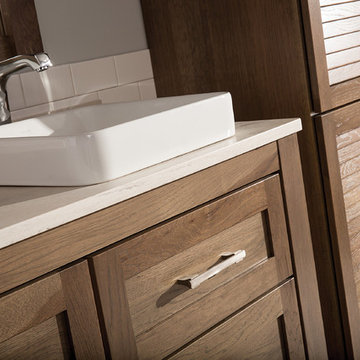
A Plumbing Drawer from Dura Supreme is the perfect way to gain extra storage under the sink but still have room for your sink's plumbing fixtures.
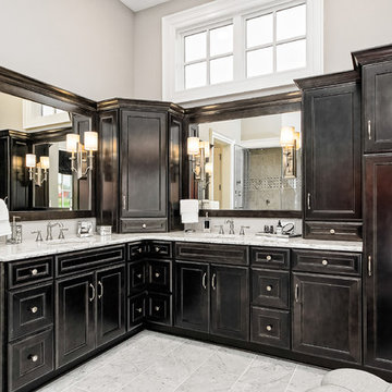
Submerse yourself in a serene bath environment and enjoy solitude as your reward. Select the most inviting and luxurious materials to create a relaxing space that rejuvenates as it soothes and calms. Coordinating bath furniture from Dura Supreme brings all the details together with your choice of beautiful styles and finishes. Mirrored doors in the linen cabinet make small spaces look expansive and add a convenient full length mirror into the bathroom.
A large linen cabinet in this bathroom adds vast amounts of storage to the small space, while adding beauty to the room. This sublime bathroom features Dura Supreme’s “Style Four” furniture series. Style Four offers 10 different configurations (for single sink vanities, double sink vanities, or offset sinks), and multiple decorative toe options to coordinate vanities and linen cabinets. A matching mirror complements the vanity design. On this example, the sculpted detail of the Cove Furniture Base creates a classic architectural detail for this bath cabinetry set.
The Storm Gray painted finish with the white subway tile, counter top and other white accents give this luxurious small space a bright yet cool feel. This look is destined to be a classic for years to come.
The bathroom has evolved from its purist utilitarian roots to a more intimate and reflective sanctuary in which to relax and reconnect. A refreshing spa-like environment offers a brisk welcome at the dawning of a new day or a soothing interlude as your day concludes.
Our busy and hectic lifestyles leave us yearning for a private place where we can truly relax and indulge. With amenities that pamper the senses and design elements inspired by luxury spas, bathroom environments are being transformed form the mundane and utilitarian to the extravagant and luxurious.
Bath cabinetry from Dura Supreme offers myriad design directions to create the personal harmony and beauty that are a hallmark of the bath sanctuary. Immerse yourself in our expansive palette of finishes and wood species to discover the look that calms your senses and soothes your soul. Your Dura Supreme designer will guide you through the selections and transform your bath into a beautiful retreat.
Request a FREE Dura Supreme Cabinetry Brochure Packet at:
http://www.durasupreme.com/request-brochure
 Cape Associates, Inc.
As innkeepers, Lois and Evan Evans know all about hospitality. So after buying a 1955 Cape Cod cottage whose interiors hadn’t been updated since the 1970s, they set out on a whole-house renovation, a major focus of which was the kitchen.
The goal of this renovation was to create a space that would be efficient and inviting for entertaining, as well as compatible with the home’s beach-cottage style.
Cape Associates removed the wall separating the kitchen from the dining room to create an open, airy layout. The ceilings were raised and clad in shiplap siding and highlighted with new pine beams, reflective of the cottage style of the home. New windows add a vintage look.
The designer used a whitewashed palette and traditional cabinetry to push a casual and beachy vibe, while granite countertops add a touch of elegance.
The layout was rearranged to include an island that’s roomy enough for casual meals and for guests to hang around when the owners are prepping party meals.
Placing the main sink and dishwasher in the island instead of the usual under-the-window spot was a decision made by Lois early in the planning stages. “If we have guests over, I can face everyone when I’m rinsing vegetables or washing dishes,” she says. “Otherwise, my back would be turned.”
The old avocado-hued linoleum flooring had an unexpected bonus: preserving the original oak floors, which were refinished.
The new layout includes room for the homeowners’ hutch from their previous residence, as well as an old pot-bellied stove, a family heirloom. A glass-front cabinet allows the homeowners to show off colorful dishes. Bringing the cabinet down to counter level adds more storage. Stacking the microwave, oven and warming drawer adds efficiency.
Sponsored
Sunbury, OH

J.Holderby - Renovations
Franklin County's Leading General Contractors - 2X Best of Houzz!
 Breathe Design Studio
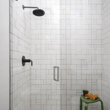
Our Austin studio decided to go bold with this project by ensuring that each space had a unique identity in the Mid-Century Modern style bathroom, butler's pantry, and mudroom. We covered the bathroom walls and flooring with stylish beige and yellow tile that was cleverly installed to look like two different patterns. The mint cabinet and pink vanity reflect the mid-century color palette. The stylish knobs and fittings add an extra splash of fun to the bathroom.
The butler's pantry is located right behind the kitchen and serves multiple functions like storage, a study area, and a bar. We went with a moody blue color for the cabinets and included a raw wood open shelf to give depth and warmth to the space. We went with some gorgeous artistic tiles that create a bold, intriguing look in the space.
In the mudroom, we used siding materials to create a shiplap effect to create warmth and texture – a homage to the classic Mid-Century Modern design. We used the same blue from the butler's pantry to create a cohesive effect. The large mint cabinets add a lighter touch to the space.
 Jordan Design Build Group
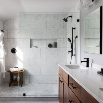
Our clients wanted to add an ensuite bathroom to their charming 1950’s Cape Cod, but they were reluctant to sacrifice the only closet in their owner’s suite. The hall bathroom they’d been sharing with their kids was also in need of an update so we took this into consideration during the design phase to come up with a creative new layout that would tick all their boxes.
By relocating the hall bathroom, we were able to create an ensuite bathroom with a generous shower, double vanity, and plenty of space left over for a separate walk-in closet. We paired the classic look of marble with matte black fixtures to add a sophisticated, modern edge. The natural wood tones of the vanity and teak bench bring warmth to the space. A frosted glass pocket door to the walk-through closet provides privacy, but still allows light through. We gave our clients additional storage by building drawers into the Cape Cod’s eave space.
 Urbanology Designs
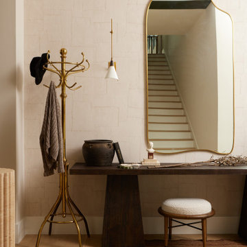
We transformed a cold modern space into a warm retreat. With earthy tones, rich textures, and thoughtful accessories, the home reflects the homeowners' personalities, creating a serene sanctuary full of life and personal touches.
This entryway features a sleek console and a large mirror that opens up the space. A textured rug adds warmth and comfort, while the minimalist design creates a welcoming and elegant first impression.
 Twelve Stones Designs, LLC
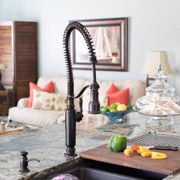
The owners of this kitchen had spent the money to upgrade the finishes in their kitchen upon building the home 12 years ago, but after living in the space for several years they realized how nonfunctional the layout really was. The (then) two preschool aged children had grown into busy, hungry teenagers with many friends who also liked to hang out at the house. So the family needed a more functional kitchen with better traffic flow, space for daily activities revolving around the kitchen at different times of day, and a kitchen that could accommodate cooking for and serving large groups. Furthermore, the dark, traditional finishes no longer reflected the homeowners’ style. They requested a brighter, more relaxed, coastal style that reflected their love of the seaside cities they like to visit.
Originally, the kitchen was U-shaped with a narrow island in the middle. The island created narrow aisles that bottle-necked at the dishwasher, refrigerator, and cooktop areas. There was a pass-through from the foyer into the kitchen, but the owners never liked that the pass-through was also located so close to the powder room. The awkward proximity was unappealing and made guests feel uncomfortable.
The kitchen’s storage was made up of lots of narrow cabinets, apothecary drawers, clipped corner units, and very few drawers. It lacked useful storage for the larger items the family used on a daily basis. And the kitchen’s only pantry was small closet that had only builder-grade, narrow shelving with no illumination to be able to see the contents inside.
Overall, the kitchen’s lighting plan was poorly executed. Only six recessed cans illuminated the entire kitchen and nook areas. The under cabinet lighting was not evenly distributed either. In fact, the builder had mis-placed the under cabinet lighting around the decorative pilasters which made for choppy, dark cubbies. Further, the builder didn’t include any lighting over the sink or the bar area, which meant whoever was doing the dishes was always in their own shadow. That, coupled with the steep overhang of the game room above made the bar area feel like a dim, cavernous space that wasn’t inviting or task oriented. The kitchen looked out into the main living space, but the raised bar and a narrow wall (which held the only large cabinet in the kitchen) created more of a barrier than a relationship to the living room or breakfast nook. In fact, one couldn’t even see the breakfast nook from the cooktop or sink areas due to its orientation. The raised bar top was too narrow to comfortably sit to either dine at or chat from due to the lack of knee space. The the homeowners confided that the kitchen felt more like a dark, dirty prison than place where the family, or their guests, wanted to gather and commune.
The clients' needs and desires were:
➢ to create a kitchen that would be a space the family loved to be in; to relate to the adjacent spaces all around, and to have better flow for entertaining large groups
➢ to remove the walls between the breakfast nook and living area and to be able to utilize the natural light from the windows in both those areas
➢ to incorporate a functional chopping block for prepping fresh food for home cooked meals, an island with a large sink and drain board, 2 pull out trash cans, and seating for at least the 2 teens to eat or do homework
➢ to design a kitchen and breakfast nook with an airy, coastal, relaxed vibe that blended with the rest of the house's coastal theme
➢ to integrate a layered lighting plan which would include ample general illumination, specific task lighting, decorative lighting, and lots of illuminated storage
➢ to design a kitchen with not only more storage for all the husband’s kitchen gadgets and collection of oils and spices, but smart storage, including a coffee/breakfast bar and a place to store and conceal the toaster oven and microwave
➢ to find a way to utilize the large open space between the kitchen, pantry area, and breakfast nook
Twelve Stones Designs achieved the owner's goals by:
➢ removing the walls between the kitchen and living room to allow the natural light to filter in from the adjacent rooms and to create a connection between the kitchen, nook, and living spaces for a sense of unity and communion
➢ removing the existing pantry and designing 3 large pantry style cabinets with LED tape lights and rollout drawers to house lots of kitchen appliances, gadgets, and tons of groceries. We also took the cabinets all the way up to the 9’ ceiling for additional storage for seasonal items and bulk storage.
➢ designing 2 islands - 1 with a gorgeous black walnut chopping block that houses a drawer for chopping and carving knives and a custom double pull out trash unit for point of use utilization - and 1 that houses the dishwasher, a large Blanco Gourmet sink with integrated drain board, woven baskets for fresh root vegetables and kitchen towels, plenty of drawer storage for kitchen items, and bar seating for up to 4 diners.
➢ closing off the space between the kitchen and the powder room to create a beautiful new private alcove for the powder room as well as adding some decorative storage. This also gave us space to include more tall storage near the new range for precision placement of the husband’s extensive oil and spice collection as well as a location for a combo-steam oven the wife wanted for baking and cooking healthy meals.
The project is enhanced functionally by:
➢ incorporated USB and standard receptacles for the kids’ laptops and phone charging in the large island
➢ designing the small island to include additional open shelving for items used on a daily basis such as a variety of bowls, plates, and colanders. This set up also works well for the husband who prefers to “plate” his dinners in restaurant-style fashion before presenting them to the table.
➢ the integration of specific storage units, such as double stacked cutlery drawers, a custom spice pull-out, a Kuerig coffee and tea pod drawer, and custom double stacked utensil drawers
➢ moving the refrigerator to the old oven location - this eliminated the bottle neck as well as created a better relationship to the eating table. It also utilizes the floor space between the pantry, nook, and kitchen
➢ creating a banquet style breakfast nook - this banquette seating not only doubles the amount of seating for large gatherings but it better utilizes the odd space between the kitchen and the previous nook area. It also helps to create a distinct pathway from the mudroom room through the pantry area, kitchen, nook, and living room.
➢ the coffee/breakfast bar area which includes the perfect location for the concealed microwave and toaster oven, convenient storage for the coffee pods and tea accoutrements. Roll-out drawers below also house the smoothie maker, hot water kettle, and a plethora of smoothie-making ingredients such as protein powders, smoothie additives, etc. Furthermore, the drawers below the Keurig house measuring utensil, cutlery, baking supplies and tupperware storage.
➢ incorporating lots of wide drawers and pullouts to accommodate large cookware.
➢ utilizing as much vertical space as possible by building storage to the ceiling which accommodates the family’s abundant amount of serving platters, baking sheets, bakeware, casserole dishes, and additional cutting boards.
The project is enhanced aesthetically by:
➢ new 5-piece Versailles pattern porcelain tile that now seamlessly joins the entire down stairs area together creating a bright, cohesiveness feeling instead of choppy separated spaces - it also adds a coastal feeling
➢ designing a cabinet to conceal the microwave and toaster oven
➢ the coastal influenced light fixtures over the nook table and island
➢ the sandy colors of the Langdon Cambria countertops. The swirling pattern and sparkling quartz pieces remind the homeowner of black-and-tan sandy beaches
➢ the striped banquet seating whose creamy white background and blue-green stripes were the inspiration for the cabinet and wall colors.
➢ All the interior doors were painted black to coordinate with the blacks and grays in the backsplash tile and countertop. This also adds a hint of tailored formality to an otherwise casual space.
➢ the use of WAC's Oculux small aperture LED units for the overhead lighting complimented with Diode LED strips for task lighting under the cabinets and inside the pantry and glass wall cabinets. All of the lighting applications are on separate dimmer switches.
Innovative uses of materials or construction methods by Realty Restoration LLC:
➢ Each 1-1/2” x 3” block of reclaimed end-grain black walnut that makes up the center island chopping block was hand milled and built in the shop. It was designed to look substantial and proportional to the surrounding elements, executed by creating the 4 inch tall top with a solid wood chamfered edge band.
➢ The metal doors on either side of the vent hood were also custom designed for this project and built in the Realty Restoration LLC shop. They are made 1x2, 11-gauge mild steel with ribbed glass. Weighing 60 lbs a piece, heavy duty cabinet hinges were added to support the weight of the door and keep them from sagging.
➢ Under-cabinet receptacles were added along the range wall in order to have a clean, uninterrupted backsplash.
Design obstacles to overcome:
➢ Because we were removing the demising walls between the kitchen and living room, we had to find a way to plumb and vent the new island. We did this by tunneling through the slab (the slab had post tension cables which prevented us from just trenching) to run a new wet vent through a nearby structural wall. We pulled the existing hot and cold lines between upper floor joists and ran them down the structural wall as well and up through a conduit in the tunnel.
➢ Since we were converting from wall overs to a gas range it allowed us to utilize the 220 feed for the wall ovens to provide a new sub panel for all the new kitchen circuits
➢ Due to framing deficiencies inherited from the original build there was a 1-1/2” differential in the floor-to-ceiling height over a 20 foot span; by utilizing the process of cutting and furring coupled with the crown moulding details on the cabinet elevations we were able to mask the problem and provide seamless transitions between the cabinet components.
Evidence of superior craftsmanship:
➢ uniquely designed, one-of-a-kind metal “X” end panels on the large island. The end panels were custom made in the Realty Restoration LLC shop and fitted to the exact dimensions of the island. The welding seams are completely indistinguishable - the posts look like they are cut from a single sheet of metal
➢ square metal posts on the small island were also custom made and designed to compliment and carry through the metal element s throughout the kitchen
➢ the beautiful, oversized end panels on the pantry cabinets which give the breakfast nook a tailored look
➢ integrating a large format 5 piece Versailles tile pattern to seamlessly flow from the existing spaces into the new kitchen space
➢ By constructing a custom cabinet that jogged around a corner we could not remodel (housing the entry way coat closet) we were able to camouflage the adjacent wall offset within the upper and lower cabinets. By designing around the existing jog in the structural walls we accomplished a few things: we were able to find the space to house, and hide, the microwave and toaster oven yet still have a clean cohesive appearance from the kitchen side. Additionally, the owners were able to keep their much needed coat closet and we didn’t have to increase the budget with unnecessary structural work.

 3north
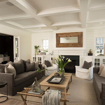
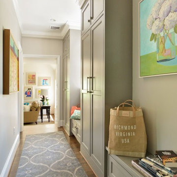
Do you move to the suburbs, make do, or add on? For a couple who wanted more kitchen and room to spread out and entertain, the decision was made to stay and grow. An addition was made behind their home that created an entirely new kitchen and family room, complete with vaulted ceilings and custom light fixtures. The addition itself is also not highly visible from the road, cutting down on the “hunchback” look of so many older city homes with massive additions. Windows give the space abundant natural light, with doors that inconspicuously blend indoor and outdoor living – an all in the home and neighborhood the couple loves best.
 Kitchen & Bath Design + Construction
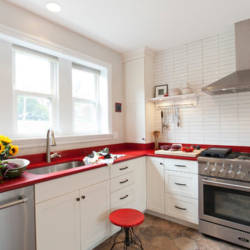
The red and white color combination are reflective of the European origins of the homeowner. Clean lines and simplicity add to the sophisticated look. Photography by Chrissy Racho
 Rudloff Custom Builders
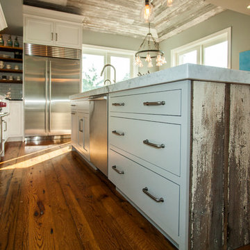
This kitchen has many interesting elements that set it apart.
The sense of openness is created by the raised ceiling and multiple ceiling levels, lighting and light colored cabinets.
A custom hood over the stone back splash creates a wonderful focal point. The traditionally styled architectural mill work compliments the island's use of reclaimed wood, transitional tapered legs, and white Carrara marble.
White Subway Tile and floating shelves in a distressed warm wood tone balance the barn door across the room and add another transitional touch to the room.
This kitchen was featured in a Houzz Kitchen of the Week article!
Photography by Alicia's Art, LLC
RUDLOFF Custom Builders, is a residential construction company that connects with clients early in the design phase to ensure every detail of your project is captured just as you imagined. RUDLOFF Custom Builders will create the project of your dreams that is executed by on-site project managers and skilled craftsman, while creating lifetime client relationships that are build on trust and integrity.
We are a full service, certified remodeling company that covers all of the Philadelphia suburban area including West Chester, Gladwynne, Malvern, Wayne, Haverford and more.
As a 6 time Best of Houzz winner, we look forward to working with you on your next project.
28