
Search results for "Remaining integrated" in Home Design Ideas
 HU-235072162
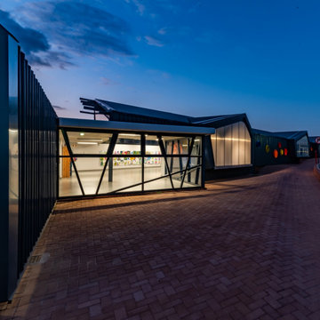
The site is located on the Mitchell House preparatory school campus in Polokwane. The client's brief
called for an early childhood development centre which would accommodate 122 learners and
requested that the building be evident of it's young and playful users.
Curiosity, wonder and intrigue would become defining criteria in an attempt to create a conducive
learning environment for young learners to grow, a building where children would be encouraged to
interact with their environment. The construction methodology of the building would remain apparent,
allowing its users to analyse the assembly of components.
Due to the age group of the users, the building would need to function semi-autonomously from the
rest of the school, while allowing for controlled interaction and inclusivity as is the norm for Mitchell
House. A linear plan which coincides with the developmental progress of the learners was identified
as the appropriate building typology. The spatial constraints of the site required this plan to be
moulded into the available space between the existing infrastructure, however the linear process was
maintained.
From the access-controlled reception and administration area one would move past the creative arts
and exhibition space towards the Northern wing where the youngest learners are taught. These would
share connected ablutions and storerooms between classes to enable fluid movement and
assistance throughout the teaching and service spaces. The East wing of the centre would house the
elder learners who would be in the process of being integrated with the fabric of the main school
campus. These classrooms include storage areas, however, have separate ablution facilities. The two
wings of the building surround a courtyard where play and interaction are in abundance.
 Talon Construction Inc.
An open floor plan kitchen renovation essentially merges your kitchen area with another living space, typically the dining room or living room, creating a more spacious and interconnected feel.
Opening Up the Space and Removing walls:
This is the key step, taking down non-load-bearing walls that separate the kitchen from the living or dining area. You'll want to consult a structural engineer to ensure any remaining walls can support the weight of the house.
Considering beams or columns:
Depending on the layout and size of the opening, you might need exposed beams or support columns to maintain structural integrity. These can be incorporated into the design as a stylish feature.
Kitchen Repositioning and Functionality:
Rethinking the work triangle: The work triangle refers to the refrigerator, sink, and stove - the most used areas in a kitchen. In an open plan, you'll want to ensure these elements remain close together for an efficient workflow. This might involve rearranging cabinetry or appliances.
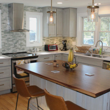
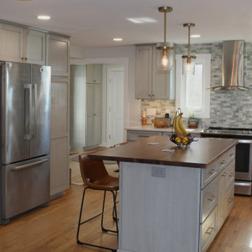
Creating a focal point: An island is a popular choice in open concept kitchens. It can house the sink, cooktop, provide additional storage and counter space, and even offer seating for guests to chat while you cook. Peninsula counters can also be used for a similar effect.
Unifying Design Elements: Use consistent flooring throughout the open area to create a cohesive flow. You can also extend the same color scheme or material accents (like backsplash tile) from the kitchen into the adjoining space.
Letting in Light: Maximize natural light by incorporating large windows or skylights. This will brighten the entire open area and make it feel even more spacious.
Storage Solutions: With an open plan, you might lose some wall space for cabinets. Consider built-in storage solutions like pantry cabinets or creative mudroom cabinetry to ensure you have enough storage for your kitchenware.
An open floor plan kitchen renovation can be a transformative project, creating a light-filled and social space in your home. By carefully planning the layout, incorporating design elements that unify the space, and addressing practical considerations with lighting and storage, you can achieve a beautiful and functional open concept kitchen.
 Talon Construction Inc.
An open floor plan kitchen renovation essentially merges your kitchen area with another living space, typically the dining room or living room, creating a more spacious and interconnected feel.
Opening Up the Space and Removing walls:
This is the key step, taking down non-load-bearing walls that separate the kitchen from the living or dining area. You'll want to consult a structural engineer to ensure any remaining walls can support the weight of the house.
Considering beams or columns:
Depending on the layout and size of the opening, you might need exposed beams or support columns to maintain structural integrity. These can be incorporated into the design as a stylish feature.
Kitchen Repositioning and Functionality:
Rethinking the work triangle: The work triangle refers to the refrigerator, sink, and stove - the most used areas in a kitchen. In an open plan, you'll want to ensure these elements remain close together for an efficient workflow. This might involve rearranging cabinetry or appliances.
Creating a focal point: An island is a popular choice in open concept kitchens. It can house the sink, cooktop, provide additional storage and counter space, and even offer seating for guests to chat while you cook. Peninsula counters can also be used for a similar effect.
Unifying Design Elements: Use consistent flooring throughout the open area to create a cohesive flow. You can also extend the same color scheme or material accents (like backsplash tile) from the kitchen into the adjoining space.
Letting in Light: Maximize natural light by incorporating large windows or skylights. This will brighten the entire open area and make it feel even more spacious.
Storage Solutions: With an open plan, you might lose some wall space for cabinets. Consider built-in storage solutions like pantry cabinets or creative mudroom cabinetry to ensure you have enough storage for your kitchenware.
An open floor plan kitchen renovation can be a transformative project, creating a light-filled and social space in your home. By carefully planning the layout, incorporating design elements that unify the space, and addressing practical considerations with lighting and storage, you can achieve a beautiful and functional open concept kitchen.
Find the right local pro for your project
 Talon Construction Inc.
An open floor plan kitchen renovation essentially merges your kitchen area with another living space, typically the dining room or living room, creating a more spacious and interconnected feel.
Opening Up the Space and Removing walls:
This is the key step, taking down non-load-bearing walls that separate the kitchen from the living or dining area. You'll want to consult a structural engineer to ensure any remaining walls can support the weight of the house.
Considering beams or columns:
Depending on the layout and size of the opening, you might need exposed beams or support columns to maintain structural integrity. These can be incorporated into the design as a stylish feature.
Kitchen Repositioning and Functionality:
Rethinking the work triangle: The work triangle refers to the refrigerator, sink, and stove - the most used areas in a kitchen. In an open plan, you'll want to ensure these elements remain close together for an efficient workflow. This might involve rearranging cabinetry or appliances.
Creating a focal point: An island is a popular choice in open concept kitchens. It can house the sink, cooktop, provide additional storage and counter space, and even offer seating for guests to chat while you cook. Peninsula counters can also be used for a similar effect.
Unifying Design Elements: Use consistent flooring throughout the open area to create a cohesive flow. You can also extend the same color scheme or material accents (like backsplash tile) from the kitchen into the adjoining space.
Letting in Light: Maximize natural light by incorporating large windows or skylights. This will brighten the entire open area and make it feel even more spacious.
Storage Solutions: With an open plan, you might lose some wall space for cabinets. Consider built-in storage solutions like pantry cabinets or creative mudroom cabinetry to ensure you have enough storage for your kitchenware.
An open floor plan kitchen renovation can be a transformative project, creating a light-filled and social space in your home. By carefully planning the layout, incorporating design elements that unify the space, and addressing practical considerations with lighting and storage, you can achieve a beautiful and functional open concept kitchen.
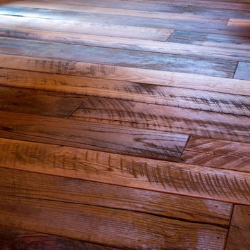
 Historic Flooring LLC
This gorgeous wide plank antique Oak is our most requested floor! With dramatic widths ranging from 6 to 12 inches (14 inches in some cases), you can easily bring an old-world charm into your home. This product comes to you completely pre-finished and ready to install.
We start by hand sanding the surface, beveling the edges ever so slightly, and being careful to preserve the historical integrity of the planks. Typically, about 80% of your flooring will be "Smooth" with the remaining 20% having a slight texture from the original saw kerfs. This material will also have nail holes, knots, and checks which only adds to the unique character.
Next, we apply Waterlox, a tung oil based sealant with or without stain added. Finally, 3 coats of Vermont Polywhey finish are added with a hand buffing between coats. The result is a luxurious satiny finish that you can only get from Historic Flooring!
Photos by Steven Dolinsky

 place architecture:design
A renovated master bathroom in this mid-century house, created a spa-like atmosphere in this small space. To maintain the clean lines, the mirror and slender shelves were recessed into an new 2x6 wall for additional storage. This enabled the wall hung toilet to be mounted in this 'double' exterior wall without protruding into the space. The horizontal lines of the custom teak vanity + recessed shelves work seamlessly with the monolithic vanity top.
Tom Holdsworth Photography
 HU-235072162
The site is located on the Mitchell House preparatory school campus in Polokwane. The client's brief
called for an early childhood development centre which would accommodate 122 learners and
requested that the building be evident of it's young and playful users.
Curiosity, wonder and intrigue would become defining criteria in an attempt to create a conducive
learning environment for young learners to grow, a building where children would be encouraged to
interact with their environment. The construction methodology of the building would remain apparent,
allowing its users to analyse the assembly of components.
Due to the age group of the users, the building would need to function semi-autonomously from the
rest of the school, while allowing for controlled interaction and inclusivity as is the norm for Mitchell
House. A linear plan which coincides with the developmental progress of the learners was identified
as the appropriate building typology. The spatial constraints of the site required this plan to be
moulded into the available space between the existing infrastructure, however the linear process was
maintained.
From the access-controlled reception and administration area one would move past the creative arts
and exhibition space towards the Northern wing where the youngest learners are taught. These would
share connected ablutions and storerooms between classes to enable fluid movement and
assistance throughout the teaching and service spaces. The East wing of the centre would house the
elder learners who would be in the process of being integrated with the fabric of the main school
campus. These classrooms include storage areas, however, have separate ablution facilities. The two
wings of the building surround a courtyard where play and interaction are in abundance.

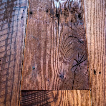 Historic Flooring LLC
This gorgeous wide plank antique Oak is our most requested floor! With dramatic widths ranging from 6 to 12 inches (14 inches in some cases), you can easily bring an old-world charm into your home. This product comes to you completely pre-finished and ready to install.
We start by hand sanding the surface, beveling the edges ever so slightly, and being careful to preserve the historical integrity of the planks. Typically, about 80% of your flooring will be "Smooth" with the remaining 20% having a slight texture from the original saw kerfs. This material will also have nail holes, knots, and checks which only adds to the unique character.
Next, we apply Waterlox, a tung oil based sealant with or without stain added. Finally, 3 coats of Vermont Polywhey finish are added with a hand buffing between coats. The result is a luxurious satiny finish that you can only get from Historic Flooring!
Photos by Steven Dolinsky

 Dream Kitchens
The kitchen in this contemporary style home seemed to be an afterthought. While the rest of the house is open and expansive, the kitchen was small and detached, especially for a couple who loves to entertain. The very large and adjacent dining room seemed a more likely location for a kitchen, but they resisted the thought of swapping the two spaces. So their designer created a layout that allowed for a second – and larger – opening to the dining room and the expansive, light-filled living space beyond.
A peninsula attaches to the wall that remained between the two openings. There the sink is located so that during food preparation or cleanup there is a view through the windows and the opportunity to socialize with people gathered at the countertop. The seating area is curved to encourage people to gather and chat. The granite countertop choice was a case of love at first sight for this homeowner since it brought his favorite shade of blue into the kitchen.
The cooking center is spread out along the wall at the back of the house. There the eye-catching stainless steel hood creates a focal point above the sleek, low-profile cooktop. Glass tile pulls color from the countertops onto the wall where it glimmers in the light. One oven combined with a microwave/convection oven meet their cooking needs and the stainless steel adds brightness to the room.
The stainless steel refrigerator is just a few steps away from the work center and the seating area and is easily accessible from other parts of the house. The original kitchen featured only one small window in addition to the sliding glass doors. Since it was almost new and the house had been resided, a second window was joined to the first, and cabinetry beneath them anchors them in the space. A tall pantry cabinet completes the kitchen, providing high quality storage and visual balance in this redesign.
Sleek cherry cabinets give this kitchen a decidedly contemporary style. They were stained just enough to add warmth and color and are enhanced with oversized stainless steel pulls.
From this redesigned space you can see into the main house and see out through the many windows there. When combined with a new layout that provides better traffic flow, there’s a new feeling of spaciousness to the kitchen. It’s no longer an afterthought. It’s an integral part of this home’s living space, enhancing the home and the lifestyle of its owners.
Photography By Scott Sherman
 Historic Flooring LLC
This gorgeous wide plank antique Oak is our most requested floor! With dramatic widths ranging from 6 to 12 inches (14 inches in some cases), you can easily bring an old-world charm into your home. This product comes to you completely pre-finished and ready to install.
We start by hand sanding the surface, beveling the edges ever so slightly, and being careful to preserve the historical integrity of the planks. Typically, about 80% of your flooring will be "Smooth" with the remaining 20% having a slight texture from the original saw kerfs. This material will also have nail holes, knots, and checks which only adds to the unique character.
Next, we apply Waterlox, a tung oil based sealant with or without stain added. Finally, 3 coats of Vermont Polywhey finish are added with a hand buffing between coats. The result is a luxurious satiny finish that you can only get from Historic Flooring!
Photos by Steven Dolinsky

 Monarch Builders & Remodelers
This aging-in-place bath has been made functional with wheelchair accessible vanity and shower. The vanity has been lowered to make everything within easy reach. The shower is now serviceable and accessible for the entire family.
Monarch Builders and Remodelers, Inc. is SW Florida’s specialist in providing state-of-the-art "Aging in Place" building design services and techniques, including a full range of home-remodeling services. With a prime goal of interpreting the needs and desires in an aesthetically pleasing way, Monarch Builders creates an environment in which homeowners can live and work positively and independently. Monarch knows there’s no place like home and people 50 and older want to remain living in their own home - comfortably, safely, and independently; it all comes down to design that keep one’s house a home. Monarch brings care, respect, and empathy into the designer-client relationship. By providing innovation and excellence, Monarch works to make your home function beautifully.
 Mayflower Construction Group
How to Tell When a Design Trend is Timeless
Design trends come and go, but some styles withstand the test of time. Whether in architecture, interior design, or branding, timeless design is one that remains relevant and appealing for decades. But how can you tell if a trend is truly timeless or just a fleeting fad? Here are key indicators to help you identify designs that will never go out of style.
1. Simplicity Over Complexity
Timeless designs are often clean, simple, and functional. They avoid excessive ornamentation or gimmicky elements that might feel outdated in a few years. Classic materials, neutral color palettes, and well-balanced proportions contribute to a look that remains fresh over time.
2. Rooted in Functionality
If a design prioritizes function as much as form, it is more likely to endure. Practicality and usability should be at the core, ensuring that the design continues to serve its purpose efficiently. In construction, for example, well-planned layouts and durable materials contribute to long-lasting appeal.
3. Inspired by Nature
Natural elements, such as stone, wood, and earth tones, have always been a staple of timeless design. Since nature itself is everlasting, incorporating organic textures and colors helps create a look that never feels outdated.
4. Influenced by History, Not Hype
Timeless designs often take cues from historical influences that have proven their longevity. Architectural styles like mid-century modern, classical, and industrial remain relevant because they have strong foundations in design principles rather than passing fads.
5. Balanced and Harmonious Composition
Good design follows fundamental principles such as symmetry, proportion, and scale. If a trend maintains a sense of balance and harmony, it’s more likely to stand the test of time. Designs that feel chaotic or unbalanced tend to fade quickly as they become overwhelming or impractical.
6. Adaptability Across Different Eras
A timeless design is versatile enough to blend with evolving styles and trends. Whether paired with modern elements or classic details, it should integrate seamlessly without looking out of place.
7. Enduring Materials and Craftsmanship
Materials and craftsmanship play a major role in a design’s longevity. High-quality materials like marble, hardwood, and concrete age beautifully, while cheap, synthetic alternatives often deteriorate and lose appeal. Investing in quality ensures a long-lasting impact.
8. Avoiding Overly Trendy Details
Fads are often characterized by extreme variations in color, form, or material. If a design heavily relies on a specific moment’s aesthetic (like neon colors in the '80s or millennial pink in the 2010s), it will likely feel outdated once the hype fades.
9. Emotional Connection and Comfort
Timeless design tends to evoke a sense of comfort, nostalgia, or familiarity. Whether in architecture, web design, or fashion, people gravitate toward designs that make them feel at ease and connected to something meaningful.
Conclusion
The key to identifying a timeless design trend is recognizing qualities that prioritize longevity, function, and balance over fleeting hype. Whether designing a website, a home, or a brand identity, choosing elements that are simple, high-quality, and adaptable will ensure lasting appeal.
Do you want a design that stands the test of time? Let’s create something that never goes out of style!
 Henderson Design Group
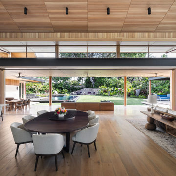
This open room, crowned by a walkaround loft overhead, unfolds as a breathtaking haven where the lush woodlands of Hawaii become an integral part of your living experience. Here, professional interior design reveals its true artistry, crafting an ongoing dialogue between the tranquil indoor sanctuary and the vibrant natural world just beyond. The space balances calm and sophistication with beauty and grace, inviting you to immerse yourself in the serenity that surrounds you while you remain enveloped in refined luxury.
Thoughtfully curated furnishings inside and out extend an alluring invitation to host a myriad of moments. From lively Friday night pool parties under the tropical sky to intimate social gatherings bathed in soft, natural light. Each element, selected with subtlety and purpose, enriches the feeling of harmony between the home's exquisite interiors and the boundless outdoor splendor.
Sponsored
Plain City, OH

The Creative Kitchen Company
Columbus Area Kitchen Remodeling and Refacing Professional

 JEB Design/Build
The living room's exposed beams were a great feature even before renovation. Updating the room's color palette, opening up the kitchen to integrate it with the dining area as part of a great room, and reflooring the whole room with engineered wood put new flesh on existing (really great) bones.
Pictures by Neil Johnson Photography

 Alair Homes Plano
The client's master suite was dark with outdated wallpaper. They wanted the vanity with the floating mirrors to remain the focal point of the bathroom, so for the most part, the layout stayed the same. We went in, removed all finishes and started over; keeping with the style of the house. Grand Mirrors with integrated lighting were installed over the center vanities. The only change in the layout was that the bath tub was removed and replaced shower. The shower was lined with solid white marble tiles and accented with a cool Valentino parquet marble. The old shower became a linen storage closet and cabinets for additional storage. The lower cabinets are a deep espresso finish with contrasting linen finished cabinets up top. The door to the water closet was replaced with a pocket door, creating more space.
The guest bathroom felt claustrophobic with the wall between the vanity and toilet/shower area. We removed the wall and used a pony wall at the end of the vanity instead to hide the toilet. Being a guest bath there was no need double sinks, so one was removed, increasing the cabinet space. The crown molding stayed but the popcorn ceiling texture was removed in both bathrooms. The clients love their new sleek, brighter bathrooms.
Design/Remodel by Hatfield Builders & Remodelers | Photography by Versatile Imaging

 Donald Lococo Architects
Subsequent additions are covered with living green walls to deemphasize stylistic conflicts imposed on a 1940’s Tudor and become backdrop surrounding a kitchen addition. On the interior, further added architectural inconsistencies are edited away, and the language of the Tudor’s original reclaimed integrity is referenced for the addition. Sympathetic to the home, windows and doors remain untrimmed and stark plaster walls contrast the original black metal windows. Sharp black elements contrast fields of white. With a ceiling pitch matching the existing and chiseled dormers, a stark ceiling hovers over the kitchen space referencing the existing homes plaster walls. Grid members in windows and on saw scored paneled walls and cabinetry mirror the machine age windows as do exposed steel beams. The exaggerated white field is pierced by an equally exaggerated 13 foot black steel tower that references the existing homes steel door and window members. Glass shelves in the tower further the window parallel. Even though it held enough dinner and glassware for eight, its thin members and transparent shelves defy its massive nature, allow light to flow through it and afford the kitchen open views and the feeling of continuous space. The full glass at the end of the kitchen reveres a grouping of 50 year old Hemlocks. At the opposite end, a window close to the peak looks up to a green roof.
 kimberly peck architect
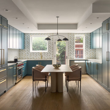
This landmarked brownstone on Prospect Park West already had extraordinary bones—and the rare advantage of windows on three sides. That natural light allowed us to rethink the traditional parlor-floor layout into something more open, connected, and reflective of the way the family lives today, while still honoring the building’s historic character.
The original sequence—a front parlor, a formal dining room in the center, and a closed-off kitchen at the rear—was replaced with a single, flowing main level anchored by a generous slate-blue kitchen. The cabinetry forms a C-shaped configuration that maximizes storage, creates a natural dining zone, and maintains easy circulation to the backyard through the existing glass French door. A full-height marble backsplash with brass inlay adds subtle drama, extending to the ceiling around the windows, and a built-in desk niche creates a casual workspace that feels fully integrated into the design.
Because storage was a priority, the kitchen includes multiple pantry cabinets and deep pull-outs to keep daily life efficient and uncluttered.
The living room now occupies the center of the plan, serving as a shared hub between the kitchen and the front of the home. Just inside the entry, we designed a custom reading nook framed by floor-to-ceiling bookcases with integrated bench seating—an intentional space for the couple and their teenage daughter, who value reading and wanted their books to be both displayed and actively used.
The entry itself was also reimagined. Now separated from the main living space by a wall and door, it functions as a true vestibule with a built-in storage wall for coats and shoes. Tucked beside it is a playful powder room featuring a green vanity, floral wallpaper, and a grey-and-white mosaic tile floor—continued throughout the entry to visually tie the front of the house together and add a moment of personality within the historic shell.
The result is a garden level that remains rooted in its 19th-century architecture but fully supports modern life—light-filled, functional, and thoughtfully layered.
Sponsored
Delaware, OH

Buckeye Basements, Inc.
Central Ohio's Basement Finishing ExpertsBest Of Houzz '13-'21
 PASS26 - Engineering & Design
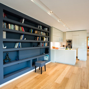
Spridon - simple modern house, blending in the surrounding
The building consists of a 75m² ground floor and a 35m² basement. It is a radical reconstruction of an old country house, from which only the basement frame and frame elements on the ground floor were kept.
The design intention was to create a space characterized by transparency so that the greenery in which it is integrated is perceived to the maximum from the interior of the space. This is achieved with the addition of a metal frame structure and energy efficient glass shell.
Due to the orientation of the building, which was a basic object of the study, the sun is not hitting directly inside the ground floor, which however remains pleasantly illuminated throughout the day. Evening and night hours are the most flattering depicting the glowing character of the structure. Existing elements and new frame were covered by metal panel. In the bedroom a glass space has been created for reading and meditation, with direct view to the thick greenery.
On the whole the building is equipped with hi-tech mechanical systems controlling heating-cooling, electric installation, lights, curtains etc. It is very high in terms of energy efficiency due to heating pumps systems, insulation and energy glass shell.
 Drury Design
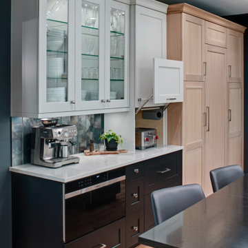
The original intent of this project was to replace the island, hood, countertops, and a few appliances. A primary bath remodel was the main priority. But once the couple realized certain features would enhance the functionality of the kitchen – not to mention completely change the aesthetic – they put the master bath on hold and decided to remodel the entire kitchen first.
Design objectives:
-Omit separate table, plan for a larger island that would seat 7 people
-Simple, clean lines – no rounded corners or weird angles
-Nothing trendy – use modern classic details
-Uncluttered countertops
-Better pantry storage for food & small appliances
-Integrated major appliances
-Coffee bar
-Avoid “1 color on perimeter with second color on island”
-Integrate a harmonious variety of finishes
-Integrate black & handmade metals
Design challenges:
-Island shape to fit within confines of existing half wall between kitchen & family room & bay window/door to backyard
-Narrow kitchen with major walkway
-Planning for 7 seats at the island
-Keep guest social area away from the cook’s zone
-Place appliances according to use
-Point-of-use storage for an avid cook within a relatively small space
-Integrate colors without looking too busy
THE NEW KITCHEN
-While the island is mostly rectangular, the seating area utilizes the bay extension without interfering with the exterior door
-All seating is placed on the outside perimeter of the island, giving the cook dedicated prep space
-The L-shaped seating area & adjacent coffee bar encourage guests to gather on the outside edge of the kitchen where they can still interact with the cook
-Island prep space includes 5 feet of versatile drawer storage, double waste basket and an open paper towel dispenser
-One pantry designated for food; the other for small appliances & bulk storage; creates visual armoire look
-Microwave drawer in island faces refrigerator for easy access & less interference with cook’s zone
-Appliance garages avoid clutter on the countertops
-Off-white upper cabinets make the kitchen look larger while the black bases offer contrast without closing in the space
Once the client committed to remodeling her entire kitchen, she had a good idea of the direction she wanted the space to take. Even so, there were many details that remained open to explore & contemplate. The end result is modern, clean and ultimately transitional – a creative vision anchored in functionality and artistry!
A powder room remodel was added to the project that beautifully compliments the kitchen aesthetic. The entire staircase, all trim & doors were painted in the same tones as the kitchen, transforming the entire first floor into a cohesive & welcoming space. It was a great collaborative partnership!

 Spaces Renewed
This is a stunning modern kitchen. Sometimes, contemporary design can feel cold or sterile. This kitchen sets itself apart by adding color, warmth, and custom design elements that remain true to modern aesthetic but add in character and personality. The extra tall upper cabinets add height and drama to the space. The glass inserts at the top have lighted interiors which serve as storage and display areas. The Crown molding continues over the stainless hood, bridging the nearly 4 foot gap between the two sides. The grey accent color on the wall cabinets is echoed at the large kitchen island. The soft white perimeter color serves as a great anchor for the bold grey accent. The granite stays true to the color scheme with its white base and grey and black veining. The back splash is a grey vein cut limestone. The glass inset tiles offer color and shine to the subway limestone. At the hood area, the pattern switches to herringbone, but maintains the glass accent. By using the same tile and simply changing the format, we add visual interest to the space without creating competing elements. The built in window seat is both practical and serves a visual purpose. An overly long counter can feel industrial or boring. The height variation added at the desk and window seat break up the long expanse while adding function. The wood plank floor is actually porcelain tile. Porcelain tile is easier to maintain than wood, and holds up better in heavy traffic or water environments, such as kitchen. The exposed end of the upper cabinets have door panels integrated to the sides. Instead of a 5 foot flat side, the decorative false door adds dimension and character.
59