
Search results for "Remodeling experience" in Home Design Ideas


 Raywal Cabinets
Kitchen Cabinets:
Forest Hill, MDF, Glacier White with Grey Brush Stroke
Island:
Forest Hill, Maple, Persian Grey
Handles Raywal Option: #241
Inspiration for a large transitional galley eat-in kitchen remodel in Toronto with raised-panel cabinets, white cabinets and an island
Inspiration for a large transitional galley eat-in kitchen remodel in Toronto with raised-panel cabinets, white cabinets and an island

 The Artisans Group, Inc.
Winner of the 2018 Tour of Homes Best Remodel, this whole house re-design of a 1963 Bennet & Johnson mid-century raised ranch home is a beautiful example of the magic we can weave through the application of more sustainable modern design principles to existing spaces.
We worked closely with our client on extensive updates to create a modernized MCM gem.
Extensive alterations include:
- a completely redesigned floor plan to promote a more intuitive flow throughout
- vaulted the ceilings over the great room to create an amazing entrance and feeling of inspired openness
- redesigned entry and driveway to be more inviting and welcoming as well as to experientially set the mid-century modern stage
- the removal of a visually disruptive load bearing central wall and chimney system that formerly partitioned the homes’ entry, dining, kitchen and living rooms from each other
- added clerestory windows above the new kitchen to accentuate the new vaulted ceiling line and create a greater visual continuation of indoor to outdoor space
- drastically increased the access to natural light by increasing window sizes and opening up the floor plan
- placed natural wood elements throughout to provide a calming palette and cohesive Pacific Northwest feel
- incorporated Universal Design principles to make the home Aging In Place ready with wide hallways and accessible spaces, including single-floor living if needed
- moved and completely redesigned the stairway to work for the home’s occupants and be a part of the cohesive design aesthetic
- mixed custom tile layouts with more traditional tiling to create fun and playful visual experiences
- custom designed and sourced MCM specific elements such as the entry screen, cabinetry and lighting
- development of the downstairs for potential future use by an assisted living caretaker
- energy efficiency upgrades seamlessly woven in with much improved insulation, ductless mini splits and solar gain
Find the right local pro for your project
 The Artisans Group, Inc.
Winner of the 2018 Tour of Homes Best Remodel, this whole house re-design of a 1963 Bennet & Johnson mid-century raised ranch home is a beautiful example of the magic we can weave through the application of more sustainable modern design principles to existing spaces.
We worked closely with our client on extensive updates to create a modernized MCM gem.
Extensive alterations include:
- a completely redesigned floor plan to promote a more intuitive flow throughout
- vaulted the ceilings over the great room to create an amazing entrance and feeling of inspired openness
- redesigned entry and driveway to be more inviting and welcoming as well as to experientially set the mid-century modern stage
- the removal of a visually disruptive load bearing central wall and chimney system that formerly partitioned the homes’ entry, dining, kitchen and living rooms from each other
- added clerestory windows above the new kitchen to accentuate the new vaulted ceiling line and create a greater visual continuation of indoor to outdoor space
- drastically increased the access to natural light by increasing window sizes and opening up the floor plan
- placed natural wood elements throughout to provide a calming palette and cohesive Pacific Northwest feel
- incorporated Universal Design principles to make the home Aging In Place ready with wide hallways and accessible spaces, including single-floor living if needed
- moved and completely redesigned the stairway to work for the home’s occupants and be a part of the cohesive design aesthetic
- mixed custom tile layouts with more traditional tiling to create fun and playful visual experiences
- custom designed and sourced MCM specific elements such as the entry screen, cabinetry and lighting
- development of the downstairs for potential future use by an assisted living caretaker
- energy efficiency upgrades seamlessly woven in with much improved insulation, ductless mini splits and solar gain

 ADM Bathroom
The SW-110S is a relatively small bathtub with a modern curved oval design. All of our bathtubs are made of durable white stone resin composite and available in a matte or glossy finish. This tub combines elegance, durability, and convenience with its high quality construction and chic modern design. This cylinder shaped freestanding tub will surely be the center of attention and will add a modern feel to your new bathroom. Its height from drain to overflow will give you plenty of space and comfort to enjoy a relaxed soaking bathtub experience.
Item#: SW-110S
Product Size (inches): 63 L x 31.5 W x 21.3 H inches
Material: Solid Surface/Stone Resin
Color / Finish: Matte White (Glossy Optional)
Product Weight: 396.8 lbs
Water Capacity: 82 Gallons
Drain to Overflow: 13.8 Inches
FEATURES
This bathtub comes with: A complimentary pop-up drain (Does NOT include any additional piping). All of our bathtubs come equipped with an overflow. The overflow is built integral to the body of the bathtub and leads down to the drain assembly (provided for free). There is only one rough-in waste pipe necessary to drain both the overflow and drain assembly (no visible piping). Please ensure that all of the seals are tightened properly to prevent leaks before completing installation.
If you require an easier installation for our free standing bathtubs, look into purchasing the Bathtub Rough-In Drain Kit for Freestanding Bathtubs.

 FineLine Kitchens, Inc.
Hi everyone, I'm Sarah and Ogun we are here with fine line kitchens. So we are a couple working together. I do the interior design and remodeling of the space material selection meeting with the clients. And I handled operations outside, you know meaning all the construction work that is taking place the inside. The houses that we work in. I handle all the aspects of the construction, so today's project is very special. We're in Vienna and the client had a very big family. It's a family of seven that lives here. So we had a few aspects that we needed to keep in mind while designing this one. Having everybody be able to sit on the island. So we wanted plenty of seating all the way around. We didn't want anybody standing or anything like that. So what we did is we maximize the space. The center island is the biggest part of the kitchen. We use a natural stone to kind of give it a beautiful texture versus quartz. It's kind of standard white or kind of fabricated, so I wanted something very natural. We did this because I took my inspiration from the outside, so the inspiration if you look at the view right in front of me is there are so many greens there's a lot of brass accents and I wanted to bring this. Into this kitchen while designing it for my clients. She is very warm very. She wanted a very homey, comfy kind of look for the kitchen. So that's what we did today. As you can see, the cabinets are sage green, very light, so I still think it's a neutral, but it's a lighter color that again brings the outside in and we combine that with the oak right behind me so it's a slightly warm oak. It's not very dark. It's not very light. It's a medium brown and the same color went on the island. To kind of tie these two in and the backsplash, my favorite part is where you can see a little bit of design. It is, in my opinion still classic, but includes a pattern so the outside part is as we said in the beginning, is handled by my husband. I'd like him to speak a little bit about that. Thanks, Sarah, I want to talk to you guys a little bit about the construction part of this project. Originally this kitchen was located mostly in this area. They had their stove there sing. It was more of a peninsula layout in Sarah's and the customer vision they wanted. They wanted to get rid of the peninsula and they want to be able to have a huge island that can at least sit seven people because they're familiar with seven. So we wanted to make sure that we can achieve this design and bring it to life so that they can be happy with this layout. Some of the challenges we had, the house, the home being, you know, old home. There were a lot of you know the older electrical and plumbing that had to be replaced. We had to relocate the stove from here to this area. Over here we had put a nice foot fan that we had to relocate all the ductwork and the plumbing. Was being on the peninsula area. We had to relocate it to the center islands. So we achieved all this and kind of like bring it to bring in this kitchen up to date it looks beautiful. That's true, so yes, the old layout did not function for my clients because everything was kind of gathered on one side of the kitchen. So there was like a peninsula right there. So the end of this island kind of continued straight. And that was just the L shape. Kind of where everything was and there used to be another big table here, so they were using only kind of half of the space. So like I said at the beginning, our vision was to kind of feed everybody at the island, create some symmetry. 'cause I love that. So as you can see behind me, this is kind of the focal point symmetrical. Everything is kind of even we wanted to also panel the fridge here so it mimics the pantry and another size. So when you're looking at it, it is bringing again that symmetry back again. I hope you enjoyed this kitchen and this video and I'll see you soon. So how do you think this project turned out? It's nice. I like the color. I think it turned out nice. It's kind of like a little bit different color than what we always do. So I realize. Are you giving me a little bit of credit here that I did something different? Are you proud? I'm so proud of you. Other than that I like it. That they have kind of like a two sink. So if this was our kitchen, if we ever like you can have your own. I can have mine if we ever get into a fight then this can be like my own kitchen. Why are we gonna bring in a fight right now? So I'm cooking anyway. You're grilling most of the time, So what are you even talking about? My kitchen? That's my kitchen. You can just take the small sink. That's fine. It's always good to have your own space right there, so anyways. Thank you guys for watching. We hope to see you soon and if you have any questions please click the link below. It'll lead you to our website, house, YouTube and all of the social media is so nice to have you guys. We'll see you soon. Thanks bye bye-bye.

 Dave Fox Design Build Remodelers
This project involved converting a partially finished basement into an ultimate media room with an English pub. The family is big on entertaining and enjoys watching movies and college football. It was important to combine the media area with the pub to create options for guests within the same space. Although the home has a full sized basement the staircase was centrally located, which made it difficult for special configuration. As a result, we were able to work with the existing plan be designing a media area large enough for a sectional sofa and additional seating with the English pub at the far end of the room.
The home owner had a projection screen on a bare wall with the electrical components stacked on boxes. The new plan involved installing new cabinets to accommodate components and surround the screen to give it a built-in finish. Open shelving also allows the homeowner to feature some of their collectible sports memorabilia. As if the 130 inch projection screen wasn’t large enough, the surround sound system makes you feel like you are part of the action. It is as close to the I MAX viewing experience as you are going to get in a home. Sound-deadening insulation was installed in the ceiling and walls to prevent noise from penetrating the second floor.
The design of the pub was inspired by the home owner’s favorite local pub, Brazenhead. The bar countertop with lift-top entrance was custom built by our carpenters to simulate aged wood. The finish looks rough, but it is smooth enough to wipe down easily. The top encloses the bar and provides seating for guests. A TV at the bar allows guest to follow along with the game on the big screen or tune into another game. The game table provides even another option for entertainment in the media room. Stacked stone with thick mortar joints was installed on the face of the bar and to an opposite wall containing the entrance to a wine room. Hand scrapped hardwood floors were installed in the pub portion of the media room to provide yet another touch to “Brazenhead” their own pub.
The wet bar is under a soffit area that continues into the media area due to existing duct work. We wanted to creatively find a way to separate the two spaces. Adding trim on the ceiling and front of soffit at the bar defined the area and made a great transition from the drywall soffit to the wet bar. A tin ceiling was installed which added to the ambience of the pub wet bar and further aided in defining the soffit as an intentional part of the design. Custom built wainscoting borders the perimeter of the media room. The end result allows the client to comfortably entertain in a space designed just for them.
Sponsored
Westerville, OH

Custom Home Works
Franklin County's Award-Winning Design, Build and Remodeling Expert

 River Valley Landscapes
The property is one of the original farm houses located on the main street of a small town. It has been in the family for many years and our client just inherited the property. They were trying to have balance of preserving the old while realizing modern day living has its benefits too. The house had a large addition added using mostly old style materials, but designed with function and modern day luxuries. Our goal was to carry that theme to the outside.
Our first problem we had to address was how to transition between the first floor elevation changes. The lower room was the husband’s office. He stated in the future he may have clients over and it would be nice to have an area to sit outside. The wife’s main concern was to renew the four corner garden. She also felt it was very important to be able to see it from the kitchen area. Finally there was an old wishing well stuck right outside the kitchen. They both felt it would be neat to be able to incorporate this in some how. They wanted a patio area with a built in grill to accommodate there family and friends. They also wanted to keep a large play area for the kids.
We were able to pull this off successfully. We addressed the first issue by having a small lower level flagstone area. This area is large enough for 1 to 2 people to sit comfortably. It also provides a transition from his office to the larger patio area. We installed a simple small gravel sitting area opposite of the main patio. This provides our client a secluded place to relax or do business. Mrs.... told me she is amazed how much her and her husband enjoys this area. It is so peaceful looking at the small creek over a glass of wine.
We built a natural limestone retaining wall to create the patio terrace. The stone was chosen to extend the houses architectural elements into the landscape. Irregular broken flagstone was used to give it a more casual feel. We installed three Serviceberries into the patio terrace to replace some trees that were taken down during the remodeling. She was very concern that they would block the view of the four corner garden. We new they were crucial to nestle in the terrace, so we placed them for a couple days for her to decide. Fortunately she agreed they not only kept the view open, but helped frame the garden.
The four corner garden was designed to be viewed from afar and experienced up close. We wanted the space to have some formal structure while keeping with the casual farm house feel. Another natural limestone retaining wall was created. This leveled the garden terrace and helped associate it with the rest of the property. The four corner garden is nestled into the existing woods edge. This provides three distinct experiences to entering the garden; a more formal from the driveway, an open feel from the lower lawn, and a more natural / casual experience from the wooded area. The Plymouth brown gravel was used for the center of the garden. This helped highlight the stone post that was found during construction. The gravel also brings the sense of sound into the garden space. Lamb’s ear was chosen as a fun way to get kids interest in horticulture.
The balance of using the new to create the old feel is what makes this project a success. The property has already hosted a local historical society event and won an award for its preservation efforts. When Mrs.... can’t find her husband, she knows he is either reading the newspaper by the grill or resting in the hammock along the wood’s path.

 Owings Brothers Contracting
Modern Aire PS 16 commercial exhaust fan with an application that keeps the hood close to the ceiling and vents through the roof.
Curtis Martin Photography

 User
UserThe Clients contacted Cecil Baker + Partners to reconfigure and remodel the top floor of a prominent Philadelphia high-rise into an urban pied-a-terre. The forty-five story apartment building, overlooking Washington Square Park and its surrounding neighborhoods, provided a modern shell for this truly contemporary renovation. Originally configured as three penthouse units, the 8,700 sf interior, as well as 2,500 square feet of terrace space, was to become a single residence with sweeping views of the city in all directions.
The Client’s mission was to create a city home for collecting and displaying contemporary glass crafts. Their stated desire was to cast an urban home that was, in itself, a gallery. While they enjoy a very vital family life, this home was targeted to their urban activities - entertainment being a central element.
The living areas are designed to be open and to flow into each other, with pockets of secondary functions. At large social events, guests feel free to access all areas of the penthouse, including the master bedroom suite. A main gallery was created in order to house unique, travelling art shows.
Stemming from their desire to entertain, the penthouse was built around the need for elaborate food preparation. Cooking would be visible from several entertainment areas with a “show” kitchen, provided for their renowned chef. Secondary preparation and cleaning facilities were tucked away.
The architects crafted a distinctive residence that is framed around the gallery experience, while also incorporating softer residential moments. Cecil Baker + Partners embraced every element of the new penthouse design beyond those normally associated with an architect’s sphere, from all material selections, furniture selections, furniture design, and art placement.
Barry Halkin and Todd Mason Photography
 Built by Krueger
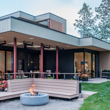
Tucked beneath the deck, this intimate outdoor lounge features built-in bench seating surrounding a sleek fire feature. Recessed heaters overhead extend the comfort year-round, while clean steel lines and natural wood finishes create a modern yet inviting retreat. Designed for connection, the space glows with warmth and purpose day or night.

 Our Town Plans
Richard Leo Johnson
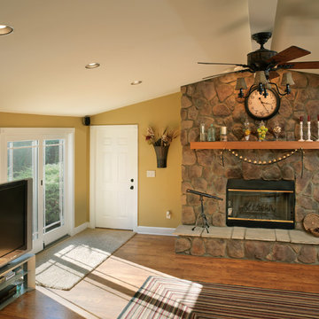
Family room - rustic loft-style family room idea in Atlanta with beige walls
Family room - rustic loft-style family room idea in Atlanta with beige walls



 Blackband Design
This Coastal Inspired Farmhouse with bay views puts a casual and sophisticated twist on beach living.
Interior Design by Blackband Design and Home Build by Arbor Real Estate.

 Lars Remodeling & Design
The goal for this Point Loma home was to transform it from the adorable beach bungalow it already was by expanding its footprint and giving it distinctive Craftsman characteristics while achieving a comfortable, modern aesthetic inside that perfectly caters to the active young family who lives here. By extending and reconfiguring the front portion of the home, we were able to not only add significant square footage, but create much needed usable space for a home office and comfortable family living room that flows directly into a large, open plan kitchen and dining area. A custom built-in entertainment center accented with shiplap is the focal point for the living room and the light color of the walls are perfect with the natural light that floods the space, courtesy of strategically placed windows and skylights. The kitchen was redone to feel modern and accommodate the homeowners busy lifestyle and love of entertaining. Beautiful white kitchen cabinetry sets the stage for a large island that packs a pop of color in a gorgeous teal hue. A Sub-Zero classic side by side refrigerator and Jenn-Air cooktop, steam oven, and wall oven provide the power in this kitchen while a white subway tile backsplash in a sophisticated herringbone pattern, gold pulls and stunning pendant lighting add the perfect design details. Another great addition to this project is the use of space to create separate wine and coffee bars on either side of the doorway. A large wine refrigerator is offset by beautiful natural wood floating shelves to store wine glasses and house a healthy Bourbon collection. The coffee bar is the perfect first top in the morning with a coffee maker and floating shelves to store coffee and cups. Luxury Vinyl Plank (LVP) flooring was selected for use throughout the home, offering the warm feel of hardwood, with the benefits of being waterproof and nearly indestructible - two key factors with young kids!
For the exterior of the home, it was important to capture classic Craftsman elements including the post and rock detail, wood siding, eves, and trimming around windows and doors. We think the porch is one of the cutest in San Diego and the custom wood door truly ties the look and feel of this beautiful home together.

 So Cal Builders & Design
Adding new maser bedroom with master bathroom to existing house.
New walking shower with frameless glass door and rain shower head.
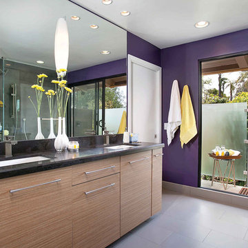
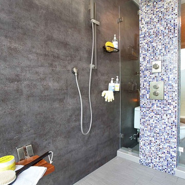
Doorless shower - large contemporary master white tile and marble tile slate floor, black floor and double-sink doorless shower idea in Los Angeles with white cabinets, a two-piece toilet, an undermount sink, marble countertops, gray countertops, blue walls, furniture-like cabinets, a niche and a built-in vanity
Doorless shower - large contemporary master white tile and marble tile slate floor, black floor and double-sink doorless shower idea in Los Angeles with white cabinets, a two-piece toilet, an undermount sink, marble countertops, gray countertops, blue walls, furniture-like cabinets, a niche and a built-in vanity


Sponsored
Columbus, OH

Structural Remodeling
Franklin County's Heavy Timber Specialists | Best of Houzz 2020!
 Dave Fox Design Build Remodelers
This project involved converting a partially finished basement into an ultimate media room with an English pub. The family is big on entertaining and enjoys watching movies and college football. It was important to combine the media area with the pub to create options for guests within the same space. Although the home has a full sized basement the staircase was centrally located, which made it difficult for special configuration. As a result, we were able to work with the existing plan be designing a media area large enough for a sectional sofa and additional seating with the English pub at the far end of the room.
The home owner had a projection screen on a bare wall with the electrical components stacked on boxes. The new plan involved installing new cabinets to accommodate components and surround the screen to give it a built-in finish. Open shelving also allows the homeowner to feature some of their collectible sports memorabilia. As if the 130 inch projection screen wasn’t large enough, the surround sound system makes you feel like you are part of the action. It is as close to the I MAX viewing experience as you are going to get in a home. Sound-deadening insulation was installed in the ceiling and walls to prevent noise from penetrating the second floor.
The design of the pub was inspired by the home owner’s favorite local pub, Brazenhead. The bar countertop with lift-top entrance was custom built by our carpenters to simulate aged wood. The finish looks rough, but it is smooth enough to wipe down easily. The top encloses the bar and provides seating for guests. A TV at the bar allows guest to follow along with the game on the big screen or tune into another game. The game table provides even another option for entertainment in the media room. Stacked stone with thick mortar joints was installed on the face of the bar and to an opposite wall containing the entrance to a wine room. Hand scrapped hardwood floors were installed in the pub portion of the media room to provide yet another touch to “Brazenhead” their own pub.
The wet bar is under a soffit area that continues into the media area due to existing duct work. We wanted to creatively find a way to separate the two spaces. Adding trim on the ceiling and front of soffit at the bar defined the area and made a great transition from the drywall soffit to the wet bar. A tin ceiling was installed which added to the ambience of the pub wet bar and further aided in defining the soffit as an intentional part of the design. Custom built wainscoting borders the perimeter of the media room. The end result allows the client to comfortably entertain in a space designed just for them.


4