
Search results for "Removable format" in Home Design Ideas

 kimberly peck architect
Photo by Pedro Marti
The client’s hired us to update this small post war apartment which didn’t appear to have ever been renovated since the buildings construction in 1964. The kitchen and bathroom were outdated and were fully gutted. In doing so we decided to open up the apartment in general by removing the wall that separated the kitchen from the living space to create a more open plan. The resulting design is an exercise in ultra-minimalism. The rear wall of the kitchen was outfitted with floor to ceiling cabinetry fit with custom satin lacquer doors and minimal white pulls. The custom paneled refrigerator integrates seamlessly within this wall to create a white backdrop for the kitchen. A peninsula was created opposite to give a work surface and to house the sink and range. Starkly contrasting black metal clad doors were chosen for this run of cabinetry. The unique metal doors have integrated pulls that are cut and folded from the metal cladding. The peninsula is topped in a faux concrete quartz surface. New wide plank walnut flooring was laid throughout the kitchen, living, and bedroom to giving the space a look of continuity. Trim was kept to a minimum, removing from all doors and windows and using only where absolutely necessary at the base of the walls. To achieve the look in the monochromatic bathroom, large format grey porcelain tile was laid in a careful grid; white metal floating shelves and the medicine cabinet were installed to precisely align with both the tile grid and the overhead linear LED fixture.
 Tracy Berman Interiors
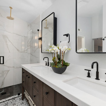
When your primary bathroom isn't large, it's so important to address the storage needs. By taking out the built in tub, and adding in a freestanding tub, we were able to gain some length for our vanity. We removed the dropped soffit over the mirrors and in the shower to increase visual space and take advantage of the vaulted ceiling. Interest was added by mixing the finish of the fixtures. The shower and tub fixtures are Vibrant Brushed Moderne Brass, and the faucets and all accessories are matte black. We used a patterned floor to create interest and a large format (24" x 48") tile to visually enlarge the shower. This primary bath is a mix of cools and warms and is now a high functioning space for the owners.
 Twelve Stones Designs, LLC
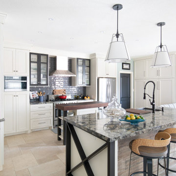
The owners of this kitchen had spent the money to upgrade the finishes in their kitchen upon building the home 12 years ago, but after living in the space for several years they realized how nonfunctional the layout really was. The (then) two preschool aged children had grown into busy, hungry teenagers with many friends who also liked to hang out at the house. So the family needed a more functional kitchen with better traffic flow, space for daily activities revolving around the kitchen at different times of day, and a kitchen that could accommodate cooking for and serving large groups. Furthermore, the dark, traditional finishes no longer reflected the homeowners’ style. They requested a brighter, more relaxed, coastal style that reflected their love of the seaside cities they like to visit.
Originally, the kitchen was U-shaped with a narrow island in the middle. The island created narrow aisles that bottle-necked at the dishwasher, refrigerator, and cooktop areas. There was a pass-through from the foyer into the kitchen, but the owners never liked that the pass-through was also located so close to the powder room. The awkward proximity was unappealing and made guests feel uncomfortable.
The kitchen’s storage was made up of lots of narrow cabinets, apothecary drawers, clipped corner units, and very few drawers. It lacked useful storage for the larger items the family used on a daily basis. And the kitchen’s only pantry was small closet that had only builder-grade, narrow shelving with no illumination to be able to see the contents inside.
Overall, the kitchen’s lighting plan was poorly executed. Only six recessed cans illuminated the entire kitchen and nook areas. The under cabinet lighting was not evenly distributed either. In fact, the builder had mis-placed the under cabinet lighting around the decorative pilasters which made for choppy, dark cubbies. Further, the builder didn’t include any lighting over the sink or the bar area, which meant whoever was doing the dishes was always in their own shadow. That, coupled with the steep overhang of the game room above made the bar area feel like a dim, cavernous space that wasn’t inviting or task oriented. The kitchen looked out into the main living space, but the raised bar and a narrow wall (which held the only large cabinet in the kitchen) created more of a barrier than a relationship to the living room or breakfast nook. In fact, one couldn’t even see the breakfast nook from the cooktop or sink areas due to its orientation. The raised bar top was too narrow to comfortably sit to either dine at or chat from due to the lack of knee space. The the homeowners confided that the kitchen felt more like a dark, dirty prison than place where the family, or their guests, wanted to gather and commune.
The clients' needs and desires were:
➢ to create a kitchen that would be a space the family loved to be in; to relate to the adjacent spaces all around, and to have better flow for entertaining large groups
➢ to remove the walls between the breakfast nook and living area and to be able to utilize the natural light from the windows in both those areas
➢ to incorporate a functional chopping block for prepping fresh food for home cooked meals, an island with a large sink and drain board, 2 pull out trash cans, and seating for at least the 2 teens to eat or do homework
➢ to design a kitchen and breakfast nook with an airy, coastal, relaxed vibe that blended with the rest of the house's coastal theme
➢ to integrate a layered lighting plan which would include ample general illumination, specific task lighting, decorative lighting, and lots of illuminated storage
➢ to design a kitchen with not only more storage for all the husband’s kitchen gadgets and collection of oils and spices, but smart storage, including a coffee/breakfast bar and a place to store and conceal the toaster oven and microwave
➢ to find a way to utilize the large open space between the kitchen, pantry area, and breakfast nook
Twelve Stones Designs achieved the owner's goals by:
➢ removing the walls between the kitchen and living room to allow the natural light to filter in from the adjacent rooms and to create a connection between the kitchen, nook, and living spaces for a sense of unity and communion
➢ removing the existing pantry and designing 3 large pantry style cabinets with LED tape lights and rollout drawers to house lots of kitchen appliances, gadgets, and tons of groceries. We also took the cabinets all the way up to the 9’ ceiling for additional storage for seasonal items and bulk storage.
➢ designing 2 islands - 1 with a gorgeous black walnut chopping block that houses a drawer for chopping and carving knives and a custom double pull out trash unit for point of use utilization - and 1 that houses the dishwasher, a large Blanco Gourmet sink with integrated drain board, woven baskets for fresh root vegetables and kitchen towels, plenty of drawer storage for kitchen items, and bar seating for up to 4 diners.
➢ closing off the space between the kitchen and the powder room to create a beautiful new private alcove for the powder room as well as adding some decorative storage. This also gave us space to include more tall storage near the new range for precision placement of the husband’s extensive oil and spice collection as well as a location for a combo-steam oven the wife wanted for baking and cooking healthy meals.
The project is enhanced functionally by:
➢ incorporated USB and standard receptacles for the kids’ laptops and phone charging in the large island
➢ designing the small island to include additional open shelving for items used on a daily basis such as a variety of bowls, plates, and colanders. This set up also works well for the husband who prefers to “plate” his dinners in restaurant-style fashion before presenting them to the table.
➢ the integration of specific storage units, such as double stacked cutlery drawers, a custom spice pull-out, a Kuerig coffee and tea pod drawer, and custom double stacked utensil drawers
➢ moving the refrigerator to the old oven location - this eliminated the bottle neck as well as created a better relationship to the eating table. It also utilizes the floor space between the pantry, nook, and kitchen
➢ creating a banquet style breakfast nook - this banquette seating not only doubles the amount of seating for large gatherings but it better utilizes the odd space between the kitchen and the previous nook area. It also helps to create a distinct pathway from the mudroom room through the pantry area, kitchen, nook, and living room.
➢ the coffee/breakfast bar area which includes the perfect location for the concealed microwave and toaster oven, convenient storage for the coffee pods and tea accoutrements. Roll-out drawers below also house the smoothie maker, hot water kettle, and a plethora of smoothie-making ingredients such as protein powders, smoothie additives, etc. Furthermore, the drawers below the Keurig house measuring utensil, cutlery, baking supplies and tupperware storage.
➢ incorporating lots of wide drawers and pullouts to accommodate large cookware.
➢ utilizing as much vertical space as possible by building storage to the ceiling which accommodates the family’s abundant amount of serving platters, baking sheets, bakeware, casserole dishes, and additional cutting boards.
The project is enhanced aesthetically by:
➢ new 5-piece Versailles pattern porcelain tile that now seamlessly joins the entire down stairs area together creating a bright, cohesiveness feeling instead of choppy separated spaces - it also adds a coastal feeling
➢ designing a cabinet to conceal the microwave and toaster oven
➢ the coastal influenced light fixtures over the nook table and island
➢ the sandy colors of the Langdon Cambria countertops. The swirling pattern and sparkling quartz pieces remind the homeowner of black-and-tan sandy beaches
➢ the striped banquet seating whose creamy white background and blue-green stripes were the inspiration for the cabinet and wall colors.
➢ All the interior doors were painted black to coordinate with the blacks and grays in the backsplash tile and countertop. This also adds a hint of tailored formality to an otherwise casual space.
➢ the use of WAC's Oculux small aperture LED units for the overhead lighting complimented with Diode LED strips for task lighting under the cabinets and inside the pantry and glass wall cabinets. All of the lighting applications are on separate dimmer switches.
Innovative uses of materials or construction methods by Realty Restoration LLC:
➢ Each 1-1/2” x 3” block of reclaimed end-grain black walnut that makes up the center island chopping block was hand milled and built in the shop. It was designed to look substantial and proportional to the surrounding elements, executed by creating the 4 inch tall top with a solid wood chamfered edge band.
➢ The metal doors on either side of the vent hood were also custom designed for this project and built in the Realty Restoration LLC shop. They are made 1x2, 11-gauge mild steel with ribbed glass. Weighing 60 lbs a piece, heavy duty cabinet hinges were added to support the weight of the door and keep them from sagging.
➢ Under-cabinet receptacles were added along the range wall in order to have a clean, uninterrupted backsplash.
Design obstacles to overcome:
➢ Because we were removing the demising walls between the kitchen and living room, we had to find a way to plumb and vent the new island. We did this by tunneling through the slab (the slab had post tension cables which prevented us from just trenching) to run a new wet vent through a nearby structural wall. We pulled the existing hot and cold lines between upper floor joists and ran them down the structural wall as well and up through a conduit in the tunnel.
➢ Since we were converting from wall overs to a gas range it allowed us to utilize the 220 feed for the wall ovens to provide a new sub panel for all the new kitchen circuits
➢ Due to framing deficiencies inherited from the original build there was a 1-1/2” differential in the floor-to-ceiling height over a 20 foot span; by utilizing the process of cutting and furring coupled with the crown moulding details on the cabinet elevations we were able to mask the problem and provide seamless transitions between the cabinet components.
Evidence of superior craftsmanship:
➢ uniquely designed, one-of-a-kind metal “X” end panels on the large island. The end panels were custom made in the Realty Restoration LLC shop and fitted to the exact dimensions of the island. The welding seams are completely indistinguishable - the posts look like they are cut from a single sheet of metal
➢ square metal posts on the small island were also custom made and designed to compliment and carry through the metal element s throughout the kitchen
➢ the beautiful, oversized end panels on the pantry cabinets which give the breakfast nook a tailored look
➢ integrating a large format 5 piece Versailles tile pattern to seamlessly flow from the existing spaces into the new kitchen space
➢ By constructing a custom cabinet that jogged around a corner we could not remodel (housing the entry way coat closet) we were able to camouflage the adjacent wall offset within the upper and lower cabinets. By designing around the existing jog in the structural walls we accomplished a few things: we were able to find the space to house, and hide, the microwave and toaster oven yet still have a clean cohesive appearance from the kitchen side. Additionally, the owners were able to keep their much needed coat closet and we didn’t have to increase the budget with unnecessary structural work.
Find the right local pro for your project

 Chester County Kitchen & Bath
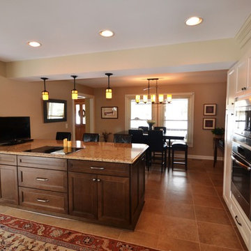
This was a great kitchen transformation with great clients. The original kitchen was dark and closed in. We removed a support column and added a new steel beam so the dining area could be fully open to the kitchen space. We enlarged the opening in between the front room and kitchen to further open the space. Adding a large new window bump out behind the sink added the illusion of extra space as well as allowing great natural light and beautiful views of the property. The clients wanted simple lines and warm tones so we chose the Tacoma door style by Fieldstone cabinetry in cherry wood with a butterscotch finish. The Kashmir Gold granite countertops have a great natural pallet of colors that tie the whole look together. The new stainless chimney vent hood with adjacent floating shelves add to the clean open feel. The large format tile back splash from Porcelanosa Tile provide a great seamless look to the back wall. The original tired wood flooring was refinished and brought back to life showing all the great natural character with the new lighter brighter finish.
 Tracy Berman Interiors
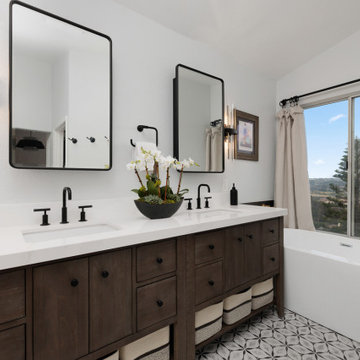
When your primary bathroom isn't large, it's so important to address the storage needs. By taking out the built in tub, and adding in a freestanding tub, we were able to gain some length for our vanity. We removed the dropped soffit over the mirrors and in the shower to increase visual space and take advantage of the vaulted ceiling. Interest was added by mixing the finish of the fixtures. The shower and tub fixtures are Vibrant Brushed Moderne Brass, and the faucets and all accessories are matte black. We used a patterned floor to create interest and a large format (24" x 48") tile to visually enlarge the shower. This primary bath is a mix of cools and warms and is now a high functioning space for the owners.

 Tile Lines
We completely revamped this bathroom, replacing everything.
The vertical mosaic stripes on the walls tie everything together with a blend of stainless steel, grey limestone, white marble, and grey glass. The walls and floor are 12x24" porcelain tiles (grouted with QuartzLock 2 urethane grout). The back/feature wall is polished to help reflect more light.
The espresso cabinet is topped with a 2cm Calcatta marble slab, brushed nickel faucet, and a Ronbow glass vessel sink. The countertop is lit from below so that it glows when the main lights are off.
The mirror was found in a thrift shop and lightly polished to remove damage.
 place architecture:design
Clean lines and a refined material palette transformed the Moss Hill House master bath into an open, light-filled space appropriate to its 1960 modern character.
Underlying the design is a thoughtful intent to maximize opportunities within the long narrow footprint. Minimizing project cost and disruption, fixture locations were generally maintained. All interior walls and existing soaking tub were removed, making room for a large walk-in shower. Large planes of glass provide definition and maintain desired openness, allowing daylight from clerestory windows to fill the space.
Light-toned finishes and large format tiles throughout offer an uncluttered vision. Polished marble “circles” provide textural contrast and small-scale detail, while an oak veneered vanity adds additional warmth.
In-floor radiant heat, reclaimed veneer, dimming controls, and ample daylighting are important sustainable features. This renovation converted a well-worn room into one with a modern functionality and a visual timelessness that will take it into the future.
Photographed by: place, inc


 Renovisions
Every successful bath project starts with the right design plan and for this teen’s bathroom, creating a stylish space reflecting their personalities was a must.
Safety features, good lighting and proper ventilation improved the usability and enhanced the space for these young adults. We recommended a vent fan that not only removes unwanted moisture but also can stream their favorite music from their smart phones Bluetooth so that the phones can stay safe and dry in a nearby room.
Transitional larger format tile in a neutral grey tone, unique and decorative glass tile and brushed nickel edging around the shower cubby added an element of dimension and style. The decorative tile created a stunning focal-point to the back wall of the shower and complimented the brushed nickel fixtures and tending finishes of the white quartz countertop and grey-blend porcelain plank flooring.
 Chester County Kitchen & Bath
This was a great kitchen transformation with great clients. The original kitchen was dark and closed in. We removed a support column and added a new steel beam so the dining area could be fully open to the kitchen space. We enlarged the opening in between the front room and kitchen to further open the space. Adding a large new window bump out behind the sink added the illusion of extra space as well as allowing great natural light and beautiful views of the property. The clients wanted simple lines and warm tones so we chose the Tacoma door style by Fieldstone cabinetry in cherry wood with a butterscotch finish. The Kashmir Gold granite countertops have a great natural pallet of colors that tie the whole look together. The new stainless chimney vent hood with adjacent floating shelves add to the clean open feel. The large format tile back splash from Porcelanosa Tile provide a great seamless look to the back wall. The original tired wood flooring was refinished and brought back to life showing all the great natural character with the new lighter brighter finish.
 Chester County Kitchen & Bath
This was a great kitchen transformation with great clients. The original kitchen was dark and closed in. We removed a support column and added a new steel beam so the dining area could be fully open to the kitchen space. We enlarged the opening in between the front room and kitchen to further open the space. Adding a large new window bump out behind the sink added the illusion of extra space as well as allowing great natural light and beautiful views of the property. The clients wanted simple lines and warm tones so we chose the Tacoma door style by Fieldstone cabinetry in cherry wood with a butterscotch finish. The Kashmir Gold granite countertops have a great natural pallet of colors that tie the whole look together. The new stainless chimney vent hood with adjacent floating shelves add to the clean open feel. The large format tile back splash from Porcelanosa Tile provide a great seamless look to the back wall. The original tired wood flooring was refinished and brought back to life showing all the great natural character with the new lighter brighter finish.

 MRF Construction, Inc.
A new bathroom was designed using the same space, and allowing for a large curbless shower, two generous sink vanities and a large storage cabinet. An unused soaking tub was removed to make space for the new layout.
The new shower is spacious and refreshing, with a large window with etched glass, a curb-less and door-less entry and a barely noticeable infinity drain all adding to the openness. Large satin-etched glass panels were installed with shower door hardware over the large window to welcome light while protecting the window from splash and providing privacy.

 Shade And Shutter Systems, Inc
This Rolling Shutter System was lifted into soffits and has removable soffit covers for maintenance.
Rolling Shutters are the ultimate solution when you want to protect what’s behind your windows and doors. With Rolling Shutters, enjoy peace of mind knowing that your home has a sturdy layer of hurricane protection and storm protection.
Rolling shutters shield against wind-blown debris, sand blasting and water penetration. Strong, secure, and durable, Rolling Hurricane Shutters are proven to reduce energy and maintenance costs while making your home more comfortable to live in.
Rolling Shutters can be retrofitted to existing openings or built-in to almost any format of design.

 San Luis Kitchen Co.
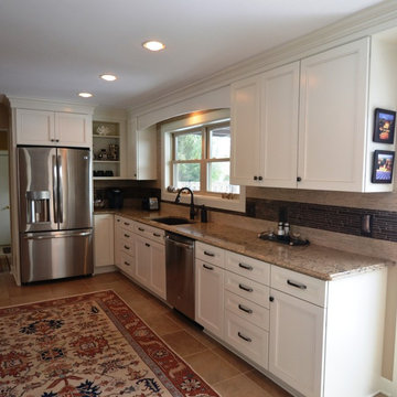
A truly soft contemporary look using Brookhaven cabinetry -- clean lines without fuss mix with warm colors and light wood finishes for an inviting whole. A kitchen that you want to cook in. We combined the kitchen entry and pass-thru into one big opening, removing the short hanging cabinets and adding a bar peninsula, to create an open plan kitchen/dining/living area. Next, we moved the refrigerator down, centering it on the wall, removing it from its former cramped corner position. On either side of the refrigerator the homeowner’s wife requested extra wide (42”) deep drawers and more counter space. The range remained in place and gained a stylish stainless chimney hood. For great storage access we added corner swing-out shelves, lots of deep drawers, roll-out shelves and a pull-out trash cabinet. The wall corner cabinets were flared for extra storage and optional lazy susans.
The new counter is engineered quartz with a textured finish in a dark charcoal color. The backsplash features large format tile in a variegated pattern of beige and green while the floor tile harmonizes in tones of mossy green. We added a nice new stainless dishwasher and undermount stainless sink and finished off the remodel with a tray ceiling and recessed lights.
 place architecture:design
Clean lines and a refined material palette transformed the Moss Hill House master bath into an open, light-filled space appropriate to its 1960 modern character.
Underlying the design is a thoughtful intent to maximize opportunities within the long narrow footprint. Minimizing project cost and disruption, fixture locations were generally maintained. All interior walls and existing soaking tub were removed, making room for a large walk-in shower. Large planes of glass provide definition and maintain desired openness, allowing daylight from clerestory windows to fill the space.
Light-toned finishes and large format tiles throughout offer an uncluttered vision. Polished marble “circles” provide textural contrast and small-scale detail, while an oak veneered vanity adds additional warmth.
In-floor radiant heat, reclaimed veneer, dimming controls, and ample daylighting are important sustainable features. This renovation converted a well-worn room into one with a modern functionality and a visual timelessness that will take it into the future.
Photographed by: place, inc

 Design Studio West
While the bathroom has plenty of space, the clients wanted to update they style to better suit their tastes and capture the ocean and sky views. We removed a water closet from the outside wall that obstructed views (far end) also allowing the vanity mirrors to reflect the spectacular view. Adding a curbless shower will allow for aging in place. Flooring: Mother-of-pearl shower floor and light blue, laser cut marble inlay in the center of the floor.
Margaret Dean- Design Studio West
James Brady Photography
 Designed Smart - Laila Ferri Johnson
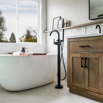
This modern farmhouse–style master bathroom became a bright, airy retreat defined by bold black metal fixtures, a warm wood vanity, and soft neutral tones. Subtle white tile keeps the space calm and refined while balancing the striking contrasts, turning a once-generic development bathroom into a serene, one-of-a-kind master escape that blends rustic charm with modern sophistication.
 Ke Design Collective Inc.
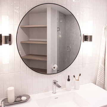
A complete two bath & kitchen renovation in a condo. Client wanted a larger kitchen area and better layout for bathrooms. We removed a wall near the entrance and extended the kitchen with additional cabinetry and storage area. Laundry room was reduced to accommodate the larger kitchen.
The shared and primary bathrooms were gutted and fully remodeled as well. Enlarged shower enclosure in shared bath for more space. Layout of primary bathroom was changed for better accessibility and flow in the area. Vanity and shower was relocated to create a more spacious and inviting environment.
Client didn’t like the current floors, we replaced it with luxury vinyl planks for durability.

 catlin stothers design
Well situated in Mont Royal, this split-level home had many positives apart from its dated interior, and layout of many small and inefficient rooms. This was all at odds with the owners’ lifestyle and aesthetic.
The client had architectural plans designed for a third floor addition that were to include a master bedroom and ensuite bathroom. The desired look for the entire house influenced all aspects of construction. Apart from the removal most walls on the main floor, everything was stripped back to the most simple and pure of finishing materials.
The existing floors were refinished in a smoked grey matte palette and offset the rich warm walnut accents in the kitchen and soft white walls.
With an abundance of white walls throughout, feature walls were essential in both the master bedroom and ensuite. The deep charcoal wall in the bedroom provides dramatic contrast to the teak headboard and hammered silver light fixture. The ensuite’s feature wall is made of pewter ceramic tiles that add texture and elegance to this simple space.
Materials and furnishings throughout were selected for their simplicity and form.
Photo : Drew Hadley

 Adam Hartig
This project converted a builder design with entry level finishes into an elegant, "L Shaped", entertaining space that fit the needs of an active family. Off white Omega painted cabinets with a timeless recessed panel door design set the tone for a transitional setting. Lennon granite was used to partner the cabinets with the grey tones in the large format tile splash and the warmth of the oak flooring. A window was removed from the cooking wall to simplify the space and organize the work triangle in a way that guests would know where to sit and multiple cooks could operate without a congested setting. The sink was placed on the large island to allow the cook to be able to engage with the family room and whoever sits at the stools. Products include Thermador / Viking / Wolf appliances, Omega Dynasty Lorring - Magnolia Cabinets, Amerock hardware, and American Hardwood Flooring - red oak flooring.

 TVL Creative Ltd.
Words cannot describe the level of transformation this beautiful 60’s ranch has undergone. The home was blessed with a ton of natural light, however the sectioned rooms made for large awkward spaces without much functionality. By removing the dividing walls and reworking a few key functioning walls, this home is ready to entertain friends and family for all occasions. The large island has dual ovens for serious bake-off competitions accompanied with an inset induction cooktop equipped with a pop-up ventilation system. Plenty of storage surrounds the cooking stations providing large countertop space and seating nook for two. The beautiful natural quartzite is a show stopper throughout with it’s honed finish and serene blue/green hue providing a touch of color. Mother-of-Pearl backsplash tiles compliment the quartzite countertops and soft linen cabinets. The level of functionality has been elevated by moving the washer & dryer to a newly created closet situated behind the refrigerator and keeps hidden by a ceiling mounted barn-door. The new laundry room and storage closet opposite provide a functional solution for maintaining easy access to both areas without door swings restricting the path to the family room. Full height pantry cabinet make up the rest of the wall providing plenty of storage space and a natural division between casual dining to formal dining. Built-in cabinetry with glass doors provides the opportunity to showcase family dishes and heirlooms accented with in-cabinet lighting. With the wall partitions removed, the dining room easily flows into the rest of the home while maintaining its special moment. A large peninsula divides the kitchen space from the seating room providing plentiful storage including countertop cabinets for hidden storage, a charging nook, and a custom doggy station for the beloved dog with an elevated bowl deck and shallow drawer for leashes and treats! Beautiful large format tiles with a touch of modern flair bring all these spaces together providing a texture and color unlike any other with spots of iridescence, brushed concrete, and hues of blue and green. The original master bath and closet was divided into two parts separated by a hallway and door leading to the outside. This created an itty-bitty bathroom and plenty of untapped floor space with potential! By removing the interior walls and bringing the new bathroom space into the bedroom, we created a functional bathroom and walk-in closet space. By reconfiguration the bathroom layout to accommodate a walk-in shower and dual vanity, we took advantage of every square inch and made it functional and beautiful! A pocket door leads into the bathroom suite and a large full-length mirror on a mosaic accent wall greets you upon entering. To the left is a pocket door leading into the walk-in closet, and to the right is the new master bath. A natural marble floor mosaic in a basket weave pattern is warm to the touch thanks to the heating system underneath. Large format white wall tiles with glass mosaic accent in the shower and continues as a wainscot throughout the bathroom providing a modern touch and compliment the classic marble floor. A crisp white double vanity furniture piece completes the space. The journey of the Yosemite project is one we will never forget. Not only were we given the opportunity to transform this beautiful home into a more functional and beautiful space, we were blessed with such amazing clients who were endlessly appreciative of TVL – and for that we are grateful!
41