
Search results for "Removable format" in Home Design Ideas

 TVL Creative Ltd.
This project was such an incredible design opportunity, and instilled inspiration and excitement at every turn! Our amazing clients came to us with the challenge of converting their beloved family home into a welcoming haven for all members of the family. At the time that we met our clients, they were struggling with the difficult personal decision of the fate of the home. Their father/father-in-law had passed away and their mother/mother-in-law had recently been admitted into a nursing facility and was fighting Alzheimer’s. Resistant to loss of the home now that both parents were out of it, our clients purchased the home to keep in in the family. Despite their permanent home currently being in New Jersey, these clients dedicated themselves to keeping and revitalizing the house. We were moved by the story and became immediately passionate about bringing this dream to life.
The home was built by the parents of our clients and was only ever owned by them, making this a truly special space to the family. Our goal was to revitalize the home and to bring new energy into every room without losing the special characteristics that were original to the home when it was built. In this way, we were able to develop a house that maintains its own unique personality while offering a space of welcoming neutrality for all members of the family to enjoy over time.
The renovation touched every part of the home: the exterior, foyer, kitchen, living room, sun room, garage, six bedrooms, three bathrooms, the laundry room, and everything in between. The focus was to develop a style that carried consistently from space to space, but allowed for unique expression in the small details in every room.
Starting at the entry, we renovated the front door and entry point to offer more presence and to bring more of the mid-century vibe to the home’s exterior. We integrated a new modern front door, cedar shingle accents, new exterior paint, and gorgeous contemporary house numbers that really allow the home to stand out. Just inside the entry, we renovated the foyer to create a playful entry point worthy of attention. Cement look tile adorns the foyer floor, and we’ve added new lighting and upgraded the entry coat storage.
Upon entering the home, one will immediately be captivated by the stunning kitchen just off the entry. We transformed this space in just about every way. While the footprint of the home ultimately remained almost identical, the aesthetics were completely turned on their head. We re-worked the kitchen to maximize storage and to create an informal dining area that is great for casual hosting or morning coffee.
We removed the entry to the garage that was once in the informal dining, and created a peninsula in its place that offers a unique division between the kitchen/informal dining and the formal dining and living areas. The simple light warm light gray cabinetry offers a bit of traditional elegance, along with the marble backsplash and quartz countertops. We extended the original wood flooring into the kitchen and stained all floors to match for a warmth that truly resonates through all spaces. We upgraded appliances, added lighting everywhere, and finished the space with some gorgeous mid century furniture pieces.
In the formal dining and living room, we really focused on maintaining the original marble fireplace as a focal point. We cleaned the marble, repaired the mortar, and refinished the original fireplace screen to give a new sleek look in black. We then integrated a new gas insert for modern heating and painted the upper portion in a rich navy blue; an accent that is carried through the home consistently as a nod to our client’s love of the color.
The former entry into the old covered porch is now an elegant glass door leading to a stunning finished sunroom. This room was completely upgraded as well. We wrapped the entire space in cozy white shiplap to keep a casual feel with brightness. We tiled the floor with large format concrete look tile, and painted the old brick fireplace a bright white. We installed a new gas burning unit, and integrated transitional style lighting to bring warmth and elegance into the space. The new black-frame windows are adorned with decorative shades that feature hand-sketched bird prints, and we’ve created a dedicated garden-ware “nook” for our client who loves to work in the yard. The far end of this space is completed with two oversized chaise loungers and overhead lights…the most perfect little reading nook!
Just off the dining room, we created an entirely new space to the home: a mudroom. The clients lacked this space and desperately needed a landing spot upon entering the home from the garage. We uniquely planned existing space in the garage to utilize for this purpose, and were able to create a small but functional entry point without losing the ability to park cars in the garage. This new space features cement-look tile, gorgeous deep brown cabinetry, and plenty of storage for all the small items one might need to store while moving in and out of the home.
The remainder of the upstairs level includes massive renovations to the guest hall bathroom and guest bedroom, upstairs master bed/bath suite, and a third bedroom that we converted into a home office for the client.
Some of the largest transformations were made in the basement, where unfinished space and lack of light were converted into gloriously lit, cozy, finished spaces. Our first task was to convert the massive basement living room into the new master bedroom for our clients. We removed existing built-ins, created an entirely new walk-in closet, painted the old brick fireplace, installed a new gas unit, added carpet, introduced new lighting, replaced windows, and upgraded every part of the aesthetic appearance. One of the most incredible features of this space is the custom double sliding barn door made by a Denver artisan. This space is truly a retreat for our clients!
We also completely transformed the laundry room, back storage room, basement master bathroom, and two bedrooms.
This home’s massive scope and ever-evolving challenges were thrilling and exciting to work with, and the result is absolutely amazing. At the end of the day, this home offers a look and feel that the clients love. Above all, though, the clients feel the spirit of their family home and have a welcoming environment for all members of the family to enjoy for years to come.
 Aloha Kitchen, Bath & Design
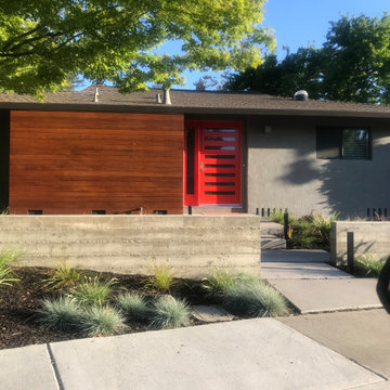
California modern rancher. Blend of warm and cool tones and material balance this space. Outdoor environment is low water use and drought resistant but still has greenery and inviting to hang out.
In the kitchen we removed the walls that made up the tiny closet of a kitchen that was in the corner under the skylight and was able to hide the ceiling height differences at the small desk area and oven cabinets and keep the skylight. The effect is a wide-open concept with the least amount of construction possible.
For the kitchen layout, we created a cozy zone for the chef to work in the corner without any cross traffic, seating area around the outside of the island keeps guest out of the work area but still close and part of the process. The warming drawer in the island positioned for proximity to the "buffet line" at the island when entertaining. On the dining end of the kitchen there is a coffee and wine bar. Coffee bar is hidden behind the metal roll up door, and the wine and liquor bar are to the left and both share the sink in the middle, making it a functional and useful space from the morning until the evening. I like to call this bar "Start and Stop" ha-ha. Even though this space is very open and airy, it has a ton of storage including underneath the seating area at the island and the little workstation, which is open and uncluttered, has lots of storage nestled in the wall and underneath the counter and hides any CPU and wires neatly.
In the master bath, we updated all the colors and finishes in a clean modern European style with large format porcelain tiles and repurposed a small useless closet (with a window in it) to a second vanity for extra counter space and linen storage. Plus, we added storage over the toilet in the water closet and an updated door and casing into the walk-in closet with frosted glass panels so that at night the light in the closet glowing in those panels can act as a night light.
 G. Christianson Construction, Inc.
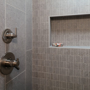
This compact modern bathroom remodel features intentionally placed colors, patterns, materials, and finishes to perfectly execute the homeowner’s style. In addition to a distaste for the bathroom’s existing brown color scheme, there was an extremely large and deep soaking tub with a shower combo that had been installed by a previous owner which made accessibility extremely difficult for these new homeowners to use the shower. The homeowners expressed a love for modern, contemporary, and sleek design styles with strong preferences for grey and slate tones and a dislike of brown tones and ornate patterns. In addition, Interior Designer Elizabeth noticed that they would get excited when discussing whimsical features. The final bathroom design involved replacing the bath vanity, toilet, flooring, and removing the obtrusive tub to create an easy-access tile shower with a sliding shower glass barn door. The existing unique bathroom layout was a narrow room open to the Primary Bedroom with no door and contained all fixtures on the interior wall facing away from the Primary Bedroom entrance. We utilized a floating vanity to give the illusion of a wider bathroom and the open space below the cabinet makes it easier to round the corner to enter the bathroom without running into the cabinet. To create a bathroom design that expressed the homeowner’s style of modern, grey, and whimsy, Interior Designer Elizabeth proposed a grey mosaic tile that formed a whimsical pattern via the grout lines, and maintained the desired modern feel by having this mosaic tile installed over the entirety of the back wall with large format tiles of the same color/collection installed on the side walls. The cool tones of the grey tile shower and charcoal tile floor are balanced with the warmth of a natural rift white oak vanity and recessed medicine cabinet mirror to create this luxurious modern bathroom.
Find the right local pro for your project
 G. Christianson Construction, Inc.
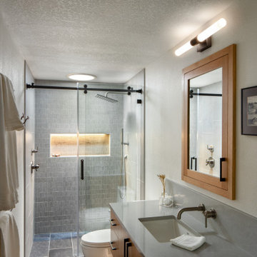
This compact modern bathroom remodel features intentionally placed colors, patterns, materials, and finishes to perfectly execute the homeowner’s style. In addition to a distaste for the bathroom’s existing brown color scheme, there was an extremely large and deep soaking tub with a shower combo that had been installed by a previous owner which made accessibility extremely difficult for these new homeowners to use the shower. The homeowners expressed a love for modern, contemporary, and sleek design styles with strong preferences for grey and slate tones and a dislike of brown tones and ornate patterns. In addition, Interior Designer Elizabeth noticed that they would get excited when discussing whimsical features. The final bathroom design involved replacing the bath vanity, toilet, flooring, and removing the obtrusive tub to create an easy-access tile shower with a sliding shower glass barn door. The existing unique bathroom layout was a narrow room open to the Primary Bedroom with no door and contained all fixtures on the interior wall facing away from the Primary Bedroom entrance. We utilized a floating vanity to give the illusion of a wider bathroom and the open space below the cabinet makes it easier to round the corner to enter the bathroom without running into the cabinet. To create a bathroom design that expressed the homeowner’s style of modern, grey, and whimsy, Interior Designer Elizabeth proposed a grey mosaic tile that formed a whimsical pattern via the grout lines, and maintained the desired modern feel by having this mosaic tile installed over the entirety of the back wall with large format tiles of the same color/collection installed on the side walls. The cool tones of the grey tile shower and charcoal tile floor are balanced with the warmth of a natural rift white oak vanity and recessed medicine cabinet mirror to create this luxurious modern bathroom.

 TaylorPro Design and Remodeling, Inc.
"Since my husband works in the residential home building industry, our standards were very high on the contractor we chose to engage. Through referrals and Angie's List, my husband and I got a total of 6 bids from 6 different reputable San Diego contractors. We ultimately selected Kerry at TaylorPro Services for the following reasons:
1. His responsiveness. He was quick to respond on email and text, which is the format of communication that works best for me given that I'm a busy mom of two little kids and talking on the phone is challenging.
2. His detailed bid. A bunch of the contractors that gave us bids didn't include line item details but Kerry did. I knew exactly what to expect and what I was paying for. Before we engaged him, we sent him follow up questions to his bid and he answered them quickly. Kerry was also flexible in removing certain items that we wanted to do ourselves.
3. Price. While all the contractors came in around $15K of each other, Kerry was the lowest of them all. Kerry appreciated that we were priced in a $850K home and not a $3M Rancho Santa Fe home. I felt that he took our budget into consideration.
Kerry's crew came on time daily to our house. Since we were living in the house during construction, I felt that they were very considerate to cleaning up and being there on time. Additionally, since I personally didn't have experience with remodels, Kerry and his crew were courteous and polite to me and answered all of my questions no matter how mundane or redundant they were.
Going into the project, everyone (and their mother) kept telling me how (a) messy it was going to be and (b) how I would wind up hating my contractor in the end and feeling like I got screwed out of money. I can say that yes, it was messy because we pulled up 1200 sq feet of tile! and no, I did not hate Kerry at the end. In fact, I would highly recommend Kerry. His personality is suited well for this kind of stressful project and his honesty and attention to detail was extraordinary."
~ Carrie H, Client
Photos by: Kerry W. Taylor

 Fiorito Interior Design
For this project, my client’s goal was to remove a rarely-used existing bath tub next to a medium-sized shower and replace it all with a roomy, open, walk-in shower. With soaring, ten-foot high ceilings, this space became a luxurious statement in minimalism!
I chose a neutral, linen-striated ceramic tile for the floor which, since we were creating a barrier-free shower, meant I could run this tile into the shower and add a hidden, tiled drain for a continuous, seamless look. This makes the bathroom appear even larger. For interest, I added opulent, large-format, ceramic tiles with a blue- and grey-veined marble pattern trimmed out with metal strips. A grand glass wall separates the wet area from the rest of the bathroom. Controls for the shower were wisely placed at the entrance which also features towel hooks and a towel bar on a coordinating panel of blue marble ceramic tile.
The rest of the bathroom received a modern makeover as well with a crisp, custom-built vanity and quartz counter top replacing the old tile counter. Undermount sinks and sculptural hardware sit under modern mirrors with integrated LED lights for maximum light on the face. To top this design off, I chose a glamorous but tailored chandelier with discreet crystal embellishments to infuse sophistication into this sleek, minimalist space.
The new room is light, bright, and uncluttered. For this client, the ultimate luxury is not having a space full of things, but having a space that is simply full of space!
Photo by Bernardo Grijalva
 TaylorPro Design and Remodeling, Inc.
"Since my husband works in the residential home building industry, our standards were very high on the contractor we chose to engage. Through referrals and Angie's List, my husband and I got a total of 6 bids from 6 different reputable San Diego contractors. We ultimately selected Kerry at TaylorPro Services for the following reasons:
1. His responsiveness. He was quick to respond on email and text, which is the format of communication that works best for me given that I'm a busy mom of two little kids and talking on the phone is challenging.
2. His detailed bid. A bunch of the contractors that gave us bids didn't include line item details but Kerry did. I knew exactly what to expect and what I was paying for. Before we engaged him, we sent him follow up questions to his bid and he answered them quickly. Kerry was also flexible in removing certain items that we wanted to do ourselves.
3. Price. While all the contractors came in around $15K of each other, Kerry was the lowest of them all. Kerry appreciated that we were priced in a $850K home and not a $3M Rancho Santa Fe home. I felt that he took our budget into consideration.
Kerry's crew came on time daily to our house. Since we were living in the house during construction, I felt that they were very considerate to cleaning up and being there on time. Additionally, since I personally didn't have experience with remodels, Kerry and his crew were courteous and polite to me and answered all of my questions no matter how mundane or redundant they were.
Going into the project, everyone (and their mother) kept telling me how (a) messy it was going to be and (b) how I would wind up hating my contractor in the end and feeling like I got screwed out of money. I can say that yes, it was messy because we pulled up 1200 sq feet of tile! and no, I did not hate Kerry at the end. In fact, I would highly recommend Kerry. His personality is suited well for this kind of stressful project and his honesty and attention to detail was extraordinary."
~ Carrie H, Client
Photos by: Kerry W. Taylor

 TaylorPro Design and Remodeling, Inc.
"Since my husband works in the residential home building industry, our standards were very high on the contractor we chose to engage. Through referrals and Angie's List, my husband and I got a total of 6 bids from 6 different reputable San Diego contractors. We ultimately selected Kerry at TaylorPro Services for the following reasons:
1. His responsiveness. He was quick to respond on email and text, which is the format of communication that works best for me given that I'm a busy mom of two little kids and talking on the phone is challenging.
2. His detailed bid. A bunch of the contractors that gave us bids didn't include line item details but Kerry did. I knew exactly what to expect and what I was paying for. Before we engaged him, we sent him follow up questions to his bid and he answered them quickly. Kerry was also flexible in removing certain items that we wanted to do ourselves.
3. Price. While all the contractors came in around $15K of each other, Kerry was the lowest of them all. Kerry appreciated that we were priced in a $850K home and not a $3M Rancho Santa Fe home. I felt that he took our budget into consideration.
Kerry's crew came on time daily to our house. Since we were living in the house during construction, I felt that they were very considerate to cleaning up and being there on time. Additionally, since I personally didn't have experience with remodels, Kerry and his crew were courteous and polite to me and answered all of my questions no matter how mundane or redundant they were.
Going into the project, everyone (and their mother) kept telling me how (a) messy it was going to be and (b) how I would wind up hating my contractor in the end and feeling like I got screwed out of money. I can say that yes, it was messy because we pulled up 1200 sq feet of tile! and no, I did not hate Kerry at the end. In fact, I would highly recommend Kerry. His personality is suited well for this kind of stressful project and his honesty and attention to detail was extraordinary."
~ Carrie H, Client
Photos by: Kerry W. Taylor

 Crystal Kitchen + Bath
A newly retired couple had purchased their 1989 home because it offered everything they needed on one level. He loved that the house was right on the Mississippi River with access for docking a boat. She loved that there was two bedrooms on the Main Level, so when the grandkids came to stay, they had their own room.
The dark, traditional style kitchen with wallpaper and coffered ceiling felt closed off from the adjacent Dining Room and Family Room. Although the island was large, there was no place for seating. We removed the peninsula and reconfigured the kitchen to create a more functional layout that includes 9-feet of 18-inch deep pantry cabinets The new island has seating for four and is orientated to the window that overlooks the back yard and river. Flat-paneled cabinets in a combination of horizontal wood and semi-gloss white paint add to the modern, updated look. A large format tile (24” x 24”) runs throughout the kitchen and into the adjacent rooms for a continuous, monolithic look.
 Aloha Kitchen, Bath & Design
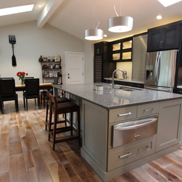
California modern rancher. Blend of warm and cool tones and material balance this space. Outdoor environment is low water use and drought resistant but still has greenery and inviting to hang out.
In the kitchen we removed the walls that made up the tiny closet of a kitchen that was in the corner under the skylight and was able to hide the ceiling height differences at the small desk area and oven cabinets and keep the skylight. The effect is a wide-open concept with the least amount of construction possible.
For the kitchen layout, we created a cozy zone for the chef to work in the corner without any cross traffic, seating area around the outside of the island keeps guest out of the work area but still close and part of the process. The warming drawer in the island positioned for proximity to the "buffet line" at the island when entertaining. On the dining end of the kitchen there is a coffee and wine bar. Coffee bar is hidden behind the metal roll up door, and the wine and liquor bar are to the left and both share the sink in the middle, making it a functional and useful space from the morning until the evening. I like to call this bar "Start and Stop" ha-ha. Even though this space is very open and airy, it has a ton of storage including underneath the seating area at the island and the little workstation, which is open and uncluttered, has lots of storage nestled in the wall and underneath the counter and hides any CPU and wires neatly.
In the master bath, we updated all the colors and finishes in a clean modern European style with large format porcelain tiles and repurposed a small useless closet (with a window in it) to a second vanity for extra counter space and linen storage. Plus, we added storage over the toilet in the water closet and an updated door and casing into the walk-in closet with frosted glass panels so that at night the light in the closet glowing in those panels can act as a night light. (Photo credit; Kitchens of Diablo)

 Proline Range Hoods
Beautiful high contrast kitchen featuring our Contemporary Proline PLFW 750 Professional Stainless Steel Wall Mounted Range Hood. The Red Walls, Dark Wood Cabinets, Island Pendant Lighting, and Modern Clean Lines make this kitchen really stand out.
PLFW 750 Range Hood Product Details:
This is our Super Low Profile, Sleek, All Stainless, Contemporary Design, Wall Mounted Range Hood. This attractive and versatile range hood looks and works great in any size. Elegant LCD touch controls, with time delay and 6 speeds from 300 cfm up to 1100 cfm, this hood has the power to handle the largest cooktops efficiently and quietly. Easy to install and super low maintenance, this wall mounted range hood is available in 5 sizes (36", 42", 48", 54" and 60") and is one of the very few large format hoods available as a ductless model.
Stainless Baffle Filters that are easy to remove and clean, and the quietest 300 CFM setting in the industry. (Based on comparable size and local blower capacity). And power when you need it with 1100 CFM total capacity.
This Range Hood comes with dual blowers and fan completely installed and factory tested.
Specifications
110v 60hz (USA and Canada Certification)
Electronic LCD 6 Speed Switch, w/Time Delay Controls
6 Speed, 1100 Max. CFM Dual Blower
2 x LED lights
Stainless Baffle Filters
Carbon filters available for ductless operation
Seamless Design
Easy to Clean and Maintain
Brushed #430 Stainless Steel
2 x 6" Air Outlets
 TaylorPro Design and Remodeling, Inc.
"Since my husband works in the residential home building industry, our standards were very high on the contractor we chose to engage. Through referrals and Angie's List, my husband and I got a total of 6 bids from 6 different reputable San Diego contractors. We ultimately selected Kerry at TaylorPro Services for the following reasons:
1. His responsiveness. He was quick to respond on email and text, which is the format of communication that works best for me given that I'm a busy mom of two little kids and talking on the phone is challenging.
2. His detailed bid. A bunch of the contractors that gave us bids didn't include line item details but Kerry did. I knew exactly what to expect and what I was paying for. Before we engaged him, we sent him follow up questions to his bid and he answered them quickly. Kerry was also flexible in removing certain items that we wanted to do ourselves.
3. Price. While all the contractors came in around $15K of each other, Kerry was the lowest of them all. Kerry appreciated that we were priced in a $850K home and not a $3M Rancho Santa Fe home. I felt that he took our budget into consideration.
Kerry's crew came on time daily to our house. Since we were living in the house during construction, I felt that they were very considerate to cleaning up and being there on time. Additionally, since I personally didn't have experience with remodels, Kerry and his crew were courteous and polite to me and answered all of my questions no matter how mundane or redundant they were.
Going into the project, everyone (and their mother) kept telling me how (a) messy it was going to be and (b) how I would wind up hating my contractor in the end and feeling like I got screwed out of money. I can say that yes, it was messy because we pulled up 1200 sq feet of tile! and no, I did not hate Kerry at the end. In fact, I would highly recommend Kerry. His personality is suited well for this kind of stressful project and his honesty and attention to detail was extraordinary."
~ Carrie H, Client
Photos by: Kerry W. Taylor
 Aloha Kitchen, Bath & Design
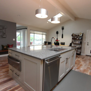
California modern rancher. Blend of warm and cool tones and material balance this space. Outdoor environment is low water use and drought resistant but still has greenery and inviting to hang out.
In the kitchen we removed the walls that made up the tiny closet of a kitchen that was in the corner under the skylight and was able to hide the ceiling height differences at the small desk area and oven cabinets and keep the skylight. The effect is a wide-open concept with the least amount of construction possible.
For the kitchen layout, we created a cozy zone for the chef to work in the corner without any cross traffic, seating area around the outside of the island keeps guest out of the work area but still close and part of the process. The warming drawer in the island positioned for proximity to the "buffet line" at the island when entertaining. On the dining end of the kitchen there is a coffee and wine bar. Coffee bar is hidden behind the metal roll up door, and the wine and liquor bar are to the left and both share the sink in the middle, making it a functional and useful space from the morning until the evening. I like to call this bar "Start and Stop" ha-ha. Even though this space is very open and airy, it has a ton of storage including underneath the seating area at the island and the little workstation, which is open and uncluttered, has lots of storage nestled in the wall and underneath the counter and hides any CPU and wires neatly.
In the master bath, we updated all the colors and finishes in a clean modern European style with large format porcelain tiles and repurposed a small useless closet (with a window in it) to a second vanity for extra counter space and linen storage. Plus, we added storage over the toilet in the water closet and an updated door and casing into the walk-in closet with frosted glass panels so that at night the light in the closet glowing in those panels can act as a night light. (Photo credit; Kitchens of Diablo)
 G. Christianson Construction, Inc.
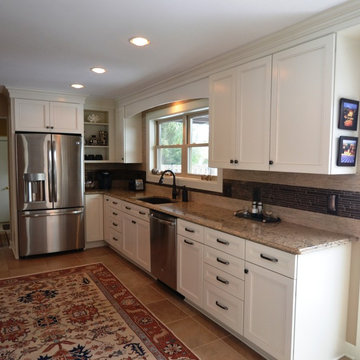
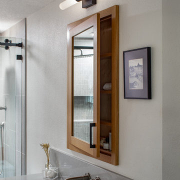
This compact modern bathroom remodel features intentionally placed colors, patterns, materials, and finishes to perfectly execute the homeowner’s style. In addition to a distaste for the bathroom’s existing brown color scheme, there was an extremely large and deep soaking tub with a shower combo that had been installed by a previous owner which made accessibility extremely difficult for these new homeowners to use the shower. The homeowners expressed a love for modern, contemporary, and sleek design styles with strong preferences for grey and slate tones and a dislike of brown tones and ornate patterns. In addition, Interior Designer Elizabeth noticed that they would get excited when discussing whimsical features. The final bathroom design involved replacing the bath vanity, toilet, flooring, and removing the obtrusive tub to create an easy-access tile shower with a sliding shower glass barn door. The existing unique bathroom layout was a narrow room open to the Primary Bedroom with no door and contained all fixtures on the interior wall facing away from the Primary Bedroom entrance. We utilized a floating vanity to give the illusion of a wider bathroom and the open space below the cabinet makes it easier to round the corner to enter the bathroom without running into the cabinet. To create a bathroom design that expressed the homeowner’s style of modern, grey, and whimsy, Interior Designer Elizabeth proposed a grey mosaic tile that formed a whimsical pattern via the grout lines, and maintained the desired modern feel by having this mosaic tile installed over the entirety of the back wall with large format tiles of the same color/collection installed on the side walls. The cool tones of the grey tile shower and charcoal tile floor are balanced with the warmth of a natural rift white oak vanity and recessed medicine cabinet mirror to create this luxurious modern bathroom.
 TKS Design Group
Download our free ebook, Creating the Ideal Kitchen. DOWNLOAD NOW
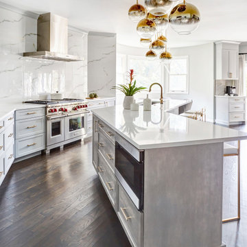
This client was referred to us from a past client. They are a busy 2-career household with young children and enjoy entertaining friends and family in their home. They have a beautiful open concept home but unfortunately the kitchen was not fitting for the rest of the home. They were not quite sure what to do with the space. We talked about trying to refresh it or do more of a minor remodel, but in the end they decided a full gut would get them to where they wanted to be.
One problem was there was no place for guests to hang out other than the large and awkward banquette area. The brick wall and tiled hood area were feeling a bit dated and tired. The space was just not functional for their lifestyle. There was no prep space near the cooktop and no landing area for items coming out of the ovens or refrigerator, plus a big dead zone in the center of the room.
Banquettes, like the one they previously had in the space, are great for small spaces, but when they get really large like this one, it makes getting in and out of the seating area awkward and uncomfortable. Plus, there was room for a large table, so we eliminated the awkward built in.
We started by removing the faux brick wall between the kitchen and back entry. We relocated the entry to the garage over a couple feet in order to get every last inch out of the new kitchen. We also made the decision to close up the primary window that faced the pretty ho hum brick wall of the neighbor’s house. There was plenty of light coming in from the seating area, so we just didn’t feel the window was adding much to the room.
Construction went smoothy. There was a bit of rework with electrical, flooring and HVAC, but in the end, we think it was well worth it.
The clients really wanted a sleek contemporary look, and we originally had planned for a full height slab backsplash, but due to it’s size, it was a budget buster. Instead, we got creative and settled on large format porcelain tiles that have a similar feel but were a fraction of the cost. We made sure the wall was plumb and level so that the fit and finish would mimic that of slab material.
The final space was quite a change. A large prep sink sits directly across from the new pro-style range with plenty additional prep space on the large island. The refrigerator and ovens now have miles of landing space, and a nice tight work triangle makes cooking a breeze.
Since we wanted a more contemporary feel, not many wall cabinets were included. Instead, we outfitted some of the drawers for dish storage with a peg system. Two large pantries flanking the refrigerator hold baking supplies and small appliances. Large drawers by the cooktop hold pots and pans, and an appliance garage tucked away to the left of the range hides away miscellaneous items. The large island also houses a microwave drawer and tons of storage, most of which is drawers offering maximum convenience.
The island now seats 5-6 people comfortably along with the new table in the seating area which can seat up to 8. Entertaining will be a breeze in this space. With such a clean backdrop, we knew we would need some drama with the lighting, so we chose two sets of staggered pendants, which we adjusted for the right visual balance above the island.
We also included a small coffee station to the right of the main kitchen, which helps keep the coffee clutter out of the kitchen proper. Two tones of complimentary gray are featured in this kitchen. The perimeter is a light gray that reads almost white. The island is a gray stain that adds some depth and interest with the visible wood texture. The countertops are clean white quartz, and the hardware, barstools and light fixtures add warm brass tones. I see lots of cooking and entertaining with family and friends in the near future in this bright and airy new space.
Designed by: Susan Klimala, CKD, CBD
Photography by: Michael Kaskel
For more information on kitchen and bath design ideas go to: www.kitchenstudio-ge.com

 Leicht Westchester-Greenwich
Example of a minimalist u-shaped concrete floor home design design in New York with an integrated sink, flat-panel cabinets, dark wood cabinets, quartzite countertops, stainless steel appliances and an island
 G. Christianson Construction, Inc.
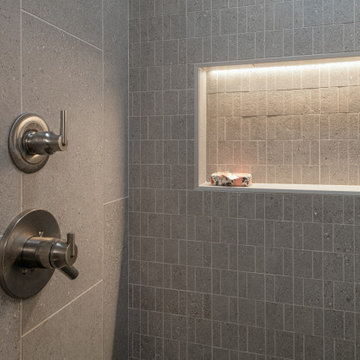
This compact modern bathroom remodel features intentionally placed colors, patterns, materials, and finishes to perfectly execute the homeowner’s style. In addition to a distaste for the bathroom’s existing brown color scheme, there was an extremely large and deep soaking tub with a shower combo that had been installed by a previous owner which made accessibility extremely difficult for these new homeowners to use the shower. The homeowners expressed a love for modern, contemporary, and sleek design styles with strong preferences for grey and slate tones and a dislike of brown tones and ornate patterns. In addition, Interior Designer Elizabeth noticed that they would get excited when discussing whimsical features. The final bathroom design involved replacing the bath vanity, toilet, flooring, and removing the obtrusive tub to create an easy-access tile shower with a sliding shower glass barn door. The existing unique bathroom layout was a narrow room open to the Primary Bedroom with no door and contained all fixtures on the interior wall facing away from the Primary Bedroom entrance. We utilized a floating vanity to give the illusion of a wider bathroom and the open space below the cabinet makes it easier to round the corner to enter the bathroom without running into the cabinet. To create a bathroom design that expressed the homeowner’s style of modern, grey, and whimsy, Interior Designer Elizabeth proposed a grey mosaic tile that formed a whimsical pattern via the grout lines, and maintained the desired modern feel by having this mosaic tile installed over the entirety of the back wall with large format tiles of the same color/collection installed on the side walls. The cool tones of the grey tile shower and charcoal tile floor are balanced with the warmth of a natural rift white oak vanity and recessed medicine cabinet mirror to create this luxurious modern bathroom.
 Aloha Kitchen, Bath & Design
California modern rancher. Blend of warm and cool tones and material balance this space. Outdoor environment is low water use and drought resistant but still has greenery and inviting to hang out.
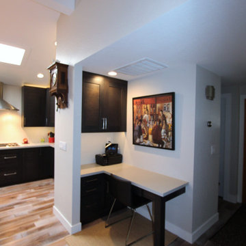
In the kitchen we removed the walls that made up the tiny closet of a kitchen that was in the corner under the skylight and was able to hide the ceiling height differences at the small desk area and oven cabinets and keep the skylight. The effect is a wide-open concept with the least amount of construction possible.
For the kitchen layout, we created a cozy zone for the chef to work in the corner without any cross traffic, seating area around the outside of the island keeps guest out of the work area but still close and part of the process. The warming drawer in the island positioned for proximity to the "buffet line" at the island when entertaining. On the dining end of the kitchen there is a coffee and wine bar. Coffee bar is hidden behind the metal roll up door, and the wine and liquor bar are to the left and both share the sink in the middle, making it a functional and useful space from the morning until the evening. I like to call this bar "Start and Stop" ha-ha. Even though this space is very open and airy, it has a ton of storage including underneath the seating area at the island and the little workstation, which is open and uncluttered, has lots of storage nestled in the wall and underneath the counter and hides any CPU and wires neatly.
In the master bath, we updated all the colors and finishes in a clean modern European style with large format porcelain tiles and repurposed a small useless closet (with a window in it) to a second vanity for extra counter space and linen storage. Plus, we added storage over the toilet in the water closet and an updated door and casing into the walk-in closet with frosted glass panels so that at night the light in the closet glowing in those panels can act as a night light. (Photo credit; Kitchens of Diablo)
 G. Christianson Construction, Inc.
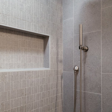
This compact modern bathroom remodel features intentionally placed colors, patterns, materials, and finishes to perfectly execute the homeowner’s style. In addition to a distaste for the bathroom’s existing brown color scheme, there was an extremely large and deep soaking tub with a shower combo that had been installed by a previous owner which made accessibility extremely difficult for these new homeowners to use the shower. The homeowners expressed a love for modern, contemporary, and sleek design styles with strong preferences for grey and slate tones and a dislike of brown tones and ornate patterns. In addition, Interior Designer Elizabeth noticed that they would get excited when discussing whimsical features. The final bathroom design involved replacing the bath vanity, toilet, flooring, and removing the obtrusive tub to create an easy-access tile shower with a sliding shower glass barn door. The existing unique bathroom layout was a narrow room open to the Primary Bedroom with no door and contained all fixtures on the interior wall facing away from the Primary Bedroom entrance. We utilized a floating vanity to give the illusion of a wider bathroom and the open space below the cabinet makes it easier to round the corner to enter the bathroom without running into the cabinet. To create a bathroom design that expressed the homeowner’s style of modern, grey, and whimsy, Interior Designer Elizabeth proposed a grey mosaic tile that formed a whimsical pattern via the grout lines, and maintained the desired modern feel by having this mosaic tile installed over the entirety of the back wall with large format tiles of the same color/collection installed on the side walls. The cool tones of the grey tile shower and charcoal tile floor are balanced with the warmth of a natural rift white oak vanity and recessed medicine cabinet mirror to create this luxurious modern bathroom.
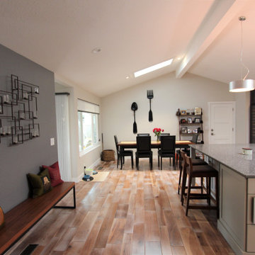 Aloha Kitchen, Bath & Design
California modern rancher. Blend of warm and cool tones and material balance this space. Outdoor environment is low water use and drought resistant but still has greenery and inviting to hang out.
In the kitchen we removed the walls that made up the tiny closet of a kitchen that was in the corner under the skylight and was able to hide the ceiling height differences at the small desk area and oven cabinets and keep the skylight. The effect is a wide-open concept with the least amount of construction possible.
For the kitchen layout, we created a cozy zone for the chef to work in the corner without any cross traffic, seating area around the outside of the island keeps guest out of the work area but still close and part of the process. The warming drawer in the island positioned for proximity to the "buffet line" at the island when entertaining. On the dining end of the kitchen there is a coffee and wine bar. Coffee bar is hidden behind the metal roll up door, and the wine and liquor bar are to the left and both share the sink in the middle, making it a functional and useful space from the morning until the evening. I like to call this bar "Start and Stop" ha-ha. Even though this space is very open and airy, it has a ton of storage including underneath the seating area at the island and the little workstation, which is open and uncluttered, has lots of storage nestled in the wall and underneath the counter and hides any CPU and wires neatly.
In the master bath, we updated all the colors and finishes in a clean modern European style with large format porcelain tiles and repurposed a small useless closet (with a window in it) to a second vanity for extra counter space and linen storage. Plus, we added storage over the toilet in the water closet and an updated door and casing into the walk-in closet with frosted glass panels so that at night the light in the closet glowing in those panels can act as a night light. (Photo credit; Kitchens of Diablo)
73