
Search results for "Remove banking" in Home Design Ideas
 Tracy Berman Interiors
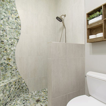
This gorgeous beach condo sits on the banks of the Pacific ocean in Solana Beach, CA. The previous design was dark, heavy and out of scale for the square footage of the space. We removed an outdated bulit in, a column that was not supporting and all the detailed trim work. We replaced it with white kitchen cabinets, continuous vinyl plank flooring and clean lines throughout. The entry was created by pulling the lower portion of the bookcases out past the wall to create a foyer. The shelves are open to both sides so the immediate view of the ocean is not obstructed. New patio sliders now open in the center to continue the view. The shiplap ceiling was updated with a fresh coat of paint and smaller LED can lights. The bookcases are the inspiration color for the entire design. Sea glass green, the color of the ocean, is sprinkled throughout the home. The fireplace is now a sleek contemporary feel with a tile surround. The mantel is made from old barn wood. A very special slab of quartzite was used for the bookcase counter, dining room serving ledge and a shelf in the laundry room. The kitchen is now white and bright with glass tile that reflects the colors of the water. The hood and floating shelves have a weathered finish to reflect drift wood. The laundry room received a face lift starting with new moldings on the door, fresh paint, a rustic cabinet and a stone shelf. The guest bathroom has new white tile with a beachy mosaic design and a fresh coat of paint on the vanity. New hardware, sinks, faucets, mirrors and lights finish off the design. The master bathroom used to be open to the bedroom. We added a wall with a barn door for privacy. The shower has been opened up with a beautiful pebble tile water fall. The pebbles are repeated on the vanity with a natural edge finish. The vanity received a fresh paint job, new hardware, faucets, sinks, mirrors and lights. The guest bedroom has a custom double bunk with reading lamps for the kiddos. This space now reflects the community it is in, and we have brought the beach inside.
 Tracy Berman Interiors
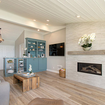
This gorgeous beach condo sits on the banks of the Pacific ocean in Solana Beach, CA. The previous design was dark, heavy and out of scale for the square footage of the space. We removed an outdated bulit in, a column that was not supporting and all the detailed trim work. We replaced it with white kitchen cabinets, continuous vinyl plank flooring and clean lines throughout. The entry was created by pulling the lower portion of the bookcases out past the wall to create a foyer. The shelves are open to both sides so the immediate view of the ocean is not obstructed. New patio sliders now open in the center to continue the view. The shiplap ceiling was updated with a fresh coat of paint and smaller LED can lights. The bookcases are the inspiration color for the entire design. Sea glass green, the color of the ocean, is sprinkled throughout the home. The fireplace is now a sleek contemporary feel with a tile surround. The mantel is made from old barn wood. A very special slab of quartzite was used for the bookcase counter, dining room serving ledge and a shelf in the laundry room. The kitchen is now white and bright with glass tile that reflects the colors of the water. The hood and floating shelves have a weathered finish to reflect drift wood. The laundry room received a face lift starting with new moldings on the door, fresh paint, a rustic cabinet and a stone shelf. The guest bathroom has new white tile with a beachy mosaic design and a fresh coat of paint on the vanity. New hardware, sinks, faucets, mirrors and lights finish off the design. The master bathroom used to be open to the bedroom. We added a wall with a barn door for privacy. The shower has been opened up with a beautiful pebble tile water fall. The pebbles are repeated on the vanity with a natural edge finish. The vanity received a fresh paint job, new hardware, faucets, sinks, mirrors and lights. The guest bedroom has a custom double bunk with reading lamps for the kiddos. This space now reflects the community it is in, and we have brought the beach inside.
 Kerry Lewis Landscape Architecture
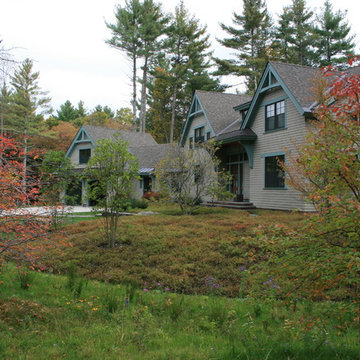
This is an example of a large craftsman partial sun front yard concrete paver landscaping in Boston for fall.
Find the right local pro for your project
 CUSTOM CRAFT - Design Build Remodel
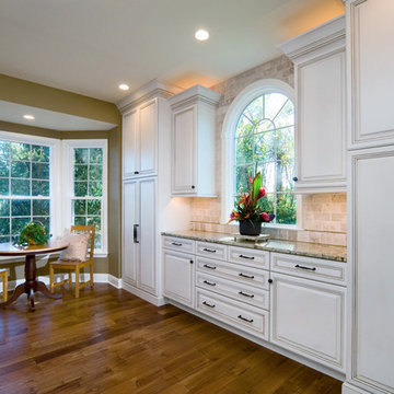
In this photo you see the space that was formerly our client's formal dining room. By removing a wall and expanding the kitchen into this little used area, we were able to add a tremendous amount of storage to the kitchen. We also added the window with southern exposure above the bank of cabinets along the exterior wall. These changes allow natural light to flood the room throughout the day, making the entire kitchen much brighter.
The bow window is now a dining nook that does double duty as a work station for when our clients work from home.
 SV Design
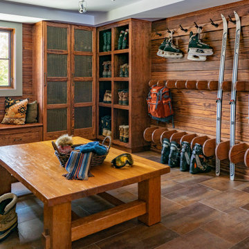
When an expanding family outgrew its beloved A frame vacation home, chaos followed. Outdoor gear multiplied exponentially, while any organized spot to stow it did not. Expected amenities were non-existent for needs of the crowd of outdoor enthusiasts. SV Design addressed the lacking elements and added practicality, with style: the multigenerational family members and friends can now appreciate space for the variety of hobbies and interests they pursue. Having worked with Siemasko + Verbridge in the past, the family turned to SV once again knowing we would design solution to address the growing list of concerns.
SV’s design of a three-story addition with a relatively small footprint was just what the home needed. A covered entry now provides the option of entering the main house or stopping off in the mud room to remove boots, drop off skis, and hang up wet clothes. Regardless of the way you enter the main house you will be greeted with a naturally lit, welcoming staircase of reclaimed white oak timber treads and steel stringers and rails. Each newel post is capped off with a polished granite sphere to pay homage to the Granite State in which the house resides.
The open stair invites you up to a spacious family space for playing board games, listening to music, gazing at the stars, or just lounging about in the warm comfort of the home. Traveling downstairs from the main level is a new, kid friendly media room for popcorn and movies, or a little video game sibling competition.
Perhaps the most striking new feature of the home is the custom designed Adirondack style bar built of varying tones of willow branches and bank. Topped off with a contrasting aged zinc counter, backsplash and shelf the bar is the perfect spot for the resident bar tender to mix up a tasty concoction for sitting by the crackling fire just steps away.
This home will provide comfort and ease for the family to relax and enjoy their getaway for years to come.
 Claire Cavalieri
Danish Modern is one of the several types of Modern design style. Popularized in Denmark from the 1940s-1970s, Danish modern furniture design was a collaboration between the principles of modern architecture and the high-quality cabinetmaking for which the Danes were known. Simple, elegant, airy, and featuring clean, sweeping lines, the furnishings are inherently warm and beautiful.
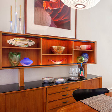
This open dining room is a collection of vintage Danish modern furniture dating from the early 1970s. The authentic pieces were located at different auction houses and specialty consigners around the country to create a cohesive look the homeowners were seeking.
The solid teak sideboard features a lighted upper display cabinet (removable) showcasing the homeowners’ collection of art including Nambé, Murano, Vietri sul Mare, and Blenko.
The lower cabinet consists of two sliding doors on either end offering plentiful storage. In between are a bank of five felt-lined drawers for items such as silverware, trays and linens.
With graceful rounded corners and rich, warm teak woodgrain, the dining room table is a perfect match to the sideboard. Two leaves tightly drop in and enable expansion with seating capacity for 14 people.
Mixing up dining chairs adds interest and variety. The curvaceous and timeless Arne Jacobsen (the Danish designer) Series 7 chair in black is the perfect pairing for this dynamic design.
Crowning the space is the airy, translucent classic Nelson bubble lamp, keeping in line with the Modernist theme.
 Fiorito Interior Design
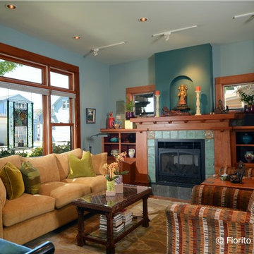
After a decade of being bi-coastal, my clients decided to retire from the east coast to the west. But the task of packing up a whole lifetime in a home was quite daunting so they hired me to comb through their furniture and accessories to see what could fit, what should be left behind, and what should make the move. The job proved difficult since my clients have a wealth of absolutely gorgeous objects and furnishings collected from trips to exotic, far-flung locales like Nepal, or inherited from relatives in England. It was tough to pare down, but after hours of diligent measuring, I mapped out what would migrate west and where it would be placed once here, and I filled in some blank spaces with new pieces.
They bought their recent Craftsman-style home from the contractor who had designed and built it for his family. The only architectural work we did was to transform the den at the rear of the house into a television/garden room. My clients did not want the television to be on display, and sticking a TV in an armoire just doesn’t cut it anymore. I recommended installing a hidden, mirror TV with accompanying invisible in-wall speakers. To do this, we removed an unnecessary small door in the corner of the room to free up the entire wall. Now, at the touch of a remote, what looks like a beautiful wall mirror mounted over a Japanese tansu console comes to life, and sound magically floats out from the wall around it! We also replaced a bank of windows with French doors to allow easy access to the garden.
While the house is extremely well made, the interiors were bland. The warm woodwork was lost in a sea of beige, so I chose a deep aqua color palette for the front rooms of the house which makes the woodwork sing. And we discovered a wonderful art niche over the fireplace that the previous owners had covered with a framed print. Conversely, a warm color palette in the TV room contrasts nicely with the greenery from the garden seen through the new French doors.
Photo by Bernardo Grijalva


 Tracy Berman Interiors
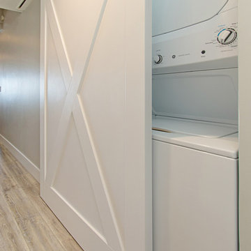
This gorgeous beach condo sits on the banks of the Pacific ocean in Solana Beach, CA. The previous design was dark, heavy and out of scale for the square footage of the space. We removed an outdated bulit in, a column that was not supporting and all the detailed trim work. We replaced it with white kitchen cabinets, continuous vinyl plank flooring and clean lines throughout. The entry was created by pulling the lower portion of the bookcases out past the wall to create a foyer. The shelves are open to both sides so the immediate view of the ocean is not obstructed. New patio sliders now open in the center to continue the view. The shiplap ceiling was updated with a fresh coat of paint and smaller LED can lights. The bookcases are the inspiration color for the entire design. Sea glass green, the color of the ocean, is sprinkled throughout the home. The fireplace is now a sleek contemporary feel with a tile surround. The mantel is made from old barn wood. A very special slab of quartzite was used for the bookcase counter, dining room serving ledge and a shelf in the laundry room. The kitchen is now white and bright with glass tile that reflects the colors of the water. The hood and floating shelves have a weathered finish to reflect drift wood. The laundry room received a face lift starting with new moldings on the door, fresh paint, a rustic cabinet and a stone shelf. The guest bathroom has new white tile with a beachy mosaic design and a fresh coat of paint on the vanity. New hardware, sinks, faucets, mirrors and lights finish off the design. The master bathroom used to be open to the bedroom. We added a wall with a barn door for privacy. The shower has been opened up with a beautiful pebble tile water fall. The pebbles are repeated on the vanity with a natural edge finish. The vanity received a fresh paint job, new hardware, faucets, sinks, mirrors and lights. The guest bedroom has a custom double bunk with reading lamps for the kiddos. This space now reflects the community it is in, and we have brought the beach inside.
 Randy Angell Designs
The subtle changes begin as soon as you walk out the back door of the house. The existing decking had a lot of what we call "tweeners"; areas that are overly generous walkways, yet not large enough to house furniture. The awkwardly small bluestone patio was expanded to accommodate a generous seating area. This was done by pushing the step-down closer to the pool.
Our talented stone mason carefully married the new bluestone into the existing portion of the patio, resulting in an imperceptible difference between the two.
As you descend the new bluestone steps to the pool level, your bare feet will be thankful for the new smooth-finished, limestone-colored concrete, with a hand cut pattern carefully etched into it's surface.
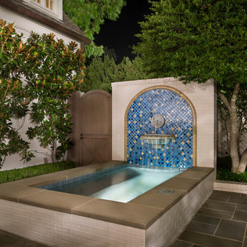
The old red brick decking was so hot that the owners could not walk around the pool with their bare feet. The brick coping was also replaced with an eased edge, Pennsylvania Premier Stone which matches the new step treads throughout the project.
Between the house and the pool, a large raised planter was reconfigured, giving additional space to the pool deck for a shaded lounge chair area. Across the pool, a bank of rather tall painted brick retaining walls were cut down, shortened and moved. This lessened the visual impact of the walls (which were overwhelming in the space) and also opened up a new seating area, nestled under the arms of the massive Pecan tree at the back of the property.
Rather than continuing solid decking around the entire pool, the area near these walls has been transformed to large stone stepper pads set in a sea of beautiful St. Augustine lawn. This creates a visually softened area that is still suited to setting tables and chairs when the guest list calls for additional seating.
The spa area is possibly the most dramatic change on this project. Yet more raised planter walls divided this area into awkward spaces, unsuited for proper furniture placement. The planters were removed, new stone decks added, and once again expertly married into the existing decks, opening the area to house a large dining table and a newly built-in BBQ area.
The spa itself was re-imagined with the bluestone coping and painted brick veneer. The most impressive addition though is the new handmade glazed tiles that surround the existing cast stone water feature. This water feature was almost unnoticeable against the painted brick wall, but now the dramatic arch and pop of color draw the eye to this quaint little corner of the property.
Originally designed by one of the most notable landscape architects in town, this once impressive project had faltered in recent years. The pool and spa still functioned well, and the client wanted to keep it intact. In addition, they wanted to keep as much of the existing landscape as possible. But, the surrounding decks, walls and steps were fair game.
At first glance, one might think that our changes were simple material changes. However, upon closer inspection, one can see the subtle-yet-transformative changes that came together to update this classic pool in a tasteful, timeless manner, as well as to improve the flow and usability of the deck areas, while softening the feel of this massive hardscape.
 Riverside Construction, LLC
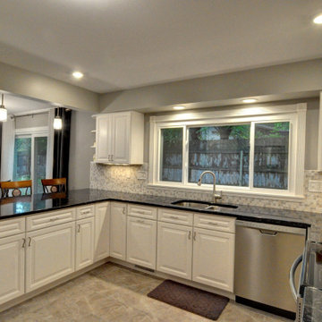
A partial wall, including an upper bank of cabinets above the peninsula, was removed, which opened up the kitchen and allowed for additional bar seating and upgraded storage solutions. This small change also made a big difference in brightening up the space—in part due to the enhanced lighting plan, which included task and undercabinet lighting, and the other to the new white Wellborn cabinets. Riverside also rearranged the range and refrigerator to achieve a better workflow. The countertops were topped with a dark granite slab creating an attractive visual contrast to the Daltile Uptown Glass Mosaic backsplash.
 Lagois Design Build Renovate
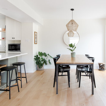
Step into a cozy and inviting atmosphere – a Hygge-inspired Scandinavian kitchen that is sure to warm the heart and bring the family closer together. Previously closed off and isolated from the rest of the home and family, we opened up walls between the kitchen and dining room and created an open-concept space that encourages togetherness and shared moments. Goodbye to isolation and hello to a kitchen that not only looks stunning but also fosters a sense of unity and connection.
The front of the home now has a full glass door as well as a full glass side panel to allow more light into the front entrance. The homeowners needed more storage, so we created a floor-to-ceiling bank of pantry cupboards in an unused part of the eat-in kitchen, and we also created more storage under the bench.
The removal of the wall was a little challenging because it was a load-bearing wall. We needed to add a full-span beam around to the back of the home and have it installed in one piece. We had to reroute the mechanical systems, a bulkhead and mechanical chase now to hide the beam and the plumbing.
The selections and colours – light cabinetry with sage-coloured lower cabinets, white countertops and natural maple hardwood – add to the beautiful open feeling the homeowners wanted. The original kitchen had dated finishes and was tired looking. The peninsula and meal-homework-and-crafts nook make the perfect setting for a young family.
 Renovisions
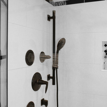
Perectly balanced, this dramatic black and white bathroom is a stunner. Thoughtful design was top of mind for these clients as they approached the Renovisions team to help narrow down their choices and bring it to life. Finding balance while mixing darker, heavier black finishes and lighter, white finishes was the task at hand and the goal was to create a modern look with an industrial/rustic feel.
The challenge on this project was incorporating all the desired elements and products in a tight spatial constraint of 9’ x 7.5’. The clients biggest concern in the old bathroom was inadequate storage, tired and under-utilized bathtub and they also needed an additional sink for their two daughters who often share this space. Renovisions recommended removing the wall between the shower and closet to gain additional floor space as you enter the bath, while providing wall space for the three towel bars.
Collaborating with the clients and searching to find the right fixtures paid off nicely. This newly remodeled Renovision accommodated two rectangular sinks, a walk-in shower with hand-held shower, wall-mounted shower head and two soft spray body jets. The oil-rubbed bronze fixtures not only provided a luxurious spa experience, but also added warmth and softness to the vintage feel. The glass shower enclosure is trimmed in a matte black grid that boasts an industrial aesthetic with retro feel while delivering modernistic function. It’s unique in appearance while allowing the chic white subway and black and white diamond tile to peek through.
The beautifully designed cabinetry in a matte black painted finish provides plenty of storage. This smart configuration included two banks of three drawers for toiletries and accessories, two towers with adjustable shelves for towels and two ‘garage’ doors for hair dryers.
Another unique design detail to capture attention was the black and white curvy geometric floor tile which plays off the straight lines of the cabinets and square grids of the shower enclosure.
The clients are thrilled with the results and their modern, high-contrast styled digs – a true customized relaxation sanctuary for the entire family.
 Kristen Elizabeth Design
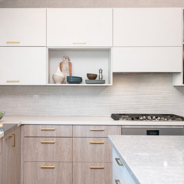
This home remodel was all about creating a modern oasis for easy entertaining and family life while accentuating the existing architecture of the home. It was critical to harmonize the kitchen with the remainder of the home and we achieved that by bringing a fresh and clean palette throughout the entry, living and kitchen areas. Every aspect of this design was thoughtfully curated in the best interest of the structure of the home and the desires of our clients.
We highlighted the negative wall space by adding a textured three dimensional tile to the entire back wall. To balance, we added an asymmetric lower bank of storage with open pockets for easy access. We blended a fine linen veneer that provides a soft contrast to the back wall cabinets and the island. For additional visual interest we added a grey wood veneer to complete the remainder of the space.
To continue the theme of harmony we needed to open up the divider wall between the living and kitchen, without removing it- as it was a critical structural shear wall. To problem solve, we mirrored the vaulted architecture of the kitchen in the opening to add consistency throughout the space.
The result: A crisp and contemporary aesthetic guests are sure to be WOW’d by.
Sponsored
Fredericksburg, OH

High Point Cabinets
Columbus' Experienced Custom Cabinet Builder | 4x Best of Houzz Winner
 SV Design
When an expanding family outgrew its beloved A frame vacation home, chaos followed. Outdoor gear multiplied exponentially, while any organized spot to stow it did not. Expected amenities were non-existent for needs of the crowd of outdoor enthusiasts. SV Design addressed the lacking elements and added practicality, with style: the multigenerational family members and friends can now appreciate space for the variety of hobbies and interests they pursue. Having worked with Siemasko + Verbridge in the past, the family turned to SV once again knowing we would design solution to address the growing list of concerns.
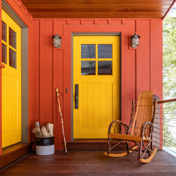
SV’s design of a three-story addition with a relatively small footprint was just what the home needed. A covered entry now provides the option of entering the main house or stopping off in the mud room to remove boots, drop off skis, and hang up wet clothes. Regardless of the way you enter the main house you will be greeted with a naturally lit, welcoming staircase of reclaimed white oak timber treads and steel stringers and rails. Each newel post is capped off with a polished granite sphere to pay homage to the Granite State in which the house resides.
The open stair invites you up to a spacious family space for playing board games, listening to music, gazing at the stars, or just lounging about in the warm comfort of the home. Traveling downstairs from the main level is a new, kid friendly media room for popcorn and movies, or a little video game sibling competition.
Perhaps the most striking new feature of the home is the custom designed Adirondack style bar built of varying tones of willow branches and bank. Topped off with a contrasting aged zinc counter, backsplash and shelf the bar is the perfect spot for the resident bar tender to mix up a tasty concoction for sitting by the crackling fire just steps away.
This home will provide comfort and ease for the family to relax and enjoy their getaway for years to come.
 Tracy Berman Interiors
This gorgeous beach condo sits on the banks of the Pacific ocean in Solana Beach, CA. The previous design was dark, heavy and out of scale for the square footage of the space. We removed an outdated bulit in, a column that was not supporting and all the detailed trim work. We replaced it with white kitchen cabinets, continuous vinyl plank flooring and clean lines throughout. The entry was created by pulling the lower portion of the bookcases out past the wall to create a foyer. The shelves are open to both sides so the immediate view of the ocean is not obstructed. New patio sliders now open in the center to continue the view. The shiplap ceiling was updated with a fresh coat of paint and smaller LED can lights. The bookcases are the inspiration color for the entire design. Sea glass green, the color of the ocean, is sprinkled throughout the home. The fireplace is now a sleek contemporary feel with a tile surround. The mantel is made from old barn wood. A very special slab of quartzite was used for the bookcase counter, dining room serving ledge and a shelf in the laundry room. The kitchen is now white and bright with glass tile that reflects the colors of the water. The hood and floating shelves have a weathered finish to reflect drift wood. The laundry room received a face lift starting with new moldings on the door, fresh paint, a rustic cabinet and a stone shelf. The guest bathroom has new white tile with a beachy mosaic design and a fresh coat of paint on the vanity. New hardware, sinks, faucets, mirrors and lights finish off the design. The master bathroom used to be open to the bedroom. We added a wall with a barn door for privacy. The shower has been opened up with a beautiful pebble tile water fall. The pebbles are repeated on the vanity with a natural edge finish. The vanity received a fresh paint job, new hardware, faucets, sinks, mirrors and lights. The guest bedroom has a custom double bunk with reading lamps for the kiddos. This space now reflects the community it is in, and we have brought the beach inside.
 Lagois Design Build Renovate
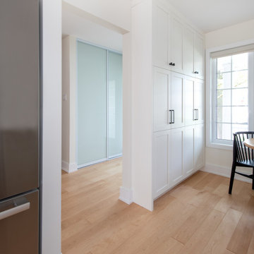
Step into a cozy and inviting atmosphere – a Hygge-inspired Scandinavian kitchen that is sure to warm the heart and bring the family closer together. Previously closed off and isolated from the rest of the home and family, we opened up walls between the kitchen and dining room and created an open-concept space that encourages togetherness and shared moments. Goodbye to isolation and hello to a kitchen that not only looks stunning but also fosters a sense of unity and connection.
The front of the home now has a full glass door as well as a full glass side panel to allow more light into the front entrance. The homeowners needed more storage, so we created a floor-to-ceiling bank of pantry cupboards in an unused part of the eat-in kitchen, and we also created more storage under the bench.
The removal of the wall was a little challenging because it was a load-bearing wall. We needed to add a full-span beam around to the back of the home and have it installed in one piece. We had to reroute the mechanical systems, a bulkhead and mechanical chase now to hide the beam and the plumbing.
The selections and colours – light cabinetry with sage-coloured lower cabinets, white countertops and natural maple hardwood – add to the beautiful open feeling the homeowners wanted. The original kitchen had dated finishes and was tired looking. The peninsula and meal-homework-and-crafts nook make the perfect setting for a young family.
 Renovisions
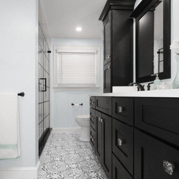
Perectly balanced, this dramatic black and white bathroom is a stunner. Thoughtful design was top of mind for these clients as they approached the Renovisions team to help narrow down their choices and bring it to life. Finding balance while mixing darker, heavier black finishes and lighter, white finishes was the task at hand and the goal was to create a modern look with an industrial/rustic feel.
The challenge on this project was incorporating all the desired elements and products in a tight spatial constraint of 9’ x 7.5’. The clients biggest concern in the old bathroom was inadequate storage, tired and under-utilized bathtub and they also needed an additional sink for their two daughters who often share this space. Renovisions recommended removing the wall between the shower and closet to gain additional floor space as you enter the bath, while providing wall space for the three towel bars.
Collaborating with the clients and searching to find the right fixtures paid off nicely. This newly remodeled Renovision accommodated two rectangular sinks, a walk-in shower with hand-held shower, wall-mounted shower head and two soft spray body jets. The oil-rubbed bronze fixtures not only provided a luxurious spa experience, but also added warmth and softness to the vintage feel. The glass shower enclosure is trimmed in a matte black grid that boasts an industrial aesthetic with retro feel while delivering modernistic function. It’s unique in appearance while allowing the chic white subway and black and white diamond tile to peek through.
The beautifully designed cabinetry in a matte black painted finish provides plenty of storage. This smart configuration included two banks of three drawers for toiletries and accessories, two towers with adjustable shelves for towels and two ‘garage’ doors for hair dryers.
Another unique design detail to capture attention was the black and white curvy geometric floor tile which plays off the straight lines of the cabinets and square grids of the shower enclosure.
The clients are thrilled with the results and their modern, high-contrast styled digs – a true customized relaxation sanctuary for the entire family.

 SV Design
When an expanding family outgrew its beloved A frame vacation home, chaos followed. Outdoor gear multiplied exponentially, while any organized spot to stow it did not. Expected amenities were non-existent for needs of the crowd of outdoor enthusiasts. SV Design addressed the lacking elements and added practicality, with style: the multigenerational family members and friends can now appreciate space for the variety of hobbies and interests they pursue. Having worked with Siemasko + Verbridge in the past, the family turned to SV once again knowing we would design solution to address the growing list of concerns.
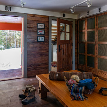
SV’s design of a three-story addition with a relatively small footprint was just what the home needed. A covered entry now provides the option of entering the main house or stopping off in the mud room to remove boots, drop off skis, and hang up wet clothes. Regardless of the way you enter the main house you will be greeted with a naturally lit, welcoming staircase of reclaimed white oak timber treads and steel stringers and rails. Each newel post is capped off with a polished granite sphere to pay homage to the Granite State in which the house resides.
The open stair invites you up to a spacious family space for playing board games, listening to music, gazing at the stars, or just lounging about in the warm comfort of the home. Traveling downstairs from the main level is a new, kid friendly media room for popcorn and movies, or a little video game sibling competition.
Perhaps the most striking new feature of the home is the custom designed Adirondack style bar built of varying tones of willow branches and bank. Topped off with a contrasting aged zinc counter, backsplash and shelf the bar is the perfect spot for the resident bar tender to mix up a tasty concoction for sitting by the crackling fire just steps away.
This home will provide comfort and ease for the family to relax and enjoy their getaway for years to come.
 RFK Kitchens
Objectives
Having lived with the kitchen as supplied by the builder since buying the property new they had finally had enough of its poor and inadequate design that provided only a basic L shape layout, no dining area and only a single built under oven.
At our initial design brief meeting it became clear that the Gardner’s wanted more light in the kitchen, more useable work surface, more storage, high level built in cooking appliances, an island with somewhere to sit and socialise but not to compromise on the aesthetic which was all important.
What We Did
They liked the whole look of the Second Nature 1909 in frame painted style but were concerned about price.
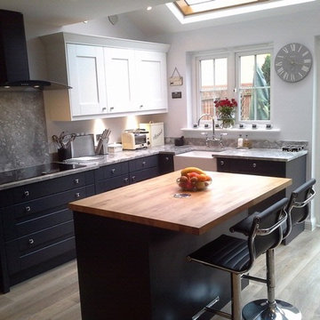
We suggested breaking into the pitched roof and introducing a long bank of Velux’s to create a much lighter, airier feel to the whole room; he also suggested removing the existing radiator and replacing it with a plinth heater thus freeing up an otherwise difficult to use wall.
To keep cost down he also suggested using the Second Nature Milbourne painted foil wrapped shaker door in contrasting colour ways shown.
The Result
We created the desired look but keeping within the budget. As you can see from the photos, the room is much lighter.
Testimonial
We were planning to renew our kitchen and had already visited some of the usual DIY stores to get ideas and estimates.
We then went along to Rugby Fitted Kitchens to see what they could offer and were immediately impressed by the showroom; the variety of kitchen styles and design ideas on display were inspirational and brought the prospect of a new kitchen to life, far better than flicking through brochures.
Trevor understood our requirements and guided us through the design process suggesting options for the cupboard configurations and fitments that maximised our storage space, in addition to which the pricing for the Neff appliances was second to none either matching or bettering the best buys I could find online.
The installation was expertly undertaken by Daniel & Daniel (yes they really do have the same Christian names!!) and nothing was too much trouble for them.
We are absolutely delighted with the finished product and would have no hesitation in recommending RFK to our friends.”
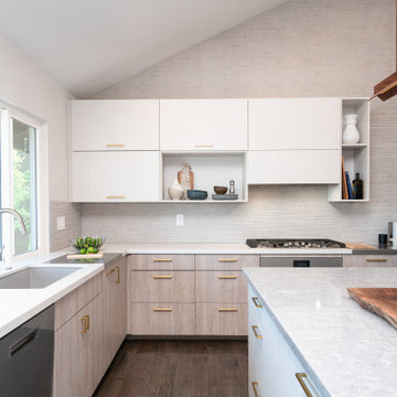 Kristen Elizabeth Design
This home remodel was all about creating a modern oasis for easy entertaining and family life while accentuating the existing architecture of the home. It was critical to harmonize the kitchen with the remainder of the home and we achieved that by bringing a fresh and clean palette throughout the entry, living and kitchen areas. Every aspect of this design was thoughtfully curated in the best interest of the structure of the home and the desires of our clients.
We highlighted the negative wall space by adding a textured three dimensional tile to the entire back wall. To balance, we added an asymmetric lower bank of storage with open pockets for easy access. We blended a fine linen veneer that provides a soft contrast to the back wall cabinets and the island. For additional visual interest we added a grey wood veneer to complete the remainder of the space.
To continue the theme of harmony we needed to open up the divider wall between the living and kitchen, without removing it- as it was a critical structural shear wall. To problem solve, we mirrored the vaulted architecture of the kitchen in the opening to add consistency throughout the space.
The result: A crisp and contemporary aesthetic guests are sure to be WOW’d by.
22