
Search results for "Remove lines" in Home Design Ideas
 Alair Homes Plano
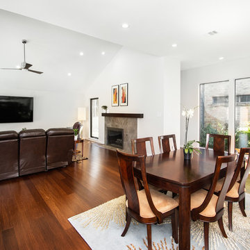
Our clients wanted to open up the wall between their kitchen and living areas to improve flow and continuity and they wanted to add a large island. They felt that although there were windows in both the kitchen and living area, it was still somewhat dark, so they wanted to brighten it up. There was a built-in wet bar in the corner of the family room that really wasn’t used much and they felt it was just wasted space. Their overall taste was clean, simple lines, white cabinets but still with a touch of style. They definitely wanted to lose all the gray cabinets and busy hardware.
We demoed all kitchen cabinets, countertops and light fixtures in the kitchen and wet bar area. All flooring in the kitchen and throughout main common areas was also removed. Waypoint Shaker Door style cabinets were installed with Leyton satin nickel hardware. The cabinets along the wall were painted linen and java on the island for a cool contrast. Beautiful Vicostone Misterio countertops were installed. Shadow glass subway tile was installed as the backsplash with a Susan Joblon Silver White and Grey Metallic Glass accent tile behind the cooktop. A large single basin undermount stainless steel sink was installed in the island with a Genta Spot kitchen faucet. The single light over the kitchen table was Seagull Lighting “Nance” and the two hanging over the island are Kuzco Lighting Vanier LED Pendants.
We removed the wet bar in the family room and added two large windows, creating a wall of windows to the backyard. This definitely helped bring more light in and open up the view to the pool. In addition to tearing out the wet bar and removing the wall between the kitchen, the fireplace was upgraded with an asymmetrical mantel finished in a modern Irving Park Gray 12x24” tile. To finish it all off and tie all the common areas together and really make it flow, the clients chose a 5” wide Java bamboo flooring. Our clients love their new spaces and the improved flow, efficiency and functionality of the kitchen and adjacent living spaces.
 Advance Design Studio, Ltd.
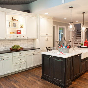
The major kitchen renovation of this old country farmhouse was a task of love, one that had been planned for many years by these Barrington seasoned homeowners. After interviewing no less than five companies, the homeowners chose the design team at Advance Design Studio to make the transformation they had long planned for.
“They had an understanding of the right design for the space almost from the instant they walked in the room”, says Sharon Scott of the design team of Nicole Ryan at Todd Jurs at Advance Design Studio. “They were the only designers who laid out ideas in the first meeting at the house that we really loved”, she says. “It was obvious that they understood the house, and understood us - and from then on the decision to hire them literally made itself”.
The original kitchen had a dividing “wall” of cabinetry…that made the rather large space seem very small, and cut off the kitchen from the eating area that has a beautiful garden view completely hidden from the main kitchen. Circulation was poor, leaving family members on top of one another when entertaining family and friends.
The new kitchen design nearly doubles the kitchen size within the original space; opening it up completely and enjoying an expansive island containing a new Kohler Whitehaven Smart Divide farm sink, a dishwasher, and pull out double trash receptacle. The great new gathering space accommodates four pull out stools beckoning grandchildren and friends alike. Removing the range from the island and relocating it to create a dramatic “feature” wall, completely out of the way of guests; it is now crowned with a beautiful completely customized wood hood designed to ventilate much more efficiently than the original island range containing a limited downdraft system.
The much more efficient use of the space after removing a pantry closet made way for a fully functional “tall wall” housing a double oven and refrigerator, out of the way of guests. Removing the restrictive cabinetry wall now allowed for an expansive floor to ceiling pantry cabinet with full extension pull out shelving, and an elegant display area complete with a beautiful furniture detailed buffet.
Fitting perfectly into the farmhouse charm of the old estate, Medallion Silver Lancaster cabinetry was chosen in a soft white Maple Divinity paint finish lining the perimeter. The stunning island hints to this old home’s past with Medallion Gold’s Maple Devonshire style graced with a Carriage Black Heirloom painted finish. The rubbed off black paint finish reveals the soft wood tones beneath, mimicking furniture you’d see in your grandmother’s home that has lovingly been polished for years to reveal a soft, subtly rubbed-off sheen.
Counter tops reverse contrast with perimeter tops of black “Raven” granite possessing a subtle honed finish, and a shift to Quartz Difinity Viareggio - resembling white Carrera marble on the island. A simple herringbone detail completes the decorative range wall, and subtle porcelain subway tiles grace the backsplash throughout.
The design is finished off with crisp Thermador and Bosch stainless steel appliances, and bright brushed cup pull and handle combination hardware. A pull down Kohler Bellaria faucet makes cleanup a breeze, and soft under-cabinet LED lighting throughout makes every work surface shine softly, and highlights the cabinetry display area with grace.
One special detail was created to make the dramatic ceiling transition to a vaulted area above the breakfast nook extra special. A tongue and groove solid wood ceiling was hung above, and a subtle greenish-grey distressed paint finish was hand developed on site by the talented crew, complementing the new kitchen with a completely unique surface that appears as if it’s been there for many, many years. It’s just one standout feature in the amazing new space that is sure to be in every conversation as newcomers enjoy the newest best hangout in this old home renewed!
After 30 years of renovating homes, this now content homeowner sips a cup of tea enjoying her new garden view, and reminisces projects of past – and lastly reports their experience with Advance Design Studio culminating with their amazing new kitchen to be the most enjoyable and satisfying home experience yet.
Designer: Nicole Ryan
Photographer: Joe Nowak
 Spin Design Limited
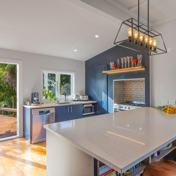
The wall between Kitchen and dining Spaces has been removed. There is a beam in place that separates the coffered Dining and Living Room kitchen from the flat GIB Lined ceiling in the lean-to Kitchen and Laundry areas. The existing timber shelf above the existing masonry chimney opening was also kept. A LED light strip was added to its underside to provide additional focus to this original feature. To create indoor / outdoor flow large double-glazed Timber French Doors were added. The space feels light and bright and welcoming.
Find the right local pro for your project
 Village Home Stores
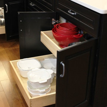
A Quad Cities kitchen remodeled from start to finish by Village Home Stores. Cherry cabinets in the "Clove" finish and a painted black island from our Dura Supreme cabinetry line are paired with Cambria "Fairborne" quartz counters and Travertine backsplash tile.
 TVL Creative Ltd.
This project is an elegant transformation that takes a dated kitchen and living room and removes all of the heavy visual weight to make way for a clean and crisp collection of spaces that are quintessentially Colorado! This project was not without issue: the initial contractor completely dropped the ball and left the space unfinished and in disrepair. After battling through the process of getting things on track for almost a year, the end result is truly worth it. The kitchen's old oak cabinets were removed and replaced with gorgeous transitional white cabinetry from Waypoint Living Spaces. We created a monochromatic palette that moves the eye through the space using texture and light. The far end of the kitchen is highlighted by a large artisan wood range hood, mini-brick stacked stone backsplash, and gorgeous marble inspired quartz countertops. The floors were refinished to a lighter and brighter hardwood, and new lighting was introduced throughout the home. In the living room, we removed the faux wall treatment on the fireplace and have replaced this with a sparkling white stacked stone. One of our favorite features is the custom shelving and copper-lined wood bin next to the fireplace, along with the hand-hewn mantle from KC Heister. This home is a welcoming winter wonderland that is cheery and cozy at every turn! We love this result and are so happy that our clients finally get to enjoy this for years to come! Thanks so much to Grace Combs for these gorgeous interior shots!
 Alair Homes Plano
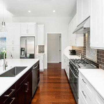
Our clients wanted to open up the wall between their kitchen and living areas to improve flow and continuity and they wanted to add a large island. They felt that although there were windows in both the kitchen and living area, it was still somewhat dark, so they wanted to brighten it up. There was a built-in wet bar in the corner of the family room that really wasn’t used much and they felt it was just wasted space. Their overall taste was clean, simple lines, white cabinets but still with a touch of style. They definitely wanted to lose all the gray cabinets and busy hardware.
We demoed all kitchen cabinets, countertops and light fixtures in the kitchen and wet bar area. All flooring in the kitchen and throughout main common areas was also removed. Waypoint Shaker Door style cabinets were installed with Leyton satin nickel hardware. The cabinets along the wall were painted linen and java on the island for a cool contrast. Beautiful Vicostone Misterio countertops were installed. Shadow glass subway tile was installed as the backsplash with a Susan Joblon Silver White and Grey Metallic Glass accent tile behind the cooktop. A large single basin undermount stainless steel sink was installed in the island with a Genta Spot kitchen faucet. The single light over the kitchen table was Seagull Lighting “Nance” and the two hanging over the island are Kuzco Lighting Vanier LED Pendants.
We removed the wet bar in the family room and added two large windows, creating a wall of windows to the backyard. This definitely helped bring more light in and open up the view to the pool. In addition to tearing out the wet bar and removing the wall between the kitchen, the fireplace was upgraded with an asymmetrical mantel finished in a modern Irving Park Gray 12x24” tile. To finish it all off and tie all the common areas together and really make it flow, the clients chose a 5” wide Java bamboo flooring. Our clients love their new spaces and the improved flow, efficiency and functionality of the kitchen and adjacent living spaces.
 Greenberg Construction
Greenberg Construction
Location: Mountain View, CA, United States
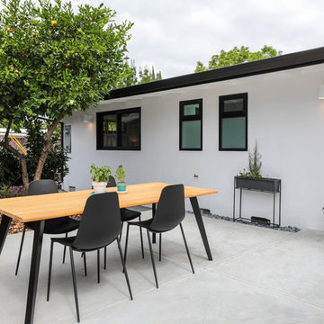
Our clients wanted to create a beautiful and open concept living space for entertaining while maximized the natural lighting throughout their midcentury modern Mackay home. Light silvery gray and bright white tones create a contemporary and sophisticated space; combined with elegant rich, dark woods throughout.
Removing the center wall and brick fireplace between the kitchen and dining areas allowed for a large seven by four foot island and abundance of light coming through the floor to ceiling windows and addition of skylights. The custom low sheen white and navy blue kitchen cabinets were designed by Segale Bros, with the goal of adding as much organization and access as possible with the island storage, drawers, and roll-outs.
Black finishings are used throughout with custom black aluminum windows and 3 panel sliding door by CBW Windows and Doors. The clients designed their custom vertical white oak front door with CBW Windows and Doors as well.

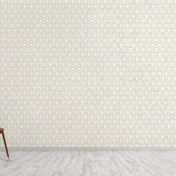
 WallsNeedLove
A distinctly art deco geometric maze of hexagonal gold lines on a white background. Available in both removable peel-and-stick and permanent wallpapers. Printed with child-safe inks.
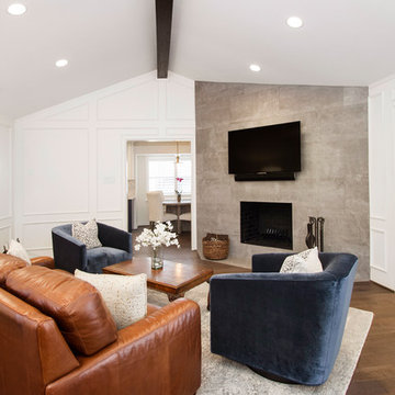 Alair Homes Plano
We loved updating this 1977 house giving our clients a more transitional kitchen, living room and powder bath. Our clients are very busy and didn’t want too many options. Our designers narrowed down their selections and gave them just enough options to choose from without being overwhelming.
In the kitchen, we replaced the cabinetry without changing the locations of the walls, doors openings or windows. All finished were replaced with beautiful cabinets, counter tops, sink, back splash and faucet hardware.
In the Master bathroom, we added all new finishes. There are two closets in the bathroom that did not change but everything else did. We.added pocket doors to the bedroom, where there were no doors before. Our clients wanted taller 36” height cabinets and a seated makeup vanity, so we were able to accommodate those requests without any problems. We added new lighting, mirrors, counter top and all new plumbing fixtures in addition to removing the soffits over the vanities and the shower, really opening up the space and giving it a new modern look. They had also been living with the cold and hot water reversed in the shower, so we also fixed that for them!
In their living room, they wanted to update the dark paneling, remove the large stone from the curved fireplace wall and they wanted a new mantel. We flattened the wall, added a TV niche above fireplace and moved the cable connections, so they have exactly what they wanted. We left the wood paneling on the walls but painted them a light color to brighten up the room.
There was a small wet bar between the living room and their family room. They liked the bar area but didn’t feel that they needed the sink, so we removed and capped the water lines and gave the bar an updated look by adding new counter tops and shelving. They had some previous water damage to their floors, so the wood flooring was replaced throughout the den and all connecting areas, making the transition from one room to the other completely seamless. In the end, the clients love their new space and are able to really enjoy their updated home and now plan stay there for a little longer!
Design/Remodel by Hatfield Builders & Remodelers | Photography by Versatile Imaging
Less
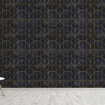 WallsNeedLove
Sleek golden curves and geometric lines create a motif that harkens back to the iconic art deco interiors of the Jazz Age in this polished, patterned wallpaper. A velvety black background accentuates the glamorous gold style elements. Available in both removable peel-and-stick and permanent wallpapers. Printed with child-safe inks.
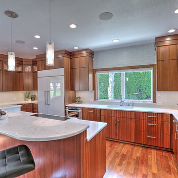
 Deb Seeley Designs LLC
The challenges I had were lack of space. She wanted the Miele white glass steam ovens, he wanted a 48"W integrated refrigerator, more storage, wanted better lighting, and they wanted to have stained cabinetry.
To capture more space, I enclosed the outdoor patio, which then became a place for the 48"W refrigerator and the bar area.
I knew I needed to somehow integrate white into the kitchen, otherwise the ovens would stick out like a sore thumb. I also knew I did not want the 48"W integrated refrigerator to have wood door fronts as the kitchen would look too heavy on the left side, somehow I needed to get white over there. The solution was those refrigerator doors needed to somehow look like white glass.
Miele was gracious enough to send me a glass sample of the oven front so after many trips to the paint store I was able to come up with a formula that matched the Miele glass and my cabinet fabricator came up with a paint finish to make the glossy finish look even more like glass door fronts, plus improve the durability. The refrigerator doors are actually wood NOT glass. Did I fool your eye?
The Sapele I presented to them because of the light it casts, and the linear look which gives their kitchen that contemporary flair they so wished for. We experimented with different finish samples, but in the end just clear coated the cabinetry. I also did the back splash in white glass and up to ceiling over the sink area, which coordinates with their existing white vinyl window and I had the window trimmed out using Sapele so the area was not over flooded with white.
The countertops we selected a white quartz product, and selected pendants with white, as it casts more reflective light and again brings in the white in order to balance out the Miele ovens.
We removed their existing tile floors and replaced with wood through out their entire house, except the bedrooms and the living room areas.
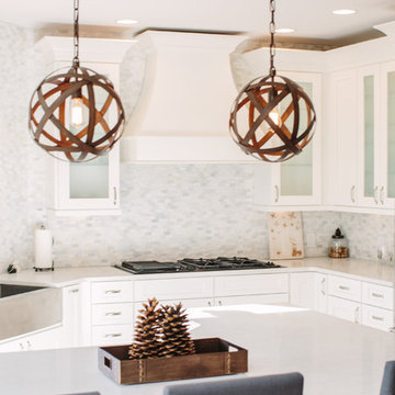 TVL Creative Ltd.
This project is an elegant transformation that takes a dated kitchen and living room and removes all of the heavy visual weight to make way for a clean and crisp collection of spaces that are quintessentially Colorado! This project was not without issue: the initial contractor completely dropped the ball and left the space unfinished and in disrepair. After battling through the process of getting things on track for almost a year, the end result is truly worth it. The kitchen's old oak cabinets were removed and replaced with gorgeous transitional white cabinetry from Waypoint Living Spaces. We created a monochromatic palette that moves the eye through the space using texture and light. The far end of the kitchen is highlighted by a large artisan wood range hood, mini-brick stacked stone backsplash, and gorgeous marble inspired quartz countertops. The floors were refinished to a lighter and brighter hardwood, and new lighting was introduced throughout the home. In the living room, we removed the faux wall treatment on the fireplace and have replaced this with a sparkling white stacked stone. One of our favorite features is the custom shelving and copper-lined wood bin next to the fireplace, along with the hand-hewn mantle from KC Heister. This home is a welcoming winter wonderland that is cheery and cozy at every turn! We love this result and are so happy that our clients finally get to enjoy this for years to come! Thanks so much to Grace Combs for these gorgeous interior shots!
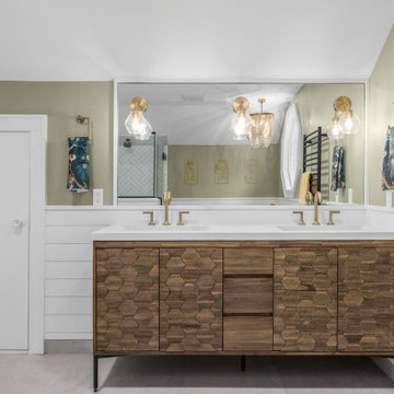
 THE Remodel Group
A luxurious en suite bath was created within this classic 1925 Portland bungalow by reconfiguring the second story’s original small bedrooms and tiny half bath. In this welcoming new urban boho space, eclectic finishes mingle harmoniously, integrated through subtle repetition of shapes and materials.
A furniture-style vanity sets the tone for this luxurious space, introducing materials, colors, shapes, and textures that repeat throughout. Individual walnut hexagons join to create distinctive vanity doors, offset beautifully by horizontal-grain drawers. Topping the cabinetry is a simple concrete countertop with integral sinks. An expansive framed mirror above enlarges and brightens the room. Within the mirror, sconces float, their globes a nod to the hexagons below. Champagne bronze fixtures reflect the warm walnut glow. Nestled into the back corner, a stunning shower features waterjet tiles in a double herringbone pattern, each precisely cut and laid to maintain design integrity at every surface transition. Teak floor tiles and a pebbled niche hint at the classic spa experience. Across from the shower, a large hexagonal window provides a treetop view from the free-standing tub below. The gentle oval of the tub and the beaded chandelier above provide a pleasing contrast to the strong lines surrounding it, as do the softly-shaded pebbles in the full-length niche. Shiplap wainscotting wraps the room, creating an illusion of height in the compact space. Subtle flooring and soft green walls create an understated backdrop for the bold mix of materials, unifying them into a serene oasis.
Asking a century-old home to accommodate a modern luxury bath is a tall order. Asbestos-laden plaster and flooring had to be abated. The subfloor had to be leveled and reinforced to increase strength and prevent deflection. Water lines and multiple electrical circuits had to be brought across and up without disturbing a beautifully-paneled ceiling, something we accomplished by firring out stair walls to hide the chases. Our client had visions of a leafy view from her tub, but the new layout eliminated existing windows. Placing a new window was complicated by deep eaves and flat soffits. By pushing the header into the roofline, however, we were able to accommodate a picture window. The flat soffit was replaced by an inverse hip lined with stained tongue and groove cedar, tying it to the bathroom finishes. Bringing materials up a narrow staircase became truly challenging when it was time to install the big items. However, strategic removal of drywall around the landing got the job done. Our attention to detail is showcased in the shower tile, where precise cuts were required at surface transitions to maintain the integrity of a complex double herringbone lay. The project was delivered on time.
Savvy layout choices minimized spending on structural changes. Because we were dealing with dormer space, head height was an issue. Raising the ceiling would have been complex and expensive so our design accommodated the constraints – tub on the low outside wall, shower on the full-height interior wall. The vanity spanned the spread, accommodating our petite client on the exterior side and her taller husband on the interior side. An under-eave closet was closed off to create room for both a freestanding tub and a separate shower. Rather than building replacement storage elsewhere, we simply added a new door into the closet from the primary bedroom. This was made possible by absorbing the short hallway separating the existing bed and bathroom into the primary bedroom. This new layout also created an en suite relationship between the primary bedroom and the new bath. We saved additional dollars by selecting a furniture-style vanity rather than using custom cabinetry, and the countertop with integral sinks provided a cost savings over a more traditional quartz countertop with undermount sinks. Affordable shower tiles allowed us to put more money into a dynamic tile layout. The project was delivered within budget.
Sponsored
Sunbury, OH

J.Holderby - Renovations
Franklin County's Leading General Contractors - 2X Best of Houzz!
 TVL Creative Ltd.
44 Photos · Updated 3 hours ago
Our Louisville clients were proud new home owners who were excited to move into their home and start personalizing! We created a transitional design for their home that incorporates modern touches and classic lines to tie the spaces together. Our primary focus was to update the home and keep things feeling clean and fresh while making it comfortable for everyone in the family. We started by painting every room in their home, replacing all of their interior doors, and updating all of their light fixtures. One of the most transformative elements was the updated flooring throughout the home. We removed the oak floors and replaced them with a wide plank solid hickory which removed the yellow undertones and gave them a clean backdrop for the rest of the design. The clients really wanted to freshen up their kitchen and incorporate new appliances without starting from scratch, so we rearranged a few of their existing cabinets to make room for their new stove and range hood. We also lowered the original bar-height counter to make the kitchen feel more open to their family room. We then painted all of their cabinets a crisp white, replaced the crown molding, updated the hardware, replaced their counter top with a marble look quartz, and used a soft green mosaic tile on their backsplash. This home has a large family room, and the original fireplace was far too small and seemed to disappear under the 20 foot ceilings. So we removed the old square fireplace, replacing it with a linear gas fireplace and a floor-to-ceiling tiled surround with a custom wood mantle. This created a real focal point and helped to anchor the space. We then brought in a cozy blue sectional and a soft new rug to make this the perfect place for a family movie night. The clients have a real love of music, and wanted to create a space where they could lay back and enjoy their vinyls. So in their family room we created a custom stereo wall with floating cabinets and shelves to house all of their audio equipment and showcase a few of their favorites. We then furnished the room with clean and classically inspired pieces to tie in with the aesthetics in the rest of the home.
 DENALI BUILDERS & Design
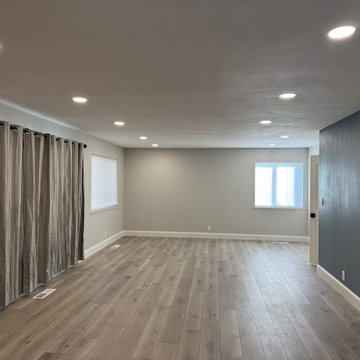
Modern Sophistication Meets Everyday Durability
Step into a home redefined by clean lines and thoughtful design. This complete interior remodel showcases a seamless blend of modern elegance and practical luxury, designed for those who appreciate the finer details.
Elevated Finishes
The foundation of the home features 100% waterproof luxury vinyl plank flooring, offering the timeless look of hardwood with unmatched durability. To anchor the space, we installed bold 5-inch modern baseboards, providing a crisp, architectural frame for every room.
A Designer’s Palette
The home’s character is defined by a sophisticated two-tone color scheme. While the walls offer a warm, inviting backdrop, the doors, trim, and baseboards feature a distinct, complementary hue. This high-contrast approach highlights the custom woodwork and gives the entire home a professionally curated feel.
Brilliant Lighting & Privacy
We’ve opened up the atmosphere with a comprehensive LED thin-can lighting package. These recessed lights offer a sleek, low-profile look while bathing the home in bright, energy-efficient light. To finish the look, brand-new custom blinds were installed throughout, offering the perfect balance of natural light control and contemporary style.
 DENALI BUILDERS & Design
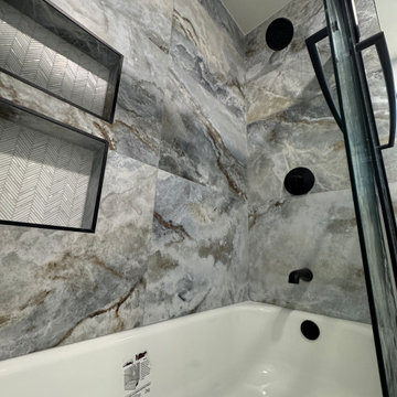
Modern Sophistication Meets Everyday Durability
Step into a home redefined by clean lines and thoughtful design. This complete interior remodel showcases a seamless blend of modern elegance and practical luxury, designed for those who appreciate the finer details.
Elevated Finishes
The foundation of the home features 100% waterproof luxury vinyl plank flooring, offering the timeless look of hardwood with unmatched durability. To anchor the space, we installed bold 5-inch modern baseboards, providing a crisp, architectural frame for every room.
A Designer’s Palette
The home’s character is defined by a sophisticated two-tone color scheme. While the walls offer a warm, inviting backdrop, the doors, trim, and baseboards feature a distinct, complementary hue. This high-contrast approach highlights the custom woodwork and gives the entire home a professionally curated feel.
Brilliant Lighting & Privacy
We’ve opened up the atmosphere with a comprehensive LED thin-can lighting package. These recessed lights offer a sleek, low-profile look while bathing the home in bright, energy-efficient light. To finish the look, brand-new custom blinds were installed throughout, offering the perfect balance of natural light control and contemporary style.
 Tile Doctor Ltd
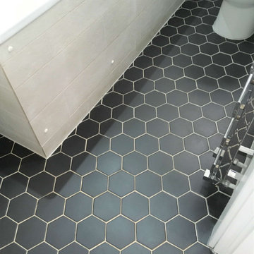
The pictures showed are of an Encaustic Cement tiled floor that had been installed in the bathroom of a property in Twickenham. At the time the tiles were installed, they did not seal them and had since accumulated dirt, especially in the grout lines.
Encaustic cement tiles have become extremely popular in the last few years with many beautiful artistic often geometric patterns available to choose from. The very nature of the cement-based tile however does make it slightly porous, and if left unsealed dirt will become ingrained in the tile making it difficult to remove and keep clean. Like grout they do therefore need to be sealed in order to keep them looking at their best for longer.
Now we normally recommend using diamond encrusted burnishing pads when renovating Encaustic Cement tiles however in this case the face of the tiles were not too bad and it was really the grout that needed the most attention. So, to cut the cost for customer, I advised a straightforward alkaline scrub clean and seal.
To clean the tile and grout I sprayed the floor with a strong dilution of Tile Doctor Pro-Clean and left it to soak into the dirt for ten minutes. Space in the bathroom was quite tight so instead of using a mechanical floor scrubber I scrubbed the tile and grout by hand working the alkaline cleaning solution into the pores to release the grout in dirt.
After scrubbing the floor was rinsed with a little water and the soil removed with a wet vacuum. Afterwards the floor was inspected, and any stubborn areas retreated with repeat of the process. After a final rinse, the floor was dried as much as possible with the wet vacuum.
Fortunately, the weather has been amazing of late and so it did not take long for the floor to dry, being a small space and a little encouragement from a heat gun always helps. Removing excess moisture before sealing is essential as even a small amount can cloud the sealer resulting in an uneven appearance.
Once satisfied that the floor was dry, I proceeded to seal it by applying a couple two coats of Tile Doctor Colour Grow across the Encaustic tile and grout. As an impregnating sealer Colour Grow penetrates the pores of the cement occupying the space and thus prevent any dirt from becoming ingrained there. Colour Grow’s colour intensifying properties also helped to deepen the black colour of the tile enhancing the contrast between the tiles and grout.
Now the floor has been properly sealed it will be far easier for the customer to keep them clean in future. For maximum longevity of the sealer I recommend maintenance cleaning with Tile Doctor Neutral Cleaner. Don’t be tempted to use supermarket cleaning products without reading the label first, many are simply too strong for cleaning sealed surfaces and will strip off the sealer prematurely leaving the tiles unprotected.
Jonathan Oldham
South Middlesex Tile Doctor


 TVL Creative Ltd.
This project is an elegant transformation that takes a dated kitchen and living room and removes all of the heavy visual weight to make way for a clean and crisp collection of spaces that are quintessentially Colorado! This project was not without issue: the initial contractor completely dropped the ball and left the space unfinished and in disrepair. After battling through the process of getting things on track for almost a year, the end result is truly worth it. The kitchen's old oak cabinets were removed and replaced with gorgeous transitional white cabinetry from Waypoint Living Spaces. We created a monochromatic palette that moves the eye through the space using texture and light. The far end of the kitchen is highlighted by a large artisan wood range hood, mini-brick stacked stone backsplash, and gorgeous marble inspired quartz countertops. The floors were refinished to a lighter and brighter hardwood, and new lighting was introduced throughout the home. In the living room, we removed the faux wall treatment on the fireplace and have replaced this with a sparkling white stacked stone. One of our favorite features is the custom shelving and copper-lined wood bin next to the fireplace, along with the hand-hewn mantle from KC Heister. This home is a welcoming winter wonderland that is cheery and cozy at every turn! We love this result and are so happy that our clients finally get to enjoy this for years to come! Thanks so much to Grace Combs for these gorgeous interior shots!
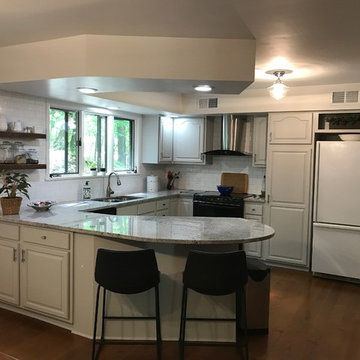
 In Place Cabinetry Finishes
AFTER
We completely updated the space by removing the cabinets above the stove, removing the cabinets to the left of the window as well as removing the cabinets that were blocking light and sight lines over the peninsula. We FACTORY FINISHED the cabinets in a beautiful gray color, replaced all of the old, exposed hinges and added new updated handles & knobs to create a completely updated version of their existing kitchen cabinets.

 Murals and Decorative Painting by Shannon Geis
Cheeky Chinoiserie, add a little spice to your home or spa with this fun hand painted wallpaper
Inspiration for a mid-sized contemporary master bedroom remodel in San Francisco with pink walls
Inspiration for a mid-sized contemporary master bedroom remodel in San Francisco with pink walls
87