
Search results for "Remove profile" in Home Design Ideas

 Adrienne DeRosa
Photo: Adrienne DeRosa © 2015 Houzz
After finding the set of antique doors at auction, Carpenter and Weiss removed several layers of paint, revealing the wood's natural characteristics. They were then joined to form a single panel that when opened offer a view of the master suite's sitting area.
The interplay of opposites is an everpresent quality running through this couple's home, and the bedroom door is no exception. Its rough-hewn quality is offset by the surrounding walls and cabinetry, and black hardware. Although the door serves as a backdrop for art when opened, it is practically a piece of art itself.

 T Hurt Construction
Removing an old wall between the kitchen and dining room gives a much more opening feeling. Photo by Thomas Grady
Elegant eat-in kitchen photo in Omaha with a farmhouse sink, white cabinets, granite countertops, stainless steel appliances and white backsplash
Elegant eat-in kitchen photo in Omaha with a farmhouse sink, white cabinets, granite countertops, stainless steel appliances and white backsplash


Find the right local pro for your project

 Christine Nelson Design
Ehlen Creative Communications
Inspiration for a small 1950s u-shaped linoleum floor eat-in kitchen remodel in Minneapolis with a farmhouse sink, flat-panel cabinets, white cabinets, wood countertops, white backsplash, ceramic backsplash, no island and stainless steel appliances
Inspiration for a small 1950s u-shaped linoleum floor eat-in kitchen remodel in Minneapolis with a farmhouse sink, flat-panel cabinets, white cabinets, wood countertops, white backsplash, ceramic backsplash, no island and stainless steel appliances


 Pinnacle Mountain Homes
Living room - rustic open concept medium tone wood floor living room idea in Denver with white walls, a standard fireplace and a stone fireplace
Living room - rustic open concept medium tone wood floor living room idea in Denver with white walls, a standard fireplace and a stone fireplace
 TKS Design Group
Download our free ebook, Creating the Ideal Kitchen. DOWNLOAD NOW
For many, extra time at home during COVID left them wanting more from their homes. Whether you realized the shortcomings of your space or simply wanted to combat boredom, a well-designed and functional home was no longer a want, it became a need. Tina found herself wanting more from her Old Irving Park home and reached out to The Kitchen Studio about adding function to her kitchen to make the most of the available real estate.
At the end of the day, there is nothing better than returning home to a bright and happy space you love. And this kitchen wasn’t that for Tina. Dark and dated, with a palette from the past and features that didn’t make the most of the available square footage, this remodel required vision and a fresh approach to the space. Lead designer, Stephanie Cole’s main design goal was better flow, while adding greater functionality with organized storage, accessible open shelving, and an overall sense of cohesion with the adjoining family room.
The original kitchen featured a large pizza oven, which was rarely used, yet its footprint limited storage space. The nearby pantry had become a catch-all, lacking the organization needed in the home. The initial plan was to keep the pizza oven, but eventually Tina realized she preferred the design possibilities that came from removing this cumbersome feature, with the goal of adding function throughout the upgraded and elevated space. Eliminating the pantry added square footage and length to the kitchen for greater function and more storage. This redesigned space reflects how she lives and uses her home, as well as her love for entertaining.
The kitchen features a classic, clean, and timeless palette. White cabinetry, with brass and bronze finishes, contrasts with rich wood flooring, and lets the large, deep blue island in Woodland’s custom color Harbor – a neutral, yet statement color – draw your eye.
The kitchen was the main priority. In addition to updating and elevating this space, Tina wanted to maximize what her home had to offer. From moving the location of the patio door and eliminating a window to removing an existing closet in the mudroom and the cluttered pantry, the kitchen footprint grew. Once the floorplan was set, it was time to bring cohesion to her home, creating connection between the kitchen and surrounding spaces.
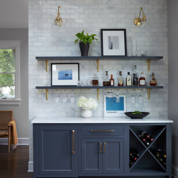
The color palette carries into the mudroom, where we added beautiful new cabinetry, practical bench seating, and accessible hooks, perfect for guests and everyday living. The nearby bar continues the aesthetic, with stunning Carrara marble subway tile, hints of brass and bronze, and a design that further captures the vibe of the kitchen.
Every home has its unique design challenges. But with a fresh perspective and a bit of creativity, there is always a way to give the client exactly what they want [and need]. In this particular kitchen, the existing soffits and high slanted ceilings added a layer of complexity to the lighting layout and upper perimeter cabinets.
While a space needs to look good, it also needs to function well. This meant making the most of the height of the room and accounting for the varied ceiling features, while also giving Tina everything she wanted and more. Pendants and task lighting paired with an abundance of natural light amplify the bright aesthetic. The cabinetry layout and design compliments the soffits with subtle profile details that bring everything together. The tile selections add visual interest, drawing the eye to the focal area above the range. Glass-doored cabinets further customize the space and give the illusion of even more height within the room.
While her family may be grown and out of the house, Tina was focused on adding function without sacrificing a stunning aesthetic and dreamy finishes that make the kitchen the gathering place of any home. It was time to love her kitchen again, and if you’re wondering what she loves most, it’s the niche with glass door cabinetry and open shelving for display paired with the marble mosaic backsplash over the range and complimenting hood. Each of these features is a stunning point of interest within the kitchen – both brag-worthy additions to a perimeter layout that previously felt limited and lacking.
Whether your remodel is the result of special needs in your home or simply the excitement of focusing your energy on creating a fun new aesthetic, we are here for it. We love a good challenge because there is always a way to make a space better – adding function and beauty simultaneously.


 Isla Homes
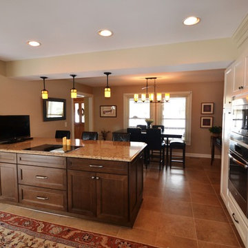
I built this on my property for my aging father who has some health issues. Handicap accessibility was a factor in design. His dream has always been to try retire to a cabin in the woods. This is what he got.
It is a 1 bedroom, 1 bath with a great room. It is 600 sqft of AC space. The footprint is 40' x 26' overall.
The site was the former home of our pig pen. I only had to take 1 tree to make this work and I planted 3 in its place. The axis is set from root ball to root ball. The rear center is aligned with mean sunset and is visible across a wetland.
The goal was to make the home feel like it was floating in the palms. The geometry had to simple and I didn't want it feeling heavy on the land so I cantilevered the structure beyond exposed foundation walls. My barn is nearby and it features old 1950's "S" corrugated metal panel walls. I used the same panel profile for my siding. I ran it vertical to math the barn, but also to balance the length of the structure and stretch the high point into the canopy, visually. The wood is all Southern Yellow Pine. This material came from clearing at the Babcock Ranch Development site. I ran it through the structure, end to end and horizontally, to create a seamless feel and to stretch the space. It worked. It feels MUCH bigger than it is.
I milled the material to specific sizes in specific areas to create precise alignments. Floor starters align with base. Wall tops adjoin ceiling starters to create the illusion of a seamless board. All light fixtures, HVAC supports, cabinets, switches, outlets, are set specifically to wood joints. The front and rear porch wood has three different milling profiles so the hypotenuse on the ceilings, align with the walls, and yield an aligned deck board below. Yes, I over did it. It is spectacular in its detailing. That's the benefit of small spaces.
Concrete counters and IKEA cabinets round out the conversation.
For those who could not live in a tiny house, I offer the Tiny-ish House.
Photos by Ryan Gamma
Staging by iStage Homes
Design assistance by Jimmy Thornton

 Alex Nerland
David Kingsbury, www.davidkingsburyphoto.com
Deck - transitional deck idea in San Francisco with decking
Deck - transitional deck idea in San Francisco with decking

 Marshall Erb Design Inc.
Marshall Morgan Erb Design Inc.
Photo: Nick Johnson
Mudroom - traditional mudroom idea in Chicago with white walls
Mudroom - traditional mudroom idea in Chicago with white walls

 Corinthian Fine Homes
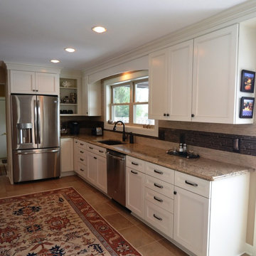
This homeowner came to us with her basic design ready for us to execute for her kitchen, but also asked us to design and update her entry, sunroom and fireplace. Her kitchen was 80’s standard builder grade cabinetry and laminate countertops and she had a knee wall separating her kitchen from the family room. We removed that wall and installed a custom cabinetry buffet to complement the cabinetry of the kitchen, allowing for access from all sides. We removed a desk area in the kitchen and converted it to a closed organization station complete with a charging station for phones and computers. Calcutta Quartzite countertops were used throughout and continued seamlessly up the walls as a backsplash to create a wow factor. We converted a closet into a pantry cabinet, and new stainless appliances, including a microwave drawer completed this renovation.
Additionally, we updated her sunroom by removing the “popcorn” textured ceiling and gave it a fresh updated coat of paint. We installed 12x24 tile floor giving the room a simple classic transformation. Finally, we renewed the fireplace area, by building a custom mantle and adding wood paneling and trim to soften the marble fireplace face and a simple coat of paint in the entry and a new chandelier brought a lighter and fresher impact upon entering the home.

 Gonyea Custom Homes
Mixed gray exterior with decorative timber truss details. Photography by Spacecrafting
Example of a large transitional gray two-story mixed siding exterior home design in Minneapolis
Example of a large transitional gray two-story mixed siding exterior home design in Minneapolis

 Dig Your Garden Landscape Design
The traditional fountain and surroundings are embellished with a variety of drought tolerant grasses, flowering plants and succulents. The removal of the dense and overgrown shrubs provides more outdoor living space for dining and entertaining for the homeowners' enjoyment. And now with site-appropriate plants and no lawn there is less maintenance and a lower water bill. Full color Blue stone and small mexican pebbles replace the lawn and pathways resulting in an updated and contemporary transformation. A variety of low-water plants including succulents offer year-round appeal and interest throughout the seasons to include Sedum rupestre 'Angelina', with chartreuse foliage, other varieties of sedum along with Echeveria succulents, Echinacea and grases. Photos and Design © Eileen Kelly, Dig Your Garden Landscape Design

 Linc Thelen Design
This couple purchased a second home as a respite from city living. Living primarily in downtown Chicago the couple desired a place to connect with nature. The home is located on 80 acres and is situated far back on a wooded lot with a pond, pool and a detached rec room. The home includes four bedrooms and one bunkroom along with five full baths.
The home was stripped down to the studs, a total gut. Linc modified the exterior and created a modern look by removing the balconies on the exterior, removing the roof overhang, adding vertical siding and painting the structure black. The garage was converted into a detached rec room and a new pool was added complete with outdoor shower, concrete pavers, ipe wood wall and a limestone surround.
Living Room Details:
Two-story space open to the kitchen features a cultured cut stone fireplace and wood niche. The niche exposes the existing stone prior to the renovation.
-Large picture windows
-Sofa, Interior Define
-Poof, Luminaire
-Artwork, Linc Thelen (Oil on Canvas)
-Sconces, Lighting NY
-Coffe table, Restoration Hardware
-Rug, Crate and Barrel
-Floor lamp, Restoration Hardware
-Storage beneath the painting, custom by Linc in his shop.
-Side table, Mater
-Lamp, Gantri
-White shiplap ceiling with white oak beams
-Flooring is rough wide plank white oak and distressed

 Alisha Taylor Interiors
Joshua Caldwell
Mudroom - small country ceramic tile and brown floor mudroom idea in Phoenix with gray walls
Mudroom - small country ceramic tile and brown floor mudroom idea in Phoenix with gray walls

 Wendy Glaister Interiors
A wall was removed and a window enlarged to create this open, clean space for the master bathroom. Vessel sinks, a floating vanity with inset hardware, wall mounted faucets, tile set on the diagonal and lighted mirrors add layers of detail and texture for a spectacular space.


 Dick Clark + Associates
Dror Baldinger
Trendy wooden u-shaped metal railing staircase photo in Austin with wooden risers
Trendy wooden u-shaped metal railing staircase photo in Austin with wooden risers

 ACQUIRE
Photo by Sean Litchfield
Inspiration for a farmhouse dark wood floor kitchen remodel in Boston with glass-front cabinets, blue cabinets, quartz countertops, multicolored backsplash, stone tile backsplash, stainless steel appliances and an island
Inspiration for a farmhouse dark wood floor kitchen remodel in Boston with glass-front cabinets, blue cabinets, quartz countertops, multicolored backsplash, stone tile backsplash, stainless steel appliances and an island

6