
Search results for "Replacements roll" in Home Design Ideas
 TKS Design Group
Download our free ebook, Creating the Ideal Kitchen. DOWNLOAD NOW
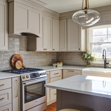
This family from Wheaton was ready to remodel their kitchen, dining room and powder room. The project didn’t call for any structural or space planning changes but the makeover still had a massive impact on their home. The homeowners wanted to change their dated 1990’s brown speckled granite and light maple kitchen. They liked the welcoming feeling they got from the wood and warm tones in their current kitchen, but this style clashed with their vision of a deVOL type kitchen, a London-based furniture company. Their inspiration came from the country homes of the UK that mix the warmth of traditional detail with clean lines and modern updates.
To create their vision, we started with all new framed cabinets with a modified overlay painted in beautiful, understated colors. Our clients were adamant about “no white cabinets.” Instead we used an oyster color for the perimeter and a custom color match to a specific shade of green chosen by the homeowner. The use of a simple color pallet reduces the visual noise and allows the space to feel open and welcoming. We also painted the trim above the cabinets the same color to make the cabinets look taller. The room trim was painted a bright clean white to match the ceiling.
In true English fashion our clients are not coffee drinkers, but they LOVE tea. We created a tea station for them where they can prepare and serve tea. We added plenty of glass to showcase their tea mugs and adapted the cabinetry below to accommodate storage for their tea items. Function is also key for the English kitchen and the homeowners. They requested a deep farmhouse sink and a cabinet devoted to their heavy mixer because they bake a lot. We then got rid of the stovetop on the island and wall oven and replaced both of them with a range located against the far wall. This gives them plenty of space on the island to roll out dough and prepare any number of baked goods. We then removed the bifold pantry doors and created custom built-ins with plenty of usable storage for all their cooking and baking needs.
The client wanted a big change to the dining room but still wanted to use their own furniture and rug. We installed a toile-like wallpaper on the top half of the room and supported it with white wainscot paneling. We also changed out the light fixture, showing us once again that small changes can have a big impact.
As the final touch, we also re-did the powder room to be in line with the rest of the first floor. We had the new vanity painted in the same oyster color as the kitchen cabinets and then covered the walls in a whimsical patterned wallpaper. Although the homeowners like subtle neutral colors they were willing to go a bit bold in the powder room for something unexpected. For more design inspiration go to: www.kitchenstudio-ge.com
 Karin Ross Designs
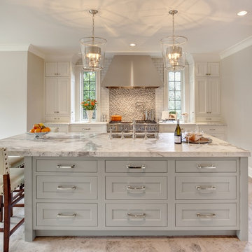
In the latest trends in kitchen remodel we have noticed the use of a warmer grey color for the kitchen cabinets. The finish on the cabinets is divided between sleek look or weathered look with aging details and the mix of both in the kitchen is fantastic. More glass doors with incorporated indirect lighting is the perfect way to show your favorite dishes but also helps create the coziness in your space. The focal points in the Spring/ Summer 2018 will be the hoods over the cook tops and the kitchen islands. The hoods will become bigger and more masculine but will have more decorative details to them so that they can draw attention and be the "hero".
The islands are going to grow bigger so that they can perform the duty and perhaps replace the kitchenette table and to do so the new islands will be very specific in shape and functionality to each owner/ cook. To accomplish the new visions for the kitchen islands, we at Karin Ross Designs like to extend the size by adding different shapes of decorative feet and or shelving instead of having another roll of cabinetry under a bigger slab of counter top. By adding feet and or shelving for your cook books and such we convert the island in a big prep area but also in the much desired space to gather around the cook preparing the family meal. After all one of the best family secrets in accordance to some soap operas, are revealed around the table in the kitchen as the meal is been prepared....

Find the right local pro for your project
 Advance Design Studio, Ltd.
Jackie and Sean loved the Algonquin neighborhood they lived in with the peaceful neighborhood and the close proximity to work and school. What they didn’t love was how outdated their home had become. With a cramped kitchen and an unused dining room, they decided a remodel was the perfect solution to their problem. They would be able to continue to live in the area they loved, while at the same time they could have the dream home they envisioned.
After a thorough search, Jackie came across Advance Design Studio. She was impressed by all of the positive reviews she saw on the internet and saw herself identifying with all of the project stories she saw on the website. Once they met with designer Scott Christensen and owner Todd Jurs, they knew Advance Design was the right company to make their dreams a reality.
The project consisted of four main areas: the kitchen/dining/powder room, the laundry room, the master bathroom, and the kid’s bathroom. They wanted to expand the kitchen into the seldom used dining room and add a large island for hosting parties and family gatherings. They also wanted new hardwood flooring throughout the first level. The laundry room needed to be more functional, and all three bathrooms were in dire need of updating.
The closed off kitchen was opened up to create a sweeping space between the new eating area and the much larger kitchen. A handsome dry bar complete with a beverage refrigerator and lighted glass door cabinetry makes an elegant transition across from a peninsula area filled with storage. An additional decorative cabinet lighting up elegant dishware through the mullioned glass sits directly across from the drybar.
An expansive island was critical to the kitchen plans. Jackie, Sean and Scott worked closely together to create just the right details for their design. They wanted the island to be functional in addition to being the centerpiece of the room. Added storage for the kid’s school supplies was hidden behind cabinet doors so the children could do their schoolwork right at the island, and a microwave drawer glides open with the touch of a finger hidden inconspicuously within the island space. The easy to care for Cambria Britannica Quartz island top with its sweeping grey and white marble look perched atop hand-carved Craftsman corbels was absolutely what they were hoping for, blending both beauty and function perfectly.
Adding a nice contrast to the brightness of the quartz and the white cabinetry, Kodiak - Leather granite countertops were used to balance the light and dark tones of the space. Dura Supreme Classic White painted cabinets grace the perimeter, while Maple Poppy Seed stained cabinets with a beautiful soft grey woodgrain were used in the beverage center and island. The two tones compliment the large space balancing it out nicely creating interest and elegance with the simple Craftsman style full overlay doors.
A deep warm Barnwood White Oak flooring was added throughout the lower level. The new floor brings additional contrast to the bright kitchen and provides unity with the now open floorplan as it rolls in to the foyer and family room. Final details like the show-stopping lunar like duo light fixtures complete the space and intermix expertly with crisscross details of the glass door mullions, the island bar seating and even accessories in the space.
The small cluttered laundry room needed more space and more storage. With a busy family it seemed to overflow daily and did not have anywhere to hide the families “in and out stuff.” Scott designed the new space with a stackable washer and dryer and much more efficiently organized cabinetry. Doing laundry is now (almost!) a pleasure and keeping everyone’s “stuff” hidden, but readily accessible is now a snap.
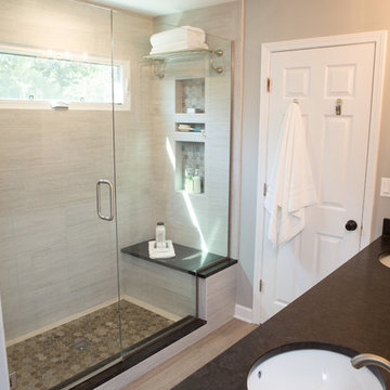
The master bath was not a place where the couple enjoyed spending time getting ready for their day. The tub almost never was used, so removing it made it possible to build an extra-large shower, replacing the small cramped cube of the previous shower they hated. Clean, horizontal lines softly draw your eye around the space with porcelain tile called Driftwood Sea spray. Full overlay cabinetry in a soft white vanity with double sinks makes getting ready for the day much more convenient for the busy couple.
Long floor planks made of porcelain tile mimic real hardwood floors in a soft grey to compliment the shower, but with the ease and care of a tile surface. Cambrian Black Granite counters with a matte finish and under mount porcelain sinks with handsome brushed chrome hardware complete the handsome space. A real bonus in any master bath; a custom built in storage nook was tucked in the corner of the space for linens and heavenly storage.
The kid’s bath was in sad shape because it was original to the house. To keep the budget in control, the tub which was in great condition was retained, but focus was on the new large brick style porcelain charcoal tile on the floor, crisp white new Craftsman style cabinetry with pretty furniture details on the corner base, a striking granite top with white under mount porcelain sinks and fresh hardware and faucets. Some beautiful soft grey wood mirrors to match mom and dads were custom sized and placed under new lighting, and 4 hooks were smartly arranged down the wall for kids’ towels.
This couple was determined not to move, and made their house their dream home. Not only does their home function greatly now, but Jackie says, “When the neighbors come to visit, they’re asking if they can “steal” the design”! The added functionality, elegance, and open floor plan were exactly what this family needed in order to stay.
Advance Design Studio, Joe Nowak
 McMillan Builders LLC
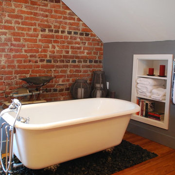
After removing old sheet paneling, we exposed the original brick walls on the gable end of the home. Once we refinished the 1922-installed pine flooring, the warmth of the room came through. Steven Berson
 Liz Schupanitz Designs
Kitchen Is Where the Hearth Is
Location: Edina, MN, USA
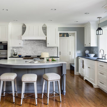
With her only daughter off to college, this busy executive decided it was time to remodel her kitchen to suit her love for baking, cooking and hosting holidays for her large family. The homeowner’s wish list included white cabinetry, an island, plenty of storage, a gas insert for the fireplace and a special place for her collection of teacups.
The fireplace and the large bank of windows in the existing footprint were a challenge to designing a cohesive plan. But by moving the doorway to the mudroom closer to the sink wall, a dedicated cooking zone was created for the convection oven, steam oven and a gas rangetop. This wall became the anchor for the island, topped with Carrara marble, an ideal surface for rolling out pie dough and making cookies. Blue, the homeowner’s favorite color was chosen for the island color with a black glaze to give it warmth. It sets off the marble and coordinates with the soapstone on the perimeter, a low maintenance option. The whimsical island stools from Hickory Chair invite friends to stay a while.
The wood-burning fireplace was replaced with gas to make it more useable and the brick was covered with a marble slab to create a clean, transitional feel. The paneled accent wall detail uses the same inside step profile of the cabinetry doors and is painted in Benjamin Moore Coventry Gray to match the walls but with a slightly higher sheen. It separates the kitchen dining space from the kitchen work area giving it a feeling of friendly formality.
The hutch adds more kitchen storage and shows off the homeowner’s collection of colorful teacups with a contrasting painted interior in Benjamin Moore Yarmouth Blue. The Urban Electric black lantern over the kitchen table also has a painted interior of Yarmouth Blue. This dining space with fun bits of drama ties in with the swooping white hood and Carrara marble wall tiles on the opposite side of the kitchen space.
The result is an organized cook’s kitchen that transitions gracefully to entertaining.
Liz Schupanitz Designs
Photographed by: Andrea Rugg
 Corynne Pless
Photo: Corynne Pless Photography © 2015 Houzz
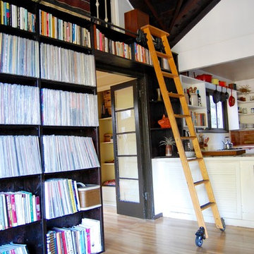
Transitional living room photo in Los Angeles
Transitional living room photo in Los Angeles


 Margot Hartford Photography
Photo: Margot Hartford ˙© 2016 Houzz
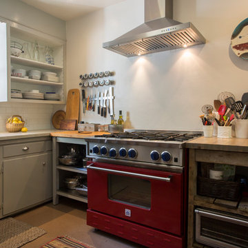
Example of an eclectic kitchen design in San Francisco
Example of an eclectic kitchen design in San Francisco
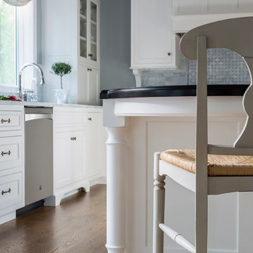 Liz Schupanitz Designs
A PLACE TO GATHER
Location: Eagan, MN, USA
This family of five wanted an inviting space to gather with family and friends. Mom, the primary cook, wanted a large island with more organized storage – everything in its place – and a crisp white kitchen with the character of an older home.
Challenges:
Design an island that could accommodate this family of five for casual weeknight dinners.
Create more usable storage within the existing kitchen footprint.
Design a better transition between the upper cabinets on the 8-foot sink wall and the adjoining 9-foot cooktop wall.
Make room for more counter space around the cooktop. It was poorly lit, cluttered with small appliances and confined by the tall oven cabinet.
Solutions:
A large island, that seats 5 comfortably, replaced the small island and kitchen table. This allowed for more storage including cookbook shelves, a heavy-duty roll out shelf for the mixer, a 2-bin recycling center and a bread drawer.
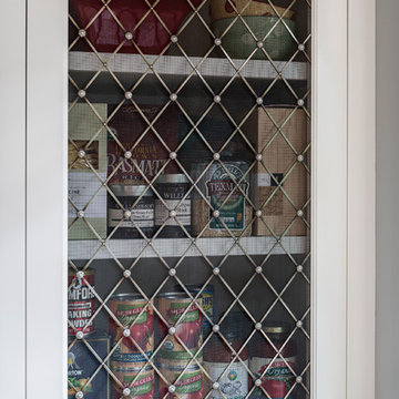
Tall pantries with decorative grilles were placed between the kitchen and family room. These created ample storage and helped define each room, making each one feel larger, yet more intimate.
A space intentionally separates the upper cabinets on the sink wall from those on the cooktop wall. This created symmetry on the sink wall and made room for an appliance garage, which keeps the countertops uncluttered.
Moving the double ovens to the former pantry location made way for more usable counter space around the cooktop and a dramatic focal point with the hood, cabinets and marble backsplash.
Special Features:
Custom designed corbels and island legs lend character.
Gilt open lanterns, antiqued nickel grilles on the pantries, and the soft linen shade at the kitchen sink add personality and charm.
The unique bronze hardware with a living finish creates the patina of an older home.
A walnut island countertop adds the warmth and feel of a kitchen table.
This homeowner truly understood the idea of living with the patina of marble. Her grandmother’s marble-topped antique table inspired the Carrara countertops.
The result is a highly organized kitchen with a light, open feel that invites you to stay a while.
Liz Schupanitz Designs
Photographed by: Andrea Rugg
 KGA Studio Architects, PC
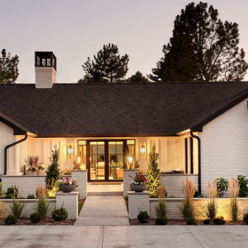
Mid-sized transitional white one-story mixed siding house exterior idea in Denver with a black roof
 Liz Schupanitz Designs
A PLACE TO GATHER
Location: Eagan, MN, USA
This family of five wanted an inviting space to gather with family and friends. Mom, the primary cook, wanted a large island with more organized storage – everything in its place – and a crisp white kitchen with the character of an older home.
Challenges:
Design an island that could accommodate this family of five for casual weeknight dinners.
Create more usable storage within the existing kitchen footprint.
Design a better transition between the upper cabinets on the 8-foot sink wall and the adjoining 9-foot cooktop wall.
Make room for more counter space around the cooktop. It was poorly lit, cluttered with small appliances and confined by the tall oven cabinet.
Solutions:
A large island, that seats 5 comfortably, replaced the small island and kitchen table. This allowed for more storage including cookbook shelves, a heavy-duty roll out shelf for the mixer, a 2-bin recycling center and a bread drawer.
Tall pantries with decorative grilles were placed between the kitchen and family room. These created ample storage and helped define each room, making each one feel larger, yet more intimate.
A space intentionally separates the upper cabinets on the sink wall from those on the cooktop wall. This created symmetry on the sink wall and made room for an appliance garage, which keeps the countertops uncluttered.
Moving the double ovens to the former pantry location made way for more usable counter space around the cooktop and a dramatic focal point with the hood, cabinets and marble backsplash.
Special Features:
Custom designed corbels and island legs lend character.
Gilt open lanterns, antiqued nickel grilles on the pantries, and the soft linen shade at the kitchen sink add personality and charm.
The unique bronze hardware with a living finish creates the patina of an older home.
A walnut island countertop adds the warmth and feel of a kitchen table.
This homeowner truly understood the idea of living with the patina of marble. Her grandmother’s marble-topped antique table inspired the Carrara countertops.
The result is a highly organized kitchen with a light, open feel that invites you to stay a while.
Liz Schupanitz Designs
Photographed by: Andrea Rugg
 FOUR POINT DESIGN BUILD INC
Interior Designer - Laura Schwartz-Muller
General Contractor - Cliff Muller
Photographer - Brian Thomas Jones
Copyright 2014
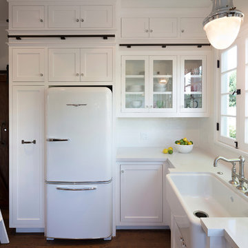
Example of a mid-sized transitional u-shaped medium tone wood floor eat-in kitchen design in Los Angeles with a farmhouse sink, shaker cabinets, white cabinets, solid surface countertops, white backsplash, subway tile backsplash, stainless steel appliances and a peninsula
Example of a mid-sized transitional u-shaped medium tone wood floor eat-in kitchen design in Los Angeles with a farmhouse sink, shaker cabinets, white cabinets, solid surface countertops, white backsplash, subway tile backsplash, stainless steel appliances and a peninsula


 Karla Trincanello, CID, Interior Decisions, Inc.
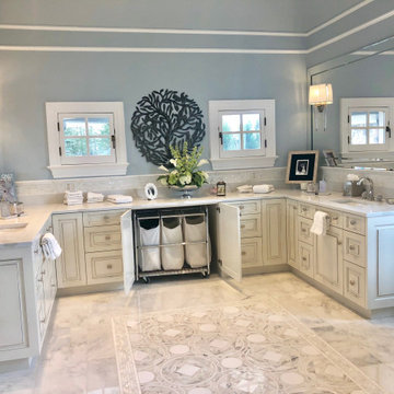
This well used but dreary bathroom was ready for an update but this time, materials were selected that not only looked great but would stand the test of time. The large steam shower (6x6') was like a dark cave with one glass door allowing light. To create a brighter shower space and the feel of an even larger shower, the wall was removed and full glass panels now allowed full sunlight streaming into the shower which avoids the growth of mold and mildew in this newly brighter space which also expands the bathroom by showing all the spaces. Originally the dark shower was permeated with cracks in the marble marble material and bench seat so mold and mildew had a home. The designer specified Porcelain slabs for a carefree un-penetrable material that had fewer grouted seams and added luxury to the new bath. Although Quartz is a hard material and fine to use in a shower, it is not suggested for steam showers because there is some porosity. A free standing bench was fabricated from quartz which works well. A new free
standing, hydrotherapy tub was installed allowing more free space around the tub area and instilling luxury with the use of beautiful marble for the walls and flooring. A lovely crystal chandelier emphasizes the height of the room and the lovely tall window.. Two smaller vanities were replaced by a larger U shaped vanity allotting two corner lazy susan cabinets for storing larger items. The center cabinet was used to store 3 laundry bins that roll out, one for towels and one for his and one for her delicates. Normally this space would be a makeup dressing table but since we were able to design a large one in her closet, she felt laundry bins were more needed in this bathroom. Instead of constructing a closet in the bathroom, the designer suggested an elegant glass front French Armoire to not encumber the space with a wall for the closet.The new bathroom is stunning and stops the heart on entering with all the luxurious amenities.
 GROUND UP CONSTRUCTING
Ground Up Constructing
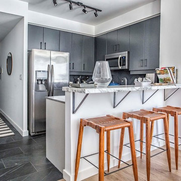
Inspiration for a mid-sized modern u-shaped slate floor and black floor eat-in kitchen remodel in Toronto with an undermount sink, flat-panel cabinets, gray cabinets, marble countertops, gray backsplash, ceramic backsplash, stainless steel appliances, a peninsula and white countertops
Inspiration for a mid-sized modern u-shaped slate floor and black floor eat-in kitchen remodel in Toronto with an undermount sink, flat-panel cabinets, gray cabinets, marble countertops, gray backsplash, ceramic backsplash, stainless steel appliances, a peninsula and white countertops
 7 Day Kitchens
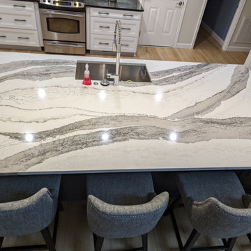
This charming family home in Belmont was in dire need of some tender loving care. The original builder-grade cabinetry and countertops were outdated and in need of an upgrade.
The kitchen was once isolated from the dining room and living room, making entertaining guests a real chore. Cooking in the kitchen meant being cut off from the rest of the household, leading to a disconnect during family time. So, we decided to make some sweeping changes.
The most transformative change was the removal of the load bearing wall separating the kitchen and living room. This created a spacious open-concept kitchen with a massive island, perfect for hosting and socializing. We upgraded the cabinets to reflect a contemporary aesthetic and added a stunning hood vent. The built-in hutch was replaced by a refrigerator and beverage center, providing ample storage space and more practical usage. The kitchen was also equipped with modern features such as roll-out trays, a trash can pull-out, spice racks, and utensil organizers. We replaced the older-style double door base cabinets with modern drawer bases for easy access, and increased the height of the cabinets from 30 inches to 36 inches, giving the kitchen a fresh, airy look and additional storage space.
The laundry room also received a makeover, with new cabinets above the washer and dryer and a tall linen/storage closet, making it more functional and storage-friendly. The small pantry closet was transformed into a sprawling 12 foot deep walk-in pantry with new shelves, cabinetry and lighting, providing ample space for all your pantry essentials. We also upgraded the flooring on the first floor with durable LVP flooring, elevating the overall aesthetic and feel of the home. All of these changes were completed in a mere 21 days, from start to finish.
 Luxury Outdoor Living, Inc.
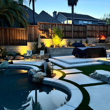
New cantilevered pool coping & water line tile replaced the old flagstone pavers, decomposed granite and rolled pool beam with synthetic turf strips to "Green-up" the large amount of concrete. The "Raw" engineered concrete wall replaced an old failing wood wall with a new fence on top and pop-out concrete planters create some movement of space along the wall giving room for some focal point planting, lighting, boulders to soften the hard lines and some spectacular color and texture. The ambient well lights reflecting light off the walls create some spectacular patterns across the wall & silhouettes some of the plantings.
Sponsored
Columbus, OH

Wannemacher Interiors
Customized Award-Winning Interior Design Solutions in Franklin Cnty OH
 ShelfGenie of Grand Valley
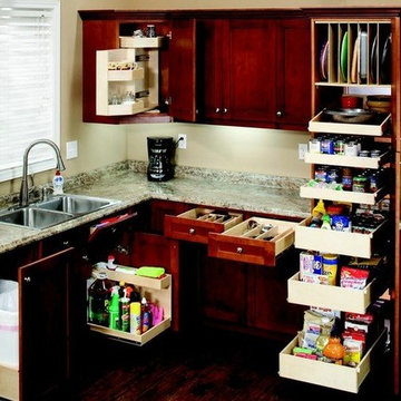
A ShelfGenie of Grand Valley certified design professional will create a custom pull out shelving plan for your kitchen, designed to fit your existing kitchen cabinets and closets. Roll out solutions include a roll out trash bin, Glide-Around corner cabinet system, drawer box replacements, pull out shelves and more.
 Drury Design
This client is in the beauty industry, so – in additional to great style – she has more beauty products than most people do. Before the renovation, there were products all over the counters and in temporary roll-in shelving units that got wheeled into the bathroom.
It was time for a change.
Design objectives:
-Add tons of storage
-Feature blingy, reflective materials
-Improve lighting
-Omit unused built-in tub
-Create a large luxurious shower
-Include large mirrors to the ceiling
THE REMODEL
With the right storage solutions, a bathroom loaded with products and gadgets can look virtually empty. Elegance and order contribute to living life artfully.
Design challenges:
-Standard vanities don’t offer much storage
-The existing window was in an ideal spot for a shower
-The client prefers large mirrors, so we needed an alternative to medicine cabinets
Design solutions:
-Replace the existing window with a waterproof privacy window
-Create dresser-style vanities with u-shaped drawers for maximum storage
-Include a tall cabinet with roll-out shelves for maximum storage and organization
THE RENEWED SPACE
Beauty products and daily needs are organized and out of the way – out of sight but easy to access. With a creative, modern palette of colors, patterns and textures, the bathroom’s aura is inviting, relaxing and luxurious.
 The Roof Medics
The Roof Medics
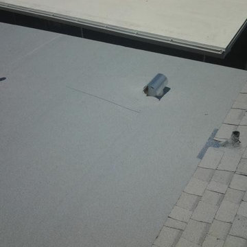
Completed flat roof replacement in Mesa, AZ over carport. Used modified bitumen (rolled roofing).
Elegant home design photo in Phoenix
Elegant home design photo in Phoenix
28