
Search results for "Repose" in Home Design Ideas
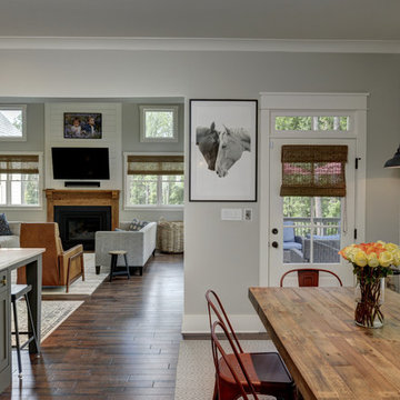


Find the right local pro for your project
 Reico Kitchen & Bath
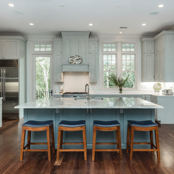
This project features cabinet designs for the kitchen, master bathroom, two additional bathrooms and a laundry room, created by Nancy Knickerbocker of Reico Kitchen & Bath in Southern Pines, NC with all cabinets and only cabinets supplied by Reico Kitchen & Bath on this project.
The kitchen design features custom frameless cabinets supplied by Reico in a combination of painted finishes in grey (perimeter) and blue spruce (island) with dovetail wood drawer cores and soft close doors and drawers.
The master bathroom design features Ultracraft Cabinetry in the Avon door style in Maple with a Sherwin Williams SW7015 Repose Gray painted finish, with dovetail wood drawer cores and soft action guides.
The bathroom design featuring a mirrored door vanity cabinet is the Ultracraft Rockford door style in Maple with a Melted Brie Nickel Linen finish, with dovetail wood drawer cores and soft action guides.
The bathroom design featuring multiple blue vanity cabinets and an offset left sink is the Ultracraft Stickley door style in Maple with a Blue Ash finish, with dovetail wood drawer cores and soft action guides.
The laundry room design features Ultracraft Cabinetry in the Kiawah door style with matching 5-piece drawer fronts in Cherry with a Coastal Grey with Brown Glaze Worn finish, with dovetail wood drawer cores and soft action guides.
Photos courtesy of Charleston Realty Pics, LLC.

 Campbell Cabinetry
John Campbell
Inspiration for a mid-sized transitional l-shaped dark wood floor open concept kitchen remodel in Orlando with an undermount sink, shaker cabinets, white cabinets, granite countertops, white backsplash, subway tile backsplash, stainless steel appliances and an island
Inspiration for a mid-sized transitional l-shaped dark wood floor open concept kitchen remodel in Orlando with an undermount sink, shaker cabinets, white cabinets, granite countertops, white backsplash, subway tile backsplash, stainless steel appliances and an island


 Mariano & Co., LLC
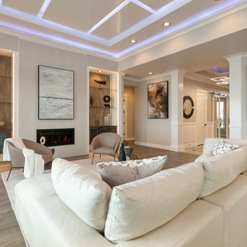
We removed a wall that separated the Kitchen and living room to open up the space. Created a Large Island that is topped with Granite with a Smokehouse stain cabinet, the surround is Grey Quartz with Cream Cabinets.
 TKS Design Group
Download our free ebook, Creating the Ideal Kitchen. DOWNLOAD NOW
The homeowners built their traditional Colonial style home 17 years’ ago. It was in great shape but needed some updating. Over the years, their taste had drifted into a more contemporary realm, and they wanted our help to bridge the gap between traditional and modern.
We decided the layout of the kitchen worked well in the space and the cabinets were in good shape, so we opted to do a refresh with the kitchen. The original kitchen had blond maple cabinets and granite countertops. This was also a great opportunity to make some updates to the functionality that they were hoping to accomplish.
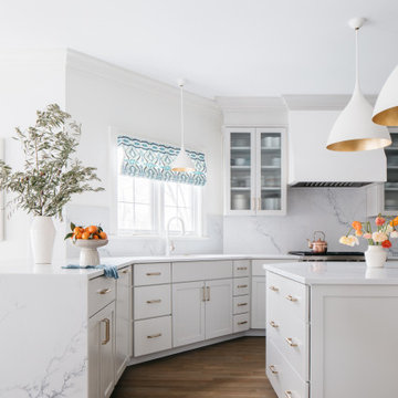
After re-finishing all the first floor wood floors with a gray stain, which helped to remove some of the red tones from the red oak, we painted the cabinetry Benjamin Moore “Repose Gray” a very soft light gray. The new countertops are hardworking quartz, and the waterfall countertop to the left of the sink gives a bit of the contemporary flavor.
We reworked the refrigerator wall to create more pantry storage and eliminated the double oven in favor of a single oven and a steam oven. The existing cooktop was replaced with a new range paired with a Venetian plaster hood above. The glossy finish from the hood is echoed in the pendant lights. A touch of gold in the lighting and hardware adds some contrast to the gray and white. A theme we repeated down to the smallest detail illustrated by the Jason Wu faucet by Brizo with its similar touches of white and gold (the arrival of which we eagerly awaited for months due to ripples in the supply chain – but worth it!).
The original breakfast room was pleasant enough with its windows looking into the backyard. Now with its colorful window treatments, new blue chairs and sculptural light fixture, this space flows seamlessly into the kitchen and gives more of a punch to the space.
The original butler’s pantry was functional but was also starting to show its age. The new space was inspired by a wallpaper selection that our client had set aside as a possibility for a future project. It worked perfectly with our pallet and gave a fun eclectic vibe to this functional space. We eliminated some upper cabinets in favor of open shelving and painted the cabinetry in a high gloss finish, added a beautiful quartzite countertop and some statement lighting. The new room is anything but cookie cutter.
Next the mudroom. You can see a peek of the mudroom across the way from the butler’s pantry which got a facelift with new paint, tile floor, lighting and hardware. Simple updates but a dramatic change! The first floor powder room got the glam treatment with its own update of wainscoting, wallpaper, console sink, fixtures and artwork. A great little introduction to what’s to come in the rest of the home.
The whole first floor now flows together in a cohesive pallet of green and blue, reflects the homeowner’s desire for a more modern aesthetic, and feels like a thoughtful and intentional evolution. Our clients were wonderful to work with! Their style meshed perfectly with our brand aesthetic which created the opportunity for wonderful things to happen. We know they will enjoy their remodel for many years to come!
Photography by Margaret Rajic Photography

 Amy Troute Inspired Interior Design
Photographed By: Heidi Von Tagen
Example of a large classic dark wood floor dining room design in Portland with beige walls
Example of a large classic dark wood floor dining room design in Portland with beige walls
 TKS Design Group
Free ebook, Creating the Ideal Kitchen. DOWNLOAD NOW
This Chicago client was tired of living with her outdated and not-so-functional kitchen and came in for an update. The goals were to update the look of the space, enclose the washer/dryer, upgrade the appliances and the cabinets.
The space is located in turn-of-the-century brownstone, so we tried to stay in keeping with that era but provide an updated and functional space.
One of the primary challenges of this project was a chimney that jutted into the space. The old configuration meandered around the chimney creating some strange configurations and odd depths for the countertop.
We finally decided that just flushing out the wall along the chimney instead would create a cleaner look and in the end a better functioning space. It also created the opportunity to access those new pockets of space behind the wall with appliance garages to create a unique and functional feature.
The new galley kitchen has the sink on one side and the range opposite with the refrigerator on the end of the run. This very functional layout also provides large runs of counter space and plenty of storage. The washer/dryer were relocated to the opposite side of the kitchen per the client's request, and hide behind a large custom bi-fold door when not in use.
A wine fridge and microwave are tucked under the counter so that the primary visual is the custom mullioned doors with antique glass and custom marble backsplash design. White cabinetry, Carrera countertops and an apron sink complete the vintage feel of the space, and polished nickel hardware and light fixtures add a little bit of bling.
Designed by: Susan Klimala, CKD, CBD
Photography by: Carlos Vergara
For more information on kitchen and bath design ideas go to: www.kitchenstudio-ge.com
 Nu Drōm Inc.
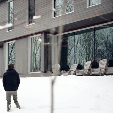
Des Mûriers se lit en deux volumes. Le premier, étroit et de plain-pied, épouse la pente; le second, plus large, se pose au-dessus et se détache du sol. Sur ce terrain très escarpé, des murs de gabion ont été nécessaires pour retenir le plateau de terre sur lequel la maison vient s’implanter.
Le deuxième étage est entièrement en porte-à-faux par rapport au rez-de-chaussée. Sa mise en œuvre a demandé une coordination précise de la structure et des appuis afin de conserver les lignes du bâtiment malgré le décalage important entre les deux niveaux.
À l’extérieur, le changement d’orientation du revêtement accompagne cette superposition : le bois est posé verticalement au rez-de-chaussée et horizontalement à l’étage. Avec une fenestration généreuse et peu d’éléments pour masquer les rencontres, les alignements et les transitions devaient être réglés avec soin.
À l’intérieur, le rez-de-chaussée repose sur un plancher de béton poli, alors que l’étage est fini en bois. Là encore, les changements de matériaux sont francs et laissent peu de place aux ajustements tardifs.
 Henderson Design Group
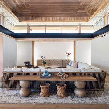
This opulent living room is an exquisite sanctuary where natural beauty and refined elegance coexist in perfect harmony. Anchored by a stately wooden side table adorned with artfully arranged vases and woven wicker baskets, the space radiates a warm, inviting spirit that gently echoes the surrounding environment’s organic textures. The grand sectional sofa gracefully encircles a collection of coffee and smaller round tables, creating an intimate yet expansive setting that invites heartfelt conversations and tranquil moments of repose.
Above, the second-story loft embraces the room with its rich black and brown wood trim, framing the space with a subtle sophistication that enhances the home's natural allure while offering visual depth and architectural intrigue. It is a space meticulously crafted to celebrate the art of living gracefully, where the sliding doors provide the thoughtful option to shift the atmosphere toward quiet privacy without sacrificing the relaxed feeling of a large, open space.

 OBM International
Designed to be a legacy and space where great family memories could be created, OBMI completed the master planning, landscape, interior design, and architecture of the holistic residential Longtail House project.
A modern home wrapped in the classic Bermudian style, it’s comprised of 4 bedrooms with in-suite bathrooms including a master suite and a guest apartment. A Great Room combines all family social activity in one space, with an incorporated living room, dining room, and kitchen. Close by is the Library-Music Room, Media Room, Home Office, back of house kitchen support and laundry. Below the Great Room are the Game Room and the wine cellar, which can be observed from above through a glass floor. There is a large garage for vehicles and various sporting items. At the front of the house, overlooking the ocean is the infinity pool, spa, and gardens with endemic shoreline plants.
The previous house on the property site was carefully disassembled and recycled as exemplified by the existing cedar wood floors, which were repurposed as entrance ceilings. Even garden plants were recycled where possible. The biggest challenge was during excavation. With a lot of hard rock present, it took several weeks to cut through. Once the foundation level was achieved, all work went smoothly. The house has a strong emphasis on respecting and nurturing the environment, with igloo nests situated at the edge of the cliffs for Longtail seabirds to repose. The layout was set so as to maximize the best sun orientation for the solar panels and for natural cooling from the offshore breezes to occur.

 Designer's Atelier
For maximum graphic impact we displayed a Neon canvas by Andrew Martin which balances with our client’s existing art piece on the opposite wall by Pietro Psaier. The Oval Fly table by Flexform with a chrome base and Isabel chairs appealed to our client for its simplicity, form and function.

 MGM Builders
This 3,036 sq. ft custom farmhouse has layers of character on the exterior with metal roofing, cedar impressions and board and batten siding details. Inside, stunning hickory storehouse plank floors cover the home as well as other farmhouse inspired design elements such as sliding barn doors. The house has three bedrooms, two and a half bathrooms, an office, second floor laundry room, and a large living room with cathedral ceilings and custom fireplace.
Photos by Tessa Manning

 FOUR POINT DESIGN BUILD INC
Interior Designer - Laura Schwartz-Muller
General Contractor - Cliff Muller
Photographer - Brian Thomas Jones
Copyright 2014
Mid-sized transitional u-shaped medium tone wood floor eat-in kitchen photo in Los Angeles with a farmhouse sink, shaker cabinets, white cabinets, solid surface countertops, white backsplash, subway tile backsplash, stainless steel appliances and a peninsula
Mid-sized transitional u-shaped medium tone wood floor eat-in kitchen photo in Los Angeles with a farmhouse sink, shaker cabinets, white cabinets, solid surface countertops, white backsplash, subway tile backsplash, stainless steel appliances and a peninsula

 DJL Builders
Tradition meets modern in this open concept full home remodel by DJL Builders. A spacious entry opens immediately to formal dining highlighted with a stacked-stone fireplace. Connected living and kitchen keep the open concept flowing. Upstairs, the master suite is capped in dramatic style with a centered jet tub and walk-in shower flanked by his-and-her vanities. A walk-in closet is hidden behind the back wall. Let DJL Builders design and build your dream home. Give us a call today!
Project Location: Plymouth, MI
CJ South Photography


 TKS Design Group
Download our free ebook, Creating the Ideal Kitchen. DOWNLOAD NOW
The homeowners built their traditional Colonial style home 17 years’ ago. It was in great shape but needed some updating. Over the years, their taste had drifted into a more contemporary realm, and they wanted our help to bridge the gap between traditional and modern.
We decided the layout of the kitchen worked well in the space and the cabinets were in good shape, so we opted to do a refresh with the kitchen. The original kitchen had blond maple cabinets and granite countertops. This was also a great opportunity to make some updates to the functionality that they were hoping to accomplish.
After re-finishing all the first floor wood floors with a gray stain, which helped to remove some of the red tones from the red oak, we painted the cabinetry Benjamin Moore “Repose Gray” a very soft light gray. The new countertops are hardworking quartz, and the waterfall countertop to the left of the sink gives a bit of the contemporary flavor.
We reworked the refrigerator wall to create more pantry storage and eliminated the double oven in favor of a single oven and a steam oven. The existing cooktop was replaced with a new range paired with a Venetian plaster hood above. The glossy finish from the hood is echoed in the pendant lights. A touch of gold in the lighting and hardware adds some contrast to the gray and white. A theme we repeated down to the smallest detail illustrated by the Jason Wu faucet by Brizo with its similar touches of white and gold (the arrival of which we eagerly awaited for months due to ripples in the supply chain – but worth it!).
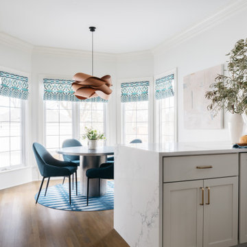
The original breakfast room was pleasant enough with its windows looking into the backyard. Now with its colorful window treatments, new blue chairs and sculptural light fixture, this space flows seamlessly into the kitchen and gives more of a punch to the space.
The original butler’s pantry was functional but was also starting to show its age. The new space was inspired by a wallpaper selection that our client had set aside as a possibility for a future project. It worked perfectly with our pallet and gave a fun eclectic vibe to this functional space. We eliminated some upper cabinets in favor of open shelving and painted the cabinetry in a high gloss finish, added a beautiful quartzite countertop and some statement lighting. The new room is anything but cookie cutter.
Next the mudroom. You can see a peek of the mudroom across the way from the butler’s pantry which got a facelift with new paint, tile floor, lighting and hardware. Simple updates but a dramatic change! The first floor powder room got the glam treatment with its own update of wainscoting, wallpaper, console sink, fixtures and artwork. A great little introduction to what’s to come in the rest of the home.
The whole first floor now flows together in a cohesive pallet of green and blue, reflects the homeowner’s desire for a more modern aesthetic, and feels like a thoughtful and intentional evolution. Our clients were wonderful to work with! Their style meshed perfectly with our brand aesthetic which created the opportunity for wonderful things to happen. We know they will enjoy their remodel for many years to come!
Photography by Margaret Rajic Photography
 TKS Design Group
Free ebook, Creating the Ideal Kitchen. DOWNLOAD NOW
This Chicago client was tired of living with her outdated and not-so-functional kitchen and came in for an update. The goals were to update the look of the space, enclose the washer/dryer, upgrade the appliances and the cabinets.
The space is located in turn-of-the-century brownstone, so we tried to stay in keeping with that era but provide an updated and functional space.
One of the primary challenges of this project was a chimney that jutted into the space. The old configuration meandered around the chimney creating some strange configurations and odd depths for the countertop.
We finally decided that just flushing out the wall along the chimney instead would create a cleaner look and in the end a better functioning space. It also created the opportunity to access those new pockets of space behind the wall with appliance garages to create a unique and functional feature.
The new galley kitchen has the sink on one side and the range opposite with the refrigerator on the end of the run. This very functional layout also provides large runs of counter space and plenty of storage. The washer/dryer were relocated to the opposite side of the kitchen per the client's request, and hide behind a large custom bi-fold door when not in use.
A wine fridge and microwave are tucked under the counter so that the primary visual is the custom mullioned doors with antique glass and custom marble backsplash design. White cabinetry, Carrera countertops and an apron sink complete the vintage feel of the space, and polished nickel hardware and light fixtures add a little bit of bling.
Designed by: Susan Klimala, CKD, CBD
Photography by: Carlos Vergara
For more information on kitchen and bath design ideas go to: www.kitchenstudio-ge.com
162