
Search results for "Reposition" in Home Design Ideas
 Fresh Look Design
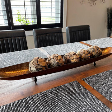
Fresh Look Design utilized her One Day Decorating Service to assist my client with repositioning their furniture and accessories and then adding some unique accessories and artwork to add some WOW factor. To complete her living room, we will add draperies, a coffee table and some lamps. My client said her main floor in their new house finally feels like home.
 Michael Nash Design, Build & Homes
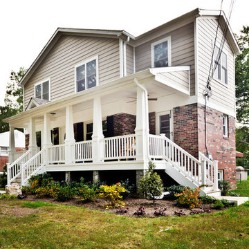
Overhaul Converts Classic Rambler to A Modern Yet Classic Family Home in Fairfax
This 1970 rambler in middle of old town in Fairfax City has been home to a growing family of five.
Ready for a massive overhaul, the family reached out to Michael Nash Design Build & Homes for assistance. Eligible for a special Fairfax City Renaissance program, this project was awarded special attention and favorable financing.
We removed the entire roof and added a bump up, second story three-bedroom, two bathroom and loft addition.
The main level was reformatted to eliminate the smallest bedroom and split the space among adjacent bedroom and the main living room. The partition walls between the living room and dining room and the partition wall between dining room and kitchen were eliminated, making space for a new enlarged kitchen.
The outside brick chimney was rebuilt and extended to pass into the new second floor roof lines. Flu lines for heater and furnace were eliminated. A furnace was added in the new attic space for second floor heating and cooling, while a new hot water heater and furnace was re-positioned and installed in the basement.
Second floor was furnished with its own laundry room.
A new stairway to the second floor was designed and built were furnace chase used to be, opening up into a loft area for a kids study or gaming area.
The master bedroom suite includes a large walk-in closet, large stoned shower, slip-free standing tub, separate commode area, double vanities and more amenities.
A kid’s bathroom was built in the middle of upstairs hallway.
The exterior of this home was wrapped around with cement board siding, maintenance free trims and gutters, and life time architectural shingles.
Added to a new front porch were Trex boards and stone and tapered style columns. Double staircase entrance from front and side yard made this residence a stand out home of the community.
This remodeled two-story colonial home with its country style front porch, five bedrooms, four and half bathrooms and second floor laundry room, will be this family’s home for many years to come.
Happier than before, this family moved back into this Extreme Makeover Home to love every inch of their new home.
 Klopf Architecture
Set on a narrow hillside lot overlooking the San Francisco Bay in Point Richmond, California, Bay Heirloom is a Mid-Century Modern family home restored, modernized and adapted for contemporary living. Oriented south-southwest toward the Marin Headlands, with views of the Golden Gate Bridge, the residence captures shifting Bay light throughout the day, from fog-muted mornings to vivid, glowing sunsets.
The home was built by Karlyn Neel’s grandfather, the owner of the construction company Flo-Crete, one of the Bay Area’s early concrete pumping firms. Flo-Crete completed the foundation and structural concrete work, with family photographs documenting the original cinderblock walls and pours. The firm also contributed to major regional infrastructure projects, including the Transbay BART tube and Candlestick Park, situating the house within a broader legacy of Bay Area construction. Growing up, Neel spent considerable time in the home, developing an early appreciation for mid-century modern principles. Instead of parting with this family heirloom, she purchased the home from her grandfather’s estate.
While her grandfather continued to live in the Point Richmond house, Neel purchased a Mid-Century Modern residence in Palm Desert. In contrast to the Bay Area’s cool temperatures, salt air, and persistent winds, the desert home is shaped by heat and sun and requires a different material response. A substantial renovation she led there emphasized thermal performance, filtered light, and restrained detailing. The experience later informed the restoration of her Bay Area family home.
What began as a modest Mid-Century Modern update expanded when decades of exposure to marine conditions revealed leaks and significant structural and seismic deficiencies. Neel was determined to honor her grandfather’s perseverance and without hesitation pivoted to a much more intensive project. Addressing these challenges required close coordination between Neel, Klopf Architecture and Kasten Builders, with architectural restraint and construction precision guiding each intervention. Rather than alter the home’s defining features, the project focused on reinforcing the structure from within. Discreet beams were embedded along the rear facade and in an upstairs wall, strengthening the building while maximizing the wall of glass facing the Bay and opening the wall between the kitchen and the living space. These structural interventions allowed the space to open fully to the Bay without visual interruption, with the kitchen repositioned as the social and functional core of an open, continuous living space. The building envelope was updated using weather- and corrosion-resistant materials appropriate to the marine environment.
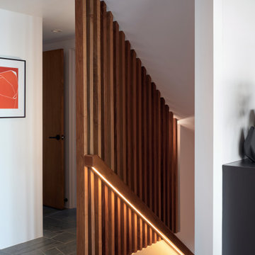
The house unfolds vertically from the street, beginning with a modest garage level and workshop, with the main living spaces located below. Original slate flooring at the entry was preserved, along with select furnishings and artwork collected by Neel’s grandfather, anchoring the restored interior in its past. A restrained palette of black accents and pale, natural finishes replaces darker wood tones, reinforcing openness and calm. A naturally illuminated stair connects to the lowest level, where a former basement was transformed into a guest suite and family room opening onto a deck. From there, steps lead directly to a small concrete boat ramp at the water’s edge.
Throughout the project, decisions were guided by continuity rather than transformation for its own sake. Lessons drawn from both desert and coastal climates informed a material strategy rooted in performance and restraint. Bay Heirloom stands as a measured evolution of a family house, structurally renewed and carefully modernized, grounded in the discipline and care that first shaped it.
Klopf Architecture Project Team: John Klopf, AIA, Angela Todorova and Fernanda Bernardes
Landscape Architect: Huettl Landscape Architecture
General Contractor: Kasten Builders
Photography: ©2025 Mariko Reed
Year Completed: 2022
Location: Point Richmond, CA
Find the right local pro for your project
 User
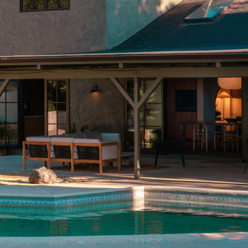
UserFeatured in Dwell, Hacienda Granada is an eclectic modern residence designed by Working Holiday Studio that subtly combines the Spanish influences of a Mexican hacienda with Scandinavian minimalism and features All Weather Architectual Aluminun custom windows and doors.
Carlos Nuade and Whitney Brown run Working Holiday, a multi disciplinary creative studio based in Los Angeles that boasts a portfolio of several renovation projects across Southern California.
Originally built in 1962, the 2,762-square-foot residence with 4 bedrooms and 2.5 baths was not the couple’s dream home but they saw potential in its vaulted ceilings, ample-sized kitchen, backyard pool and large garage and more importantly, they found a space where they could infuse with their own personal history and distinct taste. "Our style is very modern and minimalist," Carlos explains. "But we still wanted to include some of the warmth, accents, and tones from traditional Spanish architecture."
Carlos and Whitney chose All Weather Series 5000 casement and fixed windows with SDL's to infuse the home with the Hacienda vibe. They replaced the existing patio entry door with expansive Series 8100 Multi Slide Doors that connect to the living and dining room. The couple opened up the kitchen by adding an All Weather Series 7000 French Doors and repositioned the island so you can see into the house when they are cooking. They also reshaped most of the interior doorways, creating arches to enhance the Spanish-Mexican vibe.
All Weather was honored to be selected for Hacienda Granada because Carlos and Whitney treat their projects like showrooms and they only bring on brands they like and curate the space accordingly.
 Sheila Singer Design
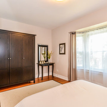
A beautiful & calm master bedroom was created, by repainting the walls, repositioning the furniture & adding some elegant bedding, accessories & art...Sheila Singer
Design
 Woodland Builders
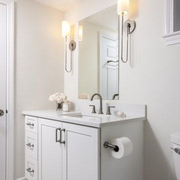
Designed to help the homeowners safely age in place while accommodating changing mobility needs, this thoughtfully planned primary bathroom addition provides exceptional accessibility without compromising style or comfort.
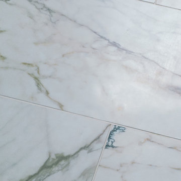
Large-format Florentine Carrara porcelain floor tile creates a seamless transition into the curbless shower, eliminating thresholds for smooth wheelchair and walker access throughout the space. The shower features a built-in bench, handheld shower system, repositioned controls that can be reached while seated, a lowered niche for everyday essentials, and grab bars installed at ADA-recommended heights. A horizontal privacy window fills the shower with natural light while maintaining privacy. Custom built-in cabinetry provides abundant storage, while premium finishes and carefully selected fixtures create a warm, sophisticated retreat.
The result is a beautiful, highly functional bathroom that combines thoughtful universal design with exceptional craftsmanship, allowing the homeowners to live safely, comfortably, and independently in the home they love.
Additional Details
Aging-in-Place Design
Every aspect of the bathroom was thoughtfully designed to promote long-term accessibility and independence. Universal design principles guided the layout, with strategically positioned grab bars, a comfort-height toilet, an accessible shower, and carefully placed fixtures.. A Kohler Cimarron comfort-height toilet with a fully skirted trap, paired with a Kohler PureWash M300 manual bidet seat, enhances both comfort and functionality.
Barrier-Free Shower
The curbless shower features a seamless transition from the bathroom floor, creating unobstructed wheelchair and walker access. A built-in bench provides comfortable seating, while the Delta Saylor shower system with handheld spray allows flexibility for seated bathing. Shower controls were positioned for easy access, and three 18-inch Delta Saylor grab bars in satin nickel provide additional stability. A lowered shower niche keeps everyday essentials within convenient reach.
Flooring & Tile
Large-format 12 x 24 Florentine Carrara porcelain floor tile by Daltile creates a durable, slip-resistant surface while minimizing grout lines for easier maintenance. The shower's feature wall is finished with Block Cloud 4 x 12 light blue tile from Best Tile, in a herringbone pattern to create subtle texture and visual interest.
Custom Cabinetry
Driftwood-finished JSI Dover cabinetry provides dedicated storage for towels, linens, and everyday essentials. The vanity features Fabuwood Galaxy cabinetry in Frost, combining clean lines with durable construction and generous drawer storage.
Fixtures & Finishes
The Delta Saylor plumbing collection in satin nickel creates a cohesive, timeless look throughout the bathroom, including the widespread faucet, shower system with handheld, pivoting toilet paper holder, robe hooks, and grab bars. Shades of Light Callie sconces provide warm, layered lighting that complements the room's calming palette.
Natural Light
A horizontal privacy window introduces abundant natural light into the shower while preserving privacy while enhancing the sense of openness.
 Drury Design
THE SETUP
The original primary bathroom was characterized by a disjointed and segmented layout. The shower featured a bulky glass-block enclosure that overwhelmed the space visually. There was a considerable amount of open, unused space, and despite having a his and hers vanity, the arrangement lacked personal space for each user, as they shared the conjoined space between the sinks. The toilet was inconveniently located right by the door, with a half-wall partition meant to provide privacy but instead contributing to a cramped and unbalanced feel. Overall, the bathroom’s layout and design were fragmented, failing to make the most of the available space and lacking adequate storage solutions.
Design objectives:
- Reconfigure the layout to enhance functionality and flow.
- Create an elegant, upscale aesthetic that is light and bright.
- Incorporate specialized storage solutions for female hair care needs.
- Increase overall storage capacity.
- Develop a spa-like shower experience.
- Provide a significant wow factor to the space.
THE REMODEL
Design challenges to be solved:
- Repositioning the toilet to a more suitable location.
- Designing hair care storage solutions without cluttering the elegant space.
- Balancing an upscale, elegant design with a feminine touch in the color palette.
- Increasing the brightness of the room without adding windows.
- Completely replacing the existing shower to create a spa-like experience.
- Planning new storage solutions without adding bulkiness or clutter to the cabinetry.
THE RENEWED SPACE
Design solutions:
Toilet Relocation: Moved the toilet by the window, creating a better overall layout that also opened up two full walls for cabinetry and storage solutions.
Specialized Vanity Storage: The left side of the left vanity is the wife’s. Open shelves facing across the vanity can be used for decorative or daily needs items. Pull-out docking drawers with power outlets and metal basins handle hot hair appliances.
Bright and Elegant Color Scheme: White cabinets, countertops, floors, and shower walls keep the space bright. The just-off-white wall color with a hint of pink adds a feminine touch. Thin wainscoting with white trim offers traditional-leaning elegance.
Layered Lighting Strategy: Ceiling can lights, sconces, lighted mirrors, and toe-kick lighting were installed. Natural light-rated bulbs keep the space bright and natural-feeling.
Spa-Like Shower: An extra-large shower was created using the same floor tile materials for continuity. Equipped with a Kohler Anthem system with a shower head, hand-held, and four body sprays. His and Hers niches for separate body care product storage.
Enhanced Storage Solutions: Added a linen cabinet within the vanity area for efficient storage of towels and bathroom essentials.
This elegant bathroom feels incredibly spacious now. The color palette and lights keep the room bright and cheery. Gold fixtures, the herringbone pattern on the floor, and exquisite trim work add an elegant touch. With the husband and wife having their own vanity wall sections joined at the corner, each user truly has their own space within the space. The clients are very happy with the final result.
 Albers Design LLC
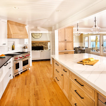
A previous client (Big Wood Lane) reached out to us to help design a remodel of a recently purchased on the south shore of Lake Minnetonka. The home had grown organically since its original construction in 1945. It had evolved over time to accommodate the needs of its numerous owners. Our client brought a new set of needs to the home that included a desire to make the lake home a comfortable destination for family and friends.
The project consisted of reconfiguring an outdated, inefficient kitchen, expansion of the bedroom wing to include individual bathrooms for bedrooms and redesign of the central stair guard rail.
The redesign of the kitchen included repositioning major appliances for greater efficiency, more seating at an enlarged island, a new pantry, and expanded views to the lake. The expansion of the bedroom wing included eliminating a three-season porch on top of the garage on the inland side of the home. The space above the garage roof was enclosed and turned into dedicated bathrooms for each bedroom. These bathrooms are accessible only from the bathrooms which provide privacy and convenience to visitors.
 Fireside Design Center
Fireplace remodel with re-positioning and replacement of firebox. Framing and tilework for new, floor to ceiling structure.
Interiors by: Design by Glen @ designbyglen.com
Photo by: Lucina Ortiz @pentaprismworks.com

 Saikley Architects
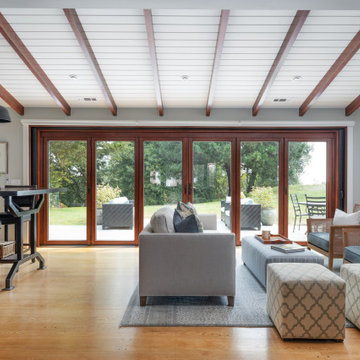
Oakland, CA: Addition and remodel to a rustic ranch home. The existing house had lovely woodwork but was dark and enclosed. The house borders on a regional park and our clients wanted to open up the space to the expansive yard, to allow views, bring in light, and modernize the spaces. New wide exterior accordion doors, with a thin screen that pulls across the opening, connect inside to outside. We retained the existing exposed redwood rafters, and repeated the pattern in the new spaces, while adding lighter materials to brighten the spaces. We positioned exterior doors for views through the whole house. Ceilings were raised and doorways repositioned to make a complicated and closed-in layout simpler and more coherent.
 Michael Nash Design, Build & Homes
2011 NATIONAL NARI COTY SOUTHEAST REGIONAL AWARD
This family of four living in a 1987 brick colonial had to make dramatic changes now that their 85 years old grandmother was about to move in. They needed a mother-in-law suite complete with bathroom facilities to meet her needs. Because they were remodeling anyway, they decided to overhaul the rest of the home to create the house they have always dreamed about, including a grand two-story entry.
Starting in the basement, the homeowner added a home theatre room, added storage and a larger bathroom. Hard wood floors and a new stairway were also added.
The main level boasts the new two-story entry foyer. To its left is the mother-in-law suite with a large front bay window and its own walk-in closet and private bath. The bath is furnished with a walk-in jetted tub and aging-in-place accessories. Other first floor highlights include a music room and gourmet kitchen.
Kitchen amenities the client always wanted were added, including a large center island, extended cabinets, double layered crown molding, exotic granite top and wide board mahogany floors throughout entire first floor.
The entire second floor and stairs going up were reconfigured too. The master bedroom is larger with a new tray ceiling and recess lights. The new walk- in closet is now adjacent to the master bath instead of being across the room. The master bathroom was totally gutted and re-positioned. It includes an enlarged shower with bench and frameless shower door, toilet hidden behind a closet and new whirlpool surround with beautiful travertine tile and long double vanity space.
This new renovation is truly a testament to the possibilities of aging-in-place remodeling strategies. Three generations are now living comfortably in this home.
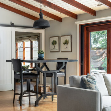 Saikley Architects
Oakland, CA: Addition and remodel to a rustic ranch home. The existing house had lovely woodwork but was dark and enclosed. The house borders on a regional park and our clients wanted to open up the space to the expansive yard, to allow views, bring in light, and modernize the spaces. New wide exterior accordion doors, with a thin screen that pulls across the opening, connect inside to outside. We retained the existing exposed redwood rafters, and repeated the pattern in the new spaces, while adding lighter materials to brighten the spaces. We positioned exterior doors for views through the whole house. Ceilings were raised and doorways repositioned to make a complicated and closed-in layout simpler and more coherent.
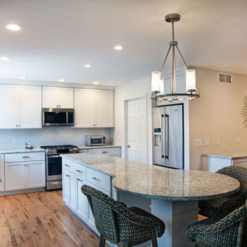
 Sweeney Design Remodel
Sweeney Design Remodel’s design solution included removing the walls that separated the dining room to open up the space. Then, we re-positioning the large refrigerator into the pantry wall to seamlessly integrate it into the kitchen and create better flow. This solution also created plenty of space to add a large island with seating and room to walk around it.
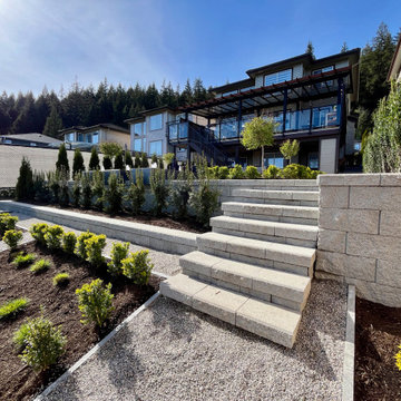
 Metamorphic Design
Now with a retaining wall and re-positioned steps built to last!
This is an example of a mid-sized modern full sun backyard gravel landscaping in Vancouver.
This is an example of a mid-sized modern full sun backyard gravel landscaping in Vancouver.
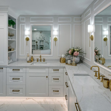 Drury Design
THE SETUP
The original primary bathroom was characterized by a disjointed and segmented layout. The shower featured a bulky glass-block enclosure that overwhelmed the space visually. There was a considerable amount of open, unused space, and despite having a his and hers vanity, the arrangement lacked personal space for each user, as they shared the conjoined space between the sinks. The toilet was inconveniently located right by the door, with a half-wall partition meant to provide privacy but instead contributing to a cramped and unbalanced feel. Overall, the bathroom’s layout and design were fragmented, failing to make the most of the available space and lacking adequate storage solutions.
Design objectives:
- Reconfigure the layout to enhance functionality and flow.
- Create an elegant, upscale aesthetic that is light and bright.
- Incorporate specialized storage solutions for female hair care needs.
- Increase overall storage capacity.
- Develop a spa-like shower experience.
- Provide a significant wow factor to the space.
THE REMODEL
Design challenges to be solved:
- Repositioning the toilet to a more suitable location.
- Designing hair care storage solutions without cluttering the elegant space.
- Balancing an upscale, elegant design with a feminine touch in the color palette.
- Increasing the brightness of the room without adding windows.
- Completely replacing the existing shower to create a spa-like experience.
- Planning new storage solutions without adding bulkiness or clutter to the cabinetry.
THE RENEWED SPACE
Design solutions:
Toilet Relocation: Moved the toilet by the window, creating a better overall layout that also opened up two full walls for cabinetry and storage solutions.
Specialized Vanity Storage: The left side of the left vanity is the wife’s. Open shelves facing across the vanity can be used for decorative or daily needs items. Pull-out docking drawers with power outlets and metal basins handle hot hair appliances.
Bright and Elegant Color Scheme: White cabinets, countertops, floors, and shower walls keep the space bright. The just-off-white wall color with a hint of pink adds a feminine touch. Thin wainscoting with white trim offers traditional-leaning elegance.
Layered Lighting Strategy: Ceiling can lights, sconces, lighted mirrors, and toe-kick lighting were installed. Natural light-rated bulbs keep the space bright and natural-feeling.
Spa-Like Shower: An extra-large shower was created using the same floor tile materials for continuity. Equipped with a Kohler Anthem system with a shower head, hand-held, and four body sprays. His and Hers niches for separate body care product storage.
Enhanced Storage Solutions: Added a linen cabinet within the vanity area for efficient storage of towels and bathroom essentials.
This elegant bathroom feels incredibly spacious now. The color palette and lights keep the room bright and cheery. Gold fixtures, the herringbone pattern on the floor, and exquisite trim work add an elegant touch. With the husband and wife having their own vanity wall sections joined at the corner, each user truly has their own space within the space. The clients are very happy with the final result.
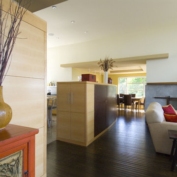
 Studio Nexus Architects + Planners
This 1950's split-level ranch house was completely renovated to meet the needs of a growing family. The central roof was raised to admit generous natural ambient light to the kitchen and living spaces. New metal windows were enlarged and repositioned to capture distant views. Interior finishes were replaced and the mechanical system revised to provide radiantly heated floors.
The project was undertaken while Jim was a partner with Richard Brown Architects, AIA, LLP.
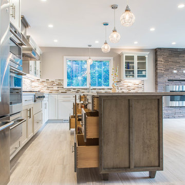
 RAJ Kitchen and Bath, LLC
There were a few difficulties in making this kitchen any better than how it was. There was a separate staircase that had access to the second floor which was located in the kitchen. This left just enough room to push the dining room to one side. Then, there was the porch. A really nice panoramic view of the back, but was somehow under-used by the family during the summer months. Then, it was the size of the kitchen. It simply was way too small for a growing family, and while it had a peninsular in place, the flow just didn’t work. I remember watching them one day demonstrating how awkward it was using the kitchen. We got it! We had our marching orders to go and figure out how to make this kitchen work for this family.
Everything in the room was fair play. The design was done to make the kitchen very open. For a few ideas, we incorporated the porch in the kitchen by using the nana wall idea but it ended up being too cost prohibitive to do so. We then decided to do a permanent fix by using a commercial glass wall application. Once we figured that out, we moved back inside and removed the staircase. This gave us two added benefits. One allowed us to really reconfigure the kitchen and the other opened up the second floor for a huge built in closet system.
We relocated the windows, added a fire place with a built In TV above. From there, it was onto the kitchen itself which contained a huge Island with seating, large kitchen sink and built in appliances which was set up in a way to take advantage of the new layout. We re-positioned the kitchen facing the beautiful views outside rather than looking towards a wall. Now, when you enter the house up the entry stairs, the kitchen now draws you into the magnificent new open space. This is now setup for entertaining, relaxation, hanging out and most of all, preparing meals in a room where you only have to leave if you want to.
This one was all about the design. Design was what made this space. Setting this space up for success was crucial, and this kitchen is a great example of how design can cover a multitude of sins in Kitchen designs.
… Just close your eyes for a second and imagine waking up one winter morning and having a cup of coffee and watching the snow fall through those huge windows, leaning up against those 3D feature walls while watching the kids sitting around the table enjoying those warm radiant heated floors in this spacious kitchen…..
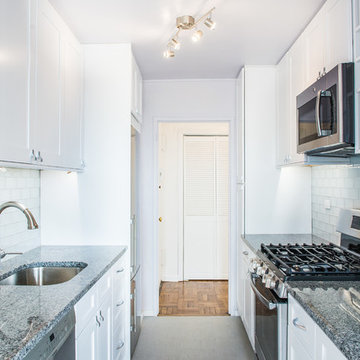 RAJ Kitchen and Bath, LLC
**Check out the video of this transformation on our website**
This small kitchen was way too small for this 2 bedrooms, 2 bathrooms apartment. Not only was it a very small kitchen, but the physical location of it made it very difficult to make it any bigger. There wasn't much that could have been done without incurring astronomical cost, which would get little or no return on the investment. The client wanted a kitchen that can be optimized in its current location to add a ton of value for resale.
This was difficult to do, because there was no moving of any mechanical around in the kitchen and even if we wanted to, the management of the building would not allow. For those of you who live in condos, co-ops or apartment building, you know how difficult it is to rework these foot prints. When we showed up, we saw the problems, but we also saw a huge opportunity where we can achieve those goals in the small space. This was accomplished by making some key changes and to incorporate some new things that was not possible when this kitchen was built years ago.
The crucial part of the design that would drive the entire new layout, was selecting the only appliance; that was the Refrigerator. Once we nailed down that refrigerator, we then proceeded to design the kitchen around it. We moved it to the other side of the wall where the sink was so that we can tap into the water line from the sink plumbing. It was crucial that it stays exactly 24" deep, not an inch more because we had to keep the entry as open as possible. Also, it was going to be directly in front of another big storage unit - The pantry. It is not ideal in most cases, but we needed the rest of the space to ramp up the design and open feel towards the side where all of the activities would take place, which happend to be the dining room and the view.
Once all that was figured out, we re-positioned the sink, dishwasher and the range and proceeded to wrap the cabinets around the columns to integrate them into the space. Thirty- six inches cabinets height was used so that they can be installed higher towards the ceiling height to give more room rather than the standard 18" required height between the counter tops. This was done to make the room feel a lot bigger than it really was. Not to mention, we also didn't want the faucet to be buried under the cabinets so that was also a necessary design detail for the space.
We then lowered both knee walls so that the counter top can sit on top of them, by removing that stop point that would have otherwise defined the kitchen area. This allowed us to pick up that extra footprint into the room for added prep space and enabled us to create the illusion of a kitchen that is looking longer than it really is. Every inch mattered when designing this kitchen and we made a conscious decision to use every one of that inch.
White cabinets were selected to do just what white cabinets are design to do; make a small or dark room appear bigger, brighter and more open. In this kitchen, this was amplified the more because of the kitchen location. It was perfect! We knew we did justice to the space because while we were there taking some photos, a few potential buyers walked in and went straight for the kitchen! They said its design just to fit the apartment.
Pantry roll out shelving, Double recycle bin, fancy handles, LED lighting, Quartz counter top, beautiful backslash tiles and grey linen floors finished off the kitchen which looked over a beautiful view of the George Washington Bridge from the top of this lovely 4th floor apartment.
Credit to Masterpiece Tile and Marble (Annmarie on the selection of Tiles and countertop and Val on the Construction to complete this project).
Davor Kokic Photography
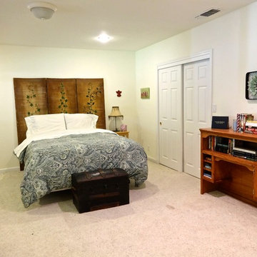
 Stage Struck Home Staging & Redesign
Another view of the basement guest room AFTER our redesign. All the art was repositioned at the proper height. Books and furniture were placed to give the room a more cohesive feel.
17