
Search results for "Reposition" in Home Design Ideas
 DRAPES & DECOR
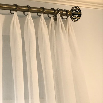
This was a renovation project for a 12 year old girl who outgrown her nursery style bedroom and desired new more grown up look with some blue colors and gold accents. We started with selecting a gorgeous chandelier to add some charm and character to the room. We've decided to keep the pale blue walls and add some striking accent colors in bedding and other accessory. We've placed a custom made monogram in navy/teal color and repeated this color in a new shaggy area rug and velvet euro shams. We have added brand new sheer curtains with a gold/grass hardware and repeated these finishes in wall art on the adjacent wall and also placed a desk lamp in gold/brass on the desk. We have repositioned the desk from a different wall and placed by the bed to serve as a nightstand and as a better homework space by the window. The bedding added lots of interest in patterns, color and texture.
 RAJ Kitchen and Bath, LLC
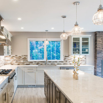
There were a few difficulties in making this kitchen any better than how it was. There was a separate staircase that had access to the second floor which was located in the kitchen. This left just enough room to push the dining room to one side. Then, there was the porch. A really nice panoramic view of the back, but was somehow under-used by the family during the summer months. Then, it was the size of the kitchen. It simply was way too small for a growing family, and while it had a peninsular in place, the flow just didn’t work. I remember watching them one day demonstrating how awkward it was using the kitchen. We got it! We had our marching orders to go and figure out how to make this kitchen work for this family.
Everything in the room was fair play. The design was done to make the kitchen very open. For a few ideas, we incorporated the porch in the kitchen by using the nana wall idea but it ended up being too cost prohibitive to do so. We then decided to do a permanent fix by using a commercial glass wall application. Once we figured that out, we moved back inside and removed the staircase. This gave us two added benefits. One allowed us to really reconfigure the kitchen and the other opened up the second floor for a huge built in closet system.
We relocated the windows, added a fire place with a built In TV above. From there, it was onto the kitchen itself which contained a huge Island with seating, large kitchen sink and built in appliances which was set up in a way to take advantage of the new layout. We re-positioned the kitchen facing the beautiful views outside rather than looking towards a wall. Now, when you enter the house up the entry stairs, the kitchen now draws you into the magnificent new open space. This is now setup for entertaining, relaxation, hanging out and most of all, preparing meals in a room where you only have to leave if you want to.
This one was all about the design. Design was what made this space. Setting this space up for success was crucial, and this kitchen is a great example of how design can cover a multitude of sins in Kitchen designs.
… Just close your eyes for a second and imagine waking up one winter morning and having a cup of coffee and watching the snow fall through those huge windows, leaning up against those 3D feature walls while watching the kids sitting around the table enjoying those warm radiant heated floors in this spacious kitchen…..
 Jacobson Construction
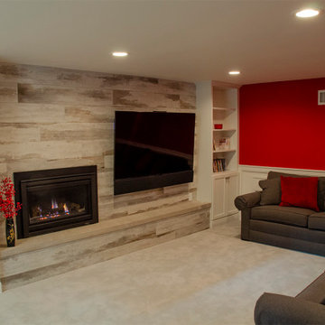
The Family Room remains the largest and most open of all. The red wall continues the theme and traffic flow from the kitchen. Check out the before and after pictures of this room. What used to be varnished pine walls have been replaced with white panel wainscoting and red walls. The old wood-burning fireplace was replaced with a gas fireplace, and white bookshelves match the cabinet style in the kitchen.
The flat-screen TV is mounted in a way that allows servicing and repositioning. The TV fits flush against the wall, thanks to a 6-inch recessed pocket built into the wall behind the TV. The bracket is mounted inside the wall, allowing the TV to fit flush with the wall.
Find the right local pro for your project
 LaMantia Design and Remodeling
During a showroom meeting with Lana Galloway, CKBR, UDCP, while preparing selections for their Downers Grove Kitchen remodel, their third project in six years, our clients received a startling phone message; there was water coming out from under the door into the hallway of their 15th floor Sandburg Village apartment. This was to be their refuge while their suburban Kitchen was removed!
The kitchen waste stack, located at the Kitchen sink, had backed up into the unit. The issue had gone unnoticed for several days while the water encompassed a large amount of the unit, causing wood floor, cabinets and drywall damage.
Before
Before
Before
Before
Before
Before
Before
Before
Insurance claims were swiftly filed and soon Galloway began designing a second kitchen remodel. Our clients were so disgruntled, their first thought was to repair only enough to sell, but once the drawings and material selections began, there was a change of heart.
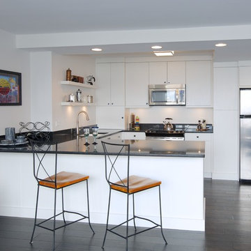
By removing the entry closet/book shelf, Galloway was able to enlarge the existing kitchen footprint. In the new design, the refrigerator was moved to the right of the buildings existing chase, the chase was then disguised with a false pantry door, the Peninsula seated area was repositioned, and the work aisle expanded with the additional cabinetry on the sink wall. The dark stained engineered flooring, installed to the strict codes of the building, creates a sleek back-drop for the contemporary cabinetry.
The beauty inside this unit now matches the glorious views of the city and our clients are now enjoying their two new LaMantia Kitchens.
 Design Spectrum, LLC
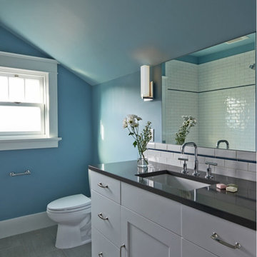
For this project, we were brought on to update this 1920's home and open up multiple small rooms into one great room. Some of the features incorporated with this were new pocket doors, all new flooring, lighting, cabinets, countertops, windows, backsplashes, and updated paint. Another unique way we accomplished opening up the home was by repositioning the stairway which provided more square footage in the kitchen and create a better traffic flow throughout the house.
Alongside of opening up the main level, we also totally renovated both upstairs bathrooms by performing a complete gut and remodel.
 JRW Construction LLC
Modern bathroom remodels emphasize sleek design, cutting-edge fixtures, and luxurious amenities. Our modern bathroom remodel service offers a seamless fusion of contemporary style and functionality. This includes clean lines, minimalist fixtures, and innovative materials. From state-of-the-art LED lighting to space-saving vanities and high-tech faucets, we prioritize efficiency and elegance in every detail. Elevate your daily routine with a modern bathroom remodel that embodies sophistication, convenience, and the latest trends in interior design.
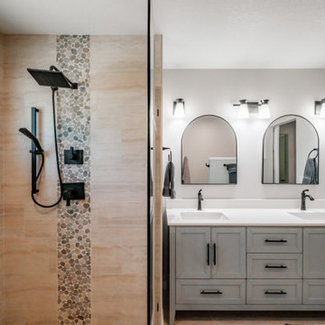
Our goal for the master bathroom was to make better use of the space. The original bathroom had a small acrylic shower and a large jacuzzi bathtub. Our plan was to create a spacious walk-in shower, relocate the toilet, add a double sink vanity, and maximize the available space. By moving the sink wall over a foot, we were able to accommodate a 72-inch vanity and create a spacious doorway. The toilet was relocated and repositioned for added privacy. We designed a custom curbless walk-in shower with a corner shower bench and niche. A glass-gridded shower partition was added to separate the shower from the rest of the bathroom. To add a touch of color and drama, we chose black fixtures to complement the light gray walls and white quartz countertops. The almost 6-inch shower head, along with the handheld shower wand, provides a luxurious spa-like experience from the comfort of your home.
 Leslie Williams Interior Design
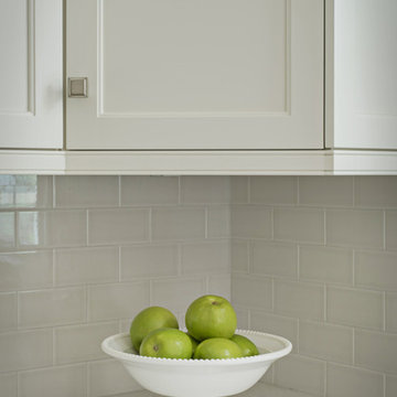
This kitchen was dramatically transformed with new white cabinets that stretch to the ceiling, custom hood, sink re-positioned under the window, new longer drawer banks, glass cabinet doors and a gorgeous new barn door pantry door! Quartz counter tops with simple subway tile back splash completes the look of this serene kitchen.
 RAJ Kitchen and Bath, LLC
**Check out the video of this transformation on our website**
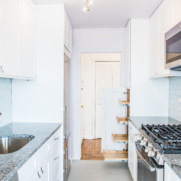
This small kitchen was way too small for this 2 bedrooms, 2 bathrooms apartment. Not only was it a very small kitchen, but the physical location of it made it very difficult to make it any bigger. There wasn't much that could have been done without incurring astronomical cost, which would get little or no return on the investment. The client wanted a kitchen that can be optimized in its current location to add a ton of value for resale.
This was difficult to do, because there was no moving of any mechanical around in the kitchen and even if we wanted to, the management of the building would not allow. For those of you who live in condos, co-ops or apartment building, you know how difficult it is to rework these foot prints. When we showed up, we saw the problems, but we also saw a huge opportunity where we can achieve those goals in the small space. This was accomplished by making some key changes and to incorporate some new things that was not possible when this kitchen was built years ago.
The crucial part of the design that would drive the entire new layout, was selecting the only appliance; that was the Refrigerator. Once we nailed down that refrigerator, we then proceeded to design the kitchen around it. We moved it to the other side of the wall where the sink was so that we can tap into the water line from the sink plumbing. It was crucial that it stays exactly 24" deep, not an inch more because we had to keep the entry as open as possible. Also, it was going to be directly in front of another big storage unit - The pantry. It is not ideal in most cases, but we needed the rest of the space to ramp up the design and open feel towards the side where all of the activities would take place, which happend to be the dining room and the view.
Once all that was figured out, we re-positioned the sink, dishwasher and the range and proceeded to wrap the cabinets around the columns to integrate them into the space. Thirty- six inches cabinets height was used so that they can be installed higher towards the ceiling height to give more room rather than the standard 18" required height between the counter tops. This was done to make the room feel a lot bigger than it really was. Not to mention, we also didn't want the faucet to be buried under the cabinets so that was also a necessary design detail for the space.
We then lowered both knee walls so that the counter top can sit on top of them, by removing that stop point that would have otherwise defined the kitchen area. This allowed us to pick up that extra footprint into the room for added prep space and enabled us to create the illusion of a kitchen that is looking longer than it really is. Every inch mattered when designing this kitchen and we made a conscious decision to use every one of that inch.
White cabinets were selected to do just what white cabinets are design to do; make a small or dark room appear bigger, brighter and more open. In this kitchen, this was amplified the more because of the kitchen location. It was perfect! We knew we did justice to the space because while we were there taking some photos, a few potential buyers walked in and went straight for the kitchen! They said its design just to fit the apartment.
Pantry roll out shelving, Double recycle bin, fancy handles, LED lighting, Quartz counter top, beautiful backslash tiles and grey linen floors finished off the kitchen which looked over a beautiful view of the George Washington Bridge from the top of this lovely 4th floor apartment.
Credit to Masterpiece Tile and Marble (Annmarie on the selection of Tiles and countertop and Val on the Construction to complete this project).
Davor Kokic Photography
 User
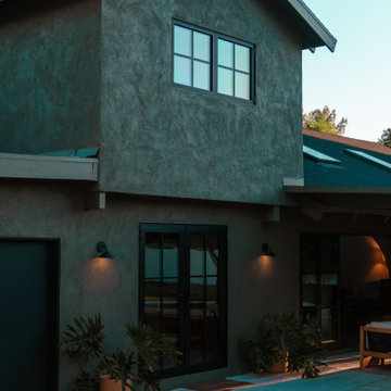
UserFeatured in Dwell, Hacienda Granada is an eclectic modern residence designed by Working Holiday Studio that subtly combines the Spanish influences of a Mexican hacienda with Scandinavian minimalism and features All Weather Architectual Aluminun custom windows and doors.
Carlos Nuade and Whitney Brown run Working Holiday, a multi disciplinary creative studio based in Los Angeles that boasts a portfolio of several renovation projects across Southern California.
Originally built in 1962, the 2,762-square-foot residence with 4 bedrooms and 2.5 baths was not the couple’s dream home but they saw potential in its vaulted ceilings, ample-sized kitchen, backyard pool and large garage and more importantly, they found a space where they could infuse with their own personal history and distinct taste. "Our style is very modern and minimalist," Carlos explains. "But we still wanted to include some of the warmth, accents, and tones from traditional Spanish architecture."
Carlos and Whitney chose All Weather Series 5000 casement and fixed windows with SDL's to infuse the home with the Hacienda vibe. They replaced the existing patio entry door with expansive Series 8100 Multi Slide Doors that connect to the living and dining room. The couple opened up the kitchen by adding an All Weather Series 7000 French Doors and repositioned the island so you can see into the house when they are cooking. They also reshaped most of the interior doorways, creating arches to enhance the Spanish-Mexican vibe.
All Weather was honored to be selected for Hacienda Granada because Carlos and Whitney treat their projects like showrooms and they only bring on brands they like and curate the space accordingly.
 Kitchen Solvers of Allentown
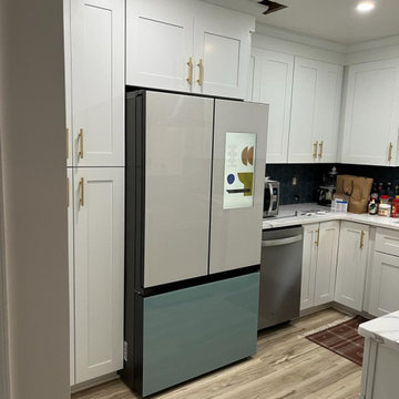
Beautiful kitchen remodeling project where the homeowner wanted to give their kitchen a new look while also changing the layout. We started by tearing out the existing cabinets and repositioning the refrigerator and oven onto different walls. We were then ready to start installing the new cabinets. They went with the Nantucket door in a polar white color. Next, we installed a new Calacatta with dark grey vein quartz countertop and a blue hexagon shaped backsplash. To finish the new look, we added a new vinyl floor. Now this homeowner has a beautiful new kitchen.
 Drury Design
THE SETUP
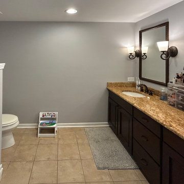
The original primary bathroom was characterized by a disjointed and segmented layout. The shower featured a bulky glass-block enclosure that overwhelmed the space visually. There was a considerable amount of open, unused space, and despite having a his and hers vanity, the arrangement lacked personal space for each user, as they shared the conjoined space between the sinks. The toilet was inconveniently located right by the door, with a half-wall partition meant to provide privacy but instead contributing to a cramped and unbalanced feel. Overall, the bathroom’s layout and design were fragmented, failing to make the most of the available space and lacking adequate storage solutions.
Design objectives:
- Reconfigure the layout to enhance functionality and flow.
- Create an elegant, upscale aesthetic that is light and bright.
- Incorporate specialized storage solutions for female hair care needs.
- Increase overall storage capacity.
- Develop a spa-like shower experience.
- Provide a significant wow factor to the space.
THE REMODEL
Design challenges to be solved:
- Repositioning the toilet to a more suitable location.
- Designing hair care storage solutions without cluttering the elegant space.
- Balancing an upscale, elegant design with a feminine touch in the color palette.
- Increasing the brightness of the room without adding windows.
- Completely replacing the existing shower to create a spa-like experience.
- Planning new storage solutions without adding bulkiness or clutter to the cabinetry.
THE RENEWED SPACE
Design solutions:
Toilet Relocation: Moved the toilet by the window, creating a better overall layout that also opened up two full walls for cabinetry and storage solutions.
Specialized Vanity Storage: The left side of the left vanity is the wife’s. Open shelves facing across the vanity can be used for decorative or daily needs items. Pull-out docking drawers with power outlets and metal basins handle hot hair appliances.
Bright and Elegant Color Scheme: White cabinets, countertops, floors, and shower walls keep the space bright. The just-off-white wall color with a hint of pink adds a feminine touch. Thin wainscoting with white trim offers traditional-leaning elegance.
Layered Lighting Strategy: Ceiling can lights, sconces, lighted mirrors, and toe-kick lighting were installed. Natural light-rated bulbs keep the space bright and natural-feeling.
Spa-Like Shower: An extra-large shower was created using the same floor tile materials for continuity. Equipped with a Kohler Anthem system with a shower head, hand-held, and four body sprays. His and Hers niches for separate body care product storage.
Enhanced Storage Solutions: Added a linen cabinet within the vanity area for efficient storage of towels and bathroom essentials.
This elegant bathroom feels incredibly spacious now. The color palette and lights keep the room bright and cheery. Gold fixtures, the herringbone pattern on the floor, and exquisite trim work add an elegant touch. With the husband and wife having their own vanity wall sections joined at the corner, each user truly has their own space within the space. The clients are very happy with the final result.
 Gayler Design Build
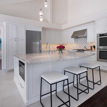
To maximize countertop space, we repositioned a doorway that separated the dining room and kitchen, streamlining traffic flow and enhancing the connection between these vital spaces.
 Mosscreek Designs Canada Inc.
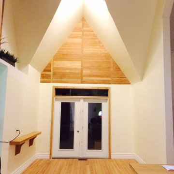
Former baptismal room opened to new kitchen space situated on former altar. Flooring pulled up, re-planed, re-positioned, re-sanded and re-finished.
 Murphy Bros. Design | Build | Remodel
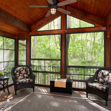
The rugged vinyl glazing has the transparency of glass without the cost or weight. The window vents are actually made of a memory film instead of glass, allowing for clear views, safety, larger sizes, and less weight. If accidentally pushed or distorted, it will return to its original shape within minutes. It's a product with a memory. Eze-Breeze® enclosure products are constructed with durable aluminum frames that hold screen and vinyl glazed panels in place.
Eze-Breeze® has four sliding vents that nest up or down over the attached screen. When completely open you have 75% screen. Remove the vents and you have 100% screen. Closed you have 100% protection from wind, pollen, and weather.
Note 59" wide center panels lowered for unobstructed view of woods. No levers involved in repositioning panels, just push up or down.
Design/Build Consultant — Jeff Robinson
Photography — Alyssa Lee
 KB Design Firm
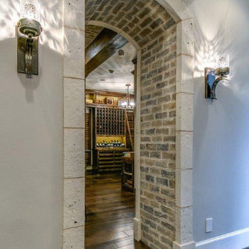
DULL BEDROOM TRANSFORMED TO THE ULTIMATE IN BAR/WINE RETREAT!
This unused bedroom was positioned off a hall close to the breakfast area. KB Design enclosed an existing hall, converted a closet space and removed a Hollywood bath vanity area to reposition entry and create a cozy bar as you walk into this fabulous wine room. Beams were added along with brick accents and custom designed storage to meet every need for the client's extensive collection of wines, champagnes and cigars. Special consideration was given to the arched entrance and the lighting throughout to create the ultimate atmosphere for this wine room!
 Riverside Construction, LLC
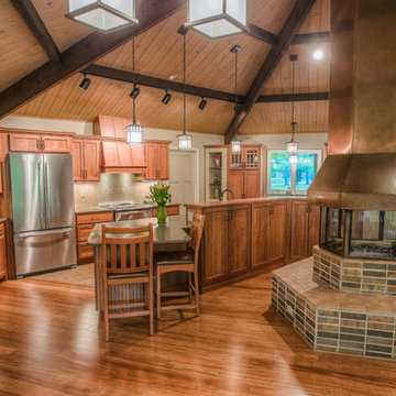
This West Lafayette couple was tired of their worn out cabinets and appliances, an outdated design and a less than functional work space. They were interested in visually opening up their kitchen to allow for entertaining. Riverside Construction accomplished this by removing the wall peninsula cabinets, moving the sink under the rear window and repositioning the double ovens closer to the range top. Maple cabinets and granite countertops added a new beauty and warmth to the space, while luxury vinyl tile flooring and a travertine backsplash completed the new look. All of these remodeling improvements not only allowed for a more functional cooking space, but created the perfect environment for many friendly gatherings and parties.
 Anita Buchheim Interiors
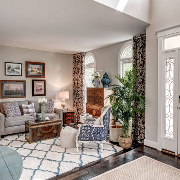
This home just went through a big addition/remodel and the existing front living room needed to be redesigned to coordinate with the new kitchen and flooring throughout the home. We repositioned the existing furnishings and gave the room a brand "new look" by adding accessories to enhance the beauty and warmth of the room. A new blue and white chair, ottoman and a small table were added for additional seating and drama. After, we rearranged the art and scouted the home for a couple of other pieces that would work to create a gallery wall. There is still room for her to add more in the future.
 User
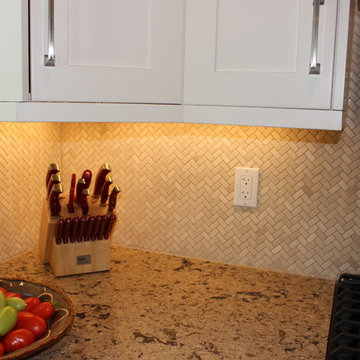
UserRemoving a wall beside the fridge, allowed the re-positioning of the range and added a landing zone to the between the range and fridge. Added full height upper cabinets in cream and base cabinets in navy.
Added shallow depth cabinets behind the peninsula as pantry storage and area for microwave.
 M-Squared Contracting Inc.
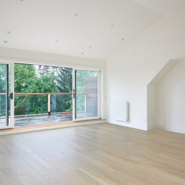
Believe it or not, this beautiful Roncesvalles home was once carved into three separate apartments. As a result, central to this renovation was the need to create a floor plan with a staircase to access all floors, space for a master bedroom and spacious ensuite on the second floor.
The kitchen was also repositioned from the back of the house to the front. It features a curved leather banquette nestled in the bay window, floor to ceiling millwork with a full pantry, integrated appliances, panel ready Sub Zero and expansive storage.
Custom fir windows and an oversized lift and slide glass door were used across the back of the house to bring in the light, call attention to the lush surroundings and provide access to the massive deck clad in thermally modified ash.
Now reclaimed as a single family home, the dwelling includes 4 bedrooms, 3 baths, a main floor mud room and an open, airy yoga retreat on the third floor with walkout deck and sweeping views of the backyard.
 Albers Design LLC
A previous client (Big Wood Lane) reached out to us to help design a remodel of a recently purchased on the south shore of Lake Minnetonka. The home had grown organically since its original construction in 1945. It had evolved over time to accommodate the needs of its numerous owners. Our client brought a new set of needs to the home that included a desire to make the lake home a comfortable destination for family and friends.
The project consisted of reconfiguring an outdated, inefficient kitchen, expansion of the bedroom wing to include individual bathrooms for bedrooms and redesign of the central stair guard rail.
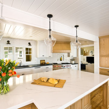
The redesign of the kitchen included repositioning major appliances for greater efficiency, more seating at an enlarged island, a new pantry, and expanded views to the lake. The expansion of the bedroom wing included eliminating a three-season porch on top of the garage on the inland side of the home. The space above the garage roof was enclosed and turned into dedicated bathrooms for each bedroom. These bathrooms are accessible only from the bathrooms which provide privacy and convenience to visitors.
20