
Search results for "Reposition" in Home Design Ideas
 RAJ Kitchen and Bath, LLC
**Check out the video of this transformation on our website**
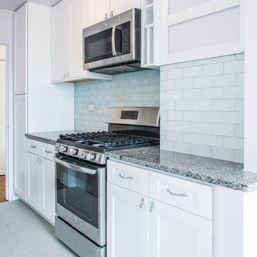
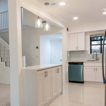
This small kitchen was way too small for this 2 bedrooms, 2 bathrooms apartment. Not only was it a very small kitchen, but the physical location of it made it very difficult to make it any bigger. There wasn't much that could have been done without incurring astronomical cost, which would get little or no return on the investment. The client wanted a kitchen that can be optimized in its current location to add a ton of value for resale.
This was difficult to do, because there was no moving of any mechanical around in the kitchen and even if we wanted to, the management of the building would not allow. For those of you who live in condos, co-ops or apartment building, you know how difficult it is to rework these foot prints. When we showed up, we saw the problems, but we also saw a huge opportunity where we can achieve those goals in the small space. This was accomplished by making some key changes and to incorporate some new things that was not possible when this kitchen was built years ago.
The crucial part of the design that would drive the entire new layout, was selecting the only appliance; that was the Refrigerator. Once we nailed down that refrigerator, we then proceeded to design the kitchen around it. We moved it to the other side of the wall where the sink was so that we can tap into the water line from the sink plumbing. It was crucial that it stays exactly 24" deep, not an inch more because we had to keep the entry as open as possible. Also, it was going to be directly in front of another big storage unit - The pantry. It is not ideal in most cases, but we needed the rest of the space to ramp up the design and open feel towards the side where all of the activities would take place, which happend to be the dining room and the view.
Once all that was figured out, we re-positioned the sink, dishwasher and the range and proceeded to wrap the cabinets around the columns to integrate them into the space. Thirty- six inches cabinets height was used so that they can be installed higher towards the ceiling height to give more room rather than the standard 18" required height between the counter tops. This was done to make the room feel a lot bigger than it really was. Not to mention, we also didn't want the faucet to be buried under the cabinets so that was also a necessary design detail for the space.
We then lowered both knee walls so that the counter top can sit on top of them, by removing that stop point that would have otherwise defined the kitchen area. This allowed us to pick up that extra footprint into the room for added prep space and enabled us to create the illusion of a kitchen that is looking longer than it really is. Every inch mattered when designing this kitchen and we made a conscious decision to use every one of that inch.
White cabinets were selected to do just what white cabinets are design to do; make a small or dark room appear bigger, brighter and more open. In this kitchen, this was amplified the more because of the kitchen location. It was perfect! We knew we did justice to the space because while we were there taking some photos, a few potential buyers walked in and went straight for the kitchen! They said its design just to fit the apartment.
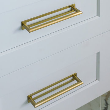
Pantry roll out shelving, Double recycle bin, fancy handles, LED lighting, Quartz counter top, beautiful backslash tiles and grey linen floors finished off the kitchen which looked over a beautiful view of the George Washington Bridge from the top of this lovely 4th floor apartment.
Credit to Masterpiece Tile and Marble (Annmarie on the selection of Tiles and countertop and Val on the Construction to complete this project).
Davor Kokic Photography
 Woodwright Custom Builders LLC
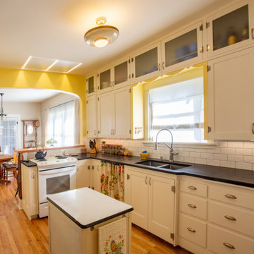
Post remodel, what had been a bank of cabinets is now the main path through the kitchen. The stove has been relocated to the north with its back against the new bar with subway tile backsplash. The fridge has been repositioned on the west side of the kitchen where a hall closet once was located. The fir floor of the kitchen has been removed and replaced with oak to match the dining room and living room. The fir was salvaged for use as the countertop of the bar and pantry. The original exhaust fan was removed and replaced with a Zephyr island exhaust with built-in LED lights visible above the stove. The faux wood countertop and backsplash have been replaced with "Absolute Black" granite with a honed finish and white subway tile. A moveable island (antique enamel topped cabinet) serves as a landing spot and work surface. The shape of the arched wall between the kitchen and dining room matches the wall between the dining room and living room.
 Klopf Architecture
Set on a narrow hillside lot overlooking the San Francisco Bay in Point Richmond, California, Bay Heirloom is a Mid-Century Modern family home restored, modernized and adapted for contemporary living. Oriented south-southwest toward the Marin Headlands, with views of the Golden Gate Bridge, the residence captures shifting Bay light throughout the day, from fog-muted mornings to vivid, glowing sunsets.
The home was built by Karlyn Neel’s grandfather, the owner of the construction company Flo-Crete, one of the Bay Area’s early concrete pumping firms. Flo-Crete completed the foundation and structural concrete work, with family photographs documenting the original cinderblock walls and pours. The firm also contributed to major regional infrastructure projects, including the Transbay BART tube and Candlestick Park, situating the house within a broader legacy of Bay Area construction. Growing up, Neel spent considerable time in the home, developing an early appreciation for mid-century modern principles. Instead of parting with this family heirloom, she purchased the home from her grandfather’s estate.
While her grandfather continued to live in the Point Richmond house, Neel purchased a Mid-Century Modern residence in Palm Desert. In contrast to the Bay Area’s cool temperatures, salt air, and persistent winds, the desert home is shaped by heat and sun and requires a different material response. A substantial renovation she led there emphasized thermal performance, filtered light, and restrained detailing. The experience later informed the restoration of her Bay Area family home.
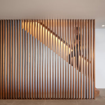
What began as a modest Mid-Century Modern update expanded when decades of exposure to marine conditions revealed leaks and significant structural and seismic deficiencies. Neel was determined to honor her grandfather’s perseverance and without hesitation pivoted to a much more intensive project. Addressing these challenges required close coordination between Neel, Klopf Architecture and Kasten Builders, with architectural restraint and construction precision guiding each intervention. Rather than alter the home’s defining features, the project focused on reinforcing the structure from within. Discreet beams were embedded along the rear facade and in an upstairs wall, strengthening the building while maximizing the wall of glass facing the Bay and opening the wall between the kitchen and the living space. These structural interventions allowed the space to open fully to the Bay without visual interruption, with the kitchen repositioned as the social and functional core of an open, continuous living space. The building envelope was updated using weather- and corrosion-resistant materials appropriate to the marine environment.
The house unfolds vertically from the street, beginning with a modest garage level and workshop, with the main living spaces located below. Original slate flooring at the entry was preserved, along with select furnishings and artwork collected by Neel’s grandfather, anchoring the restored interior in its past. A restrained palette of black accents and pale, natural finishes replaces darker wood tones, reinforcing openness and calm. A naturally illuminated stair connects to the lowest level, where a former basement was transformed into a guest suite and family room opening onto a deck. From there, steps lead directly to a small concrete boat ramp at the water’s edge.
Throughout the project, decisions were guided by continuity rather than transformation for its own sake. Lessons drawn from both desert and coastal climates informed a material strategy rooted in performance and restraint. Bay Heirloom stands as a measured evolution of a family house, structurally renewed and carefully modernized, grounded in the discipline and care that first shaped it.
Klopf Architecture Project Team: John Klopf, AIA, Angela Todorova and Fernanda Bernardes
Landscape Architect: Huettl Landscape Architecture
General Contractor: Kasten Builders
Photography: ©2025 Mariko Reed
Year Completed: 2022
Location: Point Richmond, CA
Find the right local pro for your project
 Talon Construction Inc.
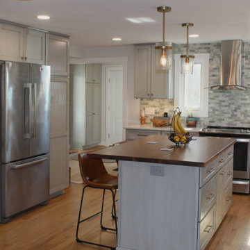
An open floor plan kitchen renovation essentially merges your kitchen area with another living space, typically the dining room or living room, creating a more spacious and interconnected feel.
Opening Up the Space and Removing walls:
This is the key step, taking down non-load-bearing walls that separate the kitchen from the living or dining area. You'll want to consult a structural engineer to ensure any remaining walls can support the weight of the house.
Considering beams or columns:
Depending on the layout and size of the opening, you might need exposed beams or support columns to maintain structural integrity. These can be incorporated into the design as a stylish feature.
Kitchen Repositioning and Functionality:
Rethinking the work triangle: The work triangle refers to the refrigerator, sink, and stove - the most used areas in a kitchen. In an open plan, you'll want to ensure these elements remain close together for an efficient workflow. This might involve rearranging cabinetry or appliances.
Creating a focal point: An island is a popular choice in open concept kitchens. It can house the sink, cooktop, provide additional storage and counter space, and even offer seating for guests to chat while you cook. Peninsula counters can also be used for a similar effect.
Unifying Design Elements: Use consistent flooring throughout the open area to create a cohesive flow. You can also extend the same color scheme or material accents (like backsplash tile) from the kitchen into the adjoining space.
Letting in Light: Maximize natural light by incorporating large windows or skylights. This will brighten the entire open area and make it feel even more spacious.
Storage Solutions: With an open plan, you might lose some wall space for cabinets. Consider built-in storage solutions like pantry cabinets or creative mudroom cabinetry to ensure you have enough storage for your kitchenware.
An open floor plan kitchen renovation can be a transformative project, creating a light-filled and social space in your home. By carefully planning the layout, incorporating design elements that unify the space, and addressing practical considerations with lighting and storage, you can achieve a beautiful and functional open concept kitchen.
 Murphy Bros. Design | Build | Remodel
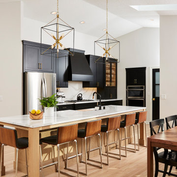
The new kitchen has a repositioned cooktop and vent hood refinished floors and dark cabinets along with more storage space.
“Both homeowners were great collaborators to work with,” recalls Mann, who remembers their response to the question of a color pallet during the design phase. “She said she really liked black and white, so we went with a pre-finished ebony shade on the cabinets in the kitchen, and color-matched to that on the fireplace shelves surround, the windows, and the new office door,” explained Mann.
 Riverwalk Contracting Group
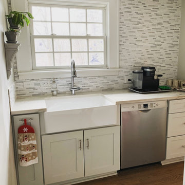
This 1920s home had a small dated kitchen. We opened the wall between the kitchen and dining room, moving the main kitchen footprint into the former dining room to be opened to the living area. A large series of kitchen windows were added to highlight the view, with the gas cooktop looking out. The former kitchen space was converted a butler's pantry to include the main farm sink and dishwasher, thus allowing closing off messy dishes during a party. The pantry was built with extra-large shelves to accommodate bulky Costco items and a small area for a coffee bar. The bulk of the budget was used to replace and reposition two staircases. The project also included sistering sagging ceiling joists from the upstairs.
 J.S. Brown & Co.
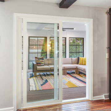
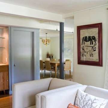
A section of wall was removed to create a doorway to the remodeled laundry room and new powder room addition, a new sliding door connects the house to the sunroom addition, repositioning the pendant light allows the table to be centered on the fireplace, and a new hutch cabinet provided much needed storage
 Sarah Bernardy Design, LLC
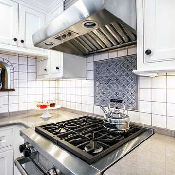
After -This compact kitchen may be small, but what lacks in size does not lack in charming details. Once we finalized the plan layout of the kitchen we were able to make the finishing details come to life. We relocated the refrigerator which had been tightly tucked next to the stove to make room for a centered range with hood and allow for cabinetry on this side of the kitchen. This created two working L shapes within our confined space. The new farmhouse style sink was re-positioned underneath the backyard window to take advantage of the view and create a focal point as you enter the kitchen from the dining room. Custom tiles hand-made in California were selected for the backsplash. A gray Quartz in Cambria Carrick was used for the countertops. Interior Design and material selections by Sarah Bernardy Design, LLC Contractor: Purcell Quality, Inc. Photographer: Steve Voegeli of Steven Voegeli Photography

 Drury Design
THE SETUP
The original primary bathroom was characterized by a disjointed and segmented layout. The shower featured a bulky glass-block enclosure that overwhelmed the space visually. There was a considerable amount of open, unused space, and despite having a his and hers vanity, the arrangement lacked personal space for each user, as they shared the conjoined space between the sinks. The toilet was inconveniently located right by the door, with a half-wall partition meant to provide privacy but instead contributing to a cramped and unbalanced feel. Overall, the bathroom’s layout and design were fragmented, failing to make the most of the available space and lacking adequate storage solutions.
Design objectives:
- Reconfigure the layout to enhance functionality and flow.
- Create an elegant, upscale aesthetic that is light and bright.
- Incorporate specialized storage solutions for female hair care needs.
- Increase overall storage capacity.
- Develop a spa-like shower experience.
- Provide a significant wow factor to the space.
THE REMODEL
Design challenges to be solved:
- Repositioning the toilet to a more suitable location.
- Designing hair care storage solutions without cluttering the elegant space.
- Balancing an upscale, elegant design with a feminine touch in the color palette.
- Increasing the brightness of the room without adding windows.
- Completely replacing the existing shower to create a spa-like experience.
- Planning new storage solutions without adding bulkiness or clutter to the cabinetry.
THE RENEWED SPACE
Design solutions:
Toilet Relocation: Moved the toilet by the window, creating a better overall layout that also opened up two full walls for cabinetry and storage solutions.
Specialized Vanity Storage: The left side of the left vanity is the wife’s. Open shelves facing across the vanity can be used for decorative or daily needs items. Pull-out docking drawers with power outlets and metal basins handle hot hair appliances.
Bright and Elegant Color Scheme: White cabinets, countertops, floors, and shower walls keep the space bright. The just-off-white wall color with a hint of pink adds a feminine touch. Thin wainscoting with white trim offers traditional-leaning elegance.
Layered Lighting Strategy: Ceiling can lights, sconces, lighted mirrors, and toe-kick lighting were installed. Natural light-rated bulbs keep the space bright and natural-feeling.
Spa-Like Shower: An extra-large shower was created using the same floor tile materials for continuity. Equipped with a Kohler Anthem system with a shower head, hand-held, and four body sprays. His and Hers niches for separate body care product storage.
Enhanced Storage Solutions: Added a linen cabinet within the vanity area for efficient storage of towels and bathroom essentials.
This elegant bathroom feels incredibly spacious now. The color palette and lights keep the room bright and cheery. Gold fixtures, the herringbone pattern on the floor, and exquisite trim work add an elegant touch. With the husband and wife having their own vanity wall sections joined at the corner, each user truly has their own space within the space. The clients are very happy with the final result.
 butter+velvet DESIGN · HOME
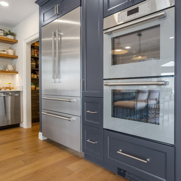
This full home renovation on White Meadow Lake in Rockaway, NJ completely transformed the heart of the home. We reimagined the kitchen layout - repositioning the island to capture stunning lake views and relocating the range to the perimeter for better flow and function. What was once a pass-through to the side door is now a beautifully integrated pantry, maximizing both storage and usability.
 Michael Nash Design, Build & Homes
2011 NATIONAL NARI COTY SOUTHEAST REGIONAL AWARD
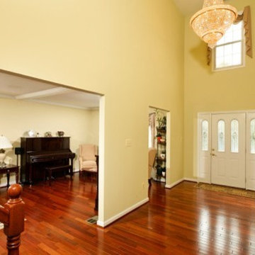
This family of four living in a 1987 brick colonial had to make dramatic changes now that their 85 years old grandmother was about to move in. They needed a mother-in-law suite complete with bathroom facilities to meet her needs. Because they were remodeling anyway, they decided to overhaul the rest of the home to create the house they have always dreamed about, including a grand two-story entry.
Starting in the basement, the homeowner added a home theatre room, added storage and a larger bathroom. Hard wood floors and a new stairway were also added.
The main level boasts the new two-story entry foyer. To its left is the mother-in-law suite with a large front bay window and its own walk-in closet and private bath. The bath is furnished with a walk-in jetted tub and aging-in-place accessories. Other first floor highlights include a music room and gourmet kitchen.
Kitchen amenities the client always wanted were added, including a large center island, extended cabinets, double layered crown molding, exotic granite top and wide board mahogany floors throughout entire first floor.
The entire second floor and stairs going up were reconfigured too. The master bedroom is larger with a new tray ceiling and recess lights. The new walk- in closet is now adjacent to the master bath instead of being across the room. The master bathroom was totally gutted and re-positioned. It includes an enlarged shower with bench and frameless shower door, toilet hidden behind a closet and new whirlpool surround with beautiful travertine tile and long double vanity space.
This new renovation is truly a testament to the possibilities of aging-in-place remodeling strategies. Three generations are now living comfortably in this home.
 AccentPositives Home Staging
Jared Tafua
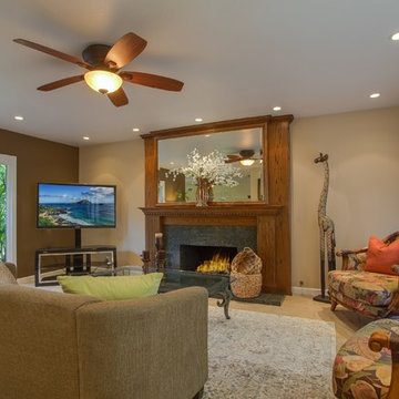
repositioned chairs and added up to date sofa, area rugs and other accessories
Small transitional open concept ceramic tile living room photo in Orange County with beige walls, a standard fireplace and a wood fireplace surround
Small transitional open concept ceramic tile living room photo in Orange County with beige walls, a standard fireplace and a wood fireplace surround
 Kraft Custom Construction
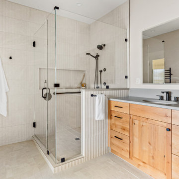
Oftentimes homeowners come to us with an idea of how they want to update their space. Through thoughtful discussion and truly understanding their needs, we develop the perfect plan together. The previous bathroom was burdened with a large jacuzzi tub, an outdated fiberglass shower, and limited open floor space. Our approach started with a simple shower and bath update and evolved into a complete reimagining of the bathroom. We prioritized fluidity and functionality, repositioning plumbing and overhauling the floor plan to create a space that seamlessly marries practicality with design impact.
The new bathroom features a custom knotty alder vanity with toe kick lighting and a sleek quartz countertop. Above, a defogging LED-lit mirror with touch screen controls adds a modern element to the bright and minimal bathroom aesthetic. The new custom shower blends sophistication with accessibility. Simple yet elegant porcelain fluted tiles and glass partitions frame the space, with a low-threshold entrance and strategically placed grab bars to support accessibility. Inside, a custom product niche with cove lighting adds both aesthetic appeal and functionality. In the end, the reimagined bathroom thoughtfully aligns the homeowner's lifestyle and design preferences.
 DRAPES & DECOR
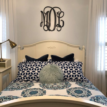
This was a renovation project for a 12 year old girl who outgrown her nursery style bedroom and desired new more grown up look with some blue colors and gold accents. We started with selecting a gorgeous chandelier to add some charm and character to the room. We've decided to keep the pale blue walls and add some striking accent colors in bedding and other accessory. We've placed a custom made monogram in navy/teal color and repeated this color in a new shaggy area rug and velvet euro shams. We have added brand new sheer curtains with a gold/grass hardware and repeated these finishes in wall art on the adjacent wall and also placed a desk lamp in gold/brass on the desk. We have repositioned the desk from a different wall and placed by the bed to serve as a nightstand and as a better homework space by the window. The bedding added lots of interest in patterns, color and texture.
 Carlton Edwards
The Cherry Road project is a humble yet striking example of how small changes can have a big impact. A meaningful project as the final room to be renovated in this house, thus our completion aligned with the family’s move-in. The kitchen posed a number of problems the design worked to remedy. Such as an existing window oriented the room towards a neighboring driveway. The initial design move sought to reorganize the space internally, focusing the view from the sink back through the house to the pool and courtyard beyond. This simple repositioning allowed the range to center on the opposite wall, flanked by two windows that reduce direct views to the driveway while increasing the natural light of the space.
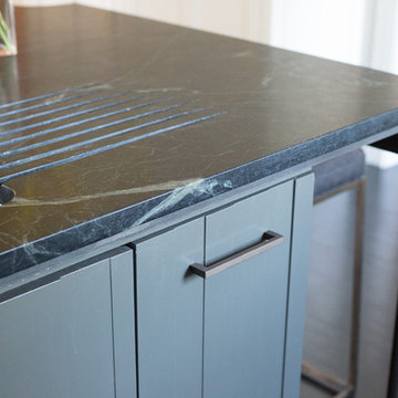
The island has a custom steel base with hammered legs, with a natural wax finish on it. The top is soapstone and incorporates an integral drain board in the kitchen sink. We did custom bar stools with steel bases and upholstered seats.
 solleydesign
Existing Conditions: A single family residence, one block from the water. which had been extended in three stages.
Objectives: a) Rationalize flow in first floor plan b) Provide less formal subdivisons between living spaces c) Capitalize on natural daylight and garden views.
Strategy a) Enclose the existing breezeway porch b) Reposition centrally located WC/Utility Room toexterior wall. c) Mainntain existing staircase to enable owner to reside during construction.
 Kitchen Solvers of Coeur d'Alene
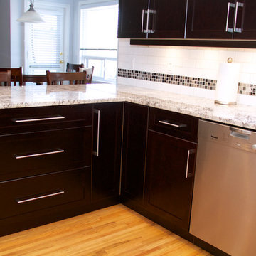
The original kitchen underwent some workflow changes prior to the refacing project. A new pantry cabinet and over the fridge cabinet were added, the fridge was repositioned and a new fridge gable was installed. The desk knee-space was eliminated in favor of a new cabinet with lower storage and cutlery size drawers.
The original cabinet door/drawer fronts were a simple raised panel maple in a clear varnish. Water damage around the cooking/sink area and sun damage to the doors, etc. required a complete face lift by ‘refacing’.
The refacing material is in Cherry veneer with a Charisma colored stain. Matching color doors and drawer fronts feature a Cherry Shaker style using 3/8” thick center panels. Blum soft-close hinges and new ‘customer sourced’ stainless handles were installed.
New counter ‘task-lighting’ was added and new task light valances were installed to conceal this feature. Then a new subway tiled backsplash and new Cherry crown molding were installed to complete this beautiful new kitchen.
 Albers Design LLC
A previous client (Big Wood Lane) reached out to us to help design a remodel of a recently purchased on the south shore of Lake Minnetonka. The home had grown organically since its original construction in 1945. It had evolved over time to accommodate the needs of its numerous owners. Our client brought a new set of needs to the home that included a desire to make the lake home a comfortable destination for family and friends.
The project consisted of reconfiguring an outdated, inefficient kitchen, expansion of the bedroom wing to include individual bathrooms for bedrooms and redesign of the central stair guard rail.
The redesign of the kitchen included repositioning major appliances for greater efficiency, more seating at an enlarged island, a new pantry, and expanded views to the lake. The expansion of the bedroom wing included eliminating a three-season porch on top of the garage on the inland side of the home. The space above the garage roof was enclosed and turned into dedicated bathrooms for each bedroom. These bathrooms are accessible only from the bathrooms which provide privacy and convenience to visitors.
 Saltwater Kitchen & Bath Studio
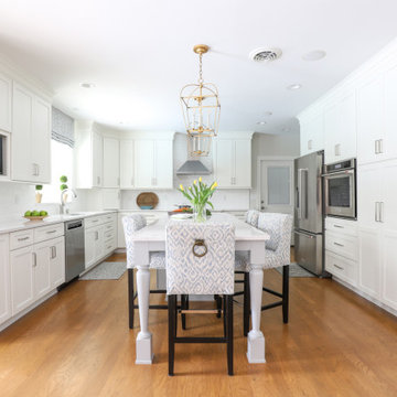
This home had a 1970s original kitchen with great bones but really needed an update. We removed a wall separating the dining from the kitchen allowing for a large island and re-positioned the refrigerator and exterior door to give more counter space at the cook and prep area. These clients love to entertain during football season so this new open plan now allows the guests to move from the kitchen to the living to the outside pool area unobstructed.
24