
Search results for "Research use" in Home Design Ideas

 Cape Associates, Inc.
Overthinking a situation isn’t always a bad thing, particularly when the home in question is one in which the past is suddenly meeting the present. Originally designed by Finnish architect Olav Hammarstrom in 1952 for fellow architect Eero Saarinen, this unique home recently received its first transformation in decades. Still in its 1950s skin, it was completely gutted, inside and out. It was a serious undertaking, as the homeowner wanted modern upgrades, while keeping an eye toward retaining the home’s 1950s charm. She had a vision for her home, and she stuck to it from beginning to end.
Perched on a rise of land and overlooking the tranquil Wellfleet Herring Pond, the home initially appears split, with the guest house on the left, and the main house of the right, but both ends are connected with a breezeway. The original home’s bones were in good shape, but many upgrades and replacements were necessary to bring the house up to date.
New siding, roofing, gutters, insulation and mechanical systems were all replaced. Doors and windows with metal frames were custom made by a company in Long Island that fabricates doors for office buildings. Modern heating and cooling systems were added, and the three bathrooms were all updated. The footprint of the home remained unchanged. Inside, the only expansion was more closet space.
The attention to detail in retaining the 50s-style look took a lot of online searching, from handles and knobs to lighting fixtures, with bits and pieces arriving from all over the world, including a doorstop from New Zealand. The homeowner selected many of the fixtures herself, while a very detail-oriented foreman exhaustively researched as well, looking for just the right piece for each and every location.
High-end appliances were purchased to modernize the kitchen and all of the old cabinetry was removed, replaced and refaced with NUVACOR, a versatile surfacing material that not only provided a sleek, modern look, but added convenience and ease of use.
Bare, wood-beamed ceilings throughout give a nod to the home’s natural surroundings, while the main living area (formerly a fisherman’s cabin), with a brick fireplace, was completely trimmed in walnut, while multiple windows of varying sizes welcome sunlight to brighten the home. Here, the sheetrock ceiling with faux rafters provides an interesting and room-brightening feature.
Behind the house sits the serene pond, which can now be enjoyed from the stunning new deck. Here, decking material was not laid out side by side, as it typically is but, instead, meticulously laid out on edge, creating an unusual and eye-catching effect. A railing of tempered glass panels allows unobstructed views of the surrounding natural beauty, and keeps consistent with the open, airy feel of the place. A new outdoor shower is accessible via the deck and left open to the wilderness and the pond below, completing the bold yet sophisticated feeling of this retro-modern home.


 Cape Associates, Inc.
Overthinking a situation isn’t always a bad thing, particularly when the home in question is one in which the past is suddenly meeting the present. Originally designed by Finnish architect Olav Hammarstrom in 1952 for fellow architect Eero Saarinen, this unique home recently received its first transformation in decades. Still in its 1950s skin, it was completely gutted, inside and out. It was a serious undertaking, as the homeowner wanted modern upgrades, while keeping an eye toward retaining the home’s 1950s charm. She had a vision for her home, and she stuck to it from beginning to end.
Perched on a rise of land and overlooking the tranquil Wellfleet Herring Pond, the home initially appears split, with the guest house on the left, and the main house of the right, but both ends are connected with a breezeway. The original home’s bones were in good shape, but many upgrades and replacements were necessary to bring the house up to date.
New siding, roofing, gutters, insulation and mechanical systems were all replaced. Doors and windows with metal frames were custom made by a company in Long Island that fabricates doors for office buildings. Modern heating and cooling systems were added, and the three bathrooms were all updated. The footprint of the home remained unchanged. Inside, the only expansion was more closet space.
The attention to detail in retaining the 50s-style look took a lot of online searching, from handles and knobs to lighting fixtures, with bits and pieces arriving from all over the world, including a doorstop from New Zealand. The homeowner selected many of the fixtures herself, while a very detail-oriented foreman exhaustively researched as well, looking for just the right piece for each and every location.
High-end appliances were purchased to modernize the kitchen and all of the old cabinetry was removed, replaced and refaced with NUVACOR, a versatile surfacing material that not only provided a sleek, modern look, but added convenience and ease of use.
Bare, wood-beamed ceilings throughout give a nod to the home’s natural surroundings, while the main living area (formerly a fisherman’s cabin), with a brick fireplace, was completely trimmed in walnut, while multiple windows of varying sizes welcome sunlight to brighten the home. Here, the sheetrock ceiling with faux rafters provides an interesting and room-brightening feature.
Behind the house sits the serene pond, which can now be enjoyed from the stunning new deck. Here, decking material was not laid out side by side, as it typically is but, instead, meticulously laid out on edge, creating an unusual and eye-catching effect. A railing of tempered glass panels allows unobstructed views of the surrounding natural beauty, and keeps consistent with the open, airy feel of the place. A new outdoor shower is accessible via the deck and left open to the wilderness and the pond below, completing the bold yet sophisticated feeling of this retro-modern home.
Find the right local pro for your project
 Cape Associates, Inc.
Overthinking a situation isn’t always a bad thing, particularly when the home in question is one in which the past is suddenly meeting the present. Originally designed by Finnish architect Olav Hammarstrom in 1952 for fellow architect Eero Saarinen, this unique home recently received its first transformation in decades. Still in its 1950s skin, it was completely gutted, inside and out. It was a serious undertaking, as the homeowner wanted modern upgrades, while keeping an eye toward retaining the home’s 1950s charm. She had a vision for her home, and she stuck to it from beginning to end.
Perched on a rise of land and overlooking the tranquil Wellfleet Herring Pond, the home initially appears split, with the guest house on the left, and the main house of the right, but both ends are connected with a breezeway. The original home’s bones were in good shape, but many upgrades and replacements were necessary to bring the house up to date.
New siding, roofing, gutters, insulation and mechanical systems were all replaced. Doors and windows with metal frames were custom made by a company in Long Island that fabricates doors for office buildings. Modern heating and cooling systems were added, and the three bathrooms were all updated. The footprint of the home remained unchanged. Inside, the only expansion was more closet space.
The attention to detail in retaining the 50s-style look took a lot of online searching, from handles and knobs to lighting fixtures, with bits and pieces arriving from all over the world, including a doorstop from New Zealand. The homeowner selected many of the fixtures herself, while a very detail-oriented foreman exhaustively researched as well, looking for just the right piece for each and every location.
High-end appliances were purchased to modernize the kitchen and all of the old cabinetry was removed, replaced and refaced with NUVACOR, a versatile surfacing material that not only provided a sleek, modern look, but added convenience and ease of use.
Bare, wood-beamed ceilings throughout give a nod to the home’s natural surroundings, while the main living area (formerly a fisherman’s cabin), with a brick fireplace, was completely trimmed in walnut, while multiple windows of varying sizes welcome sunlight to brighten the home. Here, the sheetrock ceiling with faux rafters provides an interesting and room-brightening feature.
Behind the house sits the serene pond, which can now be enjoyed from the stunning new deck. Here, decking material was not laid out side by side, as it typically is but, instead, meticulously laid out on edge, creating an unusual and eye-catching effect. A railing of tempered glass panels allows unobstructed views of the surrounding natural beauty, and keeps consistent with the open, airy feel of the place. A new outdoor shower is accessible via the deck and left open to the wilderness and the pond below, completing the bold yet sophisticated feeling of this retro-modern home.
 Cape Associates, Inc.
Overthinking a situation isn’t always a bad thing, particularly when the home in question is one in which the past is suddenly meeting the present. Originally designed by Finnish architect Olav Hammarstrom in 1952 for fellow architect Eero Saarinen, this unique home recently received its first transformation in decades. Still in its 1950s skin, it was completely gutted, inside and out. It was a serious undertaking, as the homeowner wanted modern upgrades, while keeping an eye toward retaining the home’s 1950s charm. She had a vision for her home, and she stuck to it from beginning to end.
Perched on a rise of land and overlooking the tranquil Wellfleet Herring Pond, the home initially appears split, with the guest house on the left, and the main house of the right, but both ends are connected with a breezeway. The original home’s bones were in good shape, but many upgrades and replacements were necessary to bring the house up to date.
New siding, roofing, gutters, insulation and mechanical systems were all replaced. Doors and windows with metal frames were custom made by a company in Long Island that fabricates doors for office buildings. Modern heating and cooling systems were added, and the three bathrooms were all updated. The footprint of the home remained unchanged. Inside, the only expansion was more closet space.
The attention to detail in retaining the 50s-style look took a lot of online searching, from handles and knobs to lighting fixtures, with bits and pieces arriving from all over the world, including a doorstop from New Zealand. The homeowner selected many of the fixtures herself, while a very detail-oriented foreman exhaustively researched as well, looking for just the right piece for each and every location.
High-end appliances were purchased to modernize the kitchen and all of the old cabinetry was removed, replaced and refaced with NUVACOR, a versatile surfacing material that not only provided a sleek, modern look, but added convenience and ease of use.
Bare, wood-beamed ceilings throughout give a nod to the home’s natural surroundings, while the main living area (formerly a fisherman’s cabin), with a brick fireplace, was completely trimmed in walnut, while multiple windows of varying sizes welcome sunlight to brighten the home. Here, the sheetrock ceiling with faux rafters provides an interesting and room-brightening feature.
Behind the house sits the serene pond, which can now be enjoyed from the stunning new deck. Here, decking material was not laid out side by side, as it typically is but, instead, meticulously laid out on edge, creating an unusual and eye-catching effect. A railing of tempered glass panels allows unobstructed views of the surrounding natural beauty, and keeps consistent with the open, airy feel of the place. A new outdoor shower is accessible via the deck and left open to the wilderness and the pond below, completing the bold yet sophisticated feeling of this retro-modern home.

 Advance Design Studio, Ltd.
Jennifer and Dan have lived in their Deer Park Illinois home for 15 years, slowly making minor fixes like painting and decorating; but they had a new plan for their kitchen the entire time. An awkwardly placed garage door, and an island cooktop with a terrible downdraft made a full-scale kitchen remodel an absolute must. Jennifer had many ideas in mind and wanted to work with a company that could provide high-end work, while partnering with a designer that would tailor the kitchen to her ideas.
She was intrigued by the phrase “Common Sense Remodeling” in Advance Design’s feature she discovered while perusing an issue of the community’s Quintessential Barrington Magazine. Doing further research on the company’s website, as she looked through project profiles and read about Advance Design’s “Common Sense Remodeling” philosophy, she promptly scheduled an appointment to see if the people and ideas she read about were truly who they said they were. The more she read, the more she knew that the “Common Sense” approach to remodeling they described was exactly the type of company she was looking for.
The partnership was sealed after an initial consultation with Owner Todd Jurs and Project Designer Michelle Lecinski. They displayed a combination of friendliness, professionalism and respect that was unmatched by any of the other companies Jennifer talked to. She knew that with Advance Design, she would be able to retain the vision that she had in mind with high-quality craftsmanship.
“I reached out to Advance Design because of the ‘Common Sense Remodeling’ tagline,” Jennifer said. “That’s what lingered for me”. “Advance Design was the most respectful- of the house and of my design ideas, and the most professional of the handful of companies that looked at my project”.
Soon after the meeting Jennifer began working with Michelle on the project design. They quickly developed chemistry. Jennifer loved how Michelle researched and located every detail that Jennifer wanted for the kitchen. Between the two of them, every concept and idea was worked through and perfected. “Jennifer had definite ideas about what she wanted the new kitchen to look like, she just didn’t know how to bring it all together. We worked together really well to make her ideas into the practical reality necessary for a well-functioning kitchen, with the look and feel that she had envisioned”, says Michelle.
“Michelle was wonderful in using the CAD system she would show me new drawings every time we changed the layout while working through the design,” Jennifer said. “She was a really wonderful partner in execution, she made sure everything happened quickly and easily.”
The finished design drew out elements of Jennifer’s style and personality. The pair call the look “sophisticated farmhouse” to describe the kitchen renovation to family and friends. The result was a beautifully crafted, authentic-feeling space that satisfied Jennifer’s dreams 15 years in the making. The whole project consisted of a kitchen remodel, mudroom upgrade with powder room, and garage entry relocation. “The projects I personally like the best, are the ones that put the client’s dreams on display,” Project Designer Michelle said. “And this is one of those projects.”
The main focal point of the kitchen is custom zinc and brass ventilation hood with a vintage sheen, which was hand made to order by a small company in Indiana named Vogler Metalworking. “It’s like sculpture, a true work of art”, says Jennifer. Your eye is immediately drawn towards this elegant yet practical hood that eliminated the home’s downdraft problem and added a striking conversation piece at the same time. The carpenters had to use special gloves when transporting and installing it, so they didn’t smudge it with fingerprints. The beautiful hood centers proudly over the stunning black enamel and brass LaCornue Range. “I had a friend who had a LaCornue range and after learning how easy it was to cook perfect meals, I was convinced I wanted to have one”, says Jennifer. This unique, breathtaking combination anchors the entire kitchen and is apparent immediately as you walk into the great room the surrounds the space.
DuraSupreme Crestwood cabinets with a Kendall Panel add function and sophistication. A custom gray paint color paired with a storm blue was developed so that the new kitchen looked like it belonged to the existing space. Unlacquered brass faucets and hardware were important to Jennifer because she wanted the living finishes to age over time. Remarkable brass diamond mesh cabinet door inserts imported from the UK continue to add this one-of-a-kind kitchen renovation; giving it a “you won’t see this everywhere” quality. The use of old railcar flooring for the coffee bar countertop and reclaimed oak for the open shelving gives an authenticity to the space uncommon in kitchens today.
Jennifer and Michelle fell in love with the Limestone Grey Stone while they were investigating unique island countertop ideas. They liked the fact that the limestone as a living finish will age and change over time. Calcutta Miel Quartz countertops made for an excellent pairing around the perimeter, as it’s durable and perfect for cooking preparations. A textured white subway tile backsplash that runs to the ceiling keeps your eye moving towards the open shelving, and to the main focal point of the stunning range hood combination.
“The kitchen functions beautifully, and it’s gorgeous,” beams Jennifer as she gestures with both hands while smiling ear to ear. “The most important thing was I wanted a kitchen that had a wonderful flow, cooked beautiful meals and was a great gathering place for family and friends, and this space does that perfectly! Beauty wise, it turned out exactly how I had envisioned. I felt the function part was the hardest part, and that was nailed”!
Relocating the garage entry to the new mudroom was a huge priority and has finally separated the family’s arriving home functions from their kitchen. Now coats and shoes and bags have their own area for dropping once members arrive home. Matching gray DuraSupreme cabinetry helped create gorgeous, purposeful lockers for the family. A reclaimed vintage sink and custom wall paper were added to the tiny powder room to beautify the once previously only functional space. Advance Design was even able to create a custom space for their dog to sleep while the family is away.
“It was unbelievable that a project of this size was completed in such a short time, and I think that’s because of the large amount of planning and preparation that went into it,” Jennifer marveled, “When we started, we were ready, and everything was prepared”.
When it came to execution, Project Manager Justin Davis and his crew were quick, accessible, and organized. Projects like this kitchen are typically completed in as little as 8-10 weeks. Jennifer’s kitchen however despite the relocation of some challenging HVAC in a soffit and moving of an exterior door was completed remarkably fast in part because the team was working with an existing tile floor that ran throughout the first floor that the client really loved.
“You get to know these people really well because they’re living in your house while you’re living in your house. They were so fast and really good, it didn’t take as long as even planned” reported Jennifer. “I would text Justin and he always responded almost immediately. I got to know all the guys who were working in our house and they were all wonderful people”.
Details in a customized kitchen like this one require skill and care from the people who install it. “All the guys on the job were skilled at what the did. I wanted small details like little feet to look like furniture, that is where their carpentry skill came in to make these all perfect”, said Jennifer. “The tile guys were wonderful. They even let me determine how I wanted the texture with the grout to appear for a salt and pepper look; now that is a very skilled trade person making it custom”.
In Jennifer’s interview, she continued to reference Advance Design’s “Common Sense Remodeling”, so I took a minute to ask her exactly what that phrase meant to her and how it played out in her experience with her project and the Advance Design team. Here is what she said: “I was intrigued about Common Sense Remodeling and in my head that there would be clear costs and prices, great communication between the design team, the execution team and me”, said Jennifer. They did deliver on that, it was so clear about the cost breakdown, what I could expect from everyone who came to my house, and everything that we had ordered. That to me is the Common Sense”!
It’s great to see a client take literally our assertion that a well-planned remodeling project is simply “Common Sense”! She anticipated each step of the way would be clear, concise, and predictable, all the while protecting the outcome due to the careful upfront planning. “Advance Design delivered on their ‘Common Sense Remodeling’ promise,” Jennifer said. “From the design team, to the execution team - everything was straight forward like I imagined. The project turned out exactly how I envisioned, I enjoyed this process and absolutely would recommend Advance Design Studio to anyone.”
 Cape Associates, Inc.
Overthinking a situation isn’t always a bad thing, particularly when the home in question is one in which the past is suddenly meeting the present. Originally designed by Finnish architect Olav Hammarstrom in 1952 for fellow architect Eero Saarinen, this unique home recently received its first transformation in decades. Still in its 1950s skin, it was completely gutted, inside and out. It was a serious undertaking, as the homeowner wanted modern upgrades, while keeping an eye toward retaining the home’s 1950s charm. She had a vision for her home, and she stuck to it from beginning to end.
Perched on a rise of land and overlooking the tranquil Wellfleet Herring Pond, the home initially appears split, with the guest house on the left, and the main house of the right, but both ends are connected with a breezeway. The original home’s bones were in good shape, but many upgrades and replacements were necessary to bring the house up to date.
New siding, roofing, gutters, insulation and mechanical systems were all replaced. Doors and windows with metal frames were custom made by a company in Long Island that fabricates doors for office buildings. Modern heating and cooling systems were added, and the three bathrooms were all updated. The footprint of the home remained unchanged. Inside, the only expansion was more closet space.
The attention to detail in retaining the 50s-style look took a lot of online searching, from handles and knobs to lighting fixtures, with bits and pieces arriving from all over the world, including a doorstop from New Zealand. The homeowner selected many of the fixtures herself, while a very detail-oriented foreman exhaustively researched as well, looking for just the right piece for each and every location.
High-end appliances were purchased to modernize the kitchen and all of the old cabinetry was removed, replaced and refaced with NUVACOR, a versatile surfacing material that not only provided a sleek, modern look, but added convenience and ease of use.
Bare, wood-beamed ceilings throughout give a nod to the home’s natural surroundings, while the main living area (formerly a fisherman’s cabin), with a brick fireplace, was completely trimmed in walnut, while multiple windows of varying sizes welcome sunlight to brighten the home. Here, the sheetrock ceiling with faux rafters provides an interesting and room-brightening feature.
Behind the house sits the serene pond, which can now be enjoyed from the stunning new deck. Here, decking material was not laid out side by side, as it typically is but, instead, meticulously laid out on edge, creating an unusual and eye-catching effect. A railing of tempered glass panels allows unobstructed views of the surrounding natural beauty, and keeps consistent with the open, airy feel of the place. A new outdoor shower is accessible via the deck and left open to the wilderness and the pond below, completing the bold yet sophisticated feeling of this retro-modern home.

 STUDIO KONDE | Konrad Idaszewski Architect
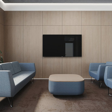
Reception seating at the Airoptic Research & Technology Office in Wysogotowo, designed by STUDIO KONDE Konrad Idaszewski Architekt, creates a dedicated lounge area for visitors, informal meetings and waiting.
Visit our page: https://conde.pl/portfolio/projekt-wnetrz-biurowych-siedziby-firmy-airoptic/
The reception area is part of a larger office interior design project near Poznań. It shows how an interior architect in Poznań can use furniture, materials and spatial proportions to give a commercial interior a distinct character.
Blue upholstered seating, natural oak wall panels and a dark rug establish the main visual language of the lounge. The composition is simple and symmetrical. A large media screen provides the central focal point, while the seating creates a clear area for conversations and informal meetings.
A three-seat sofa stands along the left side of the room. Its blue upholstery has broad side panels and softly rounded edges. Matching armchairs are positioned opposite and alongside it. Slim black metal legs lift the furniture above the floor and add a light detail to the substantial upholstered forms.
At the centre, a low coffee table combines a pale oak top with a rounded blue base. The softly curved corners repeat the geometry of the armchairs. Its compact form leaves a generous gap between the surrounding seats and keeps the circulation around the lounge unobstructed.
Behind the furniture, large oak panels cover the entire wall. Fine horizontal and vertical joints divide the surface into a regular grid. A black wall-mounted television sits centrally within the composition and creates a strong contrast against the light timber. The simple media wall gives the reception seating a clear visual focus without additional decorative elements.
A large dark brown rug defines the lounge area and visually connects the sofa, armchairs and coffee table. Its mottled surface adds subtle texture beneath the smooth upholstery. On the left, large green plants stand beside the glazing and bring natural colour into the restrained palette.
White door frames and glazed openings remain visible around the timber wall. They connect the seating area with the circulation routes and other parts of the office. Daylight entering through the glazed entrance brightens the space and highlights the natural grain of the oak.
The ceiling continues the office's restrained architectural language, combining a dark grid with integrated lighting. Linear illumination around the perimeter provides an even glow across the seating area. Oak panelling, blue contract furniture, a dark rug and carefully planned circulation create a cohesive reception lounge within the Airoptic workplace. The project reflects STUDIO KONDE Konrad Idaszewski Architekt's work in office interiors, commercial spaces and furniture arrangements for contemporary workplaces in the Poznań area.

 Jennifer Garner Interiors
The exercise room features cork flooring.
Inspiration for a timeless home gym remodel in Austin
Inspiration for a timeless home gym remodel in Austin
 Tile Doctor Ltd
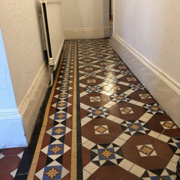
We received a request to renovate Victorian tiled hallway floor at a house in the London borough of Harlesden NW10. My client had modernised the heating system and this unfortunately required a section of the tiled flooring to be dug up so new pipework could be laid.
After speaking on the phone, I arranged an initial visit to the property so I could properly assess the work required and provide a price for restoring the floor. During my visit I could see there was another section of missing tiles at one of the door thresholds which would need attention. Except for the missing sections of floor I could see that the tiles themselves were in good condition for their age and would respond well to a deep clean and fresh seal.
I was confident on being able to source matching replacements for the missing tiles and reassured my client that we would be able not only repair the floor but also renovate it to a good standard. I gave them a price to do the restoration which they were happy to accept, and the work was booked.
After some research I managed to source replacement tiles from the Vintage Floor Tile Company in Kent; Victorian tiles are still popular so there a few companies that keep stock so we can usually find a match.
With the replacements in hand, work started by removing the cement and loose material from the missing sections of flooring and backfilling with self-levelling compound to bring the exposed base up to the right level for tiling.
The tiles were then cut to shape as required to match the existing patten and fixed into place with a quick setting adhesive and then grouted.
The floor was left to overnight to allow the adhesive to harden fully, and I returned the next day to deep clean the whole floor. To give the tiles are deep clean a strong dilution of Tile Doctor Remove and Go was sprayed onto the floor and left to soak in for ten minutes. It was then scrubbed into the floor using a rotary machine fitted with a with a black pad. This action lifted the dirt out of the tiles and the resulting slurry was removed with the wet vacuum.
It turned out that the pores of the tiles were holding a lot of dirt, so the process was repeated until I was satisfied. Due to the age of the property, there was no damp-proof membrane installed so I do try to minimise the amount of water I use in this process as there is always a chance of exacerbating any latent efflorescence issues.
Efflorescence occurs where moisture rises through the tile bringing with it salts from underneath the floor as it evaporates on the surface. This can lead to unsightly white marks appearing on the tile. To counteract this potential problem the cleaning was followed by an acid wash using Tile Doctor Acid Gel applied with a 100 then 200-grit pad, before finishing on a 400-grit burnishing pad. The floor was again rinsed with water after the application of each pad to remove the slurry and extracted with a wet vacuum.
Once I was satisfied the floor was as clean as possible, we left site and the area was left to dry over the weekend ready for application of a new sealer.
I returned on the Monday and started by taking a few moisture readings to check the floor was dry. The floor was in an acceptable range, so I applied the first of 4 coats of sealer. For this floor I chose Tile Doctor Seal and Go Extra which is specially formulated product that provides stain resistance with a hard wearing low-sheen finish.
This product is also breathable which is an important feature for old floors, anything that blocks moisture from rising through the tile will cause it to become trapped underneath where it will pool and eventually reach out to the walls and result in rising damp.
Once complete the floor looked brand new and I’m pleased to say with the deep clean and a fresh sealer applied it was impossible to tell the difference between the original and repaired sections of flooring.
For the aftercare of sealed Victorian tiled floors, I recommend Tile Doctor Neutral Cleaner, it’s a mild day to day cleaner with a neutral pH that won’t damage the sealer. Many of the tile cleaning products you find in supermarkets are simply too strong.
Andrew Newstead
North London Tile Doctor
 Advance Design Studio, Ltd.
Jennifer and Dan have lived in their Deer Park Illinois home for 15 years, slowly making minor fixes like painting and decorating; but they had a new plan for their kitchen the entire time. An awkwardly placed garage door, and an island cooktop with a terrible downdraft made a full-scale kitchen remodel an absolute must. Jennifer had many ideas in mind and wanted to work with a company that could provide high-end work, while partnering with a designer that would tailor the kitchen to her ideas.
She was intrigued by the phrase “Common Sense Remodeling” in Advance Design’s feature she discovered while perusing an issue of the community’s Quintessential Barrington Magazine. Doing further research on the company’s website, as she looked through project profiles and read about Advance Design’s “Common Sense Remodeling” philosophy, she promptly scheduled an appointment to see if the people and ideas she read about were truly who they said they were. The more she read, the more she knew that the “Common Sense” approach to remodeling they described was exactly the type of company she was looking for.
The partnership was sealed after an initial consultation with Owner Todd Jurs and Project Designer Michelle Lecinski. They displayed a combination of friendliness, professionalism and respect that was unmatched by any of the other companies Jennifer talked to. She knew that with Advance Design, she would be able to retain the vision that she had in mind with high-quality craftsmanship.
“I reached out to Advance Design because of the ‘Common Sense Remodeling’ tagline,” Jennifer said. “That’s what lingered for me”. “Advance Design was the most respectful- of the house and of my design ideas, and the most professional of the handful of companies that looked at my project”.
Soon after the meeting Jennifer began working with Michelle on the project design. They quickly developed chemistry. Jennifer loved how Michelle researched and located every detail that Jennifer wanted for the kitchen. Between the two of them, every concept and idea was worked through and perfected. “Jennifer had definite ideas about what she wanted the new kitchen to look like, she just didn’t know how to bring it all together. We worked together really well to make her ideas into the practical reality necessary for a well-functioning kitchen, with the look and feel that she had envisioned”, says Michelle.
“Michelle was wonderful in using the CAD system she would show me new drawings every time we changed the layout while working through the design,” Jennifer said. “She was a really wonderful partner in execution, she made sure everything happened quickly and easily.”
The finished design drew out elements of Jennifer’s style and personality. The pair call the look “sophisticated farmhouse” to describe the kitchen renovation to family and friends. The result was a beautifully crafted, authentic-feeling space that satisfied Jennifer’s dreams 15 years in the making. The whole project consisted of a kitchen remodel, mudroom upgrade with powder room, and garage entry relocation. “The projects I personally like the best, are the ones that put the client’s dreams on display,” Project Designer Michelle said. “And this is one of those projects.”
The main focal point of the kitchen is custom zinc and brass ventilation hood with a vintage sheen, which was hand made to order by a small company in Indiana named Vogler Metalworking. “It’s like sculpture, a true work of art”, says Jennifer. Your eye is immediately drawn towards this elegant yet practical hood that eliminated the home’s downdraft problem and added a striking conversation piece at the same time. The carpenters had to use special gloves when transporting and installing it, so they didn’t smudge it with fingerprints. The beautiful hood centers proudly over the stunning black enamel and brass LaCornue Range. “I had a friend who had a LaCornue range and after learning how easy it was to cook perfect meals, I was convinced I wanted to have one”, says Jennifer. This unique, breathtaking combination anchors the entire kitchen and is apparent immediately as you walk into the great room the surrounds the space.
DuraSupreme Crestwood cabinets with a Kendall Panel add function and sophistication. A custom gray paint color paired with a storm blue was developed so that the new kitchen looked like it belonged to the existing space. Unlacquered brass faucets and hardware were important to Jennifer because she wanted the living finishes to age over time. Remarkable brass diamond mesh cabinet door inserts imported from the UK continue to add this one-of-a-kind kitchen renovation; giving it a “you won’t see this everywhere” quality. The use of old railcar flooring for the coffee bar countertop and reclaimed oak for the open shelving gives an authenticity to the space uncommon in kitchens today.
Jennifer and Michelle fell in love with the Limestone Grey Stone while they were investigating unique island countertop ideas. They liked the fact that the limestone as a living finish will age and change over time. Calcutta Miel Quartz countertops made for an excellent pairing around the perimeter, as it’s durable and perfect for cooking preparations. A textured white subway tile backsplash that runs to the ceiling keeps your eye moving towards the open shelving, and to the main focal point of the stunning range hood combination.
“The kitchen functions beautifully, and it’s gorgeous,” beams Jennifer as she gestures with both hands while smiling ear to ear. “The most important thing was I wanted a kitchen that had a wonderful flow, cooked beautiful meals and was a great gathering place for family and friends, and this space does that perfectly! Beauty wise, it turned out exactly how I had envisioned. I felt the function part was the hardest part, and that was nailed”!
Relocating the garage entry to the new mudroom was a huge priority and has finally separated the family’s arriving home functions from their kitchen. Now coats and shoes and bags have their own area for dropping once members arrive home. Matching gray DuraSupreme cabinetry helped create gorgeous, purposeful lockers for the family. A reclaimed vintage sink and custom wall paper were added to the tiny powder room to beautify the once previously only functional space. Advance Design was even able to create a custom space for their dog to sleep while the family is away.
“It was unbelievable that a project of this size was completed in such a short time, and I think that’s because of the large amount of planning and preparation that went into it,” Jennifer marveled, “When we started, we were ready, and everything was prepared”.
When it came to execution, Project Manager Justin Davis and his crew were quick, accessible, and organized. Projects like this kitchen are typically completed in as little as 8-10 weeks. Jennifer’s kitchen however despite the relocation of some challenging HVAC in a soffit and moving of an exterior door was completed remarkably fast in part because the team was working with an existing tile floor that ran throughout the first floor that the client really loved.
“You get to know these people really well because they’re living in your house while you’re living in your house. They were so fast and really good, it didn’t take as long as even planned” reported Jennifer. “I would text Justin and he always responded almost immediately. I got to know all the guys who were working in our house and they were all wonderful people”.
Details in a customized kitchen like this one require skill and care from the people who install it. “All the guys on the job were skilled at what the did. I wanted small details like little feet to look like furniture, that is where their carpentry skill came in to make these all perfect”, said Jennifer. “The tile guys were wonderful. They even let me determine how I wanted the texture with the grout to appear for a salt and pepper look; now that is a very skilled trade person making it custom”.
In Jennifer’s interview, she continued to reference Advance Design’s “Common Sense Remodeling”, so I took a minute to ask her exactly what that phrase meant to her and how it played out in her experience with her project and the Advance Design team. Here is what she said: “I was intrigued about Common Sense Remodeling and in my head that there would be clear costs and prices, great communication between the design team, the execution team and me”, said Jennifer. They did deliver on that, it was so clear about the cost breakdown, what I could expect from everyone who came to my house, and everything that we had ordered. That to me is the Common Sense”!
It’s great to see a client take literally our assertion that a well-planned remodeling project is simply “Common Sense”! She anticipated each step of the way would be clear, concise, and predictable, all the while protecting the outcome due to the careful upfront planning. “Advance Design delivered on their ‘Common Sense Remodeling’ promise,” Jennifer said. “From the design team, to the execution team - everything was straight forward like I imagined. The project turned out exactly how I envisioned, I enjoyed this process and absolutely would recommend Advance Design Studio to anyone.”


 Bellingham Bay Builders
Situated on the north shore of Birch Point this high-performance beach home enjoys a view across Boundary Bay to White Rock, BC and the BC Coastal Range beyond. Designed for indoor, outdoor living the many decks, patios, porches, outdoor fireplace, and firepit welcome friends and family to gather outside regardless of the weather.
From a high-performance perspective this home was built to and certified by the Department of Energy’s Zero Energy Ready Home program and the EnergyStar program. In fact, an independent testing/rating agency was able to show that the home will only use 53% of the energy of a typical new home, all while being more comfortable and healthier. As with all high-performance homes we find a sweet spot that returns an excellent, comfortable, healthy home to the owners, while also producing a building that minimizes its environmental footprint.
Design by JWR Design
Photography by Radley Muller Photography
Interior Design by Markie Nelson Interior Design

Sponsored
Sunbury, OH

J.Holderby - Renovations
Franklin County's Leading General Contractors - 2X Best of Houzz!
 Advance Design Studio, Ltd.
Jennifer and Dan have lived in their Deer Park Illinois home for 15 years, slowly making minor fixes like painting and decorating; but they had a new plan for their kitchen the entire time. An awkwardly placed garage door, and an island cooktop with a terrible downdraft made a full-scale kitchen remodel an absolute must. Jennifer had many ideas in mind and wanted to work with a company that could provide high-end work, while partnering with a designer that would tailor the kitchen to her ideas.
She was intrigued by the phrase “Common Sense Remodeling” in Advance Design’s feature she discovered while perusing an issue of the community’s Quintessential Barrington Magazine. Doing further research on the company’s website, as she looked through project profiles and read about Advance Design’s “Common Sense Remodeling” philosophy, she promptly scheduled an appointment to see if the people and ideas she read about were truly who they said they were. The more she read, the more she knew that the “Common Sense” approach to remodeling they described was exactly the type of company she was looking for.
The partnership was sealed after an initial consultation with Owner Todd Jurs and Project Designer Michelle Lecinski. They displayed a combination of friendliness, professionalism and respect that was unmatched by any of the other companies Jennifer talked to. She knew that with Advance Design, she would be able to retain the vision that she had in mind with high-quality craftsmanship.
“I reached out to Advance Design because of the ‘Common Sense Remodeling’ tagline,” Jennifer said. “That’s what lingered for me”. “Advance Design was the most respectful- of the house and of my design ideas, and the most professional of the handful of companies that looked at my project”.
Soon after the meeting Jennifer began working with Michelle on the project design. They quickly developed chemistry. Jennifer loved how Michelle researched and located every detail that Jennifer wanted for the kitchen. Between the two of them, every concept and idea was worked through and perfected. “Jennifer had definite ideas about what she wanted the new kitchen to look like, she just didn’t know how to bring it all together. We worked together really well to make her ideas into the practical reality necessary for a well-functioning kitchen, with the look and feel that she had envisioned”, says Michelle.
“Michelle was wonderful in using the CAD system she would show me new drawings every time we changed the layout while working through the design,” Jennifer said. “She was a really wonderful partner in execution, she made sure everything happened quickly and easily.”
The finished design drew out elements of Jennifer’s style and personality. The pair call the look “sophisticated farmhouse” to describe the kitchen renovation to family and friends. The result was a beautifully crafted, authentic-feeling space that satisfied Jennifer’s dreams 15 years in the making. The whole project consisted of a kitchen remodel, mudroom upgrade with powder room, and garage entry relocation. “The projects I personally like the best, are the ones that put the client’s dreams on display,” Project Designer Michelle said. “And this is one of those projects.”
The main focal point of the kitchen is custom zinc and brass ventilation hood with a vintage sheen, which was hand made to order by a small company in Indiana named Vogler Metalworking. “It’s like sculpture, a true work of art”, says Jennifer. Your eye is immediately drawn towards this elegant yet practical hood that eliminated the home’s downdraft problem and added a striking conversation piece at the same time. The carpenters had to use special gloves when transporting and installing it, so they didn’t smudge it with fingerprints. The beautiful hood centers proudly over the stunning black enamel and brass LaCornue Range. “I had a friend who had a LaCornue range and after learning how easy it was to cook perfect meals, I was convinced I wanted to have one”, says Jennifer. This unique, breathtaking combination anchors the entire kitchen and is apparent immediately as you walk into the great room the surrounds the space.
DuraSupreme Crestwood cabinets with a Kendall Panel add function and sophistication. A custom gray paint color paired with a storm blue was developed so that the new kitchen looked like it belonged to the existing space. Unlacquered brass faucets and hardware were important to Jennifer because she wanted the living finishes to age over time. Remarkable brass diamond mesh cabinet door inserts imported from the UK continue to add this one-of-a-kind kitchen renovation; giving it a “you won’t see this everywhere” quality. The use of old railcar flooring for the coffee bar countertop and reclaimed oak for the open shelving gives an authenticity to the space uncommon in kitchens today.
Jennifer and Michelle fell in love with the Limestone Grey Stone while they were investigating unique island countertop ideas. They liked the fact that the limestone as a living finish will age and change over time. Calcutta Miel Quartz countertops made for an excellent pairing around the perimeter, as it’s durable and perfect for cooking preparations. A textured white subway tile backsplash that runs to the ceiling keeps your eye moving towards the open shelving, and to the main focal point of the stunning range hood combination.
“The kitchen functions beautifully, and it’s gorgeous,” beams Jennifer as she gestures with both hands while smiling ear to ear. “The most important thing was I wanted a kitchen that had a wonderful flow, cooked beautiful meals and was a great gathering place for family and friends, and this space does that perfectly! Beauty wise, it turned out exactly how I had envisioned. I felt the function part was the hardest part, and that was nailed”!
Relocating the garage entry to the new mudroom was a huge priority and has finally separated the family’s arriving home functions from their kitchen. Now coats and shoes and bags have their own area for dropping once members arrive home. Matching gray DuraSupreme cabinetry helped create gorgeous, purposeful lockers for the family. A reclaimed vintage sink and custom wall paper were added to the tiny powder room to beautify the once previously only functional space. Advance Design was even able to create a custom space for their dog to sleep while the family is away.
“It was unbelievable that a project of this size was completed in such a short time, and I think that’s because of the large amount of planning and preparation that went into it,” Jennifer marveled, “When we started, we were ready, and everything was prepared”.
When it came to execution, Project Manager Justin Davis and his crew were quick, accessible, and organized. Projects like this kitchen are typically completed in as little as 8-10 weeks. Jennifer’s kitchen however despite the relocation of some challenging HVAC in a soffit and moving of an exterior door was completed remarkably fast in part because the team was working with an existing tile floor that ran throughout the first floor that the client really loved.
“You get to know these people really well because they’re living in your house while you’re living in your house. They were so fast and really good, it didn’t take as long as even planned” reported Jennifer. “I would text Justin and he always responded almost immediately. I got to know all the guys who were working in our house and they were all wonderful people”.
Details in a customized kitchen like this one require skill and care from the people who install it. “All the guys on the job were skilled at what the did. I wanted small details like little feet to look like furniture, that is where their carpentry skill came in to make these all perfect”, said Jennifer. “The tile guys were wonderful. They even let me determine how I wanted the texture with the grout to appear for a salt and pepper look; now that is a very skilled trade person making it custom”.
In Jennifer’s interview, she continued to reference Advance Design’s “Common Sense Remodeling”, so I took a minute to ask her exactly what that phrase meant to her and how it played out in her experience with her project and the Advance Design team. Here is what she said: “I was intrigued about Common Sense Remodeling and in my head that there would be clear costs and prices, great communication between the design team, the execution team and me”, said Jennifer. They did deliver on that, it was so clear about the cost breakdown, what I could expect from everyone who came to my house, and everything that we had ordered. That to me is the Common Sense”!
It’s great to see a client take literally our assertion that a well-planned remodeling project is simply “Common Sense”! She anticipated each step of the way would be clear, concise, and predictable, all the while protecting the outcome due to the careful upfront planning. “Advance Design delivered on their ‘Common Sense Remodeling’ promise,” Jennifer said. “From the design team, to the execution team - everything was straight forward like I imagined. The project turned out exactly how I envisioned, I enjoyed this process and absolutely would recommend Advance Design Studio to anyone.”
 User
Customessaywriter.co.uk is a professional academic writing agency in the industry of academic assistance. It is not a surprise buyers who are in need of help decide to turn to them.
Clients can order any type of essay here and it will be accomplished. All learners find it hard to compose theses, term papers, research papers, application essays, reports on their own. Customessaywriter.co.uk is ready manage your acadmic troubles.
Learners often feel proofreading and revising is overwhelming. Therefore, clients who need to get their papers fixed are suggested to request help from this service.
Heavy Warranties and Advantageous Options
Customessaywriter.co.uk as proficient academic writing company proposes suitable assurances to make all students feel more safe For instance, writing service makes available entire security and also under no circumstances gives no personal users data with others.
All clients can get top-quality, free of plagiarism and remarkable writing types exactly on-time without any slowing or add-on outgoings. In addition, crew assures to refunding money when anything is wrong with the paper. But in accordance with statistics approximately ninety six percent of users is happy with received buying, and because of this there is no case to worry about the quality of paper or accordance with the academic applications.
Usability
The most interesting thing every customer should be clear about this essay writing service and its writing act is the strong point of writer-customer partnership, actually. Every job at this resource is set to provide the total control for the process of writing and whole paper creation to you. You are free to set any instructions to the writers particularly at any moment you want with the help of 24/7 customer support service.
The site for this writing website is not specific. Actually, it is very easy, but, this sign makes it just convenient and user-friendly. Order page is very simple and useful. It is good for customers to workl with clear and easy webpages today. You came here to get your paper to be done, but, not to amuse yourself, right?
Costs and Lucrative Features
Charges are really mild,though they shift regulated by your paper characteristics. Whenever you feel interested to come up with the final sum of money of task without ordering it, switch to page with information about prices and then complete - special chart on that page. You will be asked to fix on the features you want and omit ones that are irrelevant for - purchase. Doing so you will either uplift the the final cost or pull down it.
Outside of pocket-friendly costs, Customessaywriter.co.uk offers generous price-offs and is committed to take off the charge a lot for customers making order for the first time ever. The company also has freebee paper examination give during two weeks and invites students engage in gratifying customer loyalty alongside referral programs. That's clearly a pleasant plus.
About the author: Ann Jason is a freelance writer on online essay writing, who specializes in blogging, business and technology. For more information follow custom essays.

 Valentini Kids Furniture Brooklyn NY
Modern Italian TV Stand Primo by LC Mobili
Made in Italy by LC Mobili
Primo by LC Mobili is an ultra modern TV stand that features a unique interesting design and shape. The tv media unit is lacquered in a sleek high gloss finish, making it a great solution for any modern interior. The TV base features two glass shelves that can be used as a storage area for any sort of electronic media remote control devices. The tv stand is capable of housing most TV sizes and still providing the user with maximum viewing pleasure. There are also the matching entertainment towers and hanging units to provide an extra storage space, entertain and organize your living room. Optional LED lighting can be also ordered to add to the modern feel of the set. The TV stand can be ordered in Fango, Sand or White color. The Entertainment tower is available in either Fango, Sand or White, with the upper unit in White only. The Hanging Units are available only in White.
Available Finishes:
TV Stand: White, Fango, Sand
Entertainment Tower: White, Fango, Sand (upper unit in White only)
Hanging Units (small and large): in White only
MATERIAL/CONSTRUCTION:
E1-Class ecological panels, which are produced exclusively through a wood recycling production process.
The structures and front wood finishes are made of chipboard.
The lacquered structures and fronts are made of REAL POLISH SCRATCH PROOF LACQUERING, which is a non toxic and non allergenic product.
The starting price is for the Primo TV Stand. The Lights are not included in the price and can be purchased separately.
Assembly:
Disassembled, Ready-To-Assemble
Dimensions:
TV Stand: W40.9" x D19.7" x H66.5"
Entertainment Tower: W40.9" x D19.7" x H66.5"
Large Hanging Unit: W82.7" x D14.2" x H13.2"
Small Hanging Unit: W38.2" x D14.2" x H13.2"
 THE Remodel Group
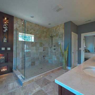
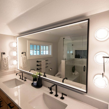
The owners of this Craftsman home loved its character, historic details, and established neighborhood, but after moving into the home, they found themselves working around a floor plan that couldn’t support the needs of their family. The bathrooms were the biggest source of frustration. Upstairs, family members shared a single hall bathroom, while downstairs, an outdated Jack and Jill bathroom occupied valuable square footage that prevented the home from functioning as a true primary suite. The renovation focused on reimagining two bathrooms and creating a new half bath from an unused closet. Like many older homes, the project revealed hidden conditions once construction began. Outdated knob-and-tube wiring and signs of water intrusion.
The former Jack and Jill bathroom was transformed into a dedicated primary bathroom, finally allowing the adjacent bedroom to function as the primary suite it was always meant to be. The existing layout featured an undersized sink, a clawfoot tub, and a configuration that felt cramped and inefficient. By reworking the space, the new primary bath provides improved circulation, better functionality, and a more relaxing experience. A Japanese soaking tub was incorporated into the primary bathroom, offering a striking focal point while overcoming the challenges presented by the home's narrow openings and existing structure.
Upstairs, the shared family bathroom was completely updated with a larger vanity, an open shower, improved storage, and refreshed finishes designed to stand up to daily use. Additional storage cabinetry was added outside the bedrooms to help support a busy household while keeping the bathrooms uncluttered.
Luxury and comfort were priorities throughout the project. Both full bathrooms received heated tile floors and high-end bidet toilets, creating spa-like spaces that elevate everyday routines.
To further improve functionality, an underutilized closet off the den was converted into a new half bath. This addition provides a convenient guest bathroom on the main level without requiring visitors to access private family spaces.
Throughout the design process, the homeowners brought extensive research and inspiration to the table. Detailed renderings and close collaboration helped translate their vision into a cohesive design that reflected both their style and their priorities. The design-build approach allowed decisions to be evaluated from both a design and construction perspective, helping the team navigate the complexities of remodeling an older home while minimizing costly surprises.
The completed renovation successfully balances historic character with modern living. By creating a true primary suite, improving the shared family bathroom, adding a convenient guest bath, and restoring key exterior elements, the home now functions more comfortably for the family while maintaining the Craftsman charm that first drew them to the property.
 THE Remodel Group
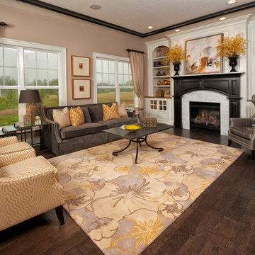
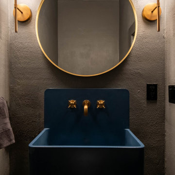
The owners of this Craftsman home loved its character, historic details, and established neighborhood, but after moving into the home, they found themselves working around a floor plan that couldn’t support the needs of their family. The bathrooms were the biggest source of frustration. Upstairs, family members shared a single hall bathroom, while downstairs, an outdated Jack and Jill bathroom occupied valuable square footage that prevented the home from functioning as a true primary suite. The renovation focused on reimagining two bathrooms and creating a new half bath from an unused closet. Like many older homes, the project revealed hidden conditions once construction began. Outdated knob-and-tube wiring and signs of water intrusion.
The former Jack and Jill bathroom was transformed into a dedicated primary bathroom, finally allowing the adjacent bedroom to function as the primary suite it was always meant to be. The existing layout featured an undersized sink, a clawfoot tub, and a configuration that felt cramped and inefficient. By reworking the space, the new primary bath provides improved circulation, better functionality, and a more relaxing experience. A Japanese soaking tub was incorporated into the primary bathroom, offering a striking focal point while overcoming the challenges presented by the home's narrow openings and existing structure.
Upstairs, the shared family bathroom was completely updated with a larger vanity, an open shower, improved storage, and refreshed finishes designed to stand up to daily use. Additional storage cabinetry was added outside the bedrooms to help support a busy household while keeping the bathrooms uncluttered.
Luxury and comfort were priorities throughout the project. Both full bathrooms received heated tile floors and high-end bidet toilets, creating spa-like spaces that elevate everyday routines.
To further improve functionality, an underutilized closet off the den was converted into a new half bath. This addition provides a convenient guest bathroom on the main level without requiring visitors to access private family spaces.
Throughout the design process, the homeowners brought extensive research and inspiration to the table. Detailed renderings and close collaboration helped translate their vision into a cohesive design that reflected both their style and their priorities. The design-build approach allowed decisions to be evaluated from both a design and construction perspective, helping the team navigate the complexities of remodeling an older home while minimizing costly surprises.
The completed renovation successfully balances historic character with modern living. By creating a true primary suite, improving the shared family bathroom, adding a convenient guest bath, and restoring key exterior elements, the home now functions more comfortably for the family while maintaining the Craftsman charm that first drew them to the property.
 THE Remodel Group
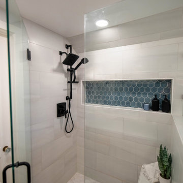
The owners of this Craftsman home loved its character, historic details, and established neighborhood, but after moving into the home, they found themselves working around a floor plan that couldn’t support the needs of their family. The bathrooms were the biggest source of frustration. Upstairs, family members shared a single hall bathroom, while downstairs, an outdated Jack and Jill bathroom occupied valuable square footage that prevented the home from functioning as a true primary suite. The renovation focused on reimagining two bathrooms and creating a new half bath from an unused closet. Like many older homes, the project revealed hidden conditions once construction began. Outdated knob-and-tube wiring and signs of water intrusion.
The former Jack and Jill bathroom was transformed into a dedicated primary bathroom, finally allowing the adjacent bedroom to function as the primary suite it was always meant to be. The existing layout featured an undersized sink, a clawfoot tub, and a configuration that felt cramped and inefficient. By reworking the space, the new primary bath provides improved circulation, better functionality, and a more relaxing experience. A Japanese soaking tub was incorporated into the primary bathroom, offering a striking focal point while overcoming the challenges presented by the home's narrow openings and existing structure.
Upstairs, the shared family bathroom was completely updated with a larger vanity, an open shower, improved storage, and refreshed finishes designed to stand up to daily use. Additional storage cabinetry was added outside the bedrooms to help support a busy household while keeping the bathrooms uncluttered.
Luxury and comfort were priorities throughout the project. Both full bathrooms received heated tile floors and high-end bidet toilets, creating spa-like spaces that elevate everyday routines.
To further improve functionality, an underutilized closet off the den was converted into a new half bath. This addition provides a convenient guest bathroom on the main level without requiring visitors to access private family spaces.
Throughout the design process, the homeowners brought extensive research and inspiration to the table. Detailed renderings and close collaboration helped translate their vision into a cohesive design that reflected both their style and their priorities. The design-build approach allowed decisions to be evaluated from both a design and construction perspective, helping the team navigate the complexities of remodeling an older home while minimizing costly surprises.
The completed renovation successfully balances historic character with modern living. By creating a true primary suite, improving the shared family bathroom, adding a convenient guest bath, and restoring key exterior elements, the home now functions more comfortably for the family while maintaining the Craftsman charm that first drew them to the property.

 Anonymous
Every web hosting company comes with a different package according to the requirements of the customers so that their websites keep on running in a smooth way. Ittotally depends on you which hosting package you choose in order to enjoy the best services for your website.
The common options in web hosting include shared web hosting, VPS, dedicated web hosting, cloud web hosting and more. It is easy to decide what type of web host to choose but choosing the right package is not that easy. Here are top5 features which make your web hosting package the most favorable one:
1. OperationSystem
Operating system is the software which runs on your host. This OS is responsible for managing the server hardware. It also helps in optimizing the use of disk space, RAM, CPU and the network. This OS might not be the same as what you get for thedesktops. The best OS will ensure that the management functions of your website keep on running.
2. WebServer
Usually, the hosting companies provide UNIX Apache or the Microsoft IIS servers. The server should be capable of processing the requests of the users fast. It must further have the SSL certificate.
3. Bandwidth
Thebandwidth provided should be just as accurate. In case your websitehosts thousands of visitors, it is recommended that you choose a large bandwidth so that your revenue stream is not interrupted. In case you have plans of business expansion, the package should have flexibility of bandwidth expansion too. Some hosting companies do offer unlimited bandwidthbut make sure you go to the depth for learning about the package and its pros and cons.
4. Domain
All of the hosting providers usually offer the sub domains but some also provide the external DNS entries to the account which is called add-on domain. This will let you buy additional domains and you will be able to run more than one website even if they are unrelated to each other.
5. ControlPanel
Control panel is the place where you get to manage your web hosting account and you have access to different features and tools for that purpose. There are 2 types of control panels; one is cPanel and the other one is Plesk. You can also get a custom control panel. Usually, cPanel is the most offered and chosen because it comes with amazing features of managing utilities. It allows you to configure the system, web server, email, website, DNS and more.
There are many other features to look for when you are choosing a web hosting package such as DMCA ignore hosting, applications provided, database and FTP. You are required to perform some research on the providers. For that, it is important to know your business needs so that the hosting package you choose caters your business needs in the most precise way. With the understanding of these features, it will get easier to make a wise decision while selecting the web hosting package for your website.
For more Info Please visit us - http://anonymous-offshore.host/
50