
Search results for "Restricted" in Home Design Ideas

 Shuler Architecture
Completed in 2011 this 4 BR, 3 1/2 bath custom home is situated on a very tight urban infill lot in Northern, Virginia. Our clients were relocating to the D.C. area from New England and wanted to retain some of the New England vernacular they were familiar with in their new home. Due to heavy zoning restrictions, stylistic CCR's and a large program of almost 7000 sf, our design response is a modern take on a traditional hipped 4-square.
We intentionally kept the skin and form of the building simple in order to contain cost and allow for a higher level of interior finish. The main level employs our favorite Great Room scheme that merges cooking, eating and entertaining into one seamless space that flows onto an expansive deck overlooking the rear yard. The entry elevation welcomes guests with a traditional front porch and stone path that passes by a small rain garden. The basement accommodates a guest room, media room, exercise area, and full shop while the upper level orients 2 kid's bedrooms, a Jack-n-Jill bath and the master suite toward a territorial view of the rear yard. All of this program is housed beneath a hipped roof that minimizes the scale of the house while presenting a thoughtful appearance toward the street and neighbors.

 Bilotta Kitchen & Home
This kitchen, designed by David Arnoff, features Bilotta Collection cabinetry in a classic Frosty White paint on the perimeter and Rift Cut White Oak with a “Driftwood” stain for the island. The kitchen prior to renovation had a small island and a peninsula that blocked the flow into the other rooms. It also had a massive wood hood that flanked both sides of the range all the way down to the countertop which was very cumbersome and restrictive. The client wanted to reuse their appliances which were fairly new. So the cabinetry had to be designed around those models but laid out with a much more functional flow. David chose to eliminate the existing peninsula to allow access to the sun room and living area. He opted instead for a larger island to give back the space lost by removing the peninsula. This gave the same amount of cabinet and counter space and was far more functional and easier to move around. Since the one wall of cabinets (where the main sink is) had no wall cabinets, David designed the opposite wall with double stacked cabinets for additional storage – with glass fronts for aesthetics. They also raised the custom hood, by Amore, allowing for more countertop space around the range. The countertops are polished quartz, Aurea Stone by Eastern Stone. The Backsplash is a basket weave marble from Greenwich Tile Marble. Sink and faucets by Kohler. Appliances are a mix of Subzero and Wolf.
Designer: David Arnoff
Photo Credit: Peter Krupenye

 Lanefab Design/Build
Walk-in shower - mid-sized contemporary master multicolored tile and mosaic tile concrete floor and gray floor walk-in shower idea in Vancouver with flat-panel cabinets, white cabinets, a one-piece toilet, blue walls, a drop-in sink, quartz countertops and white countertops
Find the right local pro for your project

 Lord & Lady Construction LLC
This is part of a whole home remodel we completed and featured in the GT Home Builder's Association Showcase of Remodeled Homes.
The tile flooring under the fireplace hearth was removed and replaced with cut down Galvano porcelain tile. Matching Brazillian Cherry wood flooring was tied into the existing in the living room. The whole kitchen was taken down to nothing and rebuilt with Ikea Ramsjo cabinetry, Bianco Antiquo granite counters from Nature's Edge Stone Products, a butcher block counter for the upper edge of the island resting on a new half wall that was finished with white washed veneered plywood and trim to match the cabinets. New lighting selected by the homeowner from West Elm and the walls have all been painted Cobblestone or Painter's White.
The trim was one of the only things that was reused from the existing home, due to budget restrictions.
Photo by Laura Cavendish
 Bilotta Kitchen & Home
This kitchen, designed by David Arnoff, features Bilotta Collection cabinetry in a classic Frosty White paint on the perimeter and Rift Cut White Oak with a “Driftwood” stain for the island. The kitchen prior to renovation had a small island and a peninsula that blocked the flow into the other rooms. It also had a massive wood hood that flanked both sides of the range all the way down to the countertop which was very cumbersome and restrictive. The client wanted to reuse their appliances which were fairly new. So the cabinetry had to be designed around those models but laid out with a much more functional flow. David chose to eliminate the existing peninsula to allow access to the sun room and living area. He opted instead for a larger island to give back the space lost by removing the peninsula. This gave the same amount of cabinet and counter space and was far more functional and easier to move around. Since the one wall of cabinets (where the main sink is) had no wall cabinets, David designed the opposite wall with double stacked cabinets for additional storage – with glass fronts for aesthetics. They also raised the custom hood, by Amore, allowing for more countertop space around the range. The countertops are polished quartz, Aurea Stone by Eastern Stone. The Backsplash is a basket weave marble from Greenwich Tile Marble. Sink and faucets by Kohler. Appliances are a mix of Subzero and Wolf.
Designer: David Arnoff
Photo Credit: Peter Krupenye

 VanAir Design
Inspiration for a small modern 3/4 beige tile and porcelain tile porcelain tile and beige floor alcove shower remodel in Vancouver with flat-panel cabinets, white cabinets, a two-piece toilet, beige walls, an undermount sink, granite countertops and a hinged shower door
 Shuler Architecture
Completed in 2011 this 4 BR, 3 1/2 bath custom home is situated on a very tight urban infill lot in Northern, Virginia. Our clients were relocating to the D.C. area from New England and wanted to retain some of the New England vernacular they were familiar with in their new home. Due to heavy zoning restrictions, stylistic CCR's and a large program of almost 7000 sf, our design response is a modern take on a traditional hipped 4-square.
We intentionally kept the skin and form of the building simple in order to contain cost and allow for a higher level of interior finish. The main level employs our favorite Great Room scheme that merges cooking, eating and entertaining into one seamless space that flows onto an expansive deck overlooking the rear yard. The entry elevation welcomes guests with a traditional front porch and stone path that passes by a small rain garden. The basement accommodates a guest room, media room, exercise area, and full shop while the upper level orients 2 kid's bedrooms, a Jack-n-Jill bath and the master suite toward a territorial view of the rear yard. All of this program is housed beneath a hipped roof that minimizes the scale of the house while presenting a thoughtful appearance toward the street and neighbors.
 Wooldridge Interiors
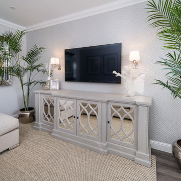
Earlier this year we completed a kitchen, lounge and bedroom refurbishment on behalf of our lovely client, and felt honoured to be called back to also refurbish their dining room into a cosy snug area recently.
When designing the space, we wanted to repeat similar materials, colours and themes that were in the other refurbished areas so that our client's property had flow and harmony.
We replaced the flooring throughout the house and incorporated a gorgeous sisal rug made from the same material as the main lounge and had the space painted in the same colour as the hallway and had a feature wall installed to provide tantalising texture.
Before doing this, we had the side window safely boarded up so that wall lights could be installed and so that the room regained it's symmetry.
Previously, the window provided only a restricted amount of day light due to the neighbouring property obstructing light, and hence, was redundant of it's primary function.
We decided to install wall lights each side of the television to provide additional lighting that did not obstruct the view of the TV.
Overall, the space was transformed into an indulgent yet gloriously cosy room, perfect for snuggling up, watching a film and welcoming those winter nights in.
 Pleasants Oncel Practice Architecture DPC
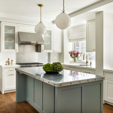
Our design for an apartment located in the West End-Collegiate Historic District Extension in Manhattan addressed a number of challenges to unleash the potential of this 2.500-square-foot space in an elegant pre-war building.
When purchased by our client, the property was in estate condition and needed extensive work, requiring demolition and a complete makeover of the living spaces, as well as the addition of contemporary climate control.
Among the spatial and design challenges, the primary bathroom was exposed to the entry foyer of the apartment, and the dining room and kitchen were each closed-in and lacking light.
The dining room’s promise as a bright, convivial space was fulfilled by adding double pocket doors opening to the living room, kitchen and foyer, establishing a seamless flow through the entertaining spaces while bringing in much-needed light.
We designed a chic and modern solution for the primary bedroom’s lack of privacy, creating a walk-in closet that serves as a transitional vestibule in the bedroom, adding both visual intrigue and additional storage space while shielding the viewscape from the apartment entrance through the foyer to the bedroom.
To add a three-zone central air conditioning system, we took advantage of the kitchen facing an interior courtyard, placing the air conditioning condensers here, which also satisfied landmark property restrictions. The climate control system was accomplished without lowering ceiling heights.
Finally, we worked with the client to choose classic finishes and fixtures that reflect and enhance the historic nature of the property, and are also contemporary and timeless. These include unlacquered brass hardware, herringbone oak flooring with a stencil border, black-and-white bathrooms, and paneling, trim, and moldings that are simple and elegant.
POP Architecture was the architect for the project, and Godwin Construction was the general contractor.

 Falling Waters Landscape
Photo Cred. Dustin Ortiz
This is an example of a small tropical partial sun front yard concrete paver driveway in San Diego for spring.
This is an example of a small tropical partial sun front yard concrete paver driveway in San Diego for spring.

 Nakamoto Forestry
Project Overview:
The owner of this project is a financial analyst turned realtor turned landlord, and the goal was to increase rental income on one of his properties as effectively as possible. The design was developed to minimize construction costs, minimize City of Portland building compliance costs and restrictions, and to avoid a county tax assessment increase based on site improvements.
The owner started with a large backyard at one of his properties, had a custom tiny home built as “personal property”, then added two ancillary sheds each under a 200SF compliance threshold to increase the habitable floor plan. Compliant navigation of laws and code ended up with an out-of-the-box design that only needed mechanical permitting and inspections by the city, but no building permits that would trigger a county value re-assessment. The owner’s final construction costs were $50k less than a standard ADU, rental income almost doubled for the property, and there was no resultant tax increase.
Product: Gendai 1×6 select grade shiplap
Prefinish: Unoiled
Application: Residential – Exterior
SF: 900SF
Designer:
Builder:
Date: March 2019
Location: Portland, OR
 Pleasants Oncel Practice Architecture DPC
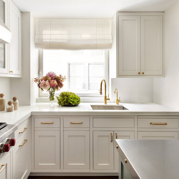
Our design for an apartment located in the West End-Collegiate Historic District Extension in Manhattan addressed a number of challenges to unleash the potential of this 2.500-square-foot space in an elegant pre-war building.
When purchased by our client, the property was in estate condition and needed extensive work, requiring demolition and a complete makeover of the living spaces, as well as the addition of contemporary climate control.
Among the spatial and design challenges, the primary bathroom was exposed to the entry foyer of the apartment, and the dining room and kitchen were each closed-in and lacking light.
The dining room’s promise as a bright, convivial space was fulfilled by adding double pocket doors opening to the living room, kitchen and foyer, establishing a seamless flow through the entertaining spaces while bringing in much-needed light.
We designed a chic and modern solution for the primary bedroom’s lack of privacy, creating a walk-in closet that serves as a transitional vestibule in the bedroom, adding both visual intrigue and additional storage space while shielding the viewscape from the apartment entrance through the foyer to the bedroom.
To add a three-zone central air conditioning system, we took advantage of the kitchen facing an interior courtyard, placing the air conditioning condensers here, which also satisfied landmark property restrictions. The climate control system was accomplished without lowering ceiling heights.
Finally, we worked with the client to choose classic finishes and fixtures that reflect and enhance the historic nature of the property, and are also contemporary and timeless. These include unlacquered brass hardware, herringbone oak flooring with a stencil border, black-and-white bathrooms, and paneling, trim, and moldings that are simple and elegant.
POP Architecture was the architect for the project, and Godwin Construction was the general contractor.
 Bilotta Kitchen & Home
This kitchen, designed by David Arnoff, features Bilotta Collection cabinetry in a classic Frosty White paint on the perimeter and Rift Cut White Oak with a “Driftwood” stain for the island. The kitchen prior to renovation had a small island and a peninsula that blocked the flow into the other rooms. It also had a massive wood hood that flanked both sides of the range all the way down to the countertop which was very cumbersome and restrictive. The client wanted to reuse their appliances which were fairly new. So the cabinetry had to be designed around those models but laid out with a much more functional flow. David chose to eliminate the existing peninsula to allow access to the sun room and living area. He opted instead for a larger island to give back the space lost by removing the peninsula. This gave the same amount of cabinet and counter space and was far more functional and easier to move around. Since the one wall of cabinets (where the main sink is) had no wall cabinets, David designed the opposite wall with double stacked cabinets for additional storage – with glass fronts for aesthetics. They also raised the custom hood, by Amore, allowing for more countertop space around the range. The countertops are polished quartz, Aurea Stone by Eastern Stone. The Backsplash is a basket weave marble from Greenwich Tile Marble. Sink and faucets by Kohler. Appliances are a mix of Subzero and Wolf.
Designer: David Arnoff
Photo Credit: Peter Krupenye

 Andover Landscape Design & Construction
Modernist architect Marcel Breuer is known for his innovative Wassily chair, a pared back seat made up of tubular steel frame and strips of canvas. Even if that’s your only point of reference, you’ll see plenty of overlap in this Andover residence he designed. It is highly functional, with clean lines and plenty of open space. We had the honor to design an updated landscape to complement this home designed by Marcel Breuer, right here in Andover. As the landscape was originally designed by renowned landscape architect, Dan Kiley, we wanted to maintain his original design intent while also updating its functionality to suit the homeowner's needs. Ultimately, it was important to respect the architectural design intent of the property while creating a safe and inviting entry.
The simplicity of the design was created with a restricted palette that compliments the materials and color tones of the house. Orthogonal lines pull from the architecture out into the landscape, unifying the two. A metal runnel with stacked stone visually connects the front entry to the primary bedroom garden, while further highlighting a unique feature in Breuer’s architecture.
Moving to a space formed for privacy and respite, the zen garden off the primary bedroom offers an outdoor shower, water feature, and minimalistic planting. Arranged boulders, undulating moss plant beds, bluestone and gravel are mediums in which we used to paint a calming atmosphere extending from this unique home. To highlight the tranquil nature of the site, a boulder was hand carved to create a recirculating water feature that can be enjoyed from both the garden and primary bedroom. A wall of glass separates the bedroom from the spa-like garden, blurring the lines of architecture and landscape.
 Wooldridge Interiors
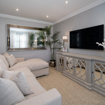
Earlier this year we completed a kitchen, lounge and bedroom refurbishment on behalf of our lovely client, and felt honoured to be called back to also refurbish their dining room into a cosy snug area recently.
When designing the space, we wanted to repeat similar materials, colours and themes that were in the other refurbished areas so that our client's property had flow and harmony.
We replaced the flooring throughout the house and incorporated a gorgeous sisal rug made from the same material as the main lounge and had the space painted in the same colour as the hallway and had a feature wall installed to provide tantalising texture.
Before doing this, we had the side window safely boarded up so that wall lights could be installed and so that the room regained it's symmetry.
Previously, the window provided only a restricted amount of day light due to the neighbouring property obstructing light, and hence, was redundant of it's primary function.
We decided to install wall lights each side of the television to provide additional lighting that did not obstruct the view of the TV.
Overall, the space was transformed into an indulgent yet gloriously cosy room, perfect for snuggling up, watching a film and welcoming those winter nights in.
 Wooldridge Interiors
Earlier this year we completed a kitchen, lounge and bedroom refurbishment on behalf of our lovely client, and felt honoured to be called back to also refurbish their dining room into a cosy snug area recently.
When designing the space, we wanted to repeat similar materials, colours and themes that were in the other refurbished areas so that our client's property had flow and harmony.
We replaced the flooring throughout the house and incorporated a gorgeous sisal rug made from the same material as the main lounge and had the space painted in the same colour as the hallway and had a feature wall installed to provide tantalising texture.
Before doing this, we had the side window safely boarded up so that wall lights could be installed and so that the room regained it's symmetry.
Previously, the window provided only a restricted amount of day light due to the neighbouring property obstructing light, and hence, was redundant of it's primary function.
We decided to install wall lights each side of the television to provide additional lighting that did not obstruct the view of the TV.
Overall, the space was transformed into an indulgent yet gloriously cosy room, perfect for snuggling up, watching a film and welcoming those winter nights in.
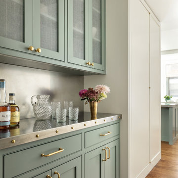 Pleasants Oncel Practice Architecture DPC
Our design for an apartment located in the West End-Collegiate Historic District Extension in Manhattan addressed a number of challenges to unleash the potential of this 2.500-square-foot space in an elegant pre-war building.
When purchased by our client, the property was in estate condition and needed extensive work, requiring demolition and a complete makeover of the living spaces, as well as the addition of contemporary climate control.
Among the spatial and design challenges, the primary bathroom was exposed to the entry foyer of the apartment, and the dining room and kitchen were each closed-in and lacking light.
The dining room’s promise as a bright, convivial space was fulfilled by adding double pocket doors opening to the living room, kitchen and foyer, establishing a seamless flow through the entertaining spaces while bringing in much-needed light.
We designed a chic and modern solution for the primary bedroom’s lack of privacy, creating a walk-in closet that serves as a transitional vestibule in the bedroom, adding both visual intrigue and additional storage space while shielding the viewscape from the apartment entrance through the foyer to the bedroom.
To add a three-zone central air conditioning system, we took advantage of the kitchen facing an interior courtyard, placing the air conditioning condensers here, which also satisfied landmark property restrictions. The climate control system was accomplished without lowering ceiling heights.
Finally, we worked with the client to choose classic finishes and fixtures that reflect and enhance the historic nature of the property, and are also contemporary and timeless. These include unlacquered brass hardware, herringbone oak flooring with a stencil border, black-and-white bathrooms, and paneling, trim, and moldings that are simple and elegant.
POP Architecture was the architect for the project, and Godwin Construction was the general contractor.
 Guenther Designs & Consulting LLC
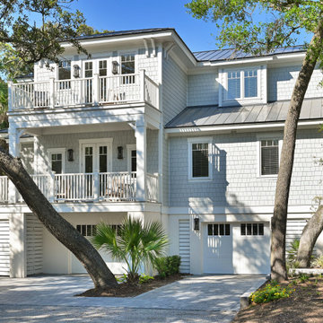
I was asked to design a new family home, for a lot that is third row back from the beach. As you can see the lot had numerous trees, all leaning in various directions, had to be accounted for. Besides the neighborhood restrictions the town, imposes even tighter guidelines on the mass and size of the building.
The collaberation with my client has ended up with thise lovely new home, just waiting for memories to be made.
Hee we can see the covered front porch with an open air second porch above. To help with the efficiency of the floor plan, due to site limitation, that fromt entry door is tucked around on the left side of the home.
We wanted a the home to have a "beachy" vibe to the architecture style. I incorporated a number of "low country architectural" design elements to provide the beach cottage feel. We used NuCedar shingle siding for ease of maintance and Hardie trim, for the some reason. The home owner choose a bronze standing seam metal roof to compliment the soft grey shingle color.
 Nakamoto Forestry
Project Overview:
The owner of this project is a financial analyst turned realtor turned landlord, and the goal was to increase rental income on one of his properties as effectively as possible. The design was developed to minimize construction costs, minimize City of Portland building compliance costs and restrictions, and to avoid a county tax assessment increase based on site improvements.
The owner started with a large backyard at one of his properties, had a custom tiny home built as “personal property”, then added two ancillary sheds each under a 200SF compliance threshold to increase the habitable floor plan. Compliant navigation of laws and code ended up with an out-of-the-box design that only needed mechanical permitting and inspections by the city, but no building permits that would trigger a county value re-assessment. The owner’s final construction costs were $50k less than a standard ADU, rental income almost doubled for the property, and there was no resultant tax increase.
Product: Gendai 1×6 select grade shiplap
Prefinish: Unoiled
Application: Residential – Exterior
SF: 900SF
Designer:
Builder:
Date: March 2019
Location: Portland, OR
 Wooldridge Interiors
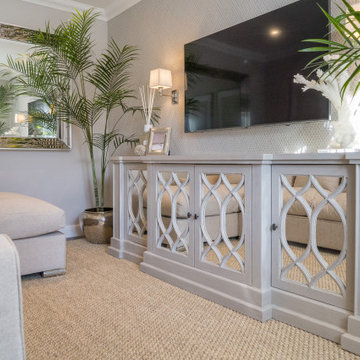
Earlier this year we completed a kitchen, lounge and bedroom refurbishment on behalf of our lovely client, and felt honoured to be called back to also refurbish their dining room into a cosy snug area recently.
When designing the space, we wanted to repeat similar materials, colours and themes that were in the other refurbished areas so that our client's property had flow and harmony.
We replaced the flooring throughout the house and incorporated a gorgeous sisal rug made from the same material as the main lounge and had the space painted in the same colour as the hallway and had a feature wall installed to provide tantalising texture.
Before doing this, we had the side window safely boarded up so that wall lights could be installed and so that the room regained it's symmetry.
Previously, the window provided only a restricted amount of day light due to the neighbouring property obstructing light, and hence, was redundant of it's primary function.
We decided to install wall lights each side of the television to provide additional lighting that did not obstruct the view of the TV.
Overall, the space was transformed into an indulgent yet gloriously cosy room, perfect for snuggling up, watching a film and welcoming those winter nights in.
115