
Search results for "Restriction" in Home Design Ideas

 Optic Verve LLC
Certain taller grasses have a transparent scrim-like quality when in flower, which fits in well with the HOA max height requirements. Volume without obstruction.
 Studio 38 Designs, Inc.
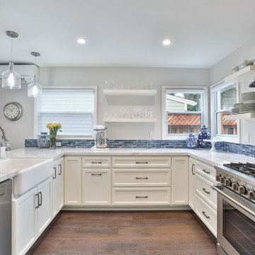
By shortening one of the kitchen windows, the new layout was able to be designed into a U-shape. With new custom cabinetry, we were able to maximize storage and kitchen working spaces. Floating shelves were installed to add decorative/working element to the space instead of adding upper cabinetry which could make the small space feel cramped. With a fully functioning kitchen and a proper triangle work zone, the clients are now exited to cook meals with no restrictions!
 Lakeside Architecture Inc.
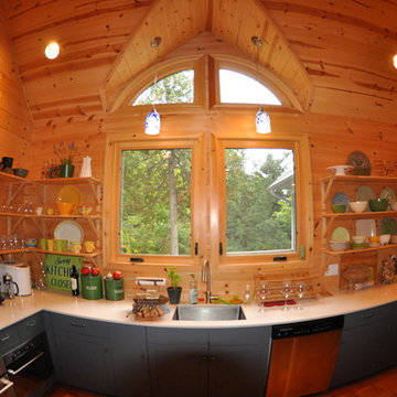
The owners of this cottage are teachers who subdivided the neighbouring family cottage lot. The owners wanted a traditional, cozy but functional space to relax and spend their summers with family and friends. The cottage is set on a point of land and had many set back restrictions. The design resulted in a unique layout and features an all wood interior, a stone fireplace and reclaimed wood floors.
Find the right local pro for your project
 JM Craftsmanship
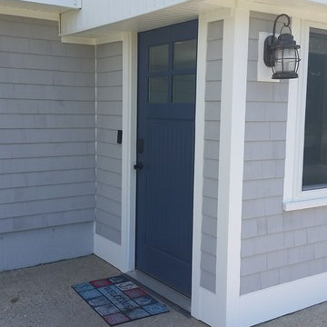
Exterior remodel - new siding, doors, windows, lighting.
SBC Cape Cod Gray shingles, ThermaTru Doors
Ground floor only done due to building restrictions; top floor to be remodeled to match in future.
 Hartville Hardware Kitchen & Bath
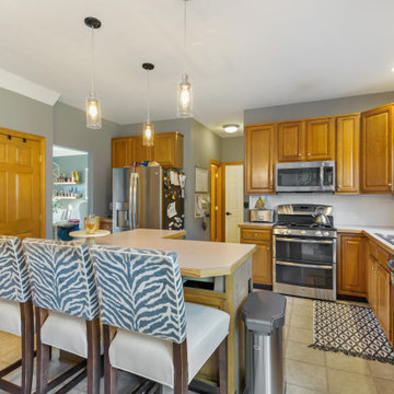
Before: Outdated Kitchen with L-shaped island isn't great for traffic flow. The Family room was separated from the Kitchen which felt restrictive.
Kitchen - contemporary kitchen idea in Cleveland
Kitchen - contemporary kitchen idea in Cleveland
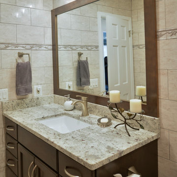
 Michael Nash Design, Build & Homes
For this couple, planning to move back to their rambler home in Arlington after living overseas for few years, they were ready to get rid of clutter, clean up their grown-up kids’ boxes, and transform their home into their dream home for their golden years.
The old home included a box-like 8 feet x 10 feet kitchen, no family room, three small bedrooms and two back to back small bathrooms. The laundry room was located in a small dark space of the unfinished basement.
This home is located in a cul-de-sac, on an uphill lot, of a very secluded neighborhood with lots of new homes just being built around them.
The couple consulted an architectural firm in past but never were satisfied with the final plans. They approached Michael Nash Custom Kitchens hoping for fresh ideas.
The backyard and side yard are wooded and the existing structure was too close to building restriction lines. We developed design plans and applied for special permits to achieve our client’s goals.
The remodel includes a family room, sunroom, breakfast area, home office, large master bedroom suite, large walk-in closet, main level laundry room, lots of windows, front porch, back deck, and most important than all an elevator from lower to upper level given them and their close relative a necessary easier access.
The new plan added extra dimensions to this rambler on all four sides. Starting from the front, we excavated to allow a first level entrance, storage, and elevator room. Building just above it, is a 12 feet x 30 feet covered porch with a leading brick staircase. A contemporary cedar rail with horizontal stainless steel cable rail system on both the front porch and the back deck sets off this project from any others in area. A new foyer with double frosted stainless-steel door was added which contains the elevator.
The garage door was widened and a solid cedar door was installed to compliment the cedar siding.
The left side of this rambler was excavated to allow a storage off the garage and extension of one of the old bedrooms to be converted to a large master bedroom suite, master bathroom suite and walk-in closet.
We installed matching brick for a seam-less exterior look.
The entire house was furnished with new Italian imported highly custom stainless-steel windows and doors. We removed several brick and block structure walls to put doors and floor to ceiling windows.
A full walk in shower with barn style frameless glass doors, double vanities covered with selective stone, floor to ceiling porcelain tile make the master bathroom highly accessible.
The other two bedrooms were reconfigured with new closets, wider doorways, new wood floors and wider windows. Just outside of the bedroom, a new laundry room closet was a major upgrade.
A second HVAC system was added in the attic for all new areas.
The back side of the master bedroom was covered with floor to ceiling windows and a door to step into a new deck covered in trex and cable railing. This addition provides a view to wooded area of the home.
By excavating and leveling the backyard, we constructed a two story 15’x 40’ addition that provided the tall ceiling for the family room just adjacent to new deck, a breakfast area a few steps away from the remodeled kitchen. Upscale stainless-steel appliances, floor to ceiling white custom cabinetry and quartz counter top, and fun lighting improved this back section of the house with its increased lighting and available work space. Just below this addition, there is extra space for exercise and storage room. This room has a pair of sliding doors allowing more light inside.
The right elevation has a trapezoid shape addition with floor to ceiling windows and space used as a sunroom/in-home office. Wide plank wood floors were installed throughout the main level for continuity.
The hall bathroom was gutted and expanded to allow a new soaking tub and large vanity. The basement half bathroom was converted to a full bathroom, new flooring and lighting in the entire basement changed the purpose of the basement for entertainment and spending time with grandkids.
Off white and soft tone were used inside and out as the color schemes to make this rambler spacious and illuminated.
Final grade and landscaping, by adding a few trees, trimming the old cherry and walnut trees in backyard, saddling the yard, and a new concrete driveway and walkway made this home a unique and charming gem in the neighborhood.
 Bilotta Kitchen & Home
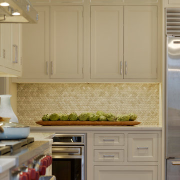
This kitchen, designed by David Arnoff, features Bilotta Collection cabinetry in a classic Frosty White paint on the perimeter and Rift Cut White Oak with a “Driftwood” stain for the island. The kitchen prior to renovation had a small island and a peninsula that blocked the flow into the other rooms. It also had a massive wood hood that flanked both sides of the range all the way down to the countertop which was very cumbersome and restrictive. The client wanted to reuse their appliances which were fairly new. So the cabinetry had to be designed around those models but laid out with a much more functional flow. David chose to eliminate the existing peninsula to allow access to the sun room and living area. He opted instead for a larger island to give back the space lost by removing the peninsula. This gave the same amount of cabinet and counter space and was far more functional and easier to move around. Since the one wall of cabinets (where the main sink is) had no wall cabinets, David designed the opposite wall with double stacked cabinets for additional storage – with glass fronts for aesthetics. They also raised the custom hood, by Amore, allowing for more countertop space around the range. The countertops are polished quartz, Aurea Stone by Eastern Stone. The Backsplash is a basket weave marble from Greenwich Tile Marble. Sink and faucets by Kohler. Appliances are a mix of Subzero and Wolf.
Designer: David Arnoff
Photo Credit: Peter Krupenye
 Buchanan Kitchen Curators
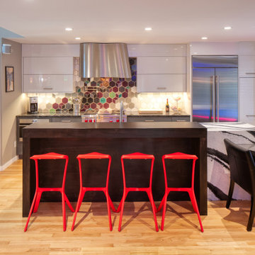
These engaging homeowners are fortuitous enough to reside in a three level townhouse on a quiet street in
downtown Minneapolis. This couple loves to entertain and host family holidays. Spaces are tight in most
urban areas. This townhome is no exception. There was nothing horribly wrong with the way the home
was laid out, it just did not serve the needs of the family. The kitchen was tucked up front and forced into
a small space, making it difficult for multiple people to be in the space at the same time. The homeowners
also wished to upgrade to professional appliances. Due to size and mechanical code restrictions, this was just
not possible in the existing space. The back of the townhome had a large living room and good sized dining
room. Off this space is a shaded deck and swimming pool, which are used all the time. Traffic always ran from
the outdoor entertaining space directly to the kitchen in the front. Not only was this inconvenient, a mess was
dragged in from wet swimmers.
To alleviate these challenges, we moved the kitchen from the smaller space at the front of the home to the
larger space the under utilized living room furniture occupied. This allowed us to curate a large kitchen that
fits all their needs, wants, and aesthetic desires. Now there is plenty of room to cook, relax, and bustle about.
We also added a wet bar next to the patio door in the dining room. Right by the door is a beverage cooler from
which guests may grab beverages and snacks without dragging the outside in with them.
Being the homeowners and designer are all members of the creative community in the Twin Cities, it was important
to incorporate the work of local artists. This kitchen is fully curated with all Minnesota products (with the exception
of the appliances, which are manufactured in Wisconsin). The cabinets and countertops are from larger local
companies, while all the other features are hand made by near by artists. These artisan products include a custom
stainless steel range hood, black powder coated table base and fireplace mantel, hand made tile for the backsplash
and fireplace surround, wood elevated island table, and wood panel backsplash at the bar. Hand made tiles had
previously been installed in the existing kitchen. The color of these tiles is no longer available. It was the home-
owners desire to preserve these tiles somehow. We cut the tile off the walls and soaked the drywall from them.
We then installed them in the powder room as a feature behind the vanity and mirror.
 Living with Lolo
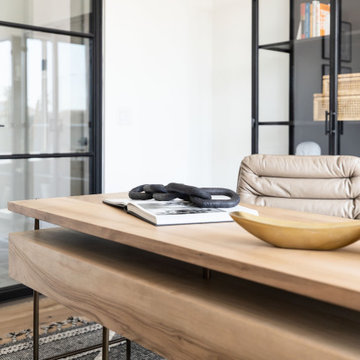
Home Office in Monte Lindo | Room Type:
Full Home Furnishing – 4,368 sq ft | 6 Bedrooms | 5 Baths- Living Room, Dining Room, Kitchen Nook, Family Room, Office, Primary Bedroom + Bath.
Project Name:
Monte Lindo |
Key Feature:
A Modern Transitional new build transformed from builder-grade into a unique, personality-driven home through curated furnishings, lighting, art, and mirrors.
Challenge:
COVID-related supply and delivery delays, along with limitations of working within a builder-grade home that restricted creativity in certain areas.
Solution:
The team elevated the space with thoughtfully selected furnishings, lighting, wallpaper, art, and mirrors, pushing the clients slightly outside their comfort zone to create a home that felt both comfortable and impressive.
Materials:
Lighting: Arteriors, Palecek, Circa, Memoky.
Rugs: Loloi, Surya.
Mirrors: Four Hands, Ferguson, Arteriors.
Wallpaper: Savannah Hayes.
Furniture: Classic Home, Four Hands, Moss Home, Dovetail, Union Home.
Budget:
$50k-$75K |
Timeline:
11 months, completed September 2021.
 Lilian H. Weinreich, Architects
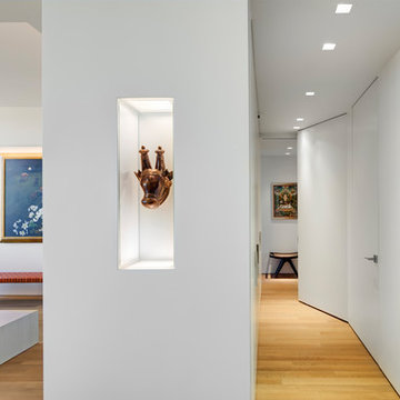
Feng Shui dictated the orientation and functional layout of this 2 bed, 3 full bath apartment to harmonize with spiritual forces. The 1,600sf plan creates generous, open, and clutter-free spaces, as small, dark areas restrict the flow of positive energy. The master bedroom suite, open most of the time, can be closed off for privacy by a hidden operable panel, conceal-hinged to the hallway wall. A welcoming mask floats in a NE-facing niche at the central axis of the apartment to protect the occupants from evil spirits.
Photographer: © Francis Dzikowski

 Cardell Cabinetry
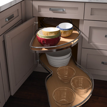
Make the most of hidden corners with our smart corner storage solutions from Cardell® Designer Collection. Lakeridge Pebble Grey with a Chrome Swing Out shown.
 Phoenix Home Remodeling
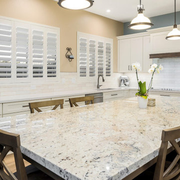
Kevin and Mary enlisted our services with the objective to modernize their antiquated kitchen.
Their goals weren't restricted to a purely aesthetic overhaul; they asked us to devise a layout that prioritized better organization and storage options with improved lighting.
We took great care to remove all the old components of the kitchen, then we proceeded to install the new Dove White Shaker style cabinets, and a larger contrasting island.
In their pursuit of a perfect blend of aesthetics and utility, they selected Victoria White Quartz Countertops for the perimeter cabinets, and balanced that with the compelling elegance of White Ice Granite Countertops for the kitchen island.
The selection of Flash Ivory 3x12 ceramic wall tiles were selected for the backsplash.
A custom made range hood was installed breaking up the monotony of the wall cabinets and finishing off their gorgeous new kitchen.
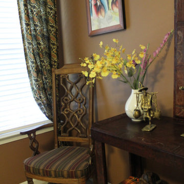
 OxanaKovalchukDesign.Inc
2016. "African Room" Interior Design Project by #OxaKovalli.
The most exotic of all existing styles is the African style. A passion for the unfamiliar is so human. Decorating the interior in the African style excites the imagination and creates a sense of touching a mystery, something special. Maximum exotic and grotesque, it breaks the clichéd notions of how the interior should be. To give your home an African flavor, a global rearrangement of the apartment to arrange not necessarily. This style - is the very embodiment of dynamics, expression, and pounding vital energy. A neatly chosen game of contrasts can achieve an interesting visual effect in this interior. For example, for decorating the room, you can choose warm, soft, muted colors: sandy, terracotta, pale, the color of melted milk, ochre, or wood bark. Against this background, the items of decor, curtains, and drapery of saturated hues will look very impressive: scarlet or lemon-yellow finishing cloth of upholstered furniture, orange fixtures, and motley carpets with characteristic ornaments. In terms of colors, the African style imposes the only restriction: you should not use synthetic, fluorescent colors.
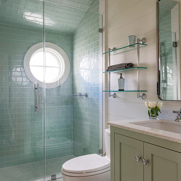
 SV Design
If you were to look up “classic summer cottage” in the dictionary, there should be a picture of this house.
Located in a densely populated community of historic summer cottages, this new gambrel-style home was designed to maintain the beach cottage feel of its predecessor. Due to strict zoning and easement restrictions the new construction had to be designed within the same footprint and volume of its former self. The new design allows for a more open floor plan, more living space, and an almost 180-degree view of the ocean.
Filled with natural light and a palette of colors and materials reminiscent of seashells, this four-bedroom home is the quintessential summer retreat. Glass foldaway doors extend the main living area to a covered porch with gas fireplace. A fully finished basement suite, with walk-out access to a gas grilling patio and the beach, is perfect for guests. The interiors are an artful blend of modern fixtures along with some slightly more traditional materials that are in keeping with the cottage vibe.
© Eric Roth Photography
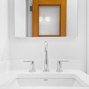
 Modern Citi Group: Renovations & Remodeling
We helped Miki and David successfully execute a bathroom and kitchen remodel for their Co-op in New York City. The primary objective was to enhance the sense of space, functionality, and style while keeping the project on track and on budget.
To kickstart the project, Anna, the highly skilled project planner, conducted a thorough walkthrough with Miki and David. During the meeting, she captured their vision, outlined a realistic timeline, and carefully considered their budgetary restrictions.
Anna made sure to grasp their aspirations of modernizing the kitchen and bathroom, aiming to elevate both the aesthetics and practicality while incorporating a bespoke design tailored to their desires.
The design challenge was to modernize the outdated kitchen and bathroom while maintaining a budget-friendly approach. The clients opted for a Scandinavian style, featuring neutral olive green colors, stone, and natural wood materials. The designers explored various layouts to maximize functionality and accommodate the clients' preferences, providing Miki and David with multiple options. Eventually, the family made their design choices and felt assured as they entered the construction phase.
During the building phase, the construction team completed a gut renovation of the kitchen and bathroom, replacing ceilings, walls, floors, and all fixtures. The result was a stunning custom kitchen designed in the Scandinavian style featuring matte grey-green cabinetry, natural wood open shelving, a built-in pantry and appliances, and Vivid White Quartz countertops. The combination of sage base cabinets with grey undertones and modern, natural wood structures created a neutral and earthy impression, while the smooth white wall cabinets and countertops added a sleek and airy touch to the space.
The bathroom renovation encompassed a full remodel, with all fixtures being replaced. A custom-ordered vanity in a matching grey-green shade was installed, along with the Maiolica White Polished Ceramic Wall Tile and Kohler and Delta fixtures. Within a few short weeks, Miki and David's new kitchen and bathroom were transformed to align perfectly with their style and vision, while significantly enhancing functionality.
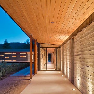
 Dynia Architects
Located near the foot of the Teton Mountains, the site and a modest program led to placing the main house and guest quarters in separate buildings configured to form outdoor spaces. With mountains rising to the northwest and a stream cutting through the southeast corner of the lot, this placement of the main house and guest cabin distinctly responds to the two scales of the site. The public and private wings of the main house define a courtyard, which is visually enclosed by the prominence of the mountains beyond. At a more intimate scale, the garden walls of the main house and guest cabin create a private entry court.
A concrete wall, which extends into the landscape marks the entrance and defines the circulation of the main house. Public spaces open off this axis toward the views to the mountains. Secondary spaces branch off to the north and south forming the private wing of the main house and the guest cabin. With regulation restricting the roof forms, the structural trusses are shaped to lift the ceiling planes toward light and the views of the landscape.
A.I.A Wyoming Chapter Design Award of Citation 2017
Project Year: 2008
 TRS Designs, Inc (Kitchens, Baths, & More)
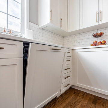
This beautiful house in an amazing neighborhood was originally built with an underwhelming kitchen. The remodel of this space involved changing a few things to allow the kitchen you see here.
We changed a sliding door to a smaller single swinging door, enlarged the window, removed a non-load bearing, decorative column and a flow restricting half wall. All off those changes as well as stealing 6.5' of the 3 car, garage allowed this kitchen to become this homes star of the show!!
 Axis Mundi Design
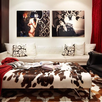
Good design must reflect the personality of the client. So when siblings purchased studios in Downtown by Philippe Starck, one of the first buildings to herald the revitalization of Manhattan’s Financial District, the aim was to create environments that were truly bespoke. The brother’s tastes jibed synchronously with the insouciant idea of France’s most popular prankster converting a building that once housed the buttoned-up offices of JP Morgan Chase. His collection of Takashi Murakami works, the gallery-like centerpiece of the main area, announces his boldness and flair up front, as do furnishings by Droog, Moooi and, of course Starck, as well as hide rugs and upholstery, and a predominantly red palette. His sister was after something soothing and discreet. So Axis Mundi responded with a neutrals and used glass to carve out a bedroom surrounded by drapes that transform it into a golden cocoon. Hide (albeit less flamboyantly applied) evokes a familial commonality, and built-in furniture and cabinetry optimize space restrictions inherent in studio apartments.
Design Team: John Beckmann, with Richard Rosenbloom
Photography: Mikiko Kikuyama
© Axis Mundi Design LLC

100