
Search results for "Resultant listing" in Home Design Ideas
 StoneUnlimited Kitchen and Bath Remodeling
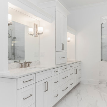
This expansive elegant marble master bathroom is classic and rates highly on our list of favorite projects. Marble is always a good choice as it is a timeless look and adds to the value of your home. Marble can be one of the higher priced materials and also requires regular maintenance however marble bathrooms are gorgeous and allow flexibility and a vast amount of possibilities for application. This marble inspired bathroom was achieved by mixing real marble with porcelain tile that mimics the look of marble. The result is breath taking, low maintenance and a fraction of the cost!
This master bath was expansive with over 300 square feet of usable space and a beautiful high ceiling. Sherry balanced out the room by creating a large double vanity designed with Waypoint cabinetry in painted linen. The higher elevation of the large tower between the vanities make it appear like a customized piece of furniture and the 4 sconces directly mounted to the mirrors are a nice detail that elevate the piece. The Ranier quartz countertops and Mayfair Volakas Giorgio Porcelain tile provide the subtle contrast of grey veining throughout the room.
A 66” Draque tub with floor mounted waterfall faucet is beautifully surrounded with the same Volakes Giorgio tile. It is the perfect spot for our client to relax and take a load off while being showered by the light of the unique Alexandria Abstract Chandelier hanging above the tub.
When designing the shower enclosure, Sherry blended different types of tile and tile sizes to create interest and movement. Cornice Perla Marble pieces create a beautiful transition between the glossy subway and the marble patterned tile. A bench for sitting is topped off with the same Ranier quartz used for the countertops and was added for the comfort of our client while using the Kohler handshower with extended hose. Bianco Perla basketweave marble are located in the niche and floor which add a different design component for interest.
Our client opted to have her half bath remodeled as well. Many of the same components that we used in the master bathroom were used to make this other wise small space appear larger.
Overall, we can’t say enough about how happy we were with the end result of this project. We were even happier to know that our client was over the moon about her dream master bathroom.
Are you dreaming about your master bathroom and what possibilities we could accomplish in a marble look for you? We would love to hear from you, the options are amazing! .
 LeichtUSA
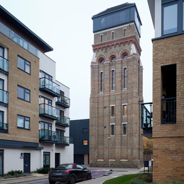
Attractive living as an architectural experiment: a 136-year-old water tower, a listed building with a spectacular 360-degree panorama view over the City of London. The task, to transform it into a superior residence, initially seemed an absolute impossibility. But when the owners came across architect Mike Collier, they had found a partner who was to make the impossible possible. The tower, which had been empty for decades, underwent radical renovation work and was extended by a four-storey cube containing kitchen, dining and living room - connected by glazed tunnels and a lift shaft. The kitchen, realised by Enclosure Interiors in Tunbridge Wells, Kent, with furniture from LEICHT is the very heart of living in this new building.
Shiny white matt-lacquered kitchen fronts (AVANCE-LR), tone-on-tone with the worktops, reflect the light in the room and thus create expanse and openness. The surface of the handle-less kitchen fronts has a horizontal relief embossing; depending on the light incidence, this results in a vitally structured surface. The free-standing preparation isle with its vertical side panels with a seamlessly integrated sink represents the transition between kitchen and living room. The fronts of the floor units facing the dining table were extended to the floor to do away with the plinth typical of most kitchens. Ceiling-high tall units on the wall provide plenty of storage space; the electrical appliances are integrated here invisible to the eye. Floor units on a high plinth which thus appear to be floating form the actual cooking centre within the kitchen, attached to the wall. A range of handle-less wall units concludes the glazed niche at the top.
LEICHT international: “Architecture and kitchen” in the centre of London. www.LeichtUSA.com
 Liz Schupanitz Designs
Kitchen Is Where the Hearth Is
Location: Edina, MN, USA
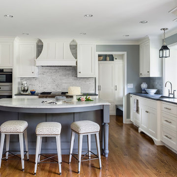
With her only daughter off to college, this busy executive decided it was time to remodel her kitchen to suit her love for baking, cooking and hosting holidays for her large family. The homeowner’s wish list included white cabinetry, an island, plenty of storage, a gas insert for the fireplace and a special place for her collection of teacups.
The fireplace and the large bank of windows in the existing footprint were a challenge to designing a cohesive plan. But by moving the doorway to the mudroom closer to the sink wall, a dedicated cooking zone was created for the convection oven, steam oven and a gas rangetop. This wall became the anchor for the island, topped with Carrara marble, an ideal surface for rolling out pie dough and making cookies. Blue, the homeowner’s favorite color was chosen for the island color with a black glaze to give it warmth. It sets off the marble and coordinates with the soapstone on the perimeter, a low maintenance option. The whimsical island stools from Hickory Chair invite friends to stay a while.
The wood-burning fireplace was replaced with gas to make it more useable and the brick was covered with a marble slab to create a clean, transitional feel. The paneled accent wall detail uses the same inside step profile of the cabinetry doors and is painted in Benjamin Moore Coventry Gray to match the walls but with a slightly higher sheen. It separates the kitchen dining space from the kitchen work area giving it a feeling of friendly formality.
The hutch adds more kitchen storage and shows off the homeowner’s collection of colorful teacups with a contrasting painted interior in Benjamin Moore Yarmouth Blue. The Urban Electric black lantern over the kitchen table also has a painted interior of Yarmouth Blue. This dining space with fun bits of drama ties in with the swooping white hood and Carrara marble wall tiles on the opposite side of the kitchen space.
The result is an organized cook’s kitchen that transitions gracefully to entertaining.
Liz Schupanitz Designs
Photographed by: Andrea Rugg
Find the right local pro for your project
 Milgard Windows & Doors
The Kiguchi family moved into their Austin, Texas home in 1994. Built in the 1980’s as part of a neighborhood development, they happily raised their family here but longed for something more contemporary. Once they became empty nesters, they decided it was time for a major remodel. After spending many years visiting Austin AIA Home Tours that highlight contemporary residential architecture, they had a lot of ideas and in 2013 were ready to interview architects and get their renovation underway.
The project turned into a major remodel due to an unstable foundation. Architects Ben Arbib and Ed Hughey, of Arbib Hughey Design were hired to solve the structural issue and look for inspiration in the bones of the house, which sat on top of a hillside and was surrounded by great views.
Unfortunately, with the old floor plan, the beautiful views were hidden by small windows that were poorly placed. In order to bring more natural light into the house the window sizes and configurations had to be addressed, all while keeping in mind the homeowners desire for a modern look and feel.
To achieve a more contemporary and sophisticated front of house, a new entry was designed that included removing a two-story bay window and porch. The entrance of the home also became more integrated with the landscape creating a template for new foliage to be planted. Older exterior materials were updated to incorporate a more muted palette of colors with a metal roof, dark grey siding in the back and white stucco in the front. Deep eaves were added over many of the new large windows for clean lines and sun protection.
“Inside it was about opening up the floor plan, expanding the views throughout the house, and updating the material palette to get a modern look that was also warm and inviting,” said Ben from Arbib Hughey Design. “Prior to the remodel, the house had the typical separation of rooms. We removed the walls between them and changed all of the windows to Milgard Thermally Improved Aluminum to connect the inside with the outside. No matter where you are you get nice views and natural light.”
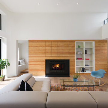
The architects wanted to create some drama, which they accomplished with the window placement and opening up the interior floor plan to an open concept approach. Cabinetry was used to help delineate intimate spaces. To add warmth to an all-white living room, white-washed oak wood floors were installed and pine planks were used around the fireplace. The large windows served as artwork bringing the color of nature into the space.
An octagon shaped, elevated dining room, (named “the turret”), had a big impact on the design of the house. They architects rounded the corners and added larger window openings overlooking a new sunken garden. The great room was also softened by rounding out the corners and that circular theme continued throughout the house, being picked up in skylight wells and kitchen cabinetry. A staircase leading to a catwalk was added and the result was a two-story window wall that flooded the home with natural light.
When asked why Milgard® Thermally Improved Aluminum windows were selected, the architectural team listed many reasons:
1) Aesthetics: “We liked the slim profiles and narrow sightlines. The window frames never get in the way of the view and that was important to us. They also have a very contemporary look that went well with our design.”
2) Options: “We liked that we could get large sliding doors that matched the windows, giving us a very cohesive look and feel throughout the project.”
3) Cost Effective: “Milgard windows are affordable. You get a good product at a good price.”
4) Custom Sizes: “Milgard windows are customizable, which allowed us to get the right window for each location.”
Ready to take on your own traditional to modern home remodeling project? Arbib Hughey Design advises, “Work with a good architect. That means picking a team that is creative, communicative, listens well and is responsive. We think it’s important for an architect to listen to their clients and give them something they want, not something the architect thinks they should have. At the same time you want an architect who is willing and able to think outside the box and offer up design options that you may not have considered. Design is about a lot of back and forth, trying out ideas, getting feedback and trying again.”
The home was completely transformed into a unique, contemporary house perfectly integrated with its site. Internally the home has a natural flow for the occupants and externally it is integrated with the surroundings taking advantage of great natural light. As a side note, it was highly praised as part of the Austin AIA homes tour.
 Gardner/Fox Associates, Inc
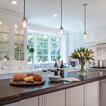
The original breakfast room was removed and the corner corner squared off a the site of the new sink. The removal of the wall dividing the kitchen and dining areas allowed the kitchen to expand and accommodate the open concept floor plan. The result is an amazingly comfortable & beautiful space in which to cook & entertain.
 Superior Fireplaces
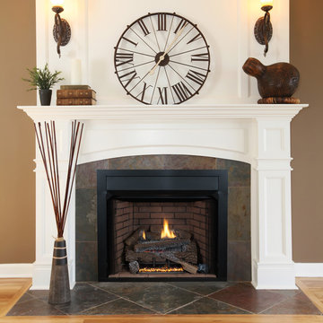
The VRT4000 radiant vent-free fireplace presents a fresh yet traditional tall and flush to the floor masonry fireplace design. Standard features include, a radiant clean face design with a 24" tall opening, hidden screen pockets, factory installed j-box and the industry's finest textured refractory panels and floor.
Features
VRT4000 Series offers 32”, 36” and 42” models
Expansive viewing area with a flush to the floor opening
Interior refractory panels available in Red and White in both stacked or herringbone pattern
Textured powder-coat paint
Full length nailing flanges for easier installation
Gas knockouts located on both sides for easier installation
Mesh draw screens for a more realistic appearance
Compatible with any listed ANSI Z21.11.2 vent-free log set. Choose a beautiful and reliable Superior vent-free log set for best results.
20 year limited warranty
 Bellingham Bay Builders
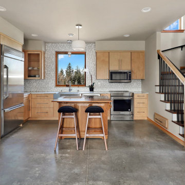
The Twin Peaks Passive House + ADU was designed and built to remain resilient in the face of natural disasters. Fortunately, the same great building strategies and design that provide resilience also provide a home that is incredibly comfortable and healthy while also visually stunning.
This home’s journey began with a desire to design and build a house that meets the rigorous standards of Passive House. Before beginning the design/ construction process, the homeowners had already spent countless hours researching ways to minimize their global climate change footprint. As with any Passive House, a large portion of this research was focused on building envelope design and construction. The wall assembly is combination of six inch Structurally Insulated Panels (SIPs) and 2x6 stick frame construction filled with blown in insulation. The roof assembly is a combination of twelve inch SIPs and 2x12 stick frame construction filled with batt insulation. The pairing of SIPs and traditional stick framing allowed for easy air sealing details and a continuous thermal break between the panels and the wall framing.
Beyond the building envelope, a number of other high performance strategies were used in constructing this home and ADU such as: battery storage of solar energy, ground source heat pump technology, Heat Recovery Ventilation, LED lighting, and heat pump water heating technology.
In addition to the time and energy spent on reaching Passivhaus Standards, thoughtful design and carefully chosen interior finishes coalesce at the Twin Peaks Passive House + ADU into stunning interiors with modern farmhouse appeal. The result is a graceful combination of innovation, durability, and aesthetics that will last for a century to come.
Despite the requirements of adhering to some of the most rigorous environmental standards in construction today, the homeowners chose to certify both their main home and their ADU to Passive House Standards. From a meticulously designed building envelope that tested at 0.62 ACH50, to the extensive solar array/ battery bank combination that allows designated circuits to function, uninterrupted for at least 48 hours, the Twin Peaks Passive House has a long list of high performance features that contributed to the completion of this arduous certification process. The ADU was also designed and built with these high standards in mind. Both homes have the same wall and roof assembly ,an HRV, and a Passive House Certified window and doors package. While the main home includes a ground source heat pump that warms both the radiant floors and domestic hot water tank, the more compact ADU is heated with a mini-split ductless heat pump. The end result is a home and ADU built to last, both of which are a testament to owners’ commitment to lessen their impact on the environment.


 LeichtUSA
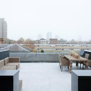
Attractive living as an architectural experiment: a 136-year-old water tower, a listed building with a spectacular 360-degree panorama view over the City of London. The task, to transform it into a superior residence, initially seemed an absolute impossibility. But when the owners came across architect Mike Collier, they had found a partner who was to make the impossible possible. The tower, which had been empty for decades, underwent radical renovation work and was extended by a four-storey cube containing kitchen, dining and living room - connected by glazed tunnels and a lift shaft. The kitchen, realised by Enclosure Interiors in Tunbridge Wells, Kent, with furniture from LEICHT is the very heart of living in this new building.
Shiny white matt-lacquered kitchen fronts (AVANCE-LR), tone-on-tone with the worktops, reflect the light in the room and thus create expanse and openness. The surface of the handle-less kitchen fronts has a horizontal relief embossing; depending on the light incidence, this results in a vitally structured surface. The free-standing preparation isle with its vertical side panels with a seamlessly integrated sink represents the transition between kitchen and living room. The fronts of the floor units facing the dining table were extended to the floor to do away with the plinth typical of most kitchens. Ceiling-high tall units on the wall provide plenty of storage space; the electrical appliances are integrated here invisible to the eye. Floor units on a high plinth which thus appear to be floating form the actual cooking centre within the kitchen, attached to the wall. A range of handle-less wall units concludes the glazed niche at the top.
LEICHT international: “Architecture and kitchen” in the centre of London. www.LeichtUSA.com
 Décor Aid
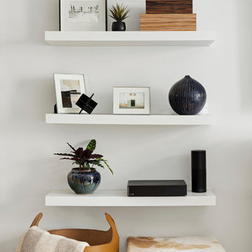
Having an eye for great interior design yet no clue on where to start or how to narrow down their aesthetic vision, a young family turned to Décor Aid to bring their drab pre-war Upper West Side apartment to life. With two young daughters in tow, our clients were looking for high style décor grounded in practicality and function – namely for their foyer, living room, dining room, and den.
Armed with a variety of inspiration from traditional to ultra-modern, they knew that they wanted their apartment’s interior design to look put together and thought through, but were short on a concise design direction.
In comes Décor Aid interior designer Gabrielle G. to revive their stark home with inspired design. After their initial in-home consultation, Gabrielle honed in on key decorative touchstones the couple had interest in and compiled a list of must-haves as an aesthetic foundation for the home.
Starting with fresh coats of pure white paint to liven up and brighten each room, Gabrielle took advantage of the apartments closed floor plan and gave each room it’s own design signature rather than having to ensure that everything flowed together – in turn, giving her more freedom.
Save for a china cabinet and formal dining table, Gabrielle was tasked with sourcing furnishings and accessories and went for clean simplicity as the couple also expressed that they’d like to have pieces that can move with them as their family grows while also being conducive for family life.
As you can see, the space is grounded with soothing neutrals so Gabrielle brought in pops of color and texture through accessories and abstract art for a sophisticated yet casual vibe.
The end result boasts concise design and pulled together everyday glamor for this modern family home that our clients adore, and so do we.
 Decor & More, LLC
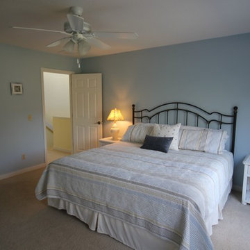
Realtor wanted to stage this Sea Pines villa. The home had been with two previous realtors with no results. When this Realtor took the listing, she told the owner that 90% of buyers start their search on the internet. Unfortunately, your place does not look "inviting but rather stark & cold in its present state so it's being passed over". That's when she called me for advice...we moved existing furniture around, borrowed some artwork, created a coffee table with two smaller tables. Added a little color with pillows & towels. The owner's only out of pocket cost for two wicker end tables and a wicker etagere was less than $200. The end result was that the place sold within two weeks of it hitting the market!
 Klopf Architecture
Malibu Glass Box House by Klopf Architecture
Following the devastating Woolsey Fire of 2018, the site in Malibu offered a unique opportunity to rebuild not just a home, but a new architectural composition that highlighted the property’s potential while navigating strict fire-rebuild codes in the area. Designed by Klopf Architecture, this project embraced a set of limitations and translated them into an architectural asset.
The city’s fire-rebuild process required the new structure to remain close to the original footprint, size and bulk, a constraint that ultimately clarified the architectural direction. Perched near the front of a long, narrow lot, the new home frames and overlooks a private, park-like rear expanse, an uncommon luxury especially in this part of Malibu .
Without a fixed program, the design process allowed for a different kind of creative focus allowing Klopf Architecture the opportunity to explore how a modernist home could best respond to this site. The team approached the project not with a list of requirements, but with a question: How might a modernist live here? What spatial qualities would inspire calm, connection, and a sense of wonder in this setting? The process became less about problem-solving and more about architectural storytelling—letting the site, the light, and the principles of modern design guide the form and flow of the home.
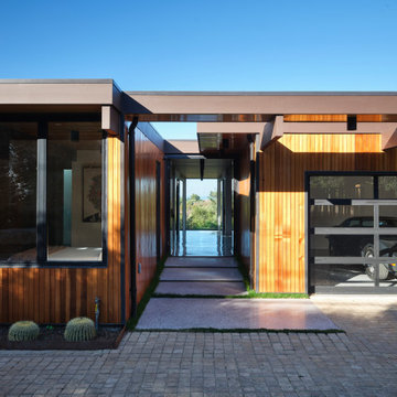
The response emerged in the form of a glass-box pavilion, an open, Mid-Century Modern inspired living, dining, and kitchen space that floats at the edge of the property’s natural descent. Connected to the more enclosed, private areas of the home by a glass-walled hallway, the living pavilion becomes a distinct centerpiece of the design. It opens on all four sides to the landscape with decks and patios on the flanks, an internal garden and water feature to the north, and a dramatic unguarded view of the expansive backyard and ocean horizon to the south.
Because of the mandated footprint, careful planning was required to ensure every space could still engage with light, landscape, or both. Strategic voids in the form of atriums and courtyards allow daylight to filter deep into the home’s core, while offering moments of surprise and retreat. These design gestures allow natural light to filter deep into the interior, creating a sense of brightness and openness throughout the day. At the same time, they expand the perceptual boundaries between inside and out, making the home feel more expansive while anchoring its connection to the surrounding landscape.
The siting of the house is what gives it its unique character. Rather than receding into the backyard like the neighboring homes, the house holds a slight prominence. From the central living pavilion, stepping down into the landscape feels more like entering a secluded park where a separate existing accessory structure, trail, and recreational areas await. The home’s modest street presence gives way to this unfolding drama of space, view, and nature.
Fire-resilient materials and assemblies are integrated seamlessly throughout including triple-pane glazing, under-slab and roof insulation, and locally sourced fire-rated cladding ensure the house not only meets Calfornia’s rigorous wildland-urban interface (WUI) standards, but feels effortlessly aligned with them. While technical decisions like fire-hardening and mechanical systems presented some construction challenges, particularly around the cantilevered glass box, the team found a functional compromise that preserved the integrity of the design.
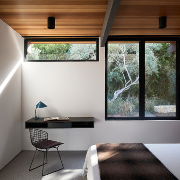
Inside, a restrained palette and exposed post and beam design celebrate the ethos of mid-century modernism. A central circulation spine extends from the entry to the rear glass wall, offering a continuous visual link from street to ocean. Spaces such as the library and office, though more intimate in scale, are never cut off from nature as each opens to its own unique courtyard or garden view.
Though born out of a strict regulatory framework and developed without a specific client, the rebuild design unfolded with remarkable clarity. Grounded in site logic, refined by limitations and an emphasis on timeless spatial relationships – light, proportion, and a strong connection to nature, the resulting design feels both effortless and uplifting. The home lives lightly on the land, opens generously to its surroundings, and strikes a careful balance between privacy, openness, and calm. For Klopf Architecture, it stands as a compelling case study in how site, code, and circumstantial constraints can inspire enduring, modernist architecture. With years of experience reimagining mid-century modern design for how people live today, the firm took the project’s limitations as an opportunity. The result is a home shaped by open, flowing spaces, strong indoor-outdoor connections, and a calm, clear sense of structure. It’s a good reminder that even with strict constraints, there’s still room for architecture to breathe—and for modernism to keep moving forward.
Klopf Architecture project team: Geoff Campen, John Klopf, AIA, and Sherry Tan
Structural Engineer: ZFA
Contractor: Maison D’Artiste
Photography: ©2025 Mariko Reed
Year Completed: 2023
 Curbio Home Improvement
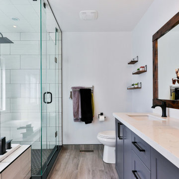
Bathrooms weren’t always a focal point for homeowners and buyers, and it shows in homes that haven’t been built or updated recently. Now, home buyers and homeowners are looking for more than just a bathroom focused solely on utility.
Bathrooms with double-sink vanities, soaker tubs, steam showers, and other spa-like features are at the top of the list for buyers. Even just updating to a neutral color scheme and reglazed the tub can increase buyer interest and modernize this essential part of the home.
At Curbio, we are a pay-at-closing concierge solution that helps homeowners captivate buyers while walking away with the most money in their pocket. We pride ourselves on making smart home improvements to modernize dated bathrooms and get sellers more money back at the closing table.
After determining which pre-listing bathroom updates will result in the greatest return on investment, our licensed general contractors will get started whether the project is a quick bathroom refresh or a full remodel. With typically a faster project completion than traditional general home contractors, the project will not face unnecessary delays. Our teams also handle the entire project from start to finish so you do not have to. This makes for happier homeowners, and agents.
 Klopf Architecture
Malibu Glass Box House by Klopf Architecture
Following the devastating Woolsey Fire of 2018, the site in Malibu offered a unique opportunity to rebuild not just a home, but a new architectural composition that highlighted the property’s potential while navigating strict fire-rebuild codes in the area. Designed by Klopf Architecture, this project embraced a set of limitations and translated them into an architectural asset.
The city’s fire-rebuild process required the new structure to remain close to the original footprint, size and bulk, a constraint that ultimately clarified the architectural direction. Perched near the front of a long, narrow lot, the new home frames and overlooks a private, park-like rear expanse, an uncommon luxury especially in this part of Malibu .
Without a fixed program, the design process allowed for a different kind of creative focus allowing Klopf Architecture the opportunity to explore how a modernist home could best respond to this site. The team approached the project not with a list of requirements, but with a question: How might a modernist live here? What spatial qualities would inspire calm, connection, and a sense of wonder in this setting? The process became less about problem-solving and more about architectural storytelling—letting the site, the light, and the principles of modern design guide the form and flow of the home.
The response emerged in the form of a glass-box pavilion, an open, Mid-Century Modern inspired living, dining, and kitchen space that floats at the edge of the property’s natural descent. Connected to the more enclosed, private areas of the home by a glass-walled hallway, the living pavilion becomes a distinct centerpiece of the design. It opens on all four sides to the landscape with decks and patios on the flanks, an internal garden and water feature to the north, and a dramatic unguarded view of the expansive backyard and ocean horizon to the south.
Because of the mandated footprint, careful planning was required to ensure every space could still engage with light, landscape, or both. Strategic voids in the form of atriums and courtyards allow daylight to filter deep into the home’s core, while offering moments of surprise and retreat. These design gestures allow natural light to filter deep into the interior, creating a sense of brightness and openness throughout the day. At the same time, they expand the perceptual boundaries between inside and out, making the home feel more expansive while anchoring its connection to the surrounding landscape.
The siting of the house is what gives it its unique character. Rather than receding into the backyard like the neighboring homes, the house holds a slight prominence. From the central living pavilion, stepping down into the landscape feels more like entering a secluded park where a separate existing accessory structure, trail, and recreational areas await. The home’s modest street presence gives way to this unfolding drama of space, view, and nature.
Fire-resilient materials and assemblies are integrated seamlessly throughout including triple-pane glazing, under-slab and roof insulation, and locally sourced fire-rated cladding ensure the house not only meets Calfornia’s rigorous wildland-urban interface (WUI) standards, but feels effortlessly aligned with them. While technical decisions like fire-hardening and mechanical systems presented some construction challenges, particularly around the cantilevered glass box, the team found a functional compromise that preserved the integrity of the design.
Inside, a restrained palette and exposed post and beam design celebrate the ethos of mid-century modernism. A central circulation spine extends from the entry to the rear glass wall, offering a continuous visual link from street to ocean. Spaces such as the library and office, though more intimate in scale, are never cut off from nature as each opens to its own unique courtyard or garden view.
Though born out of a strict regulatory framework and developed without a specific client, the rebuild design unfolded with remarkable clarity. Grounded in site logic, refined by limitations and an emphasis on timeless spatial relationships – light, proportion, and a strong connection to nature, the resulting design feels both effortless and uplifting. The home lives lightly on the land, opens generously to its surroundings, and strikes a careful balance between privacy, openness, and calm. For Klopf Architecture, it stands as a compelling case study in how site, code, and circumstantial constraints can inspire enduring, modernist architecture. With years of experience reimagining mid-century modern design for how people live today, the firm took the project’s limitations as an opportunity. The result is a home shaped by open, flowing spaces, strong indoor-outdoor connections, and a calm, clear sense of structure. It’s a good reminder that even with strict constraints, there’s still room for architecture to breathe—and for modernism to keep moving forward.
Klopf Architecture project team: Geoff Campen, John Klopf, AIA, and Sherry Tan
Structural Engineer: ZFA
Contractor: Maison D’Artiste
Photography: ©2025 Mariko Reed
Year Completed: 2023
 TVL Creative Ltd.
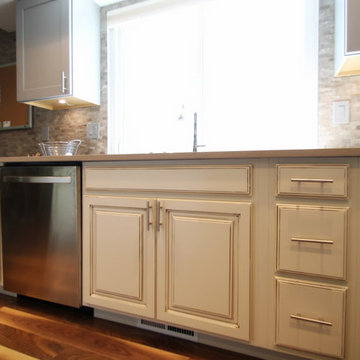
We absolutely love the final result of this unique, two-toned kitchen! Our clients came to us with the need for a lot of love in their kitchen. Their home, situated in the Fox Ridge neighboorhood of Centennial, is a lovely and spacious house with lots of potential. The kitchen, while very sizable, contained a number of super dated elements. Our goal was to give the kitchen a complete aesthetic facelift, but to also encourage better function in the kitchen. Our primary concern was disconnecting the existing (huge) peninsula and replacing it with a centralized island. This busy family of four will benefit from the gathering space the island provides. We worked with the existing ceiling condition to create a unique, recessed wood-clad ceiling that offers a gorgeous rustic aesthetic. The existing linoleum flooring was replaced with beautiful walnut hardwood. New cabinets were installed in a two-toned orientation. The upper cabinets are a soft stone gray and the lowers are a painted hazelnut. We've stacked cabinets next to the range to create a secondary pantry storage area, and repaired portions of the existing pantry to optimize shelving space and appearance. The kitchen also includes a new desk area integrated into the cabinet run for homework and to-do lists. A new large, singe-basin sink and pull-down faucet were installed, and the kitchen is brought together by the mini-stacked stone backsplash that brings texture and warmth to the room. We've offered durable and beautiful working surfaces by topping the cabinets with quartz countertops: MSI Boletus against the window wall and MSI Concerto on the island. We love the look the of this final result, but particularly love the optimized function that it offers this wonderful family!
 TVL Creative Ltd.
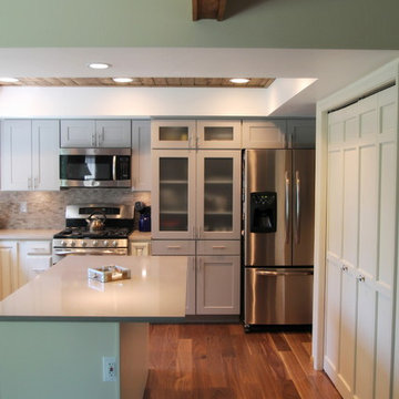
We absolutely love the final result of this unique, two-toned kitchen! Our clients came to us with the need for a lot of love in their kitchen. Their home, situated in the Fox Ridge neighboorhood of Centennial, is a lovely and spacious house with lots of potential. The kitchen, while very sizable, contained a number of super dated elements. Our goal was to give the kitchen a complete aesthetic facelift, but to also encourage better function in the kitchen. Our primary concern was disconnecting the existing (huge) peninsula and replacing it with a centralized island. This busy family of four will benefit from the gathering space the island provides. We worked with the existing ceiling condition to create a unique, recessed wood-clad ceiling that offers a gorgeous rustic aesthetic. The existing linoleum flooring was replaced with beautiful walnut hardwood. New cabinets were installed in a two-toned orientation. The upper cabinets are a soft stone gray and the lowers are a painted hazelnut. We've stacked cabinets next to the range to create a secondary pantry storage area, and repaired portions of the existing pantry to optimize shelving space and appearance. The kitchen also includes a new desk area integrated into the cabinet run for homework and to-do lists. A new large, singe-basin sink and pull-down faucet were installed, and the kitchen is brought together by the mini-stacked stone backsplash that brings texture and warmth to the room. We've offered durable and beautiful working surfaces by topping the cabinets with quartz countertops: MSI Boletus against the window wall and MSI Concerto on the island. We love the look the of this final result, but particularly love the optimized function that it offers this wonderful family!
 Zieba Builders, Inc.
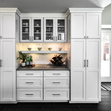
Built in the 1960’s, this 1,566 sq. ft. single story home needed updating and visual interests. The clients love to entertain and wanted to create a welcoming, fun atmosphere. Their wish lists were to have an enclosed courtyard to utilize the outdoor space, an open floor plan providing a bigger kitchen and better flow, and to incorporate a mid-century modern style.
The goal of this project was to create an open floor plan that would allow for better flow and function, thereby providing a more usable workspace and room for entertaining. We also incorporate the mid-century modern feel throughout the entire home from the inside to the out, bringing elements of design to all the spaces resulting in a completely uniform home.
Opening-up the space and removing any visual barriers resulted in the interior and exterior spaces appearing much larger. This allowed a much better flow into the space, and a flood of natural sunlight from the windows into the living area. We were able to enclose the outside front space with a rock wall and a gate providing additional square footage and a private outdoor living space. We also introduced materials such as IPE wood, stacked stone, and metal to incorporate into the exterior which created a warm, aesthetically pleasing, and mid-century modern courtyard.
 Decor & More, LLC
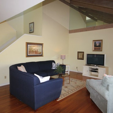
Realtor wanted to stage this Sea Pines villa. The home had been with two previous realtors with no results. When this Realtor took the listing, she told the owner that 90% of buyers start their search on the internet. Unfortunately, your place does not look "inviting but rather stark & cold in its present state so it's being passed over". That's when she called me for advice...we moved existing furniture around, borrowed some artwork, created a coffee table with two smaller tables. Added a little color with pillows & towels. The owner's only out of pocket cost for two wicker end tables and a wicker etagere was less than $200. The end result was that the place sold within two weeks of it hitting the market!
 Bellingham Bay Builders
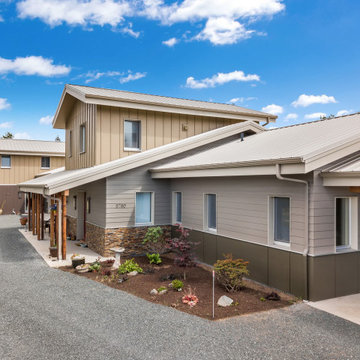
The Twin Peaks Passive House + ADU was designed and built to remain resilient in the face of natural disasters. Fortunately, the same great building strategies and design that provide resilience also provide a home that is incredibly comfortable and healthy while also visually stunning.
This home’s journey began with a desire to design and build a house that meets the rigorous standards of Passive House. Before beginning the design/ construction process, the homeowners had already spent countless hours researching ways to minimize their global climate change footprint. As with any Passive House, a large portion of this research was focused on building envelope design and construction. The wall assembly is combination of six inch Structurally Insulated Panels (SIPs) and 2x6 stick frame construction filled with blown in insulation. The roof assembly is a combination of twelve inch SIPs and 2x12 stick frame construction filled with batt insulation. The pairing of SIPs and traditional stick framing allowed for easy air sealing details and a continuous thermal break between the panels and the wall framing.
Beyond the building envelope, a number of other high performance strategies were used in constructing this home and ADU such as: battery storage of solar energy, ground source heat pump technology, Heat Recovery Ventilation, LED lighting, and heat pump water heating technology.
In addition to the time and energy spent on reaching Passivhaus Standards, thoughtful design and carefully chosen interior finishes coalesce at the Twin Peaks Passive House + ADU into stunning interiors with modern farmhouse appeal. The result is a graceful combination of innovation, durability, and aesthetics that will last for a century to come.
Despite the requirements of adhering to some of the most rigorous environmental standards in construction today, the homeowners chose to certify both their main home and their ADU to Passive House Standards. From a meticulously designed building envelope that tested at 0.62 ACH50, to the extensive solar array/ battery bank combination that allows designated circuits to function, uninterrupted for at least 48 hours, the Twin Peaks Passive House has a long list of high performance features that contributed to the completion of this arduous certification process. The ADU was also designed and built with these high standards in mind. Both homes have the same wall and roof assembly ,an HRV, and a Passive House Certified window and doors package. While the main home includes a ground source heat pump that warms both the radiant floors and domestic hot water tank, the more compact ADU is heated with a mini-split ductless heat pump. The end result is a home and ADU built to last, both of which are a testament to owners’ commitment to lessen their impact on the environment.
 grace homes
When preparing this property for sale, our goal was the maximize the curb appeal and instant wow factor to potential buyers upon a quick walk through with a minimal budget to truly maximize a bidding war and quick sale. Our goal was to sell the property within one week and close on it within 6 weeks.
By putting in roughly $10,000 in landscaping, touch-ups, and minor upgrades into this property (and a WHOLE lot of DIY work), we were able to boost the value of the home and sold it in 3 hours on the first day we had showings (technically before it was even listed on the market), and closed on the property in 21 days. We were able to execute our exact strategy as planned...resulting in a bidding war and quick sale. The property sold for $20k over the listing price.
 Klopf Architecture
Malibu Glass Box House by Klopf Architecture
Following the devastating Woolsey Fire of 2018, the site in Malibu offered a unique opportunity to rebuild not just a home, but a new architectural composition that highlighted the property’s potential while navigating strict fire-rebuild codes in the area. Designed by Klopf Architecture, this project embraced a set of limitations and translated them into an architectural asset.
The city’s fire-rebuild process required the new structure to remain close to the original footprint, size and bulk, a constraint that ultimately clarified the architectural direction. Perched near the front of a long, narrow lot, the new home frames and overlooks a private, park-like rear expanse, an uncommon luxury especially in this part of Malibu .
Without a fixed program, the design process allowed for a different kind of creative focus allowing Klopf Architecture the opportunity to explore how a modernist home could best respond to this site. The team approached the project not with a list of requirements, but with a question: How might a modernist live here? What spatial qualities would inspire calm, connection, and a sense of wonder in this setting? The process became less about problem-solving and more about architectural storytelling—letting the site, the light, and the principles of modern design guide the form and flow of the home.
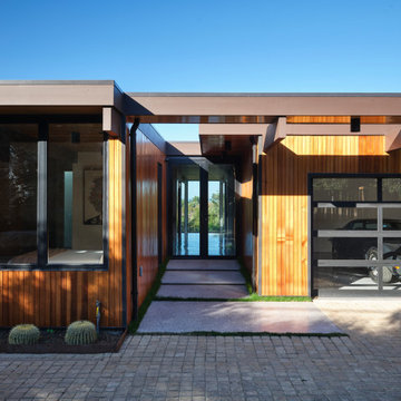
The response emerged in the form of a glass-box pavilion, an open, Mid-Century Modern inspired living, dining, and kitchen space that floats at the edge of the property’s natural descent. Connected to the more enclosed, private areas of the home by a glass-walled hallway, the living pavilion becomes a distinct centerpiece of the design. It opens on all four sides to the landscape with decks and patios on the flanks, an internal garden and water feature to the north, and a dramatic unguarded view of the expansive backyard and ocean horizon to the south.
Because of the mandated footprint, careful planning was required to ensure every space could still engage with light, landscape, or both. Strategic voids in the form of atriums and courtyards allow daylight to filter deep into the home’s core, while offering moments of surprise and retreat. These design gestures allow natural light to filter deep into the interior, creating a sense of brightness and openness throughout the day. At the same time, they expand the perceptual boundaries between inside and out, making the home feel more expansive while anchoring its connection to the surrounding landscape.
The siting of the house is what gives it its unique character. Rather than receding into the backyard like the neighboring homes, the house holds a slight prominence. From the central living pavilion, stepping down into the landscape feels more like entering a secluded park where a separate existing accessory structure, trail, and recreational areas await. The home’s modest street presence gives way to this unfolding drama of space, view, and nature.
Fire-resilient materials and assemblies are integrated seamlessly throughout including triple-pane glazing, under-slab and roof insulation, and locally sourced fire-rated cladding ensure the house not only meets Calfornia’s rigorous wildland-urban interface (WUI) standards, but feels effortlessly aligned with them. While technical decisions like fire-hardening and mechanical systems presented some construction challenges, particularly around the cantilevered glass box, the team found a functional compromise that preserved the integrity of the design.
Inside, a restrained palette and exposed post and beam design celebrate the ethos of mid-century modernism. A central circulation spine extends from the entry to the rear glass wall, offering a continuous visual link from street to ocean. Spaces such as the library and office, though more intimate in scale, are never cut off from nature as each opens to its own unique courtyard or garden view.
Though born out of a strict regulatory framework and developed without a specific client, the rebuild design unfolded with remarkable clarity. Grounded in site logic, refined by limitations and an emphasis on timeless spatial relationships – light, proportion, and a strong connection to nature, the resulting design feels both effortless and uplifting. The home lives lightly on the land, opens generously to its surroundings, and strikes a careful balance between privacy, openness, and calm. For Klopf Architecture, it stands as a compelling case study in how site, code, and circumstantial constraints can inspire enduring, modernist architecture. With years of experience reimagining mid-century modern design for how people live today, the firm took the project’s limitations as an opportunity. The result is a home shaped by open, flowing spaces, strong indoor-outdoor connections, and a calm, clear sense of structure. It’s a good reminder that even with strict constraints, there’s still room for architecture to breathe—and for modernism to keep moving forward.
Klopf Architecture project team: Geoff Campen, John Klopf, AIA, and Sherry Tan
Structural Engineer: ZFA
Contractor: Maison D’Artiste
Photography: ©2025 Mariko Reed
Year Completed: 2023
15