
Search results for "Resultant listing" in Home Design Ideas
 Fancy Interiors Studio
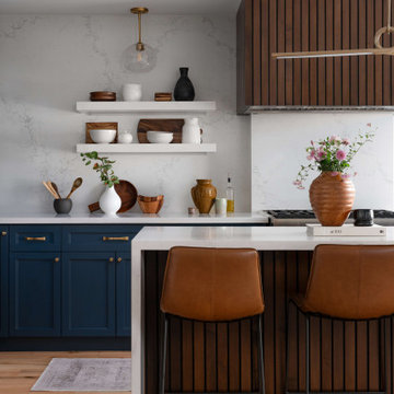
In our Brampton project, we had the pleasure of working with a wonderful family full of energy and creativity. A big family means a big need for functionality — but never at the expense of character.
Our design introduced a hidden appliance garage, ample storage, and warm brass accents that brought elegance to everyday living. The durable stainless steel appliances checked every box on their wish list.
This renovation was also an engineering feat — we removed a structural weight-bearing column, replacing it with a custom metal bridge, and extended the kitchen across the full wall. The result? A beautiful, open-concept kitchen anchored by a spacious island — perfect for both cooking and family breakfasts.
 Susan Yeley Homes
Two years before this photo shoot, a Bloomington couple came to SYI wondering whether to renovate their dated bi-level or upgrade to a new house entirely: the classic love-it-or-list-it dilemma. The whole house needed to be touched, really: bathrooms and kitchen, lighting and flooring and paint everywhere, not to mention new furniture to fill in and improve the living spaces. We spent a year with this family, considering options that were less transformative but allowed for the whole house to be upgraded, as well as options that dramatically changed the main living space but meant the rest of the house would have to wait. Meanwhile, they kept an eye out for better digs in town: a house at their price point, that met their family's needs and matched their aesthetic without major construction.
After a year of hunting, hemming and hawing: they pulled the trigger. Give us the whole enchilada in the kitchen and main living space, they said. There's no other house for us. The bathrooms and basement can wait. Make this space, where we spend all our time, a place we love to be.
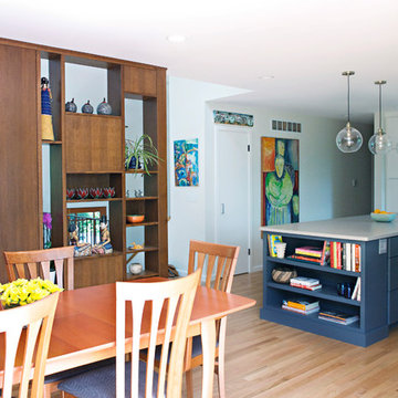
Walls and ceilings came down; clerestory windows went in. A stunning 4-panel sliding door-cum-window wall replaced two separate doors in two separate rooms, and the sun streaming in now gives this house in Indiana a California-like access to the outdoors. The central custom screen does triple duty: displaying the client's objets d'art, hiding an HVAC chase, and holding up the ceiling. The gas fireplace is completely new, with custom shelving on either side. Of course, in 2017, the kitchen anchors everything. Family Central, it features custom cabinetry, honed quartz, a new window wall, and a huge island. Materials are earthy and natural, lending a warm modern effect to the space. The medium stain of the wood and overall horizontality of the design are a nod to the home's era (1967), while white cabinetry and charcoal tile provide a neutral but crisp backdrop for the family's stunning and colorful art collection.
The result: an ordinary bi-level is now an extraordinary home, unlike any other in Bloomington.
Contractor: Rusty Peterson Construction
Cabinetry: Tim Graber Furniture
Photography: Gina Rogers
 KCBR Design | Remodel
After previously remodeling all of this family’s upstairs bathrooms, we were honored to return and transform their kitchen. Their goal was clear: improve function, enhance flow, and create spaces that truly support how they live day to day.
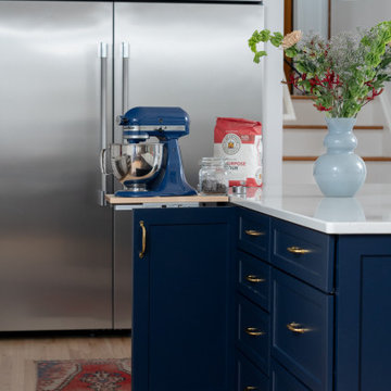
We reworked the island to improve circulation and usability, added a dedicated pantry for better organization, and incorporated a custom drink station to make hosting easy. Smart storage solutions were thoughtfully integrated throughout the kitchen, including an appliance lift that keeps their KitchenAid mixer accessible but neatly tucked away when not in use.
Personal details bring even more character to the space, like a chalkboard wall inside the pantry for last minute grocery list additions. The result is an updated kitchen that balances beauty and practicality, giving this family a space that feels both intentional and inviting.
Find the right local pro for your project
 Artistic Kitchens - Kristi Hodson
The original kitchen in this midcentury Ann Arbor home was only a fraction of the size it is today. We removed walls to open up the main floor and create a brighter, more connected space that fits the way this family lives. The existing hardwood floors were blended and refinished for a seamless transition between old and new, tying the whole space together. Storage and function were at the top of the list. We added dedicated spaces for spices, a mixer, corner pullouts, and small appliances to keep the counters clear and organized. Full-size column refrigerator and freezer units now provide plenty of food storage without sacrificing style. We also improved the light and flow of the space. A small window that faced a brick wall and a non-functioning door were both removed, replaced by a new sliding door that brings in natural light and connects the kitchen to the backyard. The new design combines navy and white cabinetry with brass and orange accents for a look that feels modern but still connected to the home’s midcentury roots. The result is a kitchen that works as beautifully as it looks, filled with smart storage and thoughtful details. Contractor: MAV Design + Build Stylist: Jill Fagan Interiors Photographer: Jacob Hawkins Photography
 J&A Stone Work
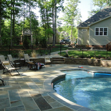
J & A Stone works were great to work with, Arthur transformed our back yard and pool area with beautiful slate patios and a fire pit area. The team was professional and meticulous, the work was done efficiently and the work area kept clean during the project. we are very happy with the results and would hire J & A Stone work again!
please feel free to keep me on your reference list.
Thanks a bunch!
Sally
 Stephanie Charest Interior Design
We completed this kitchen renovation for a SW. Calgary couple and as you’ll see, it was a much needed update after their 20+ years in the home.
Clearly the look of the cabinets needed to be brought up to date, but function was on the top of the list for this client. She enjoys cooking and often hosts several friends over for canning and other big cooking parties so countertop space was a priority. Seeing as they also host large family gatherings, the cook didn’t want to feel abandoned in the kitchen when everyone else was in the next room so opening up the space was crucial.
Here is what we did to change the way this space works for them…
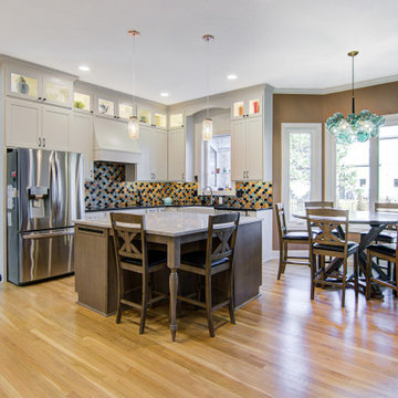
We revised the layout of the appliances and cabinets and relocated the plumbing so she could look out the window while she stood at the sink. Taking the cabinets up to the ceiling also gave them more storage as does the large pantry next to the fridge. An island wouldn’t fit, so we added a peninsula which gave them a spot to sit to have their morning coffee and a significant amount of additional counter space. By removing the walls between the kitchen and dining room it eliminated a small hallway that separated the kitchen and dining room and allowed for an open concept in their 1960’s home.
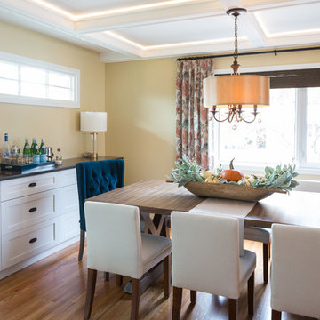
To add visual interest to the space and to define the dining room, we added a coffered celing. Now, typically a coffered ceiling is done when you have three or four walls to anchor it in. It was a bit of a risk to add a “floating” coffered ceiling! However, it turned out beautifully. It wasn’t without it issues but I’m glad we added this element as it wouldn’t have been as interesting with a typical flat ceiling.
In the dining room, a buffet was added for additional storage as well as new drapery panels, lighting and furniture. The peacock blue end chairs are stunning! Without that punch of color the dining room just wouldn’t be as outstanding. They are so lovely and really pushed the client out of her comfort zone – but she loves them and is glad she trusted us with that design decision.
The result is a much more usable space that is also classic in style and just darn pretty to look at and be in! And I know this client is enjoying her new kitchen day to day and on special family occasions.
Adrian Shellard Photography
 Décor Aid
Having an eye for great interior design yet no clue on where to start or how to narrow down their aesthetic vision, a young family turned to Décor Aid to bring their drab pre-war Upper West Side apartment to life. With two young daughters in tow, our clients were looking for high style décor grounded in practicality and function – namely for their foyer, living room, dining room, and den.
Armed with a variety of inspiration from traditional to ultra-modern, they knew that they wanted their apartment’s interior design to look put together and thought through, but were short on a concise design direction.
In comes Décor Aid interior designer Gabrielle G. to revive their stark home with inspired design. After their initial in-home consultation, Gabrielle honed in on key decorative touchstones the couple had interest in and compiled a list of must-haves as an aesthetic foundation for the home.
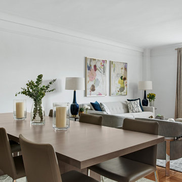
Starting with fresh coats of pure white paint to liven up and brighten each room, Gabrielle took advantage of the apartments closed floor plan and gave each room it’s own design signature rather than having to ensure that everything flowed together – in turn, giving her more freedom.
Save for a china cabinet and formal dining table, Gabrielle was tasked with sourcing furnishings and accessories and went for clean simplicity as the couple also expressed that they’d like to have pieces that can move with them as their family grows while also being conducive for family life.
As you can see, the space is grounded with soothing neutrals so Gabrielle brought in pops of color and texture through accessories and abstract art for a sophisticated yet casual vibe.
The end result boasts concise design and pulled together everyday glamor for this modern family home that our clients adore, and so do we.


 Drexel Building Supply
The Results:
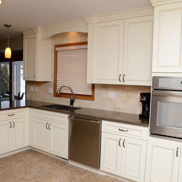
Our Drexel Designers provided an exceptionally functional kitchen that included every item on the wish list except the island. The Millers might consider a move-able island in the future.
Cabinetry
•Dura Supreme: Crest Wood
•Door & Drawer Style: Vintage panel
•Finish: Classic White with Accent
Counter Tops
•Hanstone: Auburn Abyss
 Inspired Interiors
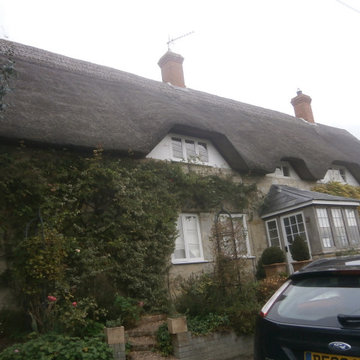
Over 400 years old, this Grade II listed thatched Cottage sprang a series of serious, under-floor leaks on the ground level – the result of poor under-floor heating pipework. All the central living area rooms were affected, making the cottage decidedly soggy and uninhabitable until fully repaired and restored.
 Reborn Cabinets Inc.
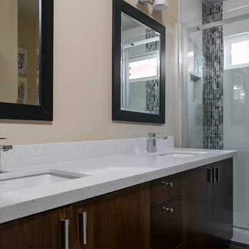
All year long, a guest bathroom can often become an afterthought. We pass them in the hall, clean them, keep them up, and all that. But it's not the space you get ready in every morning, or the room you wind down in at the end of the day. The guest bathroom is just. "there." Well, that is until the holidays arrive and you suddenly *have* guests! Overnight, your guest bathroom becomes the most-used room in the house the list of things that need to be fixed grows instantly! Maybe you are in the same spot right now! If you are looking for guest bathroom inspiration, we think that this one, located in Signal Hill, CA, is an exceptional one! Espresso, flat-panel cabinets meet clean, contemporary lines and accent tile. The result is a welcoming, strong space that is anything but an "afterthought."
 KCBR Design | Remodel
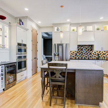
After previously remodeling all of this family’s upstairs bathrooms, we were honored to return and transform their kitchen. Their goal was clear: improve function, enhance flow, and create spaces that truly support how they live day to day.
We reworked the island to improve circulation and usability, added a dedicated pantry for better organization, and incorporated a custom drink station to make hosting easy. Smart storage solutions were thoughtfully integrated throughout the kitchen, including an appliance lift that keeps their KitchenAid mixer accessible but neatly tucked away when not in use.
Personal details bring even more character to the space, like a chalkboard wall inside the pantry for last minute grocery list additions. The result is an updated kitchen that balances beauty and practicality, giving this family a space that feels both intentional and inviting.
 Steven Flores
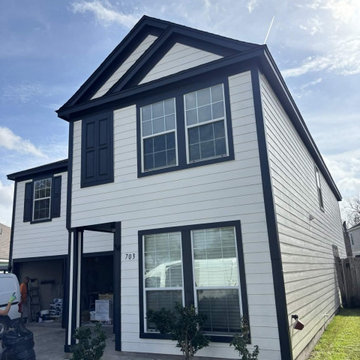
Full exterior repaint on a two-story Houston residential property. House was painted in a crisp white base coat with bold black trim, window frames, and fascia throughout. All surfaces were properly prepped and primed before application. Two finish coats applied for a clean, lasting result. This two-tone exterior transformation was completed as part of a pre-listing renovation for a Houston real estate investor.
 Drury Design
The Setup:
After purchasing this home, the homeowners faced a unique opportunity to reimagine their kitchen and nearby spaces. Water damage from a burst pipe had left much of the home’s interior in need of repair, and while the existing kitchen was functional and in relatively good shape, it didn’t align with the family’s vision for their new home. The layout included a peninsula that wasn’t ideal, and there were some druthers with the nearby pantry.
Since the space needed to be rebuilt anyway, the homeowners saw this as a chance to create a kitchen that was both highly functional for their four young children and timeless in its design. The project also included a refresh of the adjacent message center and dining room — spaces that play key roles in the family’s daily life. The goal was to create a cohesive flow between these areas, balancing modern functionality with the craftsman-inspired character of the rest of the home.
Design Objectives:
- Replace the outdated peninsula with a large island to maximize counter space and create new seating options.
- Open up the space visually by removing soffits and rethinking the cabinetry layout.
Incorporate concealed refrigeration and freezer units to provide significant storage for the family while maintaining a streamlined aesthetic.
- Integrate black cabinetry into the design without making the space feel harsh or heavy.
- Ensure the lighting plan balances functional task lighting with ambient accent lighting.
- Avoid visual clutter in the cabinetry design while still giving a nod to the craftsman aesthetic.
- Incorporate a slab backsplash as a key design feature.
Design Challenges:
- The outdated peninsula left dead space in the kitchen and lacked sufficient seating for the family.
- The cooktop wall was cramped, with small cabinets flanking the hood, limited storage, and soffits that made the space feel closed-in.
- The family needed significant refrigeration space (two refrigerators and a freezer) but wanted to avoid a cluttered look with visible stainless steel appliances.
- Adding black cabinetry risked making the space feel too dark or heavy.
- The original lighting plan was insufficient, particularly over the dining table where a decorative fixture proved too dim.
- The family wanted shaker-style drawer fronts to match the home’s arts-and-crafts design but worried that too much shaker cabinetry might look overly busy.
- Prioritizing a slab backsplash in the wish list priority planning.
The Renewed Space
Design Solutions:
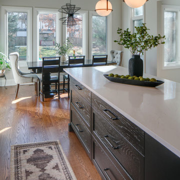
- A functional island: The peninsula was replaced with a large island that provides continuous countertop space for prepping and serving. The island also features seating for four people, creating a central hub for informal meals and activities.
- Streamlined cooktop wall: The soffits were removed, and the upper cabinets on the cooktop wall were eliminated to create a more open, streamlined design. A custom oversized hood became the focal point of the wall, with the blower unit offset inside it to align with the cooktop while maintaining exterior visual symmetry.
- Concealed refrigeration: Two column refrigerators and one freezer were integrated into the cabinetry, concealing them behind wood paneling that blends seamlessly with the overall design.
- Warm black cabinetry: The black cabinetry was crafted from hickory with a visible grain, softening its appearance and adding warmth. The grain detail gives the cabinetry a rich, textured look that avoids feeling stark or overpowering.
- Additional lighting: In the dining area, recessed can lights were added during an additional installation phase to supplement the gorgeous decorative fixture’s dim output. The new lighting plan creates a layered effect, combining functional task lighting with softer ambient lighting.
- Simplified cabinetry details: Slab drawer fronts were used on the upper drawers, while five-piece shaker fronts (with slightly less prominent rail and stile pieces) were reserved for the middle and lower drawers. This approach simplified the overall look while maintaining the craftsman-inspired aesthetic.
- Slab backsplash priority: The slab backsplash was prioritized by making thoughtful adjustments elsewhere, like opting not to extend cabinetry to the ceiling, which also helped visually prioritize the gorgeous slab backsplash. This decision also enhanced the kitchen’s furniture-like feel, aligning with the home’s craftsman character.
- This kitchen perfectly balances practicality with timeless style. By addressing the family’s functional needs — ample seating, smart storage, and effective lighting — while incorporating thoughtful design elements like warm black cabinetry and a striking slab backsplash, Alicia created a space that works beautifully for a busy household. The result is a cohesive, inviting kitchen that honors the home’s craftsman roots and will serve the family well for years to come.
 Boyce Design + Build
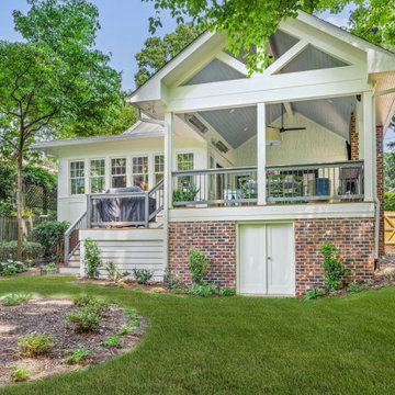
This Decatur family came to us looking for a complete renovation of their under-utilized backyard and small, outdoor deck. Their wish list included a functional design that would incorporate indoor-outdoor living and tie in with their Decatur home’s transitional aesthetic. The result is a stunning outdoor living area with a wealth of options for relaxing, entertaining, and outdoor dining.
This classic southern-style covered porch, with its open gable roof, features a tongue and groove ceiling painted in a soft shade of blue and centers around an eye-catching wood burning brick fireplace with mounted tv and ample seating in a cheerful bright blue and green color scheme. A new set of French doors off the kitchen creates a seamless transition to the outdoor living room where a small, unused closet was revamped into a stylish, custom built-in bar complete with honed black granite countertops, floating shelves, and a stainless-steel beverage fridge.
Adjacent to the lounge area is the covered outdoor dining room ideal for year-round entertaining and spacious enough to host plenty of family and friends without exposure to the elements. A statement pendant light above the large circular table and colorful green dining chairs add a fun and inviting atmosphere to the space. The lower deck includes a separate grilling station and leads down to the private backyard. A thoughtful landscape plan was designed to complement the natural surroundings and enhance the peaceful ambience of this gorgeous in-town retreat.
An added bonus is the new storage room built under the deck with a set of custom French doors that make it easily accessible for our homeowners to use.
 ALTER Design Studio
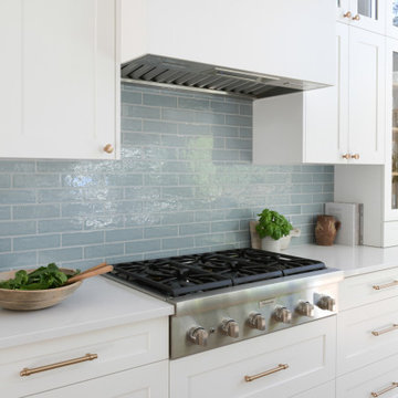
We met with our clients a few times over six months before we starting designing. They had an interesting existing layout and a very specific list of wants. We worked with their architect, re-working the home to achieve the open, light filled space they dreamed of. With roots in Australia, they wanted an elevated coastal vibe. We used muted blues, layered in texture and warm finishes - the results speak for themselves. Storage was a big challenge in the very small original kitchen. In addition to the large island and run of cabinets, we added a hidden pantry.
 Simplicity by Hayden Homes
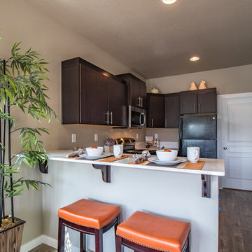
When this investor purchased the land that is now Turtle Creek, it was surrounded by multi-family house-like dwellings with great curb appeal. A large city park was adjacent as well. Simplicity was able to maximize the use of the land by building the single family dwellings in our signature “cottage community” style, creating a cozy space for renters that also made best use of the land available for the investor. The result was a 20-home subdivision with tiny homes ranging from 400-880sf that rented at 100% occupancy with a waiting list.
 Drury Design
The Setup:
After purchasing this home, the homeowners faced a unique opportunity to reimagine their kitchen and nearby spaces. Water damage from a burst pipe had left much of the home’s interior in need of repair, and while the existing kitchen was functional and in relatively good shape, it didn’t align with the family’s vision for their new home. The layout included a peninsula that wasn’t ideal, and there were some druthers with the nearby pantry.
Since the space needed to be rebuilt anyway, the homeowners saw this as a chance to create a kitchen that was both highly functional for their four young children and timeless in its design. The project also included a refresh of the adjacent message center and dining room — spaces that play key roles in the family’s daily life. The goal was to create a cohesive flow between these areas, balancing modern functionality with the craftsman-inspired character of the rest of the home.
Design Objectives:
- Replace the outdated peninsula with a large island to maximize counter space and create new seating options.
- Open up the space visually by removing soffits and rethinking the cabinetry layout.
Incorporate concealed refrigeration and freezer units to provide significant storage for the family while maintaining a streamlined aesthetic.
- Integrate black cabinetry into the design without making the space feel harsh or heavy.
- Ensure the lighting plan balances functional task lighting with ambient accent lighting.
- Avoid visual clutter in the cabinetry design while still giving a nod to the craftsman aesthetic.
- Incorporate a slab backsplash as a key design feature.
Design Challenges:
- The outdated peninsula left dead space in the kitchen and lacked sufficient seating for the family.
- The cooktop wall was cramped, with small cabinets flanking the hood, limited storage, and soffits that made the space feel closed-in.
- The family needed significant refrigeration space (two refrigerators and a freezer) but wanted to avoid a cluttered look with visible stainless steel appliances.
- Adding black cabinetry risked making the space feel too dark or heavy.
- The original lighting plan was insufficient, particularly over the dining table where a decorative fixture proved too dim.
- The family wanted shaker-style drawer fronts to match the home’s arts-and-crafts design but worried that too much shaker cabinetry might look overly busy.
- Prioritizing a slab backsplash in the wish list priority planning.
The Renewed Space
Design Solutions:
- A functional island: The peninsula was replaced with a large island that provides continuous countertop space for prepping and serving. The island also features seating for four people, creating a central hub for informal meals and activities.
- Streamlined cooktop wall: The soffits were removed, and the upper cabinets on the cooktop wall were eliminated to create a more open, streamlined design. A custom oversized hood became the focal point of the wall, with the blower unit offset inside it to align with the cooktop while maintaining exterior visual symmetry.
- Concealed refrigeration: Two column refrigerators and one freezer were integrated into the cabinetry, concealing them behind wood paneling that blends seamlessly with the overall design.
- Warm black cabinetry: The black cabinetry was crafted from hickory with a visible grain, softening its appearance and adding warmth. The grain detail gives the cabinetry a rich, textured look that avoids feeling stark or overpowering.
- Additional lighting: In the dining area, recessed can lights were added during an additional installation phase to supplement the gorgeous decorative fixture’s dim output. The new lighting plan creates a layered effect, combining functional task lighting with softer ambient lighting.
- Simplified cabinetry details: Slab drawer fronts were used on the upper drawers, while five-piece shaker fronts (with slightly less prominent rail and stile pieces) were reserved for the middle and lower drawers. This approach simplified the overall look while maintaining the craftsman-inspired aesthetic.
- Slab backsplash priority: The slab backsplash was prioritized by making thoughtful adjustments elsewhere, like opting not to extend cabinetry to the ceiling, which also helped visually prioritize the gorgeous slab backsplash. This decision also enhanced the kitchen’s furniture-like feel, aligning with the home’s craftsman character.
- This kitchen perfectly balances practicality with timeless style. By addressing the family’s functional needs — ample seating, smart storage, and effective lighting — while incorporating thoughtful design elements like warm black cabinetry and a striking slab backsplash, Alicia created a space that works beautifully for a busy household. The result is a cohesive, inviting kitchen that honors the home’s craftsman roots and will serve the family well for years to come.
 Amazing Spaces
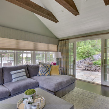
This project incorporated the main floor of the home. The existing kitchen was narrow and dated, and closed off from the rest of the common spaces. The client’s wish list included opening up the space to combine the dining room and kitchen, create a more functional entry foyer, and update the dark sunporch to be more inviting.
The concept resulted in swapping the kitchen and dining area, creating a perfect flow from the entry through to the sunporch.
A double-sided stone-clad fireplace divides the great room and sunporch, highlighting the new vaulted ceiling. The old wood paneling on the walls was removed and reclaimed wood beams were added to the ceiling. The single door to the patio was replaced with a double door. New furniture and accessories in shades of blue and gray is at home in this bright and airy family room.
 Truitt and White Window and Door Showroom
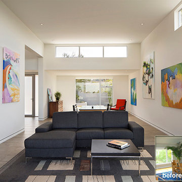
This hillside home in Piedmont, CA was remodeled to change the style from a 1940's rancher with eight foot ceilings and dark interiors, into a modern geometric composition with vast white interiors for casual living and generous daylighting for displaying the artist-owner's works.
In a city known for rigorous and difficult design review, an addition, two variances, and a full stylistic change were unanimously approved on the first round. All sloped roofs and attics were eliminated and replaced by a series of stacked and overlapping flat roofs. This made the house taller on the inside and shorter on the outside, which helped earn design review cooperation in the community. Windows were concentrated toward the rear yard views or moved up high on the side walls for daylight and privacy, benefitting the owners as well as the neighbors.
At the start, the owner husband was so enthusiastic and engaged in transforming his house into something modern that he presented the architect with a scaled foamcore model, rather than the usual magazine clippings and wish list. He participated in the design decisions throughout the process. The owner wife is the artist who did all the artwork in the house. She had been craving a display space with large walls and good natural light. Both of them loved the location and great views.
The project was an opportunity to transform the style of an older traditional home into a modern one, while solving numerous problems. By rebuilding the 1800 ft2 top of the 3-story home it was possible to change the style of the whole building, since the lower floors were a neutral base, and also to change the lifestyle of the owners, who wanted to move their master suite upstairs and live primarily on the top floor as empty nesters.
Going into the project, the architect knew there were multiple encroachments into the setbacks and potential privacy issues with close by neighbors. He approached this as a complex puzzle made up of architectural and political pieces which all had to fit together elegantly. It took many careful moves, small and large, to arrive at a serene and cohesive result that tied old and new together seamlessly.
The design-build contractor worked closely with the owners and handled all of the construction phase documents and design adjustments, adding ideas of their own to make the project really sing.
The project was a collaboration in three acts. The owner had a strong design concept from the start. The architect developed it into a realistic project and garnered the design approvals. Then the contractor executed brilliantly
 Reborn Cabinets Inc.
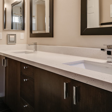
All year long, a guest bathroom can often become an afterthought. We pass them in the hall, clean them, keep them up, and all that. But it's not the space you get ready in every morning, or the room you wind down in at the end of the day. The guest bathroom is just. "there." Well, that is until the holidays arrive and you suddenly *have* guests! Overnight, your guest bathroom becomes the most-used room in the house the list of things that need to be fixed grows instantly! Maybe you are in the same spot right now! If you are looking for guest bathroom inspiration, we think that this one, located in Signal Hill, CA, is an exceptional one! Espresso, flat-panel cabinets meet clean, contemporary lines and accent tile. The result is a welcoming, strong space that is anything but an "afterthought."
45