
Search results for "Resultant listing" in Home Design Ideas

 Truitt and White Window and Door Showroom
This hillside home in Piedmont, CA was remodeled to change the style from a 1940's rancher with eight foot ceilings and dark interiors, into a modern geometric composition with vast white interiors for casual living and generous daylighting for displaying the artist-owner's works.
In a city known for rigorous and difficult design review, an addition, two variances, and a full stylistic change were unanimously approved on the first round. All sloped roofs and attics were eliminated and replaced by a series of stacked and overlapping flat roofs. This made the house taller on the inside and shorter on the outside, which helped earn design review cooperation in the community. Windows were concentrated toward the rear yard views or moved up high on the side walls for daylight and privacy, benefitting the owners as well as the neighbors.
At the start, the owner husband was so enthusiastic and engaged in transforming his house into something modern that he presented the architect with a scaled foamcore model, rather than the usual magazine clippings and wish list. He participated in the design decisions throughout the process. The owner wife is the artist who did all the artwork in the house. She had been craving a display space with large walls and good natural light. Both of them loved the location and great views.
The project was an opportunity to transform the style of an older traditional home into a modern one, while solving numerous problems. By rebuilding the 1800 ft2 top of the 3-story home it was possible to change the style of the whole building, since the lower floors were a neutral base, and also to change the lifestyle of the owners, who wanted to move their master suite upstairs and live primarily on the top floor as empty nesters.
Going into the project, the architect knew there were multiple encroachments into the setbacks and potential privacy issues with close by neighbors. He approached this as a complex puzzle made up of architectural and political pieces which all had to fit together elegantly. It took many careful moves, small and large, to arrive at a serene and cohesive result that tied old and new together seamlessly.
The design-build contractor worked closely with the owners and handled all of the construction phase documents and design adjustments, adding ideas of their own to make the project really sing.
The project was a collaboration in three acts. The owner had a strong design concept from the start. The architect developed it into a realistic project and garnered the design approvals. Then the contractor executed brilliantly
 yardscapes Inc.
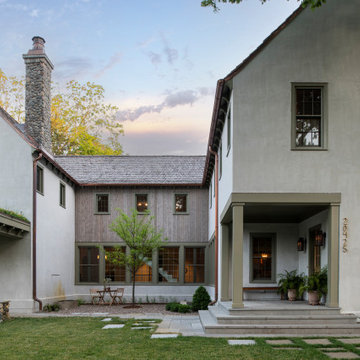
I was initially contacted by the builder and architect working on this Modern European Cottage to review the property and home design before construction began. Once the clients and I had the opportunity to meet and discuss what their visions were for the property, I started working on their wish list of items, which included a custom concrete pool, concrete spa, patios/walkways, custom fencing, and wood structures.
One of the largest challenges was that this property had a 30% (or less) hardcover surface requirement for the city location. With the lot size and square footage of the home I had limits to how much hardcover we could add to property. So, I had to get creative. We presented to the city the usage of the Live Green Roof plantings that would reduce the hardcover calculations for the site. Also, if we kept space between the Laurel Sandstones walkways, using them as steppers and planting groundcover or lawn between the stones that would also reduce the hard surface calculations. We continued that theme with the back patio as well. The client’s esthetic leaned towards the minimal style, so by adding greenery between stones work esthetically.
I chose the Laurel Tumbled Sandstone for the charm and character and thought it would lend well to the old world feel of this Modern European Cottage. We installed it on all the stone walkways, steppers, and patios around the home and pool.
I had several meetings with the client to discuss/review perennials, shrubs, and tree selections. Plant color and texture of the planting material were equally important to the clients when choosing. We grouped the plantings together and did not over-mix varieties of plants. Ultimately, we chose a variety of styles from natural groups of plantings to a touch of formal style, which all work cohesively together.
The custom fence design and installation was designed to create a cottage “country” feel. They gave us inspiration of a country style fence that you may find on a farm to keep the animals inside. We took those photos and ideas and elevated the design. We used a combination of cedar wood and sandwich the galvanized mesh between it. The fence also creates a space for the clients two dogs to roam freely around their property. We installed sod on the inside of the fence to the home and seeded the remaining areas with a Low Gro Fescue grass seed with a straw blanket for protection.
The minimal European style custom concrete pool was designed to be lined up in view from the porch and inside the home. The client requested the lawn around the edge of the pool, which helped reduce the hardcover calculations. The concrete spa is open year around. Benches are on all four sides of the spa to create enough seating for the whole family to use at the same time. Mortared field stone on the exterior of the spa mimics the stone on the exterior of the home. The spa equipment is installed in the lower level of the home to protect it from the cold winter weather.
Between the garage and the home’s entry is a pea rock sitting area and is viewed from several windows. I wanted it to be a quiet escape from the rest of the house with the minimal design. The Skyline Locust tree planted in the center of the space creates a canopy and softens the side of garage wall from the window views. The client will be installing a small water feature along the garage for serene noise ambience.
The client had very thoughtful design ideas styles, and our collaborations all came together and worked well to create the landscape design/installation. The result was everything they had dreamed of and more for their Modern European Cottage home and property.
 Classic Kitchens Designs & Renovations Ltd.
Among the list of improvements that our homeowner had in mind was a double loadbearing wall removal. The unusual existing upper floor design of the home made this one of the most challenging stuctural revisions in our company's history, but we rose to the task. Open the walls to create a large living space connected to the kitchen. After the structural revisions were complete, New Benjamin Moore painted Cabinetry was installed, complete with custom made and tiled hood to create a focal point and anchor for the look of the kitchen. A beautiful white Fireclay farm sink was then installed with Cambria quartz countertop and matching backsplash for a very clean look. White subway tile was used in key areas behind the stove and coffee bar. Natural wood floating shelves in the coffee bar area really tied the kitchen into the decor of the home. We also outfitted the family room fireplace with matching open bookshelves on both sides to really create some interest. The finished result is stunning to say the least!
Find the right local pro for your project
 ALTER Design Studio
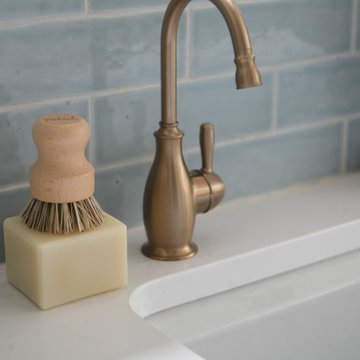
We met with our clients a few times over six months before we starting designing. They had an interesting existing layout and a very specific list of wants. We worked with their architect, re-working the home to achieve the open, light filled space they dreamed of. With roots in Australia, they wanted an elevated coastal vibe. We used muted blues, layered in texture and warm finishes - the results speak for themselves. Storage was a big challenge in the very small original kitchen. In addition to the large island and run of cabinets, we added a hidden pantry.
 KSI Kitchen & Bath
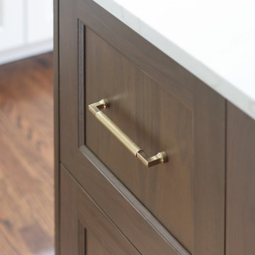
This kitchen remodel was all about maximizing the space and creating a dream space for our clients—a perfect blend of function, style, and personality. Their wish list? More storage, an inviting dining area, and the addition of a stylish island. The result? A mix of materials and textures that brought warmth and dimension, like the stunning wood bump-out on the fridge wall, the beautifully crafted wood island, and the matching hood that adds just the right touch of charm without overwhelming the space.
 Paradise Found Construction
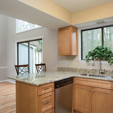
Jesse had inherited his townhome, and had lived there for several years. His career took him to another state, and the home was unoccupied for over a year. He decided that he would not return to Raleigh and that it was time to sell.
The 1975 home still had the original kitchen and baths, and was in need of general repair and new flooring. The HVAC system, water heater, and washer and dryer had been replaced as they aged and became non-functional, and the exterior had been maintained by the Home Owner’s Association. Jesse wanted to update the home and have it sell as quickly as possible, so we got to work determining what the best use of the budget would be to accomplish this goal.
We focused on updating the major interior design elements that would provide the most enjoyment, durability, and energy efficiency for the new homeowners.
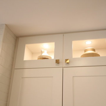
We started with completely gutting the Kitchen and reconfiguring it by moving the refrigerator into the laundry area, and stacked the washer and dryer to save space. We replaced all of the old vinyl cabinets with durable natural wood cabinetry, and added granite counter tops and a stainless steel sink. We also removed the ceiling-hung cabinets over the counter peninsula to open up the Kitchen and bring in more light and facilitate better flow and interaction, and added a floor-to-ceiling Pantry Closet to make up for the lost storage space. All of the Kitchen appliances were replaced with new energy efficient models.
We next gutted the downstairs Powder Bath and replaced the vinyl vanity with matching cabinetry with the kitchen, and replaced the toilet (as well as all other toilets in the home) with an EPA WaterSense rated low-flow toilets. We removed the wallpaper and finished the walls smooth, replaced the lighting and mirror, and removed the carpet and installed a porcelain tile floor.
The second floor 2nd Bedroom had been left open to the Great Room with a balcony and accordion door for privacy, but it left the room open to all of the noise from the Great Room and Kitchen. In order to make the room function as a private bedroom, we removed the balcony and installed a full wall in its place.
Replacing all of the flooring was also at the top of the list, as was general repair on the walls and new paint throughout. We installed natural oak flooring in the Great Room and porcelain tile in the entry foyer. The seals on several of the exterior windows and the Master Bedroom sliding door had been compromised and needed to be replaced, as well as several interior doors and repair of all the louvered closet doors. The two upstairs Baths were functionally sound and the tile was in good shape. We replaced the toilets with EPA WaterSense rated low-flow toilets, and painted the vanities with a brighter color palette.
The end result was bright, open, and comfortable updated home ready for its new occupants.
Design Features
Durable and handsome natural wood cabinetry.
Granite Kitchen and Powder countertops.
Stainless Kitchen appliances and white refrigerator.
Stainless Kitchen sink and brushed nickel faucets.
Brushed Nickel cabinetry and door hardware.
Low-flow EPA WaterSense rated toilets.
Light and bright natural hardwood flooring.
Porcelain tile and luxury vinyl flooring.
New carpet.
Private 2nd Bedroom.
Light and bright No-VOC paints and finishes.
Energy Efficient and Green Features
Energy efficient EPA Energy Star appliances.
EPA WaterSense rated low-flow toilets.
Energy efficient EPA Energy Star windows and door.
Durable No-VOC cabinetry.
Durable porcelain tile flooring.
Low-flow faucets.
Energy efficient CFL lighting throughout.
No-VOC paints and finishes.
 Jacobson Construction
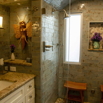
The owners of this classic “old-growth Oak trim-work and arches” 1½ story 2 BR Tudor were looking to increase the size and functionality of their first-floor bath. Their wish list included a walk-in steam shower, tiled floors and walls. They wanted to incorporate those arches where possible – a style echoed throughout the home. They also were looking for a way for someone using a wheelchair to easily access the room.
The project began by taking the former bath down to the studs and removing part of the east wall. Space was created by relocating a portion of a closet in the adjacent bedroom and part of a linen closet located in the hallway. Moving the commode and a new cabinet into the newly created space creates an illusion of a much larger bath and showcases the shower. The linen closet was converted into a shallow medicine cabinet accessed using the existing linen closet door.
The door to the bath itself was enlarged, and a pocket door installed to enhance traffic flow.
The walk-in steam shower uses a large glass door that opens in or out. The steam generator is in the basement below, saving space. The tiled shower floor is crafted with sliced earth pebbles mosaic tiling. Coy fish are incorporated in the design surrounding the drain.
Shower walls and vanity area ceilings are constructed with 3” X 6” Kyle Subway tile in dark green. The light from the two bright windows plays off the surface of the Subway tile is an added feature.
The remaining bath floor is made 2” X 2” ceramic tile, surrounded with more of the pebble tiling found in the shower and trying the two rooms together. The right choice of grout is the final design touch for this beautiful floor.
The new vanity is located where the original tub had been, repeating the arch as a key design feature. The Vanity features a granite countertop and large under-mounted sink with brushed nickel fixtures. The white vanity cabinet features two sets of large drawers.
The untiled walls feature a custom wallpaper of Henri Rousseau’s “The Equatorial Jungle, 1909,” featured in the national gallery of art. https://www.nga.gov/collection/art-object-page.46688.html
The owners are delighted in the results. This is their forever home.


![[BBC*TV*+] France - Irlande EN ..*DI.RECT -.St.reaming ...](https://st.hzcdn.com/fimgs/294126ba076fcc38_9005-w360-h360-b0-p0--.jpg)
 sdxwdwdx
 http://watchonlinestreamtv.com/euro2016live/
http://watchonlinestreamtv.com/euro2016live/
http://watchonlinestreamtv.com/euro2016live/
SKYTV.,.,.France.,.,..,.,.Irlande.,.,.EN.,.,.DIRECT.,.,.Streaming.,.,..,.,..,.,.JLM2017fr
jlm2017frskytvfranceirlandeendirectst
Translate.,.,.this.,.,.page
39.,.,.mins.,.,.ago.,.,..,.,.ENDIRECTEuro2016AvantFranceIrlandelesBleusarriventauParcOL.,.,.20minutesfr.,.,.Ilya24.,.,.
France.,.,.Irlande.,.,.En.,.,.Direct.,.,.Streaming.,.,..,.,.YouTube
httpsyoutubecomplaylist?list
Translate.,.,.this.,.,.page
France.,.,.Irlande.,.,.En.,.,.Direct.,.,.Streaming.,.,.khalid.,.,.ben;.,.,.1.,.,.video;.,.,.No.,.,.views;.,.,.Updated.,.,.today.,.,.FranceIrlandeEnDirectStreaming.,.,.LINK.,.,.1.,.,.httpbitlylinktolink
LIVE.,.,.france.,.,..,.,.irlande.,.,.en.,.,.direct.,.,.streaming.,.,.tv.,.,.lien.,.,.gratuit.,.,.
firecheatsnet.,.,.›.,.,.Home.,.,.›.,.,.Forums.,.,.›.,.,.Administração.,.,.›.,.,.Sugestões.,.,.e.,.,.Melhorias
7.,.,.hours.,.,.ago.,.,..,.,.LIVE.,.,.france.,.,..,.,.irlande.,.,.en.,.,.direct.,.,.streaming.,.,.tv.,.,.lien.,.,.gratuit.,.,.Discussion.,.,..,.,.Watch.,.,.Direct.,.,.TV.,.,.Link.,.,.Below.,.,..,.,.2sitewebcomatchFranceIrlande30479
En.,.,.ligne@France.,.,..,.,.Irlande.,.,.En.,.,.Direct.,.,.EuRo.,.,.2016.,.,.#28.,.,.·.,.,.Issues.,.,.
httpsgitlabcomBondhuliveonlineissues28
16.,.,.hours.,.,.ago.,.,..,.,.En.,.,.ligne@France.,.,..,.,.Irlande.,.,.En.,.,.Direct.,.,.EuRo.,.,.2016.,.,.Euro.,.,.26.,.,.Follow.,.,.the.,.,.eighth.,.,.finals.,.,.FranceIreland.,.,.Live.,.,.France.,.,.Info.,.,..,.,.There.,.,.are.,.,.3.,.,.days.,.,.En.,.,.
France.,.,..,.,.Irlande.,.,..,.,.match.,.,.Euro.,.,.2016.,.,.en.,.,.direct.,.,.streaming.,.,.vidéo.,.,.2606.,.,.
shapewayscomshopsfranceirlande2016endirect
Translate.,.,.this.,.,.page
12.,.,.mins.,.,.ago.,.,..,.,.France.,.,..,.,.Irlande.,.,..,.,.match.,.,.Euro.,.,.2016.,.,.en.,.,.direct.,.,.streaming.,.,.vidéo.,.,.26.,.,.juin.,.,.EN.,.,.DIRECT.,.,.Euro.,.,.2016.,.,.Matuidi.,.,.Pogba.,.,.et.,.,.Kanté.,.,.titulaires.,.,.pour.,.,.France.,.,.
VoirTV.,.,.FranceIrlande.,.,.En.,.,.Direct.,.,.Streaming.,.,.2606.,.,..,.,..,.,.Shapeways
shapewayscomshopsfranceirlandeendirectstreaming26062016
34.,.,.mins.,.,.ago.,.,..,.,.IRLANDESurquellechaînepeutonvoirlematchdeshuitièmesde.,.,.FranceIrlandematchEuro2016endirectstreamingvidéo.,.,.NextPlz
ADD.,.,.France.,.,.–.,.,.Irlande.,.,.en.,.,.direct.,.,.Streaming.,.,.sur.,.,.le.,.,.forum.,.,.Blabla.,.,.
jeuxvideocom4250474752801010addfranceirlan.,.,..,.,.Translate.,.,.this.,.,.page
51.,.,.mins.,.,.ago.,.,..,.,.ADD.,.,.France.,.,.–.,.,.Irlande.,.,.en.,.,.direct.,.,.Streaming.,.,.France.,.,.Irlande.,.,.chaîne.,.,.TV.,.,.streaming.,.,.Comment.,.,.voir.,.,.le.,.,.match.,.,.en.,.,.direct.,.,.DIFFUSION.,.,.FRANCE.,.,.
More.,.,.results.,.,.from.,.,.jeuxvideocom
ReGaRdEr>>irlande.,.,.france.,.,.en.,.,.direct.,.,.streaming.,.,.|.,.,.supportoneallcom
supportoneallcom.,.,.›.,.,.Home.,.,.›.,.,.General.,.,.›.,.,.Questions
2.,.,.hours.,.,.ago.,.,..,.,.PLUZZ.,.,.pluzzfrancetvfrfrance2.,.,.Translatethispage.,.,.France2.,.,..,.,.ReGaRdEr>>irlande.,.,.france.,.,.en.,.,.direct.,.,.streaming.,.,.JunjuniJunjuni.,.,.·.,.,.1019AM.,.,.
en@direct~France.,.,.irlande.,.,.en.,.,.direct.,.,.streaming.,.,.sur.,.,.le.,.,.
dukeforumsrivalscom.,.,.›.,.,.Other.,.,.Forums.,.,.›.,.,.The.,.,.Lounge
ReGaRdErLiVe.,.,.France.,.,.Irlande.,.,.en.,.,..,.,..,.,.›.,.,.Forums.,.,.›.,.,.Administração.,.,.›.,.,.Sugestões.,.,.e.,.,.MelhoriasTranslate.,.,.this.,.,.page.,.,.6
Résultats.,.,.football.,.,.irlandais.,.,..,.,.Foot.,.,.Irlande.,.,..,.,.scores.,.,.des.,.,..,.,..,.,.Match.,.,.en.,.,.direct
matchendirectfrirlande
Translate.,.,.this.,.,.page
Foot.,.,.irlandais.,.,..,.,.retrouvez.,.,.tous.,.,.les.,.,.scores.,.,.de.,.,.football.,.,.en.,.,.live.,.,.des.,.,.matchs.,.,.irlandais.,.,..,.,.Euro.,.,.2016BuzzCoupe.,.,.du.,.,.MondeInternationalFranceAngleterreEspagneItalie.,.,.
 Drury Design
The Setup:
After purchasing this home, the homeowners faced a unique opportunity to reimagine their kitchen and nearby spaces. Water damage from a burst pipe had left much of the home’s interior in need of repair, and while the existing kitchen was functional and in relatively good shape, it didn’t align with the family’s vision for their new home. The layout included a peninsula that wasn’t ideal, and there were some druthers with the nearby pantry.
Since the space needed to be rebuilt anyway, the homeowners saw this as a chance to create a kitchen that was both highly functional for their four young children and timeless in its design. The project also included a refresh of the adjacent message center and dining room — spaces that play key roles in the family’s daily life. The goal was to create a cohesive flow between these areas, balancing modern functionality with the craftsman-inspired character of the rest of the home.
Design Objectives:
- Replace the outdated peninsula with a large island to maximize counter space and create new seating options.
- Open up the space visually by removing soffits and rethinking the cabinetry layout.
Incorporate concealed refrigeration and freezer units to provide significant storage for the family while maintaining a streamlined aesthetic.
- Integrate black cabinetry into the design without making the space feel harsh or heavy.
- Ensure the lighting plan balances functional task lighting with ambient accent lighting.
- Avoid visual clutter in the cabinetry design while still giving a nod to the craftsman aesthetic.
- Incorporate a slab backsplash as a key design feature.
Design Challenges:
- The outdated peninsula left dead space in the kitchen and lacked sufficient seating for the family.
- The cooktop wall was cramped, with small cabinets flanking the hood, limited storage, and soffits that made the space feel closed-in.
- The family needed significant refrigeration space (two refrigerators and a freezer) but wanted to avoid a cluttered look with visible stainless steel appliances.
- Adding black cabinetry risked making the space feel too dark or heavy.
- The original lighting plan was insufficient, particularly over the dining table where a decorative fixture proved too dim.
- The family wanted shaker-style drawer fronts to match the home’s arts-and-crafts design but worried that too much shaker cabinetry might look overly busy.
- Prioritizing a slab backsplash in the wish list priority planning.
The Renewed Space
Design Solutions:
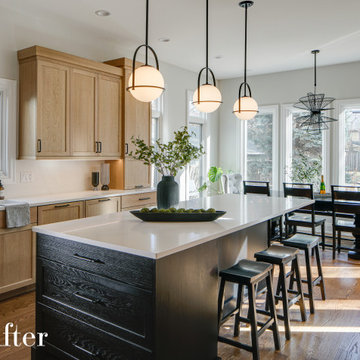
- A functional island: The peninsula was replaced with a large island that provides continuous countertop space for prepping and serving. The island also features seating for four people, creating a central hub for informal meals and activities.
- Streamlined cooktop wall: The soffits were removed, and the upper cabinets on the cooktop wall were eliminated to create a more open, streamlined design. A custom oversized hood became the focal point of the wall, with the blower unit offset inside it to align with the cooktop while maintaining exterior visual symmetry.
- Concealed refrigeration: Two column refrigerators and one freezer were integrated into the cabinetry, concealing them behind wood paneling that blends seamlessly with the overall design.
- Warm black cabinetry: The black cabinetry was crafted from hickory with a visible grain, softening its appearance and adding warmth. The grain detail gives the cabinetry a rich, textured look that avoids feeling stark or overpowering.
- Additional lighting: In the dining area, recessed can lights were added during an additional installation phase to supplement the gorgeous decorative fixture’s dim output. The new lighting plan creates a layered effect, combining functional task lighting with softer ambient lighting.
- Simplified cabinetry details: Slab drawer fronts were used on the upper drawers, while five-piece shaker fronts (with slightly less prominent rail and stile pieces) were reserved for the middle and lower drawers. This approach simplified the overall look while maintaining the craftsman-inspired aesthetic.
- Slab backsplash priority: The slab backsplash was prioritized by making thoughtful adjustments elsewhere, like opting not to extend cabinetry to the ceiling, which also helped visually prioritize the gorgeous slab backsplash. This decision also enhanced the kitchen’s furniture-like feel, aligning with the home’s craftsman character.
- This kitchen perfectly balances practicality with timeless style. By addressing the family’s functional needs — ample seating, smart storage, and effective lighting — while incorporating thoughtful design elements like warm black cabinetry and a striking slab backsplash, Alicia created a space that works beautifully for a busy household. The result is a cohesive, inviting kitchen that honors the home’s craftsman roots and will serve the family well for years to come.
 Truitt and White Window and Door Showroom
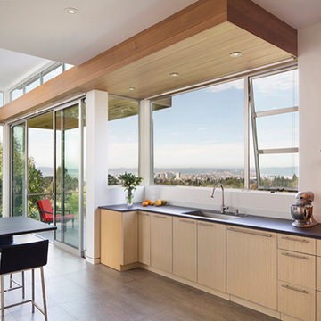
This hillside home in Piedmont, CA was remodeled to change the style from a 1940's rancher with eight foot ceilings and dark interiors, into a modern geometric composition with vast white interiors for casual living and generous daylighting for displaying the artist-owner's works.
In a city known for rigorous and difficult design review, an addition, two variances, and a full stylistic change were unanimously approved on the first round. All sloped roofs and attics were eliminated and replaced by a series of stacked and overlapping flat roofs. This made the house taller on the inside and shorter on the outside, which helped earn design review cooperation in the community. Windows were concentrated toward the rear yard views or moved up high on the side walls for daylight and privacy, benefitting the owners as well as the neighbors.
At the start, the owner husband was so enthusiastic and engaged in transforming his house into something modern that he presented the architect with a scaled foamcore model, rather than the usual magazine clippings and wish list. He participated in the design decisions throughout the process. The owner wife is the artist who did all the artwork in the house. She had been craving a display space with large walls and good natural light. Both of them loved the location and great views.
The project was an opportunity to transform the style of an older traditional home into a modern one, while solving numerous problems. By rebuilding the 1800 ft2 top of the 3-story home it was possible to change the style of the whole building, since the lower floors were a neutral base, and also to change the lifestyle of the owners, who wanted to move their master suite upstairs and live primarily on the top floor as empty nesters.
Going into the project, the architect knew there were multiple encroachments into the setbacks and potential privacy issues with close by neighbors. He approached this as a complex puzzle made up of architectural and political pieces which all had to fit together elegantly. It took many careful moves, small and large, to arrive at a serene and cohesive result that tied old and new together seamlessly.
The design-build contractor worked closely with the owners and handled all of the construction phase documents and design adjustments, adding ideas of their own to make the project really sing.
The project was a collaboration in three acts. The owner had a strong design concept from the start. The architect developed it into a realistic project and garnered the design approvals. Then the contractor executed brilliantly
 Cabinets 4U, Inc.
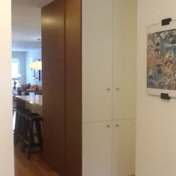
This little Chicago bungalow was ready for a new look! With the removal of walls, the space has a brighter and more open feel. Next on the list: a new Contemporary kitchen.
Storage was a huge issue, as well as prep space. So along with a new island, a free-standing storage area was created. This “tower” not only houses the refrigerator, but also includes custom pantry units.
Keeping it light and open, the perimeter laminate cabinetry is custom made in Abet Laminati 411SEI. The island and tower are also constructed in this color, then wrapped in custom Walnut panels. This gives us a warm focal point, and breaks up the monochromatic tones of the kitchen area.
The result is a clean, sophisticated kitchen that compliments beautifully the rest of the newly remodeled living space!
 Décor Aid
Having an eye for great interior design yet no clue on where to start or how to narrow down their aesthetic vision, a young family turned to Décor Aid to bring their drab pre-war Upper West Side apartment to life. With two young daughters in tow, our clients were looking for high style décor grounded in practicality and function – namely for their foyer, living room, dining room, and den.
Armed with a variety of inspiration from traditional to ultra-modern, they knew that they wanted their apartment’s interior design to look put together and thought through, but were short on a concise design direction.
In comes Décor Aid interior designer Gabrielle G. to revive their stark home with inspired design. After their initial in-home consultation, Gabrielle honed in on key decorative touchstones the couple had interest in and compiled a list of must-haves as an aesthetic foundation for the home.
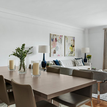
Starting with fresh coats of pure white paint to liven up and brighten each room, Gabrielle took advantage of the apartments closed floor plan and gave each room it’s own design signature rather than having to ensure that everything flowed together – in turn, giving her more freedom.
Save for a china cabinet and formal dining table, Gabrielle was tasked with sourcing furnishings and accessories and went for clean simplicity as the couple also expressed that they’d like to have pieces that can move with them as their family grows while also being conducive for family life.
As you can see, the space is grounded with soothing neutrals so Gabrielle brought in pops of color and texture through accessories and abstract art for a sophisticated yet casual vibe.
The end result boasts concise design and pulled together everyday glamor for this modern family home that our clients adore, and so do we.
 Boyce Design + Build
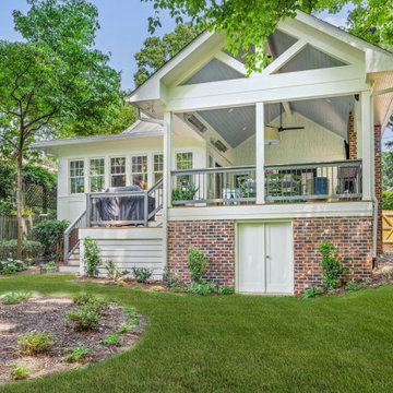
This Decatur family came to us looking for a complete renovation of their under-utilized backyard and small, outdoor deck. Their wish list included a functional design that would incorporate indoor-outdoor living and tie in with their Decatur home’s transitional aesthetic. The result is a stunning outdoor living area with a wealth of options for relaxing, entertaining, and outdoor dining.
This classic southern-style covered porch, with its open gable roof, features a tongue and groove ceiling painted in a soft shade of blue and centers around an eye-catching wood burning brick fireplace with mounted tv and ample seating in a cheerful bright blue and green color scheme. A new set of French doors off the kitchen creates a seamless transition to the outdoor living room where a small, unused closet was revamped into a stylish, custom built-in bar complete with honed black granite countertops, floating shelves, and a stainless-steel beverage fridge.
Adjacent to the lounge area is the covered outdoor dining room ideal for year-round entertaining and spacious enough to host plenty of family and friends without exposure to the elements. A statement pendant light above the large circular table and colorful green dining chairs add a fun and inviting atmosphere to the space. The lower deck includes a separate grilling station and leads down to the private backyard. A thoughtful landscape plan was designed to complement the natural surroundings and enhance the peaceful ambience of this gorgeous in-town retreat.
An added bonus is the new storage room built under the deck with a set of custom French doors that make it easily accessible for our homeowners to use.
 DPG Pavers and Design
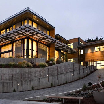
Permeable paver driveway features a reclamation tank at the top to collect rain water to water the landscape
Large minimalist multicolored three-story mixed siding flat roof photo in San Francisco
Large minimalist multicolored three-story mixed siding flat roof photo in San Francisco
 Inspired Interiors
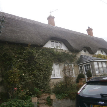
Over 400 years old, this Grade II listed thatched Cottage sprang a series of serious, under-floor leaks on the ground level – the result of poor under-floor heating pipework. All the central living area rooms were affected, making the cottage decidedly soggy and uninhabitable until fully repaired and restored.
 Artistic Kitchens - Kristi Hodson
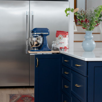
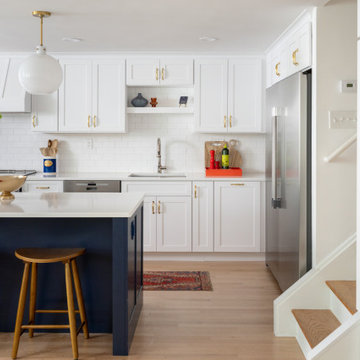
The original kitchen in this midcentury Ann Arbor home was only a fraction of the size it is today. We removed walls to open up the main floor and create a brighter, more connected space that fits the way this family lives. The existing hardwood floors were blended and refinished for a seamless transition between old and new, tying the whole space together. Storage and function were at the top of the list. We added dedicated spaces for spices, a mixer, corner pullouts, and small appliances to keep the counters clear and organized. Full-size column refrigerator and freezer units now provide plenty of food storage without sacrificing style. We also improved the light and flow of the space. A small window that faced a brick wall and a non-functioning door were both removed, replaced by a new sliding door that brings in natural light and connects the kitchen to the backyard. The new design combines navy and white cabinetry with brass and orange accents for a look that feels modern but still connected to the home’s midcentury roots. The result is a kitchen that works as beautifully as it looks, filled with smart storage and thoughtful details. Contractor: MAV Design + Build Stylist: Jill Fagan Interiors Photographer: Jacob Hawkins Photography
 Garden Artisans LLC
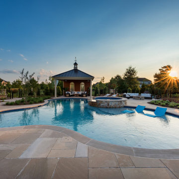
Our client's childhood memories of summer fun in her parents' pool and family time on Long Beach Island, NJ is what she wanted to recreate for her own children in the comfort of their backyard. The client's wish list included a pool that was versatile for all ages and activities. We teamed up with Liquidscapes to assist with the pool design process to ensure functionality and quality was achieved. The saltwater pool has a swim lane, sun-shelf, deck jets, built-in seating and a raised spa with an 8' spillway!
The pool deck is built with limestone, which remains cool in the hot sun. A custom pavilion cantilevers the deep end of the pool serving as a shady poolside lounge. The wavy garden beds were designed to complement the freeform shape of the pool. The landscape consists of multi-layered magnolias, ilex, and cryptomeria to ensure privacy year round. Fagus, lagerstroemia, and cotinus add in-season privacy, color, and contrast. The large garden beds are filled with lush hydrangeas, perennials, perennial grasses, and ferns.
During our presentation for the front of the property, which is the final phase of this project, our client said to us: "Over the years we have dealt with many design and build companies and we're very happy we finally found one that is a pleasure to work with and cares about delivering high quality results.”
 ALTER Design Studio
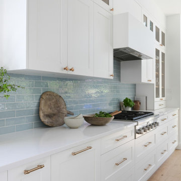
We met with our clients a few times over six months before we starting designing. They had an interesting existing layout and a very specific list of wants. We worked with their architect, re-working the home to achieve the open, light filled space they dreamed of. With roots in Australia, they wanted an elevated coastal vibe. We used muted blues, layered in texture and warm finishes - the results speak for themselves. Storage was a big challenge in the very small original kitchen. In addition to the large island and run of cabinets, we added a hidden pantry.
 Artistic Kitchens - Kristi Hodson
The original kitchen in this midcentury Ann Arbor home was only a fraction of the size it is today. We removed walls to open up the main floor and create a brighter, more connected space that fits the way this family lives. The existing hardwood floors were blended and refinished for a seamless transition between old and new, tying the whole space together. Storage and function were at the top of the list. We added dedicated spaces for spices, a mixer, corner pullouts, and small appliances to keep the counters clear and organized. Full-size column refrigerator and freezer units now provide plenty of food storage without sacrificing style. We also improved the light and flow of the space. A small window that faced a brick wall and a non-functioning door were both removed, replaced by a new sliding door that brings in natural light and connects the kitchen to the backyard. The new design combines navy and white cabinetry with brass and orange accents for a look that feels modern but still connected to the home’s midcentury roots. The result is a kitchen that works as beautifully as it looks, filled with smart storage and thoughtful details. Contractor: MAV Design + Build Stylist: Jill Fagan Interiors Photographer: Jacob Hawkins Photography
 Susan Yeley Homes
Two years before this photo shoot, a Bloomington couple came to SYI wondering whether to renovate their dated bi-level or upgrade to a new house entirely: the classic love-it-or-list-it dilemma. The whole house needed to be touched, really: bathrooms and kitchen, lighting and flooring and paint everywhere, not to mention new furniture to fill in and improve the living spaces. We spent a year with this family, considering options that were less transformative but allowed for the whole house to be upgraded, as well as options that dramatically changed the main living space but meant the rest of the house would have to wait. Meanwhile, they kept an eye out for better digs in town: a house at their price point, that met their family's needs and matched their aesthetic without major construction.
After a year of hunting, hemming and hawing: they pulled the trigger. Give us the whole enchilada in the kitchen and main living space, they said. There's no other house for us. The bathrooms and basement can wait. Make this space, where we spend all our time, a place we love to be.
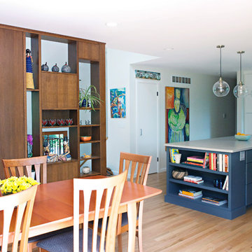
Walls and ceilings came down; clerestory windows went in. A stunning 4-panel sliding door-cum-window wall replaced two separate doors in two separate rooms, and the sun streaming in now gives this house in Indiana a California-like access to the outdoors. The central custom screen does triple duty: displaying the client's objets d'art, hiding an HVAC chase, and holding up the ceiling. The gas fireplace is completely new, with custom shelving on either side. Of course, in 2017, the kitchen anchors everything. Family Central, it features custom cabinetry, honed quartz, a new window wall, and a huge island. Materials are earthy and natural, lending a warm modern effect to the space. The medium stain of the wood and overall horizontality of the design are a nod to the home's era (1967), while white cabinetry and charcoal tile provide a neutral but crisp backdrop for the family's stunning and colorful art collection.
The result: an ordinary bi-level is now an extraordinary home, unlike any other in Bloomington.
Contractor: Rusty Peterson Construction
Cabinetry: Tim Graber Furniture
Photography: Gina Rogers
47