
Search results for "Same origin policy" in Home Design Ideas
 Liza Nicole Interiors
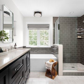
From natural stone to tone-on-tone, this master bath is now a soothing space to start and end the day.
Example of a large transitional master subway tile and gray tile marble floor and beige floor corner shower design with shaker cabinets, black cabinets, white walls, quartz countertops, a hinged shower door, beige countertops and an undermount sink
Example of a large transitional master subway tile and gray tile marble floor and beige floor corner shower design with shaker cabinets, black cabinets, white walls, quartz countertops, a hinged shower door, beige countertops and an undermount sink
 Coco Design & Build Co.
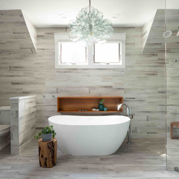
Simple clean design...in this master bathroom renovation things were kept in the same place but in a very different interpretation. The shower is where the exiting one was, but the walls surrounding it were taken out, a curbless floor was installed with a sleek tile-over linear drain that really goes away. A free-standing bathtub is in the same location that the original drop in whirlpool tub lived prior to the renovation. The result is a clean, contemporary design with some interesting "bling" effects like the bubble chandelier and the mirror rounds mosaic tile located in the back of the niche.

 Fluidesign Studio
Building Design, Plans, and Interior Finishes by: Fluidesign Studio I Builder: Anchor Builders I Photographer: sethbennphoto.com
Example of a mid-sized classic slate floor mudroom design in Minneapolis with beige walls
Example of a mid-sized classic slate floor mudroom design in Minneapolis with beige walls
Find the right local pro for your project
 Studio Robert Jamieson
Sam Oberter Photography
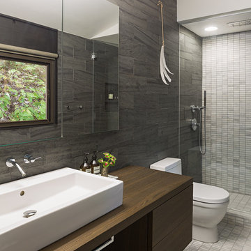
1950s gray tile and slate tile alcove shower photo in Philadelphia with a vessel sink, flat-panel cabinets and dark wood cabinets
1950s gray tile and slate tile alcove shower photo in Philadelphia with a vessel sink, flat-panel cabinets and dark wood cabinets
 Southern Living
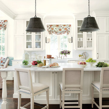
To create an elegant, light-filled look, Suzanne painted the walls and cabinetry the same creamy white and then continued the less-is-more palette with white marble countertops, a white tile backsplash, and linen barstools.
Suzanne worked with Matthew Quinn of Design Galleria to create new cabinetry while retaining the kitchen's original layout. "We strengthened the room's architectural envelope," she says. "Once that's in place, a room requires less decorating." Together, they designed Shaker-style cabinets topped with weighty molding and a handsome island with dining table-like legs. Photo by Erica George Dines for Southern Living
 Grace Hill Design
Spacecrafting
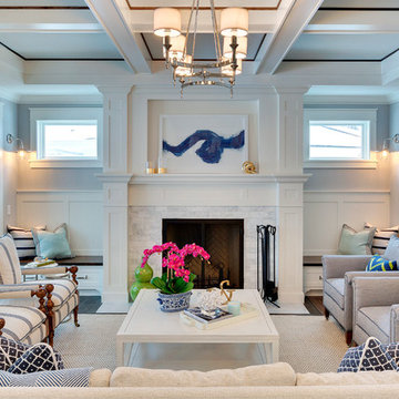
Living room - mid-sized transitional formal and enclosed dark wood floor living room idea in Minneapolis with a standard fireplace, no tv, gray walls and a tile fireplace
Living room - mid-sized transitional formal and enclosed dark wood floor living room idea in Minneapolis with a standard fireplace, no tv, gray walls and a tile fireplace
 JWT Associates
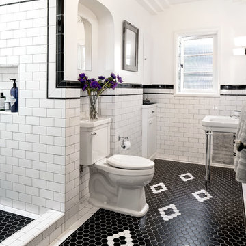
The tile in the kids' bath is all new, designed to look original to the 1936 home. The tile is from B&W Tile in Los Angeles.
Alcove shower - mid-sized victorian black and white tile and ceramic tile ceramic tile and black floor alcove shower idea in Los Angeles with a two-piece toilet, white walls and a pedestal sink
Alcove shower - mid-sized victorian black and white tile and ceramic tile ceramic tile and black floor alcove shower idea in Los Angeles with a two-piece toilet, white walls and a pedestal sink

Sponsored
Delaware, OH

Buckeye Basements, Inc.
Central Ohio's Basement Finishing ExpertsBest Of Houzz '13-'21
 Within Studio LLC
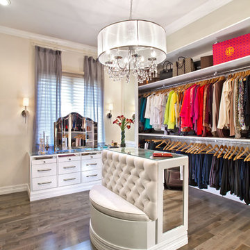
This room transformation took 4 weeks to do. It was originally a bedroom and we transformed it into a glamorous walk in dream closet for our client. All cabinets were designed and custom built for her needs. Dresser drawers on the left hold delicates and the top drawer for clutches and large jewelry. The center island was also custom built and it is a jewelry case with a built in bench on the side facing the shoes.
Bench by www.belleEpoqueupholstery.com
Lighting by www.lampsplus.com
Photo by: www.azfoto.com
www.azfoto.com
 Carl Mattison Design
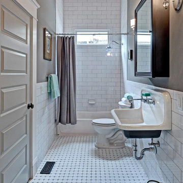
A hall bath was carved out between two of the downstairs bedrooms. This deep bath is anchored by the tub with window allowing ample light. The sink was reclaimed from an original summer/prep kitchen in the home and refinished. The school house style bath is easy to clean, simple and ready for guests with it's abundant storage.
Photography by Josh Vick
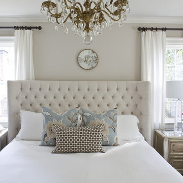
 Erika Ward - Erika Ward Interiors
Harlow Upholstered Bed by Mitchell Gold Bob Williams, Chandelier was original to the home, Nightstands and lamps are by ZGallerie, Pillow Fabrics and Hot House Flowers and Betwixt by Schumacher Fabrics.
Christina Wedge Photography
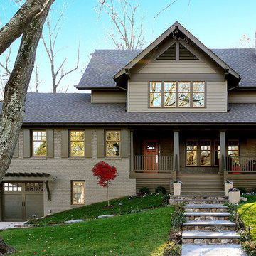
 Rill Architects
Rill Architects (Kay Kim)
Example of an arts and crafts gray mixed siding exterior home design in DC Metro
Example of an arts and crafts gray mixed siding exterior home design in DC Metro

 Liz Schupanitz Designs
Cooking for Two
Location: Plymouth, MN, United States
When this couple’s last child graduated from college they began the process of looking for a new home. After a lengthy search they decided to stay with the neighborhood they loved, saving money by remodeling rather than starting over.
The top priorities on their wish list were adding character to their 1990’s era home with a classic white kitchen and a larger island while keeping within the existing footprint. With the intention of honing their cooking skills, they were also considering better appliances and two ovens.
Challenges and Solutions
Design a larger island with seating for at least two. The existing island was small and the area behind the seating was less than recommended clearances.
To solve this challenge, the seating area of the island was extended out into the open area of the kitchen. This created a larger island with seating for three, extra storage and a bookshelf across from the range.
The original kitchen had a range with microwave above, so adding another oven was a challenge with limited wall space.
Because the adjoining dining room is used infrequently, the homeowner was open to placing the second oven and microwave in the walkway. This made room for the small buffet between the built in refrigerator and ovens, creating one of her favorite areas.
The client requested a white painted kitchen but wanted to make sure it had warmth and character. To achieve this the following elements were chosen:
1) Cabinets painted with Benjamin Moore Capitol White, a luminous and warm shade of white.
2) The Range hood was painted with warm metallic shades to reflect the bronze of the Ashley Norton hardware.
3) Black Aqua Grantique granite was chosen for countertops because it looks like soapstone and adds contrast.
4) Walker Zanger Café tile in Latte was chosen for it’s handmade look with uneven edges.
5) The to-the-counter-cabinet with glass door shows off serving dishes and lends sophisticated charm.
The result is a welcoming classic kitchen, where this couple enjoys cooking more often and sharpening their skills with gourmet appliances.
Liz Schupanitz Designs
Photographed by: Andrea Rugg Photography
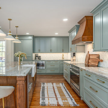
 FineLine Kitchens, Inc.
Hi everyone, I'm Sarah and Ogun we are here with fine line kitchens. So we are a couple working together. I do the interior design and remodeling of the space material selection meeting with the clients. And I handled operations outside, you know meaning all the construction work that is taking place the inside. The houses that we work in. I handle all the aspects of the construction, so today's project is very special. We're in Vienna and the client had a very big family. It's a family of seven that lives here. So we had a few aspects that we needed to keep in mind while designing this one. Having everybody be able to sit on the island. So we wanted plenty of seating all the way around. We didn't want anybody standing or anything like that. So what we did is we maximize the space. The center island is the biggest part of the kitchen. We use a natural stone to kind of give it a beautiful texture versus quartz. It's kind of standard white or kind of fabricated, so I wanted something very natural. We did this because I took my inspiration from the outside, so the inspiration if you look at the view right in front of me is there are so many greens there's a lot of brass accents and I wanted to bring this. Into this kitchen while designing it for my clients. She is very warm very. She wanted a very homey, comfy kind of look for the kitchen. So that's what we did today. As you can see, the cabinets are sage green, very light, so I still think it's a neutral, but it's a lighter color that again brings the outside in and we combine that with the oak right behind me so it's a slightly warm oak. It's not very dark. It's not very light. It's a medium brown and the same color went on the island. To kind of tie these two in and the backsplash, my favorite part is where you can see a little bit of design. It is, in my opinion still classic, but includes a pattern so the outside part is as we said in the beginning, is handled by my husband. I'd like him to speak a little bit about that. Thanks, Sarah, I want to talk to you guys a little bit about the construction part of this project. Originally this kitchen was located mostly in this area. They had their stove there sing. It was more of a peninsula layout in Sarah's and the customer vision they wanted. They wanted to get rid of the peninsula and they want to be able to have a huge island that can at least sit seven people because they're familiar with seven. So we wanted to make sure that we can achieve this design and bring it to life so that they can be happy with this layout. Some of the challenges we had, the house, the home being, you know, old home. There were a lot of you know the older electrical and plumbing that had to be replaced. We had to relocate the stove from here to this area. Over here we had put a nice foot fan that we had to relocate all the ductwork and the plumbing. Was being on the peninsula area. We had to relocate it to the center islands. So we achieved all this and kind of like bring it to bring in this kitchen up to date it looks beautiful. That's true, so yes, the old layout did not function for my clients because everything was kind of gathered on one side of the kitchen. So there was like a peninsula right there. So the end of this island kind of continued straight. And that was just the L shape. Kind of where everything was and there used to be another big table here, so they were using only kind of half of the space. So like I said at the beginning, our vision was to kind of feed everybody at the island, create some symmetry. 'cause I love that. So as you can see behind me, this is kind of the focal point symmetrical. Everything is kind of even we wanted to also panel the fridge here so it mimics the pantry and another size. So when you're looking at it, it is bringing again that symmetry back again. I hope you enjoyed this kitchen and this video and I'll see you soon. So how do you think this project turned out? It's nice. I like the color. I think it turned out nice. It's kind of like a little bit different color than what we always do. So I realize. Are you giving me a little bit of credit here that I did something different? Are you proud? I'm so proud of you. Other than that I like it. That they have kind of like a two sink. So if this was our kitchen, if we ever like you can have your own. I can have mine if we ever get into a fight then this can be like my own kitchen. Why are we gonna bring in a fight right now? So I'm cooking anyway. You're grilling most of the time, So what are you even talking about? My kitchen? That's my kitchen. You can just take the small sink. That's fine. It's always good to have your own space right there, so anyways. Thank you guys for watching. We hope to see you soon and if you have any questions please click the link below. It'll lead you to our website, house, YouTube and all of the social media is so nice to have you guys. We'll see you soon. Thanks bye bye-bye.

Sponsored
Sunbury, OH

J.Holderby - Renovations
Franklin County's Leading General Contractors - 2X Best of Houzz!
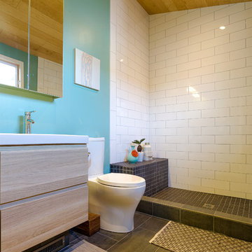
 Visual Jill Inc.
Jill's master bath, featuring a contrast of woods, gray tiles, and white. Photo by Chibi Moku. Original artwork by amiguel art.
Trendy white tile and subway tile doorless shower photo in San Francisco with flat-panel cabinets, light wood cabinets and a two-piece toilet
Trendy white tile and subway tile doorless shower photo in San Francisco with flat-panel cabinets, light wood cabinets and a two-piece toilet
 FineLine Kitchens, Inc.
Hi everyone, I'm Sarah and Ogun we are here with fine line kitchens. So we are a couple working together. I do the interior design and remodeling of the space material selection meeting with the clients. And I handled operations outside, you know meaning all the construction work that is taking place the inside. The houses that we work in. I handle all the aspects of the construction, so today's project is very special. We're in Vienna and the client had a very big family. It's a family of seven that lives here. So we had a few aspects that we needed to keep in mind while designing this one. Having everybody be able to sit on the island. So we wanted plenty of seating all the way around. We didn't want anybody standing or anything like that. So what we did is we maximize the space. The center island is the biggest part of the kitchen. We use a natural stone to kind of give it a beautiful texture versus quartz. It's kind of standard white or kind of fabricated, so I wanted something very natural. We did this because I took my inspiration from the outside, so the inspiration if you look at the view right in front of me is there are so many greens there's a lot of brass accents and I wanted to bring this. Into this kitchen while designing it for my clients. She is very warm very. She wanted a very homey, comfy kind of look for the kitchen. So that's what we did today. As you can see, the cabinets are sage green, very light, so I still think it's a neutral, but it's a lighter color that again brings the outside in and we combine that with the oak right behind me so it's a slightly warm oak. It's not very dark. It's not very light. It's a medium brown and the same color went on the island. To kind of tie these two in and the backsplash, my favorite part is where you can see a little bit of design. It is, in my opinion still classic, but includes a pattern so the outside part is as we said in the beginning, is handled by my husband. I'd like him to speak a little bit about that. Thanks, Sarah, I want to talk to you guys a little bit about the construction part of this project. Originally this kitchen was located mostly in this area. They had their stove there sing. It was more of a peninsula layout in Sarah's and the customer vision they wanted. They wanted to get rid of the peninsula and they want to be able to have a huge island that can at least sit seven people because they're familiar with seven. So we wanted to make sure that we can achieve this design and bring it to life so that they can be happy with this layout. Some of the challenges we had, the house, the home being, you know, old home. There were a lot of you know the older electrical and plumbing that had to be replaced. We had to relocate the stove from here to this area. Over here we had put a nice foot fan that we had to relocate all the ductwork and the plumbing. Was being on the peninsula area. We had to relocate it to the center islands. So we achieved all this and kind of like bring it to bring in this kitchen up to date it looks beautiful. That's true, so yes, the old layout did not function for my clients because everything was kind of gathered on one side of the kitchen. So there was like a peninsula right there. So the end of this island kind of continued straight. And that was just the L shape. Kind of where everything was and there used to be another big table here, so they were using only kind of half of the space. So like I said at the beginning, our vision was to kind of feed everybody at the island, create some symmetry. 'cause I love that. So as you can see behind me, this is kind of the focal point symmetrical. Everything is kind of even we wanted to also panel the fridge here so it mimics the pantry and another size. So when you're looking at it, it is bringing again that symmetry back again. I hope you enjoyed this kitchen and this video and I'll see you soon. So how do you think this project turned out? It's nice. I like the color. I think it turned out nice. It's kind of like a little bit different color than what we always do. So I realize. Are you giving me a little bit of credit here that I did something different? Are you proud? I'm so proud of you. Other than that I like it. That they have kind of like a two sink. So if this was our kitchen, if we ever like you can have your own. I can have mine if we ever get into a fight then this can be like my own kitchen. Why are we gonna bring in a fight right now? So I'm cooking anyway. You're grilling most of the time, So what are you even talking about? My kitchen? That's my kitchen. You can just take the small sink. That's fine. It's always good to have your own space right there, so anyways. Thank you guys for watching. We hope to see you soon and if you have any questions please click the link below. It'll lead you to our website, house, YouTube and all of the social media is so nice to have you guys. We'll see you soon. Thanks bye bye-bye.
 Melinamade - Residential Design + Interiors
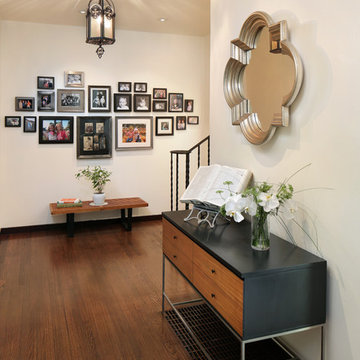
A rare, 1950s vintage Paul McCobb console table and George Nelson bench here along with traditional, original architectural Spanish features of the house. Another special element was the installation of sheet metal to the back family photo wall so it could accept magnets to not only protect the original plaster walls but allow overall flexibility for the homeowners. To know more about this makeover, please read the "Houzz Tour" feature article here: http://www.houzz.com/ideabooks/32975037/list/houzz-tour-midcentury-meets-mediterranean-in-california
Bernard Andre Photography
 Jaffa Group Design Build
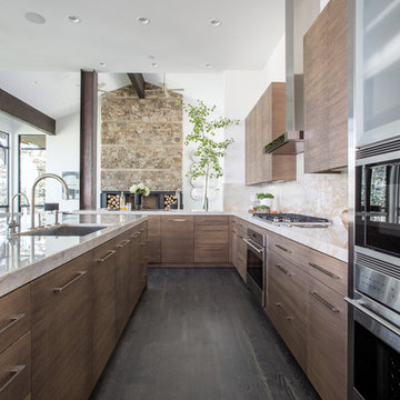
This beautiful kitchen built by Peppertree Kitchen and Bath with cabinets of architectural-grade, rift-sawn white oak veneer. It has a wire-brushed texture with a custom satin and glaze.
Sponsored
Sunbury, OH
J.Holderby - Renovations
Franklin County's Leading General Contractors - 2X Best of Houzz!
 Astro Design Inc.
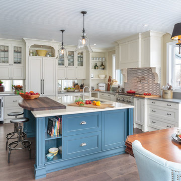
This countryside kitchen includes a beautiful blue statement island, which adds originality to the classic space. The cabinetry is made by Downsview and the design is done through Astro Design Centre in Ottawa Canada.
Astro Design, Ottawa
DoubleSpace Photography
 Herlong Architects
Julia Lynn
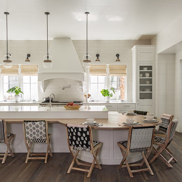
Example of a beach style l-shaped dark wood floor and brown floor eat-in kitchen design in Charleston with recessed-panel cabinets, white cabinets, white backsplash, stainless steel appliances, an island and white countertops
Example of a beach style l-shaped dark wood floor and brown floor eat-in kitchen design in Charleston with recessed-panel cabinets, white cabinets, white backsplash, stainless steel appliances, an island and white countertops
 KL Interiors
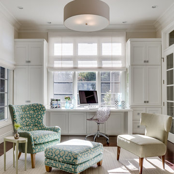
Home office - traditional built-in desk home office idea in San Francisco with beige walls
2