
Search results for "Same origin policy" in Home Design Ideas
 Bartelt. The Remodeling Resource
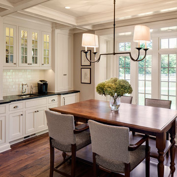
The new morning room is the size of the original kitchen. It features a beverage center, window seat, and custom table. It also showcases the pastoral views.
Photo Credit: David Bader
Interior Design Partner: Becky Howley
 Mosaic Architects SF
Jim Bartsch
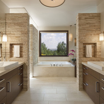
Drop-in bathtub - contemporary beige tile beige floor drop-in bathtub idea in San Francisco with a vessel sink, flat-panel cabinets, dark wood cabinets and beige walls
Drop-in bathtub - contemporary beige tile beige floor drop-in bathtub idea in San Francisco with a vessel sink, flat-panel cabinets, dark wood cabinets and beige walls
 Kitchen Magic
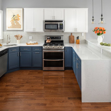
Residing in Philadelphia, it only seemed natural for a blue and white color scheme. The combination of Satin White and Colonial Blue creates instant drama in this refaced kitchen. Cambria countertop in Weybourne, include a waterfall side on the peninsula that elevate the design. An elegant backslash in a taupe ceramic adds a subtle backdrop.
Photography: Christian Giannelli
www.christiangiannelli.com/
Find the right local pro for your project
 place architecture:design
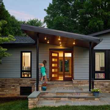
The shape of the angled porch-roof, sets the tone for a truly modern entryway. This protective covering makes a dramatic statement, as it hovers over the front door. The blue-stone terrace conveys even more interest, as it gradually moves upward, morphing into steps, until it reaches the porch.
Porch Detail
The multicolored tan stone, used for the risers and retaining walls, is proportionally carried around the base of the house. Horizontal sustainable-fiber cement board replaces the original vertical wood siding, and widens the appearance of the facade. The color scheme — blue-grey siding, cherry-wood door and roof underside, and varied shades of tan and blue stone — is complimented by the crisp-contrasting black accents of the thin-round metal columns, railing, window sashes, and the roof fascia board and gutters.
This project is a stunning example of an exterior, that is both asymmetrical and symmetrical. Prior to the renovation, the house had a bland 1970s exterior. Now, it is interesting, unique, and inviting.
Photography Credit: Tom Holdsworth Photography
Contractor: Owings Brothers Contracting
 Sroka Design, Inc.
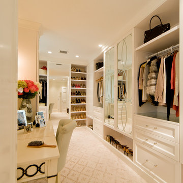
Master Closet/Dressing Area
Photo Credit: J Allen Smith
Large elegant women's carpeted dressing room photo in DC Metro with recessed-panel cabinets, white cabinets and white walls
Large elegant women's carpeted dressing room photo in DC Metro with recessed-panel cabinets, white cabinets and white walls


 Soucie Horner, Ltd.
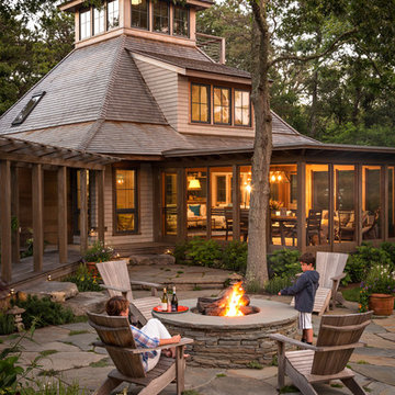
A fresh take on traditional style, this sprawling suburban home draws its occupants together in beautifully, comfortably designed spaces that gather family members for companionship, conversation, and conviviality. At the same time, it adroitly accommodates a crowd, and facilitates large-scale entertaining with ease. This balance of private intimacy and public welcome is the result of Soucie Horner’s deft remodeling of the original floor plan and creation of an all-new wing comprising functional spaces including a mudroom, powder room, laundry room, and home office, along with an exciting, three-room teen suite above. A quietly orchestrated symphony of grayed blues unites this home, from Soucie Horner Collections custom furniture and rugs, to objects, accessories, and decorative exclamationpoints that punctuate the carefully synthesized interiors. A discerning demonstration of family-friendly living at its finest.

Sponsored
Columbus, OH

Wannemacher Interiors
Customized Award-Winning Interior Design Solutions in Franklin Cnty OH

 FineLine Kitchens, Inc.
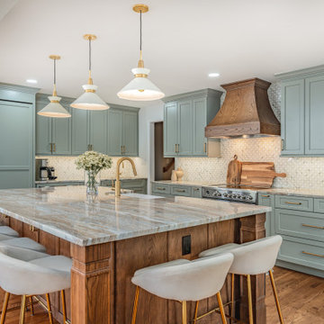
Hi everyone, I'm Sarah and Ogun we are here with fine line kitchens. So we are a couple working together. I do the interior design and remodeling of the space material selection meeting with the clients. And I handled operations outside, you know meaning all the construction work that is taking place the inside. The houses that we work in. I handle all the aspects of the construction, so today's project is very special. We're in Vienna and the client had a very big family. It's a family of seven that lives here. So we had a few aspects that we needed to keep in mind while designing this one. Having everybody be able to sit on the island. So we wanted plenty of seating all the way around. We didn't want anybody standing or anything like that. So what we did is we maximize the space. The center island is the biggest part of the kitchen. We use a natural stone to kind of give it a beautiful texture versus quartz. It's kind of standard white or kind of fabricated, so I wanted something very natural. We did this because I took my inspiration from the outside, so the inspiration if you look at the view right in front of me is there are so many greens there's a lot of brass accents and I wanted to bring this. Into this kitchen while designing it for my clients. She is very warm very. She wanted a very homey, comfy kind of look for the kitchen. So that's what we did today. As you can see, the cabinets are sage green, very light, so I still think it's a neutral, but it's a lighter color that again brings the outside in and we combine that with the oak right behind me so it's a slightly warm oak. It's not very dark. It's not very light. It's a medium brown and the same color went on the island. To kind of tie these two in and the backsplash, my favorite part is where you can see a little bit of design. It is, in my opinion still classic, but includes a pattern so the outside part is as we said in the beginning, is handled by my husband. I'd like him to speak a little bit about that. Thanks, Sarah, I want to talk to you guys a little bit about the construction part of this project. Originally this kitchen was located mostly in this area. They had their stove there sing. It was more of a peninsula layout in Sarah's and the customer vision they wanted. They wanted to get rid of the peninsula and they want to be able to have a huge island that can at least sit seven people because they're familiar with seven. So we wanted to make sure that we can achieve this design and bring it to life so that they can be happy with this layout. Some of the challenges we had, the house, the home being, you know, old home. There were a lot of you know the older electrical and plumbing that had to be replaced. We had to relocate the stove from here to this area. Over here we had put a nice foot fan that we had to relocate all the ductwork and the plumbing. Was being on the peninsula area. We had to relocate it to the center islands. So we achieved all this and kind of like bring it to bring in this kitchen up to date it looks beautiful. That's true, so yes, the old layout did not function for my clients because everything was kind of gathered on one side of the kitchen. So there was like a peninsula right there. So the end of this island kind of continued straight. And that was just the L shape. Kind of where everything was and there used to be another big table here, so they were using only kind of half of the space. So like I said at the beginning, our vision was to kind of feed everybody at the island, create some symmetry. 'cause I love that. So as you can see behind me, this is kind of the focal point symmetrical. Everything is kind of even we wanted to also panel the fridge here so it mimics the pantry and another size. So when you're looking at it, it is bringing again that symmetry back again. I hope you enjoyed this kitchen and this video and I'll see you soon. So how do you think this project turned out? It's nice. I like the color. I think it turned out nice. It's kind of like a little bit different color than what we always do. So I realize. Are you giving me a little bit of credit here that I did something different? Are you proud? I'm so proud of you. Other than that I like it. That they have kind of like a two sink. So if this was our kitchen, if we ever like you can have your own. I can have mine if we ever get into a fight then this can be like my own kitchen. Why are we gonna bring in a fight right now? So I'm cooking anyway. You're grilling most of the time, So what are you even talking about? My kitchen? That's my kitchen. You can just take the small sink. That's fine. It's always good to have your own space right there, so anyways. Thank you guys for watching. We hope to see you soon and if you have any questions please click the link below. It'll lead you to our website, house, YouTube and all of the social media is so nice to have you guys. We'll see you soon. Thanks bye bye-bye.
 FineLine Kitchens, Inc.
Hi everyone, I'm Sarah and Ogun we are here with fine line kitchens. So we are a couple working together. I do the interior design and remodeling of the space material selection meeting with the clients. And I handled operations outside, you know meaning all the construction work that is taking place the inside. The houses that we work in. I handle all the aspects of the construction, so today's project is very special. We're in Vienna and the client had a very big family. It's a family of seven that lives here. So we had a few aspects that we needed to keep in mind while designing this one. Having everybody be able to sit on the island. So we wanted plenty of seating all the way around. We didn't want anybody standing or anything like that. So what we did is we maximize the space. The center island is the biggest part of the kitchen. We use a natural stone to kind of give it a beautiful texture versus quartz. It's kind of standard white or kind of fabricated, so I wanted something very natural. We did this because I took my inspiration from the outside, so the inspiration if you look at the view right in front of me is there are so many greens there's a lot of brass accents and I wanted to bring this. Into this kitchen while designing it for my clients. She is very warm very. She wanted a very homey, comfy kind of look for the kitchen. So that's what we did today. As you can see, the cabinets are sage green, very light, so I still think it's a neutral, but it's a lighter color that again brings the outside in and we combine that with the oak right behind me so it's a slightly warm oak. It's not very dark. It's not very light. It's a medium brown and the same color went on the island. To kind of tie these two in and the backsplash, my favorite part is where you can see a little bit of design. It is, in my opinion still classic, but includes a pattern so the outside part is as we said in the beginning, is handled by my husband. I'd like him to speak a little bit about that. Thanks, Sarah, I want to talk to you guys a little bit about the construction part of this project. Originally this kitchen was located mostly in this area. They had their stove there sing. It was more of a peninsula layout in Sarah's and the customer vision they wanted. They wanted to get rid of the peninsula and they want to be able to have a huge island that can at least sit seven people because they're familiar with seven. So we wanted to make sure that we can achieve this design and bring it to life so that they can be happy with this layout. Some of the challenges we had, the house, the home being, you know, old home. There were a lot of you know the older electrical and plumbing that had to be replaced. We had to relocate the stove from here to this area. Over here we had put a nice foot fan that we had to relocate all the ductwork and the plumbing. Was being on the peninsula area. We had to relocate it to the center islands. So we achieved all this and kind of like bring it to bring in this kitchen up to date it looks beautiful. That's true, so yes, the old layout did not function for my clients because everything was kind of gathered on one side of the kitchen. So there was like a peninsula right there. So the end of this island kind of continued straight. And that was just the L shape. Kind of where everything was and there used to be another big table here, so they were using only kind of half of the space. So like I said at the beginning, our vision was to kind of feed everybody at the island, create some symmetry. 'cause I love that. So as you can see behind me, this is kind of the focal point symmetrical. Everything is kind of even we wanted to also panel the fridge here so it mimics the pantry and another size. So when you're looking at it, it is bringing again that symmetry back again. I hope you enjoyed this kitchen and this video and I'll see you soon. So how do you think this project turned out? It's nice. I like the color. I think it turned out nice. It's kind of like a little bit different color than what we always do. So I realize. Are you giving me a little bit of credit here that I did something different? Are you proud? I'm so proud of you. Other than that I like it. That they have kind of like a two sink. So if this was our kitchen, if we ever like you can have your own. I can have mine if we ever get into a fight then this can be like my own kitchen. Why are we gonna bring in a fight right now? So I'm cooking anyway. You're grilling most of the time, So what are you even talking about? My kitchen? That's my kitchen. You can just take the small sink. That's fine. It's always good to have your own space right there, so anyways. Thank you guys for watching. We hope to see you soon and if you have any questions please click the link below. It'll lead you to our website, house, YouTube and all of the social media is so nice to have you guys. We'll see you soon. Thanks bye bye-bye.
 WoodCo
?: Lauren Keller | Luxury Real Estate Services, LLC
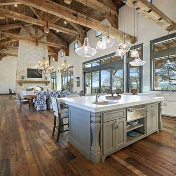
Reclaimed Wood Flooring - Sovereign Plank Wood Flooring - https://www.woodco.com/products/sovereign-plank/
Reclaimed Hand Hewn Beams - https://www.woodco.com/products/reclaimed-hand-hewn-beams/
Reclaimed Oak Patina Faced Floors, Skip Planed, Original Saw Marks. Wide Plank Reclaimed Oak Floors, Random Width Reclaimed Flooring.
 Klopf Architecture
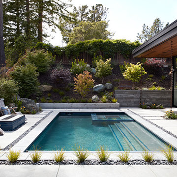
Klopf Architecture, Arterra Landscape Architects and Henry Calvert of Calvert Ventures Designed and built a new warm, modern, Eichler-inspired, open, indoor-outdoor home on a deeper-than-usual San Mateo Highlands property where an original Eichler house had burned to the ground.
The owners wanted multi-generational living and larger spaces than the original home offered, but all parties agreed that the house should respect the neighborhood and blend in stylistically with the other Eichlers. At first the Klopf team considered re-using what little was left of the original home and expanding on it. But after discussions with the owner and builder, all parties agreed that the last few remaining elements of the house were not practical to re-use, so Klopf Architecture designed a new home that pushes the Eichler approach in new directions.
One disadvantage of Eichler production homes is that the house designs were not optimized for each specific lot. A new custom home offered the team a chance to start over. In this case, a longer house that opens up sideways to the south fit the lot better than the original square-ish house that used to open to the rear (west). Accordingly, the Klopf team designed an L-shaped “bar” house with a large glass wall with large sliding glass doors that faces sideways instead of to the rear like a typical Eichler. This glass wall opens to a pool and landscaped yard designed by Arterra Landscape Architects.
Driving by the house, one might assume at first glance it is an Eichler because of the horizontality, the overhanging flat roof eaves, the dark gray vertical siding, and orange solid panel front door, but the house is designed for the 21st Century and is not meant to be a “Likeler.” You won't see any posts and beams in this home. Instead, the ceiling decking is a western red cedar that covers over all the beams. Like Eichlers, this cedar runs continuously from inside to out, enhancing the indoor / outdoor feeling of the house, but unlike Eichlers it conceals a cavity for lighting, wiring, and insulation. Ceilings are higher, rooms are larger and more open, the master bathroom is light-filled and more generous, with a separate tub and shower and a separate toilet compartment, and there is plenty of storage. The garage even easily fits two of today's vehicles with room to spare.
A massive 49-foot by 12-foot wall of glass and the continuity of materials from inside to outside enhance the inside-outside living concept, so the owners and their guests can flow freely from house to pool deck to BBQ to pool and back.
During construction in the rough framing stage, Klopf thought the front of the house appeared too tall even though the house had looked right in the design renderings (probably because the house is uphill from the street). So Klopf Architecture paid the framer to change the roofline from how we had designed it to be lower along the front, allowing the home to blend in better with the neighborhood. One project goal was for people driving up the street to pass the home without immediately noticing there is an "imposter" on this lot, and making that change was essential to achieve that goal.
This 2,606 square foot, 3 bedroom, 3 bathroom Eichler-inspired new house is located in San Mateo in the heart of the Silicon Valley.
Klopf Architecture Project Team: John Klopf, AIA, Klara Kevane
Landscape Architect: Arterra Landscape Architects
Contractor: Henry Calvert of Calvert Ventures
Photography ©2016 Mariko Reed
Location: San Mateo, CA
Year completed: 2016
 Klopf Architecture
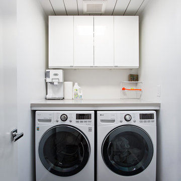
Inspiration for a small 1950s single-wall black floor dedicated laundry room remodel in San Francisco with flat-panel cabinets, white cabinets, white walls, a side-by-side washer/dryer and gray countertops
 Donald Lococo Architects
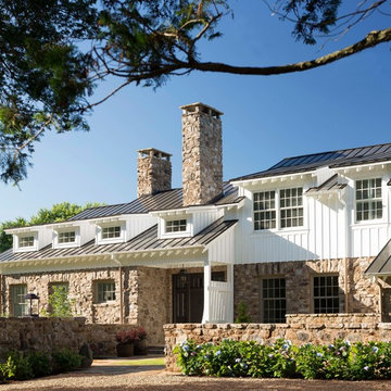
Located on farmland in McLean, Virginia, the American Farmhouse balances the expected comforts of a new home with the bucolic beauty of an old farmhouse. The final site plan still has evidence showing parallel courses of the barn’s destiny. The house mass is broken and lowered so that the home can remain secondary to the monolithic barn structure. Earthy and elemental materials are selected for the home that reference the barn without directly mimicking it. Wooden members found inside the barn and from other barns bridge ceilings and are used in floors along with rustic slate adding to a sense of simplicity to the farmhouse design.
The age and patina of the barn is reflected in the house’s textural use of board and batten and field stone layered similar to stone foundations. The original development plan was to demolish the existing barn and construct three suburban homes. Part of an endangered breed, as one of the few remaining barns in the area, it was originally viewed as a challenge in a luxury home construction with several difficulties posed to the impending project: it would be expensive to renovate, vulnerable to demolition, and threatened by urban sprawl. However, instead of trying to alter or destroy the barn, the structure was fully embraced into the traditional architecture project as a centerpiece and was used as the inspiration for the home. The new house was sited parallel to the barn so that views to the barn gable were accessible.
Sponsored
Sunbury, OH

J.Holderby - Renovations
Franklin County's Leading General Contractors - 2X Best of Houzz!

 TCP Custom Outdoor Living
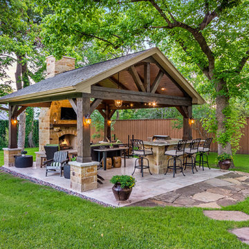
This freestanding covered patio with an outdoor kitchen and fireplace is the perfect retreat! Just a few steps away from the home, this covered patio is about 500 square feet.
The homeowner had an existing structure they wanted replaced. This new one has a custom built wood
burning fireplace with an outdoor kitchen and is a great area for entertaining.
The flooring is a travertine tile in a Versailles pattern over a concrete patio.
The outdoor kitchen has an L-shaped counter with plenty of space for prepping and serving meals as well as
space for dining.
The fascia is stone and the countertops are granite. The wood-burning fireplace is constructed of the same stone and has a ledgestone hearth and cedar mantle. What a perfect place to cozy up and enjoy a cool evening outside.
The structure has cedar columns and beams. The vaulted ceiling is stained tongue and groove and really
gives the space a very open feel. Special details include the cedar braces under the bar top counter, carriage lights on the columns and directional lights along the sides of the ceiling.
Click Photography
 TKS Design Group
Download our free ebook, Creating the Ideal Kitchen. DOWNLOAD NOW
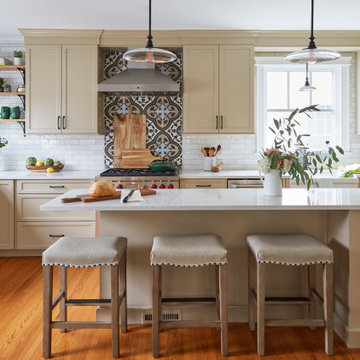
The homeowners came to us looking to update the kitchen in their historic 1897 home. The home had gone through an extensive renovation several years earlier that added a master bedroom suite and updates to the front façade. The kitchen however was not part of that update and a prior 1990’s update had left much to be desired. The client is an avid cook, and it was just not very functional for the family.
The original kitchen was very choppy and included a large eat in area that took up more than its fair share of the space. On the wish list was a place where the family could comfortably congregate, that was easy and to cook in, that feels lived in and in check with the rest of the home’s décor. They also wanted a space that was not cluttered and dark – a happy, light and airy room. A small powder room off the space also needed some attention so we set out to include that in the remodel as well.
See that arch in the neighboring dining room? The homeowner really wanted to make the opening to the dining room an arch to match, so we incorporated that into the design.
Another unfortunate eyesore was the state of the ceiling and soffits. Turns out it was just a series of shortcuts from the prior renovation, and we were surprised and delighted that we were easily able to flatten out almost the entire ceiling with a couple of little reworks.
Other changes we made were to add new windows that were appropriate to the new design, which included moving the sink window over slightly to give the work zone more breathing room. We also adjusted the height of the windows in what was previously the eat-in area that were too low for a countertop to work. We tried to keep an old island in the plan since it was a well-loved vintage find, but the tradeoff for the function of the new island was not worth it in the end. We hope the old found a new home, perhaps as a potting table.
Designed by: Susan Klimala, CKD, CBD
Photography by: Michael Kaskel
For more information on kitchen and bath design ideas go to: www.kitchenstudio-ge.com
 The Fox Group
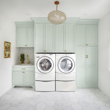
Inspiration for a transitional single-wall white floor laundry room remodel in Salt Lake City with an undermount sink, shaker cabinets, green cabinets, white walls and a side-by-side washer/dryer

Sponsored
Fredericksburg, OH

High Point Cabinets
Columbus' Experienced Custom Cabinet Builder | 4x Best of Houzz Winner
 THINK Architecture, Inc.
Photo by: Joshua Caldwell
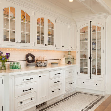
Inspiration for a timeless open concept kitchen remodel in Salt Lake City with glass-front cabinets
Inspiration for a timeless open concept kitchen remodel in Salt Lake City with glass-front cabinets
 User
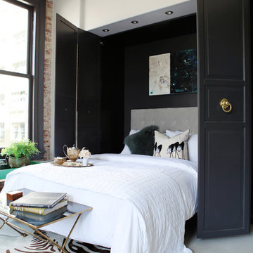
UserThe hidden murphy bed is located in the living room, turning a one bedroom loft into a two bedroom. The secret space has it's own identity with an upholstered gray headboard, a charcoal interior, decorative pillows and original art.

 Hagstrom Builder
A Modern Farmhouse set in a prairie setting exudes charm and simplicity. Wrap around porches and copious windows make outdoor/indoor living seamless while the interior finishings are extremely high on detail. In floor heating under porcelain tile in the entire lower level, Fond du Lac stone mimicking an original foundation wall and rough hewn wood finishes contrast with the sleek finishes of carrera marble in the master and top of the line appliances and soapstone counters of the kitchen. This home is a study in contrasts, while still providing a completely harmonious aura.
3