
Search results for "Select 'adding'" in Home Design Ideas

 Penny Black Interiors LLC.
This 1896 Italianate Victorian home in Portland Heights was all but derelict in 2017.
We partnered with Look Construction LLC. to save this iconic home that sits atop a steep embankment—a huge challenge for the necessary new foundation. The house was lifted and new foundation poured adding 4 feet and a whole new floor to boot.
It had been stripped of all its original interior character over the years, so the design replaced and added to what was there originally. We re-designed the home’s layout, reconfiguring the kitchen, moving the lower staircase, adding a staircase to the loft room and rebuilding the widows walk roof deck. All doorways were raised to 9 feet to add to the sense of space.
Finally, we splurged on a selection of incredible wallpapers to add drama and romance to this stunning show piece of a home.
The Penny Black House is featured in Gray Magazine #39, April 2018.
 Andrea Canedo Design
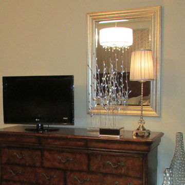
We balanced the TV wall by adding a large silver mirror and several accessories on top of the vanity to reflect the beautiful elements of the room
Inspiration for a mid-sized transitional master bedroom remodel in Tampa with beige walls
Inspiration for a mid-sized transitional master bedroom remodel in Tampa with beige walls
 Sandra Hambley
Welcome to the beach house! We are pleased to share the photos from this OBX, NC beach house we decorated for one of our existing local clients. We were happy to travel to NC to assist in setting up their vacation home.
Setting the tone in the entryway we selected furnishings with a coastal vibe. This console is 80 inches in length and is accented with beachy accessories and artwork.
This home has a fantastic open concept living area that is perfect for large family gatherings. We furnished a dining space for ten, a family room with a large sectional that will provide seating for a crowd, and added game table with chairs for overflow.
The dining table offers seating for 10 and includes 6 chairs and a bench seat that will comfortably sit 4. We selected a striped area rug in vibrant shades of blues and greens to give the space a coastal vibe.
In the mudroom, shiplap walls, bench seating, cubbies and towel hooks are both pretty and hugely functional!
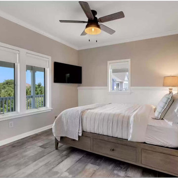
A restful sleep awaits in the primary bedroom of this OBX beach house! A king size bed made of sand-blasted solid Rustic Poplar with metal accents and coordinating bedside tables create a rustic-yet-modern vibe. A large-scale mirror features a dark bronze frame with antique mirror side panels and corners with copper cladding and nail head details. For texture and comfort, we selected an area rug crafted from hand tufted ivory wool and rescued denim. Sheer window treatments keep the room light and airy.
Need a sleeping space at your vacation home for the children? We created a bunk bed configuration that maximizes space and accommodates sleeping for eight at our client's OBX beach house. It's super functional and also fun!
Stairwells with soaring ceilings call for statement lighting! We are in love with this gorgeous chandelier we chose for our client's OBX beach house.
Find the right local pro for your project
 Rockledge Design + Architecture
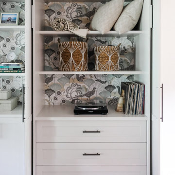
To help make this family room in Wexford more functional and cohesive, we added new custom built-in storage around the brick fireplace. On the left side, an existing built-in was situated in between the fireplace and a small closet, which also contained a sink. We started by peeling away these elements to create a larger space.
Adding symmetry to the room, we designed new cabinetry which included a mix of hidden and open shelf storage. Behind full-height pocketing doors on the left, a new wet bar with a tiled backsplash and quartz countertop. On the right, another set of pocketing doors conceals three large drawers, plus overflow toy storage for the adjacent playroom. Immediately flanking the fireplace, bookshelves provide a space to display favorite items with even more storage beneath.
To balance the room’s rich wood tones and multi-tonal red brick, we helped the clients select a neutral color palette to make the space feel more relaxed. Complimentary colors and textures are added through the playful wallpaper lining the back of the shelves, and hexagon backsplash tile. A stylish new fireplace faceplate, gallery lighting, and cabinet hardware — each in a dark metal finish — help to tie everything together.
 Sandra Hambley
A charming Airbnb, favorite restaurant, cozy coffee house, or a piece of artwork can all serve as design inspiration for your decor. How wonderful would it be to bring the colors, patterns, shapes, fabrics, or textures of those beloved places or things into your own home? That is exactly what Janet Aurora’s client was hoping to do. Her favorite restaurant, The Ivy Chelsea Garden, is located in London and features tufted leather sofas and benches, hues of salmon and sage, botanical patterns, and artwork surrounded by lush gardens and flowers. Take a look at how Janet used this point of inspiration in the client’s living room, dining room, entryway and study.
~ Dining Room ~
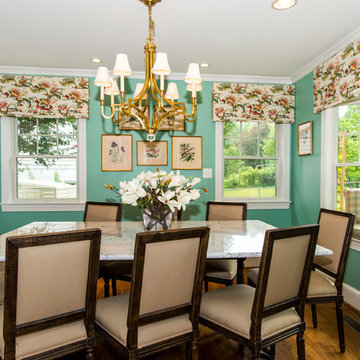
To accommodate space for a dining room table that would seat eight, we eliminated the existing fireplace. Janet custom designed a table with a beautiful wrought iron base and marble top, selected botanical prints for a gallery wall, and floral valances for the windows, all set against a fresh turquoise backdrop.
~ Living Room ~
Nods to The Ivy Chelsea Garden can be seen throughout the living room and entryway. A custom leather tufted sofa anchors the living room and compliments a beloved “Grandma’s chair” with crewel fabric, which was restored to its former beauty. Walls painted with Benjamin Moore’s Dreamcatcher 640 and dark salmon hued draperies create a color palette that is strikingly similar to the al fresco setting in London. In the entryway, floral patterned wallpaper introduces the garden fresh theme seen throughout the home.
~ The Study ~
Janet transformed an existing bedroom into a study by claiming the space from two reach-in closets to create custom built-ins with lighting. Many of the homeowner’s own furnishings were used in this room, but Janet added a much-needed reading chair in turquoise to bring a nice pop of color, window treatments, and an area rug to tie the space together. Benjamin Moore’s Deep Mauve was used on the walls and Ruby Dusk was added to the back of the cabinetry to add depth and interest. We also added French doors that lead out to a small balcony for a place to take a break or have lunch.
We love the way these spaces turned out and hope our clients will enjoy their spaces inspired by their favorite restaurant.
 SHELLEY RODNER DESIGN / DDI
DESIGN CHALLENGES ADDRESSED:
To anyone who may be reading this project overview, I do hope you'll have the opportunity to
have a look at the 'before' photo of this space. It's quite a transformation!
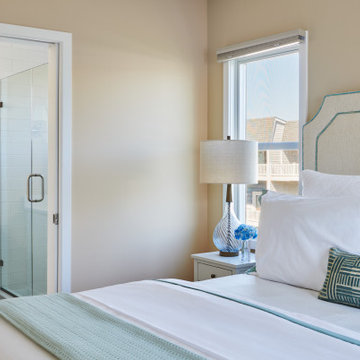
Our clients purchased their condo at the beach several years ago. As shown in the 'before' photo,
the owner's bedroom suite was a dark and dated space with unsightly paneled walls, heavy faux
ceiling beams and outdated furniture. Everything felt cramped and cluttered throughout the
condo, especially their primary bedroom . The client's vision for this space was for everything to
have an airy and relaxed spa like feel.
DESIGN SOLUTIONS PROVIDED:
The entire condo was taken down to the stud. The faux beams were edited out and the ceiling
raised. The heavy out-dated paneling was removed and replaced with fresh clean walls that were
painted in a calming creamy tone throughout the entire condo.
The awkwardly positioned windows were removed. New windows were then added with great
attention to placement. On the main wall, windows were spaced to allow a queen sized bed to
nest perfectly in between them. Richly textured honeycomb cellular shades were selected with a
black out liner to tame the direct sun throughout the day.
The homeowners have two dogs and a cat who love a visit to the beach as much as their
'humans'. All of our updated new furniture selections successfully addressed the client's quest
for a 'pet friendly' environment.
The existing dark and gloomy furniture was replaced with stylish updated pieces. Great thought
was given to the size, scale and textiles used in this space. A custom upholstered bed with great
architectural detailing was selected. It's richly textured easy-care fabric in a soft oatmeal tone
created the perfect touch.
 Reyes Creative Concepts LLC.
The owner wanted to update the family room and the kitchen of this 1970's splanch. By painting the brick wall white and adding custom built-ins we brightened up the space. The decor reflects our client's love for color and a bit of asian style elements. We also made sure that the sitting was not only beautiful, but very comfortable and durable. The sofa and the accent chairs sit very comfortably and we used the performance fabrics to make sure they last through the years. We also wanted to highlight the art collection which the owner curated through the years.
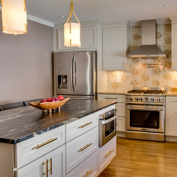
We enlarged the kitchen by removing a partition wall that divided it from the dining room and relocated the entrance. Our goal was to create a warm and inviting kitchen, therefore we selected a mellow, neutral palette. The cabinets are soft Irish Cream as opposed to a bright white. The mosaic backsplash makes a statement, but remains subtle through its beige tones. We selected polished brass for the hardware, as well as brass and warm metals for the light fixtures which emit a warm and cozy glow.
For beauty and practicality, we used quartz for the working surface countertops and for the island we chose a sophisticated leather finish marble with strong movement and gold inflections. Because of our client’s love for Asian influences, we selected upholstery fabric with an image of a dragon, chrysanthemums to mimic Japanese textiles, and red accents scattered throughout.
Functionality, aesthetics, and expressing our clients vision was our main goal.
Photography: Jeanne Calarco, Context Media Development

Sponsored
Columbus, OH

Hope Restoration & General Contracting
Columbus Design-Build, Kitchen & Bath Remodeling, Historic Renovations
 User
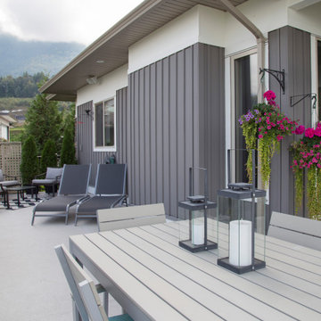
UserWe were thrilled to partner with Sherwin-Williams to have this homes tired brown exterior painted a fresh warm gray (Gauntlet Gray SW 7019), for the body and a beautiful creamy white for the trim (Greek villa SW 7551). We love it and hope that you do as well!
@sherwinwilliams #swcolorlove, #sponsorship #ad
 Reyes Creative Concepts LLC.
Living Room:
Our customer wanted to update the family room and the kitchen of this 1970's splanch. By painting the brick wall white and adding custom built-ins we brightened up the space. The decor reflects our client's love for color and a bit of asian style elements. We also made sure that the sitting was not only beautiful, but very comfortable and durable. The sofa and the accent chairs sit very comfortably and we used the performance fabrics to make sure they last through the years. We also wanted to highlight the art collection which the owner curated through the years.
Kithen:
We enlarged the kitchen by removing a partition wall that divided it from the dining room and relocated the entrance. Our goal was to create a warm and inviting kitchen, therefore we selected a mellow, neutral palette. The cabinets are soft Irish Cream as opposed to a bright white. The mosaic backsplash makes a statement, but remains subtle through its beige tones. We selected polished brass for the hardware, as well as brass and warm metals for the light fixtures which emit a warm and cozy glow.
For beauty and practicality, we used quartz for the working surface countertops and for the island we chose a sophisticated leather finish marble with strong movement and gold inflections. Because of our client’s love for Asian influences, we selected upholstery fabric with an image of a dragon, chrysanthemums to mimic Japanese textiles, and red accents scattered throughout.
Functionality, aesthetics, and expressing our clients vision was our main goal.
Photography: Jeanne Calarco, Context Media Development
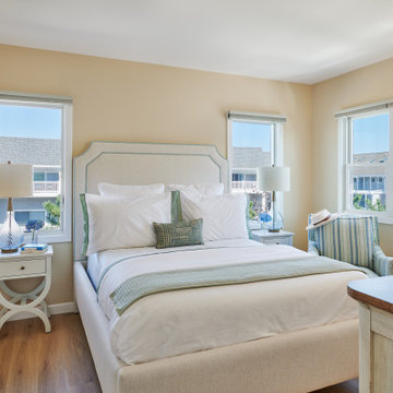 SHELLEY RODNER DESIGN / DDI
DESIGN CHALLENGES ADDRESSED:
To anyone who may be reading this project overview, I do hope you'll have the opportunity to
have a look at the 'before' photo of this space. It's quite a transformation!
Our clients purchased their condo at the beach several years ago. As shown in the 'before' photo,
the owner's bedroom suite was a dark and dated space with unsightly paneled walls, heavy faux
ceiling beams and outdated furniture. Everything felt cramped and cluttered throughout the
condo, especially their primary bedroom . The client's vision for this space was for everything to
have an airy and relaxed spa like feel.
DESIGN SOLUTIONS PROVIDED:
The entire condo was taken down to the stud. The faux beams were edited out and the ceiling
raised. The heavy out-dated paneling was removed and replaced with fresh clean walls that were
painted in a calming creamy tone throughout the entire condo.
The awkwardly positioned windows were removed. New windows were then added with great
attention to placement. On the main wall, windows were spaced to allow a queen sized bed to
nest perfectly in between them. Richly textured honeycomb cellular shades were selected with a
black out liner to tame the direct sun throughout the day.
The homeowners have two dogs and a cat who love a visit to the beach as much as their
'humans'. All of our updated new furniture selections successfully addressed the client's quest
for a 'pet friendly' environment.
The existing dark and gloomy furniture was replaced with stylish updated pieces. Great thought
was given to the size, scale and textiles used in this space. A custom upholstered bed with great
architectural detailing was selected. It's richly textured easy-care fabric in a soft oatmeal tone
created the perfect touch.
 LEDVANS
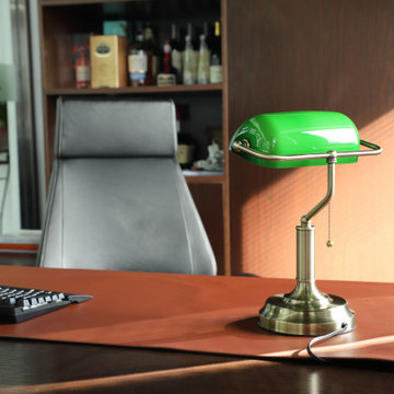
The green classic lampshade complements the metal base, showcasing an elegant and exquisite design. The pull chain switch design adds a touch of vintage charm, making you feel as if you are in an ancient library. Whether adding a historical atmosphere to the office or enhancing the unique style of home decor, this banker's lamp is an excellent choice.
 Sosna Inc
This project centered on helping a wonderful client and her equally fantastic dog transform her condo into a space that truly reflected her style and simplified her life. Eager to create a home that was both beautiful and functional, she envisioned a haven in the heart of the city.
Before: Feeling Disconnected
Before the renovation, our client felt disconnected from her condo. The builder-grade kitchen was a constant source of frustration, with an awkward peninsula that hindered the flow of the space. The condo overall felt outdated and no longer captured her vibrant personality. The foyer and laundry areas were cramped and lacked organization, while the mismatched hardwood flooring only added to the disjointed atmosphere. As for the bathrooms, they felt frozen in time, desperately needing an update.
Worries and Concerns
Like many homeowners, our client had heard her fair share of renovation horror stories—tales of projects gone awry and the frustrations of managing multiple contractors. She was understandably cautious and needed a trustworthy, experienced team she could rely on to handle the project with care and expertise.
The Solution: A Personalized Transformation
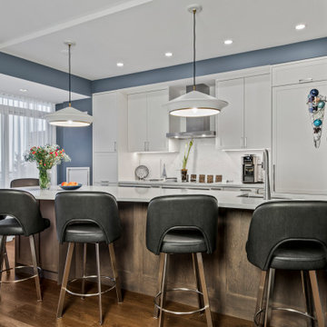
We took the time to listen carefully to our client’s needs and concerns and developed a tailored plan to address each of her pain points. For the kitchen, we preserved the existing layout but reimagined the space entirely. The awkward peninsula was redesigned to improve traffic flow and provide much-needed storage and counter space. Clever storage solutions, such as pull-outs, shelving, concealed drawers in the toe kicks, and an appliance garage, were incorporated. The kitchen now boasts a warm and inviting atmosphere, with light wood-tone lower cabinetry, off-white upper cabinets, and brushed nickel hardware that ties it all together.
The laundry room, once cramped and chaotic, was transformed into an organized, efficient space. We added custom cabinetry with pull-outs for hanging clothes, open storage above, a laundry sink, and a spacious counter for folding—no more piles of laundry!
Both the en-suite and shared bathrooms underwent complete renovations. Custom cabinetry was installed, including a floor-to-ceiling linen closet, and light grey and brown-toned tiles were selected, with contrasting hexagonal tiles for the shower floor. A heated flooring system was added for luxury and comfort year-round.
The mismatched flooring throughout the condo was replaced with cohesive vinyl and porcelain tiles, creating a seamless, modern aesthetic throughout the space.
Overcoming Challenges
As with any renovation, there were challenges to navigate. One of the key obstacles was managing the condo board’s renovation rules and policies while coordinating the delivery schedules for finishes and fixtures, especially during the busy holiday season. With careful planning, we ensured the project stayed on track. Additionally, we encountered a height variation between the tile and vinyl flooring. To resolve this, we used self-leveling material under the vinyl, ensuring a smooth and seamless transition between the two flooring types.
The Grand Reveal: A Dream Come True
The final result is simply stunning. The kitchen is now a chef’s dream, with custom-built cabinets, smooth quartz countertops, and a matching stone backsplash. Brushed nickel and stainless steel plumbing fixtures, elegant cabinet hardware, and LED lighting under the upper cabinets add the perfect finishing touches. Custom organizers in the foyer and laundry closets provide ample storage and keep everything neatly in place. The bathrooms have been transformed into spa-like retreats, with beautiful porcelain tiles and custom cabinetry. The new vinyl flooring throughout the main living areas and bedroom unifies the space, creating a cohesive and modern atmosphere.
Life Transformed
Our client’s life has been completely transformed. As a passionate cook, she now relishes spending time in her beautiful and functional kitchen. The single-bowl sink makes cleanup a breeze, and the thoughtfully designed storage solutions have brought a sense of calm and order to her home. The refreshed flooring and neutral paint palette have created a relaxing, comfortable environment she truly loves.
A Memorable Journey
This project was more than just a renovation—it was a collaboration. Our client valued our guidance throughout the design process, particularly when faced with the overwhelming number of decisions. We built a strong relationship with her, and we are immensely grateful for the trust she placed in our team.
 RAJ Kitchen and Bath, LLC
**Check out the video of this transformation on our website**
This small kitchen was way too small for this 2 bedrooms, 2 bathrooms apartment. Not only was it a very small kitchen, but the physical location of it made it very difficult to make it any bigger. There wasn't much that could have been done without incurring astronomical cost, which would get little or no return on the investment. The client wanted a kitchen that can be optimized in its current location to add a ton of value for resale.
This was difficult to do, because there was no moving of any mechanical around in the kitchen and even if we wanted to, the management of the building would not allow. For those of you who live in condos, co-ops or apartment building, you know how difficult it is to rework these foot prints. When we showed up, we saw the problems, but we also saw a huge opportunity where we can achieve those goals in the small space. This was accomplished by making some key changes and to incorporate some new things that was not possible when this kitchen was built years ago.
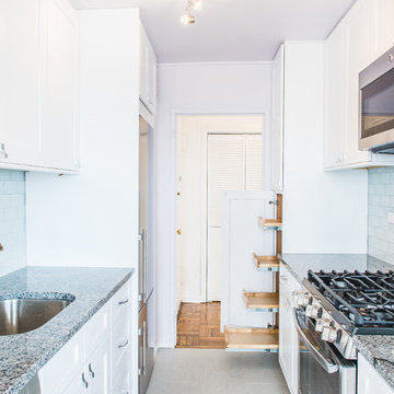
The crucial part of the design that would drive the entire new layout, was selecting the only appliance; that was the Refrigerator. Once we nailed down that refrigerator, we then proceeded to design the kitchen around it. We moved it to the other side of the wall where the sink was so that we can tap into the water line from the sink plumbing. It was crucial that it stays exactly 24" deep, not an inch more because we had to keep the entry as open as possible. Also, it was going to be directly in front of another big storage unit - The pantry. It is not ideal in most cases, but we needed the rest of the space to ramp up the design and open feel towards the side where all of the activities would take place, which happend to be the dining room and the view.
Once all that was figured out, we re-positioned the sink, dishwasher and the range and proceeded to wrap the cabinets around the columns to integrate them into the space. Thirty- six inches cabinets height was used so that they can be installed higher towards the ceiling height to give more room rather than the standard 18" required height between the counter tops. This was done to make the room feel a lot bigger than it really was. Not to mention, we also didn't want the faucet to be buried under the cabinets so that was also a necessary design detail for the space.
We then lowered both knee walls so that the counter top can sit on top of them, by removing that stop point that would have otherwise defined the kitchen area. This allowed us to pick up that extra footprint into the room for added prep space and enabled us to create the illusion of a kitchen that is looking longer than it really is. Every inch mattered when designing this kitchen and we made a conscious decision to use every one of that inch.
White cabinets were selected to do just what white cabinets are design to do; make a small or dark room appear bigger, brighter and more open. In this kitchen, this was amplified the more because of the kitchen location. It was perfect! We knew we did justice to the space because while we were there taking some photos, a few potential buyers walked in and went straight for the kitchen! They said its design just to fit the apartment.
Pantry roll out shelving, Double recycle bin, fancy handles, LED lighting, Quartz counter top, beautiful backslash tiles and grey linen floors finished off the kitchen which looked over a beautiful view of the George Washington Bridge from the top of this lovely 4th floor apartment.
Credit to Masterpiece Tile and Marble (Annmarie on the selection of Tiles and countertop and Val on the Construction to complete this project).
Davor Kokic Photography


 SENCE ARCHITECTS
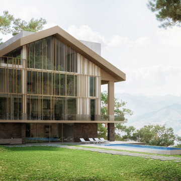
Nestled in the tranquil and picturesque mountainous region of Cyprus, the Hillside Haven project stands as a true testament to the harmonious integration of contemporary architecture with the natural environment.
The location, architecture, interior design, exterior design, and landscape design were all carefully planned and executed to create a seamless connection between the house and its natural surroundings. The result is a serene and calming oasis that is perfect for relaxation and unwinding.
Interior area / 575 sq.m
Covered terraces / 183 sq.m.
Opened terraces / 240 sq.m
Location / Cyprus, Limassol
Year / 2023
THE LOCATION AND ARCHITECTURE
The plot of land where the Hillside Haven project was built played a crucial role in the design of the house. The location was carefully selected to take advantage of the stunning natural beauty of the Cyprus mountains, with the orientation of the house being optimized to maximize sunlight and take in the breathtaking mountain views.
The topography of the site also provided ample opportunities for arranging outdoor living spaces, such as terraces, which were combined with the picturesque natural surroundings to create a seamless connection between the house and its environment.
THE INTERIOR DESIGN
The interior of the Hillside Haven project was designed with both practicality and luxury in mind. The house features four bedrooms and two separate bathrooms on the first floor, a spacious hall, and a master bedroom with a wardrobe, an additional bedroom, and a dressing room on the second floor. The interior spaces are characterized by a minimalist design, with an emphasis on clean lines and open spaces that maximize natural light.
THE EXTERIOR DESIGN
Featuring a modern and sophisticated facade that is both elegant and dynamic. The front of the house is characterized by a timber screening that provides both privacy and a sense of warmth and texture. Meanwhile, the rear facade features a dynamic composition of vertical wooden laths that create a striking visual effect. The carefully selected materials for the exterior include natural wood color for vertical and horizontal cladding slats, graphite-colored zinc roofing, natural wooden hemmed roof, pigmented concrete in white color, and natural stone veneer. The result is a house that is both beautiful and durable, capable of withstanding the harsh weather conditions of the Cyprus mountains.
THE LOCATION AND ARCHITECTURE
The plot of land where the Hillside Haven project was built played a crucial role in the design of the house. The location was carefully selected to take advantage of the stunning natural beauty of the Cyprus mountains, with the orientation of the house being optimized to maximize sunlight and take in the breathtaking mountain views.
The topography of the site also provided ample opportunities for arranging outdoor living spaces, such as terraces, which were combined with the picturesque natural surroundings to create a seamless connection between the house and its environment.
THE LANDSCAPE DESIGN
The landscape design of the Hillside Haven project was carefully planned to preserve the original amount of plantings and greenery as much as possible, while still adding a glass outdoor pool that has a reference point to the beautiful mountainous landscapes of Limassol. The pool is surrounded by a stone deck, creating a serene and calming oasis that is perfect for relaxation and unwinding.
The Hillside Haven project is a stunning example of modern and elegant architecture, designed to provide a luxurious escape from the hustle and bustle of city life.
 Reyes Creative Concepts LLC.
Living Room:
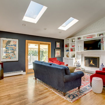
Our customer wanted to update the family room and the kitchen of this 1970's splanch. By painting the brick wall white and adding custom built-ins we brightened up the space. The decor reflects our client's love for color and a bit of asian style elements. We also made sure that the sitting was not only beautiful, but very comfortable and durable. The sofa and the accent chairs sit very comfortably and we used the performance fabrics to make sure they last through the years. We also wanted to highlight the art collection which the owner curated through the years.
Kithen:
We enlarged the kitchen by removing a partition wall that divided it from the dining room and relocated the entrance. Our goal was to create a warm and inviting kitchen, therefore we selected a mellow, neutral palette. The cabinets are soft Irish Cream as opposed to a bright white. The mosaic backsplash makes a statement, but remains subtle through its beige tones. We selected polished brass for the hardware, as well as brass and warm metals for the light fixtures which emit a warm and cozy glow.
For beauty and practicality, we used quartz for the working surface countertops and for the island we chose a sophisticated leather finish marble with strong movement and gold inflections. Because of our client’s love for Asian influences, we selected upholstery fabric with an image of a dragon, chrysanthemums to mimic Japanese textiles, and red accents scattered throughout.
Functionality, aesthetics, and expressing our clients vision was our main goal.
Photography: Jeanne Calarco, Context Media Development
 Powell Construction
This 1960’s home underwent a striking transformation--remodeling the kitchen, hall bathroom and laundry room. These homeowners dreamed of an open floor plan that would unite the kitchen and adjacent living areas. To accomplish this, we removed an imposing chimney that separated the kitchen from the living room. Additionally, we eliminated a weight-bearing wall that was between the kitchen and dining room. What a change! The spaces that formerly felt dark and confined are now bright and connected, comfortably accommodating larger gatherings.
When considering the specifics of design, we wanted to stay true to the home’s mid-century roots, while updating it with today’s style elements. Embracing the mid-century aspects, we played off some of the existing features of the home by mirroring them in the spaces we redesigned. To introduce today’s style, we thoughtfully incorporated the finishes and touches that would aptly reflect that component. The resulting design is beautifully juxtaposed by the homeowners’ treasured antique furniture pieces.
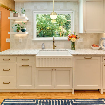
In the kitchen, we enhanced the open and airy feel by choosing a light greige color for the inset cabinetry paired with a tonal light-colored, blue-veined quartz for the countertops. These tones are perfectly complemented by the gold finishes of the cabinet hardware, faucets, and mid-century modern pendants. To maximize the storage potential of this kitchen, we customized the cabinetry with a convenient utensil organizer and a blind corner “cloud” pullout. A full height zellige-style tile backsplash with custom floating shelves makes for an impressive statement wall. With family get togethers in mind, we added an additional bar/prep sink and a spacious breakfast nook with a good deal of bench storage. A vertically-slatted wood half-wall separates the kitchen and breakfast nook, replicating the original mid-century wall detail at the entry.
Between the living room and kitchen, we designed a semi-open bar-height peninsula, accenting the bar front with a vertical shiplap kickplate in a bold blue. Carrying this color statement through the kitchen, the homeowner selected a “Navy Steel” Samsung Bespoke refrigerator and an AGA Mercury range, in “Blueberry.” These colors are also echoed in the multi-tonal quartz.
In the hall bathroom, we were aiming for the bright ambiance we’d achieved in the living areas. The penny round tile flooring and full height zellige-look tile combine for a classy, elevated look. In keeping with the kitchen, we installed similar gold fixtures and inset cabinetry and the same beautiful quartz countertop. The vanity towers provide these happy homeowners with additional room to store all their necessities.
Through the design process, we were able to gain square footage in the laundry room which allowed for the extra cabinet space the homeowners were looking for. Of course, a remodel is never complete without conveniences for the pets. The kitty’s litter box is neatly tucked in the cabinet behind a custom cat-cutout--a cute and tidy idea!
Kitchen Selections: Cabinet color-Farrow & Ball Ammonite No. 274; Countertops-Silestone Pietra; Cabinet hardware-Top Knobs Barrington collection in Honey Bronze; Pendants-Rejuvenation Palo Alto; Faucets- Delta Trinsic in Champagne Bronze; Tile-Tilebar Portmore 4x4 in White; Island bar shiplap color-Farrow and Ball Wine Dark No. 308
Bathroom Selections: Floor tile-Cepac Classic Rounds in Cloud; Tile-Tilebar Portmore 4x4 in White; Cabinet color-Farrow & Ball Purbeck Stone No. 275; Countertop-Silestone Pietra; Faucet-Delta Trinsic in Champagne Bronze
 Jane Reece Interiors
*Kitchen Remodel in Southwest Austin: A Modern Transformation by Jane Reece Interiors*
At Jane Reece Interiors (JRI), we believe that every kitchen should reflect the homeowner's personality while offering a functional, modern design. Our recent kitchen remodel in Southwest Austin perfectly embodies this philosophy, as we took an outdated oak kitchen and gave it a striking new look while maintaining some of its original charm.
*Preserving the Classic, Enhancing the Modern*
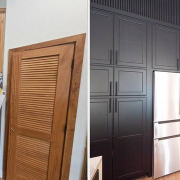
The original oak cabinets were a staple of this kitchen’s design, so rather than replacing them, we chose to breathe new life into them with Sherwin Williams' Caviar (SW 6990). This rich, sophisticated black not only modernized the cabinetry but set the tone for the entire kitchen. The deep hue created a stunning contrast with the fluted glass we used to replace the dated glass inserts. The fluted glass pulls back on the design element we incorporated throughout the space—fluted wood, adding texture and elegance.
*Fluted Wood Details: A Signature Touch*
The fluted wood became a defining design element in this remodel. To bring a sense of cohesion, we added fluted wood in several areas:
- *Custom Vent Hood:* We designed a curved wrap around the vent hood with fluted wood, making it a focal point of the kitchen.
- *Above-Cabinet Finishing:* In the empty space above the cabinets, the same fluted wood extends all the way to the ceiling, adding height and sophistication.
- *Island Design:* The island’s front is also covered in fluted wood, tying it all together and creating visual harmony.
*Opening Up the Space*
One of the most significant changes we made was removing a wall with an arch that blocked the kitchen from the rest of the home. By eliminating this obstruction, we created an open-concept design that seamlessly connects the kitchen to the living space, enhancing both flow and functionality. This openness is further accentuated by lowering the breakfast bar to countertop level, which allowed us to install a spacious island capable of seating 6-8 people comfortably.
*Luxury Meets Functionality*
For the countertops, we selected *Ijen Azul*—a stunning natural stone featuring a white base with captivating gold, cream, and black veins. This choice brings lightness and sophistication to the room, balancing the bold black cabinetry while making the space feel bright and open.
As a final touch, we replaced the pantry door with an arched black metal door with fluted glass. Though not shown here, we also remodeled the pantry’s interior, enhancing its organization and making it more compatible with the homeowner’s needs.
*A Transformation for Modern Living*
The result of this remodel is a transformed kitchen that merges contemporary design with functional details. From the dramatic black cabinetry and luxe countertops to the carefully placed fluted wood accents, every aspect of this kitchen was designed with elegance and usability in mind. What was once an outdated oak kitchen is now a stunning, open-flow black kitchen that serves as the heart of the home.
At Jane Reece Interiors, we’re proud to have turned this vision into reality, and we look forward to continuing to create spaces that inspire.
Explore the full color palette here: [Sherwin-Williams Caviar]( https://www.sherwin-williams.com/en-u...)
Explore more at http://www.janereece.com
#interiordesign #janereeceinteriors #interiordesignaustin #ASID #Janereece #Blackkitchen #kitchenremodel #contemporarykitchen


 Sosna Inc
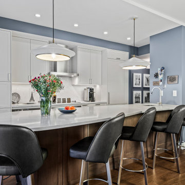
This project centered on helping a wonderful client and her equally fantastic dog transform her condo into a space that truly reflected her style and simplified her life. Eager to create a home that was both beautiful and functional, she envisioned a haven in the heart of the city.
Before: Feeling Disconnected
Before the renovation, our client felt disconnected from her condo. The builder-grade kitchen was a constant source of frustration, with an awkward peninsula that hindered the flow of the space. The condo overall felt outdated and no longer captured her vibrant personality. The foyer and laundry areas were cramped and lacked organization, while the mismatched hardwood flooring only added to the disjointed atmosphere. As for the bathrooms, they felt frozen in time, desperately needing an update.
Worries and Concerns
Like many homeowners, our client had heard her fair share of renovation horror stories—tales of projects gone awry and the frustrations of managing multiple contractors. She was understandably cautious and needed a trustworthy, experienced team she could rely on to handle the project with care and expertise.
The Solution: A Personalized Transformation
We took the time to listen carefully to our client’s needs and concerns and developed a tailored plan to address each of her pain points. For the kitchen, we preserved the existing layout but reimagined the space entirely. The awkward peninsula was redesigned to improve traffic flow and provide much-needed storage and counter space. Clever storage solutions, such as pull-outs, shelving, concealed drawers in the toe kicks, and an appliance garage, were incorporated. The kitchen now boasts a warm and inviting atmosphere, with light wood-tone lower cabinetry, off-white upper cabinets, and brushed nickel hardware that ties it all together.
The laundry room, once cramped and chaotic, was transformed into an organized, efficient space. We added custom cabinetry with pull-outs for hanging clothes, open storage above, a laundry sink, and a spacious counter for folding—no more piles of laundry!
Both the en-suite and shared bathrooms underwent complete renovations. Custom cabinetry was installed, including a floor-to-ceiling linen closet, and light grey and brown-toned tiles were selected, with contrasting hexagonal tiles for the shower floor. A heated flooring system was added for luxury and comfort year-round.
The mismatched flooring throughout the condo was replaced with cohesive vinyl and porcelain tiles, creating a seamless, modern aesthetic throughout the space.
Overcoming Challenges
As with any renovation, there were challenges to navigate. One of the key obstacles was managing the condo board’s renovation rules and policies while coordinating the delivery schedules for finishes and fixtures, especially during the busy holiday season. With careful planning, we ensured the project stayed on track. Additionally, we encountered a height variation between the tile and vinyl flooring. To resolve this, we used self-leveling material under the vinyl, ensuring a smooth and seamless transition between the two flooring types.
The Grand Reveal: A Dream Come True
The final result is simply stunning. The kitchen is now a chef’s dream, with custom-built cabinets, smooth quartz countertops, and a matching stone backsplash. Brushed nickel and stainless steel plumbing fixtures, elegant cabinet hardware, and LED lighting under the upper cabinets add the perfect finishing touches. Custom organizers in the foyer and laundry closets provide ample storage and keep everything neatly in place. The bathrooms have been transformed into spa-like retreats, with beautiful porcelain tiles and custom cabinetry. The new vinyl flooring throughout the main living areas and bedroom unifies the space, creating a cohesive and modern atmosphere.
Life Transformed
Our client’s life has been completely transformed. As a passionate cook, she now relishes spending time in her beautiful and functional kitchen. The single-bowl sink makes cleanup a breeze, and the thoughtfully designed storage solutions have brought a sense of calm and order to her home. The refreshed flooring and neutral paint palette have created a relaxing, comfortable environment she truly loves.
A Memorable Journey
This project was more than just a renovation—it was a collaboration. Our client valued our guidance throughout the design process, particularly when faced with the overwhelming number of decisions. We built a strong relationship with her, and we are immensely grateful for the trust she placed in our team.
 Williamsons Kitchens
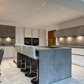
This stunning kitchen project in Fraserburgh perfectly blends modern aesthetics with functionality. The client envisioned a contemporary kitchen that maximised practicality while incorporating a striking island.
To achieve the desired look, we selected the Nolte Lux range with integrated MatrixArt handleless trims for a sleek and seamless appearance. Finished in Gloss White, the cabinetry is paired with Beton Concrete accents, creating a balanced mix of light and texture for a truly sophisticated feel.
The worktops, also by Nolte, feature a robust 40mm Concrete design, adding to the industrial yet refined charm of the space.
High-performance NEFF appliances were chosen to ensure the kitchen meets the demands of modern living. These include two Slide&Hide single ovens, a vented induction hob with an integrated extractor, and essential built-in appliances such as a fridge freezer and dishwasher.
A Blanco Zia sink in Anthracite was paired with a Quooker Fusion Square tap in a Chrome finish, offering instant boiling water for added convenience.
To enhance the flow of the home, a structural wall was removed, opening the kitchen into the conservatory and creating a spacious living area ideal for family gatherings and shared meals.
The multifunctional island serves as a focal point, combining a cooking zone, washing-up area, and informal dining space. Tall units were meticulously designed to extend to the ceiling, incorporating a goal post niche for added storage and visual interest.
Our expert team fully managed this project, ensuring a seamless experience from start to finish. Detailed drawings were provided to all on-site trades, resulting in a beautifully executed kitchen tailored to the client’s needs.
Ready to transform your space? Contact us today to begin your journey towards the kitchen of your dreams!
 Penny Black Interiors LLC.
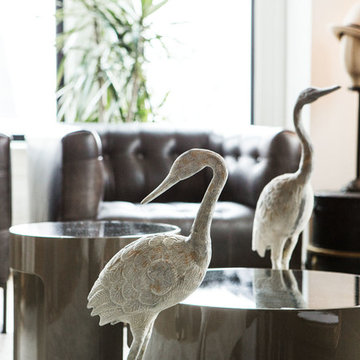
This 1896 Italianate Victorian home in Portland Heights was all but derelict in 2017.
We partnered with Look Construction LLC. to save this iconic home that sits atop a steep embankment—a huge challenge for the necessary new foundation. The house was lifted and new foundation poured adding 4 feet and a whole new floor to boot.
It had been stripped of all its original interior character over the years, so the design replaced and added to what was there originally. We re-designed the home’s layout, reconfiguring the kitchen, moving the lower staircase, adding a staircase to the loft room and rebuilding the widows walk roof deck. All doorways were raised to 9 feet to add to the sense of space.
Finally, we splurged on a selection of incredible wallpapers to add drama and romance to this stunning show piece of a home.
The Penny Black House is featured in Gray Magazine #39, April 2018.
117