
Search results for "Select 'adding'" in Home Design Ideas
 Design Connection, Inc.
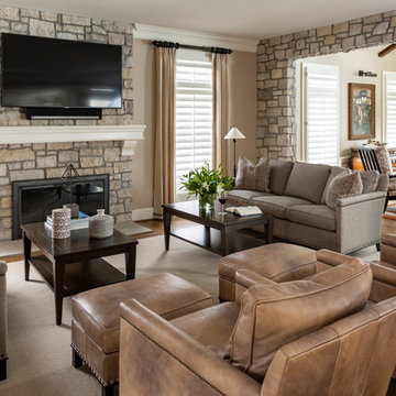
Before the renovation, the living room looked cramped – large pieces of furniture made the space feel stuffy. Design Connection, Inc.’s design concept scaled down the furniture and added depth and warmth.
We added drapery over the shutters to flank the fireplace. Smaller, lower-scale pieces gave the living room more depth and added seating for entertaining and relaxing. With two sofas, two chairs, two coffee tables and two ottomans, this room still feels open!
Design Connection, Inc. provided space planning, AutoCAD drawings, selections for lighting fixtures, furniture, area rugs, accessories, paint and stain colors, stone, window treatments, project management between the client and the contractors to keep the integrity of Design Connection, Inc.’s high standards and designs.
 Sosna Inc
This project centered on helping a wonderful client and her equally fantastic dog transform her condo into a space that truly reflected her style and simplified her life. Eager to create a home that was both beautiful and functional, she envisioned a haven in the heart of the city.
Before: Feeling Disconnected
Before the renovation, our client felt disconnected from her condo. The builder-grade kitchen was a constant source of frustration, with an awkward peninsula that hindered the flow of the space. The condo overall felt outdated and no longer captured her vibrant personality. The foyer and laundry areas were cramped and lacked organization, while the mismatched hardwood flooring only added to the disjointed atmosphere. As for the bathrooms, they felt frozen in time, desperately needing an update.
Worries and Concerns
Like many homeowners, our client had heard her fair share of renovation horror stories—tales of projects gone awry and the frustrations of managing multiple contractors. She was understandably cautious and needed a trustworthy, experienced team she could rely on to handle the project with care and expertise.
The Solution: A Personalized Transformation
We took the time to listen carefully to our client’s needs and concerns and developed a tailored plan to address each of her pain points. For the kitchen, we preserved the existing layout but reimagined the space entirely. The awkward peninsula was redesigned to improve traffic flow and provide much-needed storage and counter space. Clever storage solutions, such as pull-outs, shelving, concealed drawers in the toe kicks, and an appliance garage, were incorporated. The kitchen now boasts a warm and inviting atmosphere, with light wood-tone lower cabinetry, off-white upper cabinets, and brushed nickel hardware that ties it all together.
The laundry room, once cramped and chaotic, was transformed into an organized, efficient space. We added custom cabinetry with pull-outs for hanging clothes, open storage above, a laundry sink, and a spacious counter for folding—no more piles of laundry!
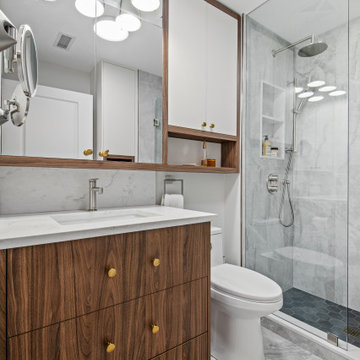
Both the en-suite and shared bathrooms underwent complete renovations. Custom cabinetry was installed, including a floor-to-ceiling linen closet, and light grey and brown-toned tiles were selected, with contrasting hexagonal tiles for the shower floor. A heated flooring system was added for luxury and comfort year-round.
The mismatched flooring throughout the condo was replaced with cohesive vinyl and porcelain tiles, creating a seamless, modern aesthetic throughout the space.
Overcoming Challenges
As with any renovation, there were challenges to navigate. One of the key obstacles was managing the condo board’s renovation rules and policies while coordinating the delivery schedules for finishes and fixtures, especially during the busy holiday season. With careful planning, we ensured the project stayed on track. Additionally, we encountered a height variation between the tile and vinyl flooring. To resolve this, we used self-leveling material under the vinyl, ensuring a smooth and seamless transition between the two flooring types.
The Grand Reveal: A Dream Come True
The final result is simply stunning. The kitchen is now a chef’s dream, with custom-built cabinets, smooth quartz countertops, and a matching stone backsplash. Brushed nickel and stainless steel plumbing fixtures, elegant cabinet hardware, and LED lighting under the upper cabinets add the perfect finishing touches. Custom organizers in the foyer and laundry closets provide ample storage and keep everything neatly in place. The bathrooms have been transformed into spa-like retreats, with beautiful porcelain tiles and custom cabinetry. The new vinyl flooring throughout the main living areas and bedroom unifies the space, creating a cohesive and modern atmosphere.
Life Transformed
Our client’s life has been completely transformed. As a passionate cook, she now relishes spending time in her beautiful and functional kitchen. The single-bowl sink makes cleanup a breeze, and the thoughtfully designed storage solutions have brought a sense of calm and order to her home. The refreshed flooring and neutral paint palette have created a relaxing, comfortable environment she truly loves.
A Memorable Journey
This project was more than just a renovation—it was a collaboration. Our client valued our guidance throughout the design process, particularly when faced with the overwhelming number of decisions. We built a strong relationship with her, and we are immensely grateful for the trust she placed in our team.
 French Creek Designs Kitchen & Bath Design Center
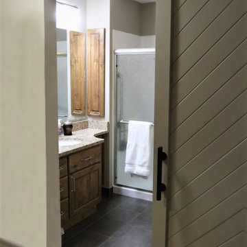
New Master Bath Remodel includes Ditra-Heat flooring for that extra warmth all year round. The door opening to the Master Bath was widened and a farm door added for easier access; aging in place. The ‘notch’ in the Master Countertop was added for ease of shower access. A hidden pull-out drawer was added in Master Bath for extra storage.
Large 12×24 Anthracite Black Porcelain Tile was used for the floor. Use of Stained Alder Knotty Cabinets with Giallo Ornamental Granite Countertops and offset with a White Undermount Sink.
French Creek Designs Kitchen & Bath Design Studio – where selections begin. Let us design and dream with you. Overwhelmed on where to start that Home Improvement, Kitchen or Bath Project? Let our Designers video conference or sit down with you, take the overwhelming out of the picture and assist in choosing your materials. Whether new construction, full remodel or just a partial remodel, we can help you to make it an enjoyable experience to design your dream space.
“Making Your Home Beautiful One Room at a Time with your local Kitchen & Bath Experts at French Creek Designs Center.”
#openforbusiness #casper #wyoming #casperbusiness #frenchcreekdesigns #shoplocal #casperwyoming #bathremodeling #bathdesigners #pebbles #niche #showersurround #showertiles #showerdrains #showerbench #cabinets #countertops #knobsandpulls #sinksandfaucets #flooring #tileandmosiacs #laundryremodel #homeimprovement
Find the right local pro for your project
 Eccentricity Designs LLC
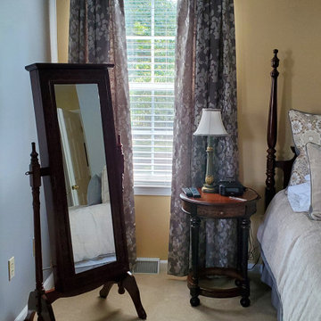
This client asked for help to upgrade her bedroom. She said her "safe" decorating style left something to be desired and she didn't know how to wake it up. The furniture was to remain however the room had great architectural lines to accent. I selected two colors that helped define the lines in the architecture. The bedding was added and we proceeded to move forward on the window treatments. The fabric is a rich cotton blend with a slight shimmer in the leaf pattern. With such short window walls I felt valances drew the eye down (shown in the before images) so they were not added to the new draperies. There is a custom cornice on the small window by the dressing area that coordinates with the draperies. The bench was reupholstered and a new centerpiece was added for the top of the television.
The client is soo pleased with the changes.
 Concepts & Dimensions
Simply elegant. Postively Serene.
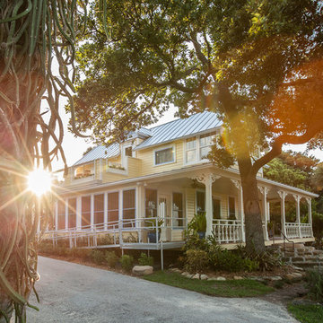
SolRisa Inn; A Historic Bed & Breakfast that evokes a fine old Caribbean home that combined discrete accessibility.
The renovation of two Indian River side homes into the Bed & Breakfast was two years in completion.
...stripped and put back together;
original architectural elements restored...the second floor porch added for a river view
 RAJ Kitchen and Bath, LLC
**Check out the video of this transformation on our website**
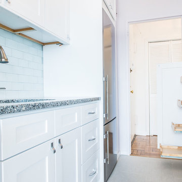
This small kitchen was way too small for this 2 bedrooms, 2 bathrooms apartment. Not only was it a very small kitchen, but the physical location of it made it very difficult to make it any bigger. There wasn't much that could have been done without incurring astronomical cost, which would get little or no return on the investment. The client wanted a kitchen that can be optimized in its current location to add a ton of value for resale.
This was difficult to do, because there was no moving of any mechanical around in the kitchen and even if we wanted to, the management of the building would not allow. For those of you who live in condos, co-ops or apartment building, you know how difficult it is to rework these foot prints. When we showed up, we saw the problems, but we also saw a huge opportunity where we can achieve those goals in the small space. This was accomplished by making some key changes and to incorporate some new things that was not possible when this kitchen was built years ago.
The crucial part of the design that would drive the entire new layout, was selecting the only appliance; that was the Refrigerator. Once we nailed down that refrigerator, we then proceeded to design the kitchen around it. We moved it to the other side of the wall where the sink was so that we can tap into the water line from the sink plumbing. It was crucial that it stays exactly 24" deep, not an inch more because we had to keep the entry as open as possible. Also, it was going to be directly in front of another big storage unit - The pantry. It is not ideal in most cases, but we needed the rest of the space to ramp up the design and open feel towards the side where all of the activities would take place, which happend to be the dining room and the view.
Once all that was figured out, we re-positioned the sink, dishwasher and the range and proceeded to wrap the cabinets around the columns to integrate them into the space. Thirty- six inches cabinets height was used so that they can be installed higher towards the ceiling height to give more room rather than the standard 18" required height between the counter tops. This was done to make the room feel a lot bigger than it really was. Not to mention, we also didn't want the faucet to be buried under the cabinets so that was also a necessary design detail for the space.
We then lowered both knee walls so that the counter top can sit on top of them, by removing that stop point that would have otherwise defined the kitchen area. This allowed us to pick up that extra footprint into the room for added prep space and enabled us to create the illusion of a kitchen that is looking longer than it really is. Every inch mattered when designing this kitchen and we made a conscious decision to use every one of that inch.
White cabinets were selected to do just what white cabinets are design to do; make a small or dark room appear bigger, brighter and more open. In this kitchen, this was amplified the more because of the kitchen location. It was perfect! We knew we did justice to the space because while we were there taking some photos, a few potential buyers walked in and went straight for the kitchen! They said its design just to fit the apartment.
Pantry roll out shelving, Double recycle bin, fancy handles, LED lighting, Quartz counter top, beautiful backslash tiles and grey linen floors finished off the kitchen which looked over a beautiful view of the George Washington Bridge from the top of this lovely 4th floor apartment.
Credit to Masterpiece Tile and Marble (Annmarie on the selection of Tiles and countertop and Val on the Construction to complete this project).
Davor Kokic Photography
 Ridgeway Interiors
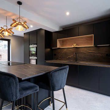
Set in the picturesque Hughendon Valley in High Wycombe, this kitchen project showcases a stunning blend of modern design and inviting warmth. The client’s goal was to create a kitchen that was not only visually striking but also highly functional and welcoming.
The kitchen boasts a sleek black Nobilia handleless design, offering a contemporary and streamlined look. This is perfectly complemented by top-of-the-line Siemens appliances, providing aesthetic appeal and unmatched performance.
A beautifully detailed Dekton worktop adds a touch of luxury and practicality to the kitchen. The central island, featuring seating and a hob, becomes the heart of the space – perfect for social cooking and casual dining.
Open wooden shelving was incorporated to balance the modern black finish, adding a natural warmth to the space. The under-cabinet and worktop lighting enhance functionality and create a soft, inviting ambience.
Are you inspired by the Black Nobilia Kitchen and looking to infuse a blend of modern elegance and warmth into your kitchen? Get in touch to see how we can bring this balance into your home.

Sponsored
Columbus, OH

Structural Remodeling
Franklin County's Heavy Timber Specialists | Best of Houzz 2020!
 Phoenix Home Remodeling
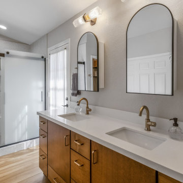
Eric and Jeni's master bathroom had always been functional, but it never quite lived up to the luxurious escape they desired. The cabinets were lackluster, offering basic storage, but they didn't contribute much to the room's aesthetics.
For cabinets, they selected Sollid Designer Series Cabinetry in Metro Cognac for both functionality and visual warmth. To top these cabinets, White Sand Quartz countertops were chosen, blending durability and elegance.
Delta Trinsic faucets in Champagne Bronze were selected to pair beautifully with two arched metal mirrors with contrasting black frames, adding refined modernity.
A Kohler sliding semi-frameless shower door with frosted glass and the Delta shower head in Champagne Bronze add the elegance desired by the homeowners.
Eric and Jeni made the great selections of Reside Beige tiles on the shower floor, and Terrazzo White tiles for the walls. An over-sized wall niche for the shower and a long bench with a quartz countertop seat were installed to complete the custom elegance of their new space.
 RAJ Kitchen and Bath, LLC
**Check out the video of this transformation on our website**
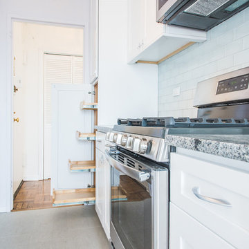
This small kitchen was way too small for this 2 bedrooms, 2 bathrooms apartment. Not only was it a very small kitchen, but the physical location of it made it very difficult to make it any bigger. There wasn't much that could have been done without incurring astronomical cost, which would get little or no return on the investment. The client wanted a kitchen that can be optimized in its current location to add a ton of value for resale.
This was difficult to do, because there was no moving of any mechanical around in the kitchen and even if we wanted to, the management of the building would not allow. For those of you who live in condos, co-ops or apartment building, you know how difficult it is to rework these foot prints. When we showed up, we saw the problems, but we also saw a huge opportunity where we can achieve those goals in the small space. This was accomplished by making some key changes and to incorporate some new things that was not possible when this kitchen was built years ago.
The crucial part of the design that would drive the entire new layout, was selecting the only appliance; that was the Refrigerator. Once we nailed down that refrigerator, we then proceeded to design the kitchen around it. We moved it to the other side of the wall where the sink was so that we can tap into the water line from the sink plumbing. It was crucial that it stays exactly 24" deep, not an inch more because we had to keep the entry as open as possible. Also, it was going to be directly in front of another big storage unit - The pantry. It is not ideal in most cases, but we needed the rest of the space to ramp up the design and open feel towards the side where all of the activities would take place, which happend to be the dining room and the view.
Once all that was figured out, we re-positioned the sink, dishwasher and the range and proceeded to wrap the cabinets around the columns to integrate them into the space. Thirty- six inches cabinets height was used so that they can be installed higher towards the ceiling height to give more room rather than the standard 18" required height between the counter tops. This was done to make the room feel a lot bigger than it really was. Not to mention, we also didn't want the faucet to be buried under the cabinets so that was also a necessary design detail for the space.
We then lowered both knee walls so that the counter top can sit on top of them, by removing that stop point that would have otherwise defined the kitchen area. This allowed us to pick up that extra footprint into the room for added prep space and enabled us to create the illusion of a kitchen that is looking longer than it really is. Every inch mattered when designing this kitchen and we made a conscious decision to use every one of that inch.
White cabinets were selected to do just what white cabinets are design to do; make a small or dark room appear bigger, brighter and more open. In this kitchen, this was amplified the more because of the kitchen location. It was perfect! We knew we did justice to the space because while we were there taking some photos, a few potential buyers walked in and went straight for the kitchen! They said its design just to fit the apartment.
Pantry roll out shelving, Double recycle bin, fancy handles, LED lighting, Quartz counter top, beautiful backslash tiles and grey linen floors finished off the kitchen which looked over a beautiful view of the George Washington Bridge from the top of this lovely 4th floor apartment.
Credit to Masterpiece Tile and Marble (Annmarie on the selection of Tiles and countertop and Val on the Construction to complete this project).
Davor Kokic Photography
 Philip Petrino Interior Design
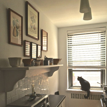
Though the space is narrow, further storage and dispaly was added creating a very functional galley. The window overlooking the terrace is another of Mr. C's favorite vantage points.
 Rockledge Design + Architecture
To help make this family room in Wexford more functional and cohesive, we added new custom built-in storage around the brick fireplace. On the left side, an existing built-in was situated in between the fireplace and a small closet, which also contained a sink. We started by peeling away these elements to create a larger space.
Adding symmetry to the room, we designed new cabinetry which included a mix of hidden and open shelf storage. Behind full-height pocketing doors on the left, a new wet bar with a tiled backsplash and quartz countertop. On the right, another set of pocketing doors conceals three large drawers, plus overflow toy storage for the adjacent playroom. Immediately flanking the fireplace, bookshelves provide a space to display favorite items with even more storage beneath.
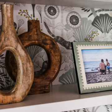
To balance the room’s rich wood tones and multi-tonal red brick, we helped the clients select a neutral color palette to make the space feel more relaxed. Complimentary colors and textures are added through the playful wallpaper lining the back of the shelves, and hexagon backsplash tile. A stylish new fireplace faceplate, gallery lighting, and cabinet hardware — each in a dark metal finish — help to tie everything together.
 RAJ Kitchen and Bath, LLC
**Check out the video of this transformation on our website**
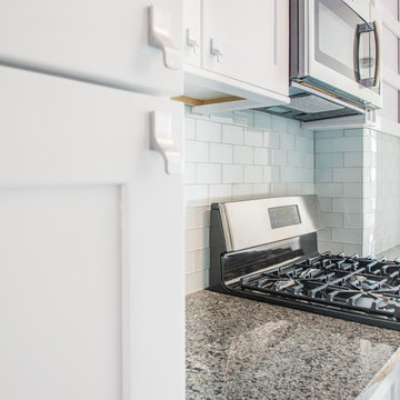
This small kitchen was way too small for this 2 bedrooms, 2 bathrooms apartment. Not only was it a very small kitchen, but the physical location of it made it very difficult to make it any bigger. There wasn't much that could have been done without incurring astronomical cost, which would get little or no return on the investment. The client wanted a kitchen that can be optimized in its current location to add a ton of value for resale.
This was difficult to do, because there was no moving of any mechanical around in the kitchen and even if we wanted to, the management of the building would not allow. For those of you who live in condos, co-ops or apartment building, you know how difficult it is to rework these foot prints. When we showed up, we saw the problems, but we also saw a huge opportunity where we can achieve those goals in the small space. This was accomplished by making some key changes and to incorporate some new things that was not possible when this kitchen was built years ago.
The crucial part of the design that would drive the entire new layout, was selecting the only appliance; that was the Refrigerator. Once we nailed down that refrigerator, we then proceeded to design the kitchen around it. We moved it to the other side of the wall where the sink was so that we can tap into the water line from the sink plumbing. It was crucial that it stays exactly 24" deep, not an inch more because we had to keep the entry as open as possible. Also, it was going to be directly in front of another big storage unit - The pantry. It is not ideal in most cases, but we needed the rest of the space to ramp up the design and open feel towards the side where all of the activities would take place, which happend to be the dining room and the view.
Once all that was figured out, we re-positioned the sink, dishwasher and the range and proceeded to wrap the cabinets around the columns to integrate them into the space. Thirty- six inches cabinets height was used so that they can be installed higher towards the ceiling height to give more room rather than the standard 18" required height between the counter tops. This was done to make the room feel a lot bigger than it really was. Not to mention, we also didn't want the faucet to be buried under the cabinets so that was also a necessary design detail for the space.
We then lowered both knee walls so that the counter top can sit on top of them, by removing that stop point that would have otherwise defined the kitchen area. This allowed us to pick up that extra footprint into the room for added prep space and enabled us to create the illusion of a kitchen that is looking longer than it really is. Every inch mattered when designing this kitchen and we made a conscious decision to use every one of that inch.
White cabinets were selected to do just what white cabinets are design to do; make a small or dark room appear bigger, brighter and more open. In this kitchen, this was amplified the more because of the kitchen location. It was perfect! We knew we did justice to the space because while we were there taking some photos, a few potential buyers walked in and went straight for the kitchen! They said its design just to fit the apartment.
Pantry roll out shelving, Double recycle bin, fancy handles, LED lighting, Quartz counter top, beautiful backslash tiles and grey linen floors finished off the kitchen which looked over a beautiful view of the George Washington Bridge from the top of this lovely 4th floor apartment.
Credit to Masterpiece Tile and Marble (Annmarie on the selection of Tiles and countertop and Val on the Construction to complete this project).
Davor Kokic Photography
 Connecticut Roofcrafters Llc
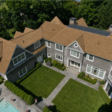
This intricate Western Red Cedar installation combines traditional craftsmanship with high-performance materials suited to its wooded Connecticut River setting. CCA-treated tapersawn cedar from Waska Mills was selected for enhanced resistance to fungal growth—an important advantage in a shaded, moisture-prone environment near the brackish river. Beneath the cedar, Grace Select underlayment provides an added moisture barrier, topped with Cedar Breather matting to promote airflow and help the roof dry properly. Complex rooflines and transitions showcase the cedar’s natural character, while a Firestone .090 EPDM membrane provides durable protection across the expansive low-slope section, creating a carefully integrated hybrid roofing system.


 User
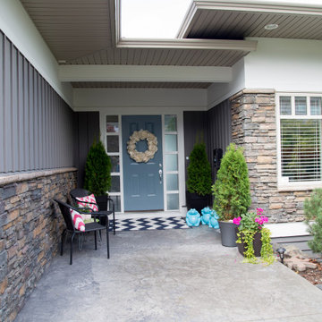
UserWe were thrilled to partner with Sherwin-Williams to have this homes tired brown exterior painted a fresh warm gray (Gauntlet Gray SW 7019), for the body and a beautiful creamy white for the trim (Greek villa SW 7551). We love it and hope that you do as well!
@sherwinwilliams #swcolorlove, #sponsorship #ad
 Powell Construction
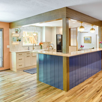
This 1960’s home underwent a striking transformation--remodeling the kitchen, hall bathroom and laundry room. These homeowners dreamed of an open floor plan that would unite the kitchen and adjacent living areas. To accomplish this, we removed an imposing chimney that separated the kitchen from the living room. Additionally, we eliminated a weight-bearing wall that was between the kitchen and dining room. What a change! The spaces that formerly felt dark and confined are now bright and connected, comfortably accommodating larger gatherings.
When considering the specifics of design, we wanted to stay true to the home’s mid-century roots, while updating it with today’s style elements. Embracing the mid-century aspects, we played off some of the existing features of the home by mirroring them in the spaces we redesigned. To introduce today’s style, we thoughtfully incorporated the finishes and touches that would aptly reflect that component. The resulting design is beautifully juxtaposed by the homeowners’ treasured antique furniture pieces.
In the kitchen, we enhanced the open and airy feel by choosing a light greige color for the inset cabinetry paired with a tonal light-colored, blue-veined quartz for the countertops. These tones are perfectly complemented by the gold finishes of the cabinet hardware, faucets, and mid-century modern pendants. To maximize the storage potential of this kitchen, we customized the cabinetry with a convenient utensil organizer and a blind corner “cloud” pullout. A full height zellige-style tile backsplash with custom floating shelves makes for an impressive statement wall. With family get togethers in mind, we added an additional bar/prep sink and a spacious breakfast nook with a good deal of bench storage. A vertically-slatted wood half-wall separates the kitchen and breakfast nook, replicating the original mid-century wall detail at the entry.
Between the living room and kitchen, we designed a semi-open bar-height peninsula, accenting the bar front with a vertical shiplap kickplate in a bold blue. Carrying this color statement through the kitchen, the homeowner selected a “Navy Steel” Samsung Bespoke refrigerator and an AGA Mercury range, in “Blueberry.” These colors are also echoed in the multi-tonal quartz.
In the hall bathroom, we were aiming for the bright ambiance we’d achieved in the living areas. The penny round tile flooring and full height zellige-look tile combine for a classy, elevated look. In keeping with the kitchen, we installed similar gold fixtures and inset cabinetry and the same beautiful quartz countertop. The vanity towers provide these happy homeowners with additional room to store all their necessities.
Through the design process, we were able to gain square footage in the laundry room which allowed for the extra cabinet space the homeowners were looking for. Of course, a remodel is never complete without conveniences for the pets. The kitty’s litter box is neatly tucked in the cabinet behind a custom cat-cutout--a cute and tidy idea!
Kitchen Selections: Cabinet color-Farrow & Ball Ammonite No. 274; Countertops-Silestone Pietra; Cabinet hardware-Top Knobs Barrington collection in Honey Bronze; Pendants-Rejuvenation Palo Alto; Faucets- Delta Trinsic in Champagne Bronze; Tile-Tilebar Portmore 4x4 in White; Island bar shiplap color-Farrow and Ball Wine Dark No. 308
Bathroom Selections: Floor tile-Cepac Classic Rounds in Cloud; Tile-Tilebar Portmore 4x4 in White; Cabinet color-Farrow & Ball Purbeck Stone No. 275; Countertop-Silestone Pietra; Faucet-Delta Trinsic in Champagne Bronze
 Sandra Hambley
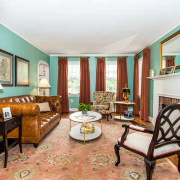
A charming Airbnb, favorite restaurant, cozy coffee house, or a piece of artwork can all serve as design inspiration for your decor. How wonderful would it be to bring the colors, patterns, shapes, fabrics, or textures of those beloved places or things into your own home? That is exactly what Janet Aurora’s client was hoping to do. Her favorite restaurant, The Ivy Chelsea Garden, is located in London and features tufted leather sofas and benches, hues of salmon and sage, botanical patterns, and artwork surrounded by lush gardens and flowers. Take a look at how Janet used this point of inspiration in the client’s living room, dining room, entryway and study.
~ Dining Room ~
To accommodate space for a dining room table that would seat eight, we eliminated the existing fireplace. Janet custom designed a table with a beautiful wrought iron base and marble top, selected botanical prints for a gallery wall, and floral valances for the windows, all set against a fresh turquoise backdrop.
~ Living Room ~
Nods to The Ivy Chelsea Garden can be seen throughout the living room and entryway. A custom leather tufted sofa anchors the living room and compliments a beloved “Grandma’s chair” with crewel fabric, which was restored to its former beauty. Walls painted with Benjamin Moore’s Dreamcatcher 640 and dark salmon hued draperies create a color palette that is strikingly similar to the al fresco setting in London. In the entryway, floral patterned wallpaper introduces the garden fresh theme seen throughout the home.
~ The Study ~
Janet transformed an existing bedroom into a study by claiming the space from two reach-in closets to create custom built-ins with lighting. Many of the homeowner’s own furnishings were used in this room, but Janet added a much-needed reading chair in turquoise to bring a nice pop of color, window treatments, and an area rug to tie the space together. Benjamin Moore’s Deep Mauve was used on the walls and Ruby Dusk was added to the back of the cabinetry to add depth and interest. We also added French doors that lead out to a small balcony for a place to take a break or have lunch.
We love the way these spaces turned out and hope our clients will enjoy their spaces inspired by their favorite restaurant.
 Penny Black Interiors LLC.
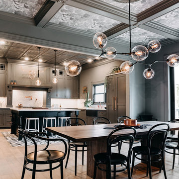
This 1896 Italianate Victorian home in Portland Heights was all but derelict in 2017.
We partnered with Look Construction LLC. to save this iconic home that sits atop a steep embankment—a huge challenge for the necessary new foundation. The house was lifted and new foundation poured adding 4 feet and a whole new floor to boot.
It had been stripped of all its original interior character over the years, so the design replaced and added to what was there originally. We re-designed the home’s layout, reconfiguring the kitchen, moving the lower staircase, adding a staircase to the loft room and rebuilding the widows walk roof deck. All doorways were raised to 9 feet to add to the sense of space.
Finally, we splurged on a selection of incredible wallpapers to add drama and romance to this stunning show piece of a home.
The Penny Black House is featured in Gray Magazine #39, April 2018.

Sponsored
Columbus, OH

Wannemacher Interiors
Customized Award-Winning Interior Design Solutions in Franklin Cnty OH
 Penny Black Interiors LLC.
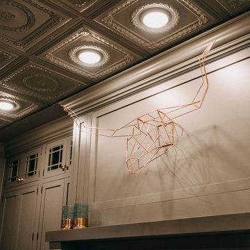
This 1896 Italianate Victorian home in Portland Heights was all but derelict in 2017.
We partnered with Look Construction LLC. to save this iconic home that sits atop a steep embankment—a huge challenge for the necessary new foundation. The house was lifted and new foundation poured adding 4 feet and a whole new floor to boot.
It had been stripped of all its original interior character over the years, so the design replaced and added to what was there originally. We re-designed the home’s layout, reconfiguring the kitchen, moving the lower staircase, adding a staircase to the loft room and rebuilding the widows walk roof deck. All doorways were raised to 9 feet to add to the sense of space.
Finally, we splurged on a selection of incredible wallpapers to add drama and romance to this stunning show piece of a home.
The Penny Black House is featured in Gray Magazine #39, April 2018.
 Rockledge Design + Architecture
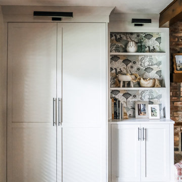
To help make this family room in Wexford more functional and cohesive, we added new custom built-in storage around the brick fireplace. On the left side, an existing built-in was situated in between the fireplace and a small closet, which also contained a sink. We started by peeling away these elements to create a larger space.
Adding symmetry to the room, we designed new cabinetry which included a mix of hidden and open shelf storage. Behind full-height pocketing doors on the left, a new wet bar with a tiled backsplash and quartz countertop. On the right, another set of pocketing doors conceals three large drawers, plus overflow toy storage for the adjacent playroom. Immediately flanking the fireplace, bookshelves provide a space to display favorite items with even more storage beneath.
To balance the room’s rich wood tones and multi-tonal red brick, we helped the clients select a neutral color palette to make the space feel more relaxed. Complimentary colors and textures are added through the playful wallpaper lining the back of the shelves, and hexagon backsplash tile. A stylish new fireplace faceplate, gallery lighting, and cabinet hardware — each in a dark metal finish — help to tie everything together.
 RAJ Kitchen and Bath, LLC
**Check out the video of this transformation on our website**
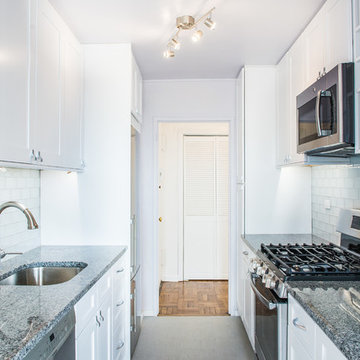
This small kitchen was way too small for this 2 bedrooms, 2 bathrooms apartment. Not only was it a very small kitchen, but the physical location of it made it very difficult to make it any bigger. There wasn't much that could have been done without incurring astronomical cost, which would get little or no return on the investment. The client wanted a kitchen that can be optimized in its current location to add a ton of value for resale.
This was difficult to do, because there was no moving of any mechanical around in the kitchen and even if we wanted to, the management of the building would not allow. For those of you who live in condos, co-ops or apartment building, you know how difficult it is to rework these foot prints. When we showed up, we saw the problems, but we also saw a huge opportunity where we can achieve those goals in the small space. This was accomplished by making some key changes and to incorporate some new things that was not possible when this kitchen was built years ago.
The crucial part of the design that would drive the entire new layout, was selecting the only appliance; that was the Refrigerator. Once we nailed down that refrigerator, we then proceeded to design the kitchen around it. We moved it to the other side of the wall where the sink was so that we can tap into the water line from the sink plumbing. It was crucial that it stays exactly 24" deep, not an inch more because we had to keep the entry as open as possible. Also, it was going to be directly in front of another big storage unit - The pantry. It is not ideal in most cases, but we needed the rest of the space to ramp up the design and open feel towards the side where all of the activities would take place, which happend to be the dining room and the view.
Once all that was figured out, we re-positioned the sink, dishwasher and the range and proceeded to wrap the cabinets around the columns to integrate them into the space. Thirty- six inches cabinets height was used so that they can be installed higher towards the ceiling height to give more room rather than the standard 18" required height between the counter tops. This was done to make the room feel a lot bigger than it really was. Not to mention, we also didn't want the faucet to be buried under the cabinets so that was also a necessary design detail for the space.
We then lowered both knee walls so that the counter top can sit on top of them, by removing that stop point that would have otherwise defined the kitchen area. This allowed us to pick up that extra footprint into the room for added prep space and enabled us to create the illusion of a kitchen that is looking longer than it really is. Every inch mattered when designing this kitchen and we made a conscious decision to use every one of that inch.
White cabinets were selected to do just what white cabinets are design to do; make a small or dark room appear bigger, brighter and more open. In this kitchen, this was amplified the more because of the kitchen location. It was perfect! We knew we did justice to the space because while we were there taking some photos, a few potential buyers walked in and went straight for the kitchen! They said its design just to fit the apartment.
Pantry roll out shelving, Double recycle bin, fancy handles, LED lighting, Quartz counter top, beautiful backslash tiles and grey linen floors finished off the kitchen which looked over a beautiful view of the George Washington Bridge from the top of this lovely 4th floor apartment.
Credit to Masterpiece Tile and Marble (Annmarie on the selection of Tiles and countertop and Val on the Construction to complete this project).
Davor Kokic Photography
115