
Search results for "Select 'adding'" in Home Design Ideas
 Reyes Creative Concepts LLC.
Living Room:
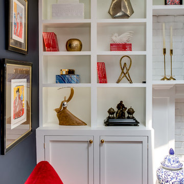
Our customer wanted to update the family room and the kitchen of this 1970's splanch. By painting the brick wall white and adding custom built-ins we brightened up the space. The decor reflects our client's love for color and a bit of asian style elements. We also made sure that the sitting was not only beautiful, but very comfortable and durable. The sofa and the accent chairs sit very comfortably and we used the performance fabrics to make sure they last through the years. We also wanted to highlight the art collection which the owner curated through the years.
Kithen:
We enlarged the kitchen by removing a partition wall that divided it from the dining room and relocated the entrance. Our goal was to create a warm and inviting kitchen, therefore we selected a mellow, neutral palette. The cabinets are soft Irish Cream as opposed to a bright white. The mosaic backsplash makes a statement, but remains subtle through its beige tones. We selected polished brass for the hardware, as well as brass and warm metals for the light fixtures which emit a warm and cozy glow.
For beauty and practicality, we used quartz for the working surface countertops and for the island we chose a sophisticated leather finish marble with strong movement and gold inflections. Because of our client’s love for Asian influences, we selected upholstery fabric with an image of a dragon, chrysanthemums to mimic Japanese textiles, and red accents scattered throughout.
Functionality, aesthetics, and expressing our clients vision was our main goal.
Photography: Jeanne Calarco, Context Media Development
 Reyes Creative Concepts LLC.
Living Room:
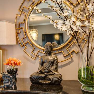
Our customer wanted to update the family room and the kitchen of this 1970's splanch. By painting the brick wall white and adding custom built-ins we brightened up the space. The decor reflects our client's love for color and a bit of asian style elements. We also made sure that the sitting was not only beautiful, but very comfortable and durable. The sofa and the accent chairs sit very comfortably and we used the performance fabrics to make sure they last through the years. We also wanted to highlight the art collection which the owner curated through the years.
Kithen:
We enlarged the kitchen by removing a partition wall that divided it from the dining room and relocated the entrance. Our goal was to create a warm and inviting kitchen, therefore we selected a mellow, neutral palette. The cabinets are soft Irish Cream as opposed to a bright white. The mosaic backsplash makes a statement, but remains subtle through its beige tones. We selected polished brass for the hardware, as well as brass and warm metals for the light fixtures which emit a warm and cozy glow.
For beauty and practicality, we used quartz for the working surface countertops and for the island we chose a sophisticated leather finish marble with strong movement and gold inflections. Because of our client’s love for Asian influences, we selected upholstery fabric with an image of a dragon, chrysanthemums to mimic Japanese textiles, and red accents scattered throughout.
Functionality, aesthetics, and expressing our clients vision was our main goal.
Photography: Jeanne Calarco, Context Media Development
 RAJ Kitchen and Bath, LLC
**Check out the video of this transformation on our website**
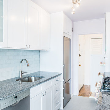
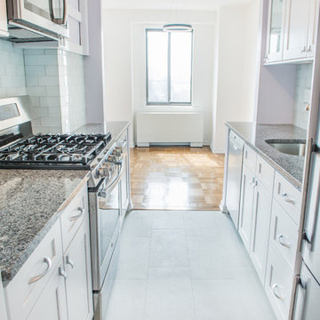
This small kitchen was way too small for this 2 bedrooms, 2 bathrooms apartment. Not only was it a very small kitchen, but the physical location of it made it very difficult to make it any bigger. There wasn't much that could have been done without incurring astronomical cost, which would get little or no return on the investment. The client wanted a kitchen that can be optimized in its current location to add a ton of value for resale.
This was difficult to do, because there was no moving of any mechanical around in the kitchen and even if we wanted to, the management of the building would not allow. For those of you who live in condos, co-ops or apartment building, you know how difficult it is to rework these foot prints. When we showed up, we saw the problems, but we also saw a huge opportunity where we can achieve those goals in the small space. This was accomplished by making some key changes and to incorporate some new things that was not possible when this kitchen was built years ago.
The crucial part of the design that would drive the entire new layout, was selecting the only appliance; that was the Refrigerator. Once we nailed down that refrigerator, we then proceeded to design the kitchen around it. We moved it to the other side of the wall where the sink was so that we can tap into the water line from the sink plumbing. It was crucial that it stays exactly 24" deep, not an inch more because we had to keep the entry as open as possible. Also, it was going to be directly in front of another big storage unit - The pantry. It is not ideal in most cases, but we needed the rest of the space to ramp up the design and open feel towards the side where all of the activities would take place, which happend to be the dining room and the view.
Once all that was figured out, we re-positioned the sink, dishwasher and the range and proceeded to wrap the cabinets around the columns to integrate them into the space. Thirty- six inches cabinets height was used so that they can be installed higher towards the ceiling height to give more room rather than the standard 18" required height between the counter tops. This was done to make the room feel a lot bigger than it really was. Not to mention, we also didn't want the faucet to be buried under the cabinets so that was also a necessary design detail for the space.
We then lowered both knee walls so that the counter top can sit on top of them, by removing that stop point that would have otherwise defined the kitchen area. This allowed us to pick up that extra footprint into the room for added prep space and enabled us to create the illusion of a kitchen that is looking longer than it really is. Every inch mattered when designing this kitchen and we made a conscious decision to use every one of that inch.
White cabinets were selected to do just what white cabinets are design to do; make a small or dark room appear bigger, brighter and more open. In this kitchen, this was amplified the more because of the kitchen location. It was perfect! We knew we did justice to the space because while we were there taking some photos, a few potential buyers walked in and went straight for the kitchen! They said its design just to fit the apartment.
Pantry roll out shelving, Double recycle bin, fancy handles, LED lighting, Quartz counter top, beautiful backslash tiles and grey linen floors finished off the kitchen which looked over a beautiful view of the George Washington Bridge from the top of this lovely 4th floor apartment.
Credit to Masterpiece Tile and Marble (Annmarie on the selection of Tiles and countertop and Val on the Construction to complete this project).
Davor Kokic Photography
Find the right local pro for your project
 Charlie Allen Renovations, Inc.
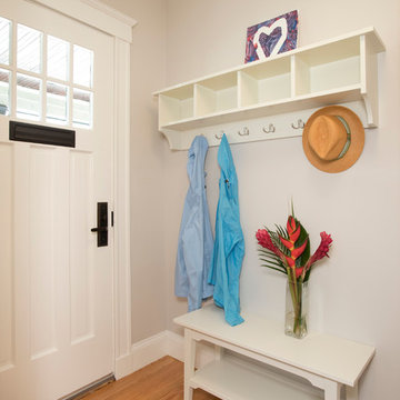
Renovation is stressful. Wouldn’t it be nice to let someone else oversee product selections, manage day-to-day issues, and bring your project to a successful completion? The owners of a two-family in Arlington recently did just that, flying off to Florida just as we began renovating their first floor unit.
Of course, before they left we thoroughly discussed all aspects of the work order, which included renovating the kitchen and bathroom, painting the bedroom, and adding a laundry closet. We reviewed color and material selections, and set up a schedule for regular briefings.
A handful of issues did come up. But because we had planned ahead, we were able to resolve them with very little stress for our clients. For instance, the client had chosen a bright yellow paint color for the kitchen walls, but once the new cabinets, countertop, and flooring had been installed, it was clear that yellow would clash. We suggested a more complementary Benjamin Moore Lancaster Whitewash shade instead.
In the bathroom, the clients had selected a deep inset mirrored medicine cabinet. But when the wall behind the vanity was opened, it revealed a pipe running up the wall, too close for the inset model. In this small space, a bump-out medicine cabinet would be awkward, so instead we placed a mirror over the sink and two smaller inset cabinets on either side – a solution that pleased the homeowners, who now have his-and-hers storage spaces.
Finally, the homeowners had resigned themselves to the fact that the laundry closet would be too small for storing detergent and other needs. However once the units were in place, we realized that a small custom shelf could be built and had it installed to the delight of the homeowners.
Photo by Shelly Harrison
 RAJ Kitchen and Bath, LLC
**Check out the video of this transformation on our website**
This small kitchen was way too small for this 2 bedrooms, 2 bathrooms apartment. Not only was it a very small kitchen, but the physical location of it made it very difficult to make it any bigger. There wasn't much that could have been done without incurring astronomical cost, which would get little or no return on the investment. The client wanted a kitchen that can be optimized in its current location to add a ton of value for resale.
This was difficult to do, because there was no moving of any mechanical around in the kitchen and even if we wanted to, the management of the building would not allow. For those of you who live in condos, co-ops or apartment building, you know how difficult it is to rework these foot prints. When we showed up, we saw the problems, but we also saw a huge opportunity where we can achieve those goals in the small space. This was accomplished by making some key changes and to incorporate some new things that was not possible when this kitchen was built years ago.
The crucial part of the design that would drive the entire new layout, was selecting the only appliance; that was the Refrigerator. Once we nailed down that refrigerator, we then proceeded to design the kitchen around it. We moved it to the other side of the wall where the sink was so that we can tap into the water line from the sink plumbing. It was crucial that it stays exactly 24" deep, not an inch more because we had to keep the entry as open as possible. Also, it was going to be directly in front of another big storage unit - The pantry. It is not ideal in most cases, but we needed the rest of the space to ramp up the design and open feel towards the side where all of the activities would take place, which happend to be the dining room and the view.
Once all that was figured out, we re-positioned the sink, dishwasher and the range and proceeded to wrap the cabinets around the columns to integrate them into the space. Thirty- six inches cabinets height was used so that they can be installed higher towards the ceiling height to give more room rather than the standard 18" required height between the counter tops. This was done to make the room feel a lot bigger than it really was. Not to mention, we also didn't want the faucet to be buried under the cabinets so that was also a necessary design detail for the space.
We then lowered both knee walls so that the counter top can sit on top of them, by removing that stop point that would have otherwise defined the kitchen area. This allowed us to pick up that extra footprint into the room for added prep space and enabled us to create the illusion of a kitchen that is looking longer than it really is. Every inch mattered when designing this kitchen and we made a conscious decision to use every one of that inch.
White cabinets were selected to do just what white cabinets are design to do; make a small or dark room appear bigger, brighter and more open. In this kitchen, this was amplified the more because of the kitchen location. It was perfect! We knew we did justice to the space because while we were there taking some photos, a few potential buyers walked in and went straight for the kitchen! They said its design just to fit the apartment.
Pantry roll out shelving, Double recycle bin, fancy handles, LED lighting, Quartz counter top, beautiful backslash tiles and grey linen floors finished off the kitchen which looked over a beautiful view of the George Washington Bridge from the top of this lovely 4th floor apartment.
Credit to Masterpiece Tile and Marble (Annmarie on the selection of Tiles and countertop and Val on the Construction to complete this project).
Davor Kokic Photography
 Thomas J. Pearson, Inc.
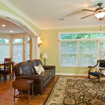
The owners of this traditional home sought to update and expand their somewhat dated and crowded kitchen. The former kitchen had a corner sink and a modified U-shape, but with the only entry intersecting the refrigerator and bar passage, it did not allow for multiple cooks in the kitchen. The existing kitchen was separated from the family room by a wall which included a see-through fireplace, but in reality the two areas were distinctly separate. As this family enjoys cooking and entertaining, they sought to open the space to accommodate a large island in the kitchen and opening the space to the adjoining family room. Additionally, they wanted the cooking surfaces and appliances to be state of the art, but with a style reminiscent of Tuscany.
To achieve the effect, color groups and materials were selected to create the Tuscan region’s theme. Round shapes were included throughout the space including the island top and the custom archway opening to the family room. The owners selected cherry cabinetry with a dark brown stain, granite counters with some hues of blue-green, and a natural stone tumbled subway tile backsplash. The island color is fossil beige, and the owners re-purposed their existing bar stools using the same color. With the serious emphasis on cooking, the range selected is a 36” gas Thermador® with custom exhaust hood. A separate Thermador® baking oven and microwave are built-in on the adjoining wall. Bela Cera® hand-scraped hardwood flooring ties together the kitchen, eating area, and family room.
The existing stone fireplace was taken down and set aside for re-installation at project completion. As the wall separating the kitchen and family room was eliminated, the stone fireplace has been reinstalled at its new location on the home’s east-wall. Windows and built-in cabinetry flank the fireplace, with the flat screen mounted above it. With added windows, additional can lighting, and antique white trim, the rooms are bright and airy.
 Powell Construction
This 1960’s home underwent a striking transformation--remodeling the kitchen, hall bathroom and laundry room. These homeowners dreamed of an open floor plan that would unite the kitchen and adjacent living areas. To accomplish this, we removed an imposing chimney that separated the kitchen from the living room. Additionally, we eliminated a weight-bearing wall that was between the kitchen and dining room. What a change! The spaces that formerly felt dark and confined are now bright and connected, comfortably accommodating larger gatherings.
When considering the specifics of design, we wanted to stay true to the home’s mid-century roots, while updating it with today’s style elements. Embracing the mid-century aspects, we played off some of the existing features of the home by mirroring them in the spaces we redesigned. To introduce today’s style, we thoughtfully incorporated the finishes and touches that would aptly reflect that component. The resulting design is beautifully juxtaposed by the homeowners’ treasured antique furniture pieces.
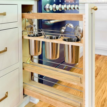
In the kitchen, we enhanced the open and airy feel by choosing a light greige color for the inset cabinetry paired with a tonal light-colored, blue-veined quartz for the countertops. These tones are perfectly complemented by the gold finishes of the cabinet hardware, faucets, and mid-century modern pendants. To maximize the storage potential of this kitchen, we customized the cabinetry with a convenient utensil organizer and a blind corner “cloud” pullout. A full height zellige-style tile backsplash with custom floating shelves makes for an impressive statement wall. With family get togethers in mind, we added an additional bar/prep sink and a spacious breakfast nook with a good deal of bench storage. A vertically-slatted wood half-wall separates the kitchen and breakfast nook, replicating the original mid-century wall detail at the entry.
Between the living room and kitchen, we designed a semi-open bar-height peninsula, accenting the bar front with a vertical shiplap kickplate in a bold blue. Carrying this color statement through the kitchen, the homeowner selected a “Navy Steel” Samsung Bespoke refrigerator and an AGA Mercury range, in “Blueberry.” These colors are also echoed in the multi-tonal quartz.
In the hall bathroom, we were aiming for the bright ambiance we’d achieved in the living areas. The penny round tile flooring and full height zellige-look tile combine for a classy, elevated look. In keeping with the kitchen, we installed similar gold fixtures and inset cabinetry and the same beautiful quartz countertop. The vanity towers provide these happy homeowners with additional room to store all their necessities.
Through the design process, we were able to gain square footage in the laundry room which allowed for the extra cabinet space the homeowners were looking for. Of course, a remodel is never complete without conveniences for the pets. The kitty’s litter box is neatly tucked in the cabinet behind a custom cat-cutout--a cute and tidy idea!
Kitchen Selections: Cabinet color-Farrow & Ball Ammonite No. 274; Countertops-Silestone Pietra; Cabinet hardware-Top Knobs Barrington collection in Honey Bronze; Pendants-Rejuvenation Palo Alto; Faucets- Delta Trinsic in Champagne Bronze; Tile-Tilebar Portmore 4x4 in White; Island bar shiplap color-Farrow and Ball Wine Dark No. 308
Bathroom Selections: Floor tile-Cepac Classic Rounds in Cloud; Tile-Tilebar Portmore 4x4 in White; Cabinet color-Farrow & Ball Purbeck Stone No. 275; Countertop-Silestone Pietra; Faucet-Delta Trinsic in Champagne Bronze

Sponsored
Columbus, OH

Wannemacher Interiors
Customized Award-Winning Interior Design Solutions in Franklin Cnty OH
 Emily Roose Interiors
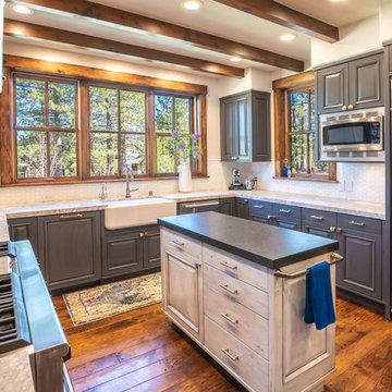
This kitchen was 20 years old with stained cabinets and felt dark and heavy. We painted all of the perimeter cabinets a beautiful blue grey and the island is a custom white with black glazing. For the countertops the perimeter is a grey and white quartzite and the island is a leathered black honed granite. The old sink was replaced with a Farmhouse styled white porcelain apron, a new faucet and added a hot/cold water dispenser. The old trash compactor was removed and replaced with a double trash pull-out drawer, a two drawer beverage fridge and ice maker were added as well. For the backspalsh we selected white marble tiles in a hexagon shape and added new geometric pendant lights over the peninsula. All the recessed can lights were updated to LED units for energy efficiency and to provide better lighting.
Photos by Patrick Sheehan of Sheehan Creative
 Sandra Hambley
Welcome to the beach house! We are pleased to share the photos from this OBX, NC beach house we decorated for one of our existing local clients. We were happy to travel to NC to assist in setting up their vacation home.
Setting the tone in the entryway we selected furnishings with a coastal vibe. This console is 80 inches in length and is accented with beachy accessories and artwork.
This home has a fantastic open concept living area that is perfect for large family gatherings. We furnished a dining space for ten, a family room with a large sectional that will provide seating for a crowd, and added game table with chairs for overflow.
The dining table offers seating for 10 and includes 6 chairs and a bench seat that will comfortably sit 4. We selected a striped area rug in vibrant shades of blues and greens to give the space a coastal vibe.
In the mudroom, shiplap walls, bench seating, cubbies and towel hooks are both pretty and hugely functional!
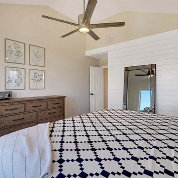
A restful sleep awaits in the primary bedroom of this OBX beach house! A king size bed made of sand-blasted solid Rustic Poplar with metal accents and coordinating bedside tables create a rustic-yet-modern vibe. A large-scale mirror features a dark bronze frame with antique mirror side panels and corners with copper cladding and nail head details. For texture and comfort, we selected an area rug crafted from hand tufted ivory wool and rescued denim. Sheer window treatments keep the room light and airy.
Need a sleeping space at your vacation home for the children? We created a bunk bed configuration that maximizes space and accommodates sleeping for eight at our client's OBX beach house. It's super functional and also fun!
Stairwells with soaring ceilings call for statement lighting! We are in love with this gorgeous chandelier we chose for our client's OBX beach house.
 Legendary Real Estate
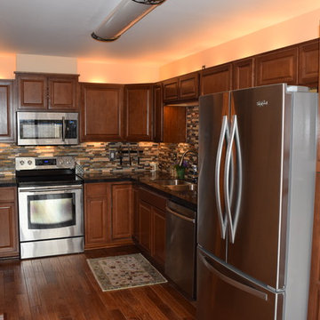
A glass/stone/metallic tile was chosen for the backsplash and Granite Transformations tile with a stainless undermount sink and stailess appliances were chosen for the kitchen. Hardwood flooring was added, and above the cabinet lighting to brighten up the kitchen.
{Featured Story} Spring, 2015 – This condo was purchased from the estate of the new owner’s parents and refurbished with trendy new touches. There were no close comparables in the Farmington neighborhood with within walking distance to the urban downtown area, so the approach for selling was to create an entirely new set of comparables when the new owner was found. On the market for just days, the renovation, marketing and finishing touches made this a highly sought after, and quick to sell property at top dollar, establishing a new trend in the neighborhood.
{Our Process for this Featured Property}: Assessed the initial investment condo, offered suggestions for rehab and renovation. Assisted with Color Theory through color selection and process (no beige in this condo!). Helped select floor and counter materials, tile selection and features in the kitchen and bath. Final staging of the property was done with antiques and housewares, and created a cozy and lived in feel. As a final touch, a party was thrown when the property was completed to invite in friends and family, as well as an open house with freshly baking chocolate chip cookies to make the prospective buyers feel right at home!
{Outcome} This property sold in days as a cash sale, at a higher price than anything in the neighborhood – and closed quickly. Both the seller and buyer were thrilled with this transaction!
 Design Connection, Inc.
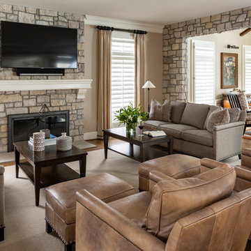
Before the renovation, the living room looked cramped – large pieces of furniture made the space feel stuffy. Design Connection, Inc.’s design concept scaled down the furniture and added depth and warmth.
We added drapery over the shutters to flank the fireplace. Smaller, lower-scale pieces gave the living room more depth and added seating for entertaining and relaxing. With two sofas, two chairs, two coffee tables and two ottomans, this room still feels open!
Design Connection, Inc. provided space planning, AutoCAD drawings, selections for lighting fixtures, furniture, area rugs, accessories, paint and stain colors, stone, window treatments, project management between the client and the contractors to keep the integrity of Design Connection, Inc.’s high standards and designs.
 Sosna Inc
This project centered on helping a wonderful client and her equally fantastic dog transform her condo into a space that truly reflected her style and simplified her life. Eager to create a home that was both beautiful and functional, she envisioned a haven in the heart of the city.
Before: Feeling Disconnected
Before the renovation, our client felt disconnected from her condo. The builder-grade kitchen was a constant source of frustration, with an awkward peninsula that hindered the flow of the space. The condo overall felt outdated and no longer captured her vibrant personality. The foyer and laundry areas were cramped and lacked organization, while the mismatched hardwood flooring only added to the disjointed atmosphere. As for the bathrooms, they felt frozen in time, desperately needing an update.
Worries and Concerns
Like many homeowners, our client had heard her fair share of renovation horror stories—tales of projects gone awry and the frustrations of managing multiple contractors. She was understandably cautious and needed a trustworthy, experienced team she could rely on to handle the project with care and expertise.
The Solution: A Personalized Transformation
We took the time to listen carefully to our client’s needs and concerns and developed a tailored plan to address each of her pain points. For the kitchen, we preserved the existing layout but reimagined the space entirely. The awkward peninsula was redesigned to improve traffic flow and provide much-needed storage and counter space. Clever storage solutions, such as pull-outs, shelving, concealed drawers in the toe kicks, and an appliance garage, were incorporated. The kitchen now boasts a warm and inviting atmosphere, with light wood-tone lower cabinetry, off-white upper cabinets, and brushed nickel hardware that ties it all together.
The laundry room, once cramped and chaotic, was transformed into an organized, efficient space. We added custom cabinetry with pull-outs for hanging clothes, open storage above, a laundry sink, and a spacious counter for folding—no more piles of laundry!
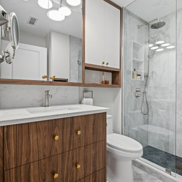
Both the en-suite and shared bathrooms underwent complete renovations. Custom cabinetry was installed, including a floor-to-ceiling linen closet, and light grey and brown-toned tiles were selected, with contrasting hexagonal tiles for the shower floor. A heated flooring system was added for luxury and comfort year-round.
The mismatched flooring throughout the condo was replaced with cohesive vinyl and porcelain tiles, creating a seamless, modern aesthetic throughout the space.
Overcoming Challenges
As with any renovation, there were challenges to navigate. One of the key obstacles was managing the condo board’s renovation rules and policies while coordinating the delivery schedules for finishes and fixtures, especially during the busy holiday season. With careful planning, we ensured the project stayed on track. Additionally, we encountered a height variation between the tile and vinyl flooring. To resolve this, we used self-leveling material under the vinyl, ensuring a smooth and seamless transition between the two flooring types.
The Grand Reveal: A Dream Come True
The final result is simply stunning. The kitchen is now a chef’s dream, with custom-built cabinets, smooth quartz countertops, and a matching stone backsplash. Brushed nickel and stainless steel plumbing fixtures, elegant cabinet hardware, and LED lighting under the upper cabinets add the perfect finishing touches. Custom organizers in the foyer and laundry closets provide ample storage and keep everything neatly in place. The bathrooms have been transformed into spa-like retreats, with beautiful porcelain tiles and custom cabinetry. The new vinyl flooring throughout the main living areas and bedroom unifies the space, creating a cohesive and modern atmosphere.
Life Transformed
Our client’s life has been completely transformed. As a passionate cook, she now relishes spending time in her beautiful and functional kitchen. The single-bowl sink makes cleanup a breeze, and the thoughtfully designed storage solutions have brought a sense of calm and order to her home. The refreshed flooring and neutral paint palette have created a relaxing, comfortable environment she truly loves.
A Memorable Journey
This project was more than just a renovation—it was a collaboration. Our client valued our guidance throughout the design process, particularly when faced with the overwhelming number of decisions. We built a strong relationship with her, and we are immensely grateful for the trust she placed in our team.
 French Creek Designs Kitchen & Bath Design Center
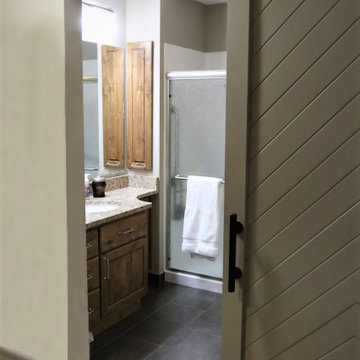
New Master Bath Remodel includes Ditra-Heat flooring for that extra warmth all year round. The door opening to the Master Bath was widened and a farm door added for easier access; aging in place. The ‘notch’ in the Master Countertop was added for ease of shower access. A hidden pull-out drawer was added in Master Bath for extra storage.
Large 12×24 Anthracite Black Porcelain Tile was used for the floor. Use of Stained Alder Knotty Cabinets with Giallo Ornamental Granite Countertops and offset with a White Undermount Sink.
French Creek Designs Kitchen & Bath Design Studio – where selections begin. Let us design and dream with you. Overwhelmed on where to start that Home Improvement, Kitchen or Bath Project? Let our Designers video conference or sit down with you, take the overwhelming out of the picture and assist in choosing your materials. Whether new construction, full remodel or just a partial remodel, we can help you to make it an enjoyable experience to design your dream space.
“Making Your Home Beautiful One Room at a Time with your local Kitchen & Bath Experts at French Creek Designs Center.”
#openforbusiness #casper #wyoming #casperbusiness #frenchcreekdesigns #shoplocal #casperwyoming #bathremodeling #bathdesigners #pebbles #niche #showersurround #showertiles #showerdrains #showerbench #cabinets #countertops #knobsandpulls #sinksandfaucets #flooring #tileandmosiacs #laundryremodel #homeimprovement

Sponsored
Columbus, OH
Wannemacher Interiors
Customized Award-Winning Interior Design Solutions in Franklin Cnty OH
 Eccentricity Designs LLC
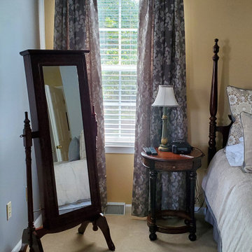
This client asked for help to upgrade her bedroom. She said her "safe" decorating style left something to be desired and she didn't know how to wake it up. The furniture was to remain however the room had great architectural lines to accent. I selected two colors that helped define the lines in the architecture. The bedding was added and we proceeded to move forward on the window treatments. The fabric is a rich cotton blend with a slight shimmer in the leaf pattern. With such short window walls I felt valances drew the eye down (shown in the before images) so they were not added to the new draperies. There is a custom cornice on the small window by the dressing area that coordinates with the draperies. The bench was reupholstered and a new centerpiece was added for the top of the television.
The client is soo pleased with the changes.
 Concepts & Dimensions
Simply elegant. Postively Serene.
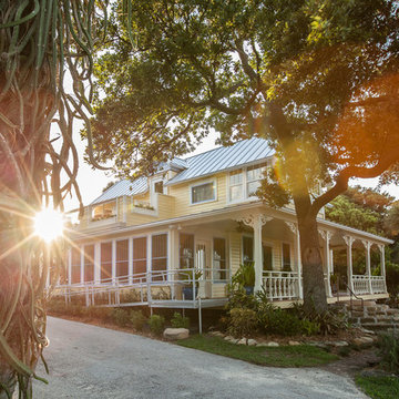
SolRisa Inn; A Historic Bed & Breakfast that evokes a fine old Caribbean home that combined discrete accessibility.
The renovation of two Indian River side homes into the Bed & Breakfast was two years in completion.
...stripped and put back together;
original architectural elements restored...the second floor porch added for a river view
 RAJ Kitchen and Bath, LLC
**Check out the video of this transformation on our website**
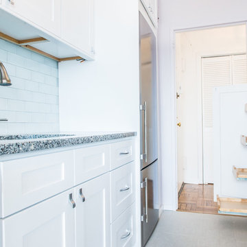
This small kitchen was way too small for this 2 bedrooms, 2 bathrooms apartment. Not only was it a very small kitchen, but the physical location of it made it very difficult to make it any bigger. There wasn't much that could have been done without incurring astronomical cost, which would get little or no return on the investment. The client wanted a kitchen that can be optimized in its current location to add a ton of value for resale.
This was difficult to do, because there was no moving of any mechanical around in the kitchen and even if we wanted to, the management of the building would not allow. For those of you who live in condos, co-ops or apartment building, you know how difficult it is to rework these foot prints. When we showed up, we saw the problems, but we also saw a huge opportunity where we can achieve those goals in the small space. This was accomplished by making some key changes and to incorporate some new things that was not possible when this kitchen was built years ago.
The crucial part of the design that would drive the entire new layout, was selecting the only appliance; that was the Refrigerator. Once we nailed down that refrigerator, we then proceeded to design the kitchen around it. We moved it to the other side of the wall where the sink was so that we can tap into the water line from the sink plumbing. It was crucial that it stays exactly 24" deep, not an inch more because we had to keep the entry as open as possible. Also, it was going to be directly in front of another big storage unit - The pantry. It is not ideal in most cases, but we needed the rest of the space to ramp up the design and open feel towards the side where all of the activities would take place, which happend to be the dining room and the view.
Once all that was figured out, we re-positioned the sink, dishwasher and the range and proceeded to wrap the cabinets around the columns to integrate them into the space. Thirty- six inches cabinets height was used so that they can be installed higher towards the ceiling height to give more room rather than the standard 18" required height between the counter tops. This was done to make the room feel a lot bigger than it really was. Not to mention, we also didn't want the faucet to be buried under the cabinets so that was also a necessary design detail for the space.
We then lowered both knee walls so that the counter top can sit on top of them, by removing that stop point that would have otherwise defined the kitchen area. This allowed us to pick up that extra footprint into the room for added prep space and enabled us to create the illusion of a kitchen that is looking longer than it really is. Every inch mattered when designing this kitchen and we made a conscious decision to use every one of that inch.
White cabinets were selected to do just what white cabinets are design to do; make a small or dark room appear bigger, brighter and more open. In this kitchen, this was amplified the more because of the kitchen location. It was perfect! We knew we did justice to the space because while we were there taking some photos, a few potential buyers walked in and went straight for the kitchen! They said its design just to fit the apartment.
Pantry roll out shelving, Double recycle bin, fancy handles, LED lighting, Quartz counter top, beautiful backslash tiles and grey linen floors finished off the kitchen which looked over a beautiful view of the George Washington Bridge from the top of this lovely 4th floor apartment.
Credit to Masterpiece Tile and Marble (Annmarie on the selection of Tiles and countertop and Val on the Construction to complete this project).
Davor Kokic Photography
 Ridgeway Interiors
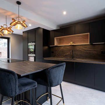
Set in the picturesque Hughendon Valley in High Wycombe, this kitchen project showcases a stunning blend of modern design and inviting warmth. The client’s goal was to create a kitchen that was not only visually striking but also highly functional and welcoming.
The kitchen boasts a sleek black Nobilia handleless design, offering a contemporary and streamlined look. This is perfectly complemented by top-of-the-line Siemens appliances, providing aesthetic appeal and unmatched performance.
A beautifully detailed Dekton worktop adds a touch of luxury and practicality to the kitchen. The central island, featuring seating and a hob, becomes the heart of the space – perfect for social cooking and casual dining.
Open wooden shelving was incorporated to balance the modern black finish, adding a natural warmth to the space. The under-cabinet and worktop lighting enhance functionality and create a soft, inviting ambience.
Are you inspired by the Black Nobilia Kitchen and looking to infuse a blend of modern elegance and warmth into your kitchen? Get in touch to see how we can bring this balance into your home.

Sponsored
Columbus, OH

Structural Remodeling
Franklin County's Heavy Timber Specialists | Best of Houzz 2020!
 Phoenix Home Remodeling
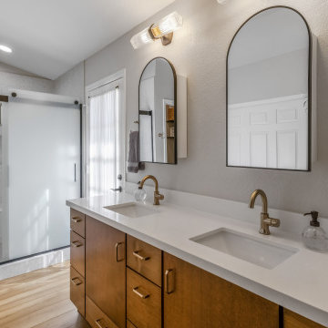
Eric and Jeni's master bathroom had always been functional, but it never quite lived up to the luxurious escape they desired. The cabinets were lackluster, offering basic storage, but they didn't contribute much to the room's aesthetics.
For cabinets, they selected Sollid Designer Series Cabinetry in Metro Cognac for both functionality and visual warmth. To top these cabinets, White Sand Quartz countertops were chosen, blending durability and elegance.
Delta Trinsic faucets in Champagne Bronze were selected to pair beautifully with two arched metal mirrors with contrasting black frames, adding refined modernity.
A Kohler sliding semi-frameless shower door with frosted glass and the Delta shower head in Champagne Bronze add the elegance desired by the homeowners.
Eric and Jeni made the great selections of Reside Beige tiles on the shower floor, and Terrazzo White tiles for the walls. An over-sized wall niche for the shower and a long bench with a quartz countertop seat were installed to complete the custom elegance of their new space.
 RAJ Kitchen and Bath, LLC
**Check out the video of this transformation on our website**
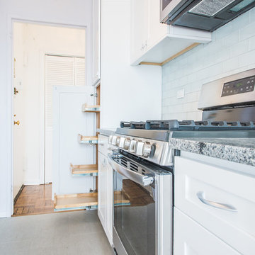
This small kitchen was way too small for this 2 bedrooms, 2 bathrooms apartment. Not only was it a very small kitchen, but the physical location of it made it very difficult to make it any bigger. There wasn't much that could have been done without incurring astronomical cost, which would get little or no return on the investment. The client wanted a kitchen that can be optimized in its current location to add a ton of value for resale.
This was difficult to do, because there was no moving of any mechanical around in the kitchen and even if we wanted to, the management of the building would not allow. For those of you who live in condos, co-ops or apartment building, you know how difficult it is to rework these foot prints. When we showed up, we saw the problems, but we also saw a huge opportunity where we can achieve those goals in the small space. This was accomplished by making some key changes and to incorporate some new things that was not possible when this kitchen was built years ago.
The crucial part of the design that would drive the entire new layout, was selecting the only appliance; that was the Refrigerator. Once we nailed down that refrigerator, we then proceeded to design the kitchen around it. We moved it to the other side of the wall where the sink was so that we can tap into the water line from the sink plumbing. It was crucial that it stays exactly 24" deep, not an inch more because we had to keep the entry as open as possible. Also, it was going to be directly in front of another big storage unit - The pantry. It is not ideal in most cases, but we needed the rest of the space to ramp up the design and open feel towards the side where all of the activities would take place, which happend to be the dining room and the view.
Once all that was figured out, we re-positioned the sink, dishwasher and the range and proceeded to wrap the cabinets around the columns to integrate them into the space. Thirty- six inches cabinets height was used so that they can be installed higher towards the ceiling height to give more room rather than the standard 18" required height between the counter tops. This was done to make the room feel a lot bigger than it really was. Not to mention, we also didn't want the faucet to be buried under the cabinets so that was also a necessary design detail for the space.
We then lowered both knee walls so that the counter top can sit on top of them, by removing that stop point that would have otherwise defined the kitchen area. This allowed us to pick up that extra footprint into the room for added prep space and enabled us to create the illusion of a kitchen that is looking longer than it really is. Every inch mattered when designing this kitchen and we made a conscious decision to use every one of that inch.
White cabinets were selected to do just what white cabinets are design to do; make a small or dark room appear bigger, brighter and more open. In this kitchen, this was amplified the more because of the kitchen location. It was perfect! We knew we did justice to the space because while we were there taking some photos, a few potential buyers walked in and went straight for the kitchen! They said its design just to fit the apartment.
Pantry roll out shelving, Double recycle bin, fancy handles, LED lighting, Quartz counter top, beautiful backslash tiles and grey linen floors finished off the kitchen which looked over a beautiful view of the George Washington Bridge from the top of this lovely 4th floor apartment.
Credit to Masterpiece Tile and Marble (Annmarie on the selection of Tiles and countertop and Val on the Construction to complete this project).
Davor Kokic Photography
 Philip Petrino Interior Design
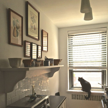
Though the space is narrow, further storage and dispaly was added creating a very functional galley. The window overlooking the terrace is another of Mr. C's favorite vantage points.
118