
Search results for "Selected idea" in Home Design Ideas

 West Winds Nursery LLC
A perfect spot to enjoy the waterside views. Plantings of Vardar Valley Boxwood, Autumn Bride Coral Bell, Dwarf Summer sweet, Inkberry and Ornamental Grasses are used around the patio. These selections bring evergreen foliage, fragrance and movement to the setting.

 Altura Architects
We drew inspiration from traditional prairie motifs and updated them for this modern home in the mountains. Throughout the residence, there is a strong theme of horizontal lines integrated with a natural, woodsy palette and a gallery-like aesthetic on the inside.
Interiors by Alchemy Design
Photography by Todd Crawford
Built by Tyner Construction

 Keechi Creek Builders
Keechi Creek Builders transformed this Houston closet into an elegant, functional retreat. Featuring custom floor-to-ceiling wood cabinetry, hardwood flooring, and a spacious island with ample storage, the space also showcases double chandeliers for a refined touch. This closet design blends organization with visual sophistication, perfect for modern Houston homeowners.
Find the right local pro for your project
 FineLine Kitchens, Inc.
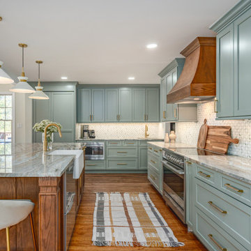
Hi everyone, I'm Sarah and Ogun we are here with fine line kitchens. So we are a couple working together. I do the interior design and remodeling of the space material selection meeting with the clients. And I handled operations outside, you know meaning all the construction work that is taking place the inside. The houses that we work in. I handle all the aspects of the construction, so today's project is very special. We're in Vienna and the client had a very big family. It's a family of seven that lives here. So we had a few aspects that we needed to keep in mind while designing this one. Having everybody be able to sit on the island. So we wanted plenty of seating all the way around. We didn't want anybody standing or anything like that. So what we did is we maximize the space. The center island is the biggest part of the kitchen. We use a natural stone to kind of give it a beautiful texture versus quartz. It's kind of standard white or kind of fabricated, so I wanted something very natural. We did this because I took my inspiration from the outside, so the inspiration if you look at the view right in front of me is there are so many greens there's a lot of brass accents and I wanted to bring this. Into this kitchen while designing it for my clients. She is very warm very. She wanted a very homey, comfy kind of look for the kitchen. So that's what we did today. As you can see, the cabinets are sage green, very light, so I still think it's a neutral, but it's a lighter color that again brings the outside in and we combine that with the oak right behind me so it's a slightly warm oak. It's not very dark. It's not very light. It's a medium brown and the same color went on the island. To kind of tie these two in and the backsplash, my favorite part is where you can see a little bit of design. It is, in my opinion still classic, but includes a pattern so the outside part is as we said in the beginning, is handled by my husband. I'd like him to speak a little bit about that. Thanks, Sarah, I want to talk to you guys a little bit about the construction part of this project. Originally this kitchen was located mostly in this area. They had their stove there sing. It was more of a peninsula layout in Sarah's and the customer vision they wanted. They wanted to get rid of the peninsula and they want to be able to have a huge island that can at least sit seven people because they're familiar with seven. So we wanted to make sure that we can achieve this design and bring it to life so that they can be happy with this layout. Some of the challenges we had, the house, the home being, you know, old home. There were a lot of you know the older electrical and plumbing that had to be replaced. We had to relocate the stove from here to this area. Over here we had put a nice foot fan that we had to relocate all the ductwork and the plumbing. Was being on the peninsula area. We had to relocate it to the center islands. So we achieved all this and kind of like bring it to bring in this kitchen up to date it looks beautiful. That's true, so yes, the old layout did not function for my clients because everything was kind of gathered on one side of the kitchen. So there was like a peninsula right there. So the end of this island kind of continued straight. And that was just the L shape. Kind of where everything was and there used to be another big table here, so they were using only kind of half of the space. So like I said at the beginning, our vision was to kind of feed everybody at the island, create some symmetry. 'cause I love that. So as you can see behind me, this is kind of the focal point symmetrical. Everything is kind of even we wanted to also panel the fridge here so it mimics the pantry and another size. So when you're looking at it, it is bringing again that symmetry back again. I hope you enjoyed this kitchen and this video and I'll see you soon. So how do you think this project turned out? It's nice. I like the color. I think it turned out nice. It's kind of like a little bit different color than what we always do. So I realize. Are you giving me a little bit of credit here that I did something different? Are you proud? I'm so proud of you. Other than that I like it. That they have kind of like a two sink. So if this was our kitchen, if we ever like you can have your own. I can have mine if we ever get into a fight then this can be like my own kitchen. Why are we gonna bring in a fight right now? So I'm cooking anyway. You're grilling most of the time, So what are you even talking about? My kitchen? That's my kitchen. You can just take the small sink. That's fine. It's always good to have your own space right there, so anyways. Thank you guys for watching. We hope to see you soon and if you have any questions please click the link below. It'll lead you to our website, house, YouTube and all of the social media is so nice to have you guys. We'll see you soon. Thanks bye bye-bye.

 Dura Supreme Cabinetry
A stainless steel roll-out shelf from Dura Supreme is a fantastic solution for storing your cleaning supplies. Select one for easy, accessible storage under a sink, or select multiple roll-out shelves if you have a full cabinet dedicated to your cleaning supplies. Coordinating gray metal accessories can be used to help you customize and organize the storage on each shelf.
This contemporary kitchen features the NEW Stainless Steel Drawers and Roll-Out Shelves from Dura Supreme Cabinetry. The Bria (frameless) cabinets in Dura Supreme's "White" and Wired-Foil cabinets in Dura Supreme's "Wired-Mercury" are a great combination of cabinetry for creating the clean sleek look of this modern two-tone kitchen design.
Dura Supreme Cabinetry is excited to introduce NEW Stainless Steel Drawers and Roll-Out Shelves for their Bria Cabinetry (Frameless / Full-Access product line). For a limited time, this new metal drawer system is available exclusively from Dura Supreme as they partnered with Blum to be the first American manufacturer to bring it to market.
Dura Supreme’s Stainless Steel Drawers and Roll-Out Shelves are an attractive option for any kitchen design. Sleek, double-wall, stainless steel sides are only ½” thick and work with many of Dura Supreme’s wood drawer accessories, as well as the coordinating gray metal accessories designed specifically for Stainless Steel drawers. Concealed, undermount glides are integrated into the sides and are self-closing with a soft-close feature.
Our new Stainless Steel drawer option provides a contemporary alternative to our classic Maple dovetailed drawer. For homeowners that favor Transitional or Contemporary styling, this sleek, high-performance drawer system will be ideal!
Request a FREE Dura Supreme Brochure:
http://www.durasupreme.com/request-brochure
Find a Dura Supreme Showroom in your area:
http://www.durasupreme.com/dealer-locator
Want to become a Dura Supreme Dealer? Go to:
http://www.durasupreme.com/new-dealer-inquiry
To view a video and more info about this product go to: http://www.durasupreme.com/storage-solutions/stainless-steel-drawers-roll-outs
 Dura Supreme Cabinetry
This modern farmhouse kitchen features a beautiful combination of Navy Blue painted and gray stained Hickory cabinets that’s sure to be an eye-catcher. The elegant “Morel” stain blends and harmonizes the natural Hickory wood grain while emphasizing the grain with a subtle gray tone that beautifully coordinated with the cool, deep blue paint.
The “Gale Force” SW 7605 blue paint from Sherwin-Williams is a stunning deep blue paint color that is sophisticated, fun, and creative. It’s a stunning statement-making color that’s sure to be a classic for years to come and represents the latest in color trends. It’s no surprise this beautiful navy blue has been a part of Dura Supreme’s Curated Color Collection for several years, making the top 6 colors for 2017 through 2020.
Beyond the beautiful exterior, there is so much well-thought-out storage and function behind each and every cabinet door. The two beautiful blue countertop towers that frame the modern wood hood and cooktop are two intricately designed larder cabinets built to meet the homeowner’s exact needs.
The larder cabinet on the left is designed as a beverage center with apothecary drawers designed for housing beverage stir sticks, sugar packets, creamers, and other misc. coffee and home bar supplies. A wine glass rack and shelves provides optimal storage for a full collection of glassware while a power supply in the back helps power coffee & espresso (machines, blenders, grinders and other small appliances that could be used for daily beverage creations. The roll-out shelf makes it easier to fill clean and operate each appliance while also making it easy to put away. Pocket doors tuck out of the way and into the cabinet so you can easily leave open for your household or guests to access, but easily shut the cabinet doors and conceal when you’re ready to tidy up.
Beneath the beverage center larder is a drawer designed with 2 layers of multi-tasking storage for utensils and additional beverage supplies storage with space for tea packets, and a full drawer of K-Cup storage. The cabinet below uses powered roll-out shelves to create the perfect breakfast center with power for a toaster and divided storage to organize all the daily fixings and pantry items the household needs for their morning routine.
On the right, the second larder is the ultimate hub and center for the homeowner’s baking tasks. A wide roll-out shelf helps store heavy small appliances like a KitchenAid Mixer while making them easy to use, clean, and put away. Shelves and a set of apothecary drawers help house an assortment of baking tools, ingredients, mixing bowls and cookbooks. Beneath the counter a drawer and a set of roll-out shelves in various heights provides more easy access storage for pantry items, misc. baking accessories, rolling pins, mixing bowls, and more.
The kitchen island provides a large worktop, seating for 3-4 guests, and even more storage! The back of the island includes an appliance lift cabinet used for a sewing machine for the homeowner’s beloved hobby, a deep drawer built for organizing a full collection of dishware, a waste recycling bin, and more!
All and all this kitchen is as functional as it is beautiful!
Request a FREE Dura Supreme Brochure Packet:
http://www.durasupreme.com/request-brochure

 Farrell and Sons, LLC
Bathroom - transitional blue tile and matchstick tile bathroom idea in Minneapolis with blue cabinets and shaker cabinets
Sponsored
Fredericksburg, OH

High Point Cabinets
Columbus' Experienced Custom Cabinet Builder | 4x Best of Houzz Winner

 Donald Lococo Architects
Located on farmland in McLean, Virginia, the American Farmhouse balances the expected comforts of a new home with the bucolic beauty of an old farmhouse. The final site plan still has evidence showing parallel courses of the barn’s destiny. The house mass is broken and lowered so that the home can remain secondary to the monolithic barn structure. Earthy and elemental materials are selected for the home that reference the barn without directly mimicking it. Wooden members found inside the barn and from other barns bridge ceilings and are used in floors along with rustic slate adding to a sense of simplicity to the farmhouse design.
The age and patina of the barn is reflected in the house’s textural use of board and batten and field stone layered similar to stone foundations. The original development plan was to demolish the existing barn and construct three suburban homes. Part of an endangered breed, as one of the few remaining barns in the area, it was originally viewed as a challenge in a luxury home construction with several difficulties posed to the impending project: it would be expensive to renovate, vulnerable to demolition, and threatened by urban sprawl. However, instead of trying to alter or destroy the barn, the structure was fully embraced into the traditional architecture project as a centerpiece and was used as the inspiration for the home. The new house was sited parallel to the barn so that views to the barn gable were accessible.

 NB Design Group, Inc
Children's bunk room provides plenty of sleeping arrangements and integrated storage.
Example of a mid-sized and bedroom mountain style guest and gender-neutral dark wood floor and brown floor kids' bedroom design in Seattle with white walls
Example of a mid-sized and bedroom mountain style guest and gender-neutral dark wood floor and brown floor kids' bedroom design in Seattle with white walls
 FineLine Kitchens, Inc.
Hi everyone, I'm Sarah and Ogun we are here with fine line kitchens. So we are a couple working together. I do the interior design and remodeling of the space material selection meeting with the clients. And I handled operations outside, you know meaning all the construction work that is taking place the inside. The houses that we work in. I handle all the aspects of the construction, so today's project is very special. We're in Vienna and the client had a very big family. It's a family of seven that lives here. So we had a few aspects that we needed to keep in mind while designing this one. Having everybody be able to sit on the island. So we wanted plenty of seating all the way around. We didn't want anybody standing or anything like that. So what we did is we maximize the space. The center island is the biggest part of the kitchen. We use a natural stone to kind of give it a beautiful texture versus quartz. It's kind of standard white or kind of fabricated, so I wanted something very natural. We did this because I took my inspiration from the outside, so the inspiration if you look at the view right in front of me is there are so many greens there's a lot of brass accents and I wanted to bring this. Into this kitchen while designing it for my clients. She is very warm very. She wanted a very homey, comfy kind of look for the kitchen. So that's what we did today. As you can see, the cabinets are sage green, very light, so I still think it's a neutral, but it's a lighter color that again brings the outside in and we combine that with the oak right behind me so it's a slightly warm oak. It's not very dark. It's not very light. It's a medium brown and the same color went on the island. To kind of tie these two in and the backsplash, my favorite part is where you can see a little bit of design. It is, in my opinion still classic, but includes a pattern so the outside part is as we said in the beginning, is handled by my husband. I'd like him to speak a little bit about that. Thanks, Sarah, I want to talk to you guys a little bit about the construction part of this project. Originally this kitchen was located mostly in this area. They had their stove there sing. It was more of a peninsula layout in Sarah's and the customer vision they wanted. They wanted to get rid of the peninsula and they want to be able to have a huge island that can at least sit seven people because they're familiar with seven. So we wanted to make sure that we can achieve this design and bring it to life so that they can be happy with this layout. Some of the challenges we had, the house, the home being, you know, old home. There were a lot of you know the older electrical and plumbing that had to be replaced. We had to relocate the stove from here to this area. Over here we had put a nice foot fan that we had to relocate all the ductwork and the plumbing. Was being on the peninsula area. We had to relocate it to the center islands. So we achieved all this and kind of like bring it to bring in this kitchen up to date it looks beautiful. That's true, so yes, the old layout did not function for my clients because everything was kind of gathered on one side of the kitchen. So there was like a peninsula right there. So the end of this island kind of continued straight. And that was just the L shape. Kind of where everything was and there used to be another big table here, so they were using only kind of half of the space. So like I said at the beginning, our vision was to kind of feed everybody at the island, create some symmetry. 'cause I love that. So as you can see behind me, this is kind of the focal point symmetrical. Everything is kind of even we wanted to also panel the fridge here so it mimics the pantry and another size. So when you're looking at it, it is bringing again that symmetry back again. I hope you enjoyed this kitchen and this video and I'll see you soon. So how do you think this project turned out? It's nice. I like the color. I think it turned out nice. It's kind of like a little bit different color than what we always do. So I realize. Are you giving me a little bit of credit here that I did something different? Are you proud? I'm so proud of you. Other than that I like it. That they have kind of like a two sink. So if this was our kitchen, if we ever like you can have your own. I can have mine if we ever get into a fight then this can be like my own kitchen. Why are we gonna bring in a fight right now? So I'm cooking anyway. You're grilling most of the time, So what are you even talking about? My kitchen? That's my kitchen. You can just take the small sink. That's fine. It's always good to have your own space right there, so anyways. Thank you guys for watching. We hope to see you soon and if you have any questions please click the link below. It'll lead you to our website, house, YouTube and all of the social media is so nice to have you guys. We'll see you soon. Thanks bye bye-bye.
 FineLine Kitchens, Inc.
Hi everyone, I'm Sarah and Ogun we are here with fine line kitchens. So we are a couple working together. I do the interior design and remodeling of the space material selection meeting with the clients. And I handled operations outside, you know meaning all the construction work that is taking place the inside. The houses that we work in. I handle all the aspects of the construction, so today's project is very special. We're in Vienna and the client had a very big family. It's a family of seven that lives here. So we had a few aspects that we needed to keep in mind while designing this one. Having everybody be able to sit on the island. So we wanted plenty of seating all the way around. We didn't want anybody standing or anything like that. So what we did is we maximize the space. The center island is the biggest part of the kitchen. We use a natural stone to kind of give it a beautiful texture versus quartz. It's kind of standard white or kind of fabricated, so I wanted something very natural. We did this because I took my inspiration from the outside, so the inspiration if you look at the view right in front of me is there are so many greens there's a lot of brass accents and I wanted to bring this. Into this kitchen while designing it for my clients. She is very warm very. She wanted a very homey, comfy kind of look for the kitchen. So that's what we did today. As you can see, the cabinets are sage green, very light, so I still think it's a neutral, but it's a lighter color that again brings the outside in and we combine that with the oak right behind me so it's a slightly warm oak. It's not very dark. It's not very light. It's a medium brown and the same color went on the island. To kind of tie these two in and the backsplash, my favorite part is where you can see a little bit of design. It is, in my opinion still classic, but includes a pattern so the outside part is as we said in the beginning, is handled by my husband. I'd like him to speak a little bit about that. Thanks, Sarah, I want to talk to you guys a little bit about the construction part of this project. Originally this kitchen was located mostly in this area. They had their stove there sing. It was more of a peninsula layout in Sarah's and the customer vision they wanted. They wanted to get rid of the peninsula and they want to be able to have a huge island that can at least sit seven people because they're familiar with seven. So we wanted to make sure that we can achieve this design and bring it to life so that they can be happy with this layout. Some of the challenges we had, the house, the home being, you know, old home. There were a lot of you know the older electrical and plumbing that had to be replaced. We had to relocate the stove from here to this area. Over here we had put a nice foot fan that we had to relocate all the ductwork and the plumbing. Was being on the peninsula area. We had to relocate it to the center islands. So we achieved all this and kind of like bring it to bring in this kitchen up to date it looks beautiful. That's true, so yes, the old layout did not function for my clients because everything was kind of gathered on one side of the kitchen. So there was like a peninsula right there. So the end of this island kind of continued straight. And that was just the L shape. Kind of where everything was and there used to be another big table here, so they were using only kind of half of the space. So like I said at the beginning, our vision was to kind of feed everybody at the island, create some symmetry. 'cause I love that. So as you can see behind me, this is kind of the focal point symmetrical. Everything is kind of even we wanted to also panel the fridge here so it mimics the pantry and another size. So when you're looking at it, it is bringing again that symmetry back again. I hope you enjoyed this kitchen and this video and I'll see you soon. So how do you think this project turned out? It's nice. I like the color. I think it turned out nice. It's kind of like a little bit different color than what we always do. So I realize. Are you giving me a little bit of credit here that I did something different? Are you proud? I'm so proud of you. Other than that I like it. That they have kind of like a two sink. So if this was our kitchen, if we ever like you can have your own. I can have mine if we ever get into a fight then this can be like my own kitchen. Why are we gonna bring in a fight right now? So I'm cooking anyway. You're grilling most of the time, So what are you even talking about? My kitchen? That's my kitchen. You can just take the small sink. That's fine. It's always good to have your own space right there, so anyways. Thank you guys for watching. We hope to see you soon and if you have any questions please click the link below. It'll lead you to our website, house, YouTube and all of the social media is so nice to have you guys. We'll see you soon. Thanks bye bye-bye.


 Fluidesign Studio
Building Design, Plans (in collaboration with Orfield Drafting), and Interior Finishes by: Fluidesign Studio I Builder & Creative Collaborator : Anchor Builders I Photographer: sethbennphoto.com

 FineLine Kitchens, Inc.
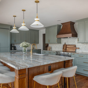
Hi everyone, I'm Sarah and Ogun we are here with fine line kitchens. So we are a couple working together. I do the interior design and remodeling of the space material selection meeting with the clients. And I handled operations outside, you know meaning all the construction work that is taking place the inside. The houses that we work in. I handle all the aspects of the construction, so today's project is very special. We're in Vienna and the client had a very big family. It's a family of seven that lives here. So we had a few aspects that we needed to keep in mind while designing this one. Having everybody be able to sit on the island. So we wanted plenty of seating all the way around. We didn't want anybody standing or anything like that. So what we did is we maximize the space. The center island is the biggest part of the kitchen. We use a natural stone to kind of give it a beautiful texture versus quartz. It's kind of standard white or kind of fabricated, so I wanted something very natural. We did this because I took my inspiration from the outside, so the inspiration if you look at the view right in front of me is there are so many greens there's a lot of brass accents and I wanted to bring this. Into this kitchen while designing it for my clients. She is very warm very. She wanted a very homey, comfy kind of look for the kitchen. So that's what we did today. As you can see, the cabinets are sage green, very light, so I still think it's a neutral, but it's a lighter color that again brings the outside in and we combine that with the oak right behind me so it's a slightly warm oak. It's not very dark. It's not very light. It's a medium brown and the same color went on the island. To kind of tie these two in and the backsplash, my favorite part is where you can see a little bit of design. It is, in my opinion still classic, but includes a pattern so the outside part is as we said in the beginning, is handled by my husband. I'd like him to speak a little bit about that. Thanks, Sarah, I want to talk to you guys a little bit about the construction part of this project. Originally this kitchen was located mostly in this area. They had their stove there sing. It was more of a peninsula layout in Sarah's and the customer vision they wanted. They wanted to get rid of the peninsula and they want to be able to have a huge island that can at least sit seven people because they're familiar with seven. So we wanted to make sure that we can achieve this design and bring it to life so that they can be happy with this layout. Some of the challenges we had, the house, the home being, you know, old home. There were a lot of you know the older electrical and plumbing that had to be replaced. We had to relocate the stove from here to this area. Over here we had put a nice foot fan that we had to relocate all the ductwork and the plumbing. Was being on the peninsula area. We had to relocate it to the center islands. So we achieved all this and kind of like bring it to bring in this kitchen up to date it looks beautiful. That's true, so yes, the old layout did not function for my clients because everything was kind of gathered on one side of the kitchen. So there was like a peninsula right there. So the end of this island kind of continued straight. And that was just the L shape. Kind of where everything was and there used to be another big table here, so they were using only kind of half of the space. So like I said at the beginning, our vision was to kind of feed everybody at the island, create some symmetry. 'cause I love that. So as you can see behind me, this is kind of the focal point symmetrical. Everything is kind of even we wanted to also panel the fridge here so it mimics the pantry and another size. So when you're looking at it, it is bringing again that symmetry back again. I hope you enjoyed this kitchen and this video and I'll see you soon. So how do you think this project turned out? It's nice. I like the color. I think it turned out nice. It's kind of like a little bit different color than what we always do. So I realize. Are you giving me a little bit of credit here that I did something different? Are you proud? I'm so proud of you. Other than that I like it. That they have kind of like a two sink. So if this was our kitchen, if we ever like you can have your own. I can have mine if we ever get into a fight then this can be like my own kitchen. Why are we gonna bring in a fight right now? So I'm cooking anyway. You're grilling most of the time, So what are you even talking about? My kitchen? That's my kitchen. You can just take the small sink. That's fine. It's always good to have your own space right there, so anyways. Thank you guys for watching. We hope to see you soon and if you have any questions please click the link below. It'll lead you to our website, house, YouTube and all of the social media is so nice to have you guys. We'll see you soon. Thanks bye bye-bye.
 Heather Cleveland Design
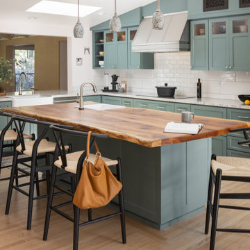
Inspiration for a large transitional medium tone wood floor kitchen remodel in San Francisco with a single-bowl sink, shaker cabinets, green cabinets, wood countertops, white backsplash, subway tile backsplash, stainless steel appliances and an island
 Donald Lococo Architects
Located on farmland in McLean, Virginia, the American Farmhouse balances the expected comforts of a new home with the bucolic beauty of an old farmhouse. The final site plan still has evidence showing parallel courses of the barn’s destiny. The house mass is broken and lowered so that the home can remain secondary to the monolithic barn structure. Earthy and elemental materials are selected for the home that reference the barn without directly mimicking it. Wooden members found inside the barn and from other barns bridge ceilings and are used in floors along with rustic slate adding to a sense of simplicity to the farmhouse design.
The age and patina of the barn is reflected in the house’s textural use of board and batten and field stone layered similar to stone foundations. The original development plan was to demolish the existing barn and construct three suburban homes. Part of an endangered breed, as one of the few remaining barns in the area, it was originally viewed as a challenge in a luxury home construction with several difficulties posed to the impending project: it would be expensive to renovate, vulnerable to demolition, and threatened by urban sprawl. However, instead of trying to alter or destroy the barn, the structure was fully embraced into the traditional architecture project as a centerpiece and was used as the inspiration for the home. The new house was sited parallel to the barn so that views to the barn gable were accessible.

 Bearded Builders
Inspiration for a large contemporary walk-out light wood floor and beige floor basement remodel in Omaha with white walls and no fireplace


 Urbanology Designs
Convey Studios, Sesha Smith
Kids' room - scandinavian girl light wood floor kids' room idea in Dallas with pink walls
Kids' room - scandinavian girl light wood floor kids' room idea in Dallas with pink walls



11