
Search results for "Self care accessible" in Home Design Ideas
 KJM Design Studio
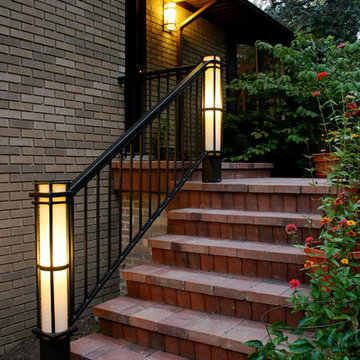
A design for a Prairie Style handrail with self-lit posts for nighttime illumination. The stair and home were existing - contrasting color on home was switched from muddy brown to dark bronze, better matching the brick. Railing post were designed to compliment the existing exterior lighting from Hubbardton Forge.

 Besch Architecture
Master bath with a free standing tub, wall mounted faucet and controls. Cedar planked wall divider with glass doors each side to access the shower and toilet room
Peter Nilson
 Visbeen Architects
Photographer: Ashley Avila Photography
Builder: Colonial Builders - Tim Schollart
Interior Designer: Laura Davidson
This large estate house was carefully crafted to compliment the rolling hillsides of the Midwest. Horizontal board & batten facades are sheltered by long runs of hipped roofs and are divided down the middle by the homes singular gabled wall. At the foyer, this gable takes the form of a classic three-part archway.
Going through the archway and into the interior, reveals a stunning see-through fireplace surround with raised natural stone hearth and rustic mantel beams. Subtle earth-toned wall colors, white trim, and natural wood floors serve as a perfect canvas to showcase patterned upholstery, black hardware, and colorful paintings. The kitchen and dining room occupies the space to the left of the foyer and living room and is connected to two garages through a more secluded mudroom and half bath. Off to the rear and adjacent to the kitchen is a screened porch that features a stone fireplace and stunning sunset views.
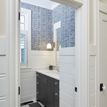
Occupying the space to the right of the living room and foyer is an understated master suite and spacious study featuring custom cabinets with diagonal bracing. The master bedroom’s en suite has a herringbone patterned marble floor, crisp white custom vanities, and access to a his and hers dressing area.
The four upstairs bedrooms are divided into pairs on either side of the living room balcony. Downstairs, the terraced landscaping exposes the family room and refreshment area to stunning views of the rear yard. The two remaining bedrooms in the lower level each have access to an en suite bathroom.
Find the right local pro for your project
 ZeroEnergy Design
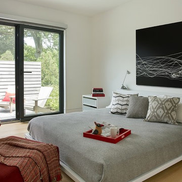
ZeroEnergy Design (ZED) created this modern home for a progressive family in the desirable community of Lexington.
Thoughtful Land Connection. The residence is carefully sited on the infill lot so as to create privacy from the road and neighbors, while cultivating a side yard that captures the southern sun. The terraced grade rises to meet the house, allowing for it to maintain a structured connection with the ground while also sitting above the high water table. The elevated outdoor living space maintains a strong connection with the indoor living space, while the stepped edge ties it back to the true ground plane. Siting and outdoor connections were completed by ZED in collaboration with landscape designer Soren Deniord Design Studio.
Exterior Finishes and Solar. The exterior finish materials include a palette of shiplapped wood siding, through-colored fiber cement panels and stucco. A rooftop parapet hides the solar panels above, while a gutter and site drainage system directs rainwater into an irrigation cistern and dry wells that recharge the groundwater.
Cooking, Dining, Living. Inside, the kitchen, fabricated by Henrybuilt, is located between the indoor and outdoor dining areas. The expansive south-facing sliding door opens to seamlessly connect the spaces, using a retractable awning to provide shade during the summer while still admitting the warming winter sun. The indoor living space continues from the dining areas across to the sunken living area, with a view that returns again to the outside through the corner wall of glass.
Accessible Guest Suite. The design of the first level guest suite provides for both aging in place and guests who regularly visit for extended stays. The patio off the north side of the house affords guests their own private outdoor space, and privacy from the neighbor. Similarly, the second level master suite opens to an outdoor private roof deck.
Light and Access. The wide open interior stair with a glass panel rail leads from the top level down to the well insulated basement. The design of the basement, used as an away/play space, addresses the need for both natural light and easy access. In addition to the open stairwell, light is admitted to the north side of the area with a high performance, Passive House (PHI) certified skylight, covering a six by sixteen foot area. On the south side, a unique roof hatch set flush with the deck opens to reveal a glass door at the base of the stairwell which provides additional light and access from the deck above down to the play space.
Energy. Energy consumption is reduced by the high performance building envelope, high efficiency mechanical systems, and then offset with renewable energy. All windows and doors are made of high performance triple paned glass with thermally broken aluminum frames. The exterior wall assembly employs dense pack cellulose in the stud cavity, a continuous air barrier, and four inches exterior rigid foam insulation. The 10kW rooftop solar electric system provides clean energy production. The final air leakage testing yielded 0.6 ACH 50 - an extremely air tight house, a testament to the well-designed details, progress testing and quality construction. When compared to a new house built to code requirements, this home consumes only 19% of the energy.
Architecture & Energy Consulting: ZeroEnergy Design
Landscape Design: Soren Deniord Design
Paintings: Bernd Haussmann Studio
Photos: Eric Roth Photography
 Gardner Architects LLC
Photography by Ken Wyner
2101 Connecticut Avenue (c.1928), an 8-story brick and limestone Beaux Arts style building with spacious apartments, is said to have been “the finest apartment house to appear in Washington between the two World Wars.” (James M. Goode, Best Addresses, 1988.) As advertised for rent in 1928, the apartments were designed “to incorporate many details that would aid the residents in establishing a home atmosphere, one possessing charm and dignity usually found only in a private house… the character and tenancy (being) assured through careful selection of guests.” Home to Senators, Ambassadors, a Vice President and a Supreme Court Justice as well as numerous Washington socialites, the building still stands as one of the undisputed “best addresses” in Washington, DC.)
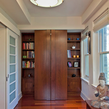
So well laid-out was this gracious 3,000 sf apartment that the basic floor plan remains unchanged from the original architect’s 1927 design. The organizing feature was, and continues to be, the grand “gallery” space in the center of the unit. Every room in the apartment can be accessed via the gallery, thus preserving it as the centerpiece of the “charm and dignity” which the original design intended. Programmatic modifications consisted of the addition of a small powder room off of the foyer, and the conversion of a corner “sun room” into a room for meditation and study. The apartment received a thorough updating of all systems, services and finishes, including a new kitchen and new bathrooms, several new built-in cabinetry units, and the consolidation of numerous small closets and passageways into more accessible and efficient storage spaces.
 mackmiller design+build
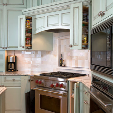
Spice and condiment rollouts above the stove are designed for easy access while cooking. The cabinets flanking the stove provide vertical pantry storage.
An inline blower for the range was mounted in the adjacent garage attic and vents it out the roof. The result is a very quiet fan taking care of the homeowners’ ventilation needs and meeting their desire for diminished noise.
For the backsplash, marble tiles and listellos were carefully designed to create an arched top niche that mirrors the shape of the range hood opening. Niche tiles were intentionally arranged in a different pattern to delineate it from the running bond pattern used on the rest of the backsplash. Three hand-painted and fired tiles created by the homeowner are incorporated into the niche. Niche doubles as a focal point and as a convenient place to store cooking oils and condiments.
The raised panel, French blue cabinets are finished with a dark brown glazing. These are full overlay doors and drawers, constructed with high precision to maintain a 1/8” gap between every side of a door and drawer.
PHOTO CREDIT: John Ray
 ZeroEnergy Design
This LEED Platinum certified house reflects the homeowner's desire for an exceptionally healthy and comfortable living environment, within a traditional neighborhood.
INFILL SITE. The family, who moved from another area of Wellesley, sought out this property to be within walking distance of the high school and downtown area. An existing structure on the tight lot was removed to make way for the new home. 84% of the construction waste, from both the previous structure and the new home, was diverted from a landfill. ZED designed to preserve the existing mature trees on the perimeter of the property to minimize site impacts, and to maintain the character of the neighborhood as well as privacy on the site.
EXTERIOR EXPRESSION. The street facade of the home relates to the local New England vernacular. The rear uses contemporary language, a nod to the family’s Californian roots, to incorporate a roof deck, solar panels, outdoor living space, and the backyard swimming pool. ZED’s careful planning avoided to the need to face the garage doors towards the street, a common syndrome of a narrow lot.
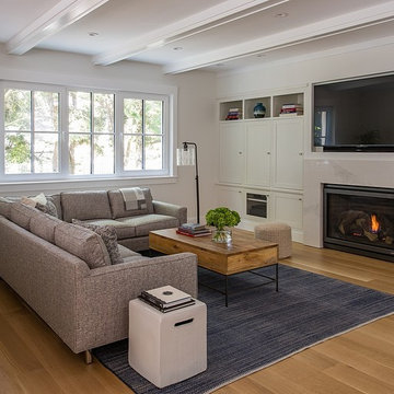
THOUGHTFUL SPACE. Homes with dual entries can often result in duplicate and unused spaces. In this home, the everyday and formal entry areas are one and the same; the front and garage doors share the entry program of coat closets, mudroom storage with bench for removing your shoes, and a laundry room with generous closets for the children's sporting equipment. The entry area leads directly to the living space, encompassing the kitchen, dining and sitting area areas in an L-shaped open plan arrangement. The kitchen is placed at the south-west corner of the space to allow for a strong connection to the dining, sitting and outdoor living spaces. A fire pit on the deck satisfies the family’s desire for an open flame while a sealed gas fireplace is used indoors - ZED’s preference after omitting gas burning appliances completely from an airtight home. A small study, with a window seat, is conveniently located just off of the living space. A first floor guest bedroom includes an accessible bathroom for aging visitors and can be used as a master suite to accommodate aging in place.
HEALTHY LIVING. The client requested a home that was easy to clean and would provide a respite from seasonal allergies and common contaminants that are found in many indoor spaces. ZED selected easy to clean solid surface flooring throughout, provided ample space for cleaning supplies on each floor, and designed a mechanical system with ventilation that provides a constant supply of fresh outdoor air. ZED selected durable materials, finishes, cabinetry, and casework with low or no volatile organic compounds (VOCs) and no added urea formaldehyde.
YEAR-ROUND COMFORT. The home is super insulated and air-tight, paired with high performance triple-paned windows, to ensure it is draft-free throughout the winter (even when in front of the large windows and doors). ZED designed a right-sized heating and cooling system to pair with the thermally improved building enclosure to ensure year-round comfort. The glazing on the home maximizes passive solar gains, and facilitates cross ventilation and daylighting.
ENERGY EFFICIENT. As one of the most energy efficient houses built to date in Wellesley, the home highlights a practical solution for Massachusetts. First, the building enclosure reduces the largest energy requirement for typical houses (heating). Super-insulation, exceptional air sealing, a thermally broken wall assembly, triple pane windows, and passive solar gain combine for a sizable heating load reduction. Second, within the house only efficient systems consume energy. These include an air source heat pump for heating & cooling, a heat pump hot water heater, LED lighting, energy recovery ventilation, and high efficiency appliances. Lastly, photovoltaics provide renewable energy help offset energy consumption. The result is an 89% reduction in energy use compared to a similar brand new home built to code requirements.
RESILIENT. The home will fare well in extreme weather events. During a winter power outage, heat loss will be very slow due to the super-insulated and airtight envelope– taking multiple days to drop to 60 degrees even with no heat source. An engineered drainage system, paired with careful the detailing of the foundation, will help to keep the finished basement dry. A generator will provide full operation of the all-electric house during a power outage.
OVERALL. The home is a reflection of the family goals and an expression of their values, beautifully enabling health, comfort, safety, resilience, and utility, all while respecting the planet.
ZED - Architect & Mechanical Designer
Bevilacqua Builders Inc - Contractor
Creative Land & Water Engineering - Civil Engineering
Barbara Peterson Landscape - Landscape Design
Nest & Company - Interior Furnishings
Eric Roth Photography - Photography
Sponsored
Sunbury, OH

J.Holderby - Renovations
Franklin County's Leading General Contractors - 2X Best of Houzz!
 Valentini Kids Furniture Brooklyn NY
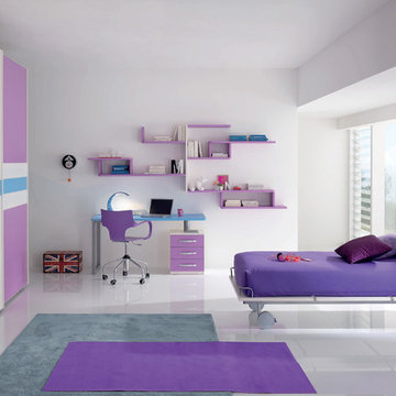
Italian Kids Bedroom Set WEB-04 by SPAR
Made in Italy by Spar
WEB Junior by Spar is an Italian kids bedroom furniture collection that is remarkable for its innovative modern solutions that help not only safe so valuable space, but get maximum out of every inch of your kids room. Modern technologies, brilliant design and outstanding quality are met within this collection, giving you endless opportunities for color and size customization, so you could realize all your individuality and meet all the requirements. WEB Bedroom line by Spar thinks about you and your lovely kids, or teenagers, providing designer bedroom solutions for all occasions, making your child's room awesome for everything: sleeping, studying and playing. WEB Junior Bedroom Furniture collection is here to realize all your biggest dreams and take care of your kids!
All the pieces can be mixed & matched from one set to another and are available in a variety of sizes and colors. Please contact our office regarding customization of this kids bedroom set.
The starting price is for the "As Shown" kids bedroom set WEB 04 that includes the following items:
1 Twin Size Bed (bed fits US standard Twin size mattress 39" x 75")
1 Desk with file cabinet (3 drawers)
1 Wall Shelf Shelving Composition
1 Sliding Door Wardrobe (2 Doors)
Please Note: Room/Bed decorative accessories and the mattress are not included in the price.
MATERIAL/CONSTRUCTION:
E1-Class ecological panels, which are produced exclusively trough a wood recycling production process
Used lacquers conform to the norm 71/3 (toys directive)
Structure: 18 mm thick melamine-coated particle board
Shelves: 25mm thick melamine-coated particle board
Back panels: medium density coated fibreboard 5mm thick
Doors: 18 mm thick melamine-coated particle board finished on 4 sides
Hardware: metal runners with self-closing system and double stop; adjustable self closing hinges; quick-mount and braking systems
Dimensions:
Twin Size Bed: W41.8" x D79.2" x H39.8" (internal 39" x 75" US Standard)
Full Size Bed: W56.8" x D79.2" x H39.8" (internal 54" x 75" US Standard)
Desk: W59" x D25.6" x H29.5"
File Cabinet: W18" x D16.5" x H28.5"
Wall Shelving Composition: W96" x D10" x H36.3" (1.6" thick)
Sliding Door Wardrobe: W71.7" x D23.6" x H89.8" or H102.4"
 Michael Nash Design, Build & Homes
This growing family of six was struggling with a dysfunctional kitchen design. The center island had been installed at an odd angle that limited accessibility and traffic flow. Additionally, storage space was limited by poor cabinet design. Finally, doorways in and out of the kitchen were narrow and poorly located, especially for children dashing in and out.
Other design challenges included how to better use a 10’ x 12’ room for children’s jackets and toys and how to add a professional-quality gas range in a neighborhood were natural gas wasn’t available. The new design would address all of these issues.
DESIGN SOLUTIONS
The new kitchen design revolves around a more proportional island. Carefully placed in the center of the new space with seating for four, it includes a prep sink, a second dishwasher and a beverage center.
The distressed ebony-stained island and hutch provides a brilliant contrast between the white color cabinetry. White Carrera marble countertops and backsplash top both island and perimeter cabinets.
Tall, double stacked cabinetry lines two walls to maximize storage space. Across the room there was an unused wall that now contains a 36” tower fridge and freezer, both covered with matching panels, and a tall cabinet that contains a microwave, steam unit and warming drawer.
A propane tank was buried in the back yard to provide gas to a new 60” professional range and cooktop. A custom-made wood mantel hood blends perfectly with the cabinet style.
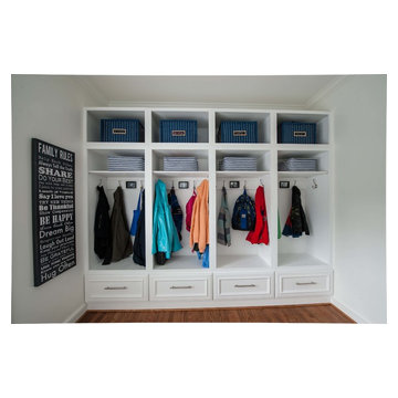
The old laundry room was reconfigured to have lots of locker space for all kids and added cabinetry for storage. A double entry door separated the new mudroom from the rest of the back hall. In the back hall the back windows were replaced with a set of French door and added decking to create a direct access to deck and backyard.
The end result is an open floor plan, high-end appliances, great traffic flow and pleasing colors. The homeowner calls it the “kitchen of her dreams.”
 Visbeen Architects
Photographer: Ashley Avila Photography
Builder: Colonial Builders - Tim Schollart
Interior Designer: Laura Davidson
This large estate house was carefully crafted to compliment the rolling hillsides of the Midwest. Horizontal board & batten facades are sheltered by long runs of hipped roofs and are divided down the middle by the homes singular gabled wall. At the foyer, this gable takes the form of a classic three-part archway.
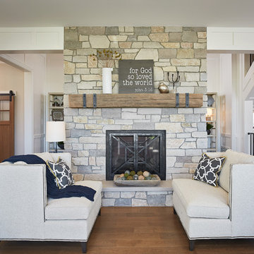
Going through the archway and into the interior, reveals a stunning see-through fireplace surround with raised natural stone hearth and rustic mantel beams. Subtle earth-toned wall colors, white trim, and natural wood floors serve as a perfect canvas to showcase patterned upholstery, black hardware, and colorful paintings. The kitchen and dining room occupies the space to the left of the foyer and living room and is connected to two garages through a more secluded mudroom and half bath. Off to the rear and adjacent to the kitchen is a screened porch that features a stone fireplace and stunning sunset views.
Occupying the space to the right of the living room and foyer is an understated master suite and spacious study featuring custom cabinets with diagonal bracing. The master bedroom’s en suite has a herringbone patterned marble floor, crisp white custom vanities, and access to a his and hers dressing area.
The four upstairs bedrooms are divided into pairs on either side of the living room balcony. Downstairs, the terraced landscaping exposes the family room and refreshment area to stunning views of the rear yard. The two remaining bedrooms in the lower level each have access to an en suite bathroom.
 Titan Homes LLC
Lisa Monteagudo - Photographer
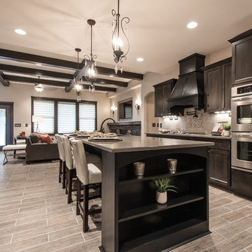
Inspiration for a transitional kitchen remodel in Seattle with recessed-panel cabinets, dark wood cabinets, beige backsplash and stainless steel appliances
Inspiration for a transitional kitchen remodel in Seattle with recessed-panel cabinets, dark wood cabinets, beige backsplash and stainless steel appliances
 The Decorating Therapist
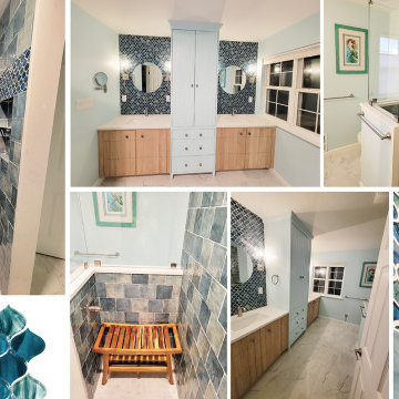
This discretely coastal primary bath has become her new favorite self-care sanctuary. What began as a simple update turned into a space that now exemplifies a personal retreat—calming, fresh, and entirely her own. By mixing and matching tiles in shades of blue and turquoise, the room captures the fluid beauty of water in motion. The color palette plays like the sea itself: some tiles smooth and glassy, others textured like rippling waves.
There’s a playful current that runs through the space, balanced with restraint and elegance. A soft, spa green graces the walls, offering a light wash of calm without feeling theme-y. It’s subtle, yet undeniably refreshing.
A bit of natural wood adds warmth and an organic layer to the design— a teak shower stool, a slatted vanity with a lived-in patina – and a live-edge floating shelf to come for a trailing plant to complete the outdoor shower ambiance.
These elements ground the space and keep it from feeling overly polished. They remind her of driftwood on the shore, sun-bleached and smoothed by time. Lighting is soft and layered, mimicking the way sunlight filters through sea spray, and even the hardware—brushed nickel with embedded abalone—feels like treasures found at low tide.
This bathroom isn’t about showiness. It’s about retreat. It’s the exhale at the end of the day, the slow mornings with coffee in hand. While its aesthetic is clearly influenced by the sea, the result is timeless and deeply personal. It’s not a coastal cliché, but a quiet tribute to her love of the shore—wrapped in self-care, serenity, and style. This is where she lingers, where she takes her time, and where she feels most at ease. A room that invites her to breathe deeper and be still.
Allow me to help you finish that room so you too can find peace in function and design!
 Advance Design Studio, Ltd.
Curtis and Peggy had been thinking of a kitchen remodel for quite some time, but they knew their house would have a unique set of challenges. Their older Victorian house was built in 1891. The kitchen cabinetry was original, and they wanted to keep the authenticity of their period home while adding modern comforts that would improve their quality of life.
A friend recommended Advance Design Studio for their exceptional experience and quality of work. After meeting with designer Michelle Lecinski at Advance Design, they were confident they could partner with Advance to accomplish the unique kitchen renovation they’d been talking about for years. “We wanted to do the kitchen for a long, long time,” Curtis said. “(We asked ourselves) what are we actually going to do? How are we going to do this? And who are we going to find to do exactly what we want?”
The goal for the project was to keep the home renovation and new kitchen feeling authentic to the time in which it was built. They desperately wanted the modern comforts that come with a larger refrigerator and the dishwasher that they never had! The old home was also a bit drafty so adding a fireplace, wall insulation and new windows became a priority. They very much wanted to create a comfortable hearth room adjacent to the kitchen, complete with old world brick.
The original cabinetry had to go to make way for beautiful new kitchen cabinetry that appears as if it was a hundred years old, but with all the benefits of cutting-edge storage, self-closing drawers, and a brand-new look. “We just wanted to keep it old looking, but with some modern updates,” Peggy said.
Dura Supreme Highland Cabinets with a Heritage Old World Painted Finish replaced the original 1891 cabinets. The hand-applied careful rubbed-off detailing makes these exquisite cabinets look as if they came from a far-gone era. Despite the small size of the kitchen, Peggy, Curtis and Michelle utilized every inch with custom cabinet sizes to increase storage capacity. The custom cabinets allowed for the addition of a 24” Fisher Paykel dishwasher with a concealing Dura Supreme door panel. Michelle was also able to work into the new design a larger 30” Fisher Paykel French refrigerator. “We made every ¼ inch count in this small space,” designer Michelle said. “Having the ability to custom size the cabinetry was the only way to achieve this.”
“The kitchen essentially was designed around the Heartland Vintage range and oven,” says Michelle. A classic appliance that combines nostalgic beauty and craftsmanship for modern cooking, with nickel plated trim and elegantly shaped handles and legs; the not to miss range is a striking focal point of the entire room and an engaging conversation piece.
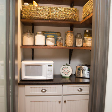
Granite countertops in Kodiak Satin with subtle veining kept with the old-world style. The delicate porcelain La Vie Crackle Sonoma tile kitchen backsplash compliments the home’s style perfectly. A handcrafted passthrough designed to show off Peggy’s fine china was custom built by project carpenters Justin Davis and Jeff Dallain to physically and visually open the space. Additional storage was created in the custom panty room with Latte Edinburg cabinets, hand-made weathered wood shelving with authentic black iron brackets, and an intricate tin copper ceiling.
Peggy and Curtis loved the idea of adding a Vermont stove to make the hearth-room not only functional, but a truly beckoning place to be. A stunning Bordeaux red Vermont Castings Stove with crisp black ventilation was chosen and combined with the authentic reclaimed Chicago brick wall. Advance’s talented carpenters custom-built elegant weathered shelves to house family memorabilia, installed carefully chosen barn sconces, and made the hearth room an inviting place to relax with a cup of coffee and a good book.
“Peggy and Curtis’ project was so much fun to work on. Creating a space that looks and feels like it always belonged in this beautiful old Victorian home is a designer’s dream. To see the delight in their faces when they saw the design details coming together truly made it worth the time and effort that went into making the very compact kitchen space work”, said Michelle. “The result is an amazing custom kitchen, packed with functionality in every inch, nook and cranny!” exclaims Michelle.
The renovation didn’t end with the kitchen. New Pella windows were added to help lessen the drafts. The removal of the original windows and trim necessitated the re-creation of hand-made corbels and trim details no longer available today. The talented carpenter team came to the rescue, crafting new pieces and masterfully finishing them as if they were always there. New custom gutters were formed and installed with a front entry rework necessary to accommodate the changes.
The whole house functions better, but it still feels like the original 1891 home. “From start to finish it’s just a much better space than we used to have,” Peggy said. “Jeff and Justin were amazing.” Curtis added; “We were lucky to find Advance Design, because they really came through for us. I loved that they had everything in house, anything you needed to have done, they could do it”.

Sponsored
Columbus, OH
Free consultation for landscape design!

Peabody Landscape Group
Franklin County's Reliable Landscape Design & Contracting
 Glickman Design Build
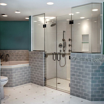
94 year old mother's birthday surprise! Wheelchair bound, her family spruced up her bathroom to accommodate her.
Fully wheelchair accessible shower
Handicap accessible bathroom and shower, Bethesda, MD
Wheelchair accessible renovation
Wheelchair accessible bathroom
Wheelchair lift
Accessible shower
Barrier free whole house remodel
ADA bathroom
Accessible design bathroom
Non-slip bathroom flooring
Accessible bathroom ideas
ADA ideas
 Western DuPage Landscaping, Inc.
After years of enjoying their backyard, the clients of this property enlisted our firm to improve the original landscape we had completed over ten years ago. Our goal was to update the patio and further develop their backyard by creating a garden with a variety of color and texture.
Over time the existing patio had settled, plantings grew, and an existing Oak thrived. During the initial home and landscape construction our clients were particularly concerned about the health of the mature Oak located just off the home. Special care was given when the patio was first built. Precautions were again taken in working around the Oak as the existing patio was removed and replaced. Surrounding trees and shrubs had grown and enclosed the backyard limiting access. This required almost all work and transport of material to be done by hand.
The old concrete paver patio was replaced with bluestone. Existing mortared limestone around the edges of the patio levels were cleaned and tuck-pointed. A new stoop was constructed with mortared limestone risers and bluestone treads. A built-in grill and fireplace further updated the backyard space. The fireplace was designed to follow the organic curve of the patio. Mortared limestone and bluestone material were repeated on all elements, tying them together.
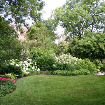
Along with the updated patio, many additions were made in transforming the modest backyard into a lush garden. Masses of annuals, ornamental grasses, and perennials along with mixed shrubs created sweeps of color and texture in front of a new arborvitae hedge and other existing trees and shrubs.
After careful planning and execution the completed landscape gave our clients the updated landscape they desired. The completion of the project was a rewarding and fulfilling experience as we transformed a good past project into a fantastic new project.
 FINNE Architects
The Mazama house is located in the Methow Valley of Washington State, a secluded mountain valley on the eastern edge of the North Cascades, about 200 miles northeast of Seattle.
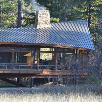
The house has been carefully placed in a copse of trees at the easterly end of a large meadow. Two major building volumes indicate the house organization. A grounded 2-story bedroom wing anchors a raised living pavilion that is lifted off the ground by a series of exposed steel columns. Seen from the access road, the large meadow in front of the house continues right under the main living space, making the living pavilion into a kind of bridge structure spanning over the meadow grass, with the house touching the ground lightly on six steel columns. The raised floor level provides enhanced views as well as keeping the main living level well above the 3-4 feet of winter snow accumulation that is typical for the upper Methow Valley.
To further emphasize the idea of lightness, the exposed wood structure of the living pavilion roof changes pitch along its length, so the roof warps upward at each end. The interior exposed wood beams appear like an unfolding fan as the roof pitch changes. The main interior bearing columns are steel with a tapered “V”-shape, recalling the lightness of a dancer.
The house reflects the continuing FINNE investigation into the idea of crafted modernism, with cast bronze inserts at the front door, variegated laser-cut steel railing panels, a curvilinear cast-glass kitchen counter, waterjet-cut aluminum light fixtures, and many custom furniture pieces. The house interior has been designed to be completely integral with the exterior. The living pavilion contains more than twelve pieces of custom furniture and lighting, creating a totality of the designed environment that recalls the idea of Gesamtkunstverk, as seen in the work of Josef Hoffman and the Viennese Secessionist movement in the early 20th century.
The house has been designed from the start as a sustainable structure, with 40% higher insulation values than required by code, radiant concrete slab heating, efficient natural ventilation, large amounts of natural lighting, water-conserving plumbing fixtures, and locally sourced materials. Windows have high-performance LowE insulated glazing and are equipped with concealed shades. A radiant hydronic heat system with exposed concrete floors allows lower operating temperatures and higher occupant comfort levels. The concrete slabs conserve heat and provide great warmth and comfort for the feet.
Deep roof overhangs, built-in shades and high operating clerestory windows are used to reduce heat gain in summer months. During the winter, the lower sun angle is able to penetrate into living spaces and passively warm the exposed concrete floor. Low VOC paints and stains have been used throughout the house. The high level of craft evident in the house reflects another key principle of sustainable design: build it well and make it last for many years!
Photo by NIls Finne
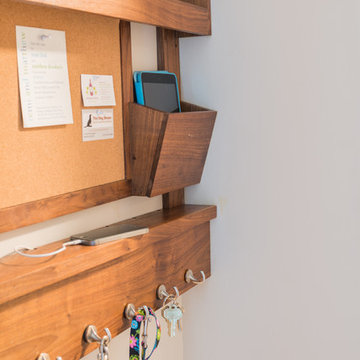
 SLR Architecture Inc.
This tired ranch was in dire need of an update. Formerly the kitchen was separate from the living room and the dining area was severely undersized.
SLR Architecture opened up the kitchen to the great room and defined the living and dining areas so that each space stands on it's own. With help from interior designer Justine Sterling the finishes, furniture, ad accessories were carefully considered so that the whole room works as an overall composition.
A compact mud room was carved out of the back hall from a formally over sized laundry room so the family had a convenient drop zone, also the front entry was upgraded and a new rear deck was added for easier exterior access. Lighting was carefully considered so that different zones were well lit.
photo: Jessica Delaney
Sponsored
Columbus, OH
Free consultation for landscape design!
Peabody Landscape Group
Franklin County's Reliable Landscape Design & Contracting
 Advance Design Studio, Ltd.
Jackie and Sean loved the Algonquin neighborhood they lived in with the peaceful neighborhood and the close proximity to work and school. What they didn’t love was how outdated their home had become. With a cramped kitchen and an unused dining room, they decided a remodel was the perfect solution to their problem. They would be able to continue to live in the area they loved, while at the same time they could have the dream home they envisioned.
After a thorough search, Jackie came across Advance Design Studio. She was impressed by all of the positive reviews she saw on the internet and saw herself identifying with all of the project stories she saw on the website. Once they met with designer Scott Christensen and owner Todd Jurs, they knew Advance Design was the right company to make their dreams a reality.
The project consisted of four main areas: the kitchen/dining/powder room, the laundry room, the master bathroom, and the kid’s bathroom. They wanted to expand the kitchen into the seldom used dining room and add a large island for hosting parties and family gatherings. They also wanted new hardwood flooring throughout the first level. The laundry room needed to be more functional, and all three bathrooms were in dire need of updating.
The closed off kitchen was opened up to create a sweeping space between the new eating area and the much larger kitchen. A handsome dry bar complete with a beverage refrigerator and lighted glass door cabinetry makes an elegant transition across from a peninsula area filled with storage. An additional decorative cabinet lighting up elegant dishware through the mullioned glass sits directly across from the drybar.
An expansive island was critical to the kitchen plans. Jackie, Sean and Scott worked closely together to create just the right details for their design. They wanted the island to be functional in addition to being the centerpiece of the room. Added storage for the kid’s school supplies was hidden behind cabinet doors so the children could do their schoolwork right at the island, and a microwave drawer glides open with the touch of a finger hidden inconspicuously within the island space. The easy to care for Cambria Britannica Quartz island top with its sweeping grey and white marble look perched atop hand-carved Craftsman corbels was absolutely what they were hoping for, blending both beauty and function perfectly.
Adding a nice contrast to the brightness of the quartz and the white cabinetry, Kodiak - Leather granite countertops were used to balance the light and dark tones of the space. Dura Supreme Classic White painted cabinets grace the perimeter, while Maple Poppy Seed stained cabinets with a beautiful soft grey woodgrain were used in the beverage center and island. The two tones compliment the large space balancing it out nicely creating interest and elegance with the simple Craftsman style full overlay doors.
A deep warm Barnwood White Oak flooring was added throughout the lower level. The new floor brings additional contrast to the bright kitchen and provides unity with the now open floorplan as it rolls in to the foyer and family room. Final details like the show-stopping lunar like duo light fixtures complete the space and intermix expertly with crisscross details of the glass door mullions, the island bar seating and even accessories in the space.
The small cluttered laundry room needed more space and more storage. With a busy family it seemed to overflow daily and did not have anywhere to hide the families “in and out stuff.” Scott designed the new space with a stackable washer and dryer and much more efficiently organized cabinetry. Doing laundry is now (almost!) a pleasure and keeping everyone’s “stuff” hidden, but readily accessible is now a snap.
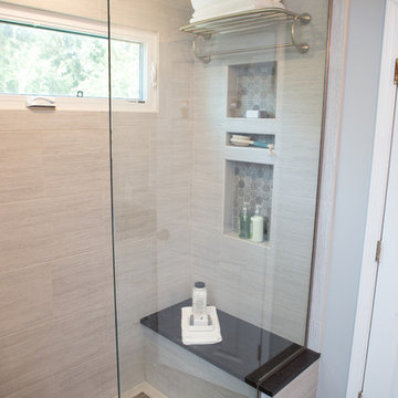
The master bath was not a place where the couple enjoyed spending time getting ready for their day. The tub almost never was used, so removing it made it possible to build an extra-large shower, replacing the small cramped cube of the previous shower they hated. Clean, horizontal lines softly draw your eye around the space with porcelain tile called Driftwood Sea spray. Full overlay cabinetry in a soft white vanity with double sinks makes getting ready for the day much more convenient for the busy couple.
Long floor planks made of porcelain tile mimic real hardwood floors in a soft grey to compliment the shower, but with the ease and care of a tile surface. Cambrian Black Granite counters with a matte finish and under mount porcelain sinks with handsome brushed chrome hardware complete the handsome space. A real bonus in any master bath; a custom built in storage nook was tucked in the corner of the space for linens and heavenly storage.
The kid’s bath was in sad shape because it was original to the house. To keep the budget in control, the tub which was in great condition was retained, but focus was on the new large brick style porcelain charcoal tile on the floor, crisp white new Craftsman style cabinetry with pretty furniture details on the corner base, a striking granite top with white under mount porcelain sinks and fresh hardware and faucets. Some beautiful soft grey wood mirrors to match mom and dads were custom sized and placed under new lighting, and 4 hooks were smartly arranged down the wall for kids’ towels.
This couple was determined not to move, and made their house their dream home. Not only does their home function greatly now, but Jackie says, “When the neighbors come to visit, they’re asking if they can “steal” the design”! The added functionality, elegance, and open floor plan were exactly what this family needed in order to stay.
Advance Design Studio, Joe Nowak
 Advance Design Studio, Ltd.
Jackie and Sean loved the Algonquin neighborhood they lived in with the peaceful neighborhood and the close proximity to work and school. What they didn’t love was how outdated their home had become. With a cramped kitchen and an unused dining room, they decided a remodel was the perfect solution to their problem. They would be able to continue to live in the area they loved, while at the same time they could have the dream home they envisioned.
After a thorough search, Jackie came across Advance Design Studio. She was impressed by all of the positive reviews she saw on the internet and saw herself identifying with all of the project stories she saw on the website. Once they met with designer Scott Christensen and owner Todd Jurs, they knew Advance Design was the right company to make their dreams a reality.
The project consisted of four main areas: the kitchen/dining/powder room, the laundry room, the master bathroom, and the kid’s bathroom. They wanted to expand the kitchen into the seldom used dining room and add a large island for hosting parties and family gatherings. They also wanted new hardwood flooring throughout the first level. The laundry room needed to be more functional, and all three bathrooms were in dire need of updating.
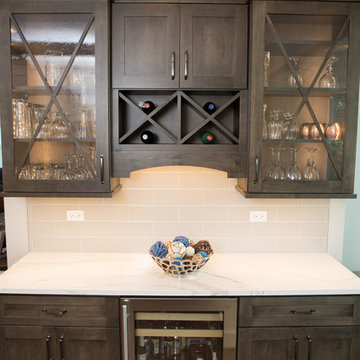
The closed off kitchen was opened up to create a sweeping space between the new eating area and the much larger kitchen. A handsome dry bar complete with a beverage refrigerator and lighted glass door cabinetry makes an elegant transition across from a peninsula area filled with storage. An additional decorative cabinet lighting up elegant dishware through the mullioned glass sits directly across from the drybar.
An expansive island was critical to the kitchen plans. Jackie, Sean and Scott worked closely together to create just the right details for their design. They wanted the island to be functional in addition to being the centerpiece of the room. Added storage for the kid’s school supplies was hidden behind cabinet doors so the children could do their schoolwork right at the island, and a microwave drawer glides open with the touch of a finger hidden inconspicuously within the island space. The easy to care for Cambria Britannica Quartz island top with its sweeping grey and white marble look perched atop hand-carved Craftsman corbels was absolutely what they were hoping for, blending both beauty and function perfectly.
Adding a nice contrast to the brightness of the quartz and the white cabinetry, Kodiak - Leather granite countertops were used to balance the light and dark tones of the space. Dura Supreme Classic White painted cabinets grace the perimeter, while Maple Poppy Seed stained cabinets with a beautiful soft grey woodgrain were used in the beverage center and island. The two tones compliment the large space balancing it out nicely creating interest and elegance with the simple Craftsman style full overlay doors.
A deep warm Barnwood White Oak flooring was added throughout the lower level. The new floor brings additional contrast to the bright kitchen and provides unity with the now open floorplan as it rolls in to the foyer and family room. Final details like the show-stopping lunar like duo light fixtures complete the space and intermix expertly with crisscross details of the glass door mullions, the island bar seating and even accessories in the space.
The small cluttered laundry room needed more space and more storage. With a busy family it seemed to overflow daily and did not have anywhere to hide the families “in and out stuff.” Scott designed the new space with a stackable washer and dryer and much more efficiently organized cabinetry. Doing laundry is now (almost!) a pleasure and keeping everyone’s “stuff” hidden, but readily accessible is now a snap.
The master bath was not a place where the couple enjoyed spending time getting ready for their day. The tub almost never was used, so removing it made it possible to build an extra-large shower, replacing the small cramped cube of the previous shower they hated. Clean, horizontal lines softly draw your eye around the space with porcelain tile called Driftwood Sea spray. Full overlay cabinetry in a soft white vanity with double sinks makes getting ready for the day much more convenient for the busy couple.
Long floor planks made of porcelain tile mimic real hardwood floors in a soft grey to compliment the shower, but with the ease and care of a tile surface. Cambrian Black Granite counters with a matte finish and under mount porcelain sinks with handsome brushed chrome hardware complete the handsome space. A real bonus in any master bath; a custom built in storage nook was tucked in the corner of the space for linens and heavenly storage.
The kid’s bath was in sad shape because it was original to the house. To keep the budget in control, the tub which was in great condition was retained, but focus was on the new large brick style porcelain charcoal tile on the floor, crisp white new Craftsman style cabinetry with pretty furniture details on the corner base, a striking granite top with white under mount porcelain sinks and fresh hardware and faucets. Some beautiful soft grey wood mirrors to match mom and dads were custom sized and placed under new lighting, and 4 hooks were smartly arranged down the wall for kids’ towels.
This couple was determined not to move, and made their house their dream home. Not only does their home function greatly now, but Jackie says, “When the neighbors come to visit, they’re asking if they can “steal” the design”! The added functionality, elegance, and open floor plan were exactly what this family needed in order to stay.
Advance Design Studio, Joe Nowak
 M Atelier
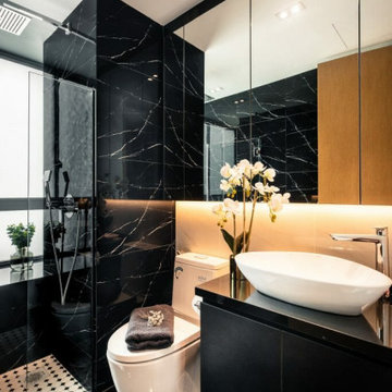
A growing trend in today’s home interiors is that of luxurious bathrooms. Homeowners think about investing in an elegant and cosy bathroom due to various reasons. Some of them see the bathroom as their temple of solace, where they do all their special self-care activities. Others want their bathrooms to be the space where they can enjoy the time with themselves. People also see the bathroom as an extension of their taste and personality.
There are ways, however, to achieve a luxurious ambiance in your bathroom. If you check out the best interior design in Singapore recommendations, here are some of the most valuable tips and tricks that you may do:
1. Invest in cove lighting.
Cove lights are trending these days because of the way they change the environmental settings of any room. They are not as bright as general lighting, but they can illuminate the space just right. They are also very versatile and can be installed in bedrooms, kitchens, living rooms, and most notably, bathrooms.
Instead of using a central light in your bathroom, it would be posher to use cove lights. The light source is not blinding but is enough to illuminate the area evenly. The lights, due to their skewed diffusion, do not overlap each other, so you can enjoy an intimate ambiance while doing your self-care tasks.
2. Have a bathtub in place.
One of the most important aspects of a luxurious bathroom is the bathtub. It not only symbolises that you have the money to spend on one, but more importantly, you can afford the space for it. You also have the time to relax and enjoy a long bath with the tub in your bathroom.
While it is more common to have a built-in tub in most bathrooms (as a way to utilise space), you may opt for the standalone kind. This tub is not fastened onto the wall but instead held stable on the floor (similar to those in Victorian-era mansions). You may also have your water system customised to accommodate the tub.
3. Declutter.
Achieving a luxurious bathroom doesn’t mean you have to spend a lot on it. The best interior designs in Singapore feature bathrooms that are minimalist in terms of décor and style.
You can start by removing all the unnecessary items in your bathroom, cleaning up all corners down to the last speck of dust. You may then have it repainted with a colour scheme that speaks of cleanliness, relaxation, and peace. These shades include white, grey, blue, and green, as they are relaxing to the eyes and easy to clean.
You may also want to invest in an organiser, where you can place all your toiletries in one place and not have them occupy your bathroom surfaces. This way, it will be easier for you to add decorations and other accents to create a cosy vibe.
It also pays to have an indoor plant as an accent in your bathroom. Not only does it speak of freshness (which today’s luxe homes embrace), but it also offers a pop of colour that breaks the monotony of your bathroom colour scheme.
15