
Search results for "Self care accessible" in Home Design Ideas
 Lori Ramsay Design
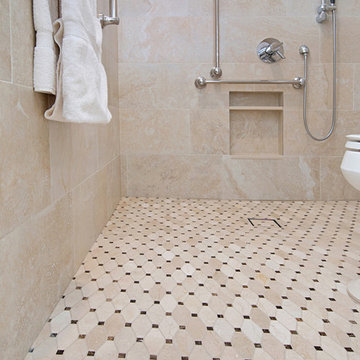
We created this beautiful accessible bathroom in Carlsbad to give our client a more functional space. We designed this unique bath, specific to the client's specifications to make it more wheel chair accessible. Features such as the roll in shower, roll up vanity and the ability to use her chair for flexibility over the fixed wall mounted seat allow her to be more independent in this bathroom. Safety was another significant factor for the room. We added support bars in all areas and with maximum flexibility to allow the client to perform all bathing functions independently, and all were positioned after carefully recreating her movements. We met the objectives of functionality and safety without compromising beauty in this aging in place bathroom. Travertine-look porcelain tile was used in a large format on the shower walls to minimize grout lines and maximize ease of maintenance. A crema marfil marble mosaic in an elongated hex pattern was used in the shower room for it’s beauty and flexibility in sloped shower. A custom cabinet was made to the height ideal for our client’s use of the sink and a protective panel placed over the pea trap.
 ONE eleven ltd.
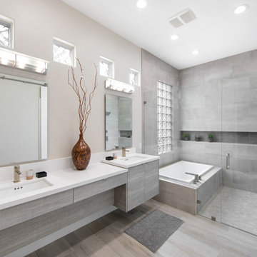
We developed a design that fully met the desires of a spacious, airy, light filled home incorporating Universal Design features that blend seamlessly adding beauty to the Minimalist Scandinavian concept.
 Lori Ramsay Design
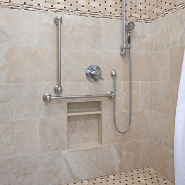
We created this beautiful accessible bathroom in Carlsbad to give our client a more functional space. We designed this unique bath, specific to the client's specifications to make it more wheel chair accessible. Features such as the roll in shower, roll up vanity and the ability to use her chair for flexibility over the fixed wall mounted seat allow her to be more independent in this bathroom. Safety was another significant factor for the room. We added support bars in all areas and with maximum flexibility to allow the client to perform all bathing functions independently, and all were positioned after carefully recreating her movements. We met the objectives of functionality and safety without compromising beauty in this aging in place bathroom. Travertine-look porcelain tile was used in a large format on the shower walls to minimize grout lines and maximize ease of maintenance. A crema marfil marble mosaic in an elongated hex pattern was used in the shower room for it’s beauty and flexibility in sloped shower. A custom cabinet was made to the height ideal for our client’s use of the sink and a protective panel placed over the pea trap.
Find the right local pro for your project
 Alloy Architecture & Construction
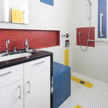
The clients for this small bathroom project are passionate art enthusiasts and asked the architects to create a space based on the work of one of their favorite abstract painters, Piet Mondrian. Mondrian was a Dutch artist associated with the De Stijl movement which reduced designs down to basic rectilinear forms and primary colors within a grid. Alloy used floor to ceiling recycled glass tiles to re-interpret Mondrian's compositions, using blocks of color in a white grid of tile to delineate space and the functions within the small room. A red block of color is recessed and becomes a niche, a blue block is a shower seat, a yellow rectangle connects shower fixtures with the drain.
The bathroom also has many aging-in-place design components which were a priority for the clients. There is a zero clearance entrance to the shower. We widened the doorway for greater accessibility and installed a pocket door to save space. ADA compliant grab bars were located to compliment the tile composition.
Andrea Hubbell Photography
 Harrell Design + Build
What our clients needed:
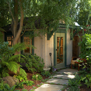
• Create a garden folly that doubles as a well-built shed for crafts and storage.
• Size the structure large enough for comfortable storage without dominating the garden.
• Discreetly locate the shed in the far corner of the rear yard while maintaining existing trees.
• Ensure that the structure is protected from the weather and carefully detailed to deter access of wildlife and rodents.
FUNCTION
• Construct the shed slab close to grade to permit easy access for bicycle storage, while building shed walls above grade to ensure against termites and dryrot.
• Install a French door and operable casement windows to admit plenty of daylight and provide views to the garden.
• Include rugged built-in work bench, shelves, bike racks and tool storage for a rustic well-organized and efficient space.
• Incorporate GFIC electrical service for safe access to power at this distant corner of the yard.
• Position energy-efficient interior lighting to ensure space can be used year-round.
• Switch control of exterior light from house and from shed for ease of command.
AESTHETICS
• Design and detail the shed to coordinate with the Arts and Crafts style house.
• Include an arbor for future flowering vines, further softening the shed’s garden presence.
• Simple and rustic interior surfaces ensure that the space is easy to clean.
• Create an aged and softly weathered appearance, and protect the exterior siding by finishing the cedar with a custom-colored semi-transparent stain.
INNOVATIVE MATERIALS AND CONSTRUCTION
• Factory-built components were pre-assembled to allow for a speedy assembly and for a shorter on-site construction schedule.
• Each component was easily transported through the yard without disturbing garden features.
• Decorative exterior trim frames the door and windows, while a simpler trim is used inside the unadorned shed.
OBSTACLE OVERCOME
• The structure is located in the corner of the yard to avoid disturbance of a curly willow tree.
• The low-profile structure is positioned close to property lines while staying beneath the allowable daylight plane for structures.
• To comply with daylight plane close to fence, the roof form combines hip and gable forms, with door located at gable end.
• The height of the modest interior is maximized, without exceeding the allowable building height.
CRAFTSMANSHIP
• The concrete slab was precisely formed and finished for ease of shed assembly before the factory-built components were delivered to site.
• Precision planning meant the pre-framed door fit exactly between raised concrete curb.
 Gardner Architects LLC
Photography by Ken Wyner
2101 Connecticut Avenue (c.1928), an 8-story brick and limestone Beaux Arts style building with spacious apartments, is said to have been “the finest apartment house to appear in Washington between the two World Wars.” (James M. Goode, Best Addresses, 1988.) As advertised for rent in 1928, the apartments were designed “to incorporate many details that would aid the residents in establishing a home atmosphere, one possessing charm and dignity usually found only in a private house… the character and tenancy (being) assured through careful selection of guests.” Home to Senators, Ambassadors, a Vice President and a Supreme Court Justice as well as numerous Washington socialites, the building still stands as one of the undisputed “best addresses” in Washington, DC.)
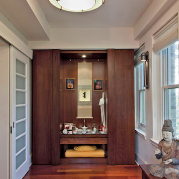
So well laid-out was this gracious 3,000 sf apartment that the basic floor plan remains unchanged from the original architect’s 1927 design. The organizing feature was, and continues to be, the grand “gallery” space in the center of the unit. Every room in the apartment can be accessed via the gallery, thus preserving it as the centerpiece of the “charm and dignity” which the original design intended. Programmatic modifications consisted of the addition of a small powder room off of the foyer, and the conversion of a corner “sun room” into a room for meditation and study. The apartment received a thorough updating of all systems, services and finishes, including a new kitchen and new bathrooms, several new built-in cabinetry units, and the consolidation of numerous small closets and passageways into more accessible and efficient storage spaces.

 ZeroEnergy Design
This LEED Platinum certified house reflects the homeowner's desire for an exceptionally healthy and comfortable living environment, within a traditional neighborhood.
INFILL SITE. The family, who moved from another area of Wellesley, sought out this property to be within walking distance of the high school and downtown area. An existing structure on the tight lot was removed to make way for the new home. 84% of the construction waste, from both the previous structure and the new home, was diverted from a landfill. ZED designed to preserve the existing mature trees on the perimeter of the property to minimize site impacts, and to maintain the character of the neighborhood as well as privacy on the site.
EXTERIOR EXPRESSION. The street facade of the home relates to the local New England vernacular. The rear uses contemporary language, a nod to the family’s Californian roots, to incorporate a roof deck, solar panels, outdoor living space, and the backyard swimming pool. ZED’s careful planning avoided to the need to face the garage doors towards the street, a common syndrome of a narrow lot.
THOUGHTFUL SPACE. Homes with dual entries can often result in duplicate and unused spaces. In this home, the everyday and formal entry areas are one and the same; the front and garage doors share the entry program of coat closets, mudroom storage with bench for removing your shoes, and a laundry room with generous closets for the children's sporting equipment. The entry area leads directly to the living space, encompassing the kitchen, dining and sitting area areas in an L-shaped open plan arrangement. The kitchen is placed at the south-west corner of the space to allow for a strong connection to the dining, sitting and outdoor living spaces. A fire pit on the deck satisfies the family’s desire for an open flame while a sealed gas fireplace is used indoors - ZED’s preference after omitting gas burning appliances completely from an airtight home. A small study, with a window seat, is conveniently located just off of the living space. A first floor guest bedroom includes an accessible bathroom for aging visitors and can be used as a master suite to accommodate aging in place.
HEALTHY LIVING. The client requested a home that was easy to clean and would provide a respite from seasonal allergies and common contaminants that are found in many indoor spaces. ZED selected easy to clean solid surface flooring throughout, provided ample space for cleaning supplies on each floor, and designed a mechanical system with ventilation that provides a constant supply of fresh outdoor air. ZED selected durable materials, finishes, cabinetry, and casework with low or no volatile organic compounds (VOCs) and no added urea formaldehyde.
YEAR-ROUND COMFORT. The home is super insulated and air-tight, paired with high performance triple-paned windows, to ensure it is draft-free throughout the winter (even when in front of the large windows and doors). ZED designed a right-sized heating and cooling system to pair with the thermally improved building enclosure to ensure year-round comfort. The glazing on the home maximizes passive solar gains, and facilitates cross ventilation and daylighting.
ENERGY EFFICIENT. As one of the most energy efficient houses built to date in Wellesley, the home highlights a practical solution for Massachusetts. First, the building enclosure reduces the largest energy requirement for typical houses (heating). Super-insulation, exceptional air sealing, a thermally broken wall assembly, triple pane windows, and passive solar gain combine for a sizable heating load reduction. Second, within the house only efficient systems consume energy. These include an air source heat pump for heating & cooling, a heat pump hot water heater, LED lighting, energy recovery ventilation, and high efficiency appliances. Lastly, photovoltaics provide renewable energy help offset energy consumption. The result is an 89% reduction in energy use compared to a similar brand new home built to code requirements.
RESILIENT. The home will fare well in extreme weather events. During a winter power outage, heat loss will be very slow due to the super-insulated and airtight envelope– taking multiple days to drop to 60 degrees even with no heat source. An engineered drainage system, paired with careful the detailing of the foundation, will help to keep the finished basement dry. A generator will provide full operation of the all-electric house during a power outage.
OVERALL. The home is a reflection of the family goals and an expression of their values, beautifully enabling health, comfort, safety, resilience, and utility, all while respecting the planet.
ZED - Architect & Mechanical Designer
Bevilacqua Builders Inc - Contractor
Creative Land & Water Engineering - Civil Engineering
Barbara Peterson Landscape - Landscape Design
Nest & Company - Interior Furnishings
Eric Roth Photography - Photography

Sponsored
Columbus, OH
Free consultation for landscape design!

Peabody Landscape Group
Franklin County's Reliable Landscape Design & Contracting
 Tali Hardonag Architect
PALO ALTO ACCESSIBLE BATHROOM
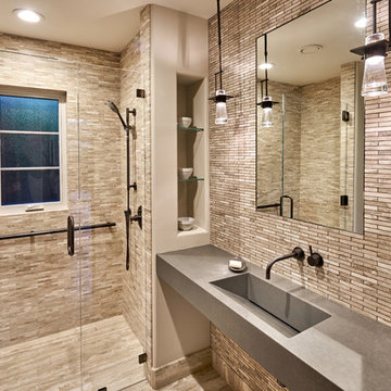
Designed for accessibility, the hall bathroom has a curbless shower, floating cast concrete countertop and a wide door.
The same stone tile is used in the shower and above the sink, but grout colors were changed for accent. Single handle lavatory faucet.
Not seen in this photo is the tiled seat in the shower (opposite the shower bar) and the toilet across from the vanity. The grab bars, both in the shower and next to the toilet, also serve as towel bars.
Erlenmeyer mini pendants from Hubbarton Forge flank a mirror set in flush with the stone tile.
Concrete ramped sink from Sonoma Cast Stone
Photo: Mark Pinkerton, vi360
 ZeroEnergy Design
ZeroEnergy Design (ZED) created this modern home for a progressive family in the desirable community of Lexington.
Thoughtful Land Connection. The residence is carefully sited on the infill lot so as to create privacy from the road and neighbors, while cultivating a side yard that captures the southern sun. The terraced grade rises to meet the house, allowing for it to maintain a structured connection with the ground while also sitting above the high water table. The elevated outdoor living space maintains a strong connection with the indoor living space, while the stepped edge ties it back to the true ground plane. Siting and outdoor connections were completed by ZED in collaboration with landscape designer Soren Deniord Design Studio.
Exterior Finishes and Solar. The exterior finish materials include a palette of shiplapped wood siding, through-colored fiber cement panels and stucco. A rooftop parapet hides the solar panels above, while a gutter and site drainage system directs rainwater into an irrigation cistern and dry wells that recharge the groundwater.
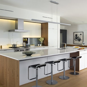
Cooking, Dining, Living. Inside, the kitchen, fabricated by Henrybuilt, is located between the indoor and outdoor dining areas. The expansive south-facing sliding door opens to seamlessly connect the spaces, using a retractable awning to provide shade during the summer while still admitting the warming winter sun. The indoor living space continues from the dining areas across to the sunken living area, with a view that returns again to the outside through the corner wall of glass.
Accessible Guest Suite. The design of the first level guest suite provides for both aging in place and guests who regularly visit for extended stays. The patio off the north side of the house affords guests their own private outdoor space, and privacy from the neighbor. Similarly, the second level master suite opens to an outdoor private roof deck.
Light and Access. The wide open interior stair with a glass panel rail leads from the top level down to the well insulated basement. The design of the basement, used as an away/play space, addresses the need for both natural light and easy access. In addition to the open stairwell, light is admitted to the north side of the area with a high performance, Passive House (PHI) certified skylight, covering a six by sixteen foot area. On the south side, a unique roof hatch set flush with the deck opens to reveal a glass door at the base of the stairwell which provides additional light and access from the deck above down to the play space.
Energy. Energy consumption is reduced by the high performance building envelope, high efficiency mechanical systems, and then offset with renewable energy. All windows and doors are made of high performance triple paned glass with thermally broken aluminum frames. The exterior wall assembly employs dense pack cellulose in the stud cavity, a continuous air barrier, and four inches exterior rigid foam insulation. The 10kW rooftop solar electric system provides clean energy production. The final air leakage testing yielded 0.6 ACH 50 - an extremely air tight house, a testament to the well-designed details, progress testing and quality construction. When compared to a new house built to code requirements, this home consumes only 19% of the energy.
Architecture & Energy Consulting: ZeroEnergy Design
Landscape Design: Soren Deniord Design
Paintings: Bernd Haussmann Studio
Photos: Eric Roth Photography

 Barbara Grushow Designs Inc.
Jim Bartsch Photography
Freestanding bathtub - mid-sized transitional master white tile and subway tile mosaic tile floor and gray floor freestanding bathtub idea in Los Angeles with a wall-mount sink, gray walls, a hinged shower door and a niche
Freestanding bathtub - mid-sized transitional master white tile and subway tile mosaic tile floor and gray floor freestanding bathtub idea in Los Angeles with a wall-mount sink, gray walls, a hinged shower door and a niche

 Advance Design Studio, Ltd.
Jennifer and Dan have lived in their Deer Park Illinois home for 15 years, slowly making minor fixes like painting and decorating; but they had a new plan for their kitchen the entire time. An awkwardly placed garage door, and an island cooktop with a terrible downdraft made a full-scale kitchen remodel an absolute must. Jennifer had many ideas in mind and wanted to work with a company that could provide high-end work, while partnering with a designer that would tailor the kitchen to her ideas.
She was intrigued by the phrase “Common Sense Remodeling” in Advance Design’s feature she discovered while perusing an issue of the community’s Quintessential Barrington Magazine. Doing further research on the company’s website, as she looked through project profiles and read about Advance Design’s “Common Sense Remodeling” philosophy, she promptly scheduled an appointment to see if the people and ideas she read about were truly who they said they were. The more she read, the more she knew that the “Common Sense” approach to remodeling they described was exactly the type of company she was looking for.
The partnership was sealed after an initial consultation with Owner Todd Jurs and Project Designer Michelle Lecinski. They displayed a combination of friendliness, professionalism and respect that was unmatched by any of the other companies Jennifer talked to. She knew that with Advance Design, she would be able to retain the vision that she had in mind with high-quality craftsmanship.
“I reached out to Advance Design because of the ‘Common Sense Remodeling’ tagline,” Jennifer said. “That’s what lingered for me”. “Advance Design was the most respectful- of the house and of my design ideas, and the most professional of the handful of companies that looked at my project”.
Soon after the meeting Jennifer began working with Michelle on the project design. They quickly developed chemistry. Jennifer loved how Michelle researched and located every detail that Jennifer wanted for the kitchen. Between the two of them, every concept and idea was worked through and perfected. “Jennifer had definite ideas about what she wanted the new kitchen to look like, she just didn’t know how to bring it all together. We worked together really well to make her ideas into the practical reality necessary for a well-functioning kitchen, with the look and feel that she had envisioned”, says Michelle.
“Michelle was wonderful in using the CAD system she would show me new drawings every time we changed the layout while working through the design,” Jennifer said. “She was a really wonderful partner in execution, she made sure everything happened quickly and easily.”
The finished design drew out elements of Jennifer’s style and personality. The pair call the look “sophisticated farmhouse” to describe the kitchen renovation to family and friends. The result was a beautifully crafted, authentic-feeling space that satisfied Jennifer’s dreams 15 years in the making. The whole project consisted of a kitchen remodel, mudroom upgrade with powder room, and garage entry relocation. “The projects I personally like the best, are the ones that put the client’s dreams on display,” Project Designer Michelle said. “And this is one of those projects.”
The main focal point of the kitchen is custom zinc and brass ventilation hood with a vintage sheen, which was hand made to order by a small company in Indiana named Vogler Metalworking. “It’s like sculpture, a true work of art”, says Jennifer. Your eye is immediately drawn towards this elegant yet practical hood that eliminated the home’s downdraft problem and added a striking conversation piece at the same time. The carpenters had to use special gloves when transporting and installing it, so they didn’t smudge it with fingerprints. The beautiful hood centers proudly over the stunning black enamel and brass LaCornue Range. “I had a friend who had a LaCornue range and after learning how easy it was to cook perfect meals, I was convinced I wanted to have one”, says Jennifer. This unique, breathtaking combination anchors the entire kitchen and is apparent immediately as you walk into the great room the surrounds the space.
DuraSupreme Crestwood cabinets with a Kendall Panel add function and sophistication. A custom gray paint color paired with a storm blue was developed so that the new kitchen looked like it belonged to the existing space. Unlacquered brass faucets and hardware were important to Jennifer because she wanted the living finishes to age over time. Remarkable brass diamond mesh cabinet door inserts imported from the UK continue to add this one-of-a-kind kitchen renovation; giving it a “you won’t see this everywhere” quality. The use of old railcar flooring for the coffee bar countertop and reclaimed oak for the open shelving gives an authenticity to the space uncommon in kitchens today.
Jennifer and Michelle fell in love with the Limestone Grey Stone while they were investigating unique island countertop ideas. They liked the fact that the limestone as a living finish will age and change over time. Calcutta Miel Quartz countertops made for an excellent pairing around the perimeter, as it’s durable and perfect for cooking preparations. A textured white subway tile backsplash that runs to the ceiling keeps your eye moving towards the open shelving, and to the main focal point of the stunning range hood combination.
“The kitchen functions beautifully, and it’s gorgeous,” beams Jennifer as she gestures with both hands while smiling ear to ear. “The most important thing was I wanted a kitchen that had a wonderful flow, cooked beautiful meals and was a great gathering place for family and friends, and this space does that perfectly! Beauty wise, it turned out exactly how I had envisioned. I felt the function part was the hardest part, and that was nailed”!
Relocating the garage entry to the new mudroom was a huge priority and has finally separated the family’s arriving home functions from their kitchen. Now coats and shoes and bags have their own area for dropping once members arrive home. Matching gray DuraSupreme cabinetry helped create gorgeous, purposeful lockers for the family. A reclaimed vintage sink and custom wall paper were added to the tiny powder room to beautify the once previously only functional space. Advance Design was even able to create a custom space for their dog to sleep while the family is away.
“It was unbelievable that a project of this size was completed in such a short time, and I think that’s because of the large amount of planning and preparation that went into it,” Jennifer marveled, “When we started, we were ready, and everything was prepared”.
When it came to execution, Project Manager Justin Davis and his crew were quick, accessible, and organized. Projects like this kitchen are typically completed in as little as 8-10 weeks. Jennifer’s kitchen however despite the relocation of some challenging HVAC in a soffit and moving of an exterior door was completed remarkably fast in part because the team was working with an existing tile floor that ran throughout the first floor that the client really loved.
“You get to know these people really well because they’re living in your house while you’re living in your house. They were so fast and really good, it didn’t take as long as even planned” reported Jennifer. “I would text Justin and he always responded almost immediately. I got to know all the guys who were working in our house and they were all wonderful people”.
Details in a customized kitchen like this one require skill and care from the people who install it. “All the guys on the job were skilled at what the did. I wanted small details like little feet to look like furniture, that is where their carpentry skill came in to make these all perfect”, said Jennifer. “The tile guys were wonderful. They even let me determine how I wanted the texture with the grout to appear for a salt and pepper look; now that is a very skilled trade person making it custom”.
In Jennifer’s interview, she continued to reference Advance Design’s “Common Sense Remodeling”, so I took a minute to ask her exactly what that phrase meant to her and how it played out in her experience with her project and the Advance Design team. Here is what she said: “I was intrigued about Common Sense Remodeling and in my head that there would be clear costs and prices, great communication between the design team, the execution team and me”, said Jennifer. They did deliver on that, it was so clear about the cost breakdown, what I could expect from everyone who came to my house, and everything that we had ordered. That to me is the Common Sense”!
It’s great to see a client take literally our assertion that a well-planned remodeling project is simply “Common Sense”! She anticipated each step of the way would be clear, concise, and predictable, all the while protecting the outcome due to the careful upfront planning. “Advance Design delivered on their ‘Common Sense Remodeling’ promise,” Jennifer said. “From the design team, to the execution team - everything was straight forward like I imagined. The project turned out exactly how I envisioned, I enjoyed this process and absolutely would recommend Advance Design Studio to anyone.”
 Visbeen Architects
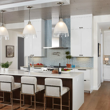
Featuring a classic H-shaped plan and minimalist details, the Winston was designed with the modern family in mind. This home carefully balances a sleek and uniform façade with more contemporary elements. This balance is noticed best when looking at the home on axis with the front or rear doors. Simple lap siding serve as a backdrop to the careful arrangement of windows and outdoor spaces. Stepping through a pair of natural wood entry doors gives way to sweeping vistas through the living and dining rooms. Anchoring the left side of the main level, and on axis with the living room, is a large white kitchen island and tiled range surround. To the right, and behind the living rooms sleek fireplace, is a vertical corridor that grants access to the upper level bedrooms, main level master suite, and lower level spaces. Serving as backdrop to this vertical corridor is a floor to ceiling glass display room for a sizeable wine collection. Set three steps down from the living room and through an articulating glass wall, the screened porch is enclosed by a retractable screen system that allows the room to be heated during cold nights. In all rooms, preferential treatment is given to maximize exposure to the rear yard, making this a perfect lakefront home.
 Lori Ramsay Design
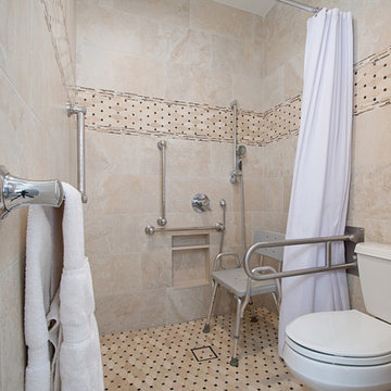
We created this beautiful accessible bathroom in Carlsbad to give our client a more functional space. We designed this unique bath, specific to the client's specifications to make it more wheel chair accessible. Features such as the roll in shower, roll up vanity and the ability to use her chair for flexibility over the fixed wall mounted seat allow her to be more independent in this bathroom. Safety was another significant factor for the room. We added support bars in all areas and with maximum flexibility to allow the client to perform all bathing functions independently, and all were positioned after carefully recreating her movements. We met the objectives of functionality and safety without compromising beauty in this aging in place bathroom. Travertine-look porcelain tile was used in a large format on the shower walls to minimize grout lines and maximize ease of maintenance. A crema marfil marble mosaic in an elongated hex pattern was used in the shower room for it’s beauty and flexibility in sloped shower. A custom cabinet was made to the height ideal for our client’s use of the sink and a protective panel placed over the pea trap.
Sponsored
Columbus, OH
Free consultation for landscape design!
Peabody Landscape Group
Franklin County's Reliable Landscape Design & Contracting
 ZeroEnergy Design
This LEED Platinum certified house reflects the homeowner's desire for an exceptionally healthy and comfortable living environment, within a traditional neighborhood.
INFILL SITE. The family, who moved from another area of Wellesley, sought out this property to be within walking distance of the high school and downtown area. An existing structure on the tight lot was removed to make way for the new home. 84% of the construction waste, from both the previous structure and the new home, was diverted from a landfill. ZED designed to preserve the existing mature trees on the perimeter of the property to minimize site impacts, and to maintain the character of the neighborhood as well as privacy on the site.
EXTERIOR EXPRESSION. The street facade of the home relates to the local New England vernacular. The rear uses contemporary language, a nod to the family’s Californian roots, to incorporate a roof deck, solar panels, outdoor living space, and the backyard swimming pool. ZED’s careful planning avoided to the need to face the garage doors towards the street, a common syndrome of a narrow lot.
THOUGHTFUL SPACE. Homes with dual entries can often result in duplicate and unused spaces. In this home, the everyday and formal entry areas are one and the same; the front and garage doors share the entry program of coat closets, mudroom storage with bench for removing your shoes, and a laundry room with generous closets for the children's sporting equipment. The entry area leads directly to the living space, encompassing the kitchen, dining and sitting area areas in an L-shaped open plan arrangement. The kitchen is placed at the south-west corner of the space to allow for a strong connection to the dining, sitting and outdoor living spaces. A fire pit on the deck satisfies the family’s desire for an open flame while a sealed gas fireplace is used indoors - ZED’s preference after omitting gas burning appliances completely from an airtight home. A small study, with a window seat, is conveniently located just off of the living space. A first floor guest bedroom includes an accessible bathroom for aging visitors and can be used as a master suite to accommodate aging in place.
HEALTHY LIVING. The client requested a home that was easy to clean and would provide a respite from seasonal allergies and common contaminants that are found in many indoor spaces. ZED selected easy to clean solid surface flooring throughout, provided ample space for cleaning supplies on each floor, and designed a mechanical system with ventilation that provides a constant supply of fresh outdoor air. ZED selected durable materials, finishes, cabinetry, and casework with low or no volatile organic compounds (VOCs) and no added urea formaldehyde.
YEAR-ROUND COMFORT. The home is super insulated and air-tight, paired with high performance triple-paned windows, to ensure it is draft-free throughout the winter (even when in front of the large windows and doors). ZED designed a right-sized heating and cooling system to pair with the thermally improved building enclosure to ensure year-round comfort. The glazing on the home maximizes passive solar gains, and facilitates cross ventilation and daylighting.
ENERGY EFFICIENT. As one of the most energy efficient houses built to date in Wellesley, the home highlights a practical solution for Massachusetts. First, the building enclosure reduces the largest energy requirement for typical houses (heating). Super-insulation, exceptional air sealing, a thermally broken wall assembly, triple pane windows, and passive solar gain combine for a sizable heating load reduction. Second, within the house only efficient systems consume energy. These include an air source heat pump for heating & cooling, a heat pump hot water heater, LED lighting, energy recovery ventilation, and high efficiency appliances. Lastly, photovoltaics provide renewable energy help offset energy consumption. The result is an 89% reduction in energy use compared to a similar brand new home built to code requirements.
RESILIENT. The home will fare well in extreme weather events. During a winter power outage, heat loss will be very slow due to the super-insulated and airtight envelope– taking multiple days to drop to 60 degrees even with no heat source. An engineered drainage system, paired with careful the detailing of the foundation, will help to keep the finished basement dry. A generator will provide full operation of the all-electric house during a power outage.
OVERALL. The home is a reflection of the family goals and an expression of their values, beautifully enabling health, comfort, safety, resilience, and utility, all while respecting the planet.
ZED - Architect & Mechanical Designer
Bevilacqua Builders Inc - Contractor
Creative Land & Water Engineering - Civil Engineering
Barbara Peterson Landscape - Landscape Design
Nest & Company - Interior Furnishings
Eric Roth Photography - Photography
 TKS Design Group
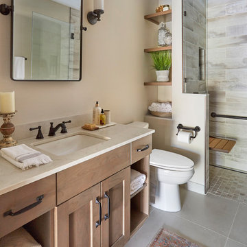
This project was completed for clients who wanted a comfortable, accessible 1ST floor bathroom for their grown daughter to use during visits to their home as well as a nicely-appointed space for any guest. Their daughter has some accessibility challenges so the bathroom was also designed with that in mind.
The original space worked fairly well in some ways, but we were able to tweak a few features to make the space even easier to maneuver through. We started by making the entry to the shower flush so that there is no curb to step over. In addition, although there was an existing oversized seat in the shower, it was way too deep and not comfortable to sit on and just wasted space. We made the shower a little smaller and then provided a fold down teak seat that is slip resistant, warm and comfortable to sit on and can flip down only when needed. Thus we were able to create some additional storage by way of open shelving to the left of the shower area. The open shelving matches the wood vanity and allows a spot for the homeowners to display heirlooms as well as practical storage for things like towels and other bath necessities.
We carefully measured all the existing heights and locations of countertops, toilet seat, and grab bars to make sure that we did not undo the things that were already working well. We added some additional hidden grab bars or “grabcessories” at the toilet paper holder and shower shelf for an extra layer of assurance. Large format, slip-resistant floor tile was added eliminating as many grout lines as possible making the surface less prone to tripping. We used a wood look tile as an accent on the walls, and open storage in the vanity allowing for easy access for clean towels. Bronze fixtures and frameless glass shower doors add an elegant yet homey feel that was important for the homeowner. A pivot mirror allows adjustability for different users.
If you are interested in designing a bathroom featuring “Living In Place” or accessibility features, give us a call to find out more. Susan Klimala, CKBD, is a Certified Aging In Place Specialist (CAPS) and particularly enjoys helping her clients with unique needs in the context of beautifully designed spaces.
Designed by: Susan Klimala, CKD, CBD
Photography by: Michael Alan Kaskel
 Gardner Architects LLC
Photography by Ken Wyner
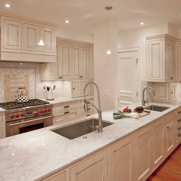
2101 Connecticut Avenue (c.1928), an 8-story brick and limestone Beaux Arts style building with spacious apartments, is said to have been “the finest apartment house to appear in Washington between the two World Wars.” (James M. Goode, Best Addresses, 1988.) As advertised for rent in 1928, the apartments were designed “to incorporate many details that would aid the residents in establishing a home atmosphere, one possessing charm and dignity usually found only in a private house… the character and tenancy (being) assured through careful selection of guests.” Home to Senators, Ambassadors, a Vice President and a Supreme Court Justice as well as numerous Washington socialites, the building still stands as one of the undisputed “best addresses” in Washington, DC.)
So well laid-out was this gracious 3,000 sf apartment that the basic floor plan remains unchanged from the original architect’s 1927 design. The organizing feature was, and continues to be, the grand “gallery” space in the center of the unit. Every room in the apartment can be accessed via the gallery, thus preserving it as the centerpiece of the “charm and dignity” which the original design intended. Programmatic modifications consisted of the addition of a small powder room off of the foyer, and the conversion of a corner “sun room” into a room for meditation and study. The apartment received a thorough updating of all systems, services and finishes, including a new kitchen and new bathrooms, several new built-in cabinetry units, and the consolidation of numerous small closets and passageways into more accessible and efficient storage spaces.
 TKS Design Group
Free ebook, Creating the Ideal Kitchen. DOWNLOAD NOW
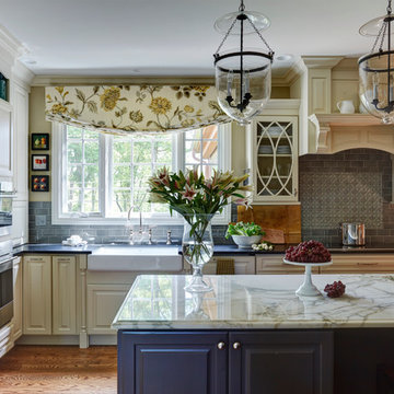
This client wanted a complete update of their kitchen and came to us with several objectives. They wanted a larger island and easier access to the dining room. They also wanted to eliminate the existing cooktop location from the island and make the island larger. Because the existing space was not able to accommodate all those requests, we decided to eliminate the breakfast area and incorporate that space into the kitchen. By eliminating an existing bay window and making the kitchen sink window larger, we were able to make the new layout work without sacrificing any natural light. A French door to the newly added and adjoining sunroom and casual outdoor dining spot still allows for multiple dining options. And by enlarging the opening to the dining room, it allows for easier access to this space on a daily basis versus for special occasions only.
The client already had a large desk in the kitchen and spends a lot of time at this area. We were able to make the new desk even larger by moving the refrigerator to another area. The refrigerator is covered in decorative panels so that it blends nicely into the furniture look of the room. The larger island can now seat several people comfortably.
The room’s traditional feel was achieved by providing different finishes on the perimeter, island and desk cabinetry. Handmade gray backsplash tile, a combination of soapstone and Carrera marble give the space a classic appeal. Details provide interest – custom glass mullions, decorative wood hood and bronze hardware give the space character and charm.
Designed by: Susan Klimala, CKD, CBD
Interior Design by: Rachel Alcorn
Architect: Rick Rearick
Contractor: KJN Renovations
Photography by: Mike Kaskel
For more information on kitchen and bath design ideas go to: www.kitchenstudio-ge.com
Sponsored
Sunbury, OH

J.Holderby - Renovations
Franklin County's Leading General Contractors - 2X Best of Houzz!
 Lori Ramsay Design
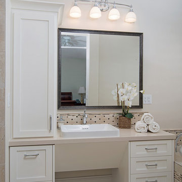
We created this beautiful accessible bathroom in Carlsbad to give our client a more functional space. We designed this unique bath, specific to the client's specifications to make it more wheel chair accessible. Features such as the roll in shower, roll up vanity and the ability to use her chair for flexibility over the fixed wall mounted seat allow her to be more independent in this bathroom. Safety was another significant factor for the room. We added support bars in all areas and with maximum flexibility to allow the client to perform all bathing functions independently, and all were positioned after carefully recreating her movements. We met the objectives of functionality and safety without compromising beauty in this aging in place bathroom. Travertine-look porcelain tile was used in a large format on the shower walls to minimize grout lines and maximize ease of maintenance. A crema marfil marble mosaic in an elongated hex pattern was used in the shower room for it’s beauty and flexibility in sloped shower. A custom cabinet was made to the height ideal for our client’s use of the sink and a protective panel placed over the pea trap.
 Michael Nash Design, Build & Homes
This growing family of six was struggling with a dysfunctional kitchen design. The center island had been installed at an odd angle that limited accessibility and traffic flow. Additionally, storage space was limited by poor cabinet design. Finally, doorways in and out of the kitchen were narrow and poorly located, especially for children dashing in and out.
Other design challenges included how to better use a 10’ x 12’ room for children’s jackets and toys and how to add a professional-quality gas range in a neighborhood were natural gas wasn’t available. The new design would address all of these issues.
DESIGN SOLUTIONS
The new kitchen design revolves around a more proportional island. Carefully placed in the center of the new space with seating for four, it includes a prep sink, a second dishwasher and a beverage center.
The distressed ebony-stained island and hutch provides a brilliant contrast between the white color cabinetry. White Carrera marble countertops and backsplash top both island and perimeter cabinets.
Tall, double stacked cabinetry lines two walls to maximize storage space. Across the room there was an unused wall that now contains a 36” tower fridge and freezer, both covered with matching panels, and a tall cabinet that contains a microwave, steam unit and warming drawer.
A propane tank was buried in the back yard to provide gas to a new 60” professional range and cooktop. A custom-made wood mantel hood blends perfectly with the cabinet style.
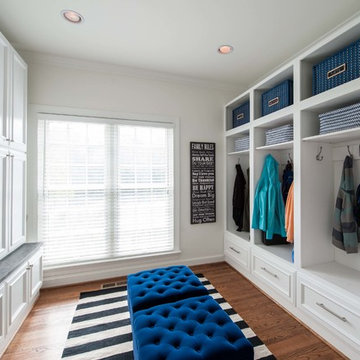
The old laundry room was reconfigured to have lots of locker space for all kids and added cabinetry for storage. A double entry door separated the new mudroom from the rest of the back hall. In the back hall the back windows were replaced with a set of French door and added decking to create a direct access to deck and backyard.
The end result is an open floor plan, high-end appliances, great traffic flow and pleasing colors. The homeowner calls it the “kitchen of her dreams.”
 Kaplan Architects, AIA
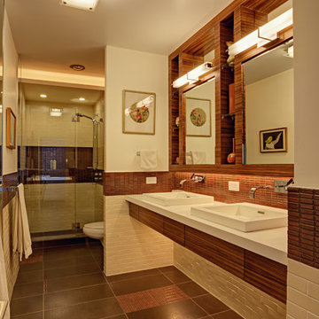
This master bath in a condo high rise was completely remodeled and transformed. Careful attention was given to tile selection and placement. The medicine cabinet display was custom design for optimum function and integration to the overall space. Various lighting systems are utilized to provide proper lighting and drama.
Mitchell Shenker, Photography
1