
Search results for "Sense running" in Home Design Ideas

 Studio 804
The 722 Ash Street residence consists of a 1500 sf primary house with a contiguous 500 sf accessory dwelling. The project is set in the rich culture of North Lawrence, its rear property line abuts the Lawrence levee trail which runs for nine miles along the north bank of the Kansas River.
North Lawrence is known for its quality soil, large trees, curbless streets and random size parcels before it breaks into larger farms further from the urban center. It is built on the typical orthogonal grid of American development, but it represents the older growth of the city prior to urban planners and zoning regulations. The rumble of freight trains and farm trucks in the shadows of the towering grain elevators are only blocks away. It is home to many who enjoy being only a bridge crossing away from Lawrence’s vibrant downtown but are far enough away to maintain their independence from many of the restrictions on living near the historic district. They can work in their large gardens and toiling in their garages and shops in a manner more rural than urban.
The house on 722 Ash St. is imbued with the character of North Lawrence and the Levee Trail area. The design was inspired by the Midwestern farmstead vernacular of the region. These timeless vernacular qualities house all the accommodations necessary for modern, sustainable living. A unique feature of this house is the Accessory Dwelling Unit permitted in the zoning district. It is a small separate residence on the same lot that can be used for income property or for extended family members. It also supports the city of Lawrence’s goals of increased density close to downtown rather than continued sprawl into the countryside.
The buildings use technology and common-sense design to reduce the building’s footprint and assure the owners low energy use and costs. A 4.9 Kw solar collection system is located on the only south facing gable and the super insulated envelopes (r-62 roof and r-35 walls) of all three forms easily exceeds the standards. Studio 804 continues their long standing pattern of maintaining the highest level of sustainable design while remaining contextually sensitive to the surrounding community. This house, like every Studio 804 project since 2008, is USGBC LEED Platinum Certified.

 Safferstone Interiors
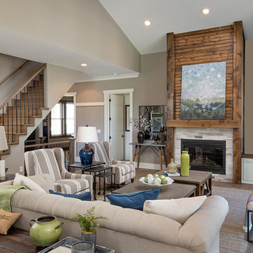
Dennis and Joe have a large, light-filled house. New construction meant lofted space and open floor plans with traditional styling. Running a busy dental practice by day and engaged in a rich social life by night, this couple needed a professional to take the lead on making their house a home.
That’s my cue!
They wanted to take risks, and stay away from “matchy-matchy”. We gussied up a plain ol’ TV room and gave it a healthy dose of luxury.
Our plan was initially inspired by an abstract painting hanging over their stone fireplace. We brought in their love of the outdoors to make things cozy and used family furniture whenever possible for nostalgia and comfort.
I took their love for one-of-a-kind objects and started making a design plan, aiming to solve their biggest frustration: the family room. They had a tortured relationship with a “forgotten family room,” a great space that was spacious and bright, but not at all cozy or joyful, and certainly not “them.”
I wanted to create a cozy space functional for everyday curling up with puppies and watching TV after dinner, yet chic enough for hosting the pre-dinner kitchen overflow and cocktails during parties.
I went looking for contrasting textures and materials. I wanted to balance patterns and scale, and use non-traditional colors as neutrals to create an overall sense of “BAM!”
Dennis and Joe loved the nod to the classics juxtaposed with new and different globally-inspired pieces. For this project our design aesthetic can be described as Middle Eastern/tribal meets mid-century modern. We played to their sensible side with proportion and balance, and stayed as far away from boring/bleh as we could.
From there we moved on to other spaces.. We added colorful pillows and sheer drapery to finish off their formal living room. We kept an inherited bedroom set from Dennis’ Mom and added color, draperies, and pillows to overhaul the guest bedroom.
Their project was not a rip-and-replace, we weren’t starting from scratch with a blank piece of paper.
Rather, our goal was to take what was already there and make it better, more like them. Using functionality first, we focused on giving the house a soothing, joyful aesthetic. We upped the chic factor by a gajillion and helped them find their ‘happy’ at home. See more Safferstone stuff at www.safferstone.com. Connect with us on Facebook, get inspired on Pinterest, and share modern musings on life & design on Instagram. Or, send us a love note at hello@safferstone.com.
Photo: Angie Seckinger

 Saikley Architects
This beautiful 1881 Alameda Victorian cottage, wonderfully embodying the Transitional Gothic-Eastlake era, had most of its original features intact. Our clients, one of whom is a painter, wanted to preserve the beauty of the historic home while modernizing its flow and function.
From several small rooms, we created a bright, open artist’s studio. We dug out the basement for a large workshop, extending a new run of stair in keeping with the existing original staircase. While keeping the bones of the house intact, we combined small spaces into large rooms, closed off doorways that were in awkward places, removed unused chimneys, changed the circulation through the house for ease and good sightlines, and made new high doorways that work gracefully with the eleven foot high ceilings. We removed inconsistent picture railings to give wall space for the clients’ art collection and to enhance the height of the rooms. From a poorly laid out kitchen and adjunct utility rooms, we made a large kitchen and family room with nine-foot-high glass doors to a new large deck. A tall wood screen at one end of the deck, fire pit, and seating give the sense of an outdoor room, overlooking the owners’ intensively planted garden. A previous mismatched addition at the side of the house was removed and a cozy outdoor living space made where morning light is received. The original house was segmented into small spaces; the new open design lends itself to the clients’ lifestyle of entertaining groups of people, working from home, and enjoying indoor-outdoor living.
Photography by Kurt Manley.
https://saikleyarchitects.com/portfolio/artists-victorian/
Find the right local pro for your project
 Studio 804
The 722 Ash Street residence consists of a 1500 sf primary house with a contiguous 500 sf accessory dwelling. The project is set in the rich culture of North Lawrence, its rear property line abuts the Lawrence levee trail which runs for nine miles along the north bank of the Kansas River.
North Lawrence is known for its quality soil, large trees, curbless streets and random size parcels before it breaks into larger farms further from the urban center. It is built on the typical orthogonal grid of American development, but it represents the older growth of the city prior to urban planners and zoning regulations. The rumble of freight trains and farm trucks in the shadows of the towering grain elevators are only blocks away. It is home to many who enjoy being only a bridge crossing away from Lawrence’s vibrant downtown but are far enough away to maintain their independence from many of the restrictions on living near the historic district. They can work in their large gardens and toiling in their garages and shops in a manner more rural than urban.
The house on 722 Ash St. is imbued with the character of North Lawrence and the Levee Trail area. The design was inspired by the Midwestern farmstead vernacular of the region. These timeless vernacular qualities house all the accommodations necessary for modern, sustainable living. A unique feature of this house is the Accessory Dwelling Unit permitted in the zoning district. It is a small separate residence on the same lot that can be used for income property or for extended family members. It also supports the city of Lawrence’s goals of increased density close to downtown rather than continued sprawl into the countryside.
The buildings use technology and common-sense design to reduce the building’s footprint and assure the owners low energy use and costs. A 4.9 Kw solar collection system is located on the only south facing gable and the super insulated envelopes (r-62 roof and r-35 walls) of all three forms easily exceeds the standards. Studio 804 continues their long standing pattern of maintaining the highest level of sustainable design while remaining contextually sensitive to the surrounding community. This house, like every Studio 804 project since 2008, is USGBC LEED Platinum Certified.

 Klopf Architecture
, Outer Space Landscape Architects, Sezen & Moon Structural Engineer and Flegels Construction updated a classic Eichler open, indoor-outdoor home.
Everyone loved the classic, original bones of this house, but it was in need of a major facelift both inside and out. The owners also wanted to remove the barriers between the kitchen and great room, and increase the size of the master bathroom as well as make other layout changes. No addition to the house was contemplated.
The owners worked with Klopf Architecture in part because of Klopf’s extensive mid-century modern / Eichler design portfolio, and in part because one of their neighbors who had worked with Klopf on their Eichler home remodel referred them. The Klopf team knew how to update the worn finishes to make a more sophisticated, higher quality home that both looks better and functions better.
In conjunction with the atrium and the landscaped rear yard / patio, the glassy living room feels open on both sides and allows an indoor / outdoor flow throughout. The new, natural wood exterior siding runs through the house from inside to outside to inside again, updating one of the classic design features of the Eichler homes.
Picking up on the wood siding, walnut vanities and cabinets offset the white walls. Gray porcelain tiles evoke the concrete slab floors and flow from interior to exterior to make the spaces appear to flow together. Similarly the ceiling decking has the same white-washed finish from inside to out. The continuity of materials and space enhances the sense of flow.
The large kitchen, perfect for entertaining, has a wall of built-ins and an oversized island. There’s plenty of storage and space for the whole group to prep and cook together.
One unique approach to the master bedroom is the bed wall. The head of the bed is tucked within a line of built-in wardrobes with a high window above. Replacing the master closet with this wall of wardrobes allowed for both a larger bathroom and a larger bedroom.
This 1,953 square foot, 4 bedroom, 2 bathroom Double Gable Eichler remodeled single-family house is located in Mountain View in the heart of the Silicon Valley.
Klopf Architecture Project Team: John Klopf, AIA, Klara Kevane, and Yegvenia Torres-Zavala
Landscape Architect: Outer Space Landscape Architects
Structural Engineer: Sezen & Moon
Contractor: Flegels Construction
Landscape Contractor: Roco's Gardening & Arroyo Vista Landscaping, Inc.
Photography ©2016 Mariko Reed
Location: Mountain View, CA
Year completed: 2015
 Twelve Stones Designs, LLC
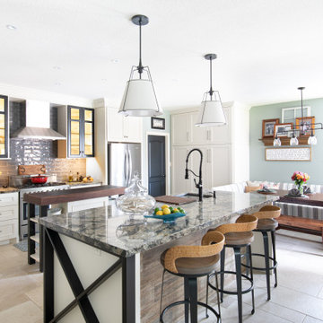
The owners of this kitchen had spent the money to upgrade the finishes in their kitchen upon building the home 12 years ago, but after living in the space for several years they realized how nonfunctional the layout really was. The (then) two preschool aged children had grown into busy, hungry teenagers with many friends who also liked to hang out at the house. So the family needed a more functional kitchen with better traffic flow, space for daily activities revolving around the kitchen at different times of day, and a kitchen that could accommodate cooking for and serving large groups. Furthermore, the dark, traditional finishes no longer reflected the homeowners’ style. They requested a brighter, more relaxed, coastal style that reflected their love of the seaside cities they like to visit.
Originally, the kitchen was U-shaped with a narrow island in the middle. The island created narrow aisles that bottle-necked at the dishwasher, refrigerator, and cooktop areas. There was a pass-through from the foyer into the kitchen, but the owners never liked that the pass-through was also located so close to the powder room. The awkward proximity was unappealing and made guests feel uncomfortable.
The kitchen’s storage was made up of lots of narrow cabinets, apothecary drawers, clipped corner units, and very few drawers. It lacked useful storage for the larger items the family used on a daily basis. And the kitchen’s only pantry was small closet that had only builder-grade, narrow shelving with no illumination to be able to see the contents inside.
Overall, the kitchen’s lighting plan was poorly executed. Only six recessed cans illuminated the entire kitchen and nook areas. The under cabinet lighting was not evenly distributed either. In fact, the builder had mis-placed the under cabinet lighting around the decorative pilasters which made for choppy, dark cubbies. Further, the builder didn’t include any lighting over the sink or the bar area, which meant whoever was doing the dishes was always in their own shadow. That, coupled with the steep overhang of the game room above made the bar area feel like a dim, cavernous space that wasn’t inviting or task oriented. The kitchen looked out into the main living space, but the raised bar and a narrow wall (which held the only large cabinet in the kitchen) created more of a barrier than a relationship to the living room or breakfast nook. In fact, one couldn’t even see the breakfast nook from the cooktop or sink areas due to its orientation. The raised bar top was too narrow to comfortably sit to either dine at or chat from due to the lack of knee space. The the homeowners confided that the kitchen felt more like a dark, dirty prison than place where the family, or their guests, wanted to gather and commune.
The clients' needs and desires were:
➢ to create a kitchen that would be a space the family loved to be in; to relate to the adjacent spaces all around, and to have better flow for entertaining large groups
➢ to remove the walls between the breakfast nook and living area and to be able to utilize the natural light from the windows in both those areas
➢ to incorporate a functional chopping block for prepping fresh food for home cooked meals, an island with a large sink and drain board, 2 pull out trash cans, and seating for at least the 2 teens to eat or do homework
➢ to design a kitchen and breakfast nook with an airy, coastal, relaxed vibe that blended with the rest of the house's coastal theme
➢ to integrate a layered lighting plan which would include ample general illumination, specific task lighting, decorative lighting, and lots of illuminated storage
➢ to design a kitchen with not only more storage for all the husband’s kitchen gadgets and collection of oils and spices, but smart storage, including a coffee/breakfast bar and a place to store and conceal the toaster oven and microwave
➢ to find a way to utilize the large open space between the kitchen, pantry area, and breakfast nook
Twelve Stones Designs achieved the owner's goals by:
➢ removing the walls between the kitchen and living room to allow the natural light to filter in from the adjacent rooms and to create a connection between the kitchen, nook, and living spaces for a sense of unity and communion
➢ removing the existing pantry and designing 3 large pantry style cabinets with LED tape lights and rollout drawers to house lots of kitchen appliances, gadgets, and tons of groceries. We also took the cabinets all the way up to the 9’ ceiling for additional storage for seasonal items and bulk storage.
➢ designing 2 islands - 1 with a gorgeous black walnut chopping block that houses a drawer for chopping and carving knives and a custom double pull out trash unit for point of use utilization - and 1 that houses the dishwasher, a large Blanco Gourmet sink with integrated drain board, woven baskets for fresh root vegetables and kitchen towels, plenty of drawer storage for kitchen items, and bar seating for up to 4 diners.
➢ closing off the space between the kitchen and the powder room to create a beautiful new private alcove for the powder room as well as adding some decorative storage. This also gave us space to include more tall storage near the new range for precision placement of the husband’s extensive oil and spice collection as well as a location for a combo-steam oven the wife wanted for baking and cooking healthy meals.
The project is enhanced functionally by:
➢ incorporated USB and standard receptacles for the kids’ laptops and phone charging in the large island
➢ designing the small island to include additional open shelving for items used on a daily basis such as a variety of bowls, plates, and colanders. This set up also works well for the husband who prefers to “plate” his dinners in restaurant-style fashion before presenting them to the table.
➢ the integration of specific storage units, such as double stacked cutlery drawers, a custom spice pull-out, a Kuerig coffee and tea pod drawer, and custom double stacked utensil drawers
➢ moving the refrigerator to the old oven location - this eliminated the bottle neck as well as created a better relationship to the eating table. It also utilizes the floor space between the pantry, nook, and kitchen
➢ creating a banquet style breakfast nook - this banquette seating not only doubles the amount of seating for large gatherings but it better utilizes the odd space between the kitchen and the previous nook area. It also helps to create a distinct pathway from the mudroom room through the pantry area, kitchen, nook, and living room.
➢ the coffee/breakfast bar area which includes the perfect location for the concealed microwave and toaster oven, convenient storage for the coffee pods and tea accoutrements. Roll-out drawers below also house the smoothie maker, hot water kettle, and a plethora of smoothie-making ingredients such as protein powders, smoothie additives, etc. Furthermore, the drawers below the Keurig house measuring utensil, cutlery, baking supplies and tupperware storage.
➢ incorporating lots of wide drawers and pullouts to accommodate large cookware.
➢ utilizing as much vertical space as possible by building storage to the ceiling which accommodates the family’s abundant amount of serving platters, baking sheets, bakeware, casserole dishes, and additional cutting boards.
The project is enhanced aesthetically by:
➢ new 5-piece Versailles pattern porcelain tile that now seamlessly joins the entire down stairs area together creating a bright, cohesiveness feeling instead of choppy separated spaces - it also adds a coastal feeling
➢ designing a cabinet to conceal the microwave and toaster oven
➢ the coastal influenced light fixtures over the nook table and island
➢ the sandy colors of the Langdon Cambria countertops. The swirling pattern and sparkling quartz pieces remind the homeowner of black-and-tan sandy beaches
➢ the striped banquet seating whose creamy white background and blue-green stripes were the inspiration for the cabinet and wall colors.
➢ All the interior doors were painted black to coordinate with the blacks and grays in the backsplash tile and countertop. This also adds a hint of tailored formality to an otherwise casual space.
➢ the use of WAC's Oculux small aperture LED units for the overhead lighting complimented with Diode LED strips for task lighting under the cabinets and inside the pantry and glass wall cabinets. All of the lighting applications are on separate dimmer switches.
Innovative uses of materials or construction methods by Realty Restoration LLC:
➢ Each 1-1/2” x 3” block of reclaimed end-grain black walnut that makes up the center island chopping block was hand milled and built in the shop. It was designed to look substantial and proportional to the surrounding elements, executed by creating the 4 inch tall top with a solid wood chamfered edge band.
➢ The metal doors on either side of the vent hood were also custom designed for this project and built in the Realty Restoration LLC shop. They are made 1x2, 11-gauge mild steel with ribbed glass. Weighing 60 lbs a piece, heavy duty cabinet hinges were added to support the weight of the door and keep them from sagging.
➢ Under-cabinet receptacles were added along the range wall in order to have a clean, uninterrupted backsplash.
Design obstacles to overcome:
➢ Because we were removing the demising walls between the kitchen and living room, we had to find a way to plumb and vent the new island. We did this by tunneling through the slab (the slab had post tension cables which prevented us from just trenching) to run a new wet vent through a nearby structural wall. We pulled the existing hot and cold lines between upper floor joists and ran them down the structural wall as well and up through a conduit in the tunnel.
➢ Since we were converting from wall overs to a gas range it allowed us to utilize the 220 feed for the wall ovens to provide a new sub panel for all the new kitchen circuits
➢ Due to framing deficiencies inherited from the original build there was a 1-1/2” differential in the floor-to-ceiling height over a 20 foot span; by utilizing the process of cutting and furring coupled with the crown moulding details on the cabinet elevations we were able to mask the problem and provide seamless transitions between the cabinet components.
Evidence of superior craftsmanship:
➢ uniquely designed, one-of-a-kind metal “X” end panels on the large island. The end panels were custom made in the Realty Restoration LLC shop and fitted to the exact dimensions of the island. The welding seams are completely indistinguishable - the posts look like they are cut from a single sheet of metal
➢ square metal posts on the small island were also custom made and designed to compliment and carry through the metal element s throughout the kitchen
➢ the beautiful, oversized end panels on the pantry cabinets which give the breakfast nook a tailored look
➢ integrating a large format 5 piece Versailles tile pattern to seamlessly flow from the existing spaces into the new kitchen space
➢ By constructing a custom cabinet that jogged around a corner we could not remodel (housing the entry way coat closet) we were able to camouflage the adjacent wall offset within the upper and lower cabinets. By designing around the existing jog in the structural walls we accomplished a few things: we were able to find the space to house, and hide, the microwave and toaster oven yet still have a clean cohesive appearance from the kitchen side. Additionally, the owners were able to keep their much needed coat closet and we didn’t have to increase the budget with unnecessary structural work.
 Saikley Architects
This beautiful 1881 Alameda Victorian cottage, wonderfully embodying the Transitional Gothic-Eastlake era, had most of its original features intact. Our clients, one of whom is a painter, wanted to preserve the beauty of the historic home while modernizing its flow and function.
From several small rooms, we created a bright, open artist’s studio. We dug out the basement for a large workshop, extending a new run of stair in keeping with the existing original staircase. While keeping the bones of the house intact, we combined small spaces into large rooms, closed off doorways that were in awkward places, removed unused chimneys, changed the circulation through the house for ease and good sightlines, and made new high doorways that work gracefully with the eleven foot high ceilings. We removed inconsistent picture railings to give wall space for the clients’ art collection and to enhance the height of the rooms. From a poorly laid out kitchen and adjunct utility rooms, we made a large kitchen and family room with nine-foot-high glass doors to a new large deck. A tall wood screen at one end of the deck, fire pit, and seating give the sense of an outdoor room, overlooking the owners’ intensively planted garden. A previous mismatched addition at the side of the house was removed and a cozy outdoor living space made where morning light is received. The original house was segmented into small spaces; the new open design lends itself to the clients’ lifestyle of entertaining groups of people, working from home, and enjoying indoor-outdoor living.
Photography by Kurt Manley.
https://saikleyarchitects.com/portfolio/artists-victorian/

 Infinite Home
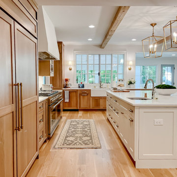
Our clients wanted a kitchen that could keep up with their family's pace. They love watching cooking competitions and wanted their kitchen to be the perfect spot for their kids to have cookie bake-offs. To make that possible, their kitchen needed to be wider, more capable, and more open than their current one, while still feeling connected to the family room. The wife wanted to be present with her family even while cooking, with a clear view of both the breakfast room and the family room wherever she stood. That sightline became the guiding principle for the entire space.
What came together is nothing short of a dream kitchen. The footprint was dramatically expanded as part of the addition, anchored by an oversized island with a bright quartz countertop that invites the whole family to pull up a stool and stay a while. Warm, natural wood cabinetry wraps the perimeter, grounding the space with richness and texture, while the white island keeps everything feeling bright and open. Exposed wood beams overhead carry warmth upward, and a pair of brass lantern pendants over the island add just the right amount of drama without competing with the natural light pouring in through the wall of windows in the breakfast room.
The butler's pantry, tucked just off the kitchen, adds the kind of storage and prep space that makes a busy household run smoothly, and gives the whole cooking experience a sense of ease and luxury that the family now wonders how they ever lived without. And with the family room and breakfast room always in view, separated only by open air, this kitchen doesn't just function beautifully. It draws everyone together exactly the way our clients always hoped it would.

 Advance Design Studio, Ltd.
Scott and Janet of Elgin have had four design to build renovations with Advance Design over the last decade. We got the chance to sit down and talk with Janet about her experience working with Advance Design on so many different areas of her home. Starting with her kitchen in 2009, Janet proclaimed, “The reason we kept coming back is because our first [renovation] went so extremely well, exceeding all of my expectations.”
Since their kitchen renovation with Advance Design ten years ago, Scott and Janet have also worked with Advance to remodel their master bedroom, their power room, a wet bar, and most recently their master bath. Having renovated practically every major room in the house with the team, we asked Janet what made her experience with Advance Design so special. “We went with Advance Design because we trusted them so much more, their experience, and everything that they brought. We were confident they were giving us what we wanted for the money we were spending.”
For their most recent renovation, Scott and Janet clearly knew what to expect going into their master bath renovation. They were familiar with Advance’s step by step design process that epitomizes the “Common Sense Remodeling” philosophy applied in every project Advance creates. After once again experiencing the careful budgeting analysis, the pointed design meetings, and the clear documentation that leads up the a thoroughly managed installation, Janet’s simple summary of their experience is this; “The word I would use to describe the process is – collaboration!”
Working closely with Advance Design kitchen designer Michelle Lecinski, together they were able to develop a new master bath design that not only worked with their investment goal, but also made sense for their lifestyle. “Oh Michelle, my designer! I connected with her immediately. She spent time getting to know us, our lifestyle, even the setting of our house.” The threesome had a great experience designing and producing yet another successful project together.
When it came to their new project plans, Scott and Janet were interested in creating a relaxing “spa-like” experience in their master bath. One of the many ideas Michelle introduced during the design process was installing a Kohler Alteo series showerhead for a rain-like shower experience. This designer showerhead, mixed with the warm ambiance of the lighting and pebble accent running throughout the shower make for what Janet calls a “luxury spa essence”. From the oversized glass sliding door to the recessed niche for accessories, each special detail was considered and implemented intentionally so as to create the maximumly optimized use of the compact space. Not only was this transformation one of beauty and luxury, but special attention was given to every way possible to provide additional storage to maximize the functionality of the bath area as a whole.
Once design was complete and the bath construction project began in their home, making sure everything happened efficiently and on schedule became new priority number one. “Having a project manager made an enormous difference,” Janet said, “It was so worth it to hire professionals that knew exactly what they were doing. Even after all of these years, I wouldn’t change a thing.”
“It was a pleasure working together with Janet and Scott to create this beautiful space that will enhance their lives for many years,” says Michelle. “It is so much fun to get to do this job every day, I love that I can have this sort of impact on their lives by doing something for them [Janet & Scott] that comes so naturally to me!”
After reviewing the long-term relationship with clients like Scott and Janet, owner Todd Jurs had this to say, “Clients returning and asking us to transform that next area of their home really warms my heart. It reaffirms that every decision to please clients no matter what is always the right choice, and that our honesty and integrity along with the immense collective talent of this team is recognized and appreciated by those who continue to return to us year after year.” He continued to say, “I always say how blessed we truly are to be able to do what we do, and experiences like this one put a smile on my face every time.”

 Natural Stone Institute
Tucker Design Awards celebrate the innovation and vision that designers bring to their projects through the specification and use of natural stone materials. For members of the Natural Stone Institute, acknowledgment as a contributor to a Tucker Design Awards winning project is a genuine tribute to their traditional values, physicality of work, and dedication to precise specifications required in the realization of such accomplished architectural design.
Landscape Architect
Design Workshop, Aspen, CO
Landscape Contractor/
Installer
Landscape Workshop, Carbondale, CO
Stone Installer
JD Masonry, Arvada, CO
Stone Suppliers
Coldspring, Cold Spring, MN
Gallegos Corporation, Vail, CO
Through a collective dialogue between landscape, architecture and interior design, a new vision reimagines the disturbed site into a livable landscape, emblematic of our American West. The residence – an ensemble of structures designed in a modern ranch vernacular – is effortlessly unified through layered, interconnected outdoor gathering spaces and regional materials that elaborates upon the experience of moving between structures, heightening and renewing one’s sense of place. Upon entering the courtyard, one is immediately aware of seamless and unfolding relationships between architecture and landscape through a sophisticated, regional palette of natural stone, water, and plants. Set upon architectural focal points, two perpendicular sandstone paths descend into the space and converge upon a monolithic, hand-carved granite fountain. The design of the fountain is purposefully quiet, both in its detailing and operation. The feature includes a recessed interior, allowing water to become still before it reaches the surface, with lightly cleft sides, allowing the water to delicately bounce as it descends into the geometric lower granite basin. The landscape architect’s selection of various stone material extends the tones of the home’s granite walls and contextual surroundings into the garden, but also be detailed in a manner that balances rural and modern qualities. The majority of the paving is constructed of rectilinear gray sandstone with a natural finish and snapped edges, laid in a staggered running bond organization. Throughout the garden, thoughtful attention was also given to the configuration and layout of terraces, pathways, and steps. In doing so, this ensured that the edges of the terrace and its interface to other elements were designed so that no “leftover” stone paver pieces would be found. Within the central courtyard, split-faced stone stairs descend into a rectilinear plinth of lawn, punctuated by a carved granite fire pit. Leveraging the property’s existing topographic relief, a shallow infinity-edge dipping pool abstracts the transparent and cavity-like pools found throughout the Rocky Mountains. The design purposefully achieves the illusion of a larger water feature with the distant pond and offers a refreshing recreational element. Containing the infinity edge, a designed granite escarpment emerges from the meadow, juxtaposing the geometric water feature and providing informal seating ledges. The site’s prior use required the landscape architect to incorporate a highly technical and complex sub-surface structural system. The initial geotechnical report identified the building envelopes rested on 12 feet of man-placed fill. Assuming a 1 percent settlement, the team faced concerns that the terraces would settle up to 12 inches. In response, a grid of structural micro-piles provides the necessary foundation for the construction of terraces immediately outside of the architecture, under the water features and site walls. The solution enabled the crisp detailing and design resolution of the architectural structures to seamlessly connect with the horizontal stone terraces.

 Miller-Roodell Architects Ltd
Set in Montana's tranquil Shields River Valley, the Shilo Ranch Compound is a collection of structures that were specifically built on a relatively smaller scale, to maximize efficiency. The main house has two bedrooms, a living area, dining and kitchen, bath and adjacent greenhouse, while two guest homes within the compound can sleep a total of 12 friends and family. There's also a common gathering hall, for dinners, games, and time together. The overall feel here is of sophisticated simplicity, with plaster walls, concrete and wood floors, and weathered boards for exteriors. The placement of each building was considered closely when envisioning how people would move through the property, based on anticipated needs and interests. Sustainability and consumption was also taken into consideration, as evidenced by the photovoltaic panels on roof of the garage, and the capability to shut down any of the compound's buildings when not in use.
 Studio 804
The 722 Ash Street residence consists of a 1500 sf primary house with a contiguous 500 sf accessory dwelling. The project is set in the rich culture of North Lawrence, its rear property line abuts the Lawrence levee trail which runs for nine miles along the north bank of the Kansas River.
North Lawrence is known for its quality soil, large trees, curbless streets and random size parcels before it breaks into larger farms further from the urban center. It is built on the typical orthogonal grid of American development, but it represents the older growth of the city prior to urban planners and zoning regulations. The rumble of freight trains and farm trucks in the shadows of the towering grain elevators are only blocks away. It is home to many who enjoy being only a bridge crossing away from Lawrence’s vibrant downtown but are far enough away to maintain their independence from many of the restrictions on living near the historic district. They can work in their large gardens and toiling in their garages and shops in a manner more rural than urban.
The house on 722 Ash St. is imbued with the character of North Lawrence and the Levee Trail area. The design was inspired by the Midwestern farmstead vernacular of the region. These timeless vernacular qualities house all the accommodations necessary for modern, sustainable living. A unique feature of this house is the Accessory Dwelling Unit permitted in the zoning district. It is a small separate residence on the same lot that can be used for income property or for extended family members. It also supports the city of Lawrence’s goals of increased density close to downtown rather than continued sprawl into the countryside.
The buildings use technology and common-sense design to reduce the building’s footprint and assure the owners low energy use and costs. A 4.9 Kw solar collection system is located on the only south facing gable and the super insulated envelopes (r-62 roof and r-35 walls) of all three forms easily exceeds the standards. Studio 804 continues their long standing pattern of maintaining the highest level of sustainable design while remaining contextually sensitive to the surrounding community. This house, like every Studio 804 project since 2008, is USGBC LEED Platinum Certified.

 Michael Nash Design, Build & Homes
2011 NARI CAPITAL COTY HONORABLE MENTION AWARD WINNER
Since moving into their home 10 years ago, the lady of the house has been unhappy with her kitchen, dining room and entryway. The layout wasn’t efficient and the formal dining room was rarely used. With two children and a dog, a mud room made more sense for their lifestyle.
To make best use of the space, the design team at Michael Nash Design, Build & Homes removed the dining room altogether. Four feet of that space went to the kitchen to make it more spacious and functional. The rest went to creating a mud room for the kids with locker style storage.
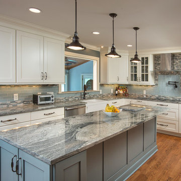
The highlight of the renovation is, however, the new kitchen. Featuring a large center island with distressed curved wood countertop, it provides an anchor around which the rest of the room flows. Stark white cabinets run along two walls, providing significant kitchen storage, as well as several display cabinets for the homeowner’s fine china.
A white farmer’s sink sits below a large window looking out over the backyard and the counters are topped with complementary stone counter and tile backsplash. Stainless steel appliances include a gas cooktop with custom wood hood that matches the cabinets. Matching crown molding tops the flush-to-the-ceiling cabinets.
In addition to natural light from the windows, the kitchen features pendant lights over the island, under-cabinet lighting and LED lights. The added lighting along with the white cabinets make the room look even more spacious.
Being a gourmet cook, the homeowner enjoys her time in kitchen while the mud room makes her daily chores a lot simpler.
Sponsored
Columbus, OH

Trish Takacs Design
Award Winning & Highly Skilled Kitchen & Bath Designer in Columbus
 Infinite Home
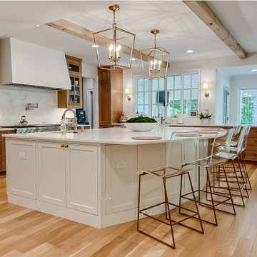
Our clients wanted a kitchen that could keep up with their family's pace. They love watching cooking competitions and wanted their kitchen to be the perfect spot for their kids to have cookie bake-offs. To make that possible, their kitchen needed to be wider, more capable, and more open than their current one, while still feeling connected to the family room. The wife wanted to be present with her family even while cooking, with a clear view of both the breakfast room and the family room wherever she stood. That sightline became the guiding principle for the entire space.
What came together is nothing short of a dream kitchen. The footprint was dramatically expanded as part of the addition, anchored by an oversized island with a bright quartz countertop that invites the whole family to pull up a stool and stay a while. Warm, natural wood cabinetry wraps the perimeter, grounding the space with richness and texture, while the white island keeps everything feeling bright and open. Exposed wood beams overhead carry warmth upward, and a pair of brass lantern pendants over the island add just the right amount of drama without competing with the natural light pouring in through the wall of windows in the breakfast room.
The butler's pantry, tucked just off the kitchen, adds the kind of storage and prep space that makes a busy household run smoothly, and gives the whole cooking experience a sense of ease and luxury that the family now wonders how they ever lived without. And with the family room and breakfast room always in view, separated only by open air, this kitchen doesn't just function beautifully. It draws everyone together exactly the way our clients always hoped it would.
 Ledden Palimeno Landscape Co.
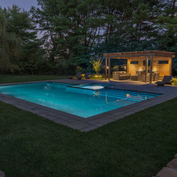
Joe Palimeno has always been inspired by the work of Landscape Architect Robert Royston, a pioneering modernist who helped define landscape architecture in the early 1940s. Palimeno has said about past designs, “it has always been the driving force in my design work, to create functional and usable outdoor spaces, whether in a backyard garden or a regional use plan. The goal is the creation of delight, joy and serenity for the people who inhabit the space.”
In this backyard, where crisp, clean lines run across the lawn to meet a vertical raw wood structure, a space is defined to offer serenity and relaxation.
 Studio 804
The 722 Ash Street residence consists of a 1500 sf primary house with a contiguous 500 sf accessory dwelling. The project is set in the rich culture of North Lawrence, its rear property line abuts the Lawrence levee trail which runs for nine miles along the north bank of the Kansas River.
North Lawrence is known for its quality soil, large trees, curbless streets and random size parcels before it breaks into larger farms further from the urban center. It is built on the typical orthogonal grid of American development, but it represents the older growth of the city prior to urban planners and zoning regulations. The rumble of freight trains and farm trucks in the shadows of the towering grain elevators are only blocks away. It is home to many who enjoy being only a bridge crossing away from Lawrence’s vibrant downtown but are far enough away to maintain their independence from many of the restrictions on living near the historic district. They can work in their large gardens and toiling in their garages and shops in a manner more rural than urban.
The house on 722 Ash St. is imbued with the character of North Lawrence and the Levee Trail area. The design was inspired by the Midwestern farmstead vernacular of the region. These timeless vernacular qualities house all the accommodations necessary for modern, sustainable living. A unique feature of this house is the Accessory Dwelling Unit permitted in the zoning district. It is a small separate residence on the same lot that can be used for income property or for extended family members. It also supports the city of Lawrence’s goals of increased density close to downtown rather than continued sprawl into the countryside.
The buildings use technology and common-sense design to reduce the building’s footprint and assure the owners low energy use and costs. A 4.9 Kw solar collection system is located on the only south facing gable and the super insulated envelopes (r-62 roof and r-35 walls) of all three forms easily exceeds the standards. Studio 804 continues their long standing pattern of maintaining the highest level of sustainable design while remaining contextually sensitive to the surrounding community. This house, like every Studio 804 project since 2008, is USGBC LEED Platinum Certified.
 Granit Architects + Interiors
We helped our clients to create a practical, modern and beautiful family home in Putney, South West London.
The Brief
The brief from our clients was to amalgamate an annex and original house building to create one practical family home. It was important the annex did not feel like an add-on, but rather as part of the original property.
The Solution
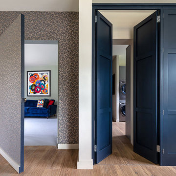
The design solution is to feature a series of new openings between the two buildings to provide subtle connections and routes between spaces throughout the house.
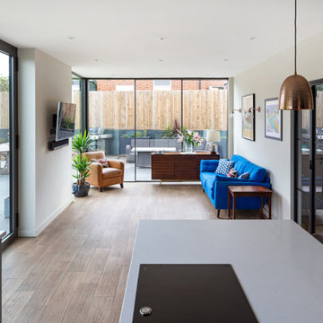
The whole footprint was utilised and spaces were carefully arranged to maximise light and provide a more functional family home. Glass doors with steel frames were used in the hallway to open up sight-lines to the large rear garden and provide flexibility to the use of the space.
The dining room features a hidden door into a secret lounge space that plays on the idea of there previously being a sense of separation. The Kitchen was made bespoke by Higham Furniture, a supplier we have worked with many times before and who are in our supplier directory.
All the original external walls and ground floor construction have been insulated to exceed building regulation standards, creating a highly sustainable building. This is great for our clients carbon footprint and for keeping their running costs low.
Externally, corner glazed full height sliding doors were added to provide a seamless transition between the lounge and garden. At roof level, a series of dormers were added to the master suite that help draw breathtaking views towards the London skyline.
The rear garden was landscaped by Patios, Pots and Pergolas.
The Result
We are delighted with the outcome, which is a sustainable and functional single family home that responds well to our clients brief.
 Infinite Home
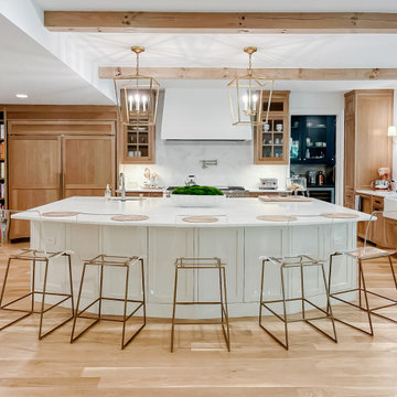
Our clients wanted a kitchen that could keep up with their family's pace. They love watching cooking competitions and wanted their kitchen to be the perfect spot for their kids to have cookie bake-offs. To make that possible, their kitchen needed to be wider, more capable, and more open than their current one, while still feeling connected to the family room. The wife wanted to be present with her family even while cooking, with a clear view of both the breakfast room and the family room wherever she stood. That sightline became the guiding principle for the entire space.
What came together is nothing short of a dream kitchen. The footprint was dramatically expanded as part of the addition, anchored by an oversized island with a bright quartz countertop that invites the whole family to pull up a stool and stay a while. Warm, natural wood cabinetry wraps the perimeter, grounding the space with richness and texture, while the white island keeps everything feeling bright and open. Exposed wood beams overhead carry warmth upward, and a pair of brass lantern pendants over the island add just the right amount of drama without competing with the natural light pouring in through the wall of windows in the breakfast room.
The butler's pantry, tucked just off the kitchen, adds the kind of storage and prep space that makes a busy household run smoothly, and gives the whole cooking experience a sense of ease and luxury that the family now wonders how they ever lived without. And with the family room and breakfast room always in view, separated only by open air, this kitchen doesn't just function beautifully. It draws everyone together exactly the way our clients always hoped it would.

 Cummings Architecture + Interiors
Situated along Eagle River, looking across to the mouth of the Ipswich Harbor, this was clearly a little cape house that was married to the sea. The owners were inquiring about adding a simple shed dormer to provide additional exposure to the stunning water view, but they were also interested in what Mathew would design if this beach cottage were his.
Inspired by the waves that came ashore mere feet from the little house, Mathew took up a fat marker and sketched a sweeping, S-shape dormer on the waterside of the building. He then described how the dormer would be designed in the shape of an ocean wave. “This way,” he explained, “you will not only be able to see the ocean from your new master bedroom, you’ll also be able to experience that view from a space that actually reflects the spirit of the waves.”
Mathew and his team designed the master suite and study using a subtle combination of contemporary and traditional, beach-house elements. The result was a completely unique and one-of-a-kind space inside and out. Transparencies are built into the design via features like gently curved glass that reflects the water and the arched interior window separating the bedroom and bath. On the exterior, the curved dormer on the street side echoes these rounded shapes and lines to create continuity throughout. The sense of movement is accentuated by the continuous, V-groove boarded ceiling that runs from one ocean-shaped dormer through to the opposite side of the house.
The bedroom features a cozy sitting area with built in storage and a porthole window to look out onto the rowboats in the harbor. A bathroom and closet were combined into a single room in a modern design that doesn't sacrifice any style or space and provides highly efficient functionality. A striking barn door made of glass with industrial hardware divides the two zones of the master suite. The custom, built-in maple cabinetry of the closets provides a textural counterpoint to the unique glass shower that incorporates sea stones and an ocean wave motif accent tile.
With this spectacular design vision, the owners are now able to enjoy their stunning view from a bright and spacious interior that brings the natural elements of the beach into the home.
Photo by Eric Roth
 Granit Architects + Interiors
We helped our clients to create a practical, modern and beautiful family home in Putney, South West London.
The Brief
The brief from our clients was to amalgamate an annex and original house building to create one practical family home. It was important the annex did not feel like an add-on, but rather as part of the original property.
The Solution
The design solution is to feature a series of new openings between the two buildings to provide subtle connections and routes between spaces throughout the house.
The whole footprint was utilised and spaces were carefully arranged to maximise light and provide a more functional family home. Glass doors with steel frames were used in the hallway to open up sight-lines to the large rear garden and provide flexibility to the use of the space.
The dining room features a hidden door into a secret lounge space that plays on the idea of there previously being a sense of separation. The Kitchen was made bespoke by Higham Furniture, a supplier we have worked with many times before and who are in our supplier directory.
All the original external walls and ground floor construction have been insulated to exceed building regulation standards, creating a highly sustainable building. This is great for our clients carbon footprint and for keeping their running costs low.
Externally, corner glazed full height sliding doors were added to provide a seamless transition between the lounge and garden. At roof level, a series of dormers were added to the master suite that help draw breathtaking views towards the London skyline.
The rear garden was landscaped by Patios, Pots and Pergolas.
The Result
We are delighted with the outcome, which is a sustainable and functional single family home that responds well to our clients brief.
53