
Search results for "Sense running" in Home Design Ideas

 Zola European Windows
Essential, contemporary, and inviting defines this extremely energy efficient, Energy Star certified, Passive House design-inspired home in the Pacific Northwest. Designed for an active family of four, the one-story 3 bedroom, 2 bath floor plan offers tasteful aging in place features, a strong sense of privacy, and a low profile that doesn’t impinge on the natural landscape. This house will heat itself in the dead of winter with less energy than it takes to run a hair dryer, and be sensual to live in while it does it. The forms throughout the home are simple and neutral, allowing for ample natural light, rich warm materials, and of course, room for the Guinea pigs makes this a great example of artful architecture applied to a genuine family lifestyle.
This ultra energy efficient home relies on extremely high levels of insulation, air-tight detailing and construction, and the implementation of high performance, custom made European windows and doors by Zola Windows. Zola’s ThermoPlus Clad line, which boasts R-11 triple glazing and is thermally broken with a layer of patented German Purenit®, was selected for the project. Natural daylight enters both from the tilt & turn and fixed windows in the living and dining areas, and through the terrace door that leads seamlessly outside to the natural landscape.
Project Designed & Built by: artisansgroup
Certifications: Energy Star & Built Green Lvl 4
Photography: Art Gray of Art Gray Photography

 Advance Design Studio, Ltd.
Jennifer and Dan have lived in their Deer Park Illinois home for 15 years, slowly making minor fixes like painting and decorating; but they had a new plan for their kitchen the entire time. An awkwardly placed garage door, and an island cooktop with a terrible downdraft made a full-scale kitchen remodel an absolute must. Jennifer had many ideas in mind and wanted to work with a company that could provide high-end work, while partnering with a designer that would tailor the kitchen to her ideas.
She was intrigued by the phrase “Common Sense Remodeling” in Advance Design’s feature she discovered while perusing an issue of the community’s Quintessential Barrington Magazine. Doing further research on the company’s website, as she looked through project profiles and read about Advance Design’s “Common Sense Remodeling” philosophy, she promptly scheduled an appointment to see if the people and ideas she read about were truly who they said they were. The more she read, the more she knew that the “Common Sense” approach to remodeling they described was exactly the type of company she was looking for.
The partnership was sealed after an initial consultation with Owner Todd Jurs and Project Designer Michelle Lecinski. They displayed a combination of friendliness, professionalism and respect that was unmatched by any of the other companies Jennifer talked to. She knew that with Advance Design, she would be able to retain the vision that she had in mind with high-quality craftsmanship.
“I reached out to Advance Design because of the ‘Common Sense Remodeling’ tagline,” Jennifer said. “That’s what lingered for me”. “Advance Design was the most respectful- of the house and of my design ideas, and the most professional of the handful of companies that looked at my project”.
Soon after the meeting Jennifer began working with Michelle on the project design. They quickly developed chemistry. Jennifer loved how Michelle researched and located every detail that Jennifer wanted for the kitchen. Between the two of them, every concept and idea was worked through and perfected. “Jennifer had definite ideas about what she wanted the new kitchen to look like, she just didn’t know how to bring it all together. We worked together really well to make her ideas into the practical reality necessary for a well-functioning kitchen, with the look and feel that she had envisioned”, says Michelle.
“Michelle was wonderful in using the CAD system she would show me new drawings every time we changed the layout while working through the design,” Jennifer said. “She was a really wonderful partner in execution, she made sure everything happened quickly and easily.”
The finished design drew out elements of Jennifer’s style and personality. The pair call the look “sophisticated farmhouse” to describe the kitchen renovation to family and friends. The result was a beautifully crafted, authentic-feeling space that satisfied Jennifer’s dreams 15 years in the making. The whole project consisted of a kitchen remodel, mudroom upgrade with powder room, and garage entry relocation. “The projects I personally like the best, are the ones that put the client’s dreams on display,” Project Designer Michelle said. “And this is one of those projects.”
The main focal point of the kitchen is custom zinc and brass ventilation hood with a vintage sheen, which was hand made to order by a small company in Indiana named Vogler Metalworking. “It’s like sculpture, a true work of art”, says Jennifer. Your eye is immediately drawn towards this elegant yet practical hood that eliminated the home’s downdraft problem and added a striking conversation piece at the same time. The carpenters had to use special gloves when transporting and installing it, so they didn’t smudge it with fingerprints. The beautiful hood centers proudly over the stunning black enamel and brass LaCornue Range. “I had a friend who had a LaCornue range and after learning how easy it was to cook perfect meals, I was convinced I wanted to have one”, says Jennifer. This unique, breathtaking combination anchors the entire kitchen and is apparent immediately as you walk into the great room the surrounds the space.
DuraSupreme Crestwood cabinets with a Kendall Panel add function and sophistication. A custom gray paint color paired with a storm blue was developed so that the new kitchen looked like it belonged to the existing space. Unlacquered brass faucets and hardware were important to Jennifer because she wanted the living finishes to age over time. Remarkable brass diamond mesh cabinet door inserts imported from the UK continue to add this one-of-a-kind kitchen renovation; giving it a “you won’t see this everywhere” quality. The use of old railcar flooring for the coffee bar countertop and reclaimed oak for the open shelving gives an authenticity to the space uncommon in kitchens today.
Jennifer and Michelle fell in love with the Limestone Grey Stone while they were investigating unique island countertop ideas. They liked the fact that the limestone as a living finish will age and change over time. Calcutta Miel Quartz countertops made for an excellent pairing around the perimeter, as it’s durable and perfect for cooking preparations. A textured white subway tile backsplash that runs to the ceiling keeps your eye moving towards the open shelving, and to the main focal point of the stunning range hood combination.
“The kitchen functions beautifully, and it’s gorgeous,” beams Jennifer as she gestures with both hands while smiling ear to ear. “The most important thing was I wanted a kitchen that had a wonderful flow, cooked beautiful meals and was a great gathering place for family and friends, and this space does that perfectly! Beauty wise, it turned out exactly how I had envisioned. I felt the function part was the hardest part, and that was nailed”!
Relocating the garage entry to the new mudroom was a huge priority and has finally separated the family’s arriving home functions from their kitchen. Now coats and shoes and bags have their own area for dropping once members arrive home. Matching gray DuraSupreme cabinetry helped create gorgeous, purposeful lockers for the family. A reclaimed vintage sink and custom wall paper were added to the tiny powder room to beautify the once previously only functional space. Advance Design was even able to create a custom space for their dog to sleep while the family is away.
“It was unbelievable that a project of this size was completed in such a short time, and I think that’s because of the large amount of planning and preparation that went into it,” Jennifer marveled, “When we started, we were ready, and everything was prepared”.
When it came to execution, Project Manager Justin Davis and his crew were quick, accessible, and organized. Projects like this kitchen are typically completed in as little as 8-10 weeks. Jennifer’s kitchen however despite the relocation of some challenging HVAC in a soffit and moving of an exterior door was completed remarkably fast in part because the team was working with an existing tile floor that ran throughout the first floor that the client really loved.
“You get to know these people really well because they’re living in your house while you’re living in your house. They were so fast and really good, it didn’t take as long as even planned” reported Jennifer. “I would text Justin and he always responded almost immediately. I got to know all the guys who were working in our house and they were all wonderful people”.
Details in a customized kitchen like this one require skill and care from the people who install it. “All the guys on the job were skilled at what the did. I wanted small details like little feet to look like furniture, that is where their carpentry skill came in to make these all perfect”, said Jennifer. “The tile guys were wonderful. They even let me determine how I wanted the texture with the grout to appear for a salt and pepper look; now that is a very skilled trade person making it custom”.
In Jennifer’s interview, she continued to reference Advance Design’s “Common Sense Remodeling”, so I took a minute to ask her exactly what that phrase meant to her and how it played out in her experience with her project and the Advance Design team. Here is what she said: “I was intrigued about Common Sense Remodeling and in my head that there would be clear costs and prices, great communication between the design team, the execution team and me”, said Jennifer. They did deliver on that, it was so clear about the cost breakdown, what I could expect from everyone who came to my house, and everything that we had ordered. That to me is the Common Sense”!
It’s great to see a client take literally our assertion that a well-planned remodeling project is simply “Common Sense”! She anticipated each step of the way would be clear, concise, and predictable, all the while protecting the outcome due to the careful upfront planning. “Advance Design delivered on their ‘Common Sense Remodeling’ promise,” Jennifer said. “From the design team, to the execution team - everything was straight forward like I imagined. The project turned out exactly how I envisioned, I enjoyed this process and absolutely would recommend Advance Design Studio to anyone.”

 Natural Stone Institute
The intrigue of the home’s powerful facade lies in the locally sourced puddingstone archway inviting you in. The custom designed bronze door with leaded sidelights opens into the foyer from underneath the covered walkway to the right, in essence hidden from the street. The wide-open central expanse allows one a sneak preview of the stone patio and back yard beyond, highlighting the 120-foot-tall Beech tree that has
been thriving on the site for over two hundred years. The challenge of designing this 6,300 square foot home and pool house was the narrow but deep one-acre lot. John Meyer’s master planning of a strong front elevation hides the “sideways configuration” of the floorplan. To the left
of the archway is a 3-car garage below an entertainment room, with a master bedroom suite on the top floor bridging the main house behind the central eyebrow over the archway.
The sense of having been on the site for decades was the intent of the design abundant in the use of stone and masonry. The carved stonework shapes the main and secondary archways as full ovals. Slate detailing is set
between the sunburst oval window, balancing interest with the keystones framing the five windows across the bridge. Rough cut boulders give weight to the structure’s base, while straight runs of stone border the shingles under the roof’s eaves and shaped stones guide corner edges downward along the retaining walls. The granite steps and bluestone patio lead one back to the lighted base of the Beech tree, terrace and on-axis pool area beyond. The roof is double thick slate, and the circular drive is crushed stone with granite edging. Like the longevity of the Beech tree, this unique design will stand proudly in its neighborhood for years to come.
Find the right local pro for your project

 Saikley Architects
This beautiful 1881 Alameda Victorian cottage, wonderfully embodying the Transitional Gothic-Eastlake era, had most of its original features intact. Our clients, one of whom is a painter, wanted to preserve the beauty of the historic home while modernizing its flow and function.
From several small rooms, we created a bright, open artist’s studio. We dug out the basement for a large workshop, extending a new run of stair in keeping with the existing original staircase. While keeping the bones of the house intact, we combined small spaces into large rooms, closed off doorways that were in awkward places, removed unused chimneys, changed the circulation through the house for ease and good sightlines, and made new high doorways that work gracefully with the eleven foot high ceilings. We removed inconsistent picture railings to give wall space for the clients’ art collection and to enhance the height of the rooms. From a poorly laid out kitchen and adjunct utility rooms, we made a large kitchen and family room with nine-foot-high glass doors to a new large deck. A tall wood screen at one end of the deck, fire pit, and seating give the sense of an outdoor room, overlooking the owners’ intensively planted garden. A previous mismatched addition at the side of the house was removed and a cozy outdoor living space made where morning light is received. The original house was segmented into small spaces; the new open design lends itself to the clients’ lifestyle of entertaining groups of people, working from home, and enjoying indoor-outdoor living.
Photography by Kurt Manley.
https://saikleyarchitects.com/portfolio/artists-victorian/

 Klopf Architecture
, Outer Space Landscape Architects, Sezen & Moon Structural Engineer and Flegels Construction updated a classic Eichler open, indoor-outdoor home.
Everyone loved the classic, original bones of this house, but it was in need of a major facelift both inside and out. The owners also wanted to remove the barriers between the kitchen and great room, and increase the size of the master bathroom as well as make other layout changes. No addition to the house was contemplated.
The owners worked with Klopf Architecture in part because of Klopf’s extensive mid-century modern / Eichler design portfolio, and in part because one of their neighbors who had worked with Klopf on their Eichler home remodel referred them. The Klopf team knew how to update the worn finishes to make a more sophisticated, higher quality home that both looks better and functions better.
In conjunction with the atrium and the landscaped rear yard / patio, the glassy living room feels open on both sides and allows an indoor / outdoor flow throughout. The new, natural wood exterior siding runs through the house from inside to outside to inside again, updating one of the classic design features of the Eichler homes.
Picking up on the wood siding, walnut vanities and cabinets offset the white walls. Gray porcelain tiles evoke the concrete slab floors and flow from interior to exterior to make the spaces appear to flow together. Similarly the ceiling decking has the same white-washed finish from inside to out. The continuity of materials and space enhances the sense of flow.
The large kitchen, perfect for entertaining, has a wall of built-ins and an oversized island. There’s plenty of storage and space for the whole group to prep and cook together.
One unique approach to the master bedroom is the bed wall. The head of the bed is tucked within a line of built-in wardrobes with a high window above. Replacing the master closet with this wall of wardrobes allowed for both a larger bathroom and a larger bedroom.
This 1,953 square foot, 4 bedroom, 2 bathroom Double Gable Eichler remodeled single-family house is located in Mountain View in the heart of the Silicon Valley.
Klopf Architecture Project Team: John Klopf, AIA, Klara Kevane, and Yegvenia Torres-Zavala
Landscape Architect: Outer Space Landscape Architects
Structural Engineer: Sezen & Moon
Contractor: Flegels Construction
Landscape Contractor: Roco's Gardening & Arroyo Vista Landscaping, Inc.
Photography ©2016 Mariko Reed
Location: Mountain View, CA
Year completed: 2015
 Klopf Architecture
, Outer Space Landscape Architects, Sezen & Moon Structural Engineer and Flegels Construction updated a classic Eichler open, indoor-outdoor home.
Everyone loved the classic, original bones of this house, but it was in need of a major facelift both inside and out. The owners also wanted to remove the barriers between the kitchen and great room, and increase the size of the master bathroom as well as make other layout changes. No addition to the house was contemplated.
The owners worked with Klopf Architecture in part because of Klopf’s extensive mid-century modern / Eichler design portfolio, and in part because one of their neighbors who had worked with Klopf on their Eichler home remodel referred them. The Klopf team knew how to update the worn finishes to make a more sophisticated, higher quality home that both looks better and functions better.
In conjunction with the atrium and the landscaped rear yard / patio, the glassy living room feels open on both sides and allows an indoor / outdoor flow throughout. The new, natural wood exterior siding runs through the house from inside to outside to inside again, updating one of the classic design features of the Eichler homes.
Picking up on the wood siding, walnut vanities and cabinets offset the white walls. Gray porcelain tiles evoke the concrete slab floors and flow from interior to exterior to make the spaces appear to flow together. Similarly the ceiling decking has the same white-washed finish from inside to out. The continuity of materials and space enhances the sense of flow.
The large kitchen, perfect for entertaining, has a wall of built-ins and an oversized island. There’s plenty of storage and space for the whole group to prep and cook together.
One unique approach to the master bedroom is the bed wall. The head of the bed is tucked within a line of built-in wardrobes with a high window above. Replacing the master closet with this wall of wardrobes allowed for both a larger bathroom and a larger bedroom.
This 1,953 square foot, 4 bedroom, 2 bathroom Double Gable Eichler remodeled single-family house is located in Mountain View in the heart of the Silicon Valley.
Klopf Architecture Project Team: John Klopf, AIA, Klara Kevane, and Yegvenia Torres-Zavala
Landscape Architect: Outer Space Landscape Architects
Structural Engineer: Sezen & Moon
Contractor: Flegels Construction
Landscape Contractor: Roco's Gardening & Arroyo Vista Landscaping, Inc.
Photography ©2016 Mariko Reed
Location: Mountain View, CA
Year completed: 2015

 TKS Design Group
This project is a good example of what can be done with a little refresh. Sometimes parts of your space work well and parts don’t, so a full gut and replace might not make sense. That was the case here.
After living with it for a decade or so realized they would really prefer two sinks in the vanity. Since there were two windows in the bathroom, we decided to eliminate the window to the left of the current vanity and replace with it with a longer run of cabinets.
The other window is to the right of the vanity let’s in beautiful morning light. The window we removed was a northern exposure and its location under an eave didn’t allow for much light, so it was the perfect solution!
In addition to the new vanity, we also changed out the countertop, added new mirrors and lighting, and changed out the tile floor to a larger hex with fewer grout lines. This adds a brighter more modern look while still maintaining the vintage feel of the room.
The shower was in great shape, so we left that as is except for swapping out the shower floor tile to match the main floor and adding a more updated decorative mosaic tile. We added a new toilet and for a bit of luxury a heated towel bar.
Designed by: Susan Klimala, CKD, CBD
Photography by: LOMA Studios
For more information on kitchen and bath design ideas go to: www.kitchenstudio-ge.com
Project Year: 2020

 Klopf Architecture
, Outer Space Landscape Architects, Sezen & Moon Structural Engineer and Flegels Construction updated a classic Eichler open, indoor-outdoor home.
Everyone loved the classic, original bones of this house, but it was in need of a major facelift both inside and out. The owners also wanted to remove the barriers between the kitchen and great room, and increase the size of the master bathroom as well as make other layout changes. No addition to the house was contemplated.
The owners worked with Klopf Architecture in part because of Klopf’s extensive mid-century modern / Eichler design portfolio, and in part because one of their neighbors who had worked with Klopf on their Eichler home remodel referred them. The Klopf team knew how to update the worn finishes to make a more sophisticated, higher quality home that both looks better and functions better.
In conjunction with the atrium and the landscaped rear yard / patio, the glassy living room feels open on both sides and allows an indoor / outdoor flow throughout. The new, natural wood exterior siding runs through the house from inside to outside to inside again, updating one of the classic design features of the Eichler homes.
Picking up on the wood siding, walnut vanities and cabinets offset the white walls. Gray porcelain tiles evoke the concrete slab floors and flow from interior to exterior to make the spaces appear to flow together. Similarly the ceiling decking has the same white-washed finish from inside to out. The continuity of materials and space enhances the sense of flow.
The large kitchen, perfect for entertaining, has a wall of built-ins and an oversized island. There’s plenty of storage and space for the whole group to prep and cook together.
One unique approach to the master bedroom is the bed wall. The head of the bed is tucked within a line of built-in wardrobes with a high window above. Replacing the master closet with this wall of wardrobes allowed for both a larger bathroom and a larger bedroom.
This 1,953 square foot, 4 bedroom, 2 bathroom Double Gable Eichler remodeled single-family house is located in Mountain View in the heart of the Silicon Valley.
Klopf Architecture Project Team: John Klopf, AIA, Klara Kevane, and Yegvenia Torres-Zavala
Landscape Architect: Outer Space Landscape Architects
Structural Engineer: Sezen & Moon
Contractor: Flegels Construction
Landscape Contractor: Roco's Gardening & Arroyo Vista Landscaping, Inc.
Photography ©2016 Mariko Reed
Location: Mountain View, CA
Year completed: 2015
 Natural Stone Institute
The intrigue of the home’s powerful facade lies in the locally sourced puddingstone archway inviting you in. The custom designed bronze door with leaded sidelights opens into the foyer from underneath the covered walkway to the right, in essence hidden from the street. The wide-open central expanse allows one a sneak preview of the stone patio and back yard beyond, highlighting the 120-foot-tall Beech tree that has
been thriving on the site for over two hundred years. The challenge of designing this 6,300 square foot home and pool house was the narrow but deep one-acre lot. John Meyer’s master planning of a strong front elevation hides the “sideways configuration” of the floorplan. To the left
of the archway is a 3-car garage below an entertainment room, with a master bedroom suite on the top floor bridging the main house behind the central eyebrow over the archway.
The sense of having been on the site for decades was the intent of the design abundant in the use of stone and masonry. The carved stonework shapes the main and secondary archways as full ovals. Slate detailing is set
between the sunburst oval window, balancing interest with the keystones framing the five windows across the bridge. Rough cut boulders give weight to the structure’s base, while straight runs of stone border the shingles under the roof’s eaves and shaped stones guide corner edges downward along the retaining walls. The granite steps and bluestone patio lead one back to the lighted base of the Beech tree, terrace and on-axis pool area beyond. The roof is double thick slate, and the circular drive is crushed stone with granite edging. Like the longevity of the Beech tree, this unique design will stand proudly in its neighborhood for years to come.
 Natural Stone Institute
The intrigue of the home’s powerful facade lies in the locally sourced puddingstone archway inviting you in. The custom designed bronze door with leaded sidelights opens into the foyer from underneath the covered walkway to the right, in essence hidden from the street. The wide-open central expanse allows one a sneak preview of the stone patio and back yard beyond, highlighting the 120-foot-tall Beech tree that has
been thriving on the site for over two hundred years. The challenge of designing this 6,300 square foot home and pool house was the narrow but deep one-acre lot. John Meyer’s master planning of a strong front elevation hides the “sideways configuration” of the floorplan. To the left
of the archway is a 3-car garage below an entertainment room, with a master bedroom suite on the top floor bridging the main house behind the central eyebrow over the archway.
The sense of having been on the site for decades was the intent of the design abundant in the use of stone and masonry. The carved stonework shapes the main and secondary archways as full ovals. Slate detailing is set
between the sunburst oval window, balancing interest with the keystones framing the five windows across the bridge. Rough cut boulders give weight to the structure’s base, while straight runs of stone border the shingles under the roof’s eaves and shaped stones guide corner edges downward along the retaining walls. The granite steps and bluestone patio lead one back to the lighted base of the Beech tree, terrace and on-axis pool area beyond. The roof is double thick slate, and the circular drive is crushed stone with granite edging. Like the longevity of the Beech tree, this unique design will stand proudly in its neighborhood for years to come.

 Paul Lopa Designs
See what our client say about Paul Lopa Designs:
It went as smooth as it possibly could go. The only bumps in the road was with what we found during demolition, you never know what your gonna run into when all the walls, floors and fixtures come out. Paul had explained to us that depending on what we found under all the out dated stuff it might take a little longer. Paul was there doing the work with his workers he showed up on time and finished on schedule. It was no problem being in touch with Paul because he answered his phone or got back to us in a timely fashion. He has an excellent sense of design he knows what goes well together and makes the house flow with comfort and usability.
Paul Lopa designs,inc
 Natural Stone Institute
The intrigue of the home’s powerful facade lies in the locally sourced puddingstone archway inviting you in. The custom designed bronze door with leaded sidelights opens into the foyer from underneath the covered walkway to the right, in essence hidden from the street. The wide-open central expanse allows one a sneak preview of the stone patio and back yard beyond, highlighting the 120-foot-tall Beech tree that has
been thriving on the site for over two hundred years. The challenge of designing this 6,300 square foot home and pool house was the narrow but deep one-acre lot. John Meyer’s master planning of a strong front elevation hides the “sideways configuration” of the floorplan. To the left
of the archway is a 3-car garage below an entertainment room, with a master bedroom suite on the top floor bridging the main house behind the central eyebrow over the archway.
The sense of having been on the site for decades was the intent of the design abundant in the use of stone and masonry. The carved stonework shapes the main and secondary archways as full ovals. Slate detailing is set
between the sunburst oval window, balancing interest with the keystones framing the five windows across the bridge. Rough cut boulders give weight to the structure’s base, while straight runs of stone border the shingles under the roof’s eaves and shaped stones guide corner edges downward along the retaining walls. The granite steps and bluestone patio lead one back to the lighted base of the Beech tree, terrace and on-axis pool area beyond. The roof is double thick slate, and the circular drive is crushed stone with granite edging. Like the longevity of the Beech tree, this unique design will stand proudly in its neighborhood for years to come.
 Zola European Windows
Essential, contemporary, and inviting defines this extremely energy efficient, Energy Star certified, Passive House design-inspired home in the Pacific Northwest. Designed for an active family of four, the one-story 3 bedroom, 2 bath floor plan offers tasteful aging in place features, a strong sense of privacy, and a low profile that doesn’t impinge on the natural landscape. This house will heat itself in the dead of winter with less energy than it takes to run a hair dryer, and be sensual to live in while it does it. The forms throughout the home are simple and neutral, allowing for ample natural light, rich warm materials, and of course, room for the Guinea pigs makes this a great example of artful architecture applied to a genuine family lifestyle.
This ultra energy efficient home relies on extremely high levels of insulation, air-tight detailing and construction, and the implementation of high performance, custom made European windows and doors by Zola Windows. Zola’s ThermoPlus Clad line, which boasts R-11 triple glazing and is thermally broken with a layer of patented German Purenit®, was selected for the project. Natural daylight enters both from the tilt & turn and fixed windows in the living and dining areas, and through the terrace door that leads seamlessly outside to the natural landscape.
Project Designed & Built by: artisansgroup
Certifications: Energy Star & Built Green Lvl 4
Photography: Art Gray of Art Gray Photography
Sponsored
Columbus, OH

Trish Takacs Design
Award Winning & Highly Skilled Kitchen & Bath Designer in Columbus

 Floor Mania
American Restoration combines two of the most expensive and high-end trends in the hardwood flooring industry. We are excited because our product offers these really pricey trends in an affordable floor! Elegantly rustic, reclaimed-wood styling with very distinctive markings. This style, paired with a rich oil-stained finish look, creates a stunningly beautiful floor and is reminiscent of old worn barnwood.
One of the hottest visuals and environmental trends is utilizing reclaimed wood. Much of this wood is resourced from the beautiful old barns you see dotting the rural countryside. These barns are quickly disappearing. To use this product for flooring can cost upward of $50 to $100 per square foot. We have created the look of this authentic reclaimed character in a running line product!
The second hottest trend – an oil-rubbed finish – has been one of the most popular hardwood flooring choices in Europe and has now found its way to the states. An oilrubbed
finish is a more natural way to finish a wood floor, and it creates a very low gloss visual that really accentuates the grain of the wood. This is a sand and finish technique
that is not only a very laborious and time consuming process, but it is not very durable. A traditional oil-rubbed finish requires reapplication several times a year. Thanks to the advantages of Shaw’s hardwood finish – ScufResist Platinum – we can create this elegant look without all the maintenance.
We have combined these two looks to bring you a floor that presents the authentic, skip-sawn look of reclaimed wood – rich with history and human touch, but with a fresh
sophistication for today’s design-aware lifestyles. A floor that expresses a sense of caring and character. A floor with great substance and style. A floor with a vintage look combined with state-of-the-art technology. A floor that can live in any setting! And of course... it is made right here.
 Advance Design Studio, Ltd.
Jennifer and Dan have lived in their Deer Park Illinois home for 15 years, slowly making minor fixes like painting and decorating; but they had a new plan for their kitchen the entire time. An awkwardly placed garage door, and an island cooktop with a terrible downdraft made a full-scale kitchen remodel an absolute must. Jennifer had many ideas in mind and wanted to work with a company that could provide high-end work, while partnering with a designer that would tailor the kitchen to her ideas.
She was intrigued by the phrase “Common Sense Remodeling” in Advance Design’s feature she discovered while perusing an issue of the community’s Quintessential Barrington Magazine. Doing further research on the company’s website, as she looked through project profiles and read about Advance Design’s “Common Sense Remodeling” philosophy, she promptly scheduled an appointment to see if the people and ideas she read about were truly who they said they were. The more she read, the more she knew that the “Common Sense” approach to remodeling they described was exactly the type of company she was looking for.
The partnership was sealed after an initial consultation with Owner Todd Jurs and Project Designer Michelle Lecinski. They displayed a combination of friendliness, professionalism and respect that was unmatched by any of the other companies Jennifer talked to. She knew that with Advance Design, she would be able to retain the vision that she had in mind with high-quality craftsmanship.
“I reached out to Advance Design because of the ‘Common Sense Remodeling’ tagline,” Jennifer said. “That’s what lingered for me”. “Advance Design was the most respectful- of the house and of my design ideas, and the most professional of the handful of companies that looked at my project”.
Soon after the meeting Jennifer began working with Michelle on the project design. They quickly developed chemistry. Jennifer loved how Michelle researched and located every detail that Jennifer wanted for the kitchen. Between the two of them, every concept and idea was worked through and perfected. “Jennifer had definite ideas about what she wanted the new kitchen to look like, she just didn’t know how to bring it all together. We worked together really well to make her ideas into the practical reality necessary for a well-functioning kitchen, with the look and feel that she had envisioned”, says Michelle.
“Michelle was wonderful in using the CAD system she would show me new drawings every time we changed the layout while working through the design,” Jennifer said. “She was a really wonderful partner in execution, she made sure everything happened quickly and easily.”
The finished design drew out elements of Jennifer’s style and personality. The pair call the look “sophisticated farmhouse” to describe the kitchen renovation to family and friends. The result was a beautifully crafted, authentic-feeling space that satisfied Jennifer’s dreams 15 years in the making. The whole project consisted of a kitchen remodel, mudroom upgrade with powder room, and garage entry relocation. “The projects I personally like the best, are the ones that put the client’s dreams on display,” Project Designer Michelle said. “And this is one of those projects.”
The main focal point of the kitchen is custom zinc and brass ventilation hood with a vintage sheen, which was hand made to order by a small company in Indiana named Vogler Metalworking. “It’s like sculpture, a true work of art”, says Jennifer. Your eye is immediately drawn towards this elegant yet practical hood that eliminated the home’s downdraft problem and added a striking conversation piece at the same time. The carpenters had to use special gloves when transporting and installing it, so they didn’t smudge it with fingerprints. The beautiful hood centers proudly over the stunning black enamel and brass LaCornue Range. “I had a friend who had a LaCornue range and after learning how easy it was to cook perfect meals, I was convinced I wanted to have one”, says Jennifer. This unique, breathtaking combination anchors the entire kitchen and is apparent immediately as you walk into the great room the surrounds the space.
DuraSupreme Crestwood cabinets with a Kendall Panel add function and sophistication. A custom gray paint color paired with a storm blue was developed so that the new kitchen looked like it belonged to the existing space. Unlacquered brass faucets and hardware were important to Jennifer because she wanted the living finishes to age over time. Remarkable brass diamond mesh cabinet door inserts imported from the UK continue to add this one-of-a-kind kitchen renovation; giving it a “you won’t see this everywhere” quality. The use of old railcar flooring for the coffee bar countertop and reclaimed oak for the open shelving gives an authenticity to the space uncommon in kitchens today.
Jennifer and Michelle fell in love with the Limestone Grey Stone while they were investigating unique island countertop ideas. They liked the fact that the limestone as a living finish will age and change over time. Calcutta Miel Quartz countertops made for an excellent pairing around the perimeter, as it’s durable and perfect for cooking preparations. A textured white subway tile backsplash that runs to the ceiling keeps your eye moving towards the open shelving, and to the main focal point of the stunning range hood combination.
“The kitchen functions beautifully, and it’s gorgeous,” beams Jennifer as she gestures with both hands while smiling ear to ear. “The most important thing was I wanted a kitchen that had a wonderful flow, cooked beautiful meals and was a great gathering place for family and friends, and this space does that perfectly! Beauty wise, it turned out exactly how I had envisioned. I felt the function part was the hardest part, and that was nailed”!
Relocating the garage entry to the new mudroom was a huge priority and has finally separated the family’s arriving home functions from their kitchen. Now coats and shoes and bags have their own area for dropping once members arrive home. Matching gray DuraSupreme cabinetry helped create gorgeous, purposeful lockers for the family. A reclaimed vintage sink and custom wall paper were added to the tiny powder room to beautify the once previously only functional space. Advance Design was even able to create a custom space for their dog to sleep while the family is away.
“It was unbelievable that a project of this size was completed in such a short time, and I think that’s because of the large amount of planning and preparation that went into it,” Jennifer marveled, “When we started, we were ready, and everything was prepared”.
When it came to execution, Project Manager Justin Davis and his crew were quick, accessible, and organized. Projects like this kitchen are typically completed in as little as 8-10 weeks. Jennifer’s kitchen however despite the relocation of some challenging HVAC in a soffit and moving of an exterior door was completed remarkably fast in part because the team was working with an existing tile floor that ran throughout the first floor that the client really loved.
“You get to know these people really well because they’re living in your house while you’re living in your house. They were so fast and really good, it didn’t take as long as even planned” reported Jennifer. “I would text Justin and he always responded almost immediately. I got to know all the guys who were working in our house and they were all wonderful people”.
Details in a customized kitchen like this one require skill and care from the people who install it. “All the guys on the job were skilled at what the did. I wanted small details like little feet to look like furniture, that is where their carpentry skill came in to make these all perfect”, said Jennifer. “The tile guys were wonderful. They even let me determine how I wanted the texture with the grout to appear for a salt and pepper look; now that is a very skilled trade person making it custom”.
In Jennifer’s interview, she continued to reference Advance Design’s “Common Sense Remodeling”, so I took a minute to ask her exactly what that phrase meant to her and how it played out in her experience with her project and the Advance Design team. Here is what she said: “I was intrigued about Common Sense Remodeling and in my head that there would be clear costs and prices, great communication between the design team, the execution team and me”, said Jennifer. They did deliver on that, it was so clear about the cost breakdown, what I could expect from everyone who came to my house, and everything that we had ordered. That to me is the Common Sense”!
It’s great to see a client take literally our assertion that a well-planned remodeling project is simply “Common Sense”! She anticipated each step of the way would be clear, concise, and predictable, all the while protecting the outcome due to the careful upfront planning. “Advance Design delivered on their ‘Common Sense Remodeling’ promise,” Jennifer said. “From the design team, to the execution team - everything was straight forward like I imagined. The project turned out exactly how I envisioned, I enjoyed this process and absolutely would recommend Advance Design Studio to anyone.”

 The Artisans Group, Inc.
Essential, contemporary, and inviting defines this extremely energy efficient, Energy Star certified, Passive House design-inspired home in the Pacific Northwest. Designed for an active family of four, the one-story 3 bedroom, 2 bath floor plan offers tasteful aging in place features, a strong sense of privacy for both kids and parents, and a low profile that doesn’t impinge on the natural landscape. This house will heat itself in the dead of winter with less energy than it takes to run a hair dryer, and be sensual to live in while it does it. The forms throughout the home are simple and neutral, allowing for ample natural light, rich warm materials, and of course, room for the Guinea pigs makes this a great example of artful architecture applied to a genuine family lifestyle.
This ultra energy efficient home relies on extremely high levels of insulation, air-tight detailing and construction, and the implementation of high performance, custom made European windows and doors by Zola Windows. Zola’s ThermoPlus Clad line, which boasts R-11 triple glazing and is thermally broken with a layer of patented German Purenit®, was selected for the project. Natural daylight enters both from the tilt & turn and fixed windows in the living and dining areas, and through the terrace door that leads seamlessly outside to the natural landscape.
Designed and constructed by The Artisans Group out of Olympia, Washington - a small but mighty firm co-owned by Randy Foster and Tessa Smith. Fun, funky and innovative, The Artisans Group has designed and built more Passive Houses than any other firm on the West Coast. Known for their striking, award winning, and sensible work, they provide solutions for projects of any size and budget.
Photography: Art Gray of Art Gray Photography

 Michael Nash Design, Build & Homes
2011 NARI CAPITAL COTY HONORABLE MENTION AWARD WINNER
Since moving into their home 10 years ago, the lady of the house has been unhappy with her kitchen, dining room and entryway. The layout wasn’t efficient and the formal dining room was rarely used. With two children and a dog, a mud room made more sense for their lifestyle.
To make best use of the space, the design team at Michael Nash Design, Build & Homes removed the dining room altogether. Four feet of that space went to the kitchen to make it more spacious and functional. The rest went to creating a mud room for the kids with locker style storage.
The highlight of the renovation is, however, the new kitchen. Featuring a large center island with distressed curved wood countertop, it provides an anchor around which the rest of the room flows. Stark white cabinets run along two walls, providing significant kitchen storage, as well as several display cabinets for the homeowner’s fine china.
A white farmer’s sink sits below a large window looking out over the backyard and the counters are topped with complementary stone counter and tile backsplash. Stainless steel appliances include a gas cooktop with custom wood hood that matches the cabinets. Matching crown molding tops the flush-to-the-ceiling cabinets.
In addition to natural light from the windows, the kitchen features pendant lights over the island, under-cabinet lighting and LED lights. The added lighting along with the white cabinets make the room look even more spacious.
Being a gourmet cook, the homeowner enjoys her time in kitchen while the mud room makes her daily chores a lot simpler.

 Appliances Connection
Since 1911, Whirlpool has been at the forefront of the home appliance industry. From its flagship washing machines, to stoves, ovens, refrigerators, and more, there isn't a category of home appliance Whirlpool hasn't revitalized and reinvented in its long and storied history. You don't need to be convinced; you're probably already a customer. You may already have a Whirlpool microwave, a Whirlpool dryer, a Whirlpool dishwasher, or even a Whirlpool grill. And since 1911, Whirlpool has been synonymous with quality. With one of the most advanced R&D departments in the modern world, Whirlpool has an unprecedented reputation for innovation, ease of use, quality of design, and accessibility, with intuitive interfaces that eliminate guesswork, and innovative features sense and adapt to your patterns of use and your needs, so that these appliances help you rather than hinder you, allowing you to run your home as you see fit. With QuietSpin technology, which uses six point suspension to reduce noise, your laundry will be so quiet you'll almost forget it's there, while Precision Dispense Ultra technology lets you load your laundry with enough detergent to last thirty-six washes, and then dispenses it as needed! Whirlpool makes an art of getting out of the way.
 Klopf Architecture
, Outer Space Landscape Architects, Sezen & Moon Structural Engineer and Flegels Construction updated a classic Eichler open, indoor-outdoor home.
Everyone loved the classic, original bones of this house, but it was in need of a major facelift both inside and out. The owners also wanted to remove the barriers between the kitchen and great room, and increase the size of the master bathroom as well as make other layout changes. No addition to the house was contemplated.
The owners worked with Klopf Architecture in part because of Klopf’s extensive mid-century modern / Eichler design portfolio, and in part because one of their neighbors who had worked with Klopf on their Eichler home remodel referred them. The Klopf team knew how to update the worn finishes to make a more sophisticated, higher quality home that both looks better and functions better.
In conjunction with the atrium and the landscaped rear yard / patio, the glassy living room feels open on both sides and allows an indoor / outdoor flow throughout. The new, natural wood exterior siding runs through the house from inside to outside to inside again, updating one of the classic design features of the Eichler homes.
Picking up on the wood siding, walnut vanities and cabinets offset the white walls. Gray porcelain tiles evoke the concrete slab floors and flow from interior to exterior to make the spaces appear to flow together. Similarly the ceiling decking has the same white-washed finish from inside to out. The continuity of materials and space enhances the sense of flow.
The large kitchen, perfect for entertaining, has a wall of built-ins and an oversized island. There’s plenty of storage and space for the whole group to prep and cook together.
One unique approach to the master bedroom is the bed wall. The head of the bed is tucked within a line of built-in wardrobes with a high window above. Replacing the master closet with this wall of wardrobes allowed for both a larger bathroom and a larger bedroom.
This 1,953 square foot, 4 bedroom, 2 bathroom Double Gable Eichler remodeled single-family house is located in Mountain View in the heart of the Silicon Valley.
Klopf Architecture Project Team: John Klopf, AIA, Klara Kevane, and Yegvenia Torres-Zavala
Landscape Architect: Outer Space Landscape Architects
Structural Engineer: Sezen & Moon
Contractor: Flegels Construction
Landscape Contractor: Roco's Gardening & Arroyo Vista Landscaping, Inc.
Photography ©2016 Mariko Reed
Location: Mountain View, CA
Year completed: 2015
 Lindy Design Build
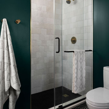
Dark green walls and a marble console sink turn this guest bath into a reason to stay an extra night. It started as a sad little ensuite with a layout that made no sense, and rather than work around what was already there we rebuilt the plan from scratch. That is almost always the right call when a bathroom feels wrong and nobody can quite say why.
The window was the thing worth building around. It is tall and generous for a bathroom this size, and the original casing stayed put, painted in Sherwin Williams 6258 Tricorn Black along with the baseboard. Black trim against saturated green is the contrast move that runs through this entire house.
Mixed metals do the rest. Brass faucet, brass mirror, and brass sconces set against the black metal legs of the washstand and a black cane fronted cabinet. Mixing finishes still gets treated as a rule you are breaking. In a small room it is usually what keeps the space from looking like a showroom set.
The black and white triangle floor tile ties back to the geometric accents in the bedroom next door, so the suite reads as one thought rather than two rooms that happen to share a door.
Marble washstand and mirror by Rejuvenation, faucet by Grohe, floor tile is TileBar B2W Angle Negative, trim in Sherwin Williams 6258 Tricorn Black. Historic home renovation in Denver, Colorado by Lindy Design Build. Photography by Jess Blackwell Photography.
49