
Search results for "Separate single phase" in Home Design Ideas
 Stanton Homes
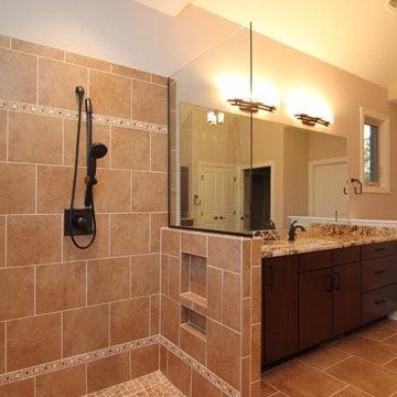
This master bath features a his and hers design - with separate vanities and separated shower heads on each end of the shower.
The shower is handicapped accessible with a no curb, roll in design.
Each end of the shower has built-in storage.
Luxury one story home by design build custom home builder Stanton Homes.
 Breathe Design Studio
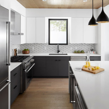
Completed in 2017, this single family home features matte black & brass finishes with hexagon motifs. We selected light oak floors to highlight the natural light throughout the modern home designed by architect Ryan Rodenberg. Joseph Builders were drawn to blue tones so we incorporated it through the navy wallpaper and tile accents to create continuity throughout the home, while also giving this pre-specified home a distinct identity.
 Corinthian Fine Homes
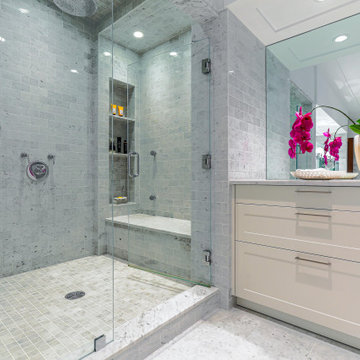
This home had a generous master suite prior to the renovation; however, it was located close to the rest of the bedrooms and baths on the floor. They desired their own separate oasis with more privacy and asked us to design and add a 2nd story addition over the existing 1st floor family room, that would include a master suite with a laundry/gift wrapping room.
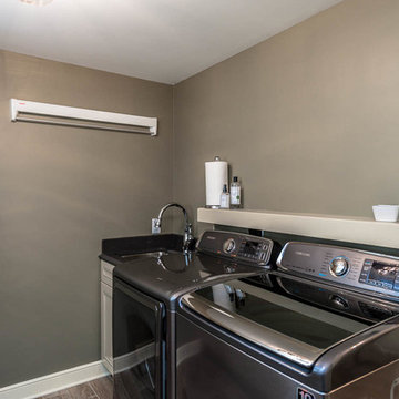
We added a 2nd story addition without adding to the existing footprint of the home. The addition is entered through a private hallway with a separate spacious laundry room, complete with custom storage cabinetry, sink area, and countertops for folding or wrapping gifts. The bedroom is brimming with details such as custom built-in storage cabinetry with fine trim mouldings, window seats, and a fireplace with fine trim details. The master bathroom was designed with comfort in mind. A custom double vanity and linen tower with mirrored front, quartz countertops and champagne bronze plumbing and lighting fixtures make this room elegant. Water jet cut Calcatta marble tile and glass tile make this walk-in shower with glass window panels a true work of art. And to complete this addition we added a large walk-in closet with separate his and her areas, including built-in dresser storage, a window seat, and a storage island. The finished renovation is their private spa-like place to escape the busyness of life in style and comfort. These delightful homeowners are already talking phase two of renovations with us and we look forward to a longstanding relationship with them.
Find the right local pro for your project
 Leicht Westchester-Greenwich
A special LEICHT Westchester | Greenwich project.
Located in Chappaqua, Westchester County, NY. this beautiful project was done in two phases, guest house first and then the main house.
In the main house, we did the kitchen and butler pantry, living area and bar, laundry room; master bathroom and master closet, three bathrooms.
In the guest house, we did the kitchen and bar; laundry; guest bath and master bath.
All LEICHT.
All cabinetry is "CARRE FS" in Frosty White finish color and the wood you see is all TOPOS in walnut color.
2 kitchens 7 bathrooms
Laundry room
Closet
Pantry
We enjoyed every step of the way working on this project. A wonderful family that worked with us in true collaboration to create this beautiful final outcome.
Designer: Leah Diamond – LEICHT Westchester |Greenwich
Photographer: Zdravko Cota

 Renovisions
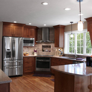
These South Shore homeowners desired a fresh look for their kitchen that was efficient and functional with a design worthy of showing off to family and friends. They also wished for more natural light, increased floor area and better countertop work space allowing for ease of preparation and cooking. The Renovisions team began the remodel by installing a larger (5’) window over the sink area which overlooks the beautiful backyard. Additional countertop workspace was achieved by utilizing the corner and installing a GE induction cooktop and stainless steel hood. This solution was spot on spectacular!
Renovisions discussed the importance of adding lighting fixtures and the homeowners agreed. Under cabinet lighting was installed under wall cabinets with switch as well as two pendants over the peninsula and one pendant over the sink. It also made good design sense to add additional recessed ceiling fixtures with LED lights and trims that blend well with the ceiling.
The project came together beautifully and boasts gorgeous shaker styled cherry cabinetry with glass mullian doors. The separate desk area serves as a much needed office/organizational area for keys, mail and electronic charging.
A lovely backsplash of Tuscan-clay-look porcelain tile in 4”x8” brick pattern and diagonal tile with decorative metal-look accent tiles serves an eye-catching design detail. We created interest without being overdone.
A large rectangular under-mounted ‘chef’ sink in stainless steel finish was the way to go here to accommodate larger pots and pans and platters. The creamy color marble like durable yet beautiful quartz countertops created a soft tone for the kitchens overall aesthetic look. Simple, pretty details give the cherry cabinets understated elegance and the mix of textures makes the room feel welcoming.
Our client can’t wait to start preparing her favorite recipes for her family.
 Lightology
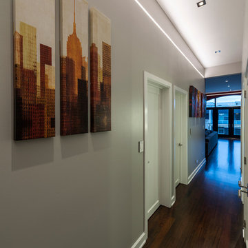
Reveal projects an indirect glow onto ceilings and floors to deliver flush mount cove and toe-kick lighting. This 24VDC linear LED system features a shallow .5 inch deep plaster-in aluminum extrusion no thicker than drywall that houses a single row of high CRI, commercial grade white LED Soft Strip. System mounts directly to studs without joist modification and plasters into .5 inch or thicker drywall. Reveal is sold in 1 foot 2.5 watt increments up to 40 feet and may be field-cut. Also available in a 5 watt per foot version as well as a Red-Blue-Green RGB version. LED Soft Strip may be cut every 2.4 inches. 2.5 watt Reveal runs up to 40 feet on a single Class 2, 96 watt power supply. Available in Amber White 2400K with 80 plus CRI, Warm White 2700K with 85 plus CRI, or Very Warm White 3000K with 85 plus CRI. LEDs consume 2.5 watts per foot and 42 lumens per system watt, delivering 116 lumens per foot for Reveal 2WDC. System includes Reveal channels, end caps, LED Soft Strip, special junction box and all mounting hardware. Power supply options include a Class 2 24 volt 0-10 96 or 192 watt, sold separately. Dimmable with a Lightolier Sunrise ZP600FAM120, Leviton IP710-DL dimmer. sold separately. Dimming systems include Lutron Radio Ra2 with Grafik Eye, RRD-10ND and GRX-TVI; Grafik Eye QS with Grafik Eye, QSGRJ-XP and GRX-TVI; Diva with Grafik Eye, DVTV and PP20; Nova T with Grafik Eye, NTFTV-WH and PP20, sold separately. Fixture includes a 5 year warranty. Made in USA.
Sponsored
Columbus, OH

Trish Takacs Design
Award Winning & Highly Skilled Kitchen & Bath Designer in Columbus
 TOC design & construction inc.
DESIGNED BY TOC design
CONSTRUCTION BY TOC design & Construction inc.
PHOTOS BY : Tania Scardellato
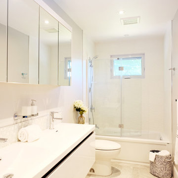
I was fortunate to have a young family approach me in desperate need to renovate there only 3 piece bathroom. This space was In dire need of a remodel, with old brown wall to wall tiles and a dated bulky yellow brown single sink vanity.
Storage was a must, lighting a necessity, and proper accessibility to the shower bath area.
We had a tight budget to respect, but a full gut of this bathroom was required. And a good thing too, once we started doing the demolition we noticed that mildew and rotting floors and walls had accumulated throughout the years. Doing it right the first time is no joke when dealing with water and electrical issues.
We discarded all reminisce of old and built from scratch, new walls, new plumbing, new electrical ,new insulation and a new window, a new fan that actually exhausted outside ( I say this laughing as you would be amazed at how many fans are installed but don’t exhaust outside, and you the client would never know unless you go inside the attic space.
Once all the hard stuff was done, the rest is just a matter of smart design. If you have a small bathroom here are some tips to guide you.
10 tips for making a small bathroom feel larger
Is your tiny bathroom cramping your functionality and style, leaving you longing for the enormous bathrooms gracing the pages of design magazines? Even if your bathroom is a fraction of the size, all it takes is some design savvy to make the most of the space you have. Consider these 10 smart tips that will help your bathroom look, feel and function like those larger contenders.
1-Get creative with corners
Space is at a premium in small bathrooms, so it's important to maximize every inch. Corners, for example, provide extra space for shelving, storage units and even hooks. Get creative and install unique design solutions that are not only functional, but also eye-catching. If you love the airiness of floating cabinets, add baskets or decorative boxes under for extra storage. If you are installing floating cabinets insure that they are installed securely to studs or plywood at wall.
2- Let solid colors shine
Busy patterns have a shrinking effect and make small bathrooms seem even smaller. Conversely, light natural hues make a space feel more open. If you're itching to get creative with design, experiment with textures but keep overpowering patterns to a minimum. Tone on tone is the best to achieve this.
3 - Maximize your bathtub
A bathtub takes up a significant portion of the room, but modern, compact options with curved basins, can make the tub feel larger when in use, all while conserving space.
4 - Select a smaller faucet
A faucet is jewelry for the bathroom. And just as accessories can overpower an outfit, a big bulky faucet isn't flattering in a small bath. Single-handle designs conserve counter space, while a wall-mount installation frees it up all together and can create quite the wow-factor, if the budget can accommodate the required changes to plumbing behind the wall.
5 - Make vanity storage simple
If you're in a storage war with your small bathroom, you're not alone in the battle. Toiletries and personal supplies without a place to call home only add clutter and chaos. Store smart with a space-saving vanity, the dual sink vanity shown here, looks quite simple, but in reality it has 4 sets of full extension drawers, and the vanity tower adds extra storage without overpowering the use of space.
6 - Show off the shower
Shower curtains may be pretty, but they interrupt the visual flow of a bathing space and make it feel significantly smaller. In bathrooms with small footprints, opt for a clear glass sliding shower door that doesn't require the clearance of one with a hinged design. Or as shown in this design and for fraction less expensive a half hinged panel installed on a fixed tempered glass panel. If you're embarking on a big remodel, create the illusion of more space by using same tile in the shower that's used throughout; instead of seeing them as two separate zones, the eye will read them as one.
7 - Discover the treasure of hidden storage
Work with a contractor, and you just might find some serious storage potential hidden behind your walls. Whether it's utilizing space between the studs for shallow shelving or a creating a small linen closet by annexing space from an adjacent room, even small additions can make a big difference.
8 - Focal Point
Tile is a beautiful, durable addition to any bathroom. For dainty spaces, consider installing tile at a diagonal to accentuate the focal point or as in this bathroom I used an oversized textured pattern to bring depth to the space at the window wall.
9 - Choose the right lights
Strategically install light to reflect and brighten a small bathroom to make it appear larger. Recessed lighting is an affordable solution for tiny rooms, offering ample light while taking up little space. Wall sconces alongside a mirror also reflect off the walls and make a room feel bright and airy. I always recommend going with LED lighting at 2800 to 3000K.
10 – Accessorize
This is your time to shine in your decorating skills, have fun with your towels, you can change the color scheme daily just by adding pops of color in your accessories, make sure to get items that serve a dual purpose, like baskets, boxes they can always be used as hampers, storing of towels and even a nice display for your guest.
 Asha Mevlana
Who lives there: Asha Mevlana and her Havanese dog named Bali
Location: Fayetteville, Arkansas
Size: Main house (400 sq ft), Trailer (160 sq ft.), 1 loft bedroom, 1 bath
What sets your home apart: The home was designed specifically for my lifestyle.
My inspiration: After reading the book, "The Life Changing Magic of Tidying," I got inspired to just live with things that bring me joy which meant scaling down on everything and getting rid of most of my possessions and all of the things that I had accumulated over the years. I also travel quite a bit and wanted to live with just what I needed.
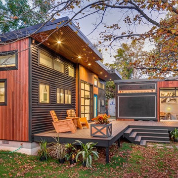
About the house: The L-shaped house consists of two separate structures joined by a deck. The main house (400 sq ft), which rests on a solid foundation, features the kitchen, living room, bathroom and loft bedroom. To make the small area feel more spacious, it was designed with high ceilings, windows and two custom garage doors to let in more light. The L-shape of the deck mirrors the house and allows for the two separate structures to blend seamlessly together. The smaller "amplified" structure (160 sq ft) is built on wheels to allow for touring and transportation. This studio is soundproof using recycled denim, and acts as a recording studio/guest bedroom/practice area. But it doesn't just look like an amp, it actually is one -- just plug in your instrument and sound comes through the front marine speakers onto the expansive deck designed for concerts.
My favorite part of the home is the large kitchen and the expansive deck that makes the home feel even bigger. The deck also acts as a way to bring the community together where local musicians perform. I love having a the amp trailer as a separate space to practice music. But I especially love all the light with windows and garage doors throughout.
Design team: Brian Crabb (designer), Zack Giffin (builder, custom furniture) Vickery Construction (builder) 3 Volve Construction (builder)
Design dilemmas: Because the city wasn’t used to having tiny houses there were certain rules that didn’t quite make sense for a tiny house. I wasn’t allowed to have stairs leading up to the loft, only ladders were allowed. Since it was built, the city is beginning to revisit some of the old rules and hopefully things will be changing.
Photo cred: Don Shreve
 Dynamic Garage Door
Getting your homeowner's association board to approve your new custom garage doors can seem daunting. Dynamic Garage Door as a custom design and manufacturing firm has come across this situation quite frequently with a phenomenal success approval rate!
In order to get approval for your custom garage door approval there are a few basic points you must understand. First off, your HOA is committed to preserving the neighborhood's curb appeal integrity by focusing on the impact your new custom garage doors might have on your house and the houses of your neighbors. It is important to understand that your curb appeal decisions will impact your home and neighborhood alike. Too many companies offer semi-custom wood doors without the true understanding of the client's need and the essence of their home's architectural style. The garage door design you choose needs to comply with neighborhood regulations while complement your home's architecture. At Dynamic Garage Door, our designers are well-rounded in the garage door industry and so we can suggest or develop designs that will reinforce the natural appearance of your home's style. If you can prove to your HOA that you've done your homework and that the garage door design you chose will complement not only your home but the neighborhood you'll be surprised when your proposal is marked with the approval stamp!
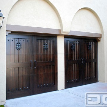
This garage door is actually a single double-car door not two as it appears. The reason is that this garage used to have two separate doors with a post in the middle. The post in the middle made it difficult to use the garage on a daily basis so the post was removed to facilitate the use of the garage. The HOA wasn't too happy about the removal of the post as it was an essential part of the arches located right above the garage doors. You can clearly see how that would have been disruptive if the homeowner went with a regular wood door and not one custom designed and manufactured by Dynamic Garage Door.
This garage door was specifically designed to address the HOA's concern about the center post removal and the effect it would have on the curb appeal of the home with the incomplete double arch look. So we addressed this by crafting the door with a false center post in the middle that was textured and painted the same color of the house to give off that illusion that the post is still there. Overall, it gives the home a complete finished appearance with two independent-looking doors and original post. The homeowner got the entire width of the opening to use at the push of a button so having a larger car won't be a problem anymore. The neighbors are all happy and no one seems to notice the center post is actually fake!
Got an interesting garage door project you want our designers to review and price out for you? Give us a call at (855) 343-DOOR
 Haven Design and Construction
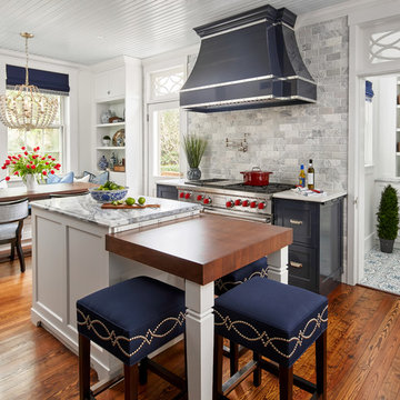
This 1902 San Antonio home was beautiful both inside and out, except for the kitchen, which was dark and dated. The original kitchen layout consisted of a breakfast room and a small kitchen separated by a wall. There was also a very small screened in porch off of the kitchen. The homeowners dreamed of a light and bright new kitchen and that would accommodate a 48" gas range, built in refrigerator, an island and a walk in pantry. At first, it seemed almost impossible, but with a little imagination, we were able to give them every item on their wish list. We took down the wall separating the breakfast and kitchen areas, recessed the new Subzero refrigerator under the stairs, and turned the tiny screened porch into a walk in pantry with a gorgeous blue and white tile floor. The french doors in the breakfast area were replaced with a single transom door to mirror the door to the pantry. The new transoms make quite a statement on either side of the 48" Wolf range set against a marble tile wall. A lovely banquette area was created where the old breakfast table once was and is now graced by a lovely beaded chandelier. Pillows in shades of blue and white and a custom walnut table complete the cozy nook. The soapstone island with a walnut butcher block seating area adds warmth and character to the space. The navy barstools with chrome nailhead trim echo the design of the transoms and repeat the navy and chrome detailing on the custom range hood. A 42" Shaws farmhouse sink completes the kitchen work triangle. Off of the kitchen, the small hallway to the dining room got a facelift, as well. We added a decorative china cabinet and mirrored doors to the homeowner's storage closet to provide light and character to the passageway. After the project was completed, the homeowners told us that "this kitchen was the one that our historic house was always meant to have." There is no greater reward for what we do than that.
 Wanda Ely Architect Inc.
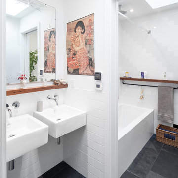
The bathroom sinks are separated from the toilet and shower by a sliding door so as to allow a family of 4 to most efficiently use the space of a single bathroom. A water-resistant redwood shelf ties the two rooms together and allows for storage of various products around the bathroom.
Photo by Scott Norsworthy
 Hudson Place Realty
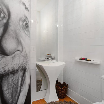
Property Marketed by Hudson Place Realty - Style meets substance in this circa 1875 townhouse. Completely renovated & restored in a contemporary, yet warm & welcoming style, 295 Pavonia Avenue is the ultimate home for the 21st century urban family. Set on a 25’ wide lot, this Hamilton Park home offers an ideal open floor plan, 5 bedrooms, 3.5 baths and a private outdoor oasis.
With 3,600 sq. ft. of living space, the owner’s triplex showcases a unique formal dining rotunda, living room with exposed brick and built in entertainment center, powder room and office nook. The upper bedroom floors feature a master suite separate sitting area, large walk-in closet with custom built-ins, a dream bath with an over-sized soaking tub, double vanity, separate shower and water closet. The top floor is its own private retreat complete with bedroom, full bath & large sitting room.
Tailor-made for the cooking enthusiast, the chef’s kitchen features a top notch appliance package with 48” Viking refrigerator, Kuppersbusch induction cooktop, built-in double wall oven and Bosch dishwasher, Dacor espresso maker, Viking wine refrigerator, Italian Zebra marble counters and walk-in pantry. A breakfast nook leads out to the large deck and yard for seamless indoor/outdoor entertaining.
Other building features include; a handsome façade with distinctive mansard roof, hardwood floors, Lutron lighting, home automation/sound system, 2 zone CAC, 3 zone radiant heat & tremendous storage, A garden level office and large one bedroom apartment with private entrances, round out this spectacular home.

 TOC design & construction inc.
DESIGNED BY TOC design
CONSTRUCTION BY TOC design & Construction inc.
PHOTOS BY : Tania Scardellato
I was fortunate to have a young family approach me in desperate need to renovate there only 3 piece bathroom. This space was In dire need of a remodel, with old brown wall to wall tiles and a dated bulky yellow brown single sink vanity.
Storage was a must, lighting a necessity, and proper accessibility to the shower bath area.
We had a tight budget to respect, but a full gut of this bathroom was required. And a good thing too, once we started doing the demolition we noticed that mildew and rotting floors and walls had accumulated throughout the years. Doing it right the first time is no joke when dealing with water and electrical issues.
We discarded all reminisce of old and built from scratch, new walls, new plumbing, new electrical ,new insulation and a new window, a new fan that actually exhausted outside ( I say this laughing as you would be amazed at how many fans are installed but don’t exhaust outside, and you the client would never know unless you go inside the attic space.
Once all the hard stuff was done, the rest is just a matter of smart design. If you have a small bathroom here are some tips to guide you.
10 tips for making a small bathroom feel larger
Is your tiny bathroom cramping your functionality and style, leaving you longing for the enormous bathrooms gracing the pages of design magazines? Even if your bathroom is a fraction of the size, all it takes is some design savvy to make the most of the space you have. Consider these 10 smart tips that will help your bathroom look, feel and function like those larger contenders.
1-Get creative with corners
Space is at a premium in small bathrooms, so it's important to maximize every inch. Corners, for example, provide extra space for shelving, storage units and even hooks. Get creative and install unique design solutions that are not only functional, but also eye-catching. If you love the airiness of floating cabinets, add baskets or decorative boxes under for extra storage. If you are installing floating cabinets insure that they are installed securely to studs or plywood at wall.
2- Let solid colors shine
Busy patterns have a shrinking effect and make small bathrooms seem even smaller. Conversely, light natural hues make a space feel more open. If you're itching to get creative with design, experiment with textures but keep overpowering patterns to a minimum. Tone on tone is the best to achieve this.
3 - Maximize your bathtub
A bathtub takes up a significant portion of the room, but modern, compact options with curved basins, can make the tub feel larger when in use, all while conserving space.
4 - Select a smaller faucet
A faucet is jewelry for the bathroom. And just as accessories can overpower an outfit, a big bulky faucet isn't flattering in a small bath. Single-handle designs conserve counter space, while a wall-mount installation frees it up all together and can create quite the wow-factor, if the budget can accommodate the required changes to plumbing behind the wall.
5 - Make vanity storage simple
If you're in a storage war with your small bathroom, you're not alone in the battle. Toiletries and personal supplies without a place to call home only add clutter and chaos. Store smart with a space-saving vanity, the dual sink vanity shown here, looks quite simple, but in reality it has 4 sets of full extension drawers, and the vanity tower adds extra storage without overpowering the use of space.
6 - Show off the shower
Shower curtains may be pretty, but they interrupt the visual flow of a bathing space and make it feel significantly smaller. In bathrooms with small footprints, opt for a clear glass sliding shower door that doesn't require the clearance of one with a hinged design. Or as shown in this design and for fraction less expensive a half hinged panel installed on a fixed tempered glass panel. If you're embarking on a big remodel, create the illusion of more space by using same tile in the shower that's used throughout; instead of seeing them as two separate zones, the eye will read them as one.
7 - Discover the treasure of hidden storage
Work with a contractor, and you just might find some serious storage potential hidden behind your walls. Whether it's utilizing space between the studs for shallow shelving or a creating a small linen closet by annexing space from an adjacent room, even small additions can make a big difference.
8 - Focal Point
Tile is a beautiful, durable addition to any bathroom. For dainty spaces, consider installing tile at a diagonal to accentuate the focal point or as in this bathroom I used an oversized textured pattern to bring depth to the space at the window wall.
9 - Choose the right lights
Strategically install light to reflect and brighten a small bathroom to make it appear larger. Recessed lighting is an affordable solution for tiny rooms, offering ample light while taking up little space. Wall sconces alongside a mirror also reflect off the walls and make a room feel bright and airy. I always recommend going with LED lighting at 2800 to 3000K.
10 – Accessorize
This is your time to shine in your decorating skills, have fun with your towels, you can change the color scheme daily just by adding pops of color in your accessories, make sure to get items that serve a dual purpose, like baskets, boxes they can always be used as hampers, storing of towels and even a nice display for your guest.
 Dura Supreme Cabinetry
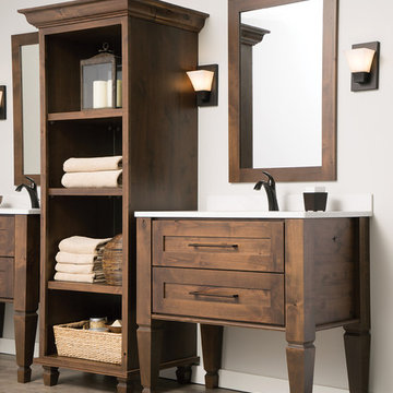
Plunge in your new bath with darling design elements to create a coordinated bathroom with a surprising appeal. Small spaces call for big design details like the ornate turn posts that frame the sink area to create a compelling look for the bath vanity. Select the most inviting and luxurious materials to create a relaxing space that rejuvenates as it soothes and calms. Coordinating bath furniture from Dura Supreme brings all the details together with your choice of beautiful styles and finishes.
A linen cabinet with a mirrored back beautifully displays stacks of towels and bathroom sundries. These furniture vanities showcase Dura Supreme’s “Style Five” furniture series. Style Five is designed with a selection of turned posts for iconic furniture style to meet your personal tastes. The two individual vanities separated by the free-standing linen cabinet provide each spouse their own divided space to organize their personal bath supplies, while the linen cabinet provides universal storage for items the couple will both use.
Style Five furniture series offers 10 different configurations (for single sink vanities, double sink vanities, or offset sinks), 15 turn post designs and an optional floor with either plain or slatted detail. A selection of classic post designs offers personalized design choices. Any combination of Dura Supreme’s many door styles, wood species, and finishes can be selected to create a one-of-a-kind bath furniture collection.
The bathroom has evolved from its purist utilitarian roots to a more intimate and reflective sanctuary in which to relax and reconnect. A refreshing spa-like environment offers a brisk welcome at the dawning of a new day or a soothing interlude as your day concludes.
Our busy and hectic lifestyles leave us yearning for a private place where we can truly relax and indulge. With amenities that pamper the senses and design elements inspired by luxury spas, bathroom environments are being transformed from the mundane and utilitarian to the extravagant and luxurious.
Bath cabinetry from Dura Supreme offers myriad design directions to create the personal harmony and beauty that are a hallmark of the bath sanctuary. Immerse yourself in our expansive palette of finishes and wood species to discover the look that calms your senses and soothes your soul. Your Dura Supreme designer will guide you through the selections and transform your bath into a beautiful retreat.
Request a FREE Dura Supreme Brochure Packet:
http://www.durasupreme.com/request-brochure
Find a Dura Supreme Showroom near you today:
http://www.durasupreme.com/dealer-locator
 Twelve Stones Designs, LLC
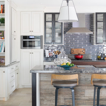
The owners of this kitchen had spent the money to upgrade the finishes in their kitchen upon building the home 12 years ago, but after living in the space for several years they realized how nonfunctional the layout really was. The (then) two preschool aged children had grown into busy, hungry teenagers with many friends who also liked to hang out at the house. So the family needed a more functional kitchen with better traffic flow, space for daily activities revolving around the kitchen at different times of day, and a kitchen that could accommodate cooking for and serving large groups. Furthermore, the dark, traditional finishes no longer reflected the homeowners’ style. They requested a brighter, more relaxed, coastal style that reflected their love of the seaside cities they like to visit.
Originally, the kitchen was U-shaped with a narrow island in the middle. The island created narrow aisles that bottle-necked at the dishwasher, refrigerator, and cooktop areas. There was a pass-through from the foyer into the kitchen, but the owners never liked that the pass-through was also located so close to the powder room. The awkward proximity was unappealing and made guests feel uncomfortable.
The kitchen’s storage was made up of lots of narrow cabinets, apothecary drawers, clipped corner units, and very few drawers. It lacked useful storage for the larger items the family used on a daily basis. And the kitchen’s only pantry was small closet that had only builder-grade, narrow shelving with no illumination to be able to see the contents inside.
Overall, the kitchen’s lighting plan was poorly executed. Only six recessed cans illuminated the entire kitchen and nook areas. The under cabinet lighting was not evenly distributed either. In fact, the builder had mis-placed the under cabinet lighting around the decorative pilasters which made for choppy, dark cubbies. Further, the builder didn’t include any lighting over the sink or the bar area, which meant whoever was doing the dishes was always in their own shadow. That, coupled with the steep overhang of the game room above made the bar area feel like a dim, cavernous space that wasn’t inviting or task oriented. The kitchen looked out into the main living space, but the raised bar and a narrow wall (which held the only large cabinet in the kitchen) created more of a barrier than a relationship to the living room or breakfast nook. In fact, one couldn’t even see the breakfast nook from the cooktop or sink areas due to its orientation. The raised bar top was too narrow to comfortably sit to either dine at or chat from due to the lack of knee space. The the homeowners confided that the kitchen felt more like a dark, dirty prison than place where the family, or their guests, wanted to gather and commune.
The clients' needs and desires were:
➢ to create a kitchen that would be a space the family loved to be in; to relate to the adjacent spaces all around, and to have better flow for entertaining large groups
➢ to remove the walls between the breakfast nook and living area and to be able to utilize the natural light from the windows in both those areas
➢ to incorporate a functional chopping block for prepping fresh food for home cooked meals, an island with a large sink and drain board, 2 pull out trash cans, and seating for at least the 2 teens to eat or do homework
➢ to design a kitchen and breakfast nook with an airy, coastal, relaxed vibe that blended with the rest of the house's coastal theme
➢ to integrate a layered lighting plan which would include ample general illumination, specific task lighting, decorative lighting, and lots of illuminated storage
➢ to design a kitchen with not only more storage for all the husband’s kitchen gadgets and collection of oils and spices, but smart storage, including a coffee/breakfast bar and a place to store and conceal the toaster oven and microwave
➢ to find a way to utilize the large open space between the kitchen, pantry area, and breakfast nook
Twelve Stones Designs achieved the owner's goals by:
➢ removing the walls between the kitchen and living room to allow the natural light to filter in from the adjacent rooms and to create a connection between the kitchen, nook, and living spaces for a sense of unity and communion
➢ removing the existing pantry and designing 3 large pantry style cabinets with LED tape lights and rollout drawers to house lots of kitchen appliances, gadgets, and tons of groceries. We also took the cabinets all the way up to the 9’ ceiling for additional storage for seasonal items and bulk storage.
➢ designing 2 islands - 1 with a gorgeous black walnut chopping block that houses a drawer for chopping and carving knives and a custom double pull out trash unit for point of use utilization - and 1 that houses the dishwasher, a large Blanco Gourmet sink with integrated drain board, woven baskets for fresh root vegetables and kitchen towels, plenty of drawer storage for kitchen items, and bar seating for up to 4 diners.
➢ closing off the space between the kitchen and the powder room to create a beautiful new private alcove for the powder room as well as adding some decorative storage. This also gave us space to include more tall storage near the new range for precision placement of the husband’s extensive oil and spice collection as well as a location for a combo-steam oven the wife wanted for baking and cooking healthy meals.
The project is enhanced functionally by:
➢ incorporated USB and standard receptacles for the kids’ laptops and phone charging in the large island
➢ designing the small island to include additional open shelving for items used on a daily basis such as a variety of bowls, plates, and colanders. This set up also works well for the husband who prefers to “plate” his dinners in restaurant-style fashion before presenting them to the table.
➢ the integration of specific storage units, such as double stacked cutlery drawers, a custom spice pull-out, a Kuerig coffee and tea pod drawer, and custom double stacked utensil drawers
➢ moving the refrigerator to the old oven location - this eliminated the bottle neck as well as created a better relationship to the eating table. It also utilizes the floor space between the pantry, nook, and kitchen
➢ creating a banquet style breakfast nook - this banquette seating not only doubles the amount of seating for large gatherings but it better utilizes the odd space between the kitchen and the previous nook area. It also helps to create a distinct pathway from the mudroom room through the pantry area, kitchen, nook, and living room.
➢ the coffee/breakfast bar area which includes the perfect location for the concealed microwave and toaster oven, convenient storage for the coffee pods and tea accoutrements. Roll-out drawers below also house the smoothie maker, hot water kettle, and a plethora of smoothie-making ingredients such as protein powders, smoothie additives, etc. Furthermore, the drawers below the Keurig house measuring utensil, cutlery, baking supplies and tupperware storage.
➢ incorporating lots of wide drawers and pullouts to accommodate large cookware.
➢ utilizing as much vertical space as possible by building storage to the ceiling which accommodates the family’s abundant amount of serving platters, baking sheets, bakeware, casserole dishes, and additional cutting boards.
The project is enhanced aesthetically by:
➢ new 5-piece Versailles pattern porcelain tile that now seamlessly joins the entire down stairs area together creating a bright, cohesiveness feeling instead of choppy separated spaces - it also adds a coastal feeling
➢ designing a cabinet to conceal the microwave and toaster oven
➢ the coastal influenced light fixtures over the nook table and island
➢ the sandy colors of the Langdon Cambria countertops. The swirling pattern and sparkling quartz pieces remind the homeowner of black-and-tan sandy beaches
➢ the striped banquet seating whose creamy white background and blue-green stripes were the inspiration for the cabinet and wall colors.
➢ All the interior doors were painted black to coordinate with the blacks and grays in the backsplash tile and countertop. This also adds a hint of tailored formality to an otherwise casual space.
➢ the use of WAC's Oculux small aperture LED units for the overhead lighting complimented with Diode LED strips for task lighting under the cabinets and inside the pantry and glass wall cabinets. All of the lighting applications are on separate dimmer switches.
Innovative uses of materials or construction methods by Realty Restoration LLC:
➢ Each 1-1/2” x 3” block of reclaimed end-grain black walnut that makes up the center island chopping block was hand milled and built in the shop. It was designed to look substantial and proportional to the surrounding elements, executed by creating the 4 inch tall top with a solid wood chamfered edge band.
➢ The metal doors on either side of the vent hood were also custom designed for this project and built in the Realty Restoration LLC shop. They are made 1x2, 11-gauge mild steel with ribbed glass. Weighing 60 lbs a piece, heavy duty cabinet hinges were added to support the weight of the door and keep them from sagging.
➢ Under-cabinet receptacles were added along the range wall in order to have a clean, uninterrupted backsplash.
Design obstacles to overcome:
➢ Because we were removing the demising walls between the kitchen and living room, we had to find a way to plumb and vent the new island. We did this by tunneling through the slab (the slab had post tension cables which prevented us from just trenching) to run a new wet vent through a nearby structural wall. We pulled the existing hot and cold lines between upper floor joists and ran them down the structural wall as well and up through a conduit in the tunnel.
➢ Since we were converting from wall overs to a gas range it allowed us to utilize the 220 feed for the wall ovens to provide a new sub panel for all the new kitchen circuits
➢ Due to framing deficiencies inherited from the original build there was a 1-1/2” differential in the floor-to-ceiling height over a 20 foot span; by utilizing the process of cutting and furring coupled with the crown moulding details on the cabinet elevations we were able to mask the problem and provide seamless transitions between the cabinet components.
Evidence of superior craftsmanship:
➢ uniquely designed, one-of-a-kind metal “X” end panels on the large island. The end panels were custom made in the Realty Restoration LLC shop and fitted to the exact dimensions of the island. The welding seams are completely indistinguishable - the posts look like they are cut from a single sheet of metal
➢ square metal posts on the small island were also custom made and designed to compliment and carry through the metal element s throughout the kitchen
➢ the beautiful, oversized end panels on the pantry cabinets which give the breakfast nook a tailored look
➢ integrating a large format 5 piece Versailles tile pattern to seamlessly flow from the existing spaces into the new kitchen space
➢ By constructing a custom cabinet that jogged around a corner we could not remodel (housing the entry way coat closet) we were able to camouflage the adjacent wall offset within the upper and lower cabinets. By designing around the existing jog in the structural walls we accomplished a few things: we were able to find the space to house, and hide, the microwave and toaster oven yet still have a clean cohesive appearance from the kitchen side. Additionally, the owners were able to keep their much needed coat closet and we didn’t have to increase the budget with unnecessary structural work.
 Wow Great Place
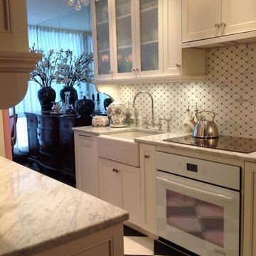
We decided to use a separate induction cooktop and wall oven, so that the countertop could wrap completely around the cooktop surface. The range hood is a slimline model from Faber, and turns on when it is pulled out from the wall.
Sponsored
Sunbury, OH

J.Holderby - Renovations
Franklin County's Leading General Contractors - 2X Best of Houzz!
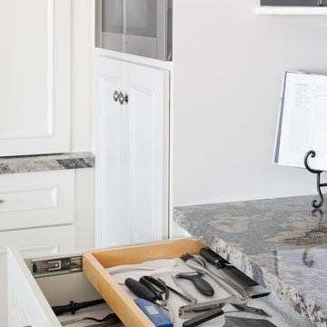 Twelve Stones Designs, LLC
The owners of this kitchen had spent the money to upgrade the finishes in their kitchen upon building the home 12 years ago, but after living in the space for several years they realized how nonfunctional the layout really was. The (then) two preschool aged children had grown into busy, hungry teenagers with many friends who also liked to hang out at the house. So the family needed a more functional kitchen with better traffic flow, space for daily activities revolving around the kitchen at different times of day, and a kitchen that could accommodate cooking for and serving large groups. Furthermore, the dark, traditional finishes no longer reflected the homeowners’ style. They requested a brighter, more relaxed, coastal style that reflected their love of the seaside cities they like to visit.
Originally, the kitchen was U-shaped with a narrow island in the middle. The island created narrow aisles that bottle-necked at the dishwasher, refrigerator, and cooktop areas. There was a pass-through from the foyer into the kitchen, but the owners never liked that the pass-through was also located so close to the powder room. The awkward proximity was unappealing and made guests feel uncomfortable.
The kitchen’s storage was made up of lots of narrow cabinets, apothecary drawers, clipped corner units, and very few drawers. It lacked useful storage for the larger items the family used on a daily basis. And the kitchen’s only pantry was small closet that had only builder-grade, narrow shelving with no illumination to be able to see the contents inside.
Overall, the kitchen’s lighting plan was poorly executed. Only six recessed cans illuminated the entire kitchen and nook areas. The under cabinet lighting was not evenly distributed either. In fact, the builder had mis-placed the under cabinet lighting around the decorative pilasters which made for choppy, dark cubbies. Further, the builder didn’t include any lighting over the sink or the bar area, which meant whoever was doing the dishes was always in their own shadow. That, coupled with the steep overhang of the game room above made the bar area feel like a dim, cavernous space that wasn’t inviting or task oriented. The kitchen looked out into the main living space, but the raised bar and a narrow wall (which held the only large cabinet in the kitchen) created more of a barrier than a relationship to the living room or breakfast nook. In fact, one couldn’t even see the breakfast nook from the cooktop or sink areas due to its orientation. The raised bar top was too narrow to comfortably sit to either dine at or chat from due to the lack of knee space. The the homeowners confided that the kitchen felt more like a dark, dirty prison than place where the family, or their guests, wanted to gather and commune.
The clients' needs and desires were:
➢ to create a kitchen that would be a space the family loved to be in; to relate to the adjacent spaces all around, and to have better flow for entertaining large groups
➢ to remove the walls between the breakfast nook and living area and to be able to utilize the natural light from the windows in both those areas
➢ to incorporate a functional chopping block for prepping fresh food for home cooked meals, an island with a large sink and drain board, 2 pull out trash cans, and seating for at least the 2 teens to eat or do homework
➢ to design a kitchen and breakfast nook with an airy, coastal, relaxed vibe that blended with the rest of the house's coastal theme
➢ to integrate a layered lighting plan which would include ample general illumination, specific task lighting, decorative lighting, and lots of illuminated storage
➢ to design a kitchen with not only more storage for all the husband’s kitchen gadgets and collection of oils and spices, but smart storage, including a coffee/breakfast bar and a place to store and conceal the toaster oven and microwave
➢ to find a way to utilize the large open space between the kitchen, pantry area, and breakfast nook
Twelve Stones Designs achieved the owner's goals by:
➢ removing the walls between the kitchen and living room to allow the natural light to filter in from the adjacent rooms and to create a connection between the kitchen, nook, and living spaces for a sense of unity and communion
➢ removing the existing pantry and designing 3 large pantry style cabinets with LED tape lights and rollout drawers to house lots of kitchen appliances, gadgets, and tons of groceries. We also took the cabinets all the way up to the 9’ ceiling for additional storage for seasonal items and bulk storage.
➢ designing 2 islands - 1 with a gorgeous black walnut chopping block that houses a drawer for chopping and carving knives and a custom double pull out trash unit for point of use utilization - and 1 that houses the dishwasher, a large Blanco Gourmet sink with integrated drain board, woven baskets for fresh root vegetables and kitchen towels, plenty of drawer storage for kitchen items, and bar seating for up to 4 diners.
➢ closing off the space between the kitchen and the powder room to create a beautiful new private alcove for the powder room as well as adding some decorative storage. This also gave us space to include more tall storage near the new range for precision placement of the husband’s extensive oil and spice collection as well as a location for a combo-steam oven the wife wanted for baking and cooking healthy meals.
The project is enhanced functionally by:
➢ incorporated USB and standard receptacles for the kids’ laptops and phone charging in the large island
➢ designing the small island to include additional open shelving for items used on a daily basis such as a variety of bowls, plates, and colanders. This set up also works well for the husband who prefers to “plate” his dinners in restaurant-style fashion before presenting them to the table.
➢ the integration of specific storage units, such as double stacked cutlery drawers, a custom spice pull-out, a Kuerig coffee and tea pod drawer, and custom double stacked utensil drawers
➢ moving the refrigerator to the old oven location - this eliminated the bottle neck as well as created a better relationship to the eating table. It also utilizes the floor space between the pantry, nook, and kitchen
➢ creating a banquet style breakfast nook - this banquette seating not only doubles the amount of seating for large gatherings but it better utilizes the odd space between the kitchen and the previous nook area. It also helps to create a distinct pathway from the mudroom room through the pantry area, kitchen, nook, and living room.
➢ the coffee/breakfast bar area which includes the perfect location for the concealed microwave and toaster oven, convenient storage for the coffee pods and tea accoutrements. Roll-out drawers below also house the smoothie maker, hot water kettle, and a plethora of smoothie-making ingredients such as protein powders, smoothie additives, etc. Furthermore, the drawers below the Keurig house measuring utensil, cutlery, baking supplies and tupperware storage.
➢ incorporating lots of wide drawers and pullouts to accommodate large cookware.
➢ utilizing as much vertical space as possible by building storage to the ceiling which accommodates the family’s abundant amount of serving platters, baking sheets, bakeware, casserole dishes, and additional cutting boards.
The project is enhanced aesthetically by:
➢ new 5-piece Versailles pattern porcelain tile that now seamlessly joins the entire down stairs area together creating a bright, cohesiveness feeling instead of choppy separated spaces - it also adds a coastal feeling
➢ designing a cabinet to conceal the microwave and toaster oven
➢ the coastal influenced light fixtures over the nook table and island
➢ the sandy colors of the Langdon Cambria countertops. The swirling pattern and sparkling quartz pieces remind the homeowner of black-and-tan sandy beaches
➢ the striped banquet seating whose creamy white background and blue-green stripes were the inspiration for the cabinet and wall colors.
➢ All the interior doors were painted black to coordinate with the blacks and grays in the backsplash tile and countertop. This also adds a hint of tailored formality to an otherwise casual space.
➢ the use of WAC's Oculux small aperture LED units for the overhead lighting complimented with Diode LED strips for task lighting under the cabinets and inside the pantry and glass wall cabinets. All of the lighting applications are on separate dimmer switches.
Innovative uses of materials or construction methods by Realty Restoration LLC:
➢ Each 1-1/2” x 3” block of reclaimed end-grain black walnut that makes up the center island chopping block was hand milled and built in the shop. It was designed to look substantial and proportional to the surrounding elements, executed by creating the 4 inch tall top with a solid wood chamfered edge band.
➢ The metal doors on either side of the vent hood were also custom designed for this project and built in the Realty Restoration LLC shop. They are made 1x2, 11-gauge mild steel with ribbed glass. Weighing 60 lbs a piece, heavy duty cabinet hinges were added to support the weight of the door and keep them from sagging.
➢ Under-cabinet receptacles were added along the range wall in order to have a clean, uninterrupted backsplash.
Design obstacles to overcome:
➢ Because we were removing the demising walls between the kitchen and living room, we had to find a way to plumb and vent the new island. We did this by tunneling through the slab (the slab had post tension cables which prevented us from just trenching) to run a new wet vent through a nearby structural wall. We pulled the existing hot and cold lines between upper floor joists and ran them down the structural wall as well and up through a conduit in the tunnel.
➢ Since we were converting from wall overs to a gas range it allowed us to utilize the 220 feed for the wall ovens to provide a new sub panel for all the new kitchen circuits
➢ Due to framing deficiencies inherited from the original build there was a 1-1/2” differential in the floor-to-ceiling height over a 20 foot span; by utilizing the process of cutting and furring coupled with the crown moulding details on the cabinet elevations we were able to mask the problem and provide seamless transitions between the cabinet components.
Evidence of superior craftsmanship:
➢ uniquely designed, one-of-a-kind metal “X” end panels on the large island. The end panels were custom made in the Realty Restoration LLC shop and fitted to the exact dimensions of the island. The welding seams are completely indistinguishable - the posts look like they are cut from a single sheet of metal
➢ square metal posts on the small island were also custom made and designed to compliment and carry through the metal element s throughout the kitchen
➢ the beautiful, oversized end panels on the pantry cabinets which give the breakfast nook a tailored look
➢ integrating a large format 5 piece Versailles tile pattern to seamlessly flow from the existing spaces into the new kitchen space
➢ By constructing a custom cabinet that jogged around a corner we could not remodel (housing the entry way coat closet) we were able to camouflage the adjacent wall offset within the upper and lower cabinets. By designing around the existing jog in the structural walls we accomplished a few things: we were able to find the space to house, and hide, the microwave and toaster oven yet still have a clean cohesive appearance from the kitchen side. Additionally, the owners were able to keep their much needed coat closet and we didn’t have to increase the budget with unnecessary structural work.
 Western Design International
Chandler Photography
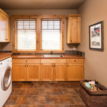
Mountain style brown floor laundry room photo in Other with a drop-in sink
Mountain style brown floor laundry room photo in Other with a drop-in sink
 Barbra Bright Design
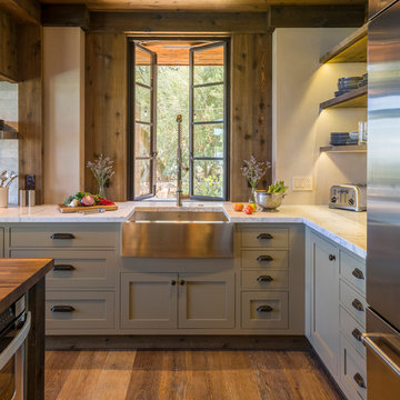
The mixture of grey green cabinets with the distressed wood floors and ceilings, gives this farmhouse kitchen a feeling of warmth.
Cabinets: Brookhaven and the color is Green Stone
Benjamin Moore paint color: There's not an exact match for Green Stone, but Gettysburg Grey, HC 107 is close.
Sink: Krauss, model KHF200-30, stainless steel
Faucet: Kraus, modelKPF-1602
Hardware: Restoration hardware, Dakota cup and Dakota round knob. The finish was either the chestnut or iron.
Windows: Bloomberg is the manufacturer
the hardware is from Restoration hardware--Dakota cup and Dakota round knob. The finish was either the chestnut or iron.
Floors: European Oak that is wired brushed. The company is Provenza, Pompeii collection and the color is Amiata.
Distressed wood: The wood is cedar that's been treated to look distressed! My client is brilliant , so he did some googling (is that a word?) and came across several sites that had a recipe to do just that. He put a steel wool pad into a jar of vinegar and let it sit for a bit. In another jar, he mixed black tea with water. Brush the tea on first and let it dry. Then brush on the steel wool/vinegar (don't forget to strain the wool). Voila, the wood turns dark.
Andrew McKinney Photography
10